


How To Combine Flexbox and CSS Grids for Efficient Layouts
Editor’s note: This guest post was written by Abbey Fitzgerald a UX software engineer and web designer who loves the art of crafting code.
In the past, CSS float properties were one of the main methods for arranging elements on a website. And if you’ve ever worked that way, you know that it’s not always ideal for complex layouts. Luckily in the modern era of web design, aligning elements has become much more streamlined thanks to Flexbox and CSS Grids.
When Flexbox came along, it made alignment much easier and has since been widely adopted. CSS Grid Layouts have also created a lot of excitement in the web design community. A while back, we took a look at how to create a basic CSS Grid Layout. Although it is not widely adopted, browsers are starting to adopt support for it. When it is fully supported, this will have a great impact on designs. Browser support is increasing all the time; be sure to check out Can I Use for the most up-to-date information.
Now you may be wondering what’s next; after all, Flexbox and CSS Grid Layouts seem to accomplish similar results. It’s not a Flexbox versus Grid debate, however, but more of learning how to use them together. The more I’ve played around with both Grid and Flexbox, I’ve found that you don’t have to choose just one or the other. In the near future, when CSS Grid Layouts have full browser support, designers will be able to take the combined advantages of each and create the most efficient and interesting designs.
Testing Basic Flexbox and CSS Grid Layouts
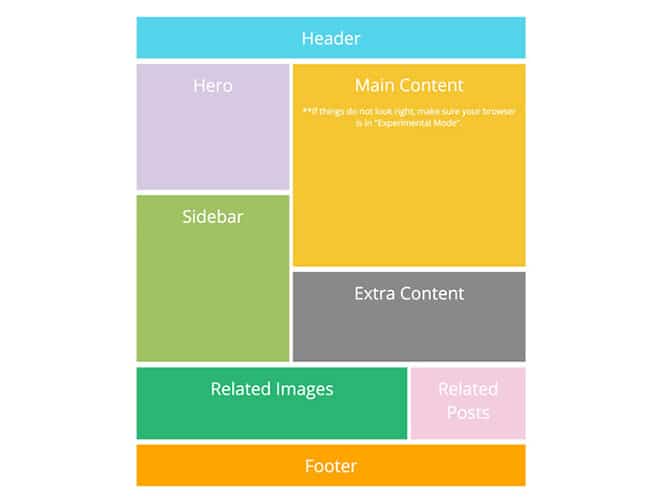
In order to determine if Flexbox or CSS Grid works better for your development workflow, creating a standard layout that only uses one or the other is a good way to see how they work and if there are advantages of one over the another. We’ll start with a very simple and very familiar layout type with a header, sidebar, main content, and footer. A simple layout like this is a quick way to get the various elements positioned.
And remember, you should never make changes on your live site. Try experimenting with Local instead, a free local WordPress development app. Download it today!
How To Create a Layout With Flexbox
Recently, I covered the subject of creating a Flexbox card layout. That post goes into detail about how Flexbox works along with specific CSS information, so if you’re a beginner to Flexbox, it will help you get familiar with how it works.
For this tutorial, here’s what we’ll be building:
See this on Codepen.
For this basic layout, the main Flexbox tasks include:
- Create full width header and footer
- Position sidebar next to main content area
- Correct sizing of sidebar and main content area
- Navigation elements positioning
Basic HTML structure
<div class="container">

    <header>
        <nav>
          <ul>
            <li></li>
            <li></li>
            <li></li>
          </ul>
        </nav>
        <button></button>
    </header>
    <div class="wrapper">
        <aside class="sidebar">
            <h3></h3>
        </aside>
        <section class="main">
            <h2></h2>
            <p></p>
        </section>
    </div><!-- /wrapper -->
    <footer>
        <h3></h3>
        <p></p>
    </footer>
</div><! -- /container -->
How to use flex display
Header styling
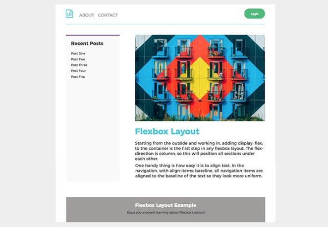
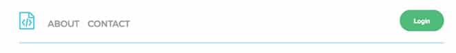
Starting from the outside and working in, adding display: flex; to the container is the first step in any Flexbox layout. The flex-direction is set to column, so this will position all sections under each other.
.container {
    display: flex;
    flex-direction: column;
}
Creating a full-width header was pretty automatic with the display: flex; (headers are a block level element by default). Because of this declaration, it will allow for easy placement for navigation elements.
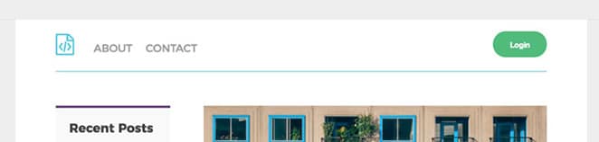
There is a logo and two menu items in the navigation on the left with a login button on the right. The nav is in the header, so by having justify-content: space-between; the navigation and button will be spaced automatically.
One handy thing is how easy it is to align text. In the navigation, with align-items: baseline;, all navigation items are aligned to the baseline of the text so they look more uniform.
header{
    padding: 15px;
    margin-bottom: 40px;
    display: flex;
    justify-content: space-between;
}
header nav ul {
    display: flex;
    align-items: baseline;
    list-style-type: none;
}
Page content styling
Next, there is the sidebar and main content areas with a wrapper that includes the two. The div with a class of .wrapper also needs the display: flex; but the flex-direction is different than above. Because the sidebar and content areas are next to each other rather than stacked, the flex-direction is
Next, there is the sidebar and main content areas with a wrapper that includes the two. The div with a class of .wrapper also needs the display: flex; but the flex-direction is different than above. Because the sidebar and content areas are next to each other rather than stacked, the flex-direction is row, which is the opposite of what was done in the container above.
.wrapper {
    display: flex;
    flex-direction: row;
}
The size of the main section and the sidebar is very important since more prominent information lives here. The main content should be three times the size of the sidebar, which is pretty easy to do with Flexbox.
.main {
    flex: 3;
    margin-right: 60px;
}
.sidebar {
   flex: 1;
}
For this code snippet, I used shorthand. The flex values are for the flex-grow property. Flex-grow is powerful because this is how much the item(s) will grow relative to the rest of the flexible items inside the same container.
Overall, Flexbox was pretty efficient in creating this simple layout. It was especially helpful having control over the styling of list items and spacing between the navigation and the button.
How To Create a Layout With CSS Grid Layouts
To test efficiency, the next step is to build the same basic layout with CSS Grid. The page elements are all the same and will be positioned the same way as the Flexbox example.
See this on Codepen.
Grid Template Areas
One handy thing with CSS Grid is the ability to specify template areas, which can make defining layouts very intuitive. By taking this approach, areas on the grid can be named and referenced to position items. For this basic layout, there are four items we’ll need to name:
- header
- main content
- sidebar
- footer
Basic HTML Structure
<div class="container">

    <header>
        <nav>
          <ul>
            <li></li>
            <li></li>
            <li></li>
          </ul>
        </nav>
        <button></button>
    </header>

    <aside class="sidebar">
        <h3></h3>
        <ul>
            <li></li>
        	<li></li>
	<li></li>
	<li></li>
	<li></li>
          </ul>
    </aside>
    <section class="main">
        <h2></h2>
        <p></p>
         <p> </p>
  </section>
    <footer>
        <h3></h3>
        <p></p>
    </footer>
</div>
We’ll define these areas on our grid container in order, kind of like drawing them out. I’ll also space them out for readability.
grid-template-areas:
        "header header"
        "sidebar main"
        "footer footer";
Note how the sidebar was listed before main? Switching them around would also make the order change on the page. Currently, the sidebar is on the left and the main content is on the right, but you could easily change it if needed.
One thing to note: These names need to be “connected” to the styling. Just because grid-template-areas have been declared, we don’t know where the header actually belongs. In the header block, grid-area: header; needs to be added.
header{
    grid-area: header;
    padding: 20px 0;
    display: grid;
    grid-template-columns: 1fr 1fr;
}
The HTML structure is the same as it is in the Flexbox example, but the CSS is quite different to create the grid layout.
.container{
    max-width: 900px;
    background-color: #fff;
    margin: 0 auto;
    padding: 0 60px;
    display: grid;
    grid-template-columns: 1fr 3fr;
    grid-template-areas:
        "header header"
        "sidebar main"
        "footer footer";
    grid-gap: 50px;
}
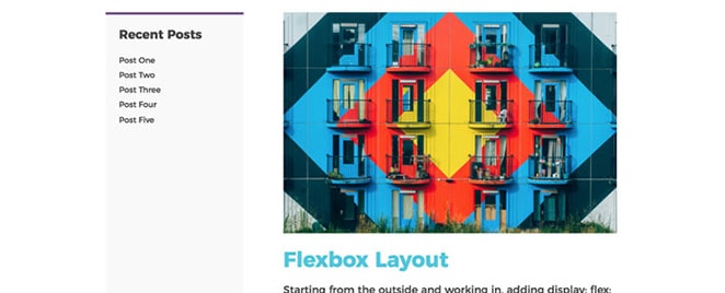
To begin working with a CSS Grid Layout, it is very important to have display: grid; set on the container. The grid-template-columns are declared here to give the overall structure of the page. Remember how the Flexbox example had the .main class set to a flex-grow of 3 and the sidebar had a flex-grow of 1 to establish sizing? Here the grid-template-columns have been set as 1fr and 3fr. This is where the grid is taking shape with the fractional units. With these values, it is apparent there are two columns and they are not equal width. The column set to 3fr is three times wider than the other. This explains how the sidebar appears more narrow than the content area.
Next, the fr units used for the container need to be adjusted for the header. The grid-template-columns have been adjusted to 1fr and 1fr. That way there are two equally sized columns and the navigation items and button will fit.
header{
    grid-area: header;
    display: grid;
    grid-template-columns: 1fr 1fr;
}
To place the button, we just need to use justify-self and set it to end.
header button {
    justify-self: end;
}
The navigation is placed where it needs to be:
header nav {
    justify-self: start;
}
The full-width footer does not need different columns set since the content is in the middle.
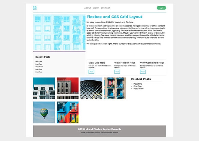
How To Create a Layout With Both Flexbox and CSS Grids
Now that we’ve seen what each method can do individually, it is time to create something more complex by combining Flexbox and CSS Grid Layouts.
See this on Codepen.
Here is the basic outline for getting the grid going:
See this on Codepen.
Notice how the design relies on both columns and rows? This layout needs things to line up and behave consistently in both directions, so using CSS Grid is efficient for the overall layout.
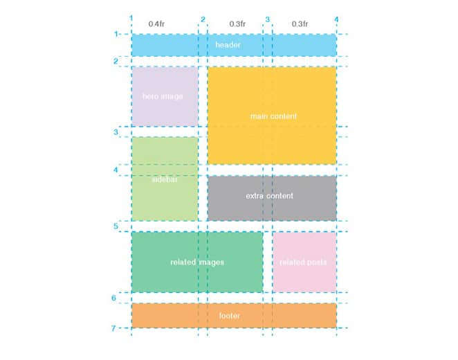
Planning is key with a layout like this. It is a good idea to sketch it out first and see how things stack up, literally. To start the code, having display: grid; is essential; without it, using this type of layout will not work. One thing to note here is that there is spacing between the content blocks. This was achieved with grid-column-gap and grid-row-gap.
.container {
  display: grid;
  grid-template-columns: 0.4fr 0.3fr 0.3fr;
  grid-column-gap: 10px;
  grid-row-gap: 15px;
}
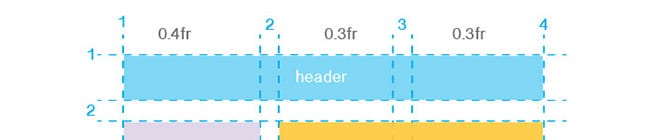
Fractional units are back for this layout and there are now three areas needed. The first value of 0.4fr is slightly wider than the second and third, which are both 0.3fr.
Column and Row Layout
This is where it’s important to reference the diagram from the beginning. Starting at the top, this is how the header is placed. It spans all columns and one row.
.header {
  grid-column-start: 1;
  grid-column-end: 4;
  grid-row-start: 1;
  grid-row-end: 2;
  background-color: #d5c9e2;
}
If you want to use shorthand, the start and end values are on the same line and a separated with a slash. It would look like this:
.header {
  grid-column: 1 / 4;
  grid-row: 1 / 2;
  background-color: #55d4eb;
}
To place all the other items, the proper grid and column values just need to be added to the CSS. Rather than go through them here one by one, this example is on Codepen.
After the Grid Layout is built, fine-tuning the content is the next step.
Navigation
Flexbox is perfect for placing the header elements. The basic layout example touched on this with justify-content: space-between. The grid example needed to have justify-self: start; on the navigation and justify-self: end; for the button to place things, but Flexbox made spacing easier for the navigation.
.header {
  grid-column: 1 / 4;
  grid-row: 1 / 2;
  color: #9f9c9c;
  text-transform: uppercase;
  border-bottom: 2px solid #b0e0ea;
  padding: 20px 0;
  display: flex;
  justify-content: space-between;
  align-items: center;
}

This same format will be followed here. The logo, menu items, and button utilized Flexbox’s justify-content for spacing.
Column content grid
For occasions that require elements to line up in one direction, meaning it is more “one-dimensional,” typically Flexbox is the better option. Also, Flexbox is good at dynamically scaling elements. Maybe you’ve tried this in a row of boxes by adding display:flex; on a parent element and flex properties on the child elements. With that technique, there’s a nice line formed and it’s an efficient way to make sure all elements are the same height.
Row content with text and buttons
In the “extra content” section, three areas with text and buttons have been added. Flexbox makes it easy to keep the set width for three columns.
.extra {
  grid-column: 2 / 4;
  grid-row: 4 / 5;
  padding: 1rem;
  display: flex;
  flex-wrap: wrap;
  border: 1px solid #ececec;
  justify-content: space-between;
}
One Flexbox Exception
Yes, I did say that Flexbox is better for one dimensional layouts, grids, or columns, but If you read the How to use Flexbox to create a modern CSS card design layout post, there was a “last row” Flexbox hack that was demonstrated to keep rows and columns balanced, even without an even number of cards.
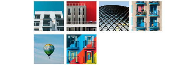
.related-images {
  grid-column: 1 / 3;
  grid-row: 5 / 6;
  display: grid;
  grid-template-columns: repeat(4,1fr);
  grid-gap: 1rem;
}
.related-images .icon {
    background-color: white;
    flex: 1 1 150px;
}
Design Approach Summary
Basically, the approach I took here was to utilize CSS Grid Layout for the overall layout (and anything that was not linear in design). Within the grid content areas, Flexbox was used to order and fine-tune the styling within the grid areas.
Resources
There are so many great resources out there for Flexbox and CSS Grid Layouts, too many to mention. Here are a few that will get you started in the right direction and inspire your layouts.
- Box Alignment Cheatsheet
- Jen Simmons’ Lab of Layouts
- A Complete Guide to Grid
- A Complete Guide to Flexbox
Hopefully, these exercises gave you a better idea of how to build layouts with both CSS Grid Layouts and Flexbox. To further set your sites up for success, check out WP Engine’s WordPress hosting options to find a plan that suits your needs!