


How to Create 3D Designs With the CSS3 Transform Property
There are two dimensions when it comes to the CSS3 transform property, 2D and 3D. When animating, transforms are used to make an element change from one state to another. This tutorial serves as an expansion from this guide about 2D animations. I’ll provide some insight into 3D design and how you can create awesome animations by combining these basic concepts.
3D transforms can be pretty detailed, and can get complex if there are a lot of different pieces combined, so starting with the basic building blocks is helpful. Some of these concepts will look familiar, but the “z” is something that will look new when working in 3D. The 3D transforms extend 2D CSS transforms to include the z-axis, allowing for 3D transformations of DOM elements.
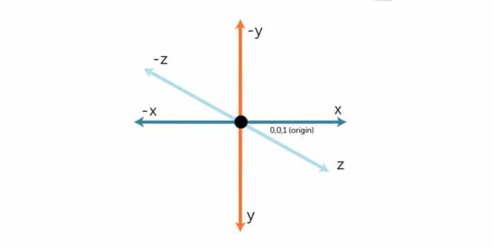
What is The Z-Axis?
There will be a lot of reference to the z-axis. It’s easy to think of it as the measurement distance of something toward or away from you. If it is a positive value, it is closer to you. If it is a negative value, it is farther away from you.
3D Transform Examples
The basic properties for 3D transform are translate3d, scale3d, rotateX, rotateY, rotateZ, perspective, and matrix3d. More arguments are included with translate3d, scale3d, and matrix3d because they take arguments for x,y, and z. The scale property takes a value for an angle and perspective also takes a single value.
Translate
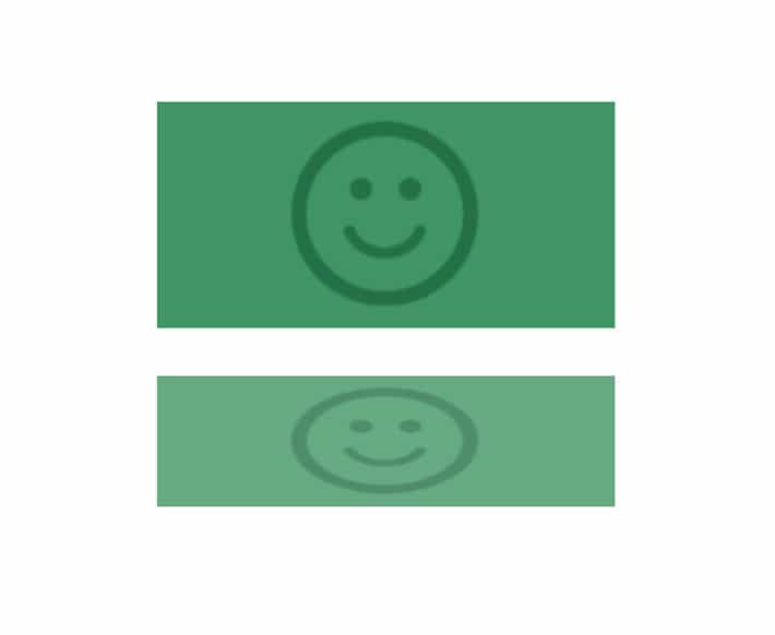
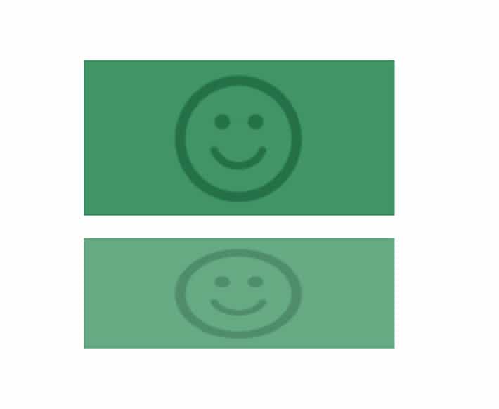
translateZ()
This defines a 3D translation by only using the z-axis value. You may remember translate x and y from 2D translate. The idea is the same with translateX(), translateY(), and translateZ() because each take a length value that moves the element by the specified distance along the correct axis.

In this example, translateZ(-20px) would move the element 20 pixels away from the viewer.
Here is the code snippet to create this example:
-webkit-transform: translateZ(-20px);
-ms-transform: translateZ(-20px);
transform: translateZ(-20px);
translate3d()
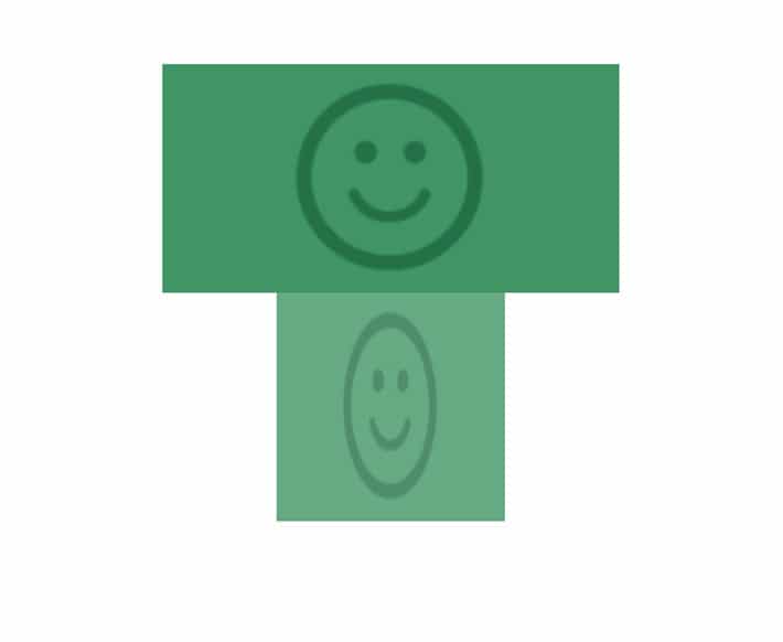
The translate3d() function is used to move the position of the element in a 3D space. This transformation is created by specifying coordinates that define how much it moves in each direction.
The function transform: translate3d(20px, -15px, 70px); moves the image 20 pixels along the positive x-axis, 15 pixels on the negative y axis, and then 70 pixels along the positive z axis.

Here’s an example of translate3d:
-webkit-transform: translate3d(20px, -15px, 70px);
-ms-transform: translate3d(20px, -15px, 70px);
transform: translate3d(20px, -15px, 70px);
It’s pretty apparent that there is some overlapping of the second square going on. It may not look as dramatic as expected, but adding the perspective property (later in this tutorial) will help.

Rotate
The rotate3d() function rotates the element in 3D space by the specified angle around the axis. This can be written as rotate(x, y, z, angle).
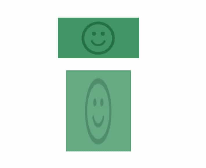
rotateX()
Pixel values won’t work here, it needs to be in degrees. The rotateX() method rotates an element around its x-axis at a given degree. See how the rectangle is shorter? It is being rotated along the x-axis. This example shows the rotation at 55 degrees.
-ms-transform: rotateX(55deg); /* IE 9 */
-webkit-transform: rotateX(55deg); /* Safari */
transform: rotateX(55deg);
rotateY()
The rotateY() method rotates an element around its y-axis. Notice how the bottom rectangle isn’t as wide as the top? It is rotated so it does not appear to be as wide as the rectangle above because it is being rotated by 60 degrees.
-ms-transform: rotateY(60deg); /* IE 9 */
-webkit-transform: rotateY(60deg); /* Safari */
transform: rotateY(60deg);
rotateZ()
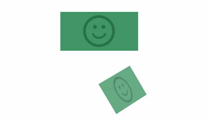
The rotateZ() method rotates an element around its z-axis by a specified degree. In this case, the value is 120 degrees.

-ms-transform: rotateZ(120deg); /* IE 9 */
-webkit-transform: rotateZ(120deg); /* Safari */
transform: rotateZ(120deg);
rotate3d()
The function rotate3d(1, -1, 1, 45deg) rotates the image along the y-axis by the angle 45 degrees. It’s important to note that you can use negative values to rotate the element in the opposite direction.

Since this is more complex than the single axis specifications, rotate3d can be broken down like this: rotate3d(x,y,z,angle) where x=1, y=-1, z=1, and the rotation angle = 45 degrees.
The code to style this looks like:
-ms-transform: rotate3d(1, -1, 1, 45deg); /* IE 9 */
-webkit-transform: rotate3d(1, -1, 1, 45deg); /* Safari */
transform: rotate3d(1, -1, 1, 45deg);
Testing the Basics
Clockwise along the x-axis by 45 degrees.
transform: rotate3d(1, 0, 0, 45deg);Clockwise along the y-axis by 45 degrees.

transform: rotate3d(0, 1, 0, 45deg);Clockwise along the z-axis by 45 degrees.

transform: rotate3d(0, 0, 1, 45deg);It’s worth mentioning that depending on the specified values, sometimes a rotation will not be noticeable; for example, this would not be noticeable: transform: rotate3d(0, 0, 0, 50deg);
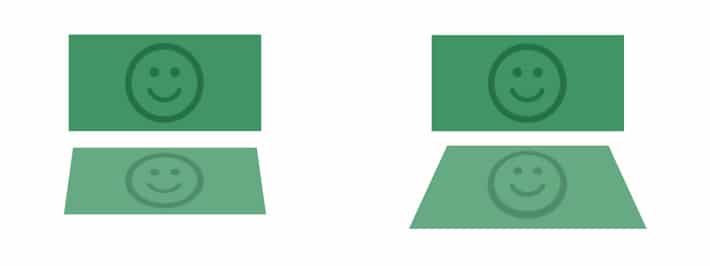
Perspective
This is probably the most “dimensional” transformation. This is where you’ll literally gain perspective. If you apply 3D transformations to an element without setting the perspective, the resulting effect will not appear as three-dimensional. This is something that could be added to the properties above as well.
To activate 3D space, an element needs perspective. This can be applied in two ways: using the transform property or the perspective property.
The transform property would look like this: transform: perspective(600px); and the perspective property would look like this: perspective: 600px;.
The following examples will be changing it up between the two, so be sure to look closely at the code.
The value of perspective determines how intense the 3D effect is. Think of a low value as being really noticable, like how it feels when you are looking at a large object. When there is a greater value, the effect is less intense.
The position of the vanishing point can be customized as well. It’s worth a mention, and a lot of experimentation, since it is relevant to CSS perspective. By default, the vanishing point for a 3D space is positioned at the center. Use the perspective-origin property to change the position of the vanishing point. It would look something like: perspective-origin: 15% 55%.
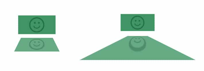
Scale
scaleZ()
This defines a 3D scale transformation by giving a value for the z-axis. Because it only scales along the z-axis, other functions are needed to demonstrate the scaling effect. See how the rectangle is out toward the viewer and how it really shows perspective?
To fully understand scale(Z), play around with the value and you’ll see the perspective get “sharper” with the larger values.
scale3d(x,y,z)
The scale3d() function changes the size of an element and is written as scale(x, y, z). Like scaleZ, it isn’t apparent what the perspective fully looks like unless it is used with perspective.
This example uses this:
-ms-transform: perspective(500px) scale3d(0.8, 2, 0.2); /* IE 9 */
-webkit-transform: perspective(500px) scale3d(0.8, 2, 0.2); /* Safari */
transform: perspective(500px) scale3d(0.8, 2, 0.2);
A quick note: If all three coordinates of the vector are equal, the scaling is uniform and there will be no noticeable difference.
transform: scale3d(1, 1, 1); /* unchanged */

transform: scale3d(2, 2, 2); /* twice the original size */
Matrix3d()
The 2D matrix can take six values, while the 3D matrix takes 16 (a 4×4 matrix)! It would be a very long post if all the details were covered, so if you want to explore this concept more, I highly recommend this interactive matrix3d experiment on Codepen.
Here is the basic outline for the matrix3d: matrix3d(a, b, 0, 0, c, d, 0, 0, 0, 0, 1, 0, tx, ty, 0, 1).
How to Create
Animations with 3D Transformations
Now that the basics are covered, creating interactive animations is the next step. Using CSS3 transforms and transitions, elements change from one state to another by rotating, scaling, or adding perspective.
If you’re new to CSS animations, it is important to know that without a transition, an element being transformed would change abruptly from one state to another. To prevent this, a transition can be added so you can control the change, giving it a smoother look.
How to Create a Card Flip
Who doesn’t like to play cards? This example features a double sided card and you can see both sides by flipping it with a transformation. If you take a look at the body tag, a lot of the effect comes from the perspective property. It is set to be 500px. A lower value like 100px looks very “skewed.”
Here is the starting HTML:
<div class="wrapper">
div class="side-one"></div>
<div class="side-two"></div>
</div>
The CSS is what makes it happen:
body {
-webkit-perspective: 500px;
perspective: 500px;
}

.wrapper {
-webkit-transition: all 1s ease-in;
transition: all 1s ease-in;
-webkit-transform-style: preserve-3d;
transform-style: preserve-3d;
position: relative;
margin: 100px auto;
width: 250px;
height: 250px;
cursor: pointer;
}

.wrapper div {
position: absolute;
-webkit-backface-visibility: hidden;
backface-visibility: hidden;
width: 100%;
height: 100%;
border-radius: 10px;
background-position: 50% 50%;
background-size: 150px;
background-repeat: no-repeat;
box-shadow: inset 0 0 45px rgba(255,255,255,.3), 0 12px 20px -10px rgba(0,0,0,.4);
color: #FFF;
text-align: center;
text-shadow: 0 1px rgba(0,0,0,.3);
}

.side-one {
z-index: 400;
background: #50c6db url(image.png);
}

.side-two {
-webkit-transform: rotateY(-180deg);
transform: rotateY(-180deg);
background: #ef4e65 url(image.png);
}

.wrapper:hover {
-webkit-transform: rotateY(-1turn);
transform: rotateY(-1turn);
}
This can be found on Codepen.
If you’re new to transforms, this may look interesting to you: transform: rotate(1turn); This unit is perfect for our card because a “turn” unit is exactly what it sounds like, which is one full circle.
I’ve also used some easing to make a custom way of spinning. This is accomplished with transition: all 1s ease-in;.
Another 3D property in the snippet is transform-style: preserve-3d;. By including this, it allows for the element to “swing” in the three-dimensional space rather than stay with the parent element.
How to Create Text With a 3D Effect
This example was inspired by an old movie poster. There are so many different typefaces out there that can utilize great CSS styling, so unique type effects are definitely possible. This text is using rotate3d and transform3d to give it a unique transformation.

The HTML is pretty simple:
<div class="container">
<div class="text-wrapper">
<div class="text">New York City</div>
</div>
</div>
Here is the basic CSS:
.container{
-webkit-perspective: 600;
}

.text {
transform: rotate3d(2, 2, .5, 22deg)translate3d(100px, 0px, 0px);
}
More detailed CSS and example can be found on Codepen.
Hopefully CSS 3D transforms bring a new dimension to your designs. Utilizing perspective is a great way to make elements look more dimensional. Combined with transitions, there are many possibilities when creating animations.