


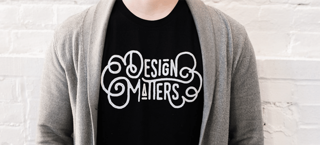
The Psychology of Typography
Along with color, the way you use typography on your website is a key element that can determine the success—or failure—of your site.
The written word has been around for centuries as a means of allowing us to express emotions, share stories, and communicate our thoughts. But you only need to look at the rise of Instagram and Snapchat compared with the decline of Twitter to realize that the written word has stiff competition from video and images.
Today, having engrossing copy on your website isn’t enough. It needs to be presented in a way that fits with your brand style, engages with your audience, and enhances their experience on your site.

The challenge of digital typography is to communicate your brand personality, influence how your users feel when they land on your site, and attract people’s attention and guide them to taking the decisions you want them to take.
Sound like a challenge? Here are some tips on using typography to engage your audience.
Express Your Brand Personality
Once upon a time, people would use your handwriting to judge your personality. While times have changed, they haven’t changed that much! Today people judge your brand personality by the fonts you use on your website and other marketing materials. So if you want to express your brand personality accurately, choose carefully.
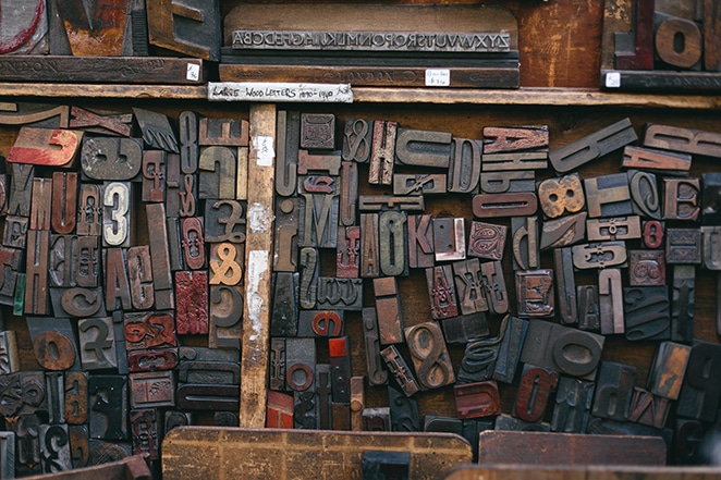
Fonts can be grouped into a number of different categories.
- Serif fonts, such as Times New Roman, Baskerville, and Georgia, have decorative lines (serifs) at the end of each character. They’re associated with tradition, authority, reliability, and respectability.
- Sans serif fonts, such as Helvetica, Arial, Museo Sans Rounded, and Verdana, don’t have the decorative lines. They’re seen as being clean, modern, objective, and stable.
- Script fonts, like Lucinda, Lobster, and Brush Script, are based on the flow of handwriting. They’re used to convey a sense of elegance, creativity, and friendliness.
- Slab fonts, including Courier, Bevan, Aracher, and Rockwell, are characterized by bold serifs. Use them if you want to appear bold, strong, or expressive in your business.
- Modern fonts, like Futura, Politica, and Eurostyle, are chic, stylish, and used to portray a sense of progressiveness and intelligence.
When choosing fonts for your site, think carefully about how you wish your brand and business to be seen, and what your target audience might be seeking. An elaborate script could be enticing to somebody shopping for boutique clothes, whereas it may comes across as snobby to the person shopping for combat pants. A sans serif font may appeal to a hipster seeking a fancy dining experience, but strike a homeowner looking for insurance as being flighty and untrustworthy.
A word of warning when it comes to choosing fonts—don’t go crazy trying to fit several different fonts onto your website. This overcomplicates the design and makes the page look cluttered and messy. Best practice is to use one style of font for your body copy and another for the headers.
Pay Attention to the Formatting
If the formatting on a site is done well, it will barely be acknowledged. But if it’s out of whack, it can cause havoc for your users and drive them away from your site.
Size and spacing are both integral factors. If your brand is bold and brash, large lettering will immediately grab people’s attention and it will help get your message across within seconds of landing on the page. But some brands may want to come across as being quiet and gentle. Using small lettering surrounded by whitespace feels a little as though you’re whispering. It encourages people to lean in and listen carefully.
Size also matters in terms of readability. The average size for body text is between 12 and 14 pixels, whereas headers can be anything from 18 to 29. Use different font sizes to draw people’s attention to the most important parts of the text, though, as with font styles, don’t use too many sizes in one section as it will appear messy and slapdash.
Make clever use of whitespace to improve people’s comprehension of the text and make it easy to digest. Don’t space lines so closely that people get them mixed up as they’re reading across the page, but take care that there isn’t too large a leap either—both make it difficult to engage with the text and digest the information.
Lean back and look at each page objectively. If readers are faced with a wall of text, it can feel impenetrable and overwhelming. Break the content into manageable chunks with plenty of whitespace so the content can ‘breathe.’ Each paragraph should introduce a new concept to help guide the reader into the text and engage with your website.
Color it Right
Historically, when writers wanted to draw people’s attention to certain aspects of text, they had two options: bold or italics. In today’s digital age, we have a much better tool at our fingertips—color.
Because a site’s readability is crucial, we tend to stick to black on white for the main body text. But then we can play with colors within a text to highlight important elements and create emphasis for the reader.
On a website, use color to make your call to action stand out so your readers know exactly what to do next. Introduce color in your navigation menus to draw people’s attention and make their options clear. It’s also a brilliant tool for product descriptions, highlighting important words and phrases so they can be seen at a glance.

When choosing colors for your text, remember that different colors hold different cultural associations. Much like choosing your fonts, take care that the colors you use for your text portray the right tone and style for your brand.
The role of text on your website is much greater than the words that you use. Typography has the power to influence your readers emotions, help them engage with your website, and improve their overall experience.