


The Benefits of Creating a One-Page Site (and How to do It)
Some websites require expansive and elaborate structures, multiple pages, and comprehensive navigation. However, this is far from universal. In fact, some of the most successful sites when it comes to generating conversions only consist of a single page.
A one-page website works similarly to a landing page, in that it contains everything relevant to your product or service without needing to click elsewhere. Such a site comes with plenty of benefits, as it enables you to create a linear narrative that leads your visitors through your conversion funnel.
In this article, we’re going to look at the advantages of creating a one-page website. We’ll also discuss the requirements of such a site, and show you how you can do it yourself. Let’s get started!
What is a One-Page Site?
First and foremost, a one-page site is not strictly the same as a landing page. This specifically refers to a single page on your site devoted to a particular topic, such as a product or service. Furthermore, a site can contain any number of landing pages.
In contrast, a one-page site is what it sounds like: an entire site on a single page. This means everything you would otherwise spread out across multiple pages, such as information about your business, product specifications, contact details, and image galleries, are all available in one place.
The Benefits of Creating a One-Page Site
You might be wondering why you’d ever want to cram so much information into a single page. Good question! Before moving on, let’s look at some of the main benefits of using a one-page site:
- Easier to create and manage. Since you don’t have to worry nearly as much about site structure and navigation, it’s much less time-consuming to put together and maintain over time.
- Helps you tell your story. Using a single page enables you to create a linear narrative over which you have full control.
- Simplifies your message. By collecting everything important in one place, users can get all the information they need without needing to leave the site.
- Helps increase conversions. You don’t need to worry about funneling users to the right page since the site effectively is the conversion funnel.
- Optimized for mobile. Having a responsive site is more important than ever, and one-page designs are perfect for any screen size.
Obviously, one-page designs aren’t ideal for every site. For example, any site that requires a complex structure or frequent updates, such as blogs, stores, or community sites, would not work well on a single page.
However, sites such as business sites, freelance portfolios, and product showcases are perfect for this type of design. This is because they let you focus your message and highlight all your relevant information without losing your visitors’ attention.
How to Create a One-Page Site (and What it Should Include)
If you’ve come to the conclusion that a one-page site is exactly what you need, it’s time to get planning. Before you start putting together your site, you need to carefully consider exactly what you need to include.
To help you along, we’re going to cover a few of the major considerations you need to make before and during the creation of your site. Naturally, your site’s requirements will affect what type of content you need, but the following points will apply to nearly every one-page site. Let’s get to it!
1. Create a Strong Narrative
A good way to think of your one-page site is as a story. As such, it’s important to consider the story you want to tell, whether the site is for you as a person, a brand, a business, or a specific product. In this sense, a one-page site is almost literally a conversion funnel. You build awareness and desire at the top, before drilling down to the specifics the further down you go.
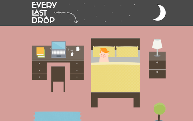
Defining your site’s narrative first makes it much easier to decide what content you need, and how it should be laid out. For instance, you could use the design to literally tell a story, like this amazing example from Every Last Drop, which changes as you scroll further:
Throughout the remaining sections, we’ll discuss some examples of how you can do this more specifically. However, you should naturally make sure that your site’s structure and story match your specific requirements.
2. Add an Attention-Grabbing Header
First impressions are extremely important. If you don’t manage to catch your visitors’ attention, they’re likely to simply bounce off your site, never to return. A strong, attention-grabbing header section is a mandatory aspect of any one-page site.
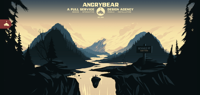
Creating a good header that will make people want to keep scrolling is an art form in itself, but a high-quality and attractive hero image is a good place to start. A good example is this illustration from Angry Bear:
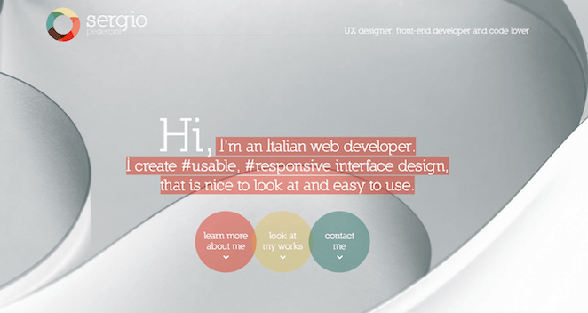
You should try to keep the text to a minimum here, and focus on communicating a single, powerful core message. You need to make it clear what your site is, what the benefits to the user are, and give them a reason to keep scrolling. Sergio Pedercini’s site shows how this can be done:
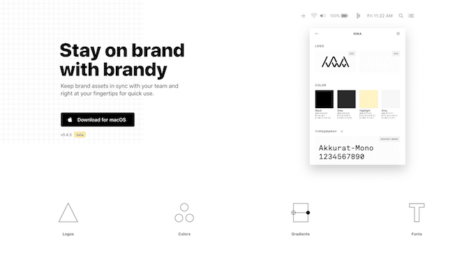
This is also a good place to include a Call To Action (CTA). Adding a CTA to the header makes it more visible and increases the likelihood of click-throughs. You’ll want the CTA itself to stand out visually, while the message should be clear. For a good example on how to accomplish this, check out Brandy:
This stands out without clashing with the rest of the design. Implementing a CTA like this one will be massively helpful for increasing your conversions.
3. Showcase Your Products or Services
When you only have a single page at your disposal, it’s important to use the space well. This means no matter what your site is dedicated to, you’ll want to showcase it clearly. For example, if you’re a freelance web designer, you’ll want to highlight your design skills and previous projects.
Similarly, if you sell chocolate bars, you’ll want to showcase them in all their glory, like KitKat does on their site:
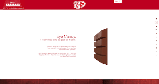
The best way to do this is naturally to include visuals, such as images and videos. The KitKat site also uses dynamic elements that change as you scroll, which adds extra flair, and makes it more fun to interact with the page.
It’s also important to add relevant information throughout. A terrific example of this is the 100 Years of National Parks Service site:
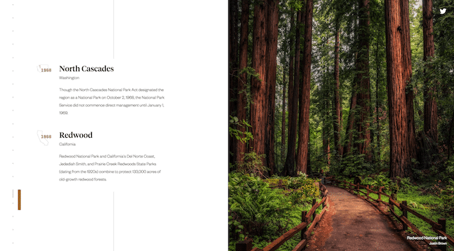
As you can see, this page uses short, clean paragraphs that explain everything you need to know without getting too wordy or cluttered. By sticking to these shorter snippets, you can still communicate all relevant details without boring the user.
4. Include Human Elements
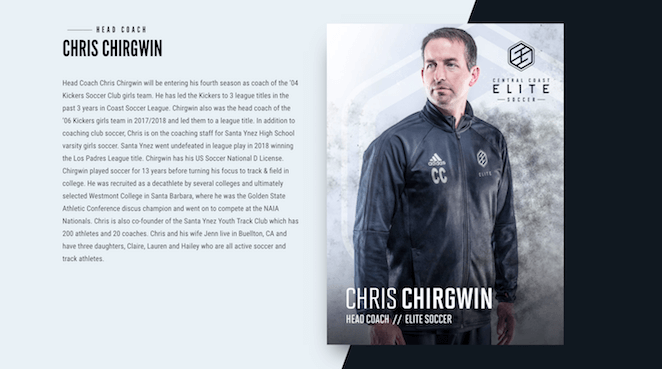
People trust people, so while it’s important to show off your work and accomplishments, you also need to include some human elements. This could mean including a section on you or your team members, like Central Coast Elite:
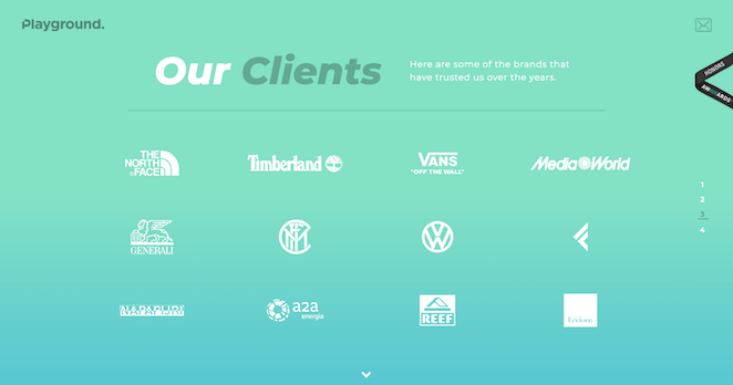
It’s also a good idea to show off your current and past clients. This example from Playground Digital Agency shows how this can be done:
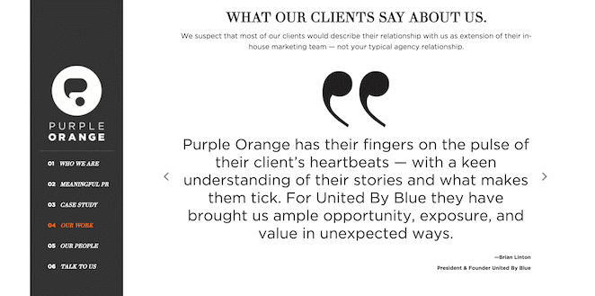
However, it’s usually an even better idea to include client testimonials from those you’ve previously worked with. Purple Orange shows how this can be done by simply adding quotations:
These may seem like small touches, but they help to make your site more trustworthy and personal. At the end of the day, visitors are more likely to get in touch if they have a sense of the people behind the brand. Speaking of which, let’s look at that next!
5. Implement a Contact Form
Once the user has devoured your entire site, they’ll hopefully be keen to reach out to you. Whether it’s to ask you a question or inquire about your services, you need to make it as easy as possible.
Fortunately, there are plenty of tools to help you implement a great contact form in WordPress. One of the most popular plugins for the job is Contact Form 7:
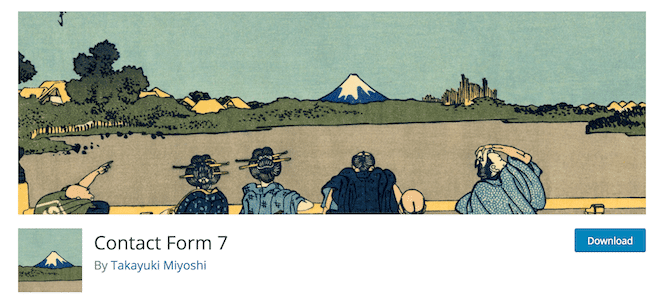
This lets you easily put together a simple form and add it anywhere on your site using a shortcode. The question is what you need to include in your form, which will naturally depend somewhat on what the goal of your site is.
However, our main recommendation is to stick with the one-page mindset: keep it short and clear. Only include the most crucial elements, such as their name, email address, and a brief message. This makes the barrier for initial contact as low as possible, which should help you drive more conversions!
Conclusion
Sometimes less truly is more. While certain sites require multiple pages to function properly, depending on your site’s purpose, you might be best served by a single page. A one-page site can help you generate more conversions and present your business or brand in the most ideal light possible.
In this article, we’ve also shown you how to create this type of site yourself. Simply consider the following:
- Create a strong narrative.
- Add an attention-grabbing header.
- Showcase your products or services.
- Include human elements.
- Implement a contact form.