


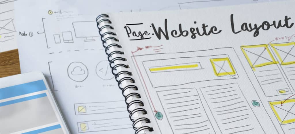
How to Create a Sticky Header
Website headers that stay in place when a user scrolls have become a very popular design element. They allow the user to easily access the navigation without the need to scroll up each time they want to choose a different page or option.
Elements with this functionality are often called “sticky” because they stick with the user, remaining visible as they move through the website. When a user first arrives at the website, elements will be in their starting position, but then the sticky header will remain in the same place.
Since navigation is one of the most important elements of a website, taking this approach helps make the navigation more accessible. Having a navigation that stays in place allows for an easy flow for the user as they move through the website content, which is extremely important.
Sticky navigation elements help create an easy user flow as people move through your website.

What Makes it Sticky?
Fixed positioning is a key component to getting the navigation to stay in place. This fixed position element is positioned relative to the viewport, or the browser window itself. Because the viewport doesn’t change when the site is scrolled, this fixed positioned element will stay in the same place when the page is scrolled.
Note: Don’t Try This on Your Live Site
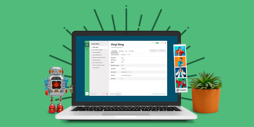
Remember: You should never change the code directly on your live site to ensure nothing breaks. Our free local development app, Local, will help you set up a test environment where you can safely follow along this tutorial.
Making the navigation sticky could not be easier; it’s just done with CSS styling. It basically looks something like this:
[css]

.navbar-fixed-top {

position: fixed;

right: 0;

left: 0;

z-index: 999;

}

[/css]
No matter how long your page is, or how many times you scroll up and down, the nav will be “stuck” to the top of the page. A class called .navbar-fixed-top was added to the navigation that creates the placement for the navigation. I added this class to the nav tag. The position is set to fixed and adding left and right positioning ensures that the placement is correct and takes up the full width of the page.
Keep in mind, anytime this class is applied, it will create the fixed position of the element. Most likely this class will only be applied once, otherwise there would be multiple page elements behaving the same way in the same place, creating a jumbled mess.
Another important consideration is the z-index. Because we want the navigation to always be visible, we need to make sure it does not get overlapped by other elements. When we reference the z-index, we are talking about the CSS property that sets the stack order of specific elements. An element with greater stack order is always in front of another element with lower stack order. A value of 999 is a large number, making it a safe bet for the navigation.
Adjust Page Body
Because the navigation is now at a fixed position, it will cover part of the content at the top. There is a simple fix for this. Adding padding to the top of the body will push the page down so then content at the top will not be covered by the header when the user arrives on the page.
You can add padding to the body in your CSS file:
[css]

body {

padding-top: 75px;

}

[/css]
Keep in mind that your padding may be larger or smaller depending on how thick the fixed header is.
Making the Sticky Header Squishy
It’s common to find a header that becomes thinner when a user scrolls past a certain point, making it look squishy. When the navigation decreases in size, it helps give the user more space to see the main website content. This is particularly helpful on smaller devices. We will be using a combination of CSS and JavaScript to make this happen.
To add an animated header that will change its size on scroll, there is a great, lightweight solution to make the navigation squishy. It is called AnimatedHeader. It has an MIT license, so it can be used for personal or commercial projects. To get these files, check out AnimatedHeader on GitHub.
Basic CSS for navigation
Let’s take a look at two important CSS styles. The first probably looks familiar to you, .navbar-fixed-top which specifies our height, width, and fixed position for the sticky navigation. Below, you can see there is another class added that specifies a height of 75px. This is the “squished” size.
[css]

.navbar-fixed-top {
position: fixed;
top: 0;
left: 0;
width: 100%;
background: #f6f6f6;
z-index: 999;
height: 90px;
overflow: hidden;
-webkit-transition: height 0.3s;
-moz-transition: height 0.3s;
transition: height 0.3s;
}

.navbar-fixed-top.cbp-af-header-shrink {
height: 75px;
}

[/css]
To change the size, JavaScript is used to add the class of .cpb-af-header-shrink. Let’s take a look at the part of the script that makes this happen:
[javascript]

function scrollPage() {
var sy = scrollY();
if ( sy >= changeHeaderOn ) {
classie.add( header, 'cbp-af-header-shrink' );
}
else {
classie.remove( header, 'cbp-af-header-shrink' );
}
didScroll = false;
}

[/javascript]
Just a reminder, there is more to the script, so be sure to download the source code so you have all the components. As you can see, after a user scrolls past a certain point, the class of .cpb-af-header-shrink is added. If the user scrolls back up the page, this class is removed.
The CSS Sticky Positioning Option
There’s also an option that may be less hassle. Depending on the browser support you are designing for, position: sticky; makes creating a sticky header very simple. Browser support isn’t terrible, but it’s not fully global either. When you have sticky declared, prefixes may be used. Check out Can i Use for more details.
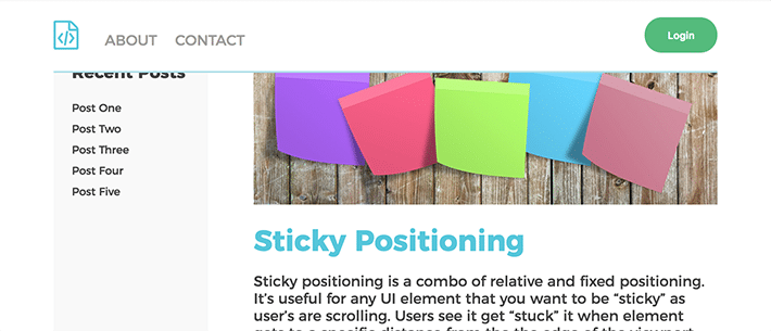
A simple way to describe sticky positioning is that it is a combination of relative and fixed positioning. I’m guessing you come across sticky positioning quite a bit. We’re talking headers here, but it’s also useful for any UI element that you want to be “sticky” as users are scrolling. They see it get “stuck” it when element gets to a specific distance from the edge of the viewport.
The element is treated as relative positioned until it hits a certain point and then it is “fixed.” This point is declared by using CSS. The “point” is basically when you specify top, bottom, left, or right, like you would with absolute positioning. You need to specify so the element has something to “stick” to.
Using Position: Sticky
It’s pretty simple to use. A few CSS declarations and I was able to have a sticky header. Here are three simple steps:
- Find the correct style so you can declare the element as sticky using
position:sticky;(don’t forget browser prefixes likeposition: -webkit-sticky;). - Choose the “sticky edge” (top, right, bottom, or left) for the item to “stick” to.
- Declare the distance from the “sticky edge,” i.e. 10px for a header that becomes sticky when it is 10px away from scroll area.
[css]

.navbar-fixed-top {
  position: -webkit-sticky;
  position: sticky;
  top: 0;
}

[/css]
I didn’t want any space between the sticky header and the viewport, so it’s 0 pixels from the top. You can see this example on Codepen.
Be Aware of These Sticky Overflow Situations
Overflow compatibility
It’s great, but it’s not perfect. There are some limitations. Overflow can sometimes be a little unpredictable. It’s best to stay clear of certain types of overflow on a parent element with something that needs position: sticky. There can be issues with overflow auto, scroll, or hidden.
Limited browser support
Browser support is limited, so using the supports rule to detect if the current browser supports sticky positioning is an option. That looks like:
[css]

@supports(position:sticky){
  .header{
    position: -webkit-sticky;
    position: sticky;
    top: 0;
  }
}

[/css]
It’s important to think about if the sticky positioning is absolutely necessary. If it is, the fixed positioning approach can be used. If it is not absolutely necessary, or browser support is not a concern, the sticky approach is easier to implement.
It may seem complex at first, but there’s no reason to be stuck in a navigation rut; it’s relatively simple to make your navigation sticky and squishy. With some simple CSS fixed positioning, you can easily create a sticky website header. With some simple JavaScript, the fixed navigation can be enhanced by squishing down to a reduced height, giving users more room to view website content.
Don’t try this on your live site
Create a sticky website header for your WP Engine-hosted sites on Local! Learn more and download it for free here!