


Creative 404 Pages
Uh oh! You’ve stumbled on a 404 page!
Generally speaking, landing on a 404 page is frustrating for your users. It’s also bad for your SEO, as most people’s first reaction is to click away, sending your bounce rate tumbling.
But 404 pages don’t have to be a nightmare for your user experience. Instead of ignoring your 404 page or using a dull, generic template, you can use it as an opportunity to reinforce your branding and even encourage some conversions.
What is a 404 Page?
A 404 page is a standard HTTP error code that appears when the page you’re seeking cannot be found on the server. Essentially, it’s a tool that tells users a page is unavailable.
There are various reasons for its appearance. The page could have been moved or deleted, or the link broken. It could also indicate that the user typed in the wrong address. This last option shows that finding a 404 page can be out of your control. So the best thing you can do is design a user-friendly, creative page that delights your users and directs them to the right place.
Here are seven tips and tricks to designing a creative, memorable 404 page.
1. Lose the Technical Mumbo-Jumbo
It’s important that people can tell at a glance that they’ve landed in the wrong place. However, it’s likely that many users won’t know what a 404 page actually is. So avoid the technical mumbo-jumbo and tell it to them straight.
Use normal, human language, such as:
- ‘Oops! Something is broken’
- ‘Uh oh! This page doesn’t exist’
- ‘Oh dear! This link isn’t working’
Injecting a little personality and humor can go a long way to alleviating some of the frustration of ending up in the wrong place.
Hootsuite gets this spot on with its witty 404, cracking a joke about their extinct page.
2. Shoulder the Blame
The goal of a 404 page is to keep the user on the website, even if they’ve landed on a page that doesn’t exist. So you don’t want to make them feel stupid for typing in an incorrect address.
Never point the finger of blame at your users, even if they made the mistake. Instead, take ownership of the problem and apologize for the error.
Emailcenter UK took this one step further by accepting the blame and asking you to choose an employee to fire.
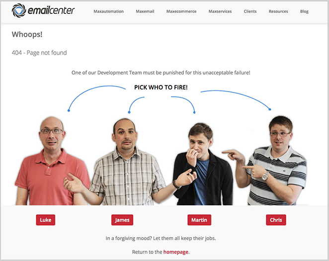
The humor continue once you chose which employee got the boot.
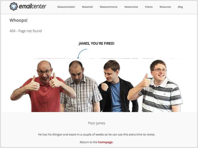
Poor James! (Gotta love the developer nerd/Star Trek humor!)
3. Offer an Immediate Solution
The worst 404 pages are the ones that leave users hanging, telling them they’re in the wrong place but not offering a solution.
Instead, you want to extend a helping hand. Your goal is to ensure your users stay on the website and find what they came for. So suggest some tools to help them out.
Good options include a link to the homepage or sitemap, a search bar, a link to your most popular posts/products, or a contact form so they can report the error. Use one or a combination of these, but take care not to overwhelm the user with choices—the less clutter there is, the higher their chance of choosing the most useful option.
HubSpot has an excellent example, offering a link to their blog, main product page, and inviting users to sign up for a free demo (great conversion tactic!).

4. Keep it on Brand
One of the biggest mistakes brands make with their 404 pages is leaving them void of personality. Indeed, you land on their error pages and you could be anywhere online.
The key is to keep your 404 page on brand. Maintain the same look, feel, and voice as the rest of your website to reassure people that they’re in the right place.
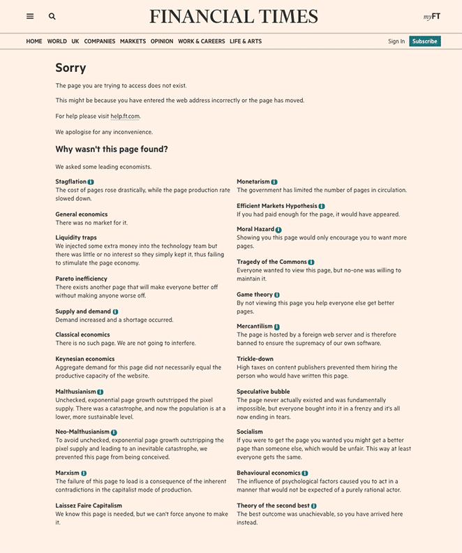
The Financial Times has designed a fabulous 404 page that will appear to finance nerds everywhere, which asks leading economists why the page couldn’t be found. All you need is a highbrow sense of humor and a solid understanding of economics theory…
5. Make Them Smile
People can become angry or frustrated if they can’t find what they’re looking for. The best way to defuse that anger and keep a potential customer is by making them smile.
Offer an amusing graphic, animation, or video that will amuse people and leave a lasting impression on them.
Audiko is a UK company offering free ringtones. They created a vibrant 404 page that was filled with London imagery, including Sherlock Holmes looking for clues. It included a link to the homepage and a search bar.

6. Be Interactive
Introducing an interactive element to your 404 page will increase the time spent on the page while decreasing your bounce rate. The more fun and entertaining you make it, the longer your users will hang around.
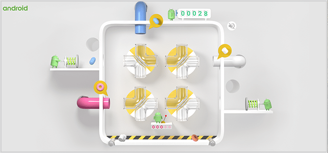
Android used to appeal to their gaming crowd by offering an interactive game to everybody that landed on its 404 page.

Once you pressed play, they launched a cute little game that involved catching desserts in the right pipe. And they longer users played, the longer they stayed—even though the page served them no real purpose.
7. Regularly Check Your Links
Finally, while adding a creative 404 page is fun, you don’t want it to become a regular sight for your users. It’s recommended that you run a frequent check of your site for broken links to ensure you keep them under control. About once a month is a good period of time.
Using a plugin like Broken Link Checker is a useful tool.
404 pages used to be a huge source of frustration, but it doesn’t have to be that way. By designing a user-friendly page that gently guides people in the right direction while bringing a smile to their faces, they can be a great way of keeping your users entertained, introducing your brand, and helping to solve people’s problems. Just ensure that they don’t see them too often!
What are your tips for designing a great 404 page? Can you add anything to our list? Tell us in the comments below.