


How to Use CSS Blend Modes
CSS blend modes are an easy way to add image effects right inside your browser.
Because of this, the traditional way of editing and then saving photos from an image editing software solution is not always necessary. As designers, we’ve spent countless hours adding effects to images with tools like Adobe Photoshop. As you go through this tutorial, you’ll notice that a lot of the options resemble those in Photoshop, but they can now be done with the efficiency of CSS styling.
Will browser blend modes completely eliminate the need for image editing software? Not entirely, and certainly not quite yet. But CSS and browser support has come a long way in supporting new ways of editing images. CSS and SVG clipping and masking, blend modes, 3D Transform, and more can certainly cut back on the dependency that we have for image editing software. As browsers become more sophisticated, we will see a lot more potential and will (hopefully) spend less time in Photoshop.
CSS Blend Modes and CSS Mix Blend Modes
This tutorial will cover CSS blend modes and how they are used. To start, there are a couple different options you should be aware of. One is an effect with background-blend-mode and the other is with mix-blend-mode.
Using the background-blend-mode property, you can blend the background layers (image or color) of an element. Blend modes are defined as a value and they specify how to blend or mix the colors of the background image with the color, or other background images, behind it.
What happens if you want to do some blending but not with background elements? Elements can be blended together using the the mix-blend-mode property. This property describes how the blending should be between stacked HTML elements. Elements on overlapping layers will blend with those beneath it. Any images, text, borders, or headings will be influenced by this property.
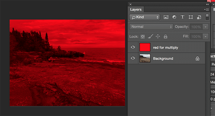
Adobe Photoshop Multiply Example
Taking a look at the traditional way of showing blend modes in an image editor gives us an idea of what we can accomplish with CSS blend modes. The following photo was created in Adobe Photoshop. The image is on its own background layer with a red layer above. A blend mode for the red layer was selected, which is “Multiply.” As you can see, there is a red overlay. To achieve this effect, Adobe Photoshop takes the colors from the layer that has “Multiply” applied, multiplies by the colors on the layer(s) below it, then divides them by 255 to show the result.
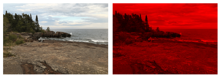
This same effect can be achieved with CSS allowing for faster customization and easy updating.
Basic Example of a CSS Blend Mode
A simple example to see how blend modes work is blending the image with a with a background-color. First, the URL path to the image needs to be declared, then a color specified. After those have been decided, the blend mode needs to be chosen. Multiply has been selected here to show how this blend mode affects the appearance of the background-image.
.simple-blended {
 background-image: url(image.jpg);
 background-color: red;
 background-blend-mode: multiply;
 }
A blend mode is the way the final color value of a pixel is calculated when layers overlap. Each blend mode takes the color value of the foreground and the backdrop (top color and bottom color), calculates its value, and returns a color value. The final, visible layer is the result of the blend mode calculation on every overlapping pixel between the blended layers.
Multiply is a very popular blend mode, but there are also other available blend mode options: screen, overlay, darken, lighten, color-dodge, color-burn, hard-light, soft-light, difference, exclusion, hue, saturation, color, and luminosity. If “normal” is specified, this will reset things. Instead of going through the details of each blend mode one by one, experimenting with them is the best way to determine what the final outcome will be.
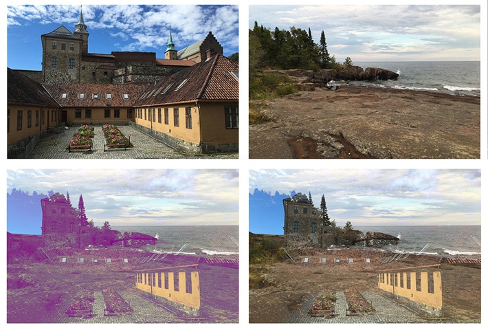
Background Blend Mode With Two Images
Rather than having a color overlay on an image, layering two images together can have a pretty cool effect. It’s as easy as adding two background images in the CSS declaration. The next choice is to have a background color (or not). If you do not want a background color, this can be removed and the images will blend together depending on the blend mode that you choose.
.two-image-stacked {
 background-image: url("image.jpg"), url("image-2.jpg");
 background-color: purple;
 background-blend-mode: lighten;
 }
Gradient on Background-blend-modes
Rather than using just a single color, gradients can also give some unique effects.
.gradient-on-image {
 background:
 linear-gradient(purple 0%, red 80%),
 linear-gradient(to right, purple 0%, yellow 100%),   url("image.jpg");
 background-blend-mode: screen, difference, lighten;
 }
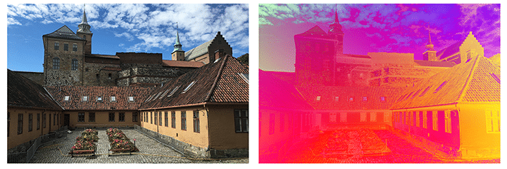
You’ll also notice that this example has multiple background blend modes. If one blend mode isn’t enough, multiple can be used.
Working examples can be found in this Codepen.
Mix Blend Mode Examples
Up until this point, the focus has been on the background. What if other elements on the page want to take advantage of blend modes? This is no problem and the same blend mode types are available.
Things look the same from background-blend-modes with the exception of initial, inherit, and unset.
- Initial: Default setting of the property that does not set a blend mode.
- Inherit: Inherits the blend mode from its parent element.
- Unset: Removes the blend mode from an element.
Basic Example of a Mixed Blend Mode With Isolation
When working with mix-blend-mode, you’ll come across the need to do some isolating. First, it’s important to know that “stacking” is possible, and this is valuable when working with a lot of layers. Think of a stack of boxes. Each box is separate from the group. Inside of each box, there can be multiple layers of items. This way of thinking will help when determining what needs to be isolated.
Text and Image Mix With Mix-blend-mode
In this example, the div with a class of img-wrap contains the image. The image has a mix-blend-mode of multiply. So basically, the image appears to fall into the background.
To prevent this, the img-wrap div (also containing the heading text) should be a new set of stacked content so it is set apart from the background of the body element. This is done with the isolation property. The default value is auto, so isolation: isolate; will need to be added.
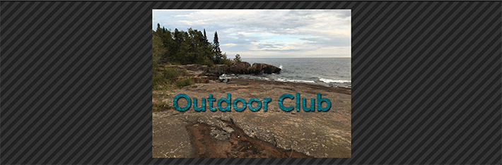
To test this out, comment out the isolation property on the div with the class of .img-wrap and check the result.
Here is the HTML:
<div class="img-wrap">
  <img src="http://abbeyjfitzgerald.com/wp-content/uploads/2017/01/blend-mode-original.jpg" />
<h2>Outdoor Club</h2>
</div>
Here is the CSS. Pay close attention to the isolate on the .img-wrap.
h2 {
  margin-bottom: 7rem;
  position: absolute;
  top: 45%;
  right: 0;
  left: 0;
  margin: auto;
  text-align: center;
  font-size: 4rem;
  padding: .5em .25em;
  color: #007eae;
  text-shadow: 2px 3px 3px #000;
  mix-blend-mode: overlay;
}
.img-wrap {
    width: 45%;
    padding: 1%;
    position: relative;
    isolation: isolate;
    margin: 0 auto;
}
.img-wrap img {
  max-width: 100%;
  mix-blend-mode: multiply;
}
The working example can be found on Codepen.
Text Cut Out With Mix-blend-mode
Some interesting type effects can be created with mix blend modes. There’s an easy way to make cut out text. The background is hidden by a fill on the h1 element.
Here is the HTML:
<div class="dark-cover">
  <h1>Outdoor Club</h1>
</div>
That containing <div> is filled with the forest background image.
.dark-cover {
background-image: url(image.jpg);
text-align: center;
background-size: cover;
}
The heading inside it is styled with an optional background color. The heading has a see-through effect with the semi see-through background image by using mix-blend-mode of multiply:
.dark-cover h1 {
  margin: 0;
  font-size: 8rem;
  text-transform: uppercase;
  line-height: 1.9;
  color: #fff;
  background-color: green;
  mix-blend-mode: multiply;
}
The working example can be found on Codepen.
Mix-blend-mode and SVG
SVG files are very popular on the web, and CSS blending modes also work well with them. Shapes can be easily targeted to give them the desired blend mode.
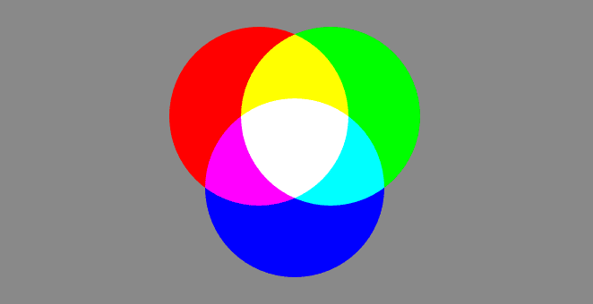
Isolate was key in this example as well. Without isolating the circles, the gray background would interfere.
Here is the code to create the circle group:
<svg>
  <g class="isolate">
    <circle cx="60" cy="60" r="50" fill="red"/>
    <circle cx="100" cy="60" r="50" fill="lime"/>
    <circle cx="80" cy="100" r="50" fill="blue"/>
  </g>
</svg>
Here are the CSS styles:
body {
  background: #898989;
}
circle {
  mix-blend-mode: screen;
}
.isolate {
  isolation: isolate;
}
/* if this was not isolated, the gray background would impact the outcome */
This example can be found on Codepen.
Browser Support for Background-blend-mode and Mix-blend-mode
Browser support is pretty good, but not entirely consistent for background-blend-mode. Before starting on a design utilizing this feature, be sure to check Can I Use. Currently, Edge and Safari are lacking support. To deal with limited support and depending on what browsers need to be supported, a CSS Feature Query may be a good option. If not, thinking of “blended” images as an enhancement (not a requirement) may be your best bet.
Browser support is slightly better for mix-blend-mode. It is good to be aware of partial support. For example, Safari does not support hue, saturation, color, or luminosity.
The best way to really learn about what can be designed with blend modes is to experiment. The examples shown here have just scratched the surface. It’s amazing what kind of graphics can be created by using blend modes. This is a great step forward for what can be done on the web.
Fuel the Freedom to Create With WP Engine
WP Engine powers the freedom to create on WordPress. Our products, some of the fastest among WordPress hosting providers, power more than 1.5 million digital experiences. More of the top 200,000 sites in the world use WP Engine to power their digital experiences than anyone else in WordPress.
Find out more at wpengine.com or speak to a representative today!