


How to Create a Simple Layout with CSS Grid Layouts
If you’ve ever dabbled in print design, you know where the idea of grid layouts originated from. A grid is a precise measurement tool used to position design elements on a page. This idea is often used on the web to make content organized and uniform, making for an improved viewing experience for your users.
When the practice of web design was new, layouts were pretty simple. Header, sidebar, content area, and footer.
As the web has evolved, our layouts have become more complex and we have a lot more to contend with as web designers. We often need numerous content regions, responsive design, multiple page layout template designs, amongst many other things. And to implement the design and get it to display correctly, floats and positioning are required. Floats sound simple, but these can sometimes be tricky to work with.
Luckily, the grid provides an easier way to design and display web content. It’s an awesome time to be a designer because CSS Grid Layouts are quickly gaining traction. It may feel like grids have been a new idea in web design in recent years, but believe it or not, CSS Grid Layouts have been in the works for many years.
Browser support for them happened very quickly, so now they can help ease some of the frustration around positioning that designers have had to deal with for many years.
It’s finally time to break into the grid and explore the new design possibilities!
CSS Grid Support
It all depends on the browsers you need to support, but there’s a pretty good chance that you do not have to worry about “flag mode” when using CSS Grids. You can always visit the Can I Use documentation to double check, but support for CSS Grids has dramatically increased and many designers are able to use it in production, which is cause for celebration!
CSS Grid Layout Basics
By utilizing CSS, grid layouts will help define content areas on your web page. There is a relatively new set of properties defined in the CSS Grid Layout Specifications. This is a great resource to reference when learning more about this new way of layout design. CSS Grid Layouts help to simplify things and make creating layouts easier. Think of the grid as a structure where measurements can be defined.
Parts of the Grid
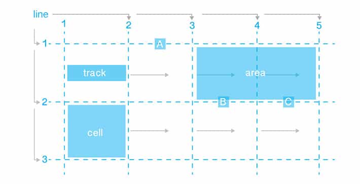
Lines
In this case, there are five vertical lines and three horizontal lines. Lines are given numbers starting from one. Vertical lines are shown from left to right in this example, but this depends on the writing direction. Because this shows reading from left to right, if it is from right to left, things will be reversed. Lines can be given names (optional), which helps with referencing them in CSS.
Tracks
A track is the space between two parallel lines. In the diagram, there are four vertical tracks and two horizontal tracks. There is a great dual effort between lines and tracks. Lines are a great way to reference where the content starts and stops. Tracks are where the content actually goes.
Cells
Cells are found where a horizontal and a vertical track meet. There are eight cells in the diagram.
Areas
Cells come into play when specifying areas. An area is a rectangular shape that can span a number of cells. Like lines, areas can be optionally named. There are a few labels included in the diagram: “A,” “B,” and “C.”
Creating a Grid Layout
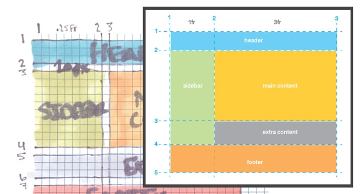
It can be helpful to sketch things out before starting your layout. There’s no substitute for good old graph paper.
HTML for the grid
[html]

<div class="container">
  <div class="grid header">Header</div>
  <div class="grid sidebar">Sidebar</div>
  <div class="grid content">Main Content</div>
  <div class="grid extra">Extra Content</div>
  <div class="grid footer">Footer</div>
</div>

[/html]
The container is very important. Within the container are the different content blocks for the website. The order of the grid items within the container does not matter. Next, we’ll use CSS to place them in our layout.
CSS styles
After you are done with the HTML markup, the most important declaration is done in the CSS. Within the container, you need to apply display:grid or display:inline-grid. Use display:grid if you would like a block-level grid. Use display:inline-grid for inline-level grids.
[css]

.container {
  	display: grid;
  	grid-template-columns: 1fr 3fr;
        grid-column-gap: 10px;
        grid-row-gap: 15px;
}

.grid {
  background-color: #444;
  color: #fff;
  padding: 25px;
  font-size: 3rem;
}

[/css]
The grid-template-columns and grid-template-rows properties are used to specify the width of the rows and columns. The grid-template-columns have been set as 1fr and 3fr. This is where the grid is taking shape with the fractional units.
With these values, it is apparent there are two columns and they are not equal width. The column set to 3fr is three times wider than the other. This explains how the sidebar appears more narrow than the content area.
There are responsive customizations that can be made, but using the fractional units is a great first step. Spacing between areas can be controlled with the grid-column-gamp and the grid-row-gap.
Things look pretty tight, but with a few more specifications, things will take shape.
This example starts with placing the header, but elements can be placed in whatever order works best for you. If you want to start with the footer, that will work, too.
Let’s start with the header, which goes from column line 1 to column line 4 and row line 1 to row line 2. The CSS will look like this:
[css]

.header {
  grid-column-start: 1;
  grid-column-end: 3;
  grid-row-start: 1;
  grid-row-end: 2;
}

[/css]
You may notice that the sidebar is squished and we can’t see it very much. We will need to do a little rearranging. In this layout, referencing the lines to get the placement will help with the arrangement. The lines act as the guidelines. The header is located between the line at row one and the line at row two.
For the sidebar, it will start at row three and end at line six. The header row ended at two, so this will be placed right under it. To view the example, see the project on Codepen.
We use grid-column-start to specify the starting vertical line for an element.
In this case, it would be set to three. The grid-column-end indicates the ending vertical line for an element. In this case, this property would be equal to four. Other row values will also be set this same way. The placement of the sidebar is there, it is just covered by the content area.
[css]

.sidebar {
  grid-column-start: 1;
  grid-column-end: 2;
  grid-row-start: 2;
  grid-row-end: 4;
  background: #a0c263;
}

[/css]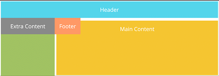
The main content starts at column three and ends at column four. The top of the sidebar and content area are even, so they both have a grid-row-start of three. You may be wondering how the content and sidebar are much taller. By putting a height on the container, in this case 400px, this is now taller than the other elements.
[css]

.content {
  grid-column-start: 2;
  grid-column-end: 3;
  grid-row-start: 2;
  grid-row-end: 3;
  background: #f5c531;
  height: 400px;
}

[/css]
The last two content areas are the extra content area and the footer.
[css]

.extra {
  grid-column-start: 2;
  grid-column-end: 3;
  grid-row-start: 3;
  grid-row-end: 4;
  background: #898989;
}

.footer {
  grid-column-start: 1;
  grid-column-end: 3;
  grid-row-start: 3;
  grid-row-end: 4;
  background: #FFA500;
}

[/css]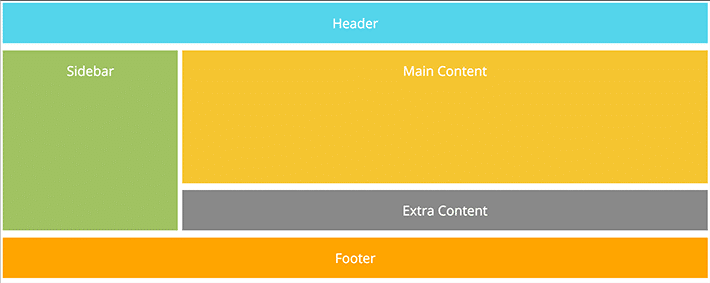
End and start declarations can be written more efficiently. You may see grid-column-start: 1; and grid-column-end: 3; written in shorthand. This would look like grid-column: 1 / 3;. This same idea can be used to declare column row information.
Responsive Advantages
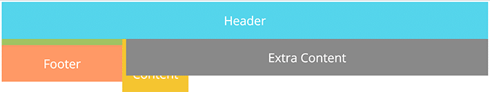
Now that a layout has been created, it seems very “desktop.” What about tablets and mobile devices? CSS Grid Layouts work well with media queries so the design can adapt to different screen sizes. What’s really cool is that you can change the content areas at these different media query breakpoints.
As a designer, this means you choose what is best for your layout at different breakpoints. For example, if you want the “extra content” to be placed above the “content” area, you can specify the correct columns and rows.
[css]

/* For mobile phones: */
    .header {
    grid-column-start: 1;
    grid-column-end: 4;
    grid-row-start: 1;
    grid-row-end: 2;
  }

  .extra {
    grid-column-start: 1;
    grid-column-end: 4;
    grid-row-start: 3;
    grid-row-end: 4;
  }

  .content {
    grid-column-start: 1;
    grid-column-end: 4;
    grid-row-start: 5;
    grid-row-end: 6;
    background: #f5c531;
    height: 400px;
  }

[/css]
By having the columns start at one and end at four, we’ve made the content areas full width. The grid rows are placed so that the “extra content” is now above the “content.”
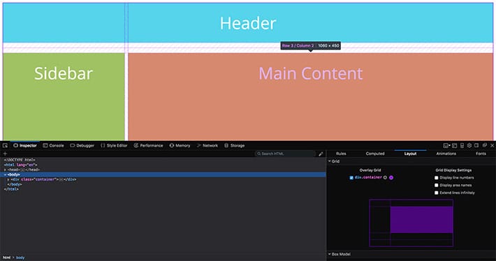
Browser tool for CSS Grid Layout
As you’re designing layouts, or inspecting other websites, Firefox offers a great tool for working with CSS Grid Layouts. It is called CSS Grid Playground and it makes examining the grid very intuitive.
By going to the inspector there’s an option in the layout tab to visually see how the grid is constructed. It will make the design process easier to have this tool to explore how different grid properties affect the overall grid layout and design.
CSS Grid Layouts are a new, exciting way to create web layouts. As you can see, it is pretty easy to be up and running when creating a simple page layout. This simple example is a good foundation for how to make more complex layouts. As this gains in popularity, there will be an advantage to this technology when designing for various devices and breakpoints with the layout customizations that can be made.
To ensure any and all of your design choices load quickly and perform as intended, make sure to check out WP Engine’s WordPress hosting solutions for a lightning fast digital experience!