


How to Use CSS and SVG Clipping and Masking Techniques
SVGs are great for working on the web, and clipping and masking allow for some interesting ways to show or hide pieces of your web graphics. Using these techniques also allows for more flexibility with your designs because you do not have to manually make changes and create new images—it’s all done with code. By using a combination of CSS clipping and masking techniques, you will have lots of options for your website graphics.
To help clarify things, masking and clipping are two different ways you can manipulate images with CSS. Let’s start with clipping.
Clipping Basics
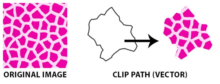
If you’ve ever used Photoshop, you are probably already familiar with Clipping Masks. It’s a similar kind of approach. Clipping involves laying a vector shape, like a circle or a triangle, on top of an image or an element. Any part of the image behind the shape will be visible, while everything outside the boundaries of the shape will be hidden.
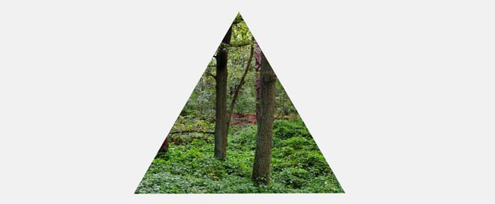
For example, if a triangle clipping mask is over the top of an image of a forest, you will see the forest image within the triangle shape. The shape’s boundary is called the clip path, not to be confused with the depreciated clip property. You create the clip path by using the clip-path property.
Note: Don’t Try This on Your Live Site
Remember: You should never change the code directly on your site, to ensure nothing breaks. Our free local development app, Local, will help you set up a test environment where you can safely follow along this tutorial.
Clipping in Action
Clips are always vector paths. It can be confusing to understand, but anything outside the path will be hidden, while anything inside the path will be visible. To get a better understanding and to test this out yourself, see the sample on CodePen.
Here is a snippet of the HTML structure from the example:
[html]

<svg class="clip-svg">
	<defs>
		<clipPath id="polygon-clip-triangle-equilateral" clipPathUnits="objectBoundingBox">
			<polygon points="0 0.87, 0.5 0, 0.5 0, 1 0.87" />
		</clipPath>
	</defs>
</svg>

[/html]
This is the CSS to make the clipping happen:
[css]

.polygon-clip-triangle-equilateral {
	-webkit-clip-path: polygon(0% 87%, 50% 0%, 50% 0%, 100% 87%);
	clip-path: polygon(0% 87%, 50% 0%, 50% 0%, 100% 87%);
	-webkit-clip-path: url("#polygon-clip-triangle-equilateral");
	clip-path: url("#polygon-clip-triangle-equilateral");
}

[/css]
You can see where the clipPath id is being referenced in the HTML and how it uses the clip-path URL to do the clipping.
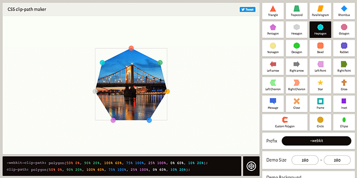
Clippy Tool
Clippy is a great tool to generate CSS clip paths. There are a wide variety of starter shapes and sizes that can be customized.
Masking Basics
Masking is done using a PNG image, CSS gradient, or an SVG element to hide part of an image or another element on the page. We will be focusing on SVG graphics, but keep in mind this can be done with other image types or styles.
The Mask Property and Mask Element
Just a refresher to help visualize, it’s important to keep in mind that the masked element is the “original” (before mask is applied) image. You may not want to see the whole image, so hiding parts of it is done with the CSS mask property. The mask is the CSS shorthand for a group of individual properties, which we’ll dive into in a second. The SVG <mask> element is used inside an SVG graphic to add masking effects. In this example, the mask is a circle and there is also a gradient applied.
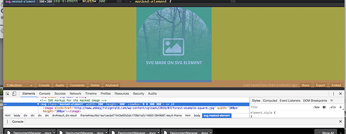
Using the SVG Mask Element on an SVG Graphic
To get a feel for the SVG <mask> we will be masking with an SVG graphic.
It might be a bit complex at a first glance, but it all works together to mask the underlying image. We have an actual image as a background, so where does the SVG come into play? Unlike the clipping examples, this background image is technically inside of an SVG element. We’ll use CSS to apply this mask to the image. Properties will come from the SVG mask element, and we’ll give it the id of masked-element in our CSS.
To see this in action, check out this Codepen sample. Here’s the working code for the masked SVG graphic:
[html] &amp;amp;lt;svg class=&quot;masked-element&quot; width=&quot;300&quot; height=&quot;300&quot; viewBox=&quot;0 0 300 300&quot;&amp;amp;gt; &amp;amp;lt;image xlink:href=&quot;image link&quot; width=&quot;300px&quot; height=&quot;300px&quot; /&amp;amp;gt; &amp;amp;lt;/svg&amp;amp;gt; [/html]
With this CSS, we are specifying where to find the mask. It will look for the ID of #mask-this:
[css]
/* Here’s the CSS for masking */
.masked-element image {
  mask: url(#mask1);
}

[/css]
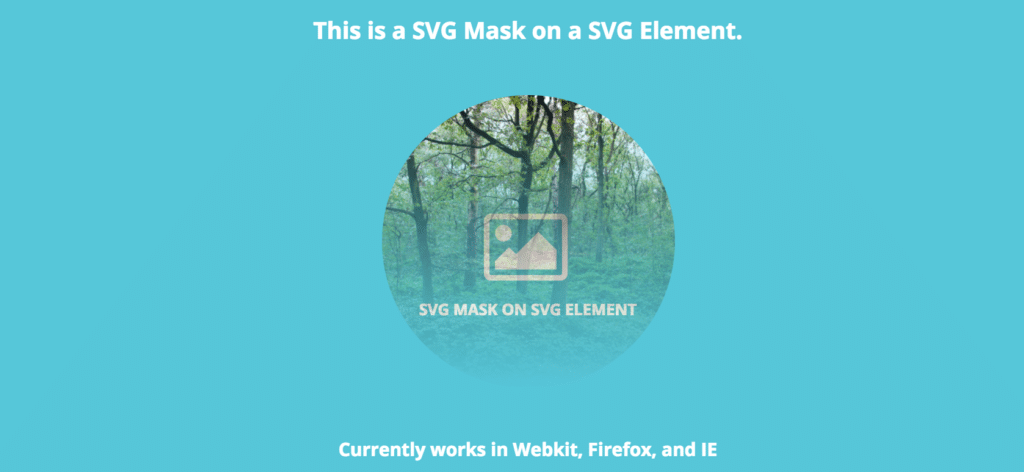
Notice a gradient in the circle shape? A gradient has been applied, as well as setting the circle shape for the mask.
[html]
&amp;amp;lt;svg class=&quot;svg-mask&quot;&amp;amp;gt;
&amp;amp;lt;defs&amp;amp;gt;
&amp;amp;lt;mask id=&quot;mask1&quot; maskUnits=&quot;objectBoundingBox&quot; maskContentUnits=&quot;objectBoundingBox&quot;&amp;amp;gt;
&amp;amp;lt;linearGradient id=&quot;grad&quot; gradientUnits=&quot;objectBoundingBox&quot; x2=&quot;0&quot; y2=&quot;1&quot;&amp;amp;gt;
&amp;amp;lt;stop stop-color=&quot;white&quot; offset=&quot;0&quot;/&amp;amp;gt;
&amp;amp;lt;stop stop-color=&quot;green&quot; stop-opacity=&quot;0&quot; offset=&quot;1&quot;/&amp;amp;gt;
&amp;amp;lt;/linearGradient&amp;amp;gt;
&amp;amp;lt;circle cx=&quot;0.50&quot; cy=&quot;0.50&quot; r=&quot;0.50&quot; id=&quot;circle&quot; fill=&quot;url(#grad)&quot;/&amp;amp;gt;
&amp;amp;lt;/mask&amp;amp;gt;
&amp;amp;lt;/defs&amp;amp;gt;
&amp;amp;lt;/svg&amp;amp;gt;
[/html]
SVG Text Masking
Text masking can do some pretty cool things, such as showing an image through a text block. The good news is that a text element can be used inside of an SVG mask. As browser support increases in the future, this could be a really interesting way to combine images and typography.
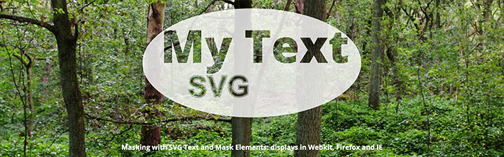
Here’s a basic explanation of what is going on. There is an SVG text element inside the SVG mask. We’ve specified the RGB value for white, which creates the oval area around the masked text. Anything behind the oval area shows through the text, giving a cut-out feel.
[html]
&amp;amp;lt;div class=&quot;text-wrap&quot;&amp;amp;gt;
&amp;amp;lt;svg class=&quot;text-demo&quot; viewBox=&quot;0 0 600 400&quot; width=&quot;600&quot; height=&quot;400&quot;&amp;amp;gt;
&amp;amp;lt;defs&amp;amp;gt;
&amp;amp;lt;mask id=&quot;myMask&quot;&amp;amp;gt;
&amp;amp;lt;rect width=&quot;100%&quot; height=&quot;100%&quot; fill=&quot;#fff&quot; /&amp;amp;gt;
&amp;amp;lt;text x=&quot;50&quot; y=&quot;200&quot; id=&quot;myText&quot;&amp;amp;gt;My Text&amp;amp;lt;/text&amp;amp;gt;
&amp;amp;lt;text x=&quot;125&quot; y=&quot;293&quot; id=&quot;mySubtext&quot;&amp;amp;gt;SVG&amp;amp;lt;/text&amp;amp;gt;
&amp;amp;lt;/mask&amp;amp;gt;
&amp;amp;lt;/defs&amp;amp;gt;
&amp;amp;lt;ellipse class=&quot;masked&quot; cx=&quot;300&quot; cy=&quot;200&quot; rx=&quot;300&quot; ry=&quot;150&quot; fill=&quot;rgba(255, 255, 255, 0.8)&quot; /&amp;amp;gt;
&amp;amp;lt;/svg&amp;amp;gt;
&amp;amp;lt;/div&amp;amp;gt;
[/html]
[css]
/* Here’s the CSS for text element */
#myText {
font-size: 125px;
font-style: bold;
fill: #000;
}
/* Here’s the CSS for masking */
.masked {
mask: url(&quot;#myMask&quot;);
}
[/css]
To fully understand, it’s helpful to play around and experiment with the code. Try changing colors, changing text, and adjusting sizes in this Codepen.
The Mask-Image Property
An image can be declared and the mask-image can be set to a URL value. The mask-image can be a PNG, SVG, or a reference to an SVG mask element, like I demonstrated in the previous example.
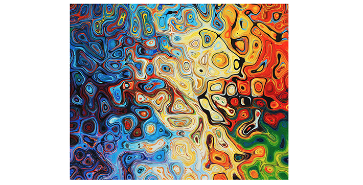
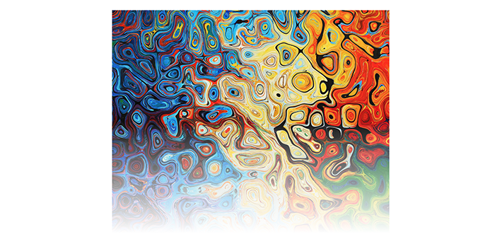
Because masking is used to partially or fully hide portions of an object or element, first you’ll want an image link to a file for the element that is going to be masked. Here’s what that image looks like. It’s colorful to make it very apparent which part the mask is showing and hiding.
[css] &amp;amp;lt;img class=&quot;mask-img example-mask&quot; src=&quot;https://linktoimage.com/img/image-example.jpg&quot; alt=&quot;Masked image&quot;&amp;amp;gt; [/css]
So far there’s been a lot of SVG code, but this example is slightly different since there is going to be a raster image masked with an SVG.
[css]

.example-mask {
  mask-image: url(https://linktoimage.com/browser-icon-01.svg);
  webkit-mask-image: url(https://linktoimage.com/browser-icon-01.svg);
  mask-mode: alpha;
  webkit-mask-mode: alpha;
  mask-repeat: no-repeat;
  webkit-mask-repeat: no-repeat;
  mask-size: 200px;
  webkit-mask-size: 200px;
  mask-position: center;
  webkit-mask-position: center;
}

[/css]
The mask-image property is where the mask shape will be declared. In this case, the mask image is an SVG graphic. Having the URL link included is how the mask is built.
Here it is on Codepen.
Combining Multiple Mask Images
Just when you thought masking couldn’t get any better, there is the option to set more than one mask image layer. All you need to do is add two URL values (or more if you’re feeling ambitious) separated by a comma.
To expand on the simple mask from above, there will be an arrow added to the original graphic. Here’s how two masks are combined.
[css]

.combined-mask {
   mask-image: url(https://linktoimage.com/arrow-01.svg), url(https://linktoimage.com/browser-icon-01.svg);
  webkit-mask-image: url(https://linktoimage.com/arrow-01.svg), url(https://linktoimage.com/browser-icon-01.svg);
}

[/css]

All you have to do is add the two values (with a comma) and now there are two combined masks, making the masking possibilities endless.
Here it is on Codepen.
Create a Simple Gradient with mask-image
Not all masks have to be a complex shape. Sometimes it’s not a particular image that is the mask, but rather a simple mask like a gradient. If you’re looking for a quick way to achieve this, the mask-image property is an option, which is pretty easy to implement.
In this example, there was a class applied to a gradient set as the mask-image property. With this simple declaration, it was easy to create a gradient mask on the image.
[css]

mask-image: linear-gradient(black, white, transparent);
-webkit-mask-image: linear-gradient(black, white, transparent);

[/css]
See this on Codepen.
The Mask-Repeat Property
Once you’ve created one mask, it’s pretty easy to make more. This really comes in handy if you’re looking to make a custom pattern. The mask-repeat property allows for repetition of the mask. If you’ve ever made a tiled background before, this is similar to that.
There are a few important things to keep in mind, like sizing and the type of mask-repeat that needs to be declared so the perfect pattern is created.
The mask-size is pretty easy to visualize, especially with the set pixel value here.
[css]

mask-size: 200px;
webkit-mask-size: 200px;

[/css]
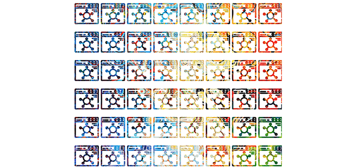
There are a few more mask-repeat options if you’re looking for a different effect for the pattern:
repeat-xrepeats along the x coordinate.Repeat-yrepeats down the y coordinate.spacerepeats and spreads out in the available area.roundrepeats a number of times across the available area (scaling will help it fill the space if needed)
Browser Support
Before committing to this new way of working with graphics, it’s important to note that browser support is not consistent with clipping and masking. Clipping is more supported than masking, but Internet Explorer does not fully support clipping.
Current browser support for CSS masks is also fairly limited, so it’s suggested to be used as an enhancement on a few decorative elements. That way, if it is not supported by the user’s browser, it does not affect the content viewing experience.
To test things out and see if your masks and clippings are supported, we’d recommend making a JSFiddle or Codepen and then trying it in different browsers. Browser support has increased in the recent years, and it will eventually get to a point where it will be fully-supported.
Don’t let the limitations get you down—it’s always good to be ahead of the game and once support is more mainstream, you will know exactly how to revolutionize your graphics. When in doubt, be sure to reference the trusted Can I Use.
After experimenting with these examples, this should provide a good introduction to masking and clipping. Although browser support is limited at this time, this will likely become a mainstream practice in the future.
It’s always fun to think about how these techniques can be used to create interesting visuals. The future of web graphics will make us less dependent on image editors and allow for more effective ways to create and modify imagery directly in the browser.
When you want to give all the hard work you’ve put in on your sites truly shine, make sure you’re choosing the best possible WordPress hosting with WP Engine!