


How to Design a One-Page Business Website on WordPress
There are many ways you can design a website for your business, depending on your goals and the amount of content you need to include. While it can sometimes make sense to create intricate sites with multiple pages and huge swaths of content, that can also get expensive and complicated.
Instead, you might want to consider creating a website containing just a single page. While that may sound like it wouldn’t be enough to fit in all the information and functionality you’ll need, you may be surprised. Single-page websites can actually be a highly effective way to drive conversions and provide value for your users.
In this article, we’ll start by discussing why you might want to use a one-page website. We’ll then walk you through the process of using one of your favorite WordPress business themes to put one together for your company. Let’s go!
How a One-Page Website can Benefit Your Business
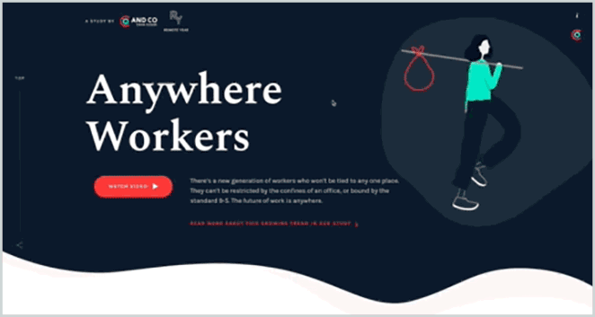
As you might suspect, a one-page website is simply a site that only consists of a single page. Most of these sites are designed as a series of sections that visitors can scroll through. And Co’s site is a good example of this in action:
Although it may seem unintuitive, creating a one-page site can actually be very beneficial, especially for businesses. For instance, a single-page business site enables you to:
- Tell your company’s story. Using a single page lets you create a linear narrative, presenting your business and services exactly as you want them to be experienced.
- Simplify your message. By focusing on the most important aspects of your business, you make it easier for visitors to grasp your core message.
- Improve user engagement and increase conversions. A one-page site can be structured to direct visitors toward one specific goal.
- Spend less time on website maintenance. The simplicity of a one-page site makes it much easier to manage and work with over time.
- Create a more responsive site. Since all your content is available on the same page, your site will be ideal for mobile devices, as users can simply scroll through the content.
I should note that there are also potential downsides to using a one-page design. For example, if your site needs to contain a lot of information and requires complex features such as membership options, then a single page won’t be enough.
You could also face slow performance since your entire site needs to load whenever a user accesses it. However, this can be avoided by optimizing your site for speed, and making sure you’re using a high-performing theme.
How to Design a One-Page Business Website (in 4 Steps)
Now that we’ve looked at the benefits of a one-page business site, let’s discuss how to actually create one. For this example, we’ll be using WordPress, so make sure you have a brand-new installation set up first. You can also use a local development tool like Local to test out new themes without hurting the live site. Then, you can get to work!
Step 1: Find and Install a One-Page Business Theme
Your first task is to find the right WordPress theme. Themes change the appearance and layout of your site. Fortunately, there are some WordPress business themes that can help you design a one-page site easily.
Using a dedicated business theme offers a number of benefits. For example, a theme specifically created for business sites will likely contain plenty of useful features, such as WooCommerce support. It’s also going to be tailored toward a business’ needs, such as creating Call To Actions (CTAs) and highlighting your products or services.
What theme you decide to use depends entirely on a mix of personal preference and professional requirements. However, there are some basics you should look for in any theme you’re using as the basis for a one-page site. Most importantly, it will need to be responsive and optimized to run smoothly (even with high amounts of traffic).
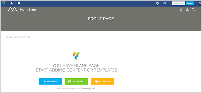
For an example, you can check out the Montblanc theme. This is a clean, professional, and versatile business theme that also includes a page builder tool. That means that you can put together a great-looking site quickly:

I’ll be using this theme throughout the rest of the walkthrough. If you want to do the same, you’ll need to purchase and download it before installing it on your site. Once you’ve done that, it’s time to start thinking about how your site is actually going to look.
Step 2: Plan Your Site’s Structure
When you’re designing a one-page site, structure is everything. You can think of your site as a story, since people will be reading it from top to bottom. Each new section should provide more information, building visitors’ interest and desire as they scroll down the page.
First and foremost, remember that simplicity is key. You don’t want to overload your site with too much content, so focus on the most important details. You also don’t want to distract readers with unrelated topics, so make sure every section you add works towards the same overall goal.
When it comes to how you organize your sections, it’s best to use the ’inverted pyramid’ technique. This method makes your content easier to consume and more engaging. The top of your site will be the broadest section, which contains more general information, while each subsequent section is more focused and includes more specific details.
Step 3: Create Your Page
Once you have a plan, it’s time to put it into practice. Fire up your site and create a new page, and set it as your site’s static home page. Depending on your theme, you might also want to customize its appearance at this stage. For instance, the Montblanc theme provides a lot of options via a dedicated General Settings section.
For our example, we’ll stick with the default look and focus on content. As such, return to your new page. We’ll be using Visual Composer, as it’s included with our chosen theme, but you can use any page builder (or even the standard editor) if you wish:
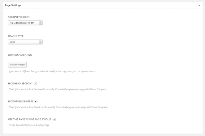
You’ll want to start by making sure your layout is set to full-width and contains no sidebar, which isn’t needed for a single-page site. You might also want to remove the ‘hero’ section, as your page probably doesn’t require it.
If you’re using Visual Composer, you can do this by scrolling down while editing a page and setting the following options:
Once you’ve done that, you can start adding content. Let’s begin with an image, accompanied by a brief description:

All we’ve done here is add a new row with an image background, followed by a header and a text block. This is a great way to grab a visitor’s attention, and make them curious to find out more.
The next section should provide some more information about your business’ specific offerings:

Here, we’ve used icons and text to explain what the business actually does. Using multimedia in this way is a smart move, since images can make users more likely to convert.
You’ll also notice that every new row appears as a separate section. You can even navigate between them using the dots on the left-hand side of the screen:

Next up, we can include some more information about the business. Notice that we’re getting more and more detailed the further down the page we go:

The hope is that the reader will be interested enough in your services to scroll all the way down to the bottom of the page. At that point, they should find the information they’ll need next, such as contact details:

You’ll also want to present them with a clear action to take. That leads us to the final step.
Step 4: Add a Strong Call to Action (CTA)
In order for your site to generate conversions, you’ll need an effective Call To Action (CTA). [twitter_link]Creating a strong CTA is its own art form.[/twitter_link] What’s most important is to make it stand out from rest of the page, and to ensure that its message is clear.
As such, let’s create a CTA and place it in two distinct areas. First, we’ll create a button and add it to our first section, so that it’s immediately visible when visitors access the site:

Then, let’s add the same button to the very last section:

This is to ensure that visitors who read all the way down are presented with the CTA once they’ve taken in all the relevant information, and have hopefully gained an interest in your services.
That brings us to the end of our tutorial! Naturally, this is only a very basic example to show you how a one-page site comes together, so we recommend that you experiment with different content and visuals.
Conclusion
Sometimes the simplest option is really the best one. When it comes to business websites, you might not need multiple pages and complex site structures. You may be better served with a one-page site that tells your story, and convinces users to convert.
In this article, we’ve discussed the benefits of using a one-page business website. We’ve also taken you through the process of creating one via a WordPress business theme.
Do you have any questions about building an effective one-page website for your business? Let us know in the comments section below!