


A Guide to Effective Use of White Space in Web Design
Designers love it, yet website owners want to fill it. White space is often regarded as a waste of valuable screen space.
Yet it isn’t a waste of space! It’s an essential design element and a powerful tool for effective web design. In fact, it’s equally important as website content. Intelligent use of white space gives your content room to breathe. It helps to create a balanced interface that’s easy to read and doesn’t overwhelm your visitors.
What is White Space?
Often referred to as “negative space,” or “open space,” white space is the space left between other elements of a page. It covers everything from line and letter spacing, to the space surrounding text and images, to margins and gutters.
Think of it as the adhesive that holds a mosaic together or the silence in music. Without it, things are left unstructured and cluttered—a little like white noise. White space holds your design together and helps to shape the overall flow of the page. It’s an active element and a fundamental building block of good design.

Here’s a guide to the effective use of white space in web design.
1. Improve the Legibility of Text
Text that’s tightly spaced feels cluttered and is difficult to read. Space it too far apart, however, and the reader feels a disconnection and can lose their place in the text. At a time when users face information overload, if you don’t make your content easy to consume, they simply won’t bother.
The correct use of white space in text can increase readability by up to 20%. Think about paragraph margins and line spacing when designing your page. The amount of white space should reflect the pauses the visitor takes while reading. It’s like visual breathing space for the eyes.
2. Organize Your Content
The law of proximity details how the human eye perceives the relationship between certain visual elements. Things grouped closely together are perceived to be related, whereas those at a distance are believed to be different.
The amount of white space between your content acts as a visual cue, showing visitors the relationship between different elements of the content. Objects can be grouped together by decreasing the white space between them, or divided by increasing it.
In terms of text, the law of proximity helps us to understand text as a whole, making use of paragraphs to group ideas together. It’s also useful when designing forms, placing the labels closer to the relevant field for clarity.
3. Create Focus and Emphasis
A cluttered interface overwhelms your visitors, confusing them with too much information and losing the core message of the page in all the noise. By removing these distractions, you draw the visitors’ eyes to the most important element of the page. The more white space surrounding an object, the more the eye is drawn to it.
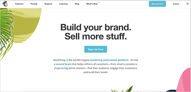
MailChimp perfected the technique of using white space to create natural hotspots in this layout. When you landed on their homepage, your eye was instantly drawn to the all-important “Sign Up Free” call to action in the center.
It’s also a great technique to use in text. If you wish to emphasize a certain element of text, perhaps to ensure a header really draws the attention, try increasing the spacing between its letters. This breaks the pattern of consistency and grabs readers’ attention.
4. Structure Your Content
Masterful use of white space can direct the eye to move from one element to another, giving a visual cue to the hierarchy of information on the page and guiding the reader on a path through it.
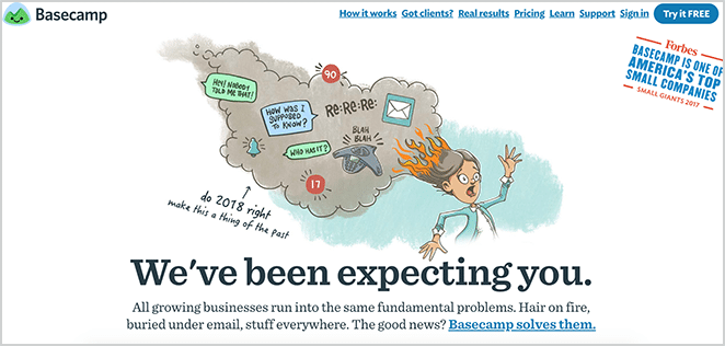
A popular formula is the Z-shaped layout, which mimics natural scanning habits. Readers start in the top-left corner, following a horizontal line to the right, then drop back to the bottom-left before following another horizontal line, as demonstrated in this Basecamp homepage.
Alternatively, an asymmetrical layout provides directional emphasis in a more unexpected, interesting form, which is great for directing focus to a particular element of the page, or even highlighting a horizontal scroll as in this example from Home Société.

5. Give an Impression of Luxury
While white space is mainly used as a technique for improving the user experience of a website, it also has its uses aesthetically. If you’ve ever flicked through a glossy magazine like Vogue, you’ll be aware of how generous use of white space gives an impression of elegance, luxury, and sophistication.

Angela Roi champions a sustainable, ethical approach to luxury fashion. The abundance of white space demonstrates that the product is far more exclusive and important than the real estate of the webpage.
6. It Doesn’t Have to be White!
Finally it’s worth noting that, despite its name, white space doesn’t have to be white! You can use any color, or lack of, in your negative space. You could even use a patterned or textured background or a background image.

If you’re designing a long-scrolling site, your use of white space is key to keeping the page flowing and managing the organization, focus, and emphasis of the content. A great tip is to alternate complementary blocks of color down the page to segment different sections while maintaining the direction and flow of the content.

White space isn’t wasted space—it can be a website’s best friend. Effective use of white space creates a design that’s enjoyable, comfortable, and easy to interact with.
How do you use white space in your designs? Do you have any tips to add to the list? Tell us in the comments below.
Stay Educated With WP Engine
Would you like to learn more about WordPress, and the various ways you can use this platform to your company’s advantage? Subscribe to our newsletter and learn more about our managed WordPress hosting and our flexible hosting plans!