


How we Build UI Components in Rails
Maintaining visual consistency in a large web application is a shared problem throughout many organizations. The main web application behind our Flywheel product is built with Ruby on Rails, and we have about multiple Rails developers and three front-end developers committing code to it on any given day. We’re big on design, too (it’s one of our core values as a company), and have three designers who work very closely with developers on our Scrum teams.

A major goal of ours is to ensure that any developer can build a responsive page without any roadblocks. Roadblocks generally have included not knowing which existing components to use to build out a mockup (which lead to inflating the codebase with very similar, redundant components) and not knowing when to discuss reusability with designers. This contributes to inconsistent customer experiences, developer frustration, and a disparate design language between developers and designers.
We’ve gone through several iterations of style guides and methods of building/maintaining UI patterns and components, and each iteration helped solve the problems we were facing at that time. We’re confident our new approach will set us up for a long time to come. If you face similar problems in your Rails application and you’d like to approach components from the server side, I hope this article can give you some ideas.

In this article, I’ll dive into:
- What we’re solving for
- Constraining components
- Rendering components on the server side
- Where we can’t use server side components
What We’re Solving For
We wanted to completely constrain our UI components and eliminate the possibility for the same UI to be created in more than one way. While a customer might not be able to tell (at first), not having constraints on components leads to a confusing developer experience, makes things very hard to maintain, and makes it difficult to make global design changes.
The traditional way we approached components was through our style guide, which listed the whole lot of markup required to build a given component. For example, here’s what the style guide page for our slat component looked like:
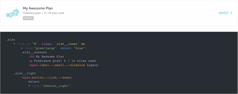
This worked well for several years, but problems started to creep in when we added variants, states, or alternative ways to use the component. With a complex piece of UI, it became cumbersome to reference the style guide to know which classes to use and which to avoid, and what order the markup needed to be in to output the desired variation.
Oftentimes, designers would make little additions or tweaks to a given component. Since the style guide didn’t quite support that, alternative hacks to get that tweak to display correctly (like inappropriately cannibalizing part of another component) became irritatingly common.
Unconstrained Component Example
To illustrate how inconsistencies surface over time, I’ll use a simple (and contrived) but very common example of one of our components in the Flywheel app: card headers.
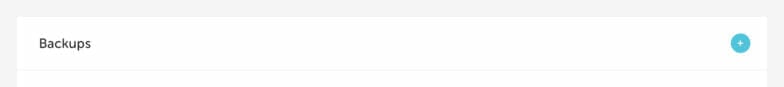
Starting fresh from a design mockup, this is what a card header looked like. It was pretty simple with a title, a button, and a bottom border.
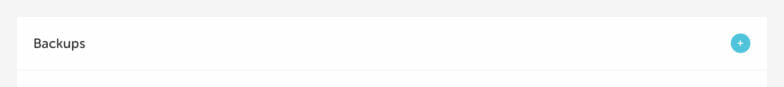
.card__header
  .card__header-left
    %h2 Backups
  .card__header-right
    = link_to "#" do
      = icon("plus_small")
After it was coded, imagine a designer wanting to add an icon to the left of the title. Out of the box, there’s not going to be any margin between the icon and the title.
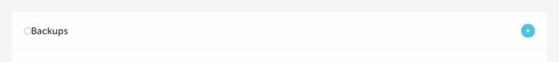
...
  .card__header-left
    = icon("arrow_backup", color: "gray25")
    %h2 Backups
...
Ideally we’d solve for that in the CSS for card headers, but for this example, let’s say another developer thought “Oh, I know! We have some margin helpers. I’ll just slap a helper class on the title.”
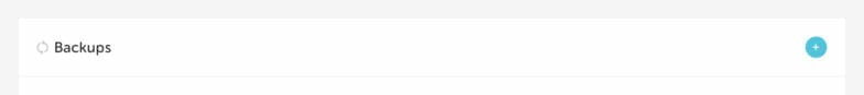
...
  .card__header-left
    = icon("arrow_backup", color: "gray25")
    %h2.--ml-10 Backups
...
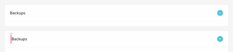
Well that technically looks like the mockup did, right?! Sure, but let’s say that a month later, another developer needs a card header, but without the icon. They find the last example, copy/paste it, and simply remove the icon.
Again it looks correct, right? Out of context, to someone without a keen eye for design, sure! But look at it next to the original. That left margin on the title is still there because they didn’t realize the margin left helper needed to be removed!
Taking this example one step further, let’s say another mockup called for a card header without a bottom border. One might find a state that we have in the style guide called “borderless” and apply that. Perfect!
Another developer might then try to reuse that code, but in this case, they actually need a border. Let’s hypothetically say that they ignore the proper usage documented in the style guide, and don’t realize that removing the borderless class will give them their border. Instead, they add a horizontal rule. There ends up being some extra padding between the title and the border, so they apply a helper class to the hr and voila!
With all of these modifications to the original card header, we now have a mess on our hands in the code.
.card__header.--borderless
  .card__header-left
    %h2.--ml-10 Backups
  .card__header-right
    = link_to "#" do
      = icon("plus_small")
  %hr.--mt-0.--mb-0
Keep in mind that the above example is just to illustrate the point of how unconstrained components can become messy over time. If anybody on our team tried to ship a variation of a card header it should be caught by a design review or code review. But things like this do sometimes slip through the cracks, hence our need to bulletproof things!
Constraining Components
You might be thinking that the problems listed above have already been clearly solved with components. That is a correct assumption! Front-end frameworks like React and Vue are super popular for this exact purpose; they’re amazing tools for encapsulating UI. However, there’s one hiccup with them that we don’t always like—they require your UI to be rendered by JavaScript.
Our Flywheel application is very back-end heavy with primarily server-rendered HTML—but luckily for us, components can come in many forms. At the end of the day, a UI component is an encapsulation of styles and design rules that outputs markup to a browser. With this realization, we can take that same approach to components, but without the overhead of a JavaScript framework.
We’ll get into how we build constrained components below, but here are a few of the benefits we’ve found by using them:
- There is never really a wrong way to put a component together.
- The component does all the design thinking for you. (You just pass in options!)
- The syntax for creating a component is very consistent and easy to reason.
- If a design change is needed on a component, we can change it once in the component and be confident it’s updated everywhere.
Rendering Components on the Server Side
So what are we talking about by constraining components? Let’s dig in!
As mentioned earlier, we want any developer working in the application to be able to look at a design mockup of a page and be able to immediately build that page without impediments. That means the method of creating the UI has to be A) documented very well and B) very declarative and free of guesswork.
Partials to the Rescue (or so we Thought)
A first stab at this that we’ve tried in the past was to use Rails partials. Partials are the only tool Rails gives you for reusability in templates. Naturally, they’re the first thing everybody reaches for. But there are significant drawbacks to relying on them because if you need to combine logic with a reusable template you have two choices: duplicate the logic across every controller that uses the partial or embed the logic into the partial itself.
Partials DO prevent copy/paste duplication mistakes and they work okay for the first couple of times you need to reuse something. But from our experience, the partials soon get cluttered with support for more and more functionality and logic. But logic shouldn’t live in templates!
Introduction to Cells
Luckily, there’s a better alternative to partials that allows us to both reuse code and keep the logic out of the view. It’s called Cells, a Ruby gem developed by Trailblazer. Cells have been around well before the popularity rise in front-end frameworks like React and Vue and they allow you to write encapsulated view models that handle both logic and templating. They provide a view model abstraction, which Rails just doesn’t really have out of the box. We’ve actually been using Cells in the Flywheel app for a while now, just not on a global, super reusable scale.
At the simplest level, Cells allow us to abstract a chunk of markup like this (we use Haml for our templating language):
%div
  %h1 Hello, world!
Into a reusable view model (very similar to partials at this point), and turn it into this:
= cell("hello_world")
This ultimately helps us constrain the component to where helper classes or incorrect child components cannot be added without modifying the cell itself.
Constructing Cells
We put all our UI Cells in a app/cells/ui directory. Each cell has to contain just one Ruby file, suffixed with _cell.rb. You can technically write the templates right in Ruby with the content_tag helper, but most of our Cells also contain a corresponding Haml template that lives in a folder named by the component.
A super basic cell with no logic in it looks something like this:
// cells/ui/slat_cell.rb
module UI
  class SlatCell < ViewModel
    def show
    end
  end
end
The show method is what’s rendered when you instantiate the cell and it will automatically look for a corresponding show.haml file in the folder with the same name as the cell. In this case, it’s app/cells/ui/slat (we scope all our UI Cells to UI module).
In the template, you can access the options passed in to the cell. For instance, if the cell is instantiated in a view like = cell(“ui/slat”, title: “Title”, subtitle: “Subtitle”, label: “Label”), we can access those options through the options object.
// cells/ui/slat/show.haml
.slat
  .slat__inner
    .slat__content
      %h4= options[:title]
      %p= options[:subtitle]
      = icon(options[:icon], color: "blue")
A lot of times we’ll move simple elements and their values into a method in the cell to prevent empty elements from being rendered if an option is not present.
// cells/ui/slat_cell.rb
def title
  return unless options[:title]
  content_tag :h4, options[:title]
end
def subtitle
  return unless options[:subtitle]
  content_tag :p, options[:subtitle]
end
// cells/ui/slat/show.haml
.slat
  .slat__inner
    .slat__content
      = title
      = subtitle
Wrapping Cells with a UI Utility
After proving the concept that this could work on a large scale, I wanted to tackle the extraneous markup required to call a cell. It just doesn’t flow quite right and is hard to remember. So we made a little helper for it! Now we can just call = ui “name_of_component” and pass in options inline.
= ui "slat", title: "Title", subtitle: "Subtitle", label: "Label"
Passing Options as a Block Instead of Inline
Taking the UI utility a bit further, it quickly became apparent that a cell with a bunch of options all on one line would be super hard to follow and just plain ugly. Here’s an example of a cell with a lot of options defined inline:
= ui “slat", title: “Title”, subtitle: “Subtitle”, label: “Label”, link: “#”, tertiary_title: “Tertiary”, disabled: true, checklist: [“Item 1”, “Item 2”, “Item 3”]
It’s very cumbersome, which lead us to create a class called OptionProxy that intercepts the Cells setter methods and translates them into hash values, which are then merged into options. If that sounds complicated, don’t worry – it’s complicated to me, too. Here’s a gist of the OptionProxy class that Adam, one of our senior software engineers, wrote.
Here’s an example of using the OptionProxy class inside our cell:
module UI
  class SlatCell < ViewModel
    def show
      OptionProxy.new(self).yield!(options, &block)
      super()
    end
  end
end
Now with that in place, we can turn our cumbersome inline options into a more pleasant block!
= ui "slat" do |slat|
  - slat.title = "Title"
  - slat.subtitle = "Subtitle"
  - slat.label = "Label"
  - slat.link = "#"
  - slat.tertiary_title = "Tertiary"
  - slat.disabled = true
  - slat.checklist = ["Item 1", "Item 2", "Item 3"]
Introducing Logic
Up to this point, the examples haven’t included any logic around what the view displays. That’s one of the best things Cells offers, so let’s talk about it!
Sticking with our slat component, we have a need to sometimes render the entire thing as a link and sometimes render it as a div, based on whether or not a link option is present. I believe this is the only component we have that can be rendered as a div or a link, but it’s a pretty neat example of the power of Cells.
The method below calls either a link_to or a content_tag helper dependent on the presence of options [:link] .
def container(&block)
  tag =
    if options[:link]
      [:link_to, options[:link]]
    else
      [:content_tag, :div]
    end
  send(*tag, class: “slat__inner”, &block)
end
That allows us to replace the .slat__inner element in the template with a container block:
.slat
  = container do
  ...
Another example of logic in Cells that we use a lot is that of conditionally outputting classes. Let’s say we add a disabled option to the cell. Nothing else in the invocation of the cell changes, other than you can now pass a disabled: true option and watch as the whole thing turns into a disabled state (grayed out with unclickable links).
= ui "slat" do |slat|
  ...
  - slat.disabled = true
When the disabled option is true, we can set classes on elements in the template that are required to get the desired disabled look.
.slat{ class: possible_classes("--disabled": options[:disabled]) }
  .slat__inner
    .slat__content
      %h4{ class: possible_classes("--alt": options[:disabled]) }= options[:title]
      %p{ class: possible_classes("--alt": options[:disabled]) }=
      options[:subtitle]
      = icon(options[:icon], color: "gray")
Traditionally, we would have had to remember (or reference the style guide) which individual elements needed additional classes to make the whole thing work correctly in the disabled state. Cells allow us to declare one option and then do the heavy lifting for us.
Note: possible_classes is a method we created to allow conditionally applying classes in Haml in a nice way.
Where we Can’t use Server Side Components
While the cell approach is extremely helpful for our particular application and the way we work, I would be remiss to say that it’s solved 100% of our problems. We still write JavaScript (a lot of it) and build quite a few experiences in Vue throughout our app. 75% of the time, our Vue template still lives in Haml and we bind our Vue instances to the containing element, which allows us to still take advantage of the cell approach.
However, in places where it makes more sense to completely constrain a component as a single-file Vue instance, we can’t use Cells. Our select lists, for example, are all Vue. But I think that’s okay! We haven’t really run into a need to have duplicate versions of components in both Cells and Vue components, so it’s okay that some components are 100% built with Vue and some are with Cells.
If a component is built with Vue, it means that JavaScript is required to build it in the DOM and we take advantage of the Vue framework to do so. For most of our other components though, they don’t require JavaScript and if they do, they require the DOM to already be built and we just hook in and add event listeners.
As we keep progressing with the cell approach, we’re definitely going to experiment with the combination of cell components and Vue components so that we have one and only one way of creating and using components. I don’t know what that looks like yet, so we’ll cross that bridge when we get there!
Our Conclusion
So far we’ve converted about thirty of our most used visual components to Cells. It’s given us a huge burst of productivity and gives developers a sense of validation that the experiences they’re building are correct and not hacked together.
Our design team is more confident than ever that the components and experiences in our app are 1:1 with what they designed in Adobe XD. Changes or additions to components are now handled solely through an interaction with a designer and front-end developer, which keeps the rest of the team focused and worry-free of knowing how to tweak a component to match a design mockup.
We’re constantly iterating on our approach to constraining UI components, but I hope the techniques illustrated in this article give you a glimpse into what’s working well for us!
Come Work With Us!
Each and every department that works on our products has a meaningful impact on our customers and bottom line. Whether it’s customer support, software development, marketing, or anything in between, we’re all working together towards our mission to build a hosting company people can truly fall in love with.
Ready to join our team? We’re hiring! Apply here.