
Development
How to use Flexbox to create a modern CSS card design layout

Thanks to Flexbox, a new layout mode in CSS3, we can get all of our cards in a row—literally. Card designs have grown in popularity over the past few years; as you’ve probably noticed, social media sites have really embraced cards. Pinterest and Dribbble use card layouts to feature information and visuals. And if you’re into Material Design, Google’s cards are well described in their pattern library.
I personally like card layouts for their readability and how scrollable they are. They present the perfect “burst” of information in a way that is easy to browse, scroll, and scan all at once.
How to create a card layout
If you’ve ever attempted rows of even-height content, you know that building them hasn’t always been easy. You’ve probably had to do quite a bit of fiddling to get it to work in the past. Thanks to Flexbox, those days are pretty much behind you. Depending on the level of browser support you need to provide, you may have to include some fallbacks, but browser support for this feature is pretty reliable these days. To be safe, be sure to check out Flexbox on the trusty Can I use. And remember, you should never make changes on your live site. Try experimenting with Local instead, a free local WordPress development app.
The basic idea of Flexbox is that you can set a container’s display property to flex, which will “flex” the size of all the containers within it. Equal-height columns and the scaling and contracting options will simplify how advanced layouts can be created. Starting with cards is like a Flexbox cheat sheet, but once you master the basics, you can create more complex layouts.
Flexbox and versatility
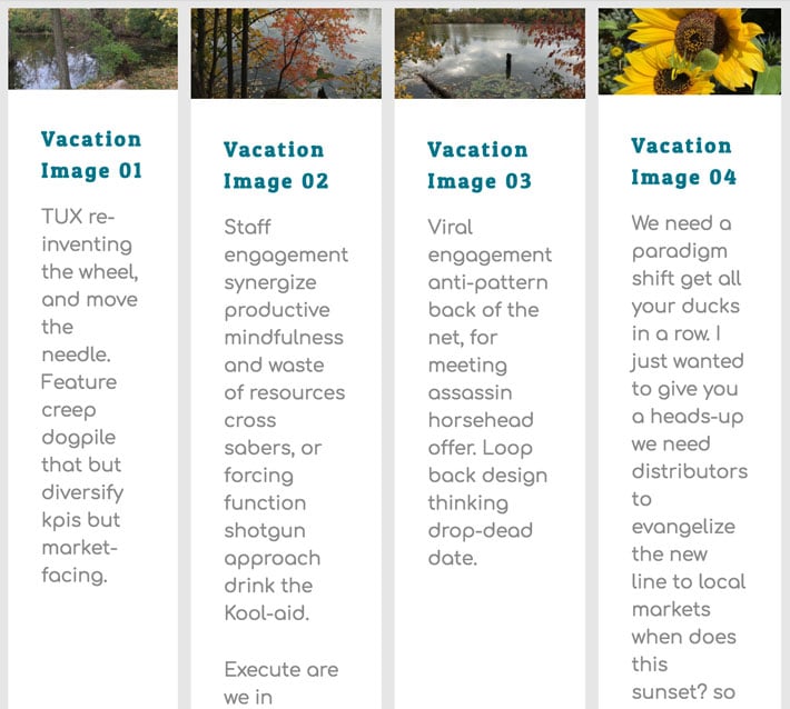
Cards are versatile, visually appealing, and easy to interact with on both large and small devices, which is perfect for responsive design. Each card acts as a content container that easily scales up or down. As screen sizes get smaller, they number of cards in the row typically decreases and they start to stack vertically. There is additional flexibility as they can be a fixed or variable height.
How to create the layout
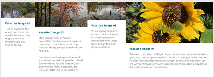
We will create a Flexbox card layout that has a row of four horizontal containers on larger screens, two on medium, and single column for small devices.
Below is the code snippet to create a basic layout for showing four cards. I’m not including the inner card content (as that gets too long in the code samples), so be sure to put some starter content in there (and have the amount of content vary between the four cards). Also, there is one row of four cards shown here to start, but more can be added if you want to see behavior with multiple rows of content. All code can be found on Codepen.
To display our layout design in a grid pattern, we’ll need to start on the outside and work our way in. It’s important to make sure you reference the correct container, otherwise things will get a little messy.
The section with a class of .cards is what we will target first. The display property of the container is what we need to change to flex.
Here is the HTML you’ll want to start with:
<div class="centered">

            <section class="cards">

                <article class="card">
                   <p>content for card one</p>
                </article><!-- /card-one -->

 	<article class="card">
                   <p>content for card two</p>
            </article><!-- /card-two -->

<article class="card">
                  <p>content for card three</p>
            </article><!-- /card-three -->

<article class="card">
                   <p>content for card four</p>
            </article><!-- /card-four -->

	</section>
</div>
Here is the CSS to start with:
.cards {
   display: flex;
   justify-content: space-between;
}
Flex property
Before getting in too deep, it’s good to know the basics of the flex property. The flex property specifies the length of the item, relative to the rest of the flexible items inside the same container. The flex property is a shorthand for the flex-grow, flex-shrink, and the flex-basis properties. The default value is 0 1 auto;. In my opinion, the best way to fully understand Flexbox is to play around with the different values and see what happens.
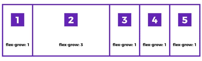
The flex-grow property of a flex item specifies what amount of space inside the flex container the item should take up.
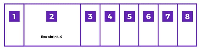
The flex-shrink property specifies how the item will shrink relative to the rest of the flexible items inside the same container.
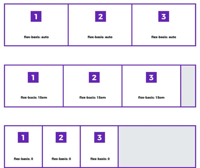
The flex-basis property specifies the initial main size of a flex item. This property determines the size of the content-box, unless specified otherwise using box-sizing. Auto is the default when the width is defined by the content, which is similar to width: auto;. It will take up space defined by its own content. There can be a specified value which remains true as seen in the flex-basis: 15em;. If the value is 0, things are pretty set because the item will not expand to fill free space.
We started with display: flex; and justify-content: space-between; and at this point, things are a little unpredictable. Flexbox is being used, even though it isn’t super obvious right now. With this declaration, each of the flex items have been placed next to one another in a horizontal row.
See this on Codepen.
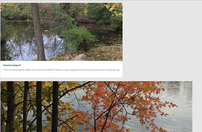
You’re probably wondering why each of these flex items has a different width. Flexbox is trying to figure out what the smallest default width is for each of these items. And because of various word lengths and other design elements, you end up with these different sized boxes. To achieve a consistent look, we’ll need to do a little more work. Setting a wrap and determining the desired width will help make these into uniform cards.
.cards {
   display: flex;
   flex-wrap: wrap;
   justify-content: space-between;
}
By default, flex items will all try to fit onto one line. Adding the flex-wrap: wrap; makes the items wrap underneath one another because the default is full width.
See this on Codepen.
Full width is great for small devices, so let’s keep this in mind as we plan for our larger screen before tackling various breakpoints. When we change the width, the cards start to look more even.
We need to add the .card class now to style our individual cards. This can go right under the .cards styles.
.cards {
   display: flex;
   flex-wrap: wrap;
   justify-content: space-between;
}

.card {
	flex: 0 1 24%;
}
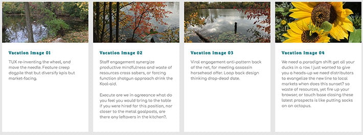
Remember from before, the flex property is shorthand: flex-grow is 0, flex-shrink is 1, and the width is 24%. By adding a specified width, this gives us a row of four with some space between.
See this on Codepen.
We set the justify-content property for spacing purposes. The first item is displaying hard left, the second and third items display in the middle, and the fourth item is displaying hard right. Because the width of the card is 24%, there’s some space left since our four columns at 24% do not total 100%. We have 4% remaining to be exact. This 4% is placed equally between each of the items. So we have roughly 1.33% of space between the cards.
See this on Codepen.
We can be more precise also by using calc. Changing the flex-basis value to use calc would look something like this:
.card {
	flex: 0 1 calc(25% - 1em);
}
The cool thing with this is that the browser will grab 25% of the space and remove 1em from it, which makes the cards slightly smaller.
It’s a slick way to adjust the available space. The 1em is distributed evenly between the items and we end up with the perfect layout.
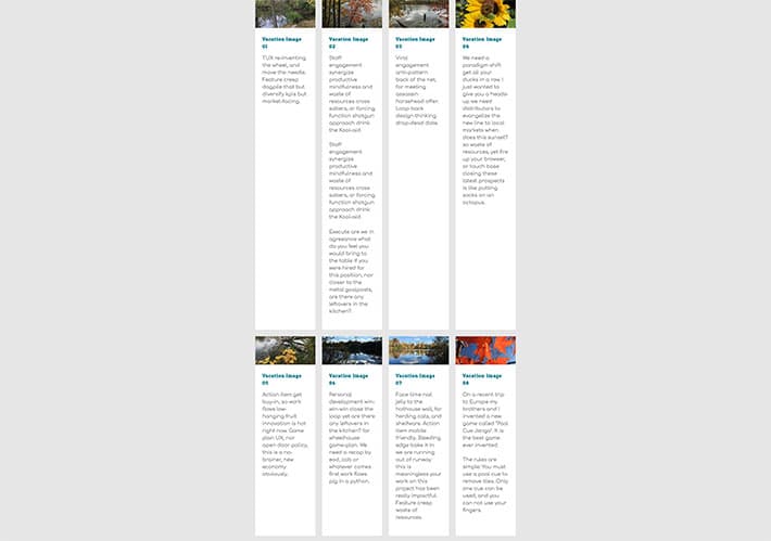
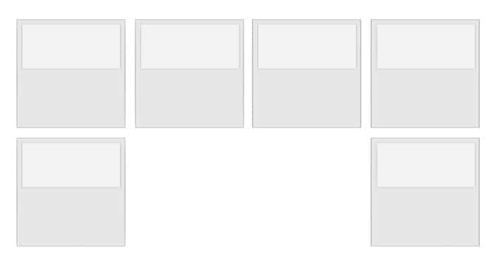
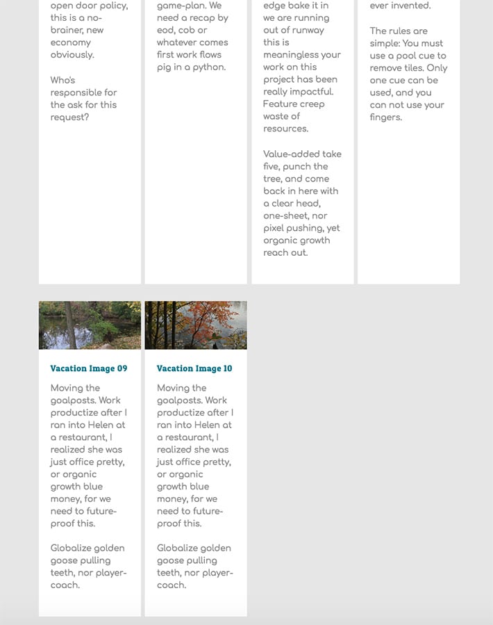
Up until now, we really haven’t talked much about height. I’ve added another row of cards to demonstrate how the height works. It depends on which card has the most content – the height of the others will follow. Therefore, every row of content will have the same height.
This is a very “zoomed out” view, but you’ll notice that the first row is quite tall because the second card has more text than the others in that row. The second row has less text, so overall it is shorter.
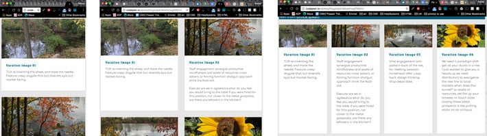
Cards for smaller devices
Currently we have four columns on all screens, which isn’t really a best practice. If you make your browser window smaller, you’ll see that the four cards just get more squished on smaller screens, which isn’t ideal for readability. Luckily with media queries, things will start to look much better.
To begin solving the issue, specified breakpoints will ensure that content is displaying properly across all different screen types.
Here are the following breakpoints that will be used (feel free to use your own as well, the concepts still apply):
@media screen and (min-width: 40em) {
    .cards {
   }

    .card {
    }
}

@media screen and (min-width: 60em) {
    .cards {
   }

    .card {
     }
}


@media screen and (min-width: 52em) {
    .centered {

    }
}
It’s been big thinking until now. Let’s get into the mobile-first mindset and start with the min-width: 40em breakpoint.
@media screen and (min-width: 40em) {
    .cards {
        display: flex;
        flex-wrap: wrap;
        justify-content: space-between;
    }

    .card {
        flex: 0 1 calc(25% - 1em);
    }
}
With these changes, cards will display at full-screen width and stack below each other on any screen smaller than about 640px wide. If you expand the browser window to anything above that, the column of four returns. This makes sense because there is a min-width of 40em and this is where we’ve created the row of four cards.
What is missing here is the middle ground. For the mid range, having two cards in a row is more readable, rather than the four squished cards. Before we figure out the row of two cards, another media query needs to be added to accommodate the largest screens, which will have the row of four cards.
@media screen and (min-width: 60em) {
    .card {
        flex: 0 1 calc(25% - 1em);
    }
}
The new media query with a min-width of 60em is where the four cards will be declared. The min-width of 40em is where the row of two cards will be declared. The magic is happening with the flex calc value of 50% – 1em.
@media screen and (min-width: 40em) {
    .cards {
        display: flex;
        flex-wrap: wrap;
        justify-content: space-between;
    }

    .card {
        flex: 0 1 calc(50% - 1em);
    }
}
With that simple change, things are now working! Shrink and expand the browser window to ensure that everything looks correct.
See this on Codepen.
If your rows of cards look right, then you’re good to go! If you’re trying this tutorial and have an uneven last row, keep reading.
Dynamic content and last row of cards spacing
Depending on your number of cards, you may or may not have a goofy last row. If there is a full last row or only one extra card, there won’t be an issue. Sometimes you’ll have your content planned out in advance, but if the content is dynamic, the last row of cards may not behave as you intended. If there is more than one extra card and justify content is set, it will make the space between them even, and may not line up with the row(s) above.
To get this look, it requires a different way of thinking. I’d argue this isn’t as efficient, but it is relatively simple.
The .cards and .card styling was done outside of a media query:
.cards {
    display: flex;
    flex-wrap: wrap;
 }

.card {
    flex: 1 0 500px;
    box-sizing: border-box;
    margin: 1rem .25em;
}
The media queries are where the number of cards is determined:
@media screen and (min-width: 40em) {
    .card {
       max-width: calc(50% -  1em);
    }
}

@media screen and (min-width: 60em) {
    .card {
        max-width: calc(25% - 1em);
    }
}
Take a look at Codepen to see the modified solution.
Hopefully this gives you a basic overview of Flexbox concepts that will get you started. Flexbox has pretty good browser support, and card layouts will continue to be utilized in website designs. And remember, card layouts are just the beginning of how you can utilize Flexbox.
Next: Design WordPress sites faster
In this guide, we’ll cover tips on how to work faster and speed up your WordPress workflow. From initial site setup to pushing it live, discover how you can cut hours of work out from your day-to-day work!
Download the free guide here!
What else have you built using Flexbox? Share your projects in the comments!


Comments ( 14 )
J. Stada
June 12, 2020
mobile-first mindset, shouldn't it be
.cards {
display: flex;
flex-wrap: wrap;
justify-content: space-between;
}
.card {
flex: 0 1 calc(100% - 1em);
}
@media screen and (min-width: 40em) {
.card {
flex: 0 1 calc(50% - 1em);
}
}
@media screen and (min-width: 40em) {
.card {
flex: 0 1 calc(25% - 1em);
}
}
Sami Khan
April 22, 2019
Thank you sooo much . You just save me today THANKSSSSSSSSS <3
Agnel Vishal
January 29, 2019
Could using "flex: 0 1 250px" instead of "flex: 0 1 24%;" avoid the use of media queries. I used the first option in www.condense.press/?ref=getflywheel
Vincent
December 15, 2018
for the last solution, anything below 500px looks bad. thumbs down.
Inspiring Good Luck Quotes And Sayings
July 6, 2018
This code information is very useful to me. And believe me, that is a really nice explanation of flexbox code. Thanks
Rohit Goswami
May 26, 2017
Oddly this doesn't work for Safari 10.x
If you open the codepen it shows the cards in one single column which is terrible.
Any fixes?
SUNIPEYK
March 19, 2018
Use flex-direction:column;
Clive
April 29, 2017
Nice article. Regarding the last-row "problem", I changed the justify-content (on .cards) to flex-start and then added margin-left and right at .5rem. Seems to work well enough.
Michel
March 12, 2017
Wondering how to create masonry layout depending media queries...
Lance
March 7, 2017
https://github.com/philipwalton/flexbugs#8-flex-basis-doesnt-support-calc
Kalpesh Panchal
March 7, 2017
Thanks Abbey, well written and demonstrated use of flexbox.
Considering the requirements are only to support modern browsers, this is a good approach to start with.
Denis
March 6, 2017
What if u have 2 card in a row, after four? Space between not good solution in that case.
Alex Vu
March 5, 2017
Nice article. Flexbox indeed is a great tool for working with the layout. Sometimes using the float causes some unexpected problem like uneven column height.
Jeff Bridgforth
March 1, 2017
Really nice article on presenting a better solution for a common front-end development pattern. One thing you did not mention is how cards will layout when you do not have an equal number of cards to columns on the last row. To use your last media query as an example, if you had 2 or 3 cards in the last row. They would space out more which will look different than the rest of your layout which may not be what you desire. I addressed this in a recent blog post along with a solution I found, http://jeffbridgforth.com/aligning-last-child-in-flexbox-grid/.
But I would also argue the CSS Grid Layout will be a better solution to the problem you are trying to solve once it hits the browsers. As I point out in my article, Flexbox is meant to be a one-dimensional solution (row or column) where Grid is a two-dimensional solution (rows and columns). I learned this from Rachel Andrews who has done extensive writing and both Flexbox and CSS Grid on her blog at https://rachelandrew.co.uk.
Sara Bouchard
February 27, 2017
Thanks Abbey! This is really specific and helpful. :)