
Design
Bringing nostalgia up to speed: How Simon Walker created Pizza Hut’s new lettering

Custom fonts and lettering have been on the rise as the demand for unique brand storytelling pushes our creative ceilings higher and higher. This is a spotlight on how one creative, Simon Walker, brought a legendary emblem to life through custom typography.
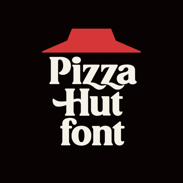
Across the world, people know Pizza Hut for their tasty ‘zas which have been a favorite comfort meal in the states and around the world for decades. Pizza Hut’s legendary 1960’s logo made it’s official modern debut in the form of a custom font created by English Graphic Designer Simon Walker and GSD&M for the pizza giant.
So how did he turn seven letters from an old logo into full-fledged alphabet characters? Well, we (virtually) sat down with Simon to chat about the project details! Here’s what he had to say.
What’s your relationship with GSD&M? Why were you brought into the project?
From what I understand, GSD&M’s first step had been to convince Pizza Hut to re-embrace and reintroduce their old, beloved logo from the 60s. I doubt it was a difficult thing to do. People obviously have so much love for it. And nostalgia is everything to us as a culture right now. Brilliant move anyway. I’m not certain how the conversation then moved to fonts, but it just seems like such a logical next step — so doable and so useful for a client with the history and the DNA and the resources to do it.
I actually worked at GSD&M for 12 years before quitting to go full-time freelance, so our relationship is grounded in that combined history. And when the potential for a new font job finally seemed like a reality, my good friend and GSD&M’s Design Director, Marc Ferrino, reached right out to me.
I haven’t had a client specifically reach out to create a font based on a logo just yet, but I have had some experience with that general concept with another old client of mine, Austin Eastciders. What started out as some lettering on a can for their flagship cider back in 2012 turned quickly into a fully-formed font, which they continue to use on their brand materials to this day.
What’s it like creating a custom font? Can you walk us through your creative process from start to finish?

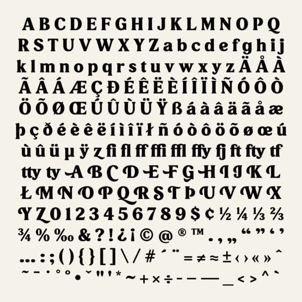
Since I needed to build out an entire font based on what was available to me — specifically the letters P, i, z, a, H, u, and t — the first step was to re-draw those as carefully as possible, and then extrapolate what I could from there to build out the rest. And actually, there were some really good clues in there to inform most of the rest of the alphabet: P informed B and R; i set the stage for j and l; the ball terminal on the a informed f, j, and r; u became h, n, m, etc. At that point it became kind of like a puzzle, just like any other font I’ve created. Which is when you put some music on and just zen out and let it kind of build itself.
Something that’s really interesting about this font is that it feels like a display font, but works fine in larger bodies of text. Could you elaborate on if you thought anything about that, or if that was just the nature of the original?
I think it was just the nature of the original logo, for sure. All of my thinking pushed toward one question: if this logo came from an existing font, with all of its own rules in place, what exactly would that look like? Which meant sometimes it dictated solutions I myself might not have preferred, but that needed to be observed anyway in order to make it all cohesive. And there were some differences of opinions with the rest of the team over a few minor details, but overall it all went pretty smoothly. And the intention was always to make it a headline font, so yeah, it needed to look good in that respect.
How did you manage to keep weight and visual density consistency across all the letters?
It’s really just about following the general rules of font-building and applying them as you build each character. When I’m designing my own fonts, the rules can be a lot more fluid. If I build a character I love, but it makes building two or three other characters difficult because the rules don’t work the same for them, I’ll more than likely go back and change the original character until everything works together well. In this case, I had the old Pizza Hut logo to work from, which dictated its own set of rules to be applied across the whole font. It presented a few challenges for sure, but at the end of the day the font as a whole was built by that old logo and not by me.
How did you handle the kern tables for forms with so many swashes?
I actually don’t edit my own fonts. I build everything out in Illustrator and hand them off to a programmer who handles all that stuff for me. This drives some type designers nuts, and I understand that, I truly do. But for me personally they’re two completely different skill-sets —my brain just doesn’t easily jump from one to the other. I’ve tried, and I just don’t enjoy it. But font-editing is absolutely an art form on its own — I have nothing but awe and respect for what those guys do, and I learn so much from the ones I work with about what makes a good font work.
What were some of the biggest challenges to this project?

There honestly weren’t too many. Initially, I think the client had been expecting to maybe see two or three different directions for the font, but my argument at the outset was that there was really only one direction, and it was already in front of us. So when I finally had a first draft ready, everybody pretty much agreed, “That’s the font.” After that it was off to the races.
How do you stay inspired?
By keeping my eyes open, and by working hard at it every day (except weekends — I’m not a workaholic!).
You’ve built an entire career solely from being an incredible letterist. What’s a piece of advice you’d give to creatives that want to be successful in a very specific niche?
First of all, thank you! That’s very kind. I think everybody’s path to success is different. For me, and for many others, it was time. I had a moderate amount of success early on, but to get to where I am today has literally taken years. And I say that like I’ve arrived — I haven’t. There’s so much left to be done, and I’m learning new things constantly. I would hate for anyone to think that because I’ve had some success here that I feel like I’ve got it all figured out. I don’t. I’m sure there are dozens of type designers out there far better than me that would love to agree with me and tell me the same. But that’s okay. All part of the journey.
So the best piece of advice I can give is to work hard at it, and be patient with the process. And allow yourself to be drawn naturally toward your own niche – don’t try and force it.
And finally, we need to know, how many pizzas were consumed in the making of this process?
More than not enough and less than too much.
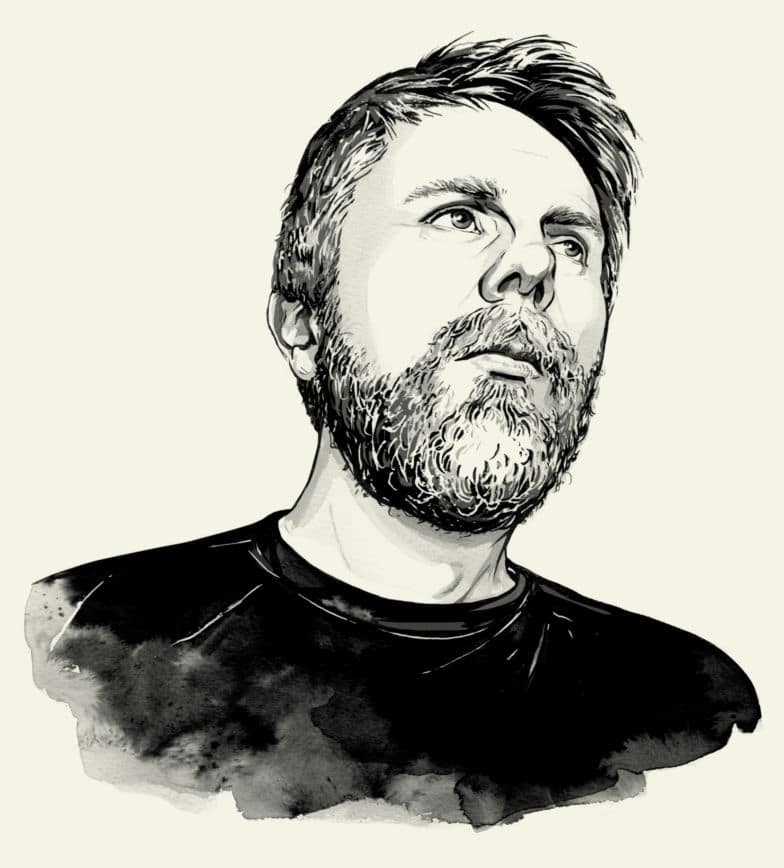
Based in Chicago, Simon Walker is a custom lettering artist and has worked with Apple Music, Nickelodeon, ESPN, Pepsi, Nike, and Target to name a few brands. See more of his work here and his Twitter here.
Conclusion
There you have it — inspiration and a starting point for you to create your own custom font and lettering. Away with the days where you spent hours fussing around with font pairings because you can make your own thanks to a little push from lettering specialist Simon Walker.
So grab a pizza, pen, and paper, and challenge yourself to push your brand storytelling through its creative ceiling with custom font designs!
Contributor


Comments ( 0 )