


How To Create SVG Animations With CSS
Web animation is all the rage these days, and there’s no limit to what you can design with SVGs. If you’re ready to try it out on your own site, knowing basic animation concepts will help you build out more complex designs. SVGs are great for animation on the web because they’re scalable and resolution independent (meaning they can be scaled without losing quality), unlike JPEGs and PNG files. They are also easy to style because you can use CSS, filters, and interactivity to enhance SVGs.
Before we dive into the tutorial, you should be familiar with CSS transitions and transforms. Some of the same concepts will be used with SVGs.
SVG basics
SVG, or Scalable Vector Graphics, use an XML-based text format to describe how the image should appear. SVGs are text files with a bunch of XML inside. If you open one with a code editor, you’ll see what we mean. The reason SVGs can be scaled to different sizes without losing quality is because text is used to describe the graphic.
Visual information in an SVG file is calculated and rendered by the browser or whatever graphics software you are using to modify it. They aren’t as complex as a JPG or other image file formats, which allows them to be designed and edited manually in a text editor, if you choose to do so. They can be altered and styled with CSS, making them awesome to design with on the web.
Browser support for SVG graphics is pretty universal; IE8 may give some issues, but modern browsers handle SVGs wonderfully. There may be minor bugs here or there, but typically it is smooth sailing.
How to create an SVG graphic
Adobe Illustrator is one program of choice when creating SVGs. In all reality, they can be created from scratch since it’s all XML, but it’s probably easier to use a design program, especially for more complex SVGs.
Tips when designing in Adobe Illustrator
Like with any other Adobe Illustrator project, the bounding box is where the illustration is created, so it’s important to make sure everything is contained. The best way to do that is to select the artwork you want to have in your SVG and then go to Object > Artboards > Fit to Artwork Bounds.
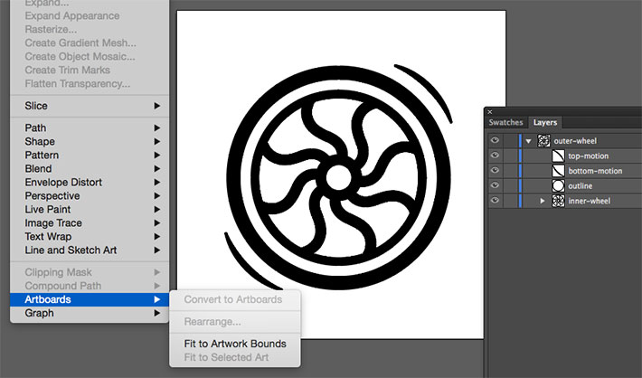
This is a very important step. There have been a few occasions where we have not done this, and the image looked very small on the site because of the extra white space. Making everything fit perfectly in bounds solved the problem.
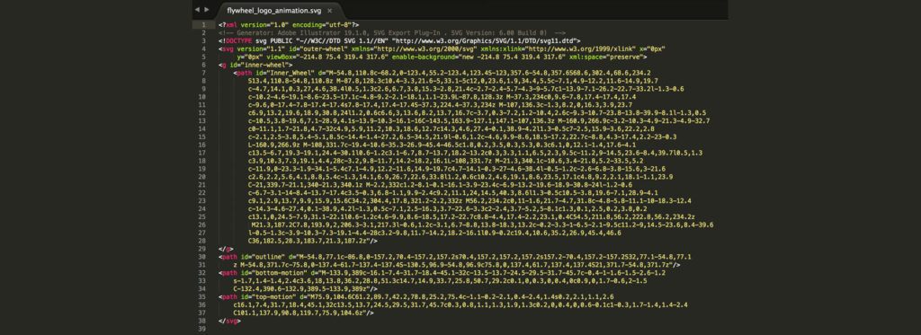
It may not be the most fun thing to do when you are in design mode, but being mindful and consistent with naming of layers will help you when you are doing future animation work with the graphic. “Layer One, Layer Two” will make it hard to remember what layers contained what part of the graphic. The reason for this is that Illustrator will use these names to generate the IDs in the SVG code.
Layer groups are awesome, especially for more complex graphics. They’re also used to create groups in SVG files. When you’re working with them, we highly recommend making sure the layer groups contain only related shapes, to keep your file clean and easy to edit later on.
In this file, you’ll see the outer part of the wheel is named “outer-wheel” and the inner part has a name of “inner-wheel.” It’s basic, but it works.
This is optional, but running it through a CSS optimizer is helpful. There’s a good chance that you can reduce the file size by doing this. One great option is SVG Optimizer by Peter Collingridge. SVG OMG is also an option worth looking into.
Exporting an SVG graphic in Adobe Illustrator
Now that you have your final SVG image, it needs to be exported so that it can be used on the web. Go to File > Save As > SVG. You may also go to File, Export, .SVG, depending on which version of Illustrator you are using. This will be saved as flyweel_wheel.
Once you do this, there will be a dialog box with a few options (if you don’t see all of the following, go to “More Options”):
Profile: SVG 1.1
Type: This controls how you want to handle any fonts in your design and embeds fonts as SVG. We don’t have any, so we’ll leave this set as SVG.
Subsetting: This option embeds character details into the SVG file when needed. This allows the file to display fonts which may not be present on the user’s system. It’s possible to only include the glyph(s) used in the SVG (which reduces file size) when “Only Glyphs Used” (if you use a special font for your artwork) is selected.
Image Location: This controls the information that can be stored for the rasterized image data inside the SVG file as a data URI with the “Embedded” option. (Not super relevant in this case, but this allows for a link or embedded images, which would increase file size.)
CSS Properties: Presentation attributes allow for CSS styles to be put right in the SVG if needed. Depending on your use case, this may or may not be optimal. Presentation Attributes specifies things like fill: blue; rather than what is seen traditionally with inline styles: style="fill: blue;". Presentation attributes are typically easier to override in CSS.
More Advanced Options: This group of checkboxes allows you to change a variety of settings, including how many decimal places you go to in the various numbers. One should be sufficient here. The advanced options are mostly necessary if there is a lot of text involved in your file. The option to output fewer <tspan> elements can dramatically reduce the size of your exported SVG.
In some cases, text might be drawn along a custom path. With the “Use <textPath> element for Text on path” option, it is exported as text on a path. The “Responsive” option is also important. If it is not checked, the SVG file will have a hard-coded width and height.
How to animate SVGs with CSS
Now that there is an actual SVG to work with, we can create a simple animation to see how this all works. The CSS transform property and translate method will help the wheel move. Animating with CSS is awesome because there aren’t any plugins or libraries that need to be installed; all you need is HTML and CSS to get started.
SVGs can be animated the same way that HTML elements can, using CSS keyframes and animation properties or using CSS transitions. More complex animations usually have some kind of transformation applied — a translation, rotation, scaling, or skewing.
Basic animation
The following is a simple animation that makes the wheel grow on hover:
svg {
   height: 20%;
   width: 20%;
   fill: #50c6db;
}
svg:hover {
   transform: scale(1.25);
   transition-duration: 1.5s;
}

Spinning wheel animation
Here’s where the hard work in Adobe Illustrator pays off. The effort of effectively naming the layers will be put to good use. With the outer and inner layer groups, animation can be controlled and customized, which is a huge advantage over animating raster graphics.
The wheel SVG will function as a loading spinner graphic. The outer wheel will spin and the inner will grow slightly as the color moves from light to dark.
SVG elements are pretty predictable, for the most part, but there are some positioning things that may be slightly more tricky. If you’re used to other HTML elements, they respond to transform and transform-origin in the same. One thing to note is that they don’t follow the box model, meaning margin, border, padding, etc. This makes positioning and transforming these elements slightly more challenging.
Transform-origin basics
The transform-origin property is used to change the position of the origin of transformation of an element. The transform origin of an HTML element is at (50%, 50%), which is the element’s center.
An SVG element’s transform origin is positioned at the (0, 0) point, which is the top-left corner of the canvas.
How does the SVG element rotate around its own center? An adjustment is needed with the the transform-origin property. This can be set using either a percentage value or an absolute value (pixels, ems, or rems). This value will be set relative to the element’s bounding box.
If we were to set the transform origin of the <rect> to the center using percentage values, it would be done like this:
rect {
  transform-origin: 50% 50%;
}
Making the wheel
First, getting the rotation keyframes set up is key. This will be a spinner graphic, so full rotation is needed. There will also be a fade-in effect applied as well. This example can be found on Codepen.
@keyframes spin {
    from {transform:rotate(0deg);}
    to {transform:rotate(360deg);}
}
@keyframes fadeIn {
    0% {
        opacity: .35;
    }
    50% {
        opacity: .5;
    }
    75% {
        opacity: .75;
    }
    100% {
        opacity: .25;
    }
}
Next, it’s important to create an SVG wrapper.
.svg-container {
  height:100%;
  width:100%;
  max-height:15cm;
  max-width:15cm;
  margin: 0 auto;
}
General SVG styles were created and this is where the transform-origin is specified.
svg {
  top: 50%;
  left: 50%;
  position: absolute;
  max-height:15cm;
  max-width:15cm;
  width: 20%;
  height: 20%;
  fill: #50c6db;
  transform: translate(50%, 50%);
}
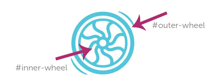
This is where the layer naming becomes very helpful. The spinning animation is applied to whole SVG graphic because it was specified on #outer-wheel, but the inner wheel has a fading effect that was only meant for that inner part of the graphic. By targeting only the #inner-wheel, the fade in animation was applied.
#outer-wheel {
  animation: spin 4s infinite linear;
}
#inner-wheel {
  animation: fadeIn 2s infinite linear;
}

Hopefully this gives you a good introduction to SVGs and basic animation techniques. As you use them more, these basic ideas will help you create more complex animations.
To make sure all your animations load quickly when users visit your site, check our WP Engine’s high-quality WordPress hosting solutions!