


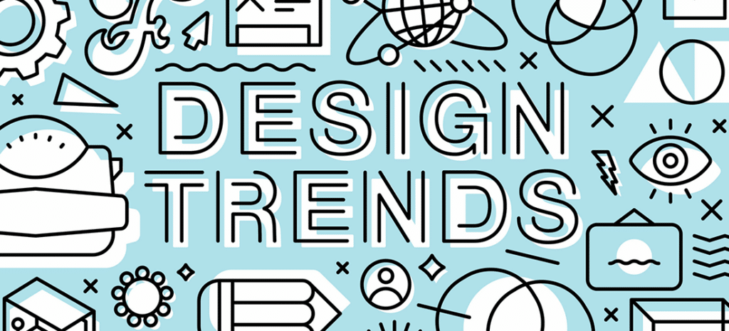
13 Web Design Trends for 2020
There are so many web design trends this year that it’s hard to know what exactly is a trend and what’s just a common topic in the design world. WordPress industry leader and art director, Nicholas Petersen, thinks keeping up with current graphic design trends is a must. “It’s helpful to be aware of the trends that are happening in the design community to really grow your own skills as a designer.”
In this article, we’ll cover what the top 13 web design trends are, why you should care about them, and more thought-provoking pieces of advice from other leading designers in the industry.
Here are the top 13 web design trends for 2020:
- Abstract illustration
- Geometric design
- Minimalism
- 3D
- Accessibility
- Preference setting
- Immersive experiences
- Dark mode
- Vibrant color schemes
- Isometric design
- Custom typography
- Simplified illustration
- Photography with graphics
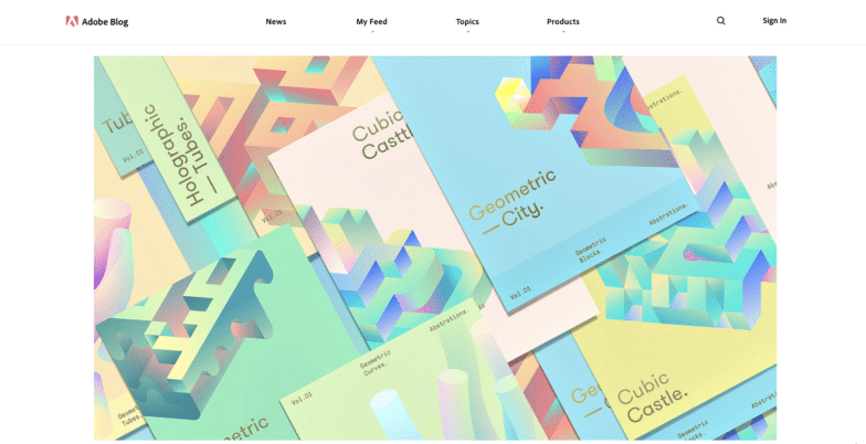
Abstract Illustration
Abstract illustration is the perfect balance between art and design. This is a growing trend because the bright colors and abstract shapes, lines, and images create a design unlike any other.
Geometric Design
Geometric web design is another trend that’s emerged this year. Geometric design features plain geometric shapes and while it may look very simple, there’s a lot of thought and intentionality behind it. It takes a specific kind of web designer to take simple geometric shapes like circles and squares, and transform them into a story.
Minimalism
If you love geometric design, you’ll love this trend: Minimalism. Minimalist design is design that’s straight to the point and clean. In a crowded world filled with loud and bright colors, minimalist websites have become the beacon in web design.
Minimalist website design is also growing in popularity because it creates a seamless user experience for visitors to navigate sites.
Zac Moore, a designer from Georgia believes minimalist graphic design has been a trend that graphic designers could see coming. “Design has followed the minimalistic path the past few years; running faster toward a clean user experience and a lack of clutter. I think designers that are just now picking up the minimal approach are doing so to follow the already popular trend and it’s only going to become more and more popular as time goes on.”
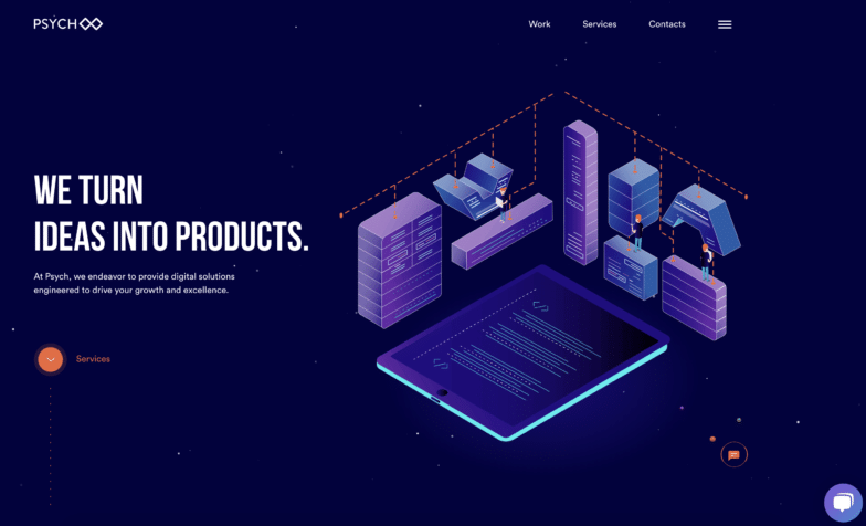
3D
3D graphic design has also made its way as a top design trend. Many graphic designers have started layering different typography, images, and abstract shapes to create this wild, unique 3D effect. This combined with vibrant colors creates an interesting design that feels like it’s come to life.
Accessibility
Accessibility is a conversation many web designers have been having recently, but it’s more important than ever before to consider and include it in every aspect of design.
David from Calibrate Media feels strongly that accessibility has become an important part of web design. “It is quickly becoming a standard for major companies. As more people from all age groups and backgrounds are using the internet for day-to-day life, it is important to cater to their access needs. In some countries, such as Israel, it is now part of the law.
In addition to accessibility, GDPR compliance is another must in today’s digital landscape. “Aside from the legal reasons, more and more users are becoming concerned about their privacy rights when browsing the web. Implementing a well-designed and well-written cookie notice (as well as implementing GDPR standards) will build a sense of trust and security with your website visitors.”
Preference Settings for Users
Preference setting in this day and age means it’s now possible to tap into the user’s software preferences (such as minimizing motion!) on the web. Let’s say a user doesn’t want motion on their system preferences on their Mac. A web designer could take that setting and adjust the experience altogether. A few solutions would be removing a parallax effect or a zooming effect on hover. This way the customer controls the experience that is best for them and allows web designers to build the best experience they can for all users.
This trend is important because it helps build web experiences that put the user first. Some users might be triggered by motion, so it’s important to have an option that can reduce that. Apple does a great job of this.
To learn more about accessibility and implementing it into your web design, click here.
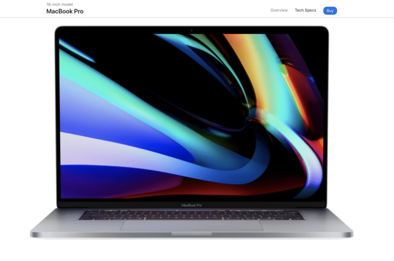
Immersive Experiences
Immersive experience and graphic design is another trend that many saw coming. In a world where people are valuing what their experience is with a brand, company, or product more and more, it’s no surprise that web designers are using augmented reality, otherwise known as AR to enhance those immersive experiences.
Christel from Kwitelle was one creative that saw immersive graphic design coming from a mile away, “You can just feel it in the air.”
Web designers are thinking of their design as an immersive experience, whether that means designing a WordPress site, creating a new animated logo for a brand, or anything in between.
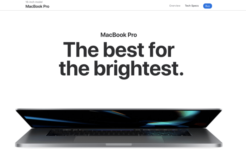
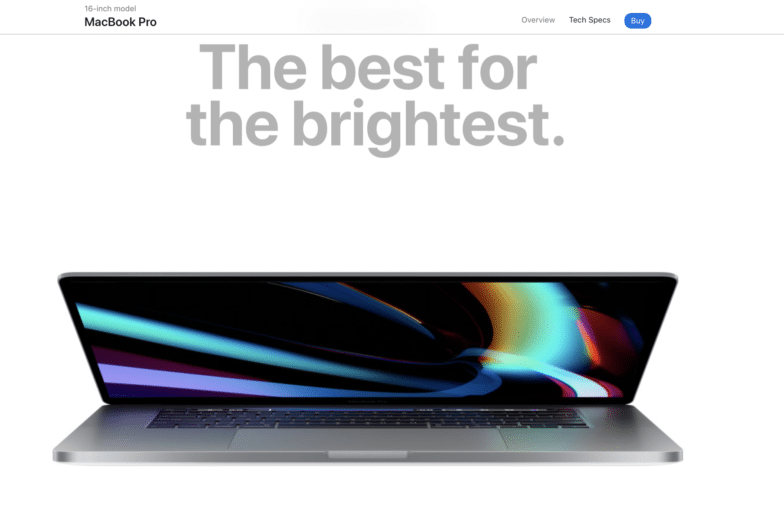
Apple, for example, makes a statement with their new products by creating immersive experiences for users searching for more information or ready to buy.
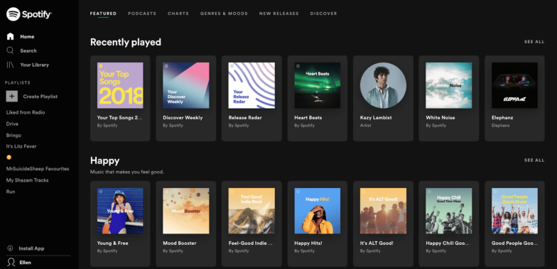
Dark mode
Dark mode is here and many web designers are loving (and dare we say, mildly obsessed with) this trend. Dark mode happens when the core part of a design is dark, oftentimes black, and the text, images, and other features are white or another pop of color. This creates a sleek and sophisticated look when done right, however it’s a fine line to balance.
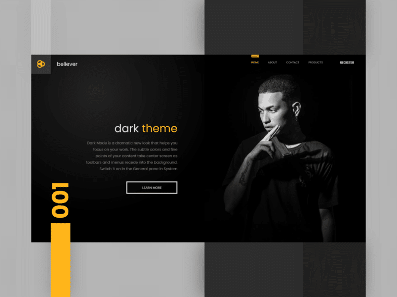
Andrew Cacho has fully embraced the dark mode trend. “It’s about balancing the tension between the need to create space on websites, while also following trends set by big tech hardware companies in their native OS. Vibrancy comes back to make splashes of personality!”
Other designers agree that mobile OS interfaces have already embraced this trend. Matt Staub from Proxima says, “with dark mode taking over mobile OS interfaces, designed experiences will follow suit. But trendy, vivid colors will punch through the darkness.”
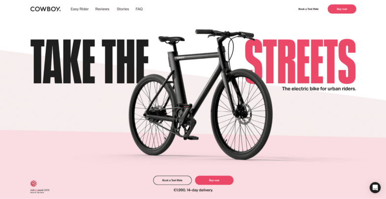
Vibrant Color Schemes
Speaking of trendy, vivid colors, let’s talk about vibrant color schemes. Web designers are embracing bold colors, often using highly saturated colors paired with dark shades that give their designs a simple, yet colorful and warm feel. Different vibrant color combinations such as neons and fluorescents are helping design stand out among the noise.
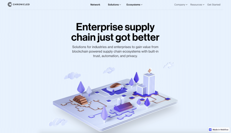
Isometric Illustration
When taking a photograph, it’s easy to understand that different perspectives and angles with a camera can create a different look, feel, and emotion. Designing isometric illustrations is a similar concept because these designs allow more perspectives of your subject. As a designer, you can use isometric illustrations to see the top, side, or any angle of a design.
The isometric technique also allows you to show more even more small details with less clutter. Having the ability to show a space in 3D opens up space that was previously unavailable. There’s more space to put things in without it looking super cluttered and forced.
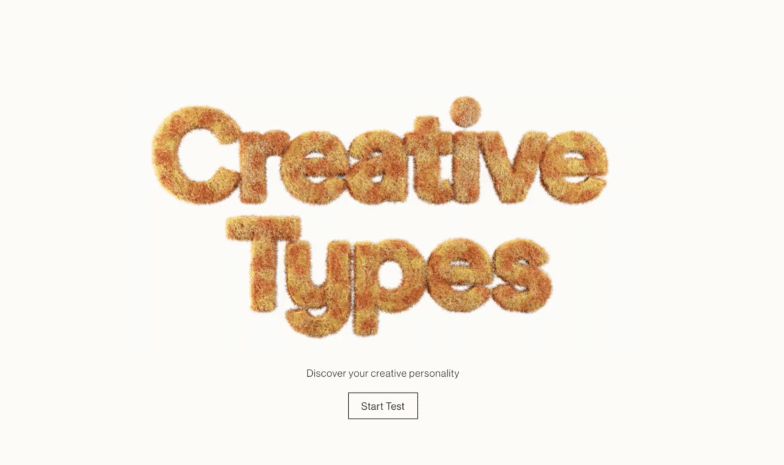
Custom Typography
To create more innovative designs, web designers are exploring new ways to show typography. The combination of different creative elements to transform text is a trend that most saw coming.
Creating a custom type is nice to do because it’s a way to personalize and manage something in your design that is usually confined to what is available in your font library.
While custom typography is one of the oldest trends in graphic design, it’s something that’s continued to evolve. It’s gone from beautiful handmade window signage to sick graphics you can find on Dribbble.
Ready to start tinkering with custom typography? Rese offers some great advice. “If you were like me and found custom-type a little daunting, go to old-type to practice and get inspired. I found just practicing and looking at old script helped me so much. Go to garage sales and vintage shops, take photos, and try to recreate what you see!”
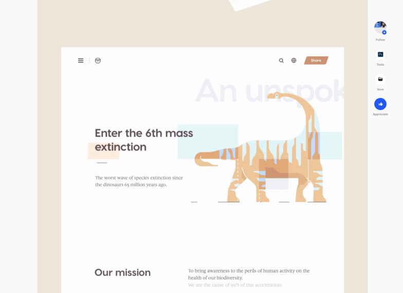
Simplified Illustrations
Simplified illustrations are a balance of two polar opposite designs. You have the generic approach, which is usually an SVG illustration with an array of people from different walks of life interacting with technology with a colorful blob of color anchoring the scene. On the other end, you have what appears to be a very loose hand-drawn illustration that is much more abstract and interpretive in its execution.
This can create a very human feeling.
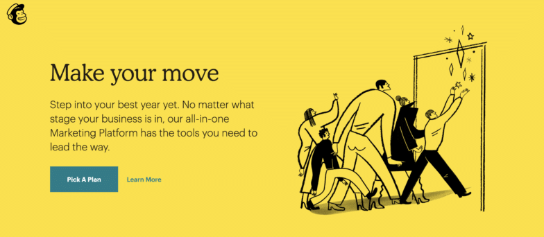
With most design trends, it’s hard to pinpoint where the original came from, whether that’s a company, brand, or specific graphic designer. However, Bryan believes that Mailchimp’s redesign in 2019 had a huge part to play in this trend. “It seems there’s a number of brands currently chasing Mailchimp’s aesthetic.”
“What I do like about this trend is that it has a lot of people (who would generally consider themselves first and foremost to be graphic designers) testing their mettle with illustration that would probably otherwise be intimidated by it. There have been a lot of great illustrations born out of this undertaking, and some really bad ones as well.”
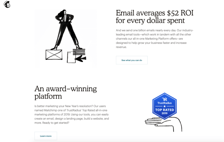
Photography with Graphics
Photography + graphics = a match made in heaven.
That might be exaggerating a bit, but both designers and photographers are adopting this trend and using it to display their own work. Capturing photos and taking them to a new level by adding animation and graphics is a trend that can bring a fun dynamic to any site.
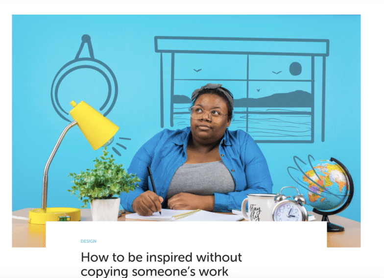
Whether it’s for our blog or reports, we love transforming images with added animation and graphics. This design is an eye-catcher and a must-include in your design work at one point or another.
Conclusion
While knowing what the design trends are and how you can implement them into your work is important, it’s also important to note that just because a style or pattern is popular doesn’t mean it will be the right solution for your problem.
One trend that will never go out of style is originality. The more you create, the more you’ll find what works for you and then get really, really good at that. Eventually, something original you make will set new trends!