


How to Use the WordPress Visualizer Charts and Graphs Plugin
Data is key to website user engagement, and charts are a great way to make sense of that data. By showing data in an easy-to-interpret format, it will be more understandable and visually appealing for your users. There are different types of charts you can use, and some types represent certain types of data better than others.
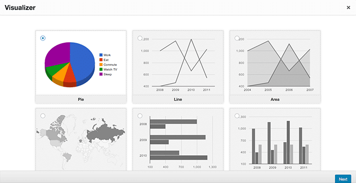
Various types of charts can be displayed on your WordPress website quite easily with the help of a great plugin called Visualizer WordPress Charts and Graphs Lite. Options include pie charts, line graphs, area charts, map charts, and much more.

With this plugin, you can even add data from a single data source to populate the charts. The charts are interactive, colorful, and look great on desktop, tablet, and mobile devices with minimal effort. Plus, the data can be updated easily to populate a new chart, instead of having to constantly update graphics when data changes.
Creating a Chart for WordPress
Before installing a new plugin, we advise you to test it first in local development environment. After you’ve set up your test environment, download and activate WordPress Charts and Graphs Lite, and then the chart building can begin!

You may notice that a Pro version also exists. We will be concentrating on the Lite version for this tutorial, but if there are additional features you’d like to use, they may be available in the Pro (paid) version.
Additional Tools You’ll Need: Excel or Google Sheets
Before getting started, it’s worth mentioning the various file options for importing chart data to your site. You can either use Microsoft Excel to save a file locally to your machine or use Google Sheets to save your data in the cloud. For the first chart example, we’ll create a local file with Excel.
Formatting Data in the CSV File
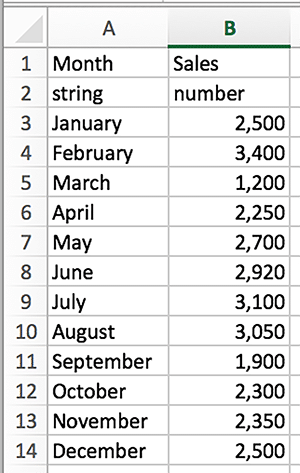
The first step is to enter the chart data in spreadsheet form. How the data is formatted is crucial for the chart data display. If it is not formatted correctly, your chart may not appear as intended or may not be visible at all. It’s important that the file has column names in the first row and the data type in the second row. Data can be entered in these types: string, number, date, time, time of day, and boolean values.
Here is an example with the correct data format. After data was entered, the file was downloaded and saved as a .csv.
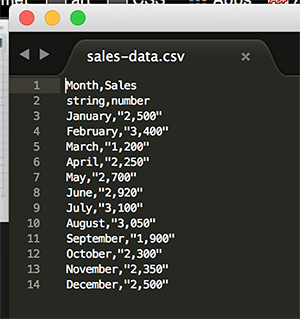
A .csv is a “Comma Separated Value” file. This allows data to be saved in a table structured format. If you open the .csv in a text editor, you will see how commas separate the values.
Create the New Chart
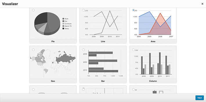
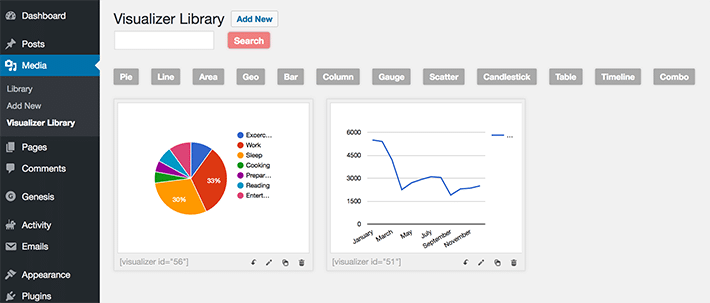
Creating new charts is done by going to Media > Visualizer Library. You’ll need to click on the “Add New” button to add your first chart. This will bring up a pop-up window on screen. There will be multiple chart types to choose from. Select the desired type and click “Next.”
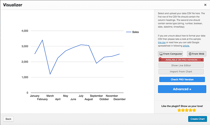
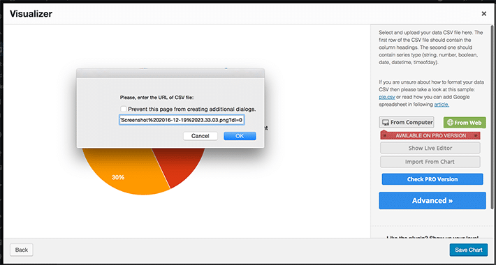
The spreadsheet is what will need to be chosen so that the accurate data displays. You’ll see “From Computer” or “From Web.” “From Computer” is used for the Excel file that was saved as a .csv file.
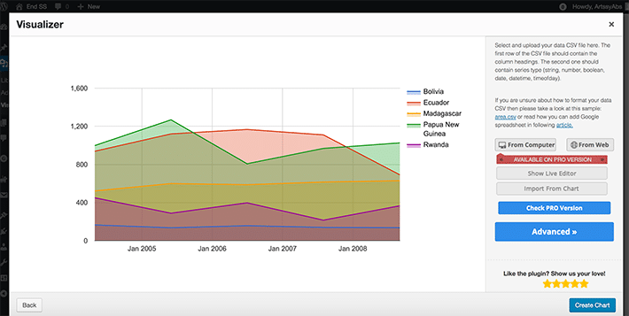
When the correct file is selected, you’ll see that the chart is populated with the correct values. Choose “Create Chart” to make it official. This new chart will now be found in the library.
Changing the Chart by Updating Data in the .csv File
Data changes all the time, so chances are the file will have to be updated from time to time. When the chart needs to be updated with new data, changing data is as simple as updating the values in the .csv file and uploading a new one. When the values have been updated, be sure to save the .csv file.
Next, go to the Visualizer Library and click the “Edit” option. Navigate until you see the option to upload the file from the computer. Click “From Computer” and then navigate to the file and choose it. The values will update and the chart reflects the updated data.
Adding the Chart to a Page (or Post)
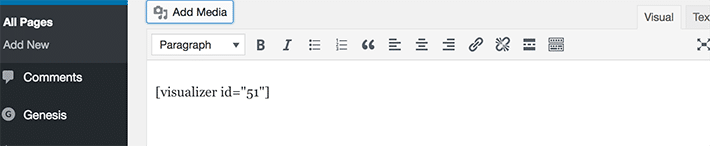
The process is very much like adding an image. Select a page or post to edit and there will be an “Add Media” button on the left. In the “Insert Media” column, there will be a Visualizations option where the active charts will be displayed.
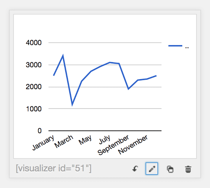
On the chart, there will be a small arrow. By selecting that, the chart will be added to the post with a shortcode. Preview and you will see how the chart looks.
Using Google Sheets to Create a Chart
Google Sheets are very popular. The cloud makes it very convenient to access spreadsheets. Many enjoy this alternative because when data is saved in this spreadsheet on Google drive, it can be added to the chart without having to export it and find it on the computer’s hard drive. It can be formatted into a .csv also, just like Excel.
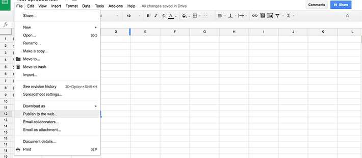
When data is in the Google Sheet, choose File > Publish to the web.
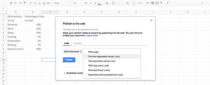
To get the proper .csv formatting choose “Comma-separated values (.csv)” from the dropdown. Then choose “Publish.”
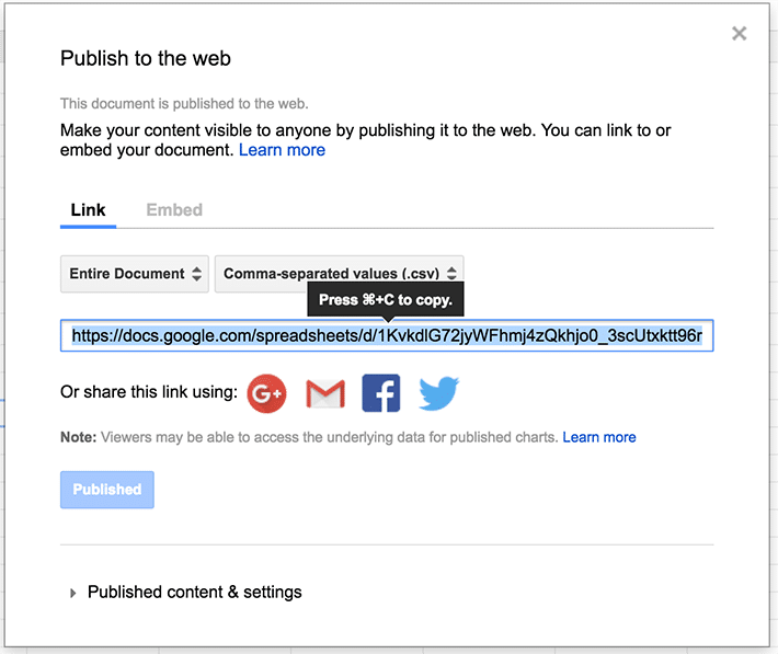
You’ll see a long URL, which is used for the chart to reference the numbers to display. Simply copy this URL and go back to the Visualizer charts.
Create a New Chart
Just like the first example, click the “Add New” button to add a new chart. Select the new chart type and choose “Next.”
Click on the “From Web” button and then paste the URL of your Google Sheets .csv file. The preview will update with the new chart data.
Click on the “Save Chart” button to save your chart.
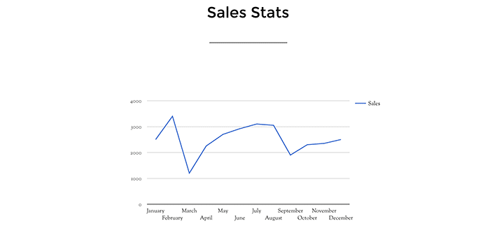
With some simple spreadsheet data, it’s easy to create a chart to display on your WordPress site. With a variety of available chart designs to choose from, they’re easily updatable, making them dynamic and accurate. This solution offers modern, legible designs that can be viewed on all devices.