
Development
What to expect with Bootstrap 4

In the last few years, Bootstrap has become very popular. There is a good chance that you have come across or created WordPress themes that incorporate Bootstrap elements. It has evolved from a basic pre-responsive framework to a robust, feature-rich, and modern responsive framework. Bootstrap 3 has been around for quite awhile, so it’s exciting to learn about what is coming next in Bootstrap 4.
State of Bootstrap 4
Bootstrap 4 is currently in the works and not quite yet ready to be used in production. Currently it’s in alpha version. This is a good opportunity to preview and become familiar with how it will help you with future projects.
The documentation for Bootstrap 4 is not complete just yet, so experimentation is a good way to test out some of the new features. Once it is officially available for production use, you will be well aware of all the great new improvements.
Built for modern browsers
As we move ahead on the web, it is getting harder and harder to support older browsers while using the latest and greatest of what web development has to offer. Whether or not this is music to your ears, we can all agree that better CSS3 techniques are made easier when working with modern browsers. Bootstrap 4 might just be the perfect way to make a clean break from older browsers. With this update, Internet Explorer 8 support is completely dropped. Keep in mind that the framework still supports Internet Explorer 9 and still supports CSS3 without many issues.
Improved Reset
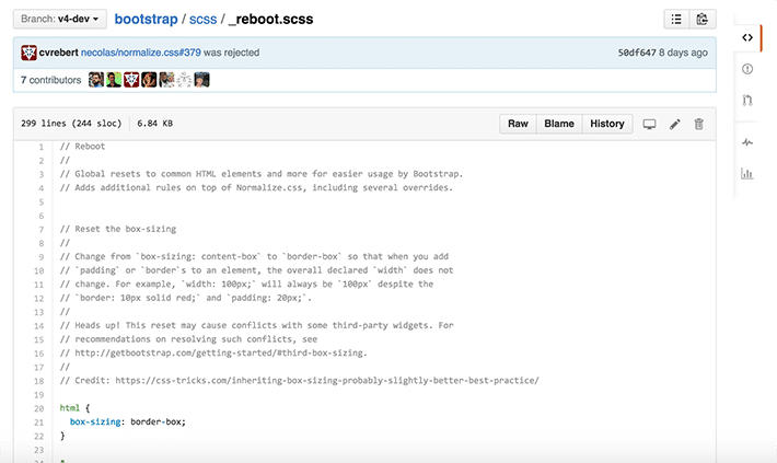
You’ve probably become accustom to Normalize.css, which is a great reset option. There is a new and improved reset with Bootstrap specific things added to it called reboot.css. Bootstrap specifics are things like the box-sizing: border, rems as the unit of measurement, link styles, and form styles. It’s a great mix between Normalize.css and specific Bootstrap needs, so you are sure to be off to a great start.
SASS
In the previous days of Bootstrap, it seemed that LESS was preferred. With industry changes and designer preferences leaning toward SASS, it is what is in current favor. If you remember back to Version 3, that is when the SASS option became available with the port option. As of right now, there isn’t planned support for LESS.
Customizations
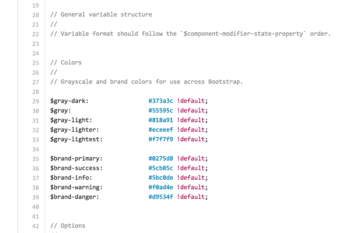
Bootstrap 4 makes it easy to create your custom designs, all done in an organized way. All variable options are consolidated into a single file. SASS can be compiled easily and there is no need for a separate style sheet, like there has been in the past.
There are quite a few new customization options in Bootstrap 4. You can see the current state here. It will most likely evolve a bit as the details continue to be released.
Keep in mind, these are easy customizations to set up in the beginning:
- Body defaults
- Color variables
- Flex box
- CSS3 design options like transitions, rounded corners, drop shadows, etc.
- Spacing measurements
- Link styles
- Grid breakpoints
- Grid containers
- Grid columns
- Typography sizing
- Components
- Tables
- More!
Flexbox anyone?
Flexbox has certainly grown in popularity and we will see more and more of web designers using this. It’s a great tool to use since it provides simple and flexible layout options with CSS styling. If you find yourself liking the ease of vertical alignment of content within a parent element, reordering content across devices and screen resolutions with the help of media queries, and appreciating an easy way to have equal height columns in your grid, Flexbox is a great solution.
Before you run off and convert all your projects, there is an important thing to mention. Even though browser support has drastically increased, Internet Explorer 9 is still lacking Flexbox support. In regards to ease of use, Bootstrap 4 makes it easy to use Flexbox if you do not need IE9 support. Essentially, all you have to do is find the _variables.scss file and change the $enable-flex from false to true. If you are familiar with SASS, this is a quick thing to do.
Grid updates
If you’ve been a long time fan of Bootstrap, you are probably an expert on how the grid system works, along with the naming convention. With Bootstrap 4, the syntax stays the same but there is a difference with the measurements used. The grid system is now based on “rems.” This is an adjustment if you are used to pixel perfect designs, as now things will be more fluid.
When parting with the pixels that we’ve become so accustom to, let’s take a look at the example of something common like the .container and .row. The container now has a max-width set in rems. A row has a default negative left and right margin of -.9375rem, while columns have default left and right padding of 0.9375rem. As you might remember, these values were previously 15px in Bootstrap 3. These new rem values are comparable to that.
Enhanced media queries
Media queries in previous versions of Bootstrap were a little general and sometimes custom ones had to be created. Here is what they looked like:
/* Extra small devices (phones, less than 768px) */
/* No media query since this is the default in Bootstrap */

/* Small devices (tablets, 768px and up) */
@media (min-width: @screen-sm-min) { ... }

/* Medium devices (desktops, 992px and up) */
@media (min-width: @screen-md-min) { ... }

/* Large devices (large desktops, 1200px and up) */
@media (min-width: @screen-lg-min) { ... }
Now, a more mobile approach can be taken with these updated media queries:
// Small devices (landscape phones, 34em and up)
@media (min-width: 34em) { ... }

// Medium devices (tablets, 48em and up)
@media (min-width: 48em) { ... }

// Large devices (desktops, 62em and up)
@media (min-width: 62em) { ... }

// Extra large devices (large desktops, 75em and up)
@media (min-width: 75em) { ... }
If you’d like something different, breakpoints are configurable in SASS if you’d like to choose your own.
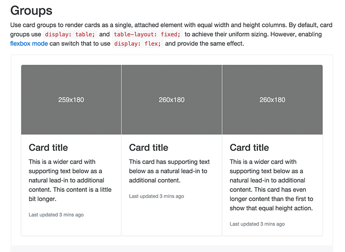
Cards as a replacement
Familiar with panels, wells, and thumbnails? Cards are now the latest and greatest, and offer some great styling options. One example is the Card Groups. Even though the amount of text varies, the cards are equal height, without depending on JavaScript. This works with both Flexbox and the default grid mode. When using Flexbox, the cards are built using Flexbox properties. The default grid uses a CSS trick to avoid the need for JavaScript. The container uses display: table; and each “card” is display: table-cell; giving it the table properties – this is where the equal column height comes from.
Typography
Remember how the grid now uses rems? Well, it only makes sense that typography would do that too! When thinking about this, remember that all font sizes are relative to the root element, the HTML tag. When you change the font-size (or any other styles) on the HTML tag, you can easily style and scale styles throughout your project.
Let’s assume your HTML element is styled with a font-size: 16px. Let’s say you wanted your h5 tags to be that size, you would declare a font-size of 1rem.
h5 {
font-size: 1rem;
}
Now, there may be some math involved moving forward. If you wanted your h1 tags to be be 40px, here’s how to figure that out:
h1 {
font-size: 2.5rem; /* 16 * 2.5 = 40px */
}
Not feeling rems just yet? You can still use pixels and ems for sizing if you’d like.
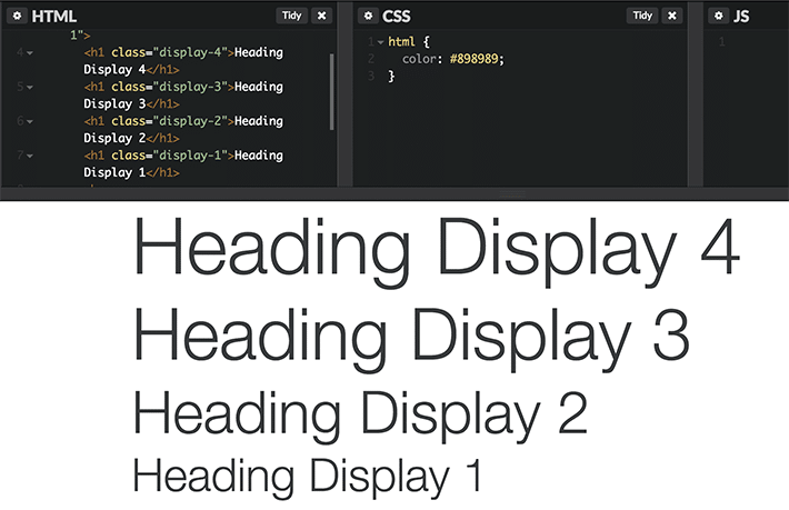
More heading styles
Headings are great for establishing hierarchy. But what if you want something more prominent than a h1, h2, h3, etc.? Well, the good news is, you can add a class of display heading to a standard heading that makes it larger. It would look something like:
<h1 class="display-4">Heading Display 4</h1>
A display-4 is larger than a display-2.
Smaller file size
Bootstrap 4 has a smaller footprint. It is actually about 30% smaller than the latest version, Bootstrap 3. It previously was around ~123kb and now is ~88kb. It’s awesome that it is smaller and still has the same great features.
Keep in mind that there is the option to only use the parts of Bootstrap that you need, which make the file sizes even smaller.
No more Glyphicons?
Glyphicons were widely used in previous versions of Bootstrap, so it is sad to see them go. Don’t worry, this isn’t the end to web icons. In its place, FontAwesome should serve you just as well. You could also check out Github’s Octigons for great icon options.
Moving to Bootstrap 4
While it is currently in alpha, there is no reason why you can’t work with it in a testing environment. The source code is available in a v4-dev branch on GitHub. As you experiment and see anything that needs attention, there is a development and tracking pull request that includes notes on the changes and any other new enhancements.
Things are in alpha, and there will eventually be beta releases after features and functionality are ready to be tested out. After beta, two release candidates will be used to test things out in production. When all goes well, the final release will be ready!
We’ve just scratched the surface here and the Bootstrap 4 conversation has just started. It’s exciting to see what the future holds and I’m getting excited to see it come out of alpha. Be sure to keep an eye on updates and download a copy to test out the new Bootstrap 4 components.


Comments ( 0 )