Development
Leveling up Flywheel’s retreat website: A developer’s tale

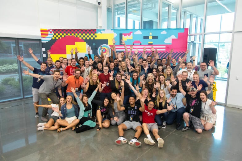
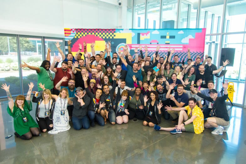
As you may know if you’ve followed Flywheel for a bit, we have a twice-yearly offsite all-company retreat that we lovingly refer to as Fly Fest. (And if I may: it’s a blast.)
As Flywheel has grown, Fly Fest has become a bigger and bigger event, with an ever-increasing number of activities, sessions, and opportunities to level up professionally and connect with our fellow Flywheelers from around the globe.
At a certain point, we realized there was a lot to keep track of – where am I supposed to be? When does it start? How do I get there? What are my choices for breakout sessions?
So, to keep anyone from being confused, or getting lost, or showing up in Las Vegas with the wrong size of shoes (if you know you know), it was decided that Fly Fest needed a dedicated website. It’s been my privilege to serve as the developer on the Fly Fest website and to share a bit about that project!
I’ll be diving into the process of creating the Fly Fest site, from start to finish:
You can follow along and view the site here.
The project requirements
It was an easy decision to build the Fly Fest website in WordPress, for lots of reasons. Obviously, Flywheel is WordPress-focused, so it’s a strong contender right off the bat. But Fly Fest also has several key internal stakeholders who need to be able to edit site on the fly (pun intended), because of possible last-minute changes to times, details, or locations.
Plus, the site has a few different types of content that need to be independently and flexibly editable and sortable. The Fest website features an overall schedule, a couple of different types of events, and an FAQ section which all need to be cohesively linked together.
Finally, the site had to work well on mobile, since it was very likely attendees would be pulling out their phones to check times, locations, and other event details throughout the day. (For this reason, we decided on a single-page layout, to keep the number of clicks and page loads to an absolute minimum.)
Given these requirements, choosing a custom WordPress site and theme, using custom post types and Advanced Custom Fields, was “not a brainer,” (to borrow founder Rick Knudtson’s phrasing).
Theme and plugins
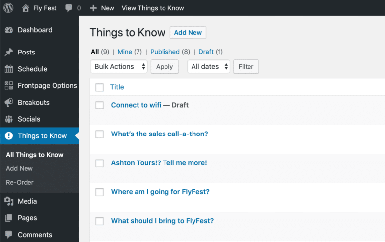
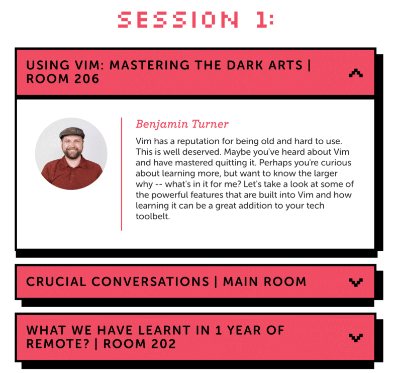
Custom post types created for the site included Schedule items (which populate the event schedule with times, places, etc.); Breakouts (for each of the breakout sessions); Socials (for all the extracurriculars); and Things to Know, which round out the FAQ section on the site.
Though there are plugins available for easy creation of custom post types (or CPTs), to keep things slim, I chose to code the CPTs directly into the site’s theme – which, incidentally, we decided to custom-build from scratch, given that the site is little more than a splash page. That meant not many template files were needed, so a child theme or even a starter theme probably would’ve been overkill. In fact, the final version of the theme only ended up using five basic template files total: one each for the footer and header; a functions file, naturally; the front-page template file, and of course, the index file just for a fallback. (Plus, there’s not much I enjoy more than a green field.)
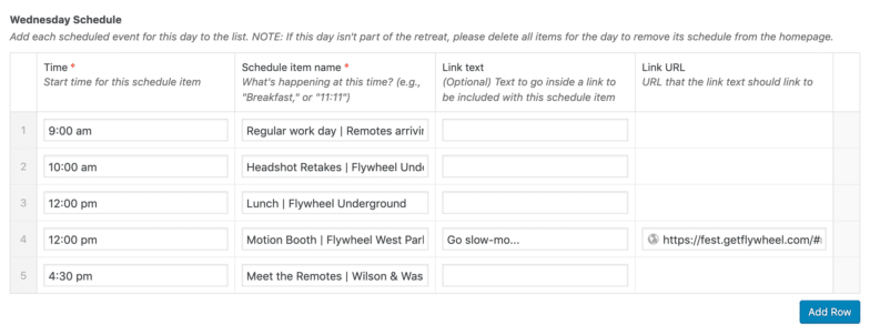
Shifting to plugins: as you already know if you’ve ever worked with Advanced Custom Fields (and if you haven’t, you’re missing out!), the plugin makes the editing experience immensely smoother and easier for site admins. Each custom post type has its own unique and simple set of custom fields to fill out, and directions to follow to make updating the site a breeze for anyone. Plus, an overall admin options page was created with ACF (one of my favorite features of the Pro version of the plugin).
Other than Advanced Custom Fields, the only plugins we opted to use were Post Types Order (to allow content editors to drag-and-drop things like the FAQs to reorder them as needed, rather than have them sorted by date); and my personal favorite image compression plugin, Compress JPEG & PNG images by TinyPNG (a must when users will be uploading their own images from who-knows-where). That’s it!
Bringing the brand to life
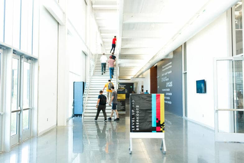
Enough with the technical stuff. This year, the theme of Fly Fest was “Level Up.” Our stellar designers devised a brand-new (pun once again intended) branded look and feel for the event, referencing that theme in a nod to retro ’80s video games. The vibrant brand enlivened every aspect of the retreat, from the swag to the signage and environmental design.

The site was naturally designed to capture that same whimsical feel, down to the pixelated font. I have our phenomenal designers Bryan and Rese to thank for the look and layout; I did my best to faithfully recreate their gorgeous high-res mockups. But their work was so good it inspired me to push even further as the site developer, to see what other opportunities there might be to bring even further life to the vision.
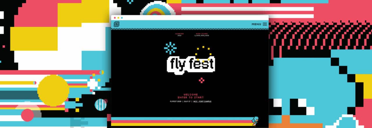
First off: we collaborated on ways to make the initial view of the site look like the splash screen of an arcade game, and I couldn’t be happier with the result (see it below!). The designers provided me with an animation of 8-bit fireworks over the Fly Fest logo, as well as one of our Fest mascot (dubbed “Fly Kid”). I added some motion and a longer colorful trail to Fly Kid using CSS keyframes, just to add a bit of (pun still intended) character. Watch long enough and Fly Kid turns around and runs back the other way, which seemed to feel very arcade-like to me.
The final touch was making the “Enter to start” text flash, to give the whole splash screen that sweet retro vibe, as though you’d just walked up to an arcade cabinet with a fist full of quarters when you land on the site:
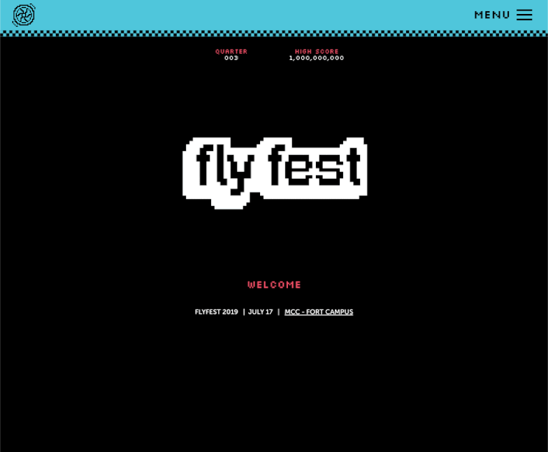
Animation lends an arcade-like feel to the top section of the Fly Fest website
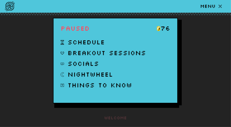
Obviously, for any website, navigation is important. That’s especially true here, where Flywheelers might be hopping onto the site at any moment to check up on key details of the event in progress.
To both achieve that goal and push the inspiration even further, I decided to make the nav menu look and behave like a video game pause screen; hit the hamburger menu icon in the nav bar, and you’ll hear a familiar sound effect as the “pause” screen (i.e., the nav menu) opens up over the site:
I could go on much longer about the myriad little flourishes that brought the brand to life, but I especially want to call out the designers’ work on the custom cursors and the animated assets and icons all around the site; the stars twinkle, the spaceships soar, and the waves…uh, wave, I guess!
I’m also proud of the “color flood” game near the bottom of the page, which – fun fact – is an embedded CodePen I built in React a while back, adapted to the site’s brand. We felt that having an actual game in the site helped to take the whole experience to the next level. (You know what? Let’s just say all the puns are intended.)
Technical challenges
I’m always up for finding creative ways to solve problems in code, and this site provided some interesting opportunities.
One of my favorite bits of the design was these accordion button components. They’d start as boxes (to give users an easy overview of content), but could be touched/clicked to reveal more info:
The challenge these accordion elements presented was in the thick bottom/right shadow. CSS doesn’t have any way to generate borders like that (let alone in a way that would work whether the accordion was collapsed or expanded), so I had to get a little creative.
The solution was in the realization that CSS allows you to set multiple box-shadow values. The “border” that you’re seeing is actually two shadows; one offset to the right, one slightly to the right and to the bottom. That declaration looks like this:
box-shadow: 14px 0 0 var(--black), 2px 12px 0 var(--black)
(By the way, if you’re not familiar with that var(–black) syntax: those are CSS variables; they’re amazing, and you can read more about them here!)
Speaking of accordions, though:
These accordion elements are used in most of the sections of the site, which means that each section could be very short, very tall, or anywhere in between, just based on how many elements the user decides to inspect as they browse the page.
On most websites, this wouldn’t be an issue, since the background would typically be just a static color. But here, where there are so many interesting things going on in the background, I wanted to be sure that no matter the height of the section, the pseudo-random decorative elements collapsed or expanded with it, and you never saw too much or too little.
The solution to this challenge was to absolutely position each background element inside of its parent section, then set its top and left properties dynamically with the CSS calc function, using a combination of viewport and percentage units, something like this:
svg.star:nth-of-type(4){
 left: 90%;
 top: calc(16vh + 20%);
}
The calculated combination of viewport units and percentage units helped to lend a feeling of randomness to the layout, while also accounting for the size of the user’s screen.
Easter eggs
Astute observers might have noticed the coin count in the pause menu, and that isn’t just decorative. I had a ton of fun building references to classic video game franchises into the site, and it was a delight to watch my coworkers post their surprise in Slack as they unlocked these little Easter eggs.
I won’t spoil too much here, but I will say that there are a couple of ways you can add to your coin total, and that you should have the sound on when you go searching for secrets. Look closely enough, and you’ll find plenty of references to Nintendo, Capcom, and Konami games…oh, and there’s also a little 8-bit tribute to a Flywheel favorite track hidden in the site, which I created using onlinesequencer.net.
Happy hunting and thanks for reading!
Keep reading: The perfect development workflow
Developing WordPress sites doesn’t have to be difficult. In fact, with the right tools and some simple software, your development workflow can be downright delightful! From developing locally to taking sites live, we’ve compiled our best tips and tricks for simplifying the process and maintaining sites for years to come.
Download it below!


Comments ( 2 )
cuenta gratuita en Binance
June 3, 2025
Thank you for your sharing. I am worried that I lack creative ideas. It is your article that makes me full of hope. Thank you. But, I have a question, can you help me?
^Inscrieti-va pentru a obtine 100 USDT
May 29, 2025
I don't think the title of your article matches the content lol. Just kidding, mainly because I had some doubts after reading the article. https://accounts.binance.com/id/register?ref=GJY4VW8W