
Development
Why you should consider a mobile-first design for your website

While it’s been five years since Google’s ‘Mobilegeddon’ announcement, creating a mobile User Experience (UX) is still a challenge for many designers. In fact, it can be difficult to differentiate between what makes a design truly functional for mobile users, or just visually less cumbersome.
This is where a “mobile-first” strategy can be of vital importance. Given that mobile internet usage is predicted to increase sevenfold between 2017 and 2022, the need to cater to mobile users is not going to decrease. With this in mind, you might want to consider adding mobile-first WordPress builders to your cache of web design tools.
In this article, I’ll take a close look at the differences between mobile-first and mobile-friendly strategies. I’ll also discuss:
Let’s get started!
Why you should design mobile-first (and how it differs from mobile-friendly)
First, it’s important to understand the difference between a “mobile-first” approach and a “mobile-friendly” one. While you might sometimes see these terms used interchangeably, they’re not the same thing. Actually, both the technical specifications and the methods of execution can differ greatly.
If you want to see a mobile-first approach in action, a few good examples include Apple’s website, YouTube, and Airbnb. A quick test is to pull these sites up on both a desktop computer and your mobile device. If the differences are hard to detect or absent completely, you’re seeing evidence of a mobile-first design.
Let’s look at the YouTube homepage for some examples of strong mobile-first design choices:
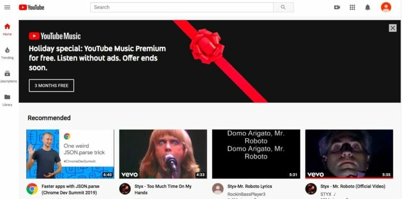
The use of large images, minimal text, and an icon-based menu are all ways YouTube has prioritized mobile users. It has even abandoned more traditional desktop menu structures for the ‘hamburger’ menu that works well on mobile screens.
Now, I want to switch over to a mobile-friendly approach for a closer look. This can actually be a more complicated path to take. This is because the process relies on coding for larger screens first, then using CSS to achieve a better experience on small screens. For example, if you access a mobile-friendly website on your phone, the code will detect your display and deliver the ‘friendly’ format to your device.
In this situation, the menus will typically change, images will be optimized, and your experience will be a bit better for the screen size you’re using. However, you may also lose some functionality in the reformatting. For example, some elements may become hidden on the smaller screen or the images, and graphics will become stacked to accommodate a mobile layout.
At Flywheel, we believe Design matters. If you agree, download this free Design Matters desktop wallpaper today!

However, with a mobile-first approach, you’ll be building for mobile displays from the get-go. While a mobile-first design might use some of the same design frameworks as its friendly cousin, it places mobile users as the primary concern. You can also look at mobile-first as a design strategy that delivers exactly what’s needed from the start, while mobile-friendly strategies adapt what you have to smaller screens.
Consequently, it makes more sense to design for the majority of your users. Starting with mobile in mind means you can build one site and deliver content specifically designed for the largest number of site visitors, without losing functionality or diminishing the experience.
How you can benefit from a mobile-first design
I already mentioned Mobilegeddon, but it’s worth discussing Google’s latest steps to prioritize mobile sites. In July of 2019, the search giant upped the ante and began indexing on a mobile-first basis.
In reality, this actually grandfathered in any sites that were previously indexed, even if they were of the desktop variety. However, there is definitely more to the mobile-first story.
When you design with a mobile-first strategy, you will likely be using some tried and true UX design best practices. These keep your users in mind, and are geared toward improving the user experience. All of this is proven to benefit your bottom line by keeping visitors on site longer and more engaged in your content.
Additionally, a mobile mindset brings with it a whole host of other options. This might include using real-time interaction, location-based strategies, and more.
How to build with a mobile-first strategy
Next, I want to take a look at a couple of key tips that can help you get started on a mobile-first strategy. While these can be considered recommended practices for any site design, there are a few things you wouldn’t be able to implement with just mobile-friendly CSS.
Here are three key tips for building with a mobile-first strategy
- Keep it simple
- Revamp your site design
- Harness the potential of mobile technology
Keep it simple by consolidating your content
This is a pretty widely used approach that can systematically help you declutter your content before switching over to a mobile-first site. It’s inefficient to try and work with content you may just delete later.
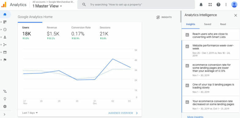
Content consolidation has a pretty flexible but prescriptive process that starts with cataloging your existing content. Readily available tools such as Google Analytics can be used to help with this process, and can pinpoint how certain content areas are performing:
Once you’ve taken stock of your content and analyzed its performance, you can begin making decisions about your future style and content strategies.
Revamp your site design by using a mobile-first theme
If you’re revamping a desktop-focused website with a mobile-first design, you’ll likely need to choose a new theme. This is because the mobile-first approach is not tacked onto an existing design – it’s a transformation with a different strategy altogether.
If you’re not already using mobile-first WordPress builders, I highly recommend considering it. Not only is WordPress the most popular Content Management System (CMS) available, it also offers the most versatile themes. This includes many mobile-first themes all packed with features that can help keep your new design on track.
Harness the potential of mobile technology with innovative design
One of the big upsides to designing for mobile, as we mentioned earlier, is that you are no longer locked into the time and space a desktop user would be in. For example, you can design with the assumption that your customer could literally be anywhere when they interact with your website.
This opens up the door to prioritizing development that incorporates elements such as Augmented Reality (AR), voice activation, touchscreen features, and more. For example, one popular and engaging touch-enabled option is to gamify your website with a ‘spin wheel’:
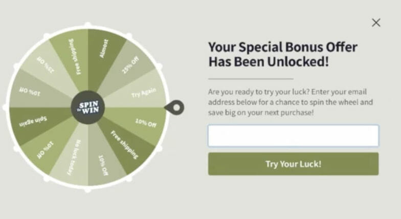
This is a fun option that gives you a way to collect lead information while offering a coupon or discount. Mobile versions of this often give the user the option to literally ‘spin’ the wheel by swiping their finger across it.
Just a couple of other possibilities you can consider with mobile-first design include:
- Using touch-enabled signature options for things like contract signing and product customization.
- Utilizing AR to provide engaging experiences where users can see what virtual products would look like in their house.
- Creating location-based sales options or discounts with push notifications and GPS technology.
There are many other ways to maximize the opportunities a mobile-first design approach can introduce. The key is to balance form and function, as you’ll want to make sure you’re still delivering a user-friendly experience.
Conclusion
Once you understand the basic differences between mobile-friendly and mobile-first strategies, you can begin your own mobile-first website makeover. Since the adoption of mobile internet usage doesn’t look like it will be declining anytime soon, I definitely recommend evaluating your current website for areas where you can implement mobile-first practices.
As you begin your mobile-first design plans, you can keep these three simple tips in mind:
- Keep your content simple and straightforward.
- Revamp your site design with a mobile-first theme.
- Leverage the unique technical features of mobile devices.
Are you working on a mobile-first makeover, and if so, how’s it going? Let us know in the comments section below!
Want more tips for designing sites?

In this guide, we’ll cover tips on how to work faster to speed up your WordPress workflow and how to offload web design workflow tasks. From initial site setup to pushing it live, discover how you can cut hours from your day-to-day work! Download the free guide below.


Comments ( 279 )
projember
June 25, 2025
Mau cari rumah Gedung toko atau tanah dijual atau disewakan di jember, bisa langsung ke projember.com, mudah dan cepat.
https://projember.com
PatrickPoono
June 12, 2025
http://semaglupharm.com/# Affordable Rybelsus price
AaronQuelo
June 6, 2025
alpesh pharmacy store charlotte nc: Pharm Express 24 - topamax pharmacy
Josephner
May 28, 2025
Discount pharmacy Australia: Medications online Australia - Discount pharmacy Australia
Josephner
May 28, 2025
cheapest erectile dysfunction pills: Ero Pharm Fast - best ed meds online
Davidunlor
May 28, 2025
https://biotpharm.shop/# get antibiotics without seeing a doctor
Rodneysog
May 28, 2025
buy antibiotics for uti [url=https://biotpharm.com/#]BiotPharm[/url] buy antibiotics
Josephner
May 28, 2025
online erectile dysfunction medication: Ero Pharm Fast - discount ed meds
DanielTem
May 28, 2025
https://biotpharm.com/# antibiotic without presription
Josephner
May 28, 2025
over the counter antibiotics: buy antibiotics online - get antibiotics without seeing a doctor
Davidunlor
May 27, 2025
https://pharmau24.shop/# Licensed online pharmacy AU
Josephner
May 27, 2025
Ero Pharm Fast: cheapest ed treatment - Ero Pharm Fast
Rodneysog
May 27, 2025
Ero Pharm Fast [url=http://eropharmfast.com/#]Ero Pharm Fast[/url] ed meds cheap
CurtisAdurl
May 27, 2025
Discount pharmacy Australia: Medications online Australia - online pharmacy australia
CurtisAdurl
May 27, 2025
low cost ed meds online: online ed medicine - cheapest ed meds
Davidunlor
May 27, 2025
https://pharmau24.com/# PharmAu24
Rodneysog
May 27, 2025
Pharm Au24 [url=https://pharmau24.com/#]online pharmacy australia[/url] Pharm Au24
CurtisAdurl
May 27, 2025
Online medication store Australia: Online drugstore Australia - Licensed online pharmacy AU
Josephner
May 27, 2025
Online medication store Australia: Licensed online pharmacy AU - Discount pharmacy Australia
Charlesmub
May 27, 2025
antibiotic without presription: Biot Pharm - get antibiotics quickly
CurtisAdurl
May 27, 2025
Ero Pharm Fast: Ero Pharm Fast - online ed treatments
Rodneysog
May 27, 2025
PharmAu24 [url=https://pharmau24.shop/#]Medications online Australia[/url] PharmAu24
JosephTes
May 24, 2025
cialis and adderall [url=https://tadalaccess.com/#]bph treatment cialis[/url] cialis and high blood pressure
Lorenhag
May 24, 2025
cialis drug interactions: Tadal Access - difference between sildenafil and tadalafil
temp email
May 23, 2025
I recommend 0mail pro for anyone who wants a quick and secure way to generate temp emails, search on google, or click in my name.
https://www.google.com/search?q=temp+email+site3A0mail2Bpro
Lorenhag
May 23, 2025
cialis testimonials: Tadal Access - what does cialis cost
FrankieLar
May 23, 2025
https://tadalaccess.com/# sildenafil vs tadalafil vs vardenafil
Lorenhag
May 23, 2025
uses for cialis: when will generic tadalafil be available - does medicare cover cialis
Lorenhag
May 23, 2025
is tadalafil from india safe: Tadal Access - cialis stories
FrankieLar
May 23, 2025
https://tadalaccess.com/# buy cialis by paypal
JosephTes
May 23, 2025
what is cialis tadalafil used for [url=https://tadalaccess.com/#]TadalAccess[/url] black cialis
Lorenhag
May 23, 2025
cialis generic best price that accepts mastercard: buy cialis canadian - cialis alternative
Lorenhag
May 22, 2025
cialis mexico: Tadal Access - tadalafil oral jelly
FrankieLar
May 22, 2025
https://tadalaccess.com/# what is cialis used for
Lorenhag
May 22, 2025
canadian online pharmacy no prescription cialis dapoxetine: cialis contraindications - cialis canada over the counter
Lorenhag
May 22, 2025
tadalafil liquid fda approval date: Tadal Access - does medicare cover cialis for bph
FrankieLar
May 22, 2025
https://tadalaccess.com/# cialis for sale online in canada
Lorenhag
May 22, 2025
buy cialis generic online: TadalAccess - ambrisentan and tadalafil combination brands
Scottdroca
May 22, 2025
compounded tadalafil troche life span: cialis mechanism of action - buy cialis canada
JosephTes
May 21, 2025
cialis same as tadalafil [url=https://tadalaccess.com/#]cialis how to use[/url] cialis sell
FrankieLar
May 21, 2025
https://tadalaccess.com/# cialis online no prior prescription
Lorenhag
May 21, 2025
cialis online no prior prescription: cialis walmart - tadalafil versus cialis
JosephTes
May 21, 2025
cialis available in walgreens over counter?? [url=https://tadalaccess.com/#]generic tadalafil in us[/url] tadalafil and ambrisentan newjm 2015
Scottdroca
May 21, 2025
cialis dosis: Tadal Access - canadian pharmacy cialis brand
Lorenhag
May 21, 2025
tadalafil review: tadalafil tablets 20 mg reviews - cialis 10mg ireland
Scottdroca
May 21, 2025
cialis online without pres: mint pharmaceuticals tadalafil - best price cialis supper active
Lorenhag
May 21, 2025
when to take cialis 20mg: cialis coupon online - cialis 20 mg price costco
FrankieLar
May 20, 2025
https://tadalaccess.com/# where can i buy cialis on line
Scottdroca
May 20, 2025
does tadalafil work: cialis dosage for ed - cialis soft tabs
Lorenhag
May 20, 2025
cialis prescription cost: Tadal Access - how long does cialis last in your system
Scottdroca
May 20, 2025
cialis review: cialis experience - cialis com free sample
Lorenhag
May 20, 2025
canadian no prescription pharmacy cialis: Tadal Access - п»їwhat can i take to enhance cialis
FrankieLar
May 20, 2025
https://tadalaccess.com/# cialis 5mg how long does it take to work
Scottdroca
May 20, 2025
what cialis: sunrise pharmaceutical tadalafil - cialis recommended dosage
Lorenhag
May 20, 2025
cialis 20mg: how to get cialis without doctor - cialis 20mg review
JosephTes
May 20, 2025
cialis online pharmacy australia [url=https://tadalaccess.com/#]Tadal Access[/url] cialis efectos secundarios
FrankieLar
May 20, 2025
https://tadalaccess.com/# how many 5mg cialis can i take at once
Lorenhag
May 20, 2025
buy tadalafil online canada: how much does cialis cost at walgreens - buy cialis canada paypal
FrankieLar
May 19, 2025
https://tadalaccess.com/# tadalafil no prescription forum
JosephTes
May 19, 2025
tadalafil (megalis-macleods) reviews [url=https://tadalaccess.com/#]cialis how long[/url] cialis 30 mg dose
Lorenhag
May 19, 2025
cialis free trial coupon: TadalAccess - cialis effect on blood pressure
Scottdroca
May 19, 2025
when will generic tadalafil be available: TadalAccess - generic cialis from india
FrankieLar
May 19, 2025
https://tadalaccess.com/# truth behind generic cialis
JosephTes
May 19, 2025
which is better cialis or levitra [url=https://tadalaccess.com/#]TadalAccess[/url] cialis black
Lorenhag
May 19, 2025
cialis side effect: how much is cialis without insurance - can i take two 5mg cialis at once
FrankieLar
May 19, 2025
https://tadalaccess.com/# generic tadalafil canada
Lorenhag
May 19, 2025
cialis coupon code: tadalafil troche reviews - when will cialis become generic
Scottdroca
May 19, 2025
cialis 20 milligram: shelf life of liquid tadalafil - poppers and cialis
FrankieLar
May 19, 2025
https://tadalaccess.com/# canadian pharmacy cialis brand
Lorenhag
May 19, 2025
buy generic cialis: Tadal Access - buy cialis without doctor prescription
Scottdroca
May 19, 2025
cialis 5mg cost per pill: canadian online pharmacy no prescription cialis dapoxetine - purchase cialis online cheap
JosephTes
May 18, 2025
cialis dosages [url=https://tadalaccess.com/#]TadalAccess[/url] when does cialis go generic
Scottdroca
May 18, 2025
cialis for pulmonary hypertension: Tadal Access - cialis online no prescription
FrankieLar
May 18, 2025
https://tadalaccess.com/# where to get generic cialis without prescription
Lorenhag
May 18, 2025
cialis in las vegas: Tadal Access - when will generic tadalafil be available
Scottdroca
May 18, 2025
cialis and high blood pressure: how much does cialis cost at cvs - cialis savings card
FrankieLar
May 18, 2025
https://tadalaccess.com/# cialis online canada ripoff
Lorenhag
May 18, 2025
where can i buy cialis on line: TadalAccess - price of cialis
JosephTes
May 18, 2025
cialis shipped from usa [url=https://tadalaccess.com/#]Tadal Access[/url] tadalafil (megalis-macleods) reviews
Scottdroca
May 18, 2025
buy cialis online in austalia: order cialis online no prescription reviews - who makes cialis
kode pos buduran sidoarjo
May 18, 2025
Informasi kode pos kodepos seluruh wilayah indonesia
https://kodepos.info
FrankieLar
May 18, 2025
https://tadalaccess.com/# canada drug cialis
Lorenhag
May 18, 2025
cialis indien bezahlung mit paypal: cialis savings card - what is the active ingredient in cialis
JosephTes
May 18, 2025
tadalafil liquid review [url=https://tadalaccess.com/#]buying generic cialis[/url] tadalafil 20mg
Scottdroca
May 18, 2025
cialis with out a prescription: cialis priligy online australia - what is the generic for cialis
FrankieLar
May 18, 2025
https://tadalaccess.com/# cialis 10mg reviews
Lorenhag
May 17, 2025
buy cialis without prescription: cialis available in walgreens over counter?? - cialis mexico
Scottdroca
May 17, 2025
what does cialis do: generic cialis tadalafil 20mg india - cialis cheapest price
FrankieLar
May 17, 2025
https://tadalaccess.com/# when will cialis become generic
Lorenhag
May 17, 2025
order generic cialis online: Tadal Access - best price cialis supper active
FrankieLar
May 17, 2025
https://tadalaccess.com/# canada drugs cialis
Scottdroca
May 17, 2025
cialis 10mg ireland: tadalafil liquid review - when will cialis become generic
Lorenhag
May 17, 2025
cheap cialis generic online: Tadal Access - buying cialis internet
FrankieLar
May 17, 2025
https://tadalaccess.com/# is there a generic cialis available?
Scottdroca
May 17, 2025
buy cialis cheap fast delivery: Tadal Access - cialis usa
Lorenhag
May 17, 2025
active ingredient in cialis: tadalafil citrate - cialis from india online pharmacy
FrankieLar
May 17, 2025
https://tadalaccess.com/# cialis patent expiration 2016
Scottdroca
May 16, 2025
cialis para que sirve: find tadalafil - best price cialis supper active
Lorenhag
May 16, 2025
tadalafil 40 mg india: cialis and blood pressure - best place to get cialis without pesricption
FrankieLar
May 16, 2025
https://tadalaccess.com/# buy cialis 20mg
JosephTes
May 16, 2025
purchase cialis [url=https://tadalaccess.com/#]TadalAccess[/url] recreational cialis
Scottdroca
May 16, 2025
buy cialis in toronto: TadalAccess - cheap cialis generic online
Lorenhag
May 16, 2025
cialis for bph reviews: TadalAccess - cialis 5 mg price
FrankieLar
May 16, 2025
https://tadalaccess.com/# cialis logo
Scottdroca
May 16, 2025
tadalafil review: tadalafil (tadalis-ajanta) reviews - generic cialis
FrankieLar
May 16, 2025
https://tadalaccess.com/# cheap cialis for sale
JosephTes
May 16, 2025
buy cialis tadalafil [url=https://tadalaccess.com/#]TadalAccess[/url] cialis sample request form
Scottdroca
May 16, 2025
what happens if you take 2 cialis: Tadal Access - buying cialis online usa
FrankieLar
May 16, 2025
https://tadalaccess.com/# cialis cheap
JosephTes
May 15, 2025
tadalafil vidalista [url=https://tadalaccess.com/#]cialis coupon free trial[/url] teva generic cialis
Scottdroca
May 15, 2025
tadalafil vs sildenafil: Tadal Access - tadalafil canada is it safe
Lorenhag
May 15, 2025
cialis and high blood pressure: Tadal Access - cialis for bph
FrankieLar
May 15, 2025
https://tadalaccess.com/# tadalafil from nootropic review
Scottdroca
May 15, 2025
vidalista 20 tadalafil tablets: cialis price south africa - cialis 10mg
Lorenhag
May 15, 2025
buy cialis/canada: cialis patent expiration date - sildenafil vs tadalafil vs vardenafil
FrankieLar
May 15, 2025
https://tadalaccess.com/# cialis cost at cvs
Lorenhag
May 15, 2025
cialis doesnt work: TadalAccess - where to buy tadalafil online
JosephTes
May 15, 2025
where to get the best price on cialis [url=https://tadalaccess.com/#]how to get cialis prescription online[/url] tadalafil buy online canada
Scottdroca
May 15, 2025
cialis medicare: what is cialis good for - cialis free trial
FrankieLar
May 15, 2025
https://tadalaccess.com/# us pharmacy prices for cialis
Lorenhag
May 15, 2025
buy cialis online overnight shipping: buy cialis tadalafil - tadalafil tablets 20 mg side effects
Scottdroca
May 15, 2025
cialis from canada to usa: Tadal Access - cialis erection
FrankieLar
May 15, 2025
https://tadalaccess.com/# cialis headache
kode swift bank
May 15, 2025
kode swift bank Indonesia dan kode swift bank di seluruh dunia. semua data swift bank ada disini.
https://kodeswiftbank.com
Lorenhag
May 14, 2025
free samples of cialis: cialis and high blood pressure - cialis australia online shopping
FrankieLar
May 14, 2025
https://tadalaccess.com/# does cialis shrink the prostate
Scottdroca
May 14, 2025
buy a kilo of tadalafil powder: TadalAccess - does tadalafil lower blood pressure
JosephTes
May 14, 2025
cialis copay card [url=https://tadalaccess.com/#]cheap cialis online tadalafil[/url] sublingual cialis
Lorenhag
May 14, 2025
cialis black review: TadalAccess - 20 mg tadalafil best price
FrankieLar
May 14, 2025
https://tadalaccess.com/# canadian pharmacy cialis 20mg
Scottdroca
May 14, 2025
cialis manufacturer coupon lilly: Tadal Access - cialis professional 20 lowest price
JosephTes
May 14, 2025
buy tadalafil online canada [url=https://tadalaccess.com/#]price comparison tadalafil[/url] is generic tadalafil as good as cialis
Lorenhag
May 14, 2025
walgreen cialis price: TadalAccess - cialis from canada
FrankieLar
May 14, 2025
https://tadalaccess.com/# cialis 5mg price cvs
Scottdroca
May 14, 2025
cialis online no prescription: purchase cialis - cialis not working anymore
Lorenhag
May 14, 2025
cheapest cialis online: Tadal Access - cialis pharmacy
FrankieLar
May 14, 2025
https://tadalaccess.com/# cialis tadalafil 20mg price
Scottdroca
May 14, 2025
cialis used for: cialis buy online canada - walgreens cialis prices
song lyrics search by phrase on youtube
May 14, 2025
Are you looking for song lyrics ?
https://siteforlyrics.com/
Lorenhag
May 14, 2025
what to do when cialis stops working: TadalAccess - buy cheap tadalafil online
RogerCouct
May 13, 2025
https://clomhealth.shop/# where to get generic clomid online
Russellfeeve
May 13, 2025
prednisone 300mg: PredniHealth - PredniHealth
Oscargef
May 13, 2025
amoxicillin capsule 500mg price: amoxicillin script - amoxicillin 500 mg without prescription
RogerCouct
May 13, 2025
http://prednihealth.com/# PredniHealth
Russellfeeve
May 13, 2025
cost of cheap clomid tablets: buying clomid without dr prescription - where can i buy clomid without insurance
Oscargef
May 13, 2025
can i order clomid: can you buy cheap clomid without prescription - can you get generic clomid tablets
RogerCouct
May 13, 2025
https://amohealthcare.store/# amoxicillin 875 mg tablet
Russellfeeve
May 13, 2025
amoxicillin generic: amoxicillin cost australia - Amo Health Care
MatthewTom
May 13, 2025
buy prednisone online without a script [url=http://prednihealth.com/#]PredniHealth[/url] PredniHealth
Oscargef
May 13, 2025
Amo Health Care: Amo Health Care - where to buy amoxicillin pharmacy
RogerCouct
May 13, 2025
https://amohealthcare.store/# Amo Health Care
Russellfeeve
May 13, 2025
where to buy clomid without a prescription: where can i get generic clomid without a prescription - where buy clomid
JudsonZoown
May 13, 2025
cost of amoxicillin prescription: Amo Health Care - Amo Health Care
Oscargef
May 12, 2025
PredniHealth: prednisone 2 mg - prednisone 2.5 mg cost
RogerCouct
May 12, 2025
https://clomhealth.com/# cost generic clomid without dr prescription
Russellfeeve
May 12, 2025
Amo Health Care: amoxicillin over counter - Amo Health Care
JudsonZoown
May 12, 2025
amoxicillin capsules 250mg: Amo Health Care - amoxicillin capsules 250mg
Oscargef
May 12, 2025
20 mg prednisone: PredniHealth - where can i buy prednisone
Russellfeeve
May 12, 2025
PredniHealth: prednisone 5 mg tablet rx - PredniHealth
RogerCouct
May 12, 2025
https://amohealthcare.store/# Amo Health Care
JudsonZoown
May 12, 2025
can you get generic clomid prices: Clom Health - get generic clomid without dr prescription
Oscargef
May 12, 2025
Amo Health Care: how to get amoxicillin over the counter - Amo Health Care
Russellfeeve
May 12, 2025
PredniHealth: PredniHealth - buy prednisone online india
RogerCouct
May 12, 2025
http://prednihealth.com/# prednisone without prescription
JudsonZoown
May 12, 2025
can you get generic clomid pills: Clom Health - where can i buy generic clomid without a prescription
Oscargef
May 12, 2025
prednisone 15 mg daily: PredniHealth - can i buy prednisone from canada without a script
Russellfeeve
May 12, 2025
prednisone 500 mg tablet: PredniHealth - prednisone for sale
RogerCouct
May 12, 2025
https://amohealthcare.store/# where can i buy amoxocillin
Jeremyfax
May 12, 2025
Viagra without prescription: generic sildenafil 100mg - safe online pharmacy
LorenzoBlize
May 11, 2025
order Viagra discreetly [url=https://maxviagramd.com/#]secure checkout Viagra[/url] best price for Viagra
Jeremyfax
May 11, 2025
legal Modafinil purchase: modafinil 2025 - verified Modafinil vendors
Jeremyfax
May 10, 2025
doctor-reviewed advice: modafinil legality - modafinil legality
RobertKet
May 10, 2025
trusted Viagra suppliers: secure checkout Viagra - best price for Viagra
Jeremyfax
May 10, 2025
affordable ED medication: FDA approved generic Cialis - secure checkout ED drugs
LorenzoBlize
May 10, 2025
generic tadalafil [url=https://zipgenericmd.com/#]affordable ED medication[/url] FDA approved generic Cialis
RobertKet
May 10, 2025
modafinil pharmacy: verified Modafinil vendors - legal Modafinil purchase
Albertoseino
May 10, 2025
cheap Cialis online: Cialis without prescription - cheap Cialis online
Jeremyfax
May 10, 2025
Cialis without prescription: best price Cialis tablets - order Cialis online no prescription
Albertoseino
May 10, 2025
order Viagra discreetly: trusted Viagra suppliers - cheap Viagra online
RonaldFOEFS
May 10, 2025
https://zipgenericmd.shop/# reliable online pharmacy Cialis
Jeremyfax
May 10, 2025
fast Viagra delivery: trusted Viagra suppliers - Viagra without prescription
RonaldFOEFS
May 9, 2025
http://maxviagramd.com/# fast Viagra delivery
RobertKet
May 9, 2025
affordable ED medication: buy generic Cialis online - reliable online pharmacy Cialis
Albertoseino
May 9, 2025
modafinil 2025: modafinil 2025 - modafinil legality
Jeremyfax
May 9, 2025
Modafinil for sale: verified Modafinil vendors - modafinil 2025
LorenzoBlize
May 9, 2025
purchase Modafinil without prescription [url=http://modafinilmd.store/#]safe modafinil purchase[/url] verified Modafinil vendors
RonaldFOEFS
May 9, 2025
https://zipgenericmd.com/# buy generic Cialis online
Albertoseino
May 9, 2025
safe online pharmacy: order Viagra discreetly - order Viagra discreetly
RobertKet
May 9, 2025
generic sildenafil 100mg: trusted Viagra suppliers - order Viagra discreetly
Jeremyfax
May 9, 2025
affordable ED medication: online Cialis pharmacy - generic tadalafil
LorenzoBlize
May 9, 2025
Cialis without prescription [url=http://zipgenericmd.com/#]affordable ED medication[/url] reliable online pharmacy Cialis
RonaldFOEFS
May 9, 2025
https://maxviagramd.shop/# fast Viagra delivery
Jeremyfax
May 9, 2025
order Cialis online no prescription: discreet shipping ED pills - reliable online pharmacy Cialis
RobertKet
May 9, 2025
FDA approved generic Cialis: online Cialis pharmacy - reliable online pharmacy Cialis
LorenzoBlize
May 9, 2025
trusted Viagra suppliers [url=https://maxviagramd.com/#]cheap Viagra online[/url] discreet shipping
RonaldFOEFS
May 9, 2025
https://maxviagramd.shop/# cheap Viagra online
ElmerSip
May 8, 2025
pin-up casino giris: pin up - pinup az
ElmerSip
May 7, 2025
vavada: vavada - вавада зеркало
ElmerSip
May 3, 2025
pin up azerbaycan: pinup az - pinup az
ElmerSip
May 3, 2025
пин ап зеркало: пинап казино - пин ап зеркало
ElmerSip
May 2, 2025
pin up: pin-up - pin-up casino giris
BrianCrugh
May 2, 2025
pin up casino: pin-up - pin-up
ElmerSip
May 1, 2025
pin-up: pin up - pin-up
BrianCrugh
May 1, 2025
pin up вход: пинап казино - пин ап зеркало
ElmerSip
April 30, 2025
вавада официальный сайт: вавада - вавада зеркало
ElmerSip
April 30, 2025
вавада казино: vavada casino - vavada вход
ZackaryCaush
April 30, 2025
http://pinuprus.pro/# пин ап казино официальный сайт
Richardmat
April 30, 2025
vavada [url=http://vavadavhod.tech/#]вавада[/url] vavada вход
Kennethsheby
April 30, 2025
pin-up casino giris: pin up azerbaycan - pin up azerbaycan
ElmerSip
April 30, 2025
pinup az: pin up casino - pin up az
ZackaryCaush
April 30, 2025
https://pinuprus.pro/# пин ап зеркало
Kennethsheby
April 30, 2025
pin-up: pin up azerbaycan - pin up az
Richardmat
April 30, 2025
вавада зеркало [url=http://vavadavhod.tech/#]вавада[/url] vavada
ElmerSip
April 30, 2025
вавада зеркало: вавада казино - vavada
ZackaryCaush
April 30, 2025
https://pinupaz.top/# pin up azerbaycan
Dannysit
April 30, 2025
buying from online mexican pharmacy: mexico drug stores pharmacies - mexican rx online
Walterhap
April 30, 2025
https://expressrxcanada.shop/# canadian pharmacies
Stevendrype
April 30, 2025
medicine courier from India to USA: indian pharmacy - Medicine From India
Dannysit
April 29, 2025
canadian pharmacy king: Express Rx Canada - legitimate canadian mail order pharmacy
Michaeljouch
April 29, 2025
mexico pharmacy order online [url=https://rxexpressmexico.shop/#]RxExpressMexico[/url] mexico pharmacy order online
Stevendrype
April 29, 2025
indian pharmacy: indian pharmacy online shopping - MedicineFromIndia
MichaelFaulp
April 29, 2025
mexico drug stores pharmacies: mexican rx online - best online pharmacies in mexico
Stevendrype
April 29, 2025
MedicineFromIndia: Medicine From India - indian pharmacy online shopping
Dannysit
April 29, 2025
mexico drug stores pharmacies: mexico pharmacy order online - mexico pharmacy order online
Walterhap
April 29, 2025
https://medicinefromindia.com/# Medicine From India
MichaelFaulp
April 29, 2025
mexican online pharmacy: purple pharmacy mexico price list - mexican rx online
Stevendrype
April 29, 2025
medication from mexico pharmacy: mexico drug stores pharmacies - mexico pharmacy order online
Michaeljouch
April 29, 2025
reputable mexican pharmacies online [url=https://rxexpressmexico.com/#]mexico drug stores pharmacies[/url] RxExpressMexico
Dannysit
April 29, 2025
canadian pharmacy: Express Rx Canada - canadian pharmacy india
MichaelFaulp
April 29, 2025
mexican online pharmacy: mexico drug stores pharmacies - mexican online pharmacy
Stevendrype
April 29, 2025
mexico pharmacies prescription drugs: mexican online pharmacy - mexico pharmacy order online
Michaeljouch
April 29, 2025
medicine courier from India to USA [url=http://medicinefromindia.com/#]MedicineFromIndia[/url] indian pharmacy online
Dannysit
April 28, 2025
medicine courier from India to USA: top 10 online pharmacy in india - Medicine From India
Walterhap
April 28, 2025
https://rxexpressmexico.shop/# mexico drug stores pharmacies
MichaelFaulp
April 28, 2025
Medicine From India: indian pharmacy online - medicine courier from India to USA
Stevendrype
April 28, 2025
canada cloud pharmacy: ExpressRxCanada - reputable canadian online pharmacies
Dannysit
April 28, 2025
indian pharmacy: medicine courier from India to USA - indian pharmacy online shopping
MichaelFaulp
April 28, 2025
best canadian online pharmacy: Express Rx Canada - best online canadian pharmacy
Stevendrype
April 28, 2025
legit canadian online pharmacy: Express Rx Canada - adderall canadian pharmacy
Dannysit
April 28, 2025
RxExpressMexico: mexico drug stores pharmacies - mexico pharmacy order online
Michaeljouch
April 28, 2025
indian pharmacy [url=https://medicinefromindia.shop/#]Medicine From India[/url] Medicine From India
Walterhap
April 28, 2025
http://medicinefromindia.com/# indian pharmacy online
MichaelFaulp
April 28, 2025
MedicineFromIndia: pharmacy website india - Medicine From India
Stevendrype
April 28, 2025
mexican online pharmacy: mexican rx online - Rx Express Mexico
Dannysit
April 28, 2025
buying prescription drugs in mexico: Rx Express Mexico - mexico pharmacy order online
Walterhap
April 28, 2025
https://medicinefromindia.com/# reputable indian online pharmacy
Michaeljouch
April 28, 2025
п»їlegitimate online pharmacies india [url=https://medicinefromindia.com/#]indian pharmacy online shopping[/url] indian pharmacy online
BilliesniCt
April 28, 2025
trouver un mГ©dicament en pharmacie: pharmacie en ligne - Pharmacie Internationale en ligne pharmafst.com
PeterUnomb
April 28, 2025
Pharmacie en ligne livraison Europe [url=https://pharmafst.shop/#]Meilleure pharmacie en ligne[/url] Pharmacie en ligne livraison Europe pharmafst.shop
Robertmut
April 28, 2025
https://pharmafst.com/# pharmacie en ligne france livraison internationale
BernardVeida
April 27, 2025
pharmacie en ligne france pas cher: pharmacie en ligne - Pharmacie en ligne livraison Europe pharmafst.com
BernardVeida
April 27, 2025
Tadalafil sans ordonnance en ligne: Cialis sans ordonnance 24h - Tadalafil sans ordonnance en ligne tadalmed.shop
BernardVeida
April 27, 2025
pharmacie en ligne france livraison belgique: pharmacie en ligne - acheter mГ©dicament en ligne sans ordonnance pharmafst.com
BernardVeida
April 27, 2025
kamagra gel: Acheter Kamagra site fiable - achat kamagra
Robertmut
April 27, 2025
https://tadalmed.com/# Acheter Cialis
BernardVeida
April 27, 2025
Cialis generique prix: Cialis sans ordonnance pas cher - Acheter Cialis 20 mg pas cher tadalmed.shop
BilliesniCt
April 27, 2025
cialis generique: Acheter Cialis - Tadalafil sans ordonnance en ligne tadalmed.shop
Robertmut
April 26, 2025
https://kamagraprix.shop/# kamagra livraison 24h
Bradleyfup
April 26, 2025
cialis generique: Acheter Cialis - Acheter Cialis tadalmed.shop
BernardVeida
April 26, 2025
Pharmacie en ligne livraison Europe: Livraison rapide - Pharmacie Internationale en ligne pharmafst.com
BilliesniCt
April 26, 2025
Acheter Kamagra site fiable: kamagra oral jelly - Kamagra pharmacie en ligne
Bradleyfup
April 26, 2025
pharmacie en ligne sans ordonnance: Livraison rapide - pharmacie en ligne france pas cher pharmafst.com
BernardVeida
April 25, 2025
kamagra pas cher: Kamagra Commander maintenant - Kamagra Oral Jelly pas cher
BilliesniCt
April 25, 2025
kamagra livraison 24h: Kamagra pharmacie en ligne - Kamagra pharmacie en ligne
PeterUnomb
April 25, 2025
cialis sans ordonnance [url=https://tadalmed.com/#]Cialis sans ordonnance 24h[/url] Tadalafil achat en ligne tadalmed.com
BernardVeida
April 25, 2025
Pharmacie sans ordonnance: pharmacie en ligne sans ordonnance - pharmacie en ligne fiable pharmafst.com
Robertmut
April 25, 2025
https://tadalmed.com/# Pharmacie en ligne Cialis sans ordonnance
BilliesniCt
April 25, 2025
pharmacie en ligne france pas cher: pharmacie en ligne - vente de mГ©dicament en ligne pharmafst.com
Bradleyfup
April 25, 2025
pharmacie en ligne pas cher: pharmacie en ligne - pharmacies en ligne certifiГ©es pharmafst.com
PeterUnomb
April 25, 2025
Tadalafil achat en ligne [url=https://tadalmed.com/#]Cialis sans ordonnance pas cher[/url] Pharmacie en ligne Cialis sans ordonnance tadalmed.com
Robertmut
April 25, 2025
https://pharmafst.com/# acheter mГ©dicament en ligne sans ordonnance
BilliesniCt
April 25, 2025
acheter mГ©dicament en ligne sans ordonnance: п»їpharmacie en ligne france - Pharmacie sans ordonnance pharmafst.com
BernardVeida
April 25, 2025
Achat mГ©dicament en ligne fiable: Pharmacie en ligne France - п»їpharmacie en ligne france pharmafst.com
Bradleyfup
April 25, 2025
Cialis en ligne: Tadalafil 20 mg prix en pharmacie - Acheter Viagra Cialis sans ordonnance tadalmed.shop
PeterUnomb
April 25, 2025
achat kamagra [url=http://kamagraprix.com/#]kamagra en ligne[/url] Acheter Kamagra site fiable
Robertmut
April 25, 2025
http://pharmafst.com/# vente de mГ©dicament en ligne
BernardVeida
April 25, 2025
Kamagra Commander maintenant: Acheter Kamagra site fiable - kamagra en ligne
Edwardtoupe
April 23, 2025
olympe casino avis: olympe - olympe casino en ligne
DemiA
January 21, 2020
Any suggestions on woocommerce mobile- first designed themes?