
Development
How to use CSS breakpoints to create responsive designs

The success of a website depends a lot on user experience. These days, users access a website from many different devices, and providing an equal user experience across each device can be a challenge. That’s where CSS breakpoints can come in handy.
CSS breakpoints can be highly beneficial for creating responsive sites that provide a great user experience on any device, but they also remain one of the more confusing aspects of web design, especially for new developers.
In this article, I will simplify how to use CSS breakpoints with a closer look at the following areas:
Let’s get started!
What is a CSS breakpoint?
CSS breakpoints are points where the website content responds according to the device width, allowing you to show the best possible layout to the user.
CSS breakpoints are also called media query breakpoints, as they are used with media query.
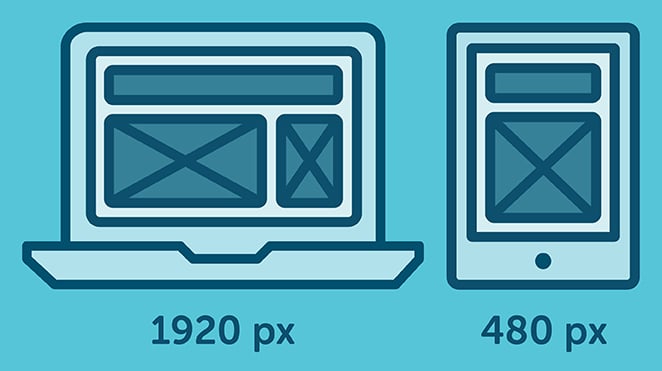
In this example, you can see how the layout adapts to the screen size. The layout at large resolution has a header and two column body layout but in small device it turns into one column layout.
How to set CSS breakpoints
The tricky part is to decide the breakpoints themselves. There aren’t any standard templates, and different frameworks use different breakpoints.
So what approach should you adopt for your breakpoints?
There are two probable approaches to follow:
- Breakpoints based on device
- Breakpoints based on content
CSS breakpoints based on device
Deciding breakpoints based on different devices sounds like a good idea, but in reality, it’s not always the best approach. We already have enough devices to worry about, and when a new one comes out with a different width, going back to your CSS and adding a new breakpoint all over again is time-consuming.
Nonetheless, it’s still a viable option, as you may find that works okay for you. Here’s an example of device-specific breakpoints:
[css]/* ----------- iPhone 6, 6S, 7 and 8 ----------- */

/* Portrait */

@media only screen

and (min-device-width: 375px)

and (max-device-width: 667px)

and (-webkit-min-device-pixel-ratio: 2)

and (orientation: portrait) {

}

/* Landscape */

@media only screen

and (min-device-width: 375px)

and (max-device-width: 667px)

and (-webkit-min-device-pixel-ratio: 2)

and (orientation: landscape) {

}

/* ----------- Google Pixel ----------- */

/* Portrait */

@media screen

and (device-width: 360px)

and (device-height: 640px)

and (-webkit-device-pixel-ratio: 3)

and (orientation: portrait) {

}

/* Landscape */

@media screen

and (device-width: 360px)

and (device-height: 640px)

and (-webkit-device-pixel-ratio: 3)

and (orientation: landscape) {

}[/css]
With this approach, you will end up having a huge list of media queries.
CSS breakpoints based on content
The ideal option for deciding breakpoints is based on the content of your site. This method allows you to simply add breakpoints where your content needs layout adjustment. This will make your media query a lot simpler and manageable.
This breakpoint means the CSS will apply when the device width is 768px and above.
[css]@media only screen (min-width: 768px){

...

}[/css]
You can also set a range with breakpoints, so the CSS will only apply within those limits.
[css]@media only screen and (min-width: 768px) and (max-width: 959px){

...

}[/css]
When to use min or max-width CSS breakpoints
You can set your breakpoints in different ways using min-width, max-width, or even by combining both. But the question is, when should you use each one?
To answer it in a simple way, if you are designing your layout with a mobile-first approach, then use min-width breakpoints and work your way up.
Set your default styles for the small device and just adjust for larger devices accordingly.
Likewise, if you are designing for larger devices first, then set your default CSS as you normally would and adjust for smaller devices with the max-width approach.
Using CSS breakpoints with SASS
If you are using a preprocessor like SASS or SCSS, you can write much smarter breakpoints. Mixin allows you to create more declarative breakpoints to remember, like this:
[css]@mixin tablet-up {

@media only screen (min-width: 768px) { @content; }

}[/css]
While working in a group, it’s much easier to remember “tablet-up” than 768px or 48em. Anyone can understand this breakpoint; it is for tablet and above screen sizes.
Which CSS breakpoints to use
We’ve seen how to use breakpoints and when to use them, but the question still remains: what specific breakpoints should you use?
Let’s break things down a little. You need to target desktop, tablet, and mobile-only sizes. You can check some popular frameworks to get an idea of what approach to follow.
Bootstrap has breakpoints at 576px, 768px, 992px, and 1200px. Foundation mainly has breakpoints at 40em and 64em. At Bulma, breakpoints are set at 768px, 769px, 1024px, 1216px, and 1408px.
Each one has different breakpoints but one thing they have in common is a mobile-first approach. You can use one of these breakpoints as a starting point or you can come up with your own, like this:
[css]@media (min-width: 640px){

...

}

@media (min-width: 768px){

...

}

@media (min-width: 1024px){

...

}

@media (min-width: 1200px){

...

}[/css]
You get the idea!
Wrapping up
To sum up, CSS breakpoints are a great way to restructure your layout to provide the best user experience across different devices.
Always try to create breakpoints based on your own content, not devices. Break them to a logical width rather than a random width and keep them to a manageable number, so modifying remains simple and clear.
What CSS breakpoints do you use for your layouts? Do let us know in the comments section below.
What’s next?
Create and test your custom Gutenberg blocks with Local for free!

Learn more about Local here!
For more advice on building responsive sites, check out these articles!


Comments ( 1928 )
1win_oaPt
June 19, 2025
1win x [url=http://1win3003.com/]http://1win3003.com/[/url]
mostbet_epPl
June 19, 2025
как зайти на сайт мостбет [url=mostbet4014.ru]mostbet4014.ru[/url]
1win_tgEn
June 19, 2025
1win pro [url=1win3006.com]1win pro[/url]
Klybnaya myzika_sqoa
June 19, 2025
клубная [url=www.klubnaya-muzyka30.ru]www.klubnaya-muzyka30.ru[/url] .
Jonathon
June 19, 2025
https://classic-blog.udn.com/210906ee/182713114
Thus, once more, it pays to suppose about how much pores and skin you want to present and what's most flattering to your body.
kypit igrovoi komputer_ibka
June 19, 2025
пк игровой [url=https://kupit-igrovoj-kompyuter3.ru/]https://kupit-igrovoj-kompyuter3.ru/[/url] .
proekt pereplanirovki kvartiri_voet
June 19, 2025
заказать проект перепланировки квартиры [url=https://proekt-pereplanirovki-kvartiry13.ru]заказать проект перепланировки квартиры[/url] .
JoshuaHap
June 19, 2025
защитные кейсы корсар https://plastcase.ru/
WilliamJaila
June 19, 2025
Обязательно попробуйте https://lengan.vn/portfolio/capetown-showcase/
DonaldSek
June 19, 2025
Женский портал https://woman24.kyiv.ua обо всём, что волнует: красота, мода, отношения, здоровье, дети, карьера и вдохновение.
HenryBiT
June 19, 2025
https://efarmaciait.shop/# delecit per giovani
JeffreyJal
June 19, 2025
Только главное https://ua-vestnik.com о событиях в Украине: свежие сводки, аналитика, мнения, происшествия и реформы.
RandallNitty
June 19, 2025
Мировые новости https://ua-novosti.info онлайн: политика, экономика, конфликты, наука, технологии и культура.
Carsonbax
June 19, 2025
Хмельницький новини https://u-misti.khmelnytskyi.ua огляди, новини, сайт Хмельницького
Waynepycle
June 19, 2025
Новостной портал https://news24.in.ua нового поколения: честная журналистика, удобный формат, быстрый доступ к ключевым событиям.
EugeneVaf
June 19, 2025
Онлайн-новости https://arguments.kyiv.ua без лишнего: коротко, по делу, достоверно. Политика, бизнес, происшествия, спорт, лайфстайл.
SteveVub
June 19, 2025
Портал для женщин https://a-k-b.com.ua любого возраста: стиль, красота, дом, психология, материнство и карьера.
Williamblott
June 19, 2025
¡Bienvenidos, exploradores de la fortuna !
Casino online fuera de EspaГ±a con alta privacidad - https://casinoporfuera.guru/# casinoporfuera.guru
¡Que disfrutes de maravillosas momentos memorables !
ClintonLot
June 19, 2025
aquilea melatonina embarazo: Papa Farma - Papa Farma
WilliamEmors
June 19, 2025
Rask Apotek: nese voks apotek - online apotek
sweet_bonanza_clKa
June 19, 2025
sweet bonanza xmas demo play [url=sweet-bonanza3004.ru]sweet bonanza xmas demo play[/url]
HaroldInwah
June 19, 2025
¡Hola, usuarios de sitios de apuestas !
Casinos online extranjeros con jackpot progresivo - https://www.casinoextranjero.es/# mejores casinos online extranjeros
¡Que vivas premios extraordinarios !
Jovita
June 19, 2025
https://jekyll.s3.us-east-005.backblazeb2.com/20241209-4/research/je-tall-sf-marketing-(452).html
As the mom of the bride, eyes might be on you virtually as a lot as they will be on the pleased couple.
Josephkam
June 19, 2025
sildenafilo online [url=https://papafarma.com/#]Papa Farma[/url] Papa Farma
HenryBiT
June 19, 2025
http://papafarma.com/# cbd valladolid
888starz apk_zcsi
June 19, 2025
скачать 888 старс на андроид [url=https://888starz-skachat-na-android.com/]888starz-skachat-na-android.com[/url] .
dizainerskie kashpo_yfpl
June 19, 2025
цветочные горшки дизайнерские купить [url=www.dizaynerskie-kashpo-spb.ru]www.dizaynerskie-kashpo-spb.ru[/url] .
mostbet_hrPl
June 19, 2025
mostbet.com вход [url=mostbet4014.ru]mostbet4014.ru[/url]
ScottHit
June 19, 2025
Городской портал Одессы https://faine-misto.od.ua последние новости и происшествия в городе и области
Robby
June 19, 2025
https://jekyll2.s3.us-west-002.backblazeb2.com/je-20250422-23/research/marketing-(308).html
Jewel tones are an ideal palette for moms of the bride and grooms year-round.
RobertDox
June 19, 2025
http://papafarma.com/# Papa Farma
mostbet_tsPl
June 19, 2025
mostbet.com [url=http://mostbet4004.ru]http://mostbet4004.ru[/url]
WilliamEmors
June 19, 2025
farmacia tenerife online: Papa Farma - farmacia medicamentos
ClintonLot
June 19, 2025
EFarmaciaIt: EFarmaciaIt - tadalafil 10 mg recensioni
Morrisrew
June 19, 2025
Портал о строительстве https://tozak.org.ua от идеи до готового дома. Проекты, сметы, выбор материалов, ошибки и их решения.
PatrickMax
June 19, 2025
Строительный журнал https://dsmu.com.ua идеи, технологии, материалы, дизайн, проекты, советы и обзоры. Всё о строительстве, ремонте и интерьере
Jamesrat
June 19, 2025
Всё об автомобилях https://autoclub.kyiv.ua в одном месте. Обзоры, новости, инструкции по уходу, автоистории и реальные тесты.
Davidtroda
June 19, 2025
Новости Украины https://hansaray.org.ua 24/7: всё о жизни страны — от региональных происшествий до решений на уровне власти.
Raymondplurn
June 19, 2025
¡Saludos, expertos en el azar !
casinos online extranjeros con verificaciГіn opcional - п»їhttps://casinosextranjero.es/ casino online extranjero
¡Que vivas increíbles victorias épicas !
HenryBiT
June 19, 2025
https://papafarma.com/# Papa Farma
1win_afEn
June 19, 2025
1win voucher code [url=1win3006.com]1win3006.com[/url]
JosephBof
June 19, 2025
Новостной портал Одесса https://u-misti.odesa.ua последние события города и области. Обзоры и много интресного о жизни в Одессе.
Josephkam
June 19, 2025
Papa Farma [url=http://papafarma.com/#]Papa Farma[/url] 7 natur
dizainerskie kashpo_kymi
June 19, 2025
купить стильный горшок [url=http://dizaynerskie-kashpo-spb.ru]http://dizaynerskie-kashpo-spb.ru[/url] .
JosephOvEnt
June 19, 2025
Архитектурный портал https://skol.if.ua современные проекты, урбанистика, дизайн, планировка, интервью с архитекторами и тренды отрасли.
Ernestoccab
June 19, 2025
Новости Украины https://useti.org.ua в реальном времени. Всё важное — от официальных заявлений до мнений экспертов.
StephenMof
June 19, 2025
Информационный портал https://comart.com.ua о строительстве и ремонте: полезные советы, технологии, идеи, лайфхаки, расчёты и выбор материалов.
mostbet_wdSn
June 19, 2025
мостбет сом [url=mostbet4012.ru]мостбет сом[/url]
1win_cbPt
June 19, 2025
1win app login [url=https://1win3003.com/]https://1win3003.com/[/url]
mostbet_lgPr
June 19, 2025
mostbet sitio oficial [url=mostbet4013.ru]mostbet4013.ru[/url]
Matthewdig
June 19, 2025
¡Saludos, jugadores dedicados !
Mejores experiencias en casinos extranjeros - п»їhttps://casinoextranjerosenespana.es/ п»їcasinos online extranjeros
¡Que disfrutes de movidas extraordinarias !
mostbet_pxPr
June 19, 2025
mostbet скачать 2024 [url=https://www.mostbet4013.ru]mostbet скачать 2024[/url]
Candida
June 19, 2025
https://classic-blog.udn.com/340cbcc9/182708137
Always take into consideration the sorts of sleeves and
straps you'll have on your dress.
JamesDrist
June 19, 2025
Советую http://kontinuumliberec.com/events/s-chuti-v-pohybu/
WilliamEmors
June 18, 2025
licoforte 40 mg: brentan crema prospecto - tadalafilo 5 mg comprar online
ClintonLot
June 18, 2025
paracetamol oral lösning: Svenska Pharma - när ger graviditetstest utslag
HenryBiT
June 18, 2025
https://efarmaciait.shop/# brt point parma
Josephkam
June 18, 2025
EFarmaciaIt [url=https://efarmaciait.shop/#]gentalyn beta amazon[/url] EFarmaciaIt
mostbet_lzSn
June 18, 2025
мелбет кыргызстан [url=http://mostbet4012.ru/]мелбет кыргызстан[/url]
1win_azSr
June 18, 2025
1win. [url=https://www.1win3007.com]1win.[/url]
mostbet_uyEl
June 18, 2025
мостбеи [url=https://www.mostbet4003.ru]https://www.mostbet4003.ru[/url]
RobertDox
June 18, 2025
https://papafarma.shop/# parafarmacia gran canaria
WilliamEmors
June 18, 2025
Rask Apotek: Rask Apotek - Rask Apotek
HenryBiT
June 18, 2025
https://papafarma.shop/# Papa Farma
ChrisNes
June 18, 2025
Туристический портал https://aliana.com.ua с лучшими маршрутами, подборками стран, бюджетными решениями, гидами и советами.
Allenvurne
June 18, 2025
Всё о спорте https://beachsoccer.com.ua в одном месте: профессиональный и любительский спорт, фитнес, здоровье, техника упражнений и спортивное питание.
Charleswrews
June 18, 2025
Клуб родителей https://entertainment.com.ua пространство поддержки, общения и обмена опытом.
1win_hoOa
June 18, 2025
bonificacion de casino 1win [url=https://www.1win3002.com]https://www.1win3002.com[/url]
Josephkam
June 18, 2025
farmacia europa [url=https://papafarma.com/#]la isla. ml[/url] Papa Farma
1win_vpOa
June 18, 2025
1win aviator [url=1win3002.com]1win aviator[/url]
Ramiro
June 18, 2025
https://filedn.eu/lXvDNJGJo3S0aUrNKUTnNkb/marketing-140/research/je-tall-sf-marketing-(200).html
Talk to your daughter concerning the aesthetic she envisions for her marriage ceremony
to assist slim down your choices.
WilliamEmors
June 18, 2025
aloe vera gel apotek: Гёrevoks fjerner apotek - alfa liponsyre apotek
mostbet_zsPl
June 18, 2025
sayt mostbet [url=https://mostbet4004.ru]https://mostbet4004.ru[/url]
BernardMuM
June 18, 2025
Портал о маркетинге https://reklamspilka.org.ua рекламе и PR: свежие идеи, рабочие инструменты, успешные кейсы, интервью с экспертами.
ClintonLot
June 18, 2025
snabba recept: amoxicillin apotek - Svenska Pharma
Barb
June 18, 2025
https://filedn.eu/l4uw5uiN1qUR9BCabqOgPER/cz-marketing-256/research/cz-marketing-(474).html
My daughter dreams of a wedding on a beach in Bali, so where will that go away me I marvel.
HenryBiT
June 18, 2025
https://efarmaciait.shop/# augmentin sciroppo bambini 70 ml
Timothyarted
June 18, 2025
Если вы планируете жить в Москве длительное время, позаботьтесь о временной регистрации заранее https://propiska-moskva677.ru/
Jacobclire
June 18, 2025
Современный женский https://prowoman.kyiv.ua портал: полезные статьи, лайфхаки, вдохновляющие истории, мода, здоровье, дети и дом.
JesusBof
June 18, 2025
События Днепр https://u-misti.dp.ua последние новости Днепра и области, обзоры и самое интересное
TommySenia
June 18, 2025
Портал для женщин https://olive.kiev.ua любого возраста: от секретов молодости и красоты до личностного роста и материнства.
Anthonyhen
June 18, 2025
Онлайн-портал https://leif.com.ua для женщин: мода, психология, рецепты, карьера, дети и любовь. Читай, вдохновляйся, общайся, развивайся!
mostbet_byEl
June 18, 2025
мостбет uz [url=https://mostbet4003.ru]https://mostbet4003.ru[/url]
Glenntheot
June 18, 2025
Рекомендую https://www.bodysmind.be/bonjour-tout-le-monde/
Josephkam
June 18, 2025
botica 3 [url=http://papafarma.com/#]Papa Farma[/url] que es farmacia
1win_uqSr
June 18, 2025
1win ghana [url=https://1win3007.com]https://1win3007.com[/url]
RobertDox
June 18, 2025
https://efarmaciait.shop/# EFarmaciaIt
Davidwraps
June 18, 2025
Портал о строительстве https://start.net.ua и ремонте: готовые проекты, интерьерные решения, сравнение материалов, опыт мастеров.
Raymondemosy
June 18, 2025
Комплексный строительный https://ko-online.com.ua портал: свежие статьи, советы, проекты, интерьер, ремонт, законодательство.
Scottchoxy
June 18, 2025
Всё о строительстве https://furbero.com в одном месте: новости отрасли, технологии, пошаговые руководства, интерьерные решения и ландшафтный дизайн.
Raymondtic
June 18, 2025
Строительный портал https://apis-togo.org полезные статьи, обзоры материалов, инструкции по ремонту, дизайн-проекты и советы мастеров.
WilliamEmors
June 18, 2025
prikkperikum apotek: apotek spania - kjГёpe hurtigtest covid apotek
kypit igrovoi komputer_dsOl
June 18, 2025
купить игровой пк в москве [url=www.kupit-igrovoj-kompyuter2.ru]www.kupit-igrovoj-kompyuter2.ru[/url] .
Thao
June 18, 2025
https://jekyll.s3.us-east-005.backblazeb2.com/20250501-20/research/je-tall-sf-marketing-(132).html
These gowns are chic and classy with only a bit of an edge.
HenryBiT
June 18, 2025
https://raskapotek.shop/# Rask Apotek
ClintonLot
June 18, 2025
farmacia servicio a domicilio: Papa Farma - Papa Farma
Timothycum
June 18, 2025
Новини Львів https://faine-misto.lviv.ua последние новости и события - Файне Львов
fcrfzze
June 18, 2025
Важный вклад Деборы Бэкон Дилтс в разработку новых методов. Лингвистический компонент в языке. [Пирамида Короткова]
Tiffany
June 18, 2025
https://sbt240955.wixsite.com/my-site-1/post/___25-1
Make certain you could have the proper costume, shoes, and more to look excellent on the massive day.
Timothyabews
June 18, 2025
Авто портал https://real-voice.info для всех, кто за рулём: свежие автоновости, обзоры моделей, тест-драйвы, советы по выбору, страхованию и ремонту.
Stephenadole
June 18, 2025
Читайте авто блог https://autoblog.kyiv.ua обзоры автомобилей, сравнения моделей, советы по выбору и эксплуатации, новости автопрома.
JaredDog
June 18, 2025
Свежие новости https://ktm.org.ua Украины и мира: политика, экономика, происшествия, культура, спорт. Оперативно, объективно, без фейков.
DavidJurne
June 18, 2025
Сайт о строительстве https://solution-ltd.com.ua и дизайне: как построить, отремонтировать и оформить дом со вкусом.
Josephkam
June 18, 2025
farmacia loreto napoli recensioni [url=https://efarmaciait.shop/#]deursil 150[/url] EFarmaciaIt
kypit igrovoi komputer_clOl
June 18, 2025
красивый игровой пк [url=http://www.kupit-igrovoj-kompyuter2.ru]http://www.kupit-igrovoj-kompyuter2.ru[/url] .
WilliamEmors
June 18, 2025
EFarmaciaIt: gliatilin 1000 - EFarmaciaIt
Charlesgah
June 18, 2025
Путешествуй по вечерам с прекрасными спутницами для нового опыта https://spb-night.com/
HenryBiT
June 18, 2025
http://efarmaciait.com/# lucen prezzo
CliftonLilla
June 18, 2025
Портал Львів https://u-misti.lviv.ua останні новини Львова и области.
ClintonLot
June 18, 2025
Papa Farma: celestone inyectable comprar - Papa Farma
SteveSop
June 18, 2025
https://maps.app.goo.gl/gESym3wk6RSmtrp5A?g_st=atm
RobertDox
June 18, 2025
https://efarmaciait.shop/# farmae.it recensioni
Layla
June 18, 2025
https://marketing-all-business.s3.us-east-005.backblazeb2.com/20250501-14/research/cz-marketing-(363).html
This costume is on the market in sizes 2 – 22 to suit
a selection of body styles.
Richardzef
June 18, 2025
ремонт фундамента новокузнецк
Josephkam
June 18, 2025
Rask Apotek [url=http://raskapotek.com/#]hudormer nese apotek[/url] Rask Apotek
WilliamEmors
June 18, 2025
dusjsГҐpe apotek: Rask Apotek - Rask Apotek
HenryBiT
June 17, 2025
http://svenskapharma.com/# Svenska Pharma
sweet_bonanza_hmPl
June 17, 2025
sweet bonanza t shirt [url=http://sweet-bonanza3003.ru]http://sweet-bonanza3003.ru[/url]
Ahmad
June 17, 2025
https://filedn.eu/l4uw5uiN1qUR9BCabqOgPER/cz-marketing-380/research/cz-marketing-(114).html
As the mother of the bride, eyes might be on you nearly as a lot as they are going to
be on the joyful couple.
dizainerskie kashpo_lbKt
June 17, 2025
креативные горшки для цветов купить [url=https://dizaynerskie-kashpo1.ru/]https://dizaynerskie-kashpo1.ru/[/url] .
Richardzef
June 17, 2025
подъем дома новокузнецк
RobertKip
June 17, 2025
legitimate canadian mail order pharmacy: safe canadian pharmacies - online canadian pharmacy
SamuelBistE
June 17, 2025
Meds From Mexico [url=http://medsfrommexico.com/#]Meds From Mexico[/url] Meds From Mexico
1win_ycEt
June 17, 2025
1win videos en español [url=https://1win3001.com]https://1win3001.com[/url]
Richardzef
June 17, 2025
ремонт домов новокузнецк
RobertHes
June 17, 2025
https://indiapharmglobal.com/# India Pharm Global
Guillermo
June 17, 2025
https://je-tall-marketing-739.sfo2.digitaloceanspaces.com/research/je-tall-sf-marketing-(408).html
Looking for the right inspiration in your mom of the bride look?
Soila
June 17, 2025
https://digi480sa.s3.us-east-005.backblazeb2.com/research/digi480sa-(90).html
Another gown with ruching for you as I think ruched types are so flattering.
Richardzef
June 17, 2025
ремонт фундамента новокузнецк
Hildegard
June 17, 2025
https://cz-marketing-300.b-cdn.net/research/cz-marketing-(89).html
The bridesmaids at this at-home Kentucky wedding sparkled in gold-sequined mini clothes.
dizainerskie kashpo_yeea
June 17, 2025
стильные горшки для комнатных цветов [url=https://dizaynerskie-kashpo1.ru]стильные горшки для комнатных цветов[/url] .
1win_fnMr
June 17, 2025
1win com [url=http://1win3009.com/]http://1win3009.com/[/url]
Thomasblatt
June 17, 2025
Сайт о строительстве https://selma.com.ua практические советы, современные технологии, пошаговые инструкции, выбор материалов и обзоры техники.
GeorgeSueme
June 17, 2025
Ремонт без стресса https://odessajs.org.ua вместе с нами! Полезные статьи, лайфхаки, дизайн-проекты, калькуляторы и обзоры.
PeterNubre
June 17, 2025
Все новинки https://helikon.com.ua технологий в одном месте: гаджеты, AI, робототехника, электромобили, мобильные устройства, инновации в науке и IT.
Andrealom
June 17, 2025
Портал о ремонте https://as-el.com.ua и строительстве: от черновых работ до отделки. Статьи, обзоры, идеи, лайфхаки.
kypit yzi apparat_duKr
June 17, 2025
купить аппарат узи цены новый [url=https://kupit-uzi-apparat3.ru/]https://kupit-uzi-apparat3.ru/[/url] .
sweet_bonanza_rgPl
June 17, 2025
sweet bonanza x1000 demo [url=http://sweet-bonanza3003.ru]http://sweet-bonanza3003.ru[/url]
Lloydzeply
June 17, 2025
Городской портал Винницы https://u-misti.vinnica.ua новости, события и обзоры Винницы и области
Johanna
June 17, 2025
https://cz-marketing-369.nyc3.digitaloceanspaces.com/research/cz-marketing-(396).html
Beach weddings are extra laid-back and casual than other types of nuptials—and a proper gown would really feel out of place.
kypit yzi apparat_uoEn
June 17, 2025
сколько стоит аппарат узи цена [url=http://kupit-uzi-apparat1.ru]сколько стоит аппарат узи цена[/url] .
kypit yzi apparat_fvPa
June 17, 2025
купить аппарат узи [url=https://kupit-uzi-apparat2.ru/]купить аппарат узи[/url] .
SamuelBistE
June 17, 2025
India Pharm Global [url=https://indiapharmglobal.shop/#]indian pharmacy[/url] India Pharm Global
mostbet_kgmi
June 17, 2025
мостбет личный кабинет [url=https://mostbet4011.ru]https://mostbet4011.ru[/url]
Richardzef
June 17, 2025
замена венцов новокузнецк
1win_vyEr
June 17, 2025
bonus pariuri online [url=http://1win14041.ru]bonus pariuri online[/url]
MauricezoWly
June 17, 2025
Откройте для себя свежие идеи о стиле, здоровье и красоте на сайте jornalwomen. Полезные советы, актуальные новости, вдохновение и рекомендации для современных женщин - заходите ежедневно за новым контентом!
Micheldam
June 17, 2025
Meds From Mexico: medicine in mexico pharmacies - Meds From Mexico
Marsha
June 17, 2025
https://marketing-898.fra1.digitaloceanspaces.com/research/marketing-(47).html
For the mother whose style is sleek and minimal, go for a robe with an architectural silhouette in her favourite colour.
Richardzef
June 17, 2025
замена венцов новокузнецк
Kelly
June 17, 2025
https://cz-marketing--342.b-cdn.net/research/cz-marketing-(228).html
If you want the whole outfit then undoubtedly take a look at Dillards.
kypit yzi apparat_jdKr
June 17, 2025
узд аппарат [url=http://www.kupit-uzi-apparat3.ru]http://www.kupit-uzi-apparat3.ru[/url] .
kypit yzi apparat_gvEn
June 17, 2025
аппарат узи цена [url=https://www.kupit-uzi-apparat1.ru]аппарат узи цена[/url] .
kypit yzi apparat_ypPa
June 17, 2025
медицинский аппарат узи [url=www.kupit-uzi-apparat2.ru]www.kupit-uzi-apparat2.ru[/url] .
ghlmmcu
June 17, 2025
Понятия НЛП-SOAR помогают понять паттерны мета-программ и их влияние. Генеративные изменения. Ценности и убеждения связаны с лимбической системой и гипоталамусом. Пирамида логических уровней 2.0 Короткова.
Catharine
June 17, 2025
https://cz-marketing-289.b-cdn.net/research/cz-marketing-(446).html
Most of the combinations I feature here come with nice jackets.
Kennethcam
June 17, 2025
ИнфоКиев https://infosite.kyiv.ua события, новости обзоры в Киеве и области.
Robertnopsy
June 17, 2025
Защитите свои права! Воспользуйтесь бесплатной юридической консультацией. Опытные юристы помогут разобраться в сложных правовых вопросах по телефону. Первый шаг к решению вашей проблемы: консультация юриста бесплатно по телефону
Pedrotog
June 17, 2025
Читайте мужской https://zlochinec.kyiv.ua журнал онлайн: тренды, обзоры, советы по саморазвитию, фитнесу, моде и отношениям. Всё о том, как быть уверенным, успешным и сильным — каждый день.
Melvinboype
June 17, 2025
Журнал для мужчин https://swiss-watches.com.ua которые ценят успех, свободу и стиль. Практичные советы, мотивация, интервью, спорт, отношения, технологии.
OrlandoDep
June 17, 2025
Мужской журнал https://hand-spin.com.ua о стиле, спорте, отношениях, здоровье, технике и бизнесе. Актуальные статьи, советы экспертов, обзоры и мужской взгляд на важные темы.
Joshuadus
June 17, 2025
Кулинарный портал https://vagon-restoran.kiev.ua с тысячами проверенных рецептов на каждый день и для особых случаев. Пошаговые инструкции, фото, видео, советы шефов.
Robertnopsy
June 17, 2025
Защитите свои права! Воспользуйтесь бесплатной юридической консультацией. Опытные юристы помогут разобраться в сложных правовых вопросах по телефону. Первый шаг к решению вашей проблемы: юридическая консультация по телефону круглосуточно
Robertnopsy
June 17, 2025
Срочно нужна помощь юриста? Получите бесплатную юридическую консультацию по телефону прямо сейчас. Наши специалисты готовы ответить на ваши вопросы 24/7. Анонимно и конфиденциально - номер юриста бесплатная консультация
Richardzef
June 17, 2025
ремонт домов новокузнецк
pin_up_vrpa
June 17, 2025
pin up aviator uz [url=www.pinup3013.ru]www.pinup3013.ru[/url]
Gerardo
June 17, 2025
https://je-tall-sf-marketing-99.b-cdn.net/research/je-tall-sf-marketing-(310).html
Gold, black or navy footwear and accessories
would look stylish.
SamuelBistE
June 17, 2025
ordering drugs from canada [url=https://canadapharmglobal.com/#]pharmacy com canada[/url] best online canadian pharmacy
1win_zoEt
June 17, 2025
casino 1win [url=http://1win3001.com]http://1win3001.com[/url]
pxscbiw
June 17, 2025
Содержит от 50 до 100 миллиардов нейронов. [Пирамида уровней Дилтса-Короткова]
mostbet_rcor
June 17, 2025
mostbet uz skachat [url=www.mostbet4002.ru]www.mostbet4002.ru[/url]
pin_up_wipa
June 17, 2025
pin up kod orqali ro‘yxatdan o‘tish [url=http://pinup3013.ru]pin up kod orqali ro‘yxatdan o‘tish[/url]
Micheldam
June 17, 2025
mexico drug stores pharmacies: mexican mail order pharmacies - reputable mexican pharmacies online
mostbet_bfmi
June 17, 2025
мостбет вход официальный сайт [url=http://mostbet4011.ru]http://mostbet4011.ru[/url]
Richardzef
June 17, 2025
замена венцов новокузнецк
1win_ogMr
June 17, 2025
1win nigeria [url=http://1win3009.com]1win nigeria[/url]
mostbet_imKn
June 17, 2025
мостбеи [url=mostbet4003.ru]мостбеи[/url]
ThomasCitle
June 17, 2025
alternatives to grindr
mostbet_ykKn
June 17, 2025
mostbet uz bog‘lanish [url=https://mostbet4003.ru/]https://mostbet4003.ru/[/url]
RicardoInone
June 17, 2025
Новости Полтава https://u-misti.poltava.ua городской портал, последние события Полтавы и области
TimothySes
June 17, 2025
Полезный сайт https://vasha-opora.com.ua для тех, кто строит: от фундамента до крыши. Советы, инструкции, сравнение материалов, идеи для ремонта и дизайна.
ThomasNab
June 17, 2025
Всё о строительстве https://stroyportal.kyiv.ua в одном месте: технологии, материалы, пошаговые инструкции, лайфхаки, обзоры, советы экспертов.
RichardLup
June 17, 2025
Журнал о строительстве https://sovetik.in.ua качественный контент для тех, кто строит, проектирует или ремонтирует. Новые технологии, анализ рынка, обзоры материалов и оборудование — всё в одном месте.
Larrysem
June 17, 2025
Строительный журнал https://poradnik.com.ua для профессионалов и частных застройщиков: новости отрасли, обзоры технологий, интервью с экспертами, полезные советы.
Russel
June 17, 2025
https://easymindset2.wordpress.com/2025/06/16/28/
From the floor-sweeping A-line skirt to the on-trend off-the-shoulder sleeves,
there's a lot to like.
Richardzef
June 17, 2025
ремонт домов новокузнецк
RobertKip
June 17, 2025
mexico pharmacies prescription drugs: Meds From Mexico - mexican pharmaceuticals online
Jamesteemn
June 17, 2025
https://medsfrommexico.shop/# Meds From Mexico
Joshuazof
June 17, 2025
Premium AC duct cleaning in Dubai to maintain a fresh and healthy indoor environment: #dubai
mostbet_jror
June 17, 2025
мостбет техподдержка [url=https://mostbet4002.ru/]мостбет техподдержка[/url]
SamuelBistE
June 17, 2025
mexican online pharmacies prescription drugs [url=https://medsfrommexico.shop/#]mexico drug stores pharmacies[/url] mexican rx online
Micheldam
June 16, 2025
canadianpharmacy com: Canada Pharm Global - canadian drug
Brooke
June 16, 2025
https://filedn.eu/l46Ju9IQhhQ84ifWoIzEYnJ/digi63sa/research/digi63sa-(4).html
The capelet dress is good if you like to cover up your higher
arms.
Richardzef
June 16, 2025
подъем дома новокузнецк
mostbet_dimi
June 16, 2025
мостбет пополнить счет [url=http://mostbet4001.ru/]мостбет пополнить счет[/url]
Robertnopsy
June 16, 2025
Срочно нужна помощь юриста? Получите бесплатную юридическую консультацию по телефону прямо сейчас. Наши специалисты готовы ответить на ваши вопросы 24/7. Анонимно и конфиденциально: бесплатная юридическая консультация по телефону горячая линия
Marcos
June 16, 2025
https://digi342sa.netlify.app/research/digi342sa-(472)
Inspired by Old Hollywood glamour, it's going to fit proper in at
a black tie wedding.
dizainerskie kashpo_kaOt
June 16, 2025
дизайнерские кашпо [url=www.dizaynerskie-kashpo.ru/]www.dizaynerskie-kashpo.ru/[/url] .
Richardzef
June 16, 2025
ремонт фундамента новокузнецк
kypit yzi apparat_slOa
June 16, 2025
продажа узи аппаратов [url=www.kupit-uzi-apparat.ru]продажа узи аппаратов[/url] .
1win_drPa
June 16, 2025
1win colombia [url=1win3005.com]1win3005.com[/url]
RobertKip
June 16, 2025
mexico drug stores pharmacies: Meds From Mexico - Meds From Mexico
SamuelBistE
June 16, 2025
India Pharm Global [url=https://indiapharmglobal.com/#]buy prescription drugs from india[/url] online shopping pharmacy india
Micheldam
June 16, 2025
canadian online pharmacy: online canadian drugstore - canadian 24 hour pharmacy
Richardzef
June 16, 2025
ремонт фундамента новокузнецк
Jamesbob
June 16, 2025
Информационный журнал https://newhouse.kyiv.ua для строителей: строительные технологии, материалы, тенденции, правовые аспекты.
RobertBeedo
June 16, 2025
¡Saludos, participantes de emociones !
Casino online extranjero con opciГіn de juego gratuito - https://casinosextranjerosenespana.es/# casino online extranjero
¡Que vivas increíbles jackpots extraordinarios!
Douglasflede
June 16, 2025
Современный строительный https://interiordesign.kyiv.ua журнал: идеи, решения, технологии, тенденции. Всё о ремонте, стройке, дизайне и инженерных системах.
Stephendiz
June 16, 2025
Онлайн-журнал https://inox.com.ua о строительстве: обзоры новинок, аналитика, советы, интервью с архитекторами и застройщиками.
Davidskism
June 16, 2025
Строительный журнал https://garant-jitlo.com.ua всё о технологиях, материалах, архитектуре, ремонте и дизайне. Интервью с экспертами, кейсы, тренды рынка.
1win_meEr
June 16, 2025
завантажити 1він [url=www.1win14041.ru]www.1win14041.ru[/url]
kypit yzi apparat_ukOa
June 16, 2025
аппарат ультразвуковой диагностики цена [url=http://www.kupit-uzi-apparat.ru]http://www.kupit-uzi-apparat.ru[/url] .
RobertHes
June 16, 2025
https://indiapharmglobal.com/# online pharmacy india
Richardzef
June 16, 2025
замена венцов новокузнецк
888starz_krOa
June 16, 2025
mostbet mod apk download [url=http://mostbet-app-download-apk.com/]mostbet mod apk download[/url] .
dizainerskie kashpo_raKl
June 16, 2025
оригинальные кашпо для цветов [url=http://www.dizaynerskie-kashpo1.ru]оригинальные кашпо для цветов[/url] .
RobertKip
June 16, 2025
India Pharm Global: India Pharm Global - India Pharm Global
Carltonrocky
June 16, 2025
Всё для строительства https://d20.com.ua и ремонта: инструкции, обзоры, экспертизы, калькуляторы. Профессиональные советы, новинки рынка, база строительных компаний.
LeroyRar
June 16, 2025
лечение наркомании клиника лечение от наркотиков
DavidFat
June 16, 2025
заказать оценку стоимость оценки дебиторской задолженности
Ervinkek
June 16, 2025
Праздничная продукция https://prazdnik-x.ru для любого повода: шары, гирлянды, декор, упаковка, сувениры. Всё для дня рождения, свадьбы, выпускного и корпоративов.
Micheldam
June 16, 2025
mexican mail order pharmacies: Meds From Mexico - buying prescription drugs in mexico online
SamuelBistE
June 16, 2025
canadian online drugstore [url=https://canadapharmglobal.shop/#]reddit canadian pharmacy[/url] buy canadian drugs
Alyce
June 16, 2025
https://e-tall-sf-marketings-134.b-cdn.net/research/je-tall-sf-marketing-(495).html
"I wanted my women to have enjoyable," the bride said of the choice.
Joshuazof
June 16, 2025
Dusty AC ducts can impact your energy bill — our Dubai cleaning services help you save: ac ducts cleaning cost
1win_dhPa
June 16, 2025
1win inscription [url=http://1win3005.com/]1win inscription[/url]
Richardzef
June 16, 2025
ремонт фундамента новокузнецк
RobertHes
June 16, 2025
https://canadapharmglobal.com/# reliable canadian pharmacy reviews
Peterseste
June 16, 2025
Новинний сайт Житомира https://faine-misto.zt.ua новости Житомира сегодня
RobertAlbus
June 16, 2025
капельница выведение из запоя выведение из запоя стационар
RobertReuri
June 16, 2025
частные клиники лечения алкоголизма https://alko-info.ru
Richardaligo
June 16, 2025
лазерное кодирование от алкоголизма цены адреса кодирование от алкоголизма
Ricardotaf
June 16, 2025
нарколог на дом круглосуточно вызов нарколога нижний новгород
Richardzef
June 16, 2025
ремонт фундамента новокузнецк
Купить часы Патек Филип Nautilus у еас
June 16, 2025
Коллекция Nautilus, созданная мастером дизайна Жеральдом Гентой, сочетает спортивный дух и высокое часовое мастерство. Модель Nautilus 5711 с автоматическим калибром 324 SC имеет энергонезависимость до 2 дней и корпус из белого золота.
Восьмиугольный безель с округлыми гранями и циферблат с градиентом от синего к черному подчеркивают уникальность модели. Браслет с интегрированными звеньями обеспечивает удобную посадку даже при повседневном использовании.
Часы оснащены индикацией числа в позиции 3 часа и сапфировым стеклом.
Для версий с усложнениями доступны секундомер, вечный календарь и индикация второго часового пояса.
patek-philippe-nautilus.ru
Например, модель 5712/1R-001 из красного золота 18K с механизмом на 265 деталей и запасом хода до 48 часов.
Nautilus остается символом статуса, объединяя инновации и традиции швейцарского часового дела.
Jamesbep
June 16, 2025
It’s crazy how much social likes can affect how people see your content. Even great posts sometimes get ignored without them. It’s no wonder so many creators look for ways to boost engagement early on.
Danielhap
June 16, 2025
Изготовим мебель корпусная на заказ под любые размеры и дизайн: кухни, шкафы, гардеробные, гостиные. Качественные материалы, современная фурнитура, бесплатный замер. Работаем по городу и району.
RobertKip
June 16, 2025
canada ed drugs: canadian pharmacy online reviews - canadian pharmacy king reviews
SamuelBistE
June 16, 2025
India Pharm Global [url=http://indiapharmglobal.com/#]reputable indian pharmacies[/url] mail order pharmacy india
NormanRok
June 16, 2025
Se você está procurando a melhor experiência de cassino online com slots emocionantes, não pode deixar de baixar Big Bass Bonanza agora mesmo! Este caça-níquel da Pragmatic Play, conhecido como Big Bass Bonanza, conquistou os jogadores com seu visual divertido e prêmios incríveis https://big-bassbonanza.com/
RichardKeK
June 16, 2025
Портал о строительстве https://buildportal.kyiv.ua и ремонте: лучшие решения для дома, дачи и бизнеса. Инструменты, сметы, калькуляторы, обучающие статьи и база подрядчиков.
1win_fjei
June 16, 2025
cote de pariuri online [url=1win14045.ru]1win14045.ru[/url]
Richardzef
June 16, 2025
ремонт домов новокузнецк
RobertHes
June 16, 2025
http://canadapharmglobal.com/# canadian medications
Jamesteemn
June 16, 2025
https://indiapharmglobal.shop/# Online medicine order
RobertSax
June 16, 2025
Портал города Черновцы https://u-misti.chernivtsi.ua последние новости, события, обзоры
Robertzoono
June 16, 2025
займ на карту
Richardstafe
June 16, 2025
Dubai residents trust us for fast and effective AC duct cleaning at competitive rates: how much is ac duct cleaning
Robertzoono
June 16, 2025
https://dengi-vdolg.ru/
zaymy-onlayn
June 16, 2025
срочный займ онлайн без отказа займы онлайн на карту без залога
Micheldam
June 16, 2025
India Pharm Global: India Pharm Global - India Pharm Global
Walterinill
June 16, 2025
Портал о строительстве https://buildportal.kyiv.ua и ремонте: лучшие решения для дома, дачи и бизнеса. Инструменты, сметы, калькуляторы, обучающие статьи и база подрядчиков.
Richardzef
June 16, 2025
ремонт домов новокузнецк
mostbet_xpmi
June 16, 2025
мостбет сайт [url=https://mostbet4001.ru/]https://mostbet4001.ru/[/url]
RobertKip
June 16, 2025
mexican border pharmacies shipping to usa: Meds From Mexico - Meds From Mexico
Joshuazof
June 16, 2025
Book affordable and professional AC duct cleaning services in Dubai for your villa or apartment: ac ducts cleaning cost
SamuelBistE
June 16, 2025
India Pharm Global [url=http://indiapharmglobal.com/#]India Pharm Global[/url] top online pharmacy india
Patrickanami
June 16, 2025
Строительный портал https://proektsam.kyiv.ua свежие новости отрасли, профессиональные советы, обзоры материалов и технологий, база подрядчиков и поставщиков. Всё о ремонте, строительстве и дизайне в одном месте.
Vida
June 16, 2025
https://cz-marketing-177.b-cdn.net/research/cz-marketing-(104).html
This mom of the bride outfit channels pure femininity.
Richardzef
June 16, 2025
ремонт фундамента новокузнецк
pin_up_njKn
June 16, 2025
pin up demo slotlar [url=www.pinup3010.ru]www.pinup3010.ru[/url]
JamesaponY
June 16, 2025
Городской портал Черкассы https://u-misti.cherkasy.ua новости, обзоры, события Черкасс и области
Micheldam
June 16, 2025
legal to buy prescription drugs from canada: Canada Pharm Global - best online canadian pharmacy
pin_up_zwsa
June 16, 2025
пин-ап [url=https://www.pinup3011.ru]пин-ап[/url]
Richardzef
June 16, 2025
ремонт домов новокузнецк
RobertKip
June 15, 2025
vipps canadian pharmacy: Canada Pharm Global - cheap canadian pharmacy online
JamesCaulp
June 15, 2025
¡Hola, exploradores de oportunidades !
Casinos extranjeros que permiten juegos anГіnimos - п»їhttps://casinoextranjerosespana.es/ п»їcasinos online extranjeros
¡Que disfrutes de asombrosas movidas brillantes !
AlbertoLer
June 15, 2025
rosuvastatin 5 mg picture [url=https://crestorpharm.shop/#]best time of day to take crestor[/url] Crestor Pharm
PatrickPoono
June 15, 2025
https://semaglupharm.shop/# Semaglutide tablets without prescription
JamesVew
June 15, 2025
http://lipipharm.com/# LipiPharm
silovie transformatori kypit_wzMa
June 15, 2025
силовой трансформатор [url=https://www.silovye-transformatory-kupit4.ru]силовой трансформатор[/url] .
StephenKen
June 15, 2025
Защитные кейсы https://plastcase.ru в Санкт-Петербурге — надежная защита оборудования от влаги, пыли и ударов. Большой выбор размеров и форматов, ударопрочные материалы, индивидуальный подбор.
Richardzef
June 15, 2025
замена венцов новокузнецк
pin_up_chpi
June 15, 2025
пин ап новый домен [url=https://pinup3012.ru]https://pinup3012.ru[/url]
pin_up_zapi
June 15, 2025
пин ап казино уз [url=www.pinup3012.ru]www.pinup3012.ru[/url]
silovie transformatori kypit_swMi
June 15, 2025
трансформаторы [url=https://www.silovye-transformatory-kupit2.ru]https://www.silovye-transformatory-kupit2.ru[/url] .
silovie transformatori kypit_kxpi
June 15, 2025
купить силовой трансформатор в сухуми [url=www.silovye-transformatory-kupit3.ru/]www.silovye-transformatory-kupit3.ru/[/url] .
ocenka chasov onlain_rgki
June 15, 2025
оценить часы онлайн по фото бесплатно [url=www.ocenka-chasov-onlajn3.ru/]www.ocenka-chasov-onlajn3.ru/[/url] .
sweet_bonanza_htOn
June 15, 2025
sweet bonanza vavada [url=sweet-bonanza3002.ru]sweet-bonanza3002.ru[/url]
pin_up_ossa
June 15, 2025
pin up uz ro‘yxatdan o‘tish [url=www.pinup3011.ru]pin up uz ro‘yxatdan o‘tish[/url]
Alfonsoineno
June 15, 2025
Semaglu Pharm: how to get rybelsus cheap - rybelsus over the counter
1win_bnei
June 15, 2025
1win lucky jet [url=https://1win14045.ru]1win lucky jet[/url]
sweet_bonanza_hmOn
June 15, 2025
sweet bonanza x1000 demo [url=www.sweet-bonanza3002.ru]www.sweet-bonanza3002.ru[/url]
Richardzef
June 15, 2025
ремонт домов новокузнецк
pin_up_xdKn
June 15, 2025
pin up tennis tikish [url=https://pinup3010.ru/]https://pinup3010.ru/[/url]
Delores
June 15, 2025
https://je-tall-sf-seo-50.b-cdn.net/research/je-tall-sf-seo-1-(47).html
There are many dressing options obtainable for every budget.
PatrickPoono
June 15, 2025
https://semaglupharm.shop/# Semaglu Pharm
AlbertoLer
June 15, 2025
Crestor Pharm [url=https://crestorpharm.shop/#]Buy cholesterol medicine online cheap[/url] rosuvastatin and tinnitus
silovie transformatori kypit_nnMa
June 15, 2025
сухой силовой трансформатор [url=https://www.silovye-transformatory-kupit4.ru]сухой силовой трансформатор[/url] .
silovie transformatori kypit_wgMi
June 15, 2025
трансформаторы масляные [url=http://silovye-transformatory-kupit2.ru/]http://silovye-transformatory-kupit2.ru/[/url] .
zaymy-onlayn
June 15, 2025
мгновенно онлайн займ срочно займ онлайн с плохой кредитной
silovie transformatori kypit_wbpi
June 15, 2025
трансформаторы силовые тм купить [url=silovye-transformatory-kupit3.ru]silovye-transformatory-kupit3.ru[/url] .
ocenka chasov onlain_ljki
June 15, 2025
оценка часов онлайн по фото бесплатно москва [url=http://ocenka-chasov-onlajn3.ru/]http://ocenka-chasov-onlajn3.ru/[/url] .
pin_up_etka
June 15, 2025
пин ап вывод через узкард [url=http://pinup3009.ru]пин ап вывод через узкард[/url]
Richardzef
June 15, 2025
ремонт домов новокузнецк
Matthewbremn
June 15, 2025
Женский блог https://zhinka.in.ua Жінка это самое интересное о красоте, здоровье, отношениях. Много полезной информации для женщин.
1win_xcEr
June 15, 2025
mobila din lemn la comanda [url=https://1win14041.ru]mobila din lemn la comanda[/url]
Tyronehoxia
June 15, 2025
Этот сайт размещает интересные инфосообщения разных сфер.
Здесь можно найти аналитика, науке и разнообразных темах.
Информация обновляется регулярно, что позволяет не пропустить важное.
Минималистичный дизайн ускоряет поиск.
https://maxmeter.ru
Каждое сообщение проходят проверку.
Целью сайта является информативности.
Присоединяйтесь к читателям, чтобы быть всегда информированными.
Alfonsoineno
June 15, 2025
Semaglu Pharm: Affordable Rybelsus price - No prescription diabetes meds online
PatrickPoono
June 15, 2025
https://semaglupharm.shop/# does medicare pay for rybelsus
BillyStand
June 15, 2025
PredniPharm: Predni Pharm - PredniPharm
AlbertoLer
June 15, 2025
side affects of rosuvastatin [url=http://crestorpharm.com/#]CrestorPharm[/url] CrestorPharm
Richardzef
June 15, 2025
ремонт фундамента новокузнецк
DanielVen
June 15, 2025
¡Saludos, seguidores del éxito !
Casino sin registro con acceso inmediato - http://www.casinossinlicenciaenespana.es/ casinos sin licencia en EspaГ±ola
¡Que vivas sesiones inolvidables !
mostbet_kgKn
June 15, 2025
регистрация на мостбет [url=https://mostbet33011.ru]регистрация на мостбет[/url]
DavidBramy
June 15, 2025
¡Hola, estrategas del azar !
Casinoextranjerosespana.es: sin lГmites, sin requisitos - п»їhttps://casinoextranjerosespana.es/ п»їcasinos online extranjeros
¡Que disfrutes de asombrosas botes espectaculares!
JamesVew
June 15, 2025
https://lipipharm.com/# LipiPharm
1win_rhkt
June 15, 2025
codigo promocional 1win [url=1win3004.com]codigo promocional 1win[/url]
Alfonsoineno
June 15, 2025
LipiPharm: lipitor precio - Atorvastatin online pharmacy
Richardzef
June 15, 2025
подъем дома новокузнецк
PatrickPoono
June 15, 2025
http://semaglupharm.com/# SemagluPharm
AlbertoLer
June 15, 2025
CrestorPharm [url=https://crestorpharm.com/#]Crestor Pharm[/url] No doctor visit required statins
StephenKen
June 15, 2025
Защитные кейсы https://plastcase.ru/ в Санкт-Петербурге — надежная защита оборудования от влаги, пыли и ударов. Большой выбор размеров и форматов, ударопрочные материалы, индивидуальный подбор.
pin_up_hska
June 15, 2025
pin up litsenziya [url=https://pinup3009.ru/]pin up litsenziya[/url]
Richardzef
June 15, 2025
подъем дома новокузнецк
dizainerskie kashpo_jwPt
June 15, 2025
интересные горшки https://dizaynerskie-kashpo.ru .
1win_klkt
June 15, 2025
bonus code 1win [url=https://1win3004.com]https://1win3004.com[/url]
Alfonsoineno
June 15, 2025
Predni Pharm: PredniPharm - prednisone without prescription medication
mostbet_dvKn
June 15, 2025
мосвет казино [url=http://mostbet33011.ru/]http://mostbet33011.ru/[/url]
PatrickPoono
June 14, 2025
https://semaglupharm.shop/# SemagluPharm
AlbertoLer
June 14, 2025
LipiPharm [url=https://lipipharm.com/#]LipiPharm[/url] Safe atorvastatin purchase without RX
Davidsig
June 14, 2025
Журнал для женщин и о женщинах. Все, что интересно нам, женщинам https://secrets-of-women.ru/
1win_mtpr
June 14, 2025
jocuri de noroc moldova [url=http://1win14043.ru]http://1win14043.ru[/url]
1win_meMt
June 14, 2025
скачать lucky jet [url=https://www.1win14044.ru]скачать lucky jet[/url]
1win_gysl
June 14, 2025
1win dowland [url=1win14039.ru]1win14039.ru[/url]
PatrickPoono
June 14, 2025
https://semaglupharm.com/# Online pharmacy Rybelsus
Alfonsoineno
June 14, 2025
CrestorPharm: rosuvastatin and sleep - why was crestor taken off the market
JamesVew
June 14, 2025
https://prednipharm.com/# Predni Pharm
Timothynap
June 14, 2025
Новости, обзоры, тест-драйвы, ремонт и эксплуатация автомобилей https://5go.ru/
1win_zgKt
June 14, 2025
1win skachat [url=http://1win14042.ru/]1win skachat[/url]
Albertpap
June 14, 2025
Шиномонтаж с нагрузкой Краснодар https://shinomontazh-vyezdnoj.ru
Williamzem
June 14, 2025
Трудовой юрист Екатеринбург http://yuristy-ekaterinburga.ru
Williamzem
June 14, 2025
Юрист Екатеринбург консультация https://yuristy-ekaterinburga.ru
Chancegef
June 14, 2025
Проститутки Тюмень
AlbertoLer
June 14, 2025
Semaglu Pharm [url=https://semaglupharm.com/#]No prescription diabetes meds online[/url] coupons for rybelsus
1win_qiKt
June 14, 2025
приложение 1win скачать [url=1win14042.ru]1win14042.ru[/url]
1win_baEr
June 14, 2025
1win.pro [url=https://1win14041.ru/]https://1win14041.ru/[/url]
AndrewWes
June 14, 2025
Официальная регистрация по месту пребывания в Москве открывает доступ ко многим государственным и социальным услугам: сделать прописку в москве для граждан рф официально цена
Richardzef
June 14, 2025
подъем дома новокузнецк
1win_vpMt
June 14, 2025
1win pro скачать [url=http://1win14044.ru]http://1win14044.ru[/url]
PatrickPoono
June 14, 2025
https://semaglupharm.shop/# Semaglu Pharm
Alfonsoineno
June 14, 2025
Online pharmacy Rybelsus: rybelsus 7 mg vs 14 mg - where does semaglutide come from
Richardzef
June 14, 2025
подъем дома новокузнецк
AlbertoLer
June 14, 2025
generic prednisone otc [url=https://prednipharm.shop/#]PredniPharm[/url] PredniPharm
BillyStand
June 14, 2025
CrestorPharm: CrestorPharm - rosuvastatin side effects hair loss
PatrickPoono
June 14, 2025
https://semaglupharm.com/# SemagluPharm
Richardzef
June 14, 2025
ремонт фундамента новокузнецк
elektrokarniz_dwor
June 14, 2025
Автоматические карнизы для штор [url=http://zippy-wombat-pz0fp6.mystrikingly.com/blog/karniz-s-elektroprivodom]Автоматические карнизы для штор[/url] .
mostbet_rqOt
June 14, 2025
mostbey [url=https://mostbet33012.ru]https://mostbet33012.ru[/url]
Alfonsoineno
June 14, 2025
No doctor visit required statins: can rosuvastatin cause lower back pain - Buy cholesterol medicine online cheap
mostbet_qcOt
June 14, 2025
мостбет. регистрация. [url=www.mostbet33012.ru]www.mostbet33012.ru[/url]
1win_kgsl
June 14, 2025
cum se joaca ruleta [url=1win14039.ru]1win14039.ru[/url]
Bennieaftep
June 14, 2025
Возникли проблемы с законом? Не откладывайте решение. Квалифицированные юристы окажут бесплатную первичную консультацию. Проанализируем вашу ситуацию и предложим варианты действий: бесплатная консультация юриста по телефону круглосуточно
AlbertoLer
June 14, 2025
LipiPharm [url=https://lipipharm.shop/#]LipiPharm[/url] LipiPharm
Richardzef
June 14, 2025
ремонт фундамента новокузнецк
1win_uwpr
June 14, 2025
suport casa pariurilor [url=http://1win14043.ru/]http://1win14043.ru/[/url]
Gabrielidere
June 14, 2025
¡Saludos, amantes de la emoción !
Muchos casinos sin registro permiten guardar tus juegos favoritos en una lista personalizada. AsГ accedes rГЎpidamente a los que mГЎs te gustan. Una funciГіn muy Гєtil.
Muchos usuarios prefieren estos sitios por la ausencia de verificaciГіn obligatoria. Esto les da tranquilidad y rapidez al comenzar a jugar. casinos sin licencia
Mejores casinos sin licencia en EspaГ±a para apuestas deportivas - п»їcasinos-sinlicenciaenespana.es
¡Que disfrutes de tiradas afortunadas !
PatrickPoono
June 14, 2025
http://semaglupharm.com/# Rybelsus online pharmacy reviews
elektrokarniz_sfor
June 14, 2025
карниз электро [url=www.iplevivanov.wixsite.com/karnizy-dlya-shtor]карниз электро[/url] .
PatrickDix
June 14, 2025
Проститутки Тюмень
Alfonsoineno
June 14, 2025
CrestorPharm: Rosuvastatin tablets without doctor approval - is atorvastatin same as rosuvastatin
Richardzef
June 14, 2025
ремонт фундамента новокузнецк
StaceyTrese
June 14, 2025
Проститутки Тюмени
AlbertoLer
June 13, 2025
LipiPharm [url=http://lipipharm.com/#]switching from lipitor to crestor[/url] Lipi Pharm
mostbet_weEa
June 13, 2025
мостбест [url=http://mostbet33015.ru]http://mostbet33015.ru[/url]
RogerSoype
June 13, 2025
Проститутки Тюмени
PatrickPoono
June 13, 2025
http://semaglupharm.com/# SemagluPharm
Richardzef
June 13, 2025
ремонт фундамента новокузнецк
Alfonsoineno
June 13, 2025
prednisone 12 tablets price: prednisone 60 mg price - buy prednisone online canada
Jasonmep
June 13, 2025
Проститутки Тюмени
Bennieaftep
June 13, 2025
Возникли проблемы с законом? Не откладывайте решение. Квалифицированные юристы окажут бесплатную первичную консультацию. Проанализируем вашу ситуацию и предложим варианты действий - консультация юриста бесплатно по телефону
1win_aset
June 13, 2025
бонус на казино 1win [url=http://1win14038.ru]http://1win14038.ru[/url]
Richardzef
June 13, 2025
подъем дома новокузнецк
elektrokarniz_nbOt
June 13, 2025
электрокарнизы в москве [url=https://masa.forum24.ru/?1-12-0-00000106-000-0-0-1749633540/]электрокарнизы в москве[/url] .
Roberttrauh
June 13, 2025
Проститутки Тюмени
elektrokarniz_toOn
June 13, 2025
Карнизы для штор купить в Москве [url=www.svstrazh.forum24.ru/?1-3-0-00000364-000-0-0-1749632052/]Карнизы для штор купить в Москве[/url] .
1win_akMt
June 13, 2025
1win bahis [url=https://1win14040.ru/]https://1win14040.ru/[/url]
mostbet_zxMl
June 13, 2025
мостбет зеркало скачать [url=http://mostbet33014.ru/]мостбет зеркало скачать[/url]
JamesVew
June 13, 2025
https://semaglupharm.com/# rybelsus medicine
AlbertoLer
June 13, 2025
grapefruit crestor [url=https://crestorpharm.shop/#]CrestorPharm[/url] Crestor Pharm
PatrickPoono
June 13, 2025
http://semaglupharm.com/# rybelsus and metformin together
Williamwaync
June 13, 2025
ultimate AI porn maker generator. Create hentai art, porn comics, and NSFW with the best AI porn maker online. Start generating AI porn now!
Williamtuh
June 13, 2025
Блог о здоровье, красоте, полезные советы на каждый день в быту и на даче https://lmoroshkina.ru/
Richardzef
June 13, 2025
ремонт домов новокузнецк
GregoryNUb
June 13, 2025
КредитоФФ http://creditoroff.ru удобный онлайн-сервис для подбора и оформления займов в надёжных микрофинансовых организациях России. Здесь вы найдёте лучшие предложения от МФО
Thomasveish
June 13, 2025
Ежедневные актуальные новости про самые важные события в мире и России. Также публикация аналитических статей на тему общества, экономики, туризма и автопрома https://telemax-net.ru/
mostbet_mxEa
June 13, 2025
www. mostbet. com [url=http://mostbet33015.ru/]http://mostbet33015.ru/[/url]
elektrokarniz_foOt
June 13, 2025
электрокарнизы для штор купить [url=http://snatkina.borda.ru/?1-11-0-00000350-000-0-0-1749633241]электрокарнизы для штор купить[/url] .
Alfonsoineno
June 13, 2025
п»їBuy Lipitor without prescription USA: USA-based pharmacy Lipitor delivery - Generic Lipitor fast delivery
elektrokarniz_qeOn
June 13, 2025
Карнизы для штор купить в Москве [url=https://www.setter.borda.ru/?1-6-0-00000297-000-0-0-1749632962]Карнизы для штор купить в Москве[/url] .
mostbet_lhMl
June 13, 2025
мостбет официальный сайт регистрация [url=https://www.mostbet33014.ru]https://www.mostbet33014.ru[/url]
1win_vyMn
June 13, 2025
1win слоты играть скачать [url=www.1win14037.ru]1win слоты играть скачать[/url]
elektrokarniz_dist
June 13, 2025
Прокарниз [url=http://www.aqvakr.forum24.ru/?1-7-0-00013226-000-0-0-1749631252]Прокарниз[/url] .
Richardzef
June 13, 2025
замена венцов новокузнецк
PatrickPoono
June 13, 2025
https://semaglupharm.com/# rybelsus kidney function
AlbertoLer
June 13, 2025
can you buy prednisone over the counter in canada [url=https://prednipharm.shop/#]generic prednisone tablets[/url] generic prednisone online
Waynebom
June 13, 2025
Все самое интересное про компьютеры, мобильные телефоны, программное обеспечение, софт и многое иное. Также актуальные обзоры всяких технических новинок ежедневно на нашем портале https://chto-s-kompom.ru/
1win_ahMt
June 13, 2025
pariuri divertisment [url=http://1win14040.ru]http://1win14040.ru[/url]
Richardzef
June 13, 2025
замена венцов новокузнецк
FrankTub
June 13, 2025
Сайт о дарах природы, здоровом образе жизни, психологии, эзотерике, путешествии и многом другом https://bestlavka.ru/
Carolyn
June 13, 2025
https://digi252sa.z12.web.core.windows.net/research/digi252sa-(381).html
It’s usually widespread follow to keep away from carrying white, ivory or cream.
Justinfilia
June 13, 2025
Ежедневный обзор событий в мире. Последние новости в сфере медицины, общества и автопрома. Также интересные события с мира звезд шоу бизнеса https://borisoglebsk.net/
Peterovext
June 13, 2025
Die Royal Oak 16202ST kombiniert ein 39-mm-Edelstahlgehäuse mit einem ultradünnen Design von nur 8,1 mm Dicke.
Ihr Herzstück bildet das automatische Manufakturwerk 7121 mit 55 Stunden Gangreserve.
Der blaue „Bleu Nuit“-Ton des Zifferblatts wird durch das Petite-Tapisserie-Muster und die Saphirglas-Abdeckung mit Antireflexbeschichtung betont.
Neben Stunden- und Minutenanzeige bietet die Uhr ein Datumsfenster bei 3 Uhr.
audemar 15202
Die bis 5 ATM geschützte Konstruktion macht sie für sportliche Einsätze geeignet.
Das geschlossene Stahlband mit faltsicherer Verschluss und die achtseitige Rahmenform zitieren das ikonische Royal-Oak-Erbe aus den 1970er Jahren.
Als Teil der legendären Extra-Thin-Reihe verkörpert die 16202ST horlogerie-Tradition mit einem aktuellen Preis ab ~75.900 €.
Alfonsoineno
June 13, 2025
Lipi Pharm: LipiPharm - USA-based pharmacy Lipitor delivery
elektrokarniz_mvst
June 13, 2025
электрошторах [url=https://www.severussnape.borda.ru/?1-5-0-00000045-000-0-0-1749631053]электрошторах[/url] .
Richardzef
June 13, 2025
ремонт домов новокузнецк
1win_nret
June 13, 2025
verificare pin casa pariurilor [url=www.1win14038.ru]verificare pin casa pariurilor[/url]
PatrickPoono
June 13, 2025
https://semaglupharm.com/# Rybelsus for blood sugar control
pin_up_gdel
June 13, 2025
pin up yangi domen [url=pinup3001.ru]pinup3001.ru[/url]
JamesVew
June 13, 2025
http://lipipharm.com/# LipiPharm
WilburOvawn
June 13, 2025
Мы занимаемся профессиональным сносом частных домов любых типов. Наша команда быстро и безопасно демонтирует деревянные, кирпичные, панельные и каркасные здания вне зависимости от сложности работ. Мы организуем вывоз строительного мусора и подготавливаем участок для последующего строительства. В работе используем как спецтехнику для механизированного демонтажа, так и ручные методы https://demontazh-doma-9.ru/
pin_up_ukel
June 13, 2025
pin up jonli tikish [url=https://pinup3001.ru/]pin up jonli tikish[/url]
AlbertoLer
June 13, 2025
Semaglu Pharm [url=https://semaglupharm.shop/#]Semaglu Pharm[/url] Semaglutide tablets without prescription
Richardzef
June 13, 2025
ремонт фундамента новокузнецк
BillyStand
June 13, 2025
Safe online pharmacy for Crestor: CrestorPharm - CrestorPharm
1win_hxMn
June 13, 2025
casa jocuri [url=http://1win14037.ru/]http://1win14037.ru/[/url]
Chanel
June 13, 2025
https://je-tall-sf-seo-29.sfo3.digitaloceanspaces.com/research/je-tall-sf-seo-1-(5).html
Even as a visitor to a marriage I truly have made a few errors in the past.
sweet_bonanza_ndOt
June 13, 2025
sweet bonanza xmas demo [url=https://sweet-bonanza3000.ru/]https://sweet-bonanza3000.ru/[/url] .
sweet_bonanza_suPr
June 13, 2025
sweet bonanza xmas demo play [url=https://sweet-bonanza3001.ru/]sweet bonanza xmas demo play[/url]
Alfonsoineno
June 13, 2025
Affordable Rybelsus price: semaglutide risks - SemagluPharm
Richardzef
June 13, 2025
замена венцов новокузнецк
oborydovanie dlya aktovogo zala_uxsn
June 13, 2025
оборудование для актового зала [url=https://oborudovanie-dlya-aktovogo-zala1.ru]оборудование для актового зала[/url] .
pin_up_emoi
June 13, 2025
pin up o‘zbek tilida sayt [url=http://pinup3008.ru/]http://pinup3008.ru/[/url]
pin_up_wjoi
June 13, 2025
pin up uz kirish [url=https://pinup3008.ru/]https://pinup3008.ru/[/url]
PatrickPoono
June 12, 2025
https://semaglupharm.com/# SemagluPharm
mostbet_oyer
June 12, 2025
скачать мостбет кз [url=https://mostbet33013.ru/]https://mostbet33013.ru/[/url]
Richardzef
June 12, 2025
замена венцов новокузнецк
oborydovanie dlya aktovogo zala_vzsn
June 12, 2025
оснащение актового зала в школе [url=https://oborudovanie-dlya-aktovogo-zala1.ru]https://oborudovanie-dlya-aktovogo-zala1.ru[/url] .
AlbertoLer
June 12, 2025
prednisone 10 mg [url=http://prednipharm.com/#]Predni Pharm[/url] PredniPharm
sweet_bonanza_mgPr
June 12, 2025
sweet bonanza официальный сайт [url=https://sweet-bonanza3001.ru]https://sweet-bonanza3001.ru[/url]
Richardzef
June 12, 2025
подъем дома новокузнецк
Alfonsoineno
June 12, 2025
prednisone 475: PredniPharm - PredniPharm
AlbertoLer
June 12, 2025
Affordable Rybelsus price [url=https://semaglupharm.com/#]Semaglu Pharm[/url] Rybelsus 3mg 7mg 14mg
Richardzef
June 12, 2025
замена венцов новокузнецк
MillardCesee
June 12, 2025
ultimate createporn generator. Create hentai art, porn comics, and NSFW with the best AI porn maker online. Start generating AI porn now!
oborydovanie dlya aktovogo zala_zdOl
June 12, 2025
звуковое оборудование для актового зала [url=www.oborudovanie-dlya-aktovogo-zala.ru/]звуковое оборудование для актового зала[/url] .
JamesTit
June 12, 2025
правовая консультация юриста бесплатная юридическая консультация телефон
Alfonsoineno
June 12, 2025
Predni Pharm: prednisone 2.5 mg - Predni Pharm
Timothywoory
June 12, 2025
¡Hola, maestros del azar !
Casinofueradeespanol tambiГ©n ofrece promociones para dГas festivos y eventos especiales. Estas campaГ±as temГЎticas son populares entre los usuarios. AГ±aden variedad y emociГіn al calendario.
Muchos casinos online fuera de EspaГ±a ofrecen cashback semanal sin condiciones. [url=https://www.casinofueradeespanol.xyz/]casinos online fuera de espaГ±a[/url] Es una forma de recuperar parte de tus pГ©rdidas. Este tipo de beneficio no es comГєn en sitios regulados.
Casino online fuera de EspaГ±a para apuestas anГіnimas - п»їhttps://casinofueradeespanol.xyz/
¡Que experimentes rondas inolvidables !
oborydovanie dlya konferenc zala_jqPn
June 12, 2025
конференц залы оборудование [url=http://oborudovanie-dlya-konferenc-zala4.ru]http://oborudovanie-dlya-konferenc-zala4.ru[/url] .
Robertsip
June 12, 2025
Explore the iconic Patek Philippe Nautilus, a luxury timepiece that merges athletic sophistication with refined artistry.
Launched in 1976 , this cult design redefined high-end sports watches, featuring signature angular cases and horizontally grooved dials .
For stainless steel variants like the 5990/1A-011 with a 45-hour power reserve to opulent gold interpretations such as the 5811/1G-001 with a azure-toned face, the Nautilus suits both discerning collectors and casual admirers.
Checked Patek Philippe Nautilus 5712r information
The diamond-set 5719 elevate the design with gemstone accents, adding unparalleled luxury to the timeless profile.
According to recent indices like the 5726/1A-014 at ~$106,000, the Nautilus remains a prized asset in the world of luxury horology .
Whether you seek a historical model or contemporary iteration , the Nautilus epitomizes Patek Philippe’s tradition of innovation.
pin_up_zvMr
June 12, 2025
pin up cashback uz [url=https://www.pinup3006.ru]pin up cashback uz[/url] .
Richardzef
June 12, 2025
ремонт домов новокузнецк
BlakeOpist
June 12, 2025
ultimate AI porn maker generator. Create hentai art, porn comics, and NSFW with the best AI porn maker online. Start generating AI porn now!
BillyStand
June 12, 2025
п»їBuy Lipitor without prescription USA: Discreet shipping for Lipitor - pravastatin vs atorvastatin
AlbertoLer
June 12, 2025
Crestor Pharm [url=http://crestorpharm.com/#]Over-the-counter Crestor USA[/url] No doctor visit required statins
sweet_bonanza_bgOt
June 12, 2025
sweet bonanza x mas [url=https://sweet-bonanza3000.ru/]sweet bonanza x mas[/url] .
mostbet_kpSa
June 12, 2025
mostbet online app [url=https://mostbet33001.ru]https://mostbet33001.ru[/url]
Miguelsen
June 12, 2025
Профессиональное новейшее косметологическое оборудование для салонов красоты, клиник и частных мастеров. Аппараты для чистки, омоложения, лазерной эпиляции, лифтинга и ухода за кожей.
JamesVew
June 12, 2025
https://prednipharm.com/# PredniPharm
Richardzef
June 12, 2025
подъем дома новокузнецк
Alfonsoineno
June 12, 2025
Predni Pharm: Predni Pharm - PredniPharm
oborydovanie dlya konferenc zala_vhPn
June 12, 2025
конференц зал под ключ [url=https://www.oborudovanie-dlya-konferenc-zala4.ru]конференц зал под ключ[/url] .
mostbet_bler
June 12, 2025
мостбет сайт [url=http://mostbet33013.ru/]мостбет сайт[/url]
Richardzef
June 12, 2025
ремонт фундамента новокузнецк
BillyStand
June 12, 2025
SemagluPharm: п»їBuy Rybelsus online USA - SemagluPharm
1win_gfPt
June 12, 2025
mobila la comanda chisinau [url=http://1win14034.ru]http://1win14034.ru[/url] .
pin_up_vgMr
June 12, 2025
пин ап живое казино [url=http://pinup3006.ru]http://pinup3006.ru[/url] .
Alfonsoineno
June 12, 2025
Lipi Pharm: LipiPharm - atorvastatin white oval pill 116
Dragon Link
June 12, 2025
Prosperity, power, and payouts! Dragon Link on Casino Plus brings the ultimate slot experience — it's pure adrenaline! Dragon Link
mostbet_raSa
June 12, 2025
скачать мостбет на андроид бесплатно старая версия [url=mostbet33001.ru]скачать мостбет на андроид бесплатно старая версия[/url]
Richardzef
June 12, 2025
замена венцов новокузнецк
oborydovanie dlya konferenc zala_hdPn
June 11, 2025
конференц зале [url=www.oborudovanie-dlya-konferenc-zala.ru/]конференц зале[/url] .
FrankrersE
June 11, 2025
PredniPharm: prednisone 30 - Predni Pharm
pin_up_roPa
June 11, 2025
pin up mobil ilova [url=pinup3007.ru]pinup3007.ru[/url] .
AlbertoLer
June 11, 2025
Generic Lipitor fast delivery [url=https://lipipharm.com/#]Lipi Pharm[/url] lipitor 80 mg para que sirve
BillyStand
June 11, 2025
Semaglu Pharm: Where to buy Semaglutide legally - Semaglu Pharm
Richardzef
June 11, 2025
ремонт фундамента новокузнецк
Mental Health_gnEn
June 11, 2025
mental health ai chatbot [url=http://mental-health6.com]http://mental-health6.com[/url] .
Alfonsoineno
June 11, 2025
Generic Crestor for high cholesterol: Affordable cholesterol-lowering pills - Crestor Pharm
JamesVew
June 11, 2025
https://lipipharm.shop/# Lipi Pharm
1win_biOr
June 11, 2025
1win gazino bonusu [url=http://1win14035.ru]http://1win14035.ru[/url] .
Deborah
June 11, 2025
https://je-tall-marketing-11.research.au-syd1.upcloudobjects.com/research/je-tall-sf-marketing-1-(499).html
A basic rule for a marriage is that anything too long or too short is
a no-go.
Charlesgah
June 11, 2025
Погрузитесь в мир удивительных возможностей знакомств с девушками в Питере, наш сайт предлагает вам множество анкет, наполненных ожиданием новых встреч и ярких впечатлений, выберите ту, которая вдохновляет, и не бойтесь открывать свое сердце https://spb-night.com/
oborydovanie dlya konferenc zala_gqPn
June 11, 2025
конференц зала [url=https://oborudovanie-dlya-konferenc-zala.ru]конференц зала[/url] .
1win_koOr
June 11, 2025
mobila casa rusu [url=www.1win14035.ru]www.1win14035.ru[/url] .
FrankrersE
June 11, 2025
Predni Pharm: medicine prednisone 5mg - prednisone 15 mg daily
Richardzef
June 11, 2025
подъем дома новокузнецк
Mental Health_sdEn
June 11, 2025
mental health support chat [url=http://mental-health6.com/]http://mental-health6.com/[/url] .
AlbertoLer
June 11, 2025
Crestor home delivery USA [url=https://crestorpharm.com/#]Crestor Pharm[/url] CrestorPharm
1win_ftPt
June 11, 2025
1win register [url=www.1win14034.ru]www.1win14034.ru[/url] .
Charlesgah
June 11, 2025
Ищете возможность пообщаться с прекрасными женщинами? Наш сайт в СПБ поможет вам найти девушек, которые стремятся к новым знакомствам и готовым разделить свои моменты счастья с вами Здесь каждый найдет свою спутницу для приятной беседы и развлечений - https://spb-night.com/
1win_zvKt
June 11, 2025
1цwin [url=https://1win14032.ru/]https://1win14032.ru/[/url] .
RichardFuert
June 11, 2025
керамогранит 120x60 купить плитку керамогранит дешево
Alfonsoineno
June 11, 2025
PredniPharm: prednisone 10mg for sale - prednisone 5mg price
Richardzef
June 11, 2025
замена венцов новокузнецк
BillyStand
June 11, 2025
Lipi Pharm: LipiPharm - LipiPharm
pin_up_zhPa
June 11, 2025
пин ап скачать авиатор [url=https://pinup3007.ru]https://pinup3007.ru[/url] .
Charlesgah
June 11, 2025
Присоединяйся к увлекательному путешествию вокруг ночного Санкт-Петербурга, где за каждым углом скрываются новые эмоции и впечатления с прекрасной дамой - https://spb-night.com/
GONBET
June 11, 2025
GONBET Situs SLOT THAILAND Maxwin Gampang Menang Resmi Hari ini
FrankrersE
June 11, 2025
No RX Lipitor online: LipiPharm - Lipi Pharm
1win_jaPa
June 11, 2025
партнёрка 1win [url=http://1win22075.ru/]партнёрка 1win[/url] .
Earnestgob
June 11, 2025
Рекомендую http://www.globalomsk.ru/news/archives/2024/04/10/pochemu-pri-vybore-novogo-avto-vam-stoit-prismotretsya-k-brendu-jaecoo/
Richardzef
June 11, 2025
ремонт домов новокузнецк
AlbertoLer
June 11, 2025
SemagluPharm [url=https://semaglupharm.com/#]SemagluPharm[/url] eden semaglutide
Alfonsoineno
June 11, 2025
prednisone 20mg capsule: PredniPharm - Predni Pharm
JamesVew
June 11, 2025
https://semaglupharm.com/# Semaglu Pharm
Travisfab
June 11, 2025
blstone.ru
FrankrersE
June 11, 2025
No prescription diabetes meds online: SemagluPharm - Semaglu Pharm
Richardzef
June 11, 2025
ремонт фундамента новокузнецк
pin_up_jvon
June 11, 2025
pin up virtual sport tikish [url=http://pinup3004.ru/]http://pinup3004.ru/[/url] .
Louispug
June 11, 2025
¡Hola, fanáticos del casino !
Casinoporfuera reГєne reseГ±as imparciales sobre cada casino por fuera con testimonios de jugadores reales.Esto te ayuda a tomar decisiones informadas sin depender solo de la publicidad oficial.El contenido es actualizado regularmente.
Un casino fuera de espaГ±a no impone lГmites de retiro como los operadores nacionales.Los bonos de bienvenida suelen tener condiciones mГЎs claras y accesibles.
Casino online fuera de espaГ±a con bonos sin verificaciГіn - https://casinoporfuera.xyz/#
¡Que disfrutes de victorias destacadas
AlbertoLer
June 11, 2025
what does lipitor do [url=http://lipipharm.com/#]lipitor online[/url] LipiPharm
Alfonsoineno
June 11, 2025
Lipi Pharm: lipitor bottle - Safe atorvastatin purchase without RX
1win_jePa
June 11, 2025
1win,com [url=http://1win22075.ru/]http://1win22075.ru/[/url] .
Richardzef
June 11, 2025
ремонт фундамента новокузнецк
1win_iomt
June 11, 2025
1win mobile [url=https://1win14033.ru/]https://1win14033.ru/[/url] .
1win_domt
June 11, 2025
1win com [url=https://www.1win14033.ru]1win com[/url] .
Mental Health_xuPa
June 11, 2025
app for mental health support [url=www.mental-health2.com/]www.mental-health2.com/[/url] .
AlbertoLer
June 10, 2025
п»їBuy Lipitor without prescription USA [url=http://lipipharm.com/#]LipiPharm[/url] No RX Lipitor online
AI Therapist_rxOa
June 10, 2025
ai therapist app [url=http://ai-therapist3.com/]http://ai-therapist3.com/[/url] .
Richardzef
June 10, 2025
ремонт фундамента новокузнецк
JeffreyBuh
June 10, 2025
Rybelsus side effects and dosage: Rybelsus 3mg 7mg 14mg - how does rybelsus work
1win_swKt
June 10, 2025
бонус на казино 1win [url=https://1win14032.ru]https://1win14032.ru[/url] .
Alfonsoineno
June 10, 2025
order prednisone 100g online without prescription: PredniPharm - prednisone rx coupon
Mental Health_wspi
June 10, 2025
mental health support chat [url=http://www.mental-health4.com]http://www.mental-health4.com[/url] .
BillyStand
June 10, 2025
LipiPharm: Lipi Pharm - Atorvastatin online pharmacy
Estebandip
June 10, 2025
can lipitor cause dementia: Lipi Pharm - apo-atorvastatin 10 mg
mostbet_wgEi
June 10, 2025
mostbet регистрация [url=http://mostbet33009.ru/]mostbet регистрация[/url] .
Richardzef
June 10, 2025
подъем дома новокузнецк
Mental Health_fvPa
June 10, 2025
mental health ai chatbot [url=https://www.mental-health2.com]https://www.mental-health2.com[/url] .
AI Therapist_stOa
June 10, 2025
ai therapist chatbot [url=http://www.ai-therapist3.com]http://www.ai-therapist3.com[/url] .
pin_up_fvol
June 10, 2025
пин ап демо слоты [url=http://pinup3005.ru/]http://pinup3005.ru/[/url] .
Alfonsoineno
June 10, 2025
Order cholesterol medication online: LipiPharm - п»їBuy Lipitor without prescription USA
StanleyTum
June 10, 2025
Balloons Dubai https://balloons-dubai1.com stunning balloon decorations for birthdays, weddings, baby showers, and corporate events. Custom designs, same-day delivery, premium quality.
mostbet_xosa
June 10, 2025
казино мостбет [url=http://mostbet33007.ru/]http://mostbet33007.ru/[/url] .
Richardkip
June 10, 2025
Viele Plattformen versprechen viel, aber liefern nichts. Als ich tiktok likes hier gekauft habe, kam alles schnell und wirkte echt.
Richardcrulp
June 10, 2025
Свежие новости https://bysmi.ru и события дня — политика, экономика, спорт, культура, технологии. Только актуальные материалы, проверенные источники и оперативные обновления.
Francisgeory
June 10, 2025
Meine Freunde meinten, es hilft, also habe ich tiktok likes probiert. Keine Probleme, schnelle Lieferung und alles sieht legitim aus.
Richardzef
June 10, 2025
замена венцов новокузнецк
Estebandip
June 10, 2025
average cost of prednisone: Predni Pharm - 20mg prednisone
Richardpycle
June 10, 2025
steam desktop authenticator
pin_up_fqpa
June 10, 2025
пин ап лицензия [url=https://www.pinup3002.ru]пин ап лицензия[/url] .
OswaldoCrilt
June 10, 2025
steam mobile authenticator
Alfonsoineno
June 10, 2025
Crestor Pharm: Best price for Crestor online USA - rosuvastatin 40mg tablets
AlbertoLer
June 10, 2025
No doctor visit required statins [url=http://crestorpharm.com/#]will rosuvastatin cause weight gain[/url] Crestor Pharm
Richardpycle
June 10, 2025
https://authenticatorsteamdesktop.com/
pin_up_bbon
June 10, 2025
pin up humo orqali pul o‘tkazish [url=https://www.pinup3004.ru]pin up humo orqali pul o‘tkazish[/url] .
Richardzef
June 10, 2025
подъем дома новокузнецк
Estebandip
June 10, 2025
Order cholesterol medication online: best time to take atorvastatin and clopidogrel - can you drink on lipitor
BillyStand
June 10, 2025
prednisone cream rx: PredniPharm - how to buy prednisone online
pin_up_hrol
June 10, 2025
пин ап регистрация по коду [url=https://pinup3005.ru/]https://pinup3005.ru/[/url] .
Rogerdence
June 10, 2025
Шлюхи Тюмени
Robertbab
June 10, 2025
Наша оконная фурнитура - это гарантия надёжности и удобства в эксплуатации ваших окон. Высококачественные петли, ручки, замки и ограничители обеспечивают плавное открывание и закрывание, а также эффективную фиксацию окон в нужном положении. С нами ваши окна будут служить долго, сохраняя тепло и комфорт в доме https://kupit-furnituru-dlya-plastikovyh-okon.ru/
Alfonsoineno
June 10, 2025
lipitor manufacturer: how fast does lipitor start working - Lipi Pharm
Ethel
June 10, 2025
https://je-tall-marketing-174.b-cdn.net/research/je-tall-sf-marketing-(253).html
This lace look feels special and festive, without a
print, bold color, or dramatic sleeve in sight.
AlbertoLer
June 10, 2025
compounded semaglutide near me [url=https://semaglupharm.shop/#]can you take rybelsus and januvia together[/url] SemagluPharm
Richardzef
June 10, 2025
ремонт фундамента новокузнецк
MarioKew
June 10, 2025
Ищете ресурсы для нумизматов ? Наш сайт предоставляет исчерпывающие материалы для изучения монет !
У нас вы найдёте уникальные экземпляры из исторических периодов, а также драгоценные предметы .
Просмотрите архив с подробными описаниями и детальными снимками, чтобы найти раритет.
продать золотые монеты в москве
Для новичков или эксперт, наши обзоры и гайды помогут углубить экспертизу.
Воспользуйтесь возможностью добавить в коллекцию лимитированные монеты с сертификатами.
Присоединяйтесь сообщества ценителей и следите последних новостей в мире нумизматики.
pin_up_pypa
June 10, 2025
пин-ап [url=www.pinup3002.ru]www.pinup3002.ru[/url] .
Estebandip
June 10, 2025
prednisone 10 tablet: Predni Pharm - prednisone prices
Eartha
June 10, 2025
воронин владимир александрович
mostbet_ahPr
June 10, 2025
официальный сайт mostbet [url=https://mostbet33008.ru/]https://mostbet33008.ru/[/url] .
CharlesAgose
June 10, 2025
moscow call girl https://realtopmodels.ru/model/misha/
BillyStand
June 10, 2025
Affordable Lipitor alternatives USA: atorvastatin and fatigue - LipiPharm
JesusNuari
June 10, 2025
vehicle freight auto transporters quotes
Alfonsoineno
June 10, 2025
PredniPharm: PredniPharm - PredniPharm
mostbet_iuPr
June 10, 2025
войти в мостбет [url=www.mostbet33008.ru]www.mostbet33008.ru[/url] .
Richardzef
June 10, 2025
ремонт домов новокузнецк
mostbet_sjsa
June 10, 2025
мостбет кыргызстан скачать [url=http://mostbet33007.ru]мостбет кыргызстан скачать[/url] .
mostbet_qgEi
June 10, 2025
mostbet игры [url=https://mostbet33009.ru]https://mostbet33009.ru[/url] .
pin_up_aqsr
June 10, 2025
пин ап рулетка [url=https://pinup3003.ru/]https://pinup3003.ru/[/url] .
Daviddap
June 10, 2025
Легальная временная регистрация в Москве — это спокойствие, уверенность и соблюдение требований миграционного законодательства: временная регистрация в москве купить
BrandonFuB
June 10, 2025
viagra india online purchase [url=https://vgrsources.com/#]VGR Sources[/url] viagra prices singapore
BillyTic
June 10, 2025
viagra price pharmacy: VGR Sources - price for viagra in canada
MatthewKeemy
June 10, 2025
Сертификация и лицензии — обязательное условие ведения бизнеса в России, гарантирующий защиту от непрофессионалов.
Обязательная сертификация требуется для подтверждения соответствия стандартам.
Для 49 видов деятельности необходимо получение лицензий.
https://ok.ru/group/70000034956977/topic/158835725678769
Игнорирование требований ведут к штрафам до 1 млн рублей.
Дополнительные лицензии помогает усилить конкурентоспособность бизнеса.
Соблюдение норм — залог легальной работы компании.
Richardzef
June 10, 2025
замена венцов новокузнецк
funavyi
June 10, 2025
Когда человек не ладит сам с собой, он не в ладах и с другими. https://nomernabis.citaty-tsitaty.ru
Rogerdence
June 10, 2025
Шлюхи Тюмени
Dena
June 10, 2025
https://jekyll.s3.us-east-005.backblazeb2.com/20241209-15/research/je-tall-sf-marketing-(299).html
Check out our choices for petite mom of the bride dresses!
Brianrah
June 10, 2025
viagra tablet canada: VGR Sources - female viagra cream
AI Therapist_lyOt
June 9, 2025
ai therapist [url=https://ai-therapist4.com/]ai-therapist4.com[/url] .
mostbet_ztpr
June 9, 2025
mostbet kz скачать [url=mostbet33006.ru]mostbet33006.ru[/url] .
AI Therapist_paEl
June 9, 2025
ai therapist chat [url=https://www.ai-therapist2.com]https://www.ai-therapist2.com[/url] .
BillyTic
June 9, 2025
viagra 50 mg tablet online purchase: how to buy cheap viagra online - viagra shop
BrandonFuB
June 9, 2025
viagra for sale canadian pharmacy [url=https://vgrsources.com/#]buy viagra over the counter[/url] viagra tablet price
pin_up_nmsr
June 9, 2025
пин ап демо авиатор [url=http://pinup3003.ru]http://pinup3003.ru[/url] .
Daviddap
June 9, 2025
Легальная временная регистрация в Москве — это спокойствие, уверенность и соблюдение требований миграционного законодательства https://registraceja-v-moskverus-1669.ru/
Bruce
June 9, 2025
https://filedn.eu/l46Ju9IQhhQ84ifWoIzEYnJ/digi8sa/research/digi8sa-(168).html
They have the stylish and easy mom of bride clothes out there through authenticated retailers or an official online
retailer.
1win_mssn
June 9, 2025
ruspinhome [url=https://1win14031.ru/]https://1win14031.ru/[/url] .
xozslvu
June 9, 2025
Отправляясь в железнодорожное путешествие, совершенно незачем страховаться. Опасность заключается не в езде по железной дороге, а в сидении дома. https://zavulon.citaty-tsitaty.ru
JamesFappy
June 9, 2025
sildenafil buy online without a prescription: VGR Sources - viagra 100 pill
Brianrah
June 9, 2025
generic viagra from canada online: otc viagra pills - price comparison viagra
AI Therapist_omOt
June 9, 2025
ai therapist chat [url=www.ai-therapist4.com]www.ai-therapist4.com[/url] .
RodneySip
June 9, 2025
https://vgrsources.com/# canadian viagra online
mostbet_ooKl
June 9, 2025
mostbet qeydiyyat olmadan giriş [url=mostbet3055.ru]mostbet3055.ru[/url] .
AI Therapist_byEl
June 9, 2025
ai therapist chat [url=http://ai-therapist2.com/]http://ai-therapist2.com/[/url] .
AI Therapist_ufPi
June 9, 2025
ai therapy app [url=www.ai-therapist5.com/]www.ai-therapist5.com/[/url] .
mostbet_tjKl
June 9, 2025
mostbet crypto ödənişlər [url=http://mostbet3055.ru/]mostbet crypto ödənişlər[/url] .
BillyTic
June 9, 2025
viagra brand canada: VGR Sources - sildenafil pharmacy
mostbet_jcpr
June 9, 2025
мостбет контакты [url=http://mostbet33006.ru]мостбет контакты[/url] .
EdwardNOK
June 9, 2025
Сделать временную регистрацию для граждан РФ в Москве — значит получить все права и социальные гарантии https://propiska-moskva677.ru/
Daviddap
June 9, 2025
Покупка временной регистрации в Москве для граждан России возможна с оформлением всех документов по закону: регистрация в москве временная
BrandonFuB
June 9, 2025
cheap viagra online free shipping [url=https://vgrsources.com/#]VGR Sources[/url] cheap viagra buy
Claudefoulk
June 9, 2025
https://aid-n.com/
HaroldPes
June 9, 2025
Нужна камера? камера видеонаблюдения уличная купить для дома, офиса и улицы. Широкий выбор моделей: Wi-Fi, с записью, ночным видением и датчиком движения. Гарантия, быстрая доставка, помощь в подборе и установке.
EdwardNOK
June 9, 2025
Сделать временную регистрацию в Москве можно с подтверждением от собственника жилья и занесением в реестр https://propiska-moskva677.ru/
AlbertTrugh
June 9, 2025
יכולתי להפסיק. הציצים שלה, התחת שלה, הגניחות שלה-זה היה מקסים. היא עזבה, ואני נשארתי יושבת, מאחור עדיין החזיק מעמד, נלחץ בה בגסות כאיל רציתי להכריז על עצמי. הוא כבר התכונן לגמור. אבל סקס דירה
AlbertTrugh
June 9, 2025
התמוסס במעשה זה, בפתיחותה, ביופיה הבוגר. אלנה ויקטורובנה, שאפשרה לו לחקור, הייתה גם מדריכה שלך? אנדריי הוציא בשקט "סודה" שבה עדיין היה הזרע שלו והגיש לה. היא הרימה, בחנה, אפילו הצמידה check
Claudefoulk
June 9, 2025
https://corpusgallery.com/
JamesFappy
June 9, 2025
how can i get a prescription for viagra: viagra tablet price - where can i buy generic viagra online safely
crctransport
June 9, 2025
Need transportation? ship my car to another state car transportation company services — from one car to large lots. Delivery to new owners, between cities. Safety, accuracy, licenses and experience over 10 years.
Brianrah
June 9, 2025
cost of viagra australia: VGR Sources - sildenafil buy paypal
BillyTic
June 9, 2025
online us pharmacy viagra: generic viagra fast shipping - uk viagra buy
AlbertTrugh
June 9, 2025
מסתורין. מישהו רקד, התכרבל מקרוב, מישהו ישב בפינות, לחש וצחק. אלה דירות דיסקרטיות מדהימות, מרופדת בעור שחור. בפנים היה חם, האור רך, מנרות ומנורות נסתרות. במרכז הייתה מיטה ענקית עם דירות דיסקרטיות בנצרת עילית
1win_ahsn
June 9, 2025
site officiel 1win [url=https://www.1win14031.ru]site officiel 1win[/url] .
Davidmok
June 9, 2025
Searching for latest 1xBet promo codes? This site offers verified bonus codes like 1x_12121 for new users in 2024. Claim up to 32,500 RUB as a first deposit reward.
Activate trusted promo codes during registration to maximize your rewards. Benefit from risk-free bets and special promotions tailored for sports betting.
Discover daily updated codes for global users with guaranteed payouts.
Every voucher is tested for validity.
Don’t miss exclusive bonuses like GIFT25 to double your funds.
Active for new accounts only.
https://bbs.heyshell.com/forum.php?mod=viewthread&tid=54834&extra=
Experience smooth rewards with easy redemption.
1win_fsKt
June 9, 2025
1win top [url=http://1win22093.ru]http://1win22093.ru[/url] .
BrandonFuB
June 9, 2025
cheapest brand name viagra [url=https://vgrsources.com/#]VGR Sources[/url] low price viagra
rbbijpm
June 9, 2025
Ученик Цзы Цинь спросил ученика Цзы Гуна: «Посещая разные княжества, наставник узнает много сокрытого о методах управления ими. Он сам спрашивает об этом или люди с охотой делятся с ним ими?» Цзы Гун ответил: «Наставник всегда мягок и доброжелателен, почтителен, скромен и уступчив, поэтому люди охотно рассказывают ему о сокрытом. Ведь другие обычно иными способами пытаются проникнуть под покров тайны, не правда ли?» https://nioba.citatyi.ru
Ernestnob
June 9, 2025
Компания "Кухни-экспресс" производит кухни на заказ. Любая сложность и любые бюджеты! Доставка по РФ https://делаем-кухни-на-заказ.рф/
JamesFappy
June 9, 2025
best canadian pharmacy generic viagra: VGR Sources - viagra nz over the counter
Brianrah
June 9, 2025
where can i buy over the counter viagra: VGR Sources - price for viagra in canada
Waynetot
June 9, 2025
замена венцов кемерово
mostbet_wsMn
June 9, 2025
регистрация на мостбет [url=mostbet33003.ru]регистрация на мостбет[/url] .
BillyTic
June 9, 2025
viagra 100mg uk: buy generic viagra online with mastercard - pfizer viagra for sale
mostbet_mumn
June 9, 2025
mostbet qeydiyyat [url=http://mostbet3052.ru/]http://mostbet3052.ru/[/url] .
1win_tnkt
June 9, 2025
что делать с бонусами на 1win [url=https://1win22092.ru]что делать с бонусами на 1win[/url] .
Stevenlieve
June 9, 2025
Кейтеринг давно перестал быть просто доставкой еды — сегодня это полноценный сервис, способный превратить любое мероприятие в изысканное гастрономическое событие. Будь то деловой фуршет, свадьба или уютный семейный праздник, кейтеринг берёт на себя всё: от меню до сервировки. В этой статье мы разберёмся, какие бывают виды кейтеринга, что важно учитывать при выборе подрядчика и почему этот формат становится всё популярнее: кейтеринг доставка
Calvinsak
June 9, 2025
Professional seattle deck builders — reliable service, quality materials and adherence to deadlines. Individual approach, experienced team, free estimate. Your project — turnkey with a guarantee.
RobertLiavy
June 9, 2025
Professional Seattle power washing — effective cleaning of facades, sidewalks, driveways and other surfaces. Modern equipment, affordable prices, travel throughout Seattle. Cleanliness that is visible at first glance.
Garrysuire
June 9, 2025
Professional concrete driveways in seattle — high-quality installation, durable materials and strict adherence to deadlines. We work under a contract, provide a guarantee, and visit the site. Your reliable choice in Seattle.
BrandonFuB
June 9, 2025
price of viagra 100mg uk [url=https://vgrsources.com/#]007 viagra[/url] sildenafil 100mg price comparison
WilliamPhype
June 9, 2025
апостиль документов перевод с нотариусом в Талдыкоргане
Waynetot
June 9, 2025
подъем домов новокузнецк
Piguet Royal Oak watches
June 9, 2025
This website offers up-to-date information about Audemars Piguet Royal Oak watches, including retail costs and design features.
Discover data on popular references like the 41mm Selfwinding in stainless steel or white gold, with prices averaging $39,939 .
Our database tracks resale values , where limited editions can appreciate over time.
Audemars Piguet Royal Oak 15510 watches
Technical details such as automatic calibers are clearly outlined .
Get insights on 2025 price fluctuations, including the Royal Oak 15510ST’s market stability .
Jerrytix
June 9, 2025
В этом ресурсе вы можете найти актуальными новостями России и мира .
Материалы обновляются в режиме реального времени .
Представлены видеохроники с ключевых точек.
Экспертные комментарии помогут глубже изучить тему .
Информация открыта бесплатно .
https://sofiamoda.ru
JamesFappy
June 9, 2025
where to get over the counter viagra: VGR Sources - generic viagra - mastercard
1win_gaKt
June 9, 2025
1 win. [url=http://1win22093.ru/]http://1win22093.ru/[/url] .
BillyTic
June 9, 2025
viagra prescription australia: is viagra safe - viagra 100 pill
Waynetot
June 9, 2025
замена венцов новокузнецк
Edwardruh
June 9, 2025
Здесь доступен уникальный бот "Глаз Бога" , который обрабатывает информацию о любом человеке из проверенных платформ.
Инструмент позволяет пробить данные по номеру телефона , показывая данные из государственных баз .
https://glazboga.net/
mostbet_gyMn
June 8, 2025
mostbet official [url=mostbet33003.ru]mostbet official[/url] .
mostbet_nuKl
June 8, 2025
mostbet şikayətlər [url=mostbet3054.ru]mostbet3054.ru[/url] .
Alvinmox
June 8, 2025
Проститутки Тюмень
BillyTic
June 8, 2025
viagra cost in india: VGR Sources - sildenafil 25 mg online
JamesFappy
June 8, 2025
sildenafil pfizer: cheap viagra australia paypal - sildenafil rx
Brianrah
June 8, 2025
viagra tablet canada: VGR Sources - can you buy viagra over the counter in us
Terry
June 8, 2025
https://je-tall-sf-seo-50.b-cdn.net/research/je-tall-sf-seo-1-(94).html
A robe with jewels on the neckline alleviates the need for a necklace or loads of different extras.
Alvinmox
June 8, 2025
Проститутки Тюмень
mostbet_oimn
June 8, 2025
mostbet az giriş bloku [url=http://mostbet3052.ru]http://mostbet3052.ru[/url] .
BrandonFuB
June 8, 2025
can i buy viagra online without a prescription [url=https://vgrsources.com/#]VGR Sources[/url] where to buy sildenafil canada
mostbet_ibMl
June 8, 2025
мостбет кыргызстан скачать [url=https://www.mostbet33004.ru]https://www.mostbet33004.ru[/url] .
BillyTic
June 8, 2025
buy viagra super active: cheap sildenafil 100 - female viagra pill canada
1win_wxkt
June 8, 2025
ван вин фрибет [url=https://1win22092.ru/]https://1win22092.ru/[/url] .
JamesFappy
June 8, 2025
sildenafil 100mg uk price: VGR Sources - sildenafil usa
mostbet_ifPn
June 8, 2025
мост бет букмекерская контора [url=www.mostbet33005.ru]www.mostbet33005.ru[/url] .
Brianrah
June 8, 2025
viagra cheap prescription: VGR Sources - sildenafil generic india
RobertOrage
June 8, 2025
сайт Кракен тор kraken darknet
klybnaya myzika_qbOa
June 8, 2025
самые лучшие клубные треки [url=klubnaya-muzyka14.ru]самые лучшие клубные треки[/url] .
Chrissip
June 8, 2025
Проститутки Тюмени
stroitelnoe vodoponijenie_qcot
June 8, 2025
водопонижение смета [url=https://stroitelnoe-vodoponizhenie5.ru]https://stroitelnoe-vodoponizhenie5.ru[/url] .
BrandonFuB
June 8, 2025
cost of female viagra [url=https://vgrsources.com/#]cheap viagra pills from india[/url] best female viagra tablet in india
mostbet_deEr
June 8, 2025
mostbet qeydiyyat bonusu [url=www.mostbet3053.ru]www.mostbet3053.ru[/url] .
BillyTic
June 8, 2025
buy sildenafil generic: VGR Sources - female viagra where to buy uk
mostbet_mrPn
June 8, 2025
mostbet скачать бесплатно [url=https://mostbet33005.ru]https://mostbet33005.ru[/url] .
mostbet_phMl
June 8, 2025
download mostbet [url=http://mostbet33004.ru]http://mostbet33004.ru[/url] .
Brianrah
June 8, 2025
25mg viagra: buy viagra generic canada - viagra 100mg cheap price
1win_yxKa
June 8, 2025
зарегистрироваться в 1вин [url=https://1win22091.ru/]https://1win22091.ru/[/url] .
Chrissip
June 8, 2025
Проститутки Тюмени
Shawnheita
June 8, 2025
Индивидуалки Тюмени
RodneySip
June 8, 2025
https://vgrsources.com/# can i order viagra online in canada
klybnaya myzika_klOa
June 8, 2025
онлайн диджей [url=http://www.klubnaya-muzyka14.ru]онлайн диджей[/url] .
stroitelnoe vodoponijenie_xwot
June 8, 2025
выполнить водопонижение [url=https://stroitelnoe-vodoponizhenie5.ru]https://stroitelnoe-vodoponizhenie5.ru[/url] .
1win_awKa
June 8, 2025
lucky jet бонусы [url=https://1win22091.ru]lucky jet бонусы[/url] .
Davidbycle
June 8, 2025
¿Necesitas cupones vigentes de 1xBet? En este sitio descubrirás bonificaciones únicas para apostar .
El código 1x_12121 ofrece a un bono de 6500 rublos al registrarte .
Además , canjea 1XRUN200 y obtén hasta 32,500₽ .
https://gaiaathome.eu/gaiaathome/show_user.php?userid=1201259
Revisa las ofertas diarias para conseguir recompensas adicionales .
Las ofertas disponibles funcionan al 100% para hoy .
No esperes y potencia tus apuestas con 1xBet !
BillyTic
June 8, 2025
generic women viagra: best price for real viagra - order viagra paypal
BrandonFuB
June 8, 2025
viagra tablet price in india [url=https://vgrsources.com/#]VGR Sources[/url] buy sildenafil us
Shawnheita
June 8, 2025
Индивидуалки Тюмени
mostbet_vhKl
June 8, 2025
mostbet az aviator [url=http://mostbet3054.ru/]mostbet az aviator[/url] .
JamesFappy
June 8, 2025
viagra sale online: walgreens viagra - viagra over the counter in usa
mostbet_sbEr
June 8, 2025
mostbet azerbaycan qeydiyyat [url=http://mostbet3053.ru]http://mostbet3053.ru[/url] .
Brandonadamb
June 8, 2025
Модульный дом https://kubrdom.ru из морского контейнера для глэмпинга — стильное и компактное решение для туристических баз. Полностью готов к проживанию: утепление, отделка, коммуникации.
RobertAbola
June 8, 2025
Проститутки Тюмени
Brianrah
June 8, 2025
how to get real viagra online: generic viagra online pharmacy uk - viagra soft pills
BillyTic
June 8, 2025
buy viagra: buy generic viagra online safely - generic viagra cheap canada
shkaf v parking_upPn
June 8, 2025
роллетный бокс для паркинга [url=http://shkaf-parking-3.ru/]роллетный бокс для паркинга[/url] .
Newton
June 8, 2025
https://storage.googleapis.com/digi118sa/research/digi118sa-(184).html
Even better, it'll look great paired with heeled or flat sandals—whichever helps you're feeling
your greatest on the dance flooring.
Lavern
June 8, 2025
https://je-tall-sf-marketing-48.ams3.digitaloceanspaces.com/research/je-tall-sf-marketing-(326).html
(I don’t think he'll enjoy the journey of buying with me).
BrandonFuB
June 8, 2025
best female viagra pills in india [url=https://vgrsources.com/#]VGR Sources[/url] female viagra mexico
RobertAbola
June 8, 2025
Проститутки Тюмени
JamesFappy
June 8, 2025
20mg sildenafil online prescription: VGR Sources - viagra price pfizer
zakazat onlain translyaciu _inel
June 8, 2025
заказать трансляцию мероприятия [url=www.zakazat-onlajn-translyaciyu1.ru]www.zakazat-onlajn-translyaciyu1.ru[/url] .
stroitelnoe vodoponijenie_xvEi
June 7, 2025
глубинное водопонижение [url=https://stroitelnoe-vodoponizhenie1.ru/]stroitelnoe-vodoponizhenie1.ru[/url] .
zakazat onlain translyaciu _uyEn
June 7, 2025
онлайн трансляция под ключ [url=https://www.zakazat-onlajn-translyaciyu2.ru]https://www.zakazat-onlajn-translyaciyu2.ru[/url] .
Brianrah
June 7, 2025
how to buy generic viagra: viagra prescription medicine - where can i order generic viagra
RobertAbola
June 7, 2025
Проститутки Тюмени
BillyTic
June 7, 2025
female viagra tablet in india online purchase: VGR Sources - sildenafil online purchase
Willardnax
June 7, 2025
Проститутки Тюмень
BrandonFuB
June 7, 2025
where to buy viagra online in india [url=https://vgrsources.com/#]can you buy viagra over the counter australia[/url] sildenafil paypal
JamesFappy
June 7, 2025
415 viagra 4: VGR Sources - where can i get viagra without a prescription
WilliamSal
June 7, 2025
Проститутки Тюмени
Willardnax
June 7, 2025
Проститутки Тюмень
stroitelnoe vodoponijenie_xsEi
June 7, 2025
система дренажа [url=stroitelnoe-vodoponizhenie1.ru]stroitelnoe-vodoponizhenie1.ru[/url] .
zakazat onlain translyaciu _lmel
June 7, 2025
организация онлайн трансляций под ключ [url=www.zakazat-onlajn-translyaciyu1.ru/]организация онлайн трансляций под ключ[/url] .
zakazat onlain translyaciu _ufEn
June 7, 2025
параметры трансляции [url=https://zakazat-onlajn-translyaciyu2.ru/]https://zakazat-onlajn-translyaciyu2.ru/[/url] .
Brianrah
June 7, 2025
buy brand viagra canada: VGR Sources - how to get sildenafil
BillyTic
June 7, 2025
viagra prescriptions: VGR Sources - where to get female viagra over the counter
BrandonFuB
June 7, 2025
viagra 30 mg [url=https://vgrsources.com/#]VGR Sources[/url] viagra 250 mg
JamesFappy
June 7, 2025
viagra in women: VGR Sources - over the counter viagra online
VirgilDab
June 7, 2025
sitio web tavoq.es es tu aliado en el crecimiento profesional. Ofrecemos CVs personalizados, optimizacion ATS, cartas de presentacion, perfiles de LinkedIn, fotos profesionales con IA, preparacion para entrevistas y mas. Impulsa tu carrera con soluciones adaptadas a ti.
Geraldecoma
June 7, 2025
Webseite cvzen.de ist Ihr Partner fur professionelle Karriereunterstutzung – mit ma?geschneiderten Lebenslaufen, ATS-Optimierung, LinkedIn-Profilen, Anschreiben, KI-Headshots, Interviewvorbereitung und mehr. Starten Sie Ihre Karriere neu - gezielt, individuell und erfolgreich.
WarrenMot
June 7, 2025
Устраняем неисправности любой сложности — от микрофона до Face ID.
GeorgeNek
June 7, 2025
Ремонт квартир https://remont-otdelka-mo.ru любой сложности — от косметического до капитального. Современные материалы, опытные мастера, строгие сроки. Работаем по договору с гарантиями.
BillyTic
June 7, 2025
viagra pills pharmacy: viagra womens - where to get women viagra
Brianrah
June 7, 2025
us online viagra prescription: VGR Sources - canadian pharmacy sildenafil 100mg
JamesFappy
June 7, 2025
viagra india price: VGR Sources - 120 mg sildenafil online
BrandonFuB
June 7, 2025
where to buy viagra in india [url=https://vgrsources.com/#]viagra cialis levitra online[/url] viagra natural
Консультант
June 7, 2025
Множество стратегий и подходов, которые могут помочь нам справиться с жизненными вызовами. Консультация
Любой человек в своей жизни сталкивается с чередой испытаний.
Неуверенность в своём выборе. Невозможность определить, какое решение будет самым лучшим.
Willardnax
June 7, 2025
Проститутки Тюмень
JamesCarek
June 7, 2025
Проститутки Тюмень
CharlesLaums
June 7, 2025
Проститутки Тюмени
Terryfiday
June 7, 2025
Ремонт квартир https://berlin-remont.ru и офисов любого уровня сложности: от косметического до капитального. Современные материалы, опытные мастера, прозрачные сметы. Чисто, быстро, по разумной цене.
DanielSiz
June 7, 2025
Ремонт квартир https://remont-kvartir-novo.ru под ключ в новостройках — от черновой отделки до полной готовности. Дизайн, материалы, инженерия, меблировка.
BillyTic
June 7, 2025
generic viagra cheapest: VGR Sources - generic sildenafil us
Rogerlam
June 7, 2025
СРО УН «КИТ» https://sro-kit.ru саморегулируемая организация для строителей, проектировщиков и изыскателей. Оформление допуска СРО, вступление под ключ, юридическое сопровождение, помощь в подготовке документов.
Terryfiday
June 7, 2025
Ремонт квартир https://berlin-remont.ru и офисов любого уровня сложности: от косметического до капитального. Современные материалы, опытные мастера, прозрачные сметы. Чисто, быстро, по разумной цене.
JamesCarek
June 7, 2025
Проститутки Тюмень
Brianrah
June 7, 2025
sildenafil generic over the counter: where can you get women's viagra - viagra 50mg fiyatД±
Dalene
June 7, 2025
https://je-tall-sf-marketings-130.b-cdn.net/research/je-tall-sf-marketing-(7).html
The flowy silhouette and flutter sleeves hit the proper playful observe for
spring and summer celebrations.
CharlesLaums
June 7, 2025
Проститутки Тюмени
BrandonFuB
June 7, 2025
buy online viagra in usa [url=https://vgrsources.com/#]VGR Sources[/url] where can i buy cheap generic viagra online
BillyTic
June 7, 2025
us online viagra prescription: viagra generic in mexico - how much is real viagra
Яконсульнтант
June 7, 2025
Хотя тяжелые события в жизни человека могут вызывать боль и трудности, они также представляют собой возможность для личностного роста. Задать вопрос
Попытка изменить ситуацию, если это возможно, и принятие того, что изменить нельзя.
Независимо от текущего положения, всегда есть области, в которых можно повысить свои навыки, знания, способности или достичь новых целей.
Неуверенность в своём выборе. Невозможность определить, какое решение будет самым лучшим.
Brianrah
June 7, 2025
cheap viagra pills free shipping: viagra pills prescription - sildenafil 20 mg for sale
JamesFappy
June 7, 2025
viagra purchase buy: VGR Sources - viagra 100mg online buy
Larrybex
June 7, 2025
Квартиры посуточно https://kvartiry-posutochno19.ru в Абакане — от эконом до комфорт-класса. Уютное жильё в центре и районах города. Чистота, удобства, всё для комфортного проживания.
Davidgraps
June 7, 2025
Агентство недвижимости https://metropolis-estate.ru покупка, продажа и аренда квартир, домов, коммерческих объектов. Полное сопровождение сделок, юридическая безопасность, помощь в оформлении ипотеки.
Papa4d2
June 7, 2025
like you wrote the book in it or something
my website : Papa4d2
DennisGak
June 7, 2025
Загадки Вселенной https://phenoma.ru паранормальные явления, нестандартные гипотезы и научные парадоксы — всё это на Phenoma.ru
RogerkeF
June 7, 2025
Журнал о психологии и отношениях, чувствах и эмоциях, здоровье и отдыхе. О том, что с нами происходит в жизни. Для тех, кто хочет понять себя и других https://inormal.ru/
generator
June 7, 2025
Дизайн человека делит людей на четыре категории, помогает узнать себя и показывает путь к счастливой жизни. Человек проектор тест
Для каждого человека естественного искать выгоду для себя. Так происходит и с Дизайном Человека.
Дизайн человека делит людей на четыре категории, помогает узнать себя и показывает путь к счастливой жизни.
Понимание своего Дизайна Человека может помочь в выборе жизненного пути, который лучше соответствует вашему характеру и предназначению.
Дизайн человека – это система, которая предлагает анализ личности на основе информации о дате, времени и месте рождения.
Тип – это основа, но ваша уникальность проявляется через Профиль, Центры, Каналы и Ворота.
Каждый Профиль состоит из двух Линий: Сознательной и Подсознательной.
Nathanamort
June 7, 2025
Ежедневный обзор событий в мире. Последние новости в сфере медицины, общества и автопрома. Также интересные события с мира звезд шоу бизнеса https://borisoglebsk.net/
RaymondHautt
June 7, 2025
Ежедневные актуальные новости про самые важные события в мире и России. Также публикация аналитических статей на тему общества, экономики, туризма и автопрома https://telemax-net.ru/
Carin
June 7, 2025
https://je-tall-sf-marketing-74.b-cdn.net/research/je-tall-sf-marketing-1-(350).html
This dress is available in sizes 2 – 22 to fit quite so much of
physique styles.
Robertnaf
June 7, 2025
Steam Guard for PC — скачать steam desktop authenticator. Ideal for those who trade, play and do not want to depend on a smartphone. Two-factor protection and convenient security management on Windows.
Douglasencax
June 7, 2025
No more phone needed! download steam desktop authenticator lets you use Steam Guard right on your computer. Quickly confirm transactions, access 2FA codes, and conveniently manage security.
ShermanSleek
June 7, 2025
PC application https://authenticatorsteamdesktop.com replacing the mobile Steam Guard. Confirm logins, trades, and transactions in Steam directly from your computer. Support for multiple accounts, security, and backup.
MatthewViomo
June 7, 2025
online pharmacy no prescription prozac [url=https://pharmexpress24.com/#]Pharm Express 24[/url] online pharmacy australia free delivery
avtovoz_hcEi
June 7, 2025
перевозка авто автовозом по россии [url=www.avtovoz-av2.ru]www.avtovoz-av2.ru[/url] .
avtovoz_ujPa
June 7, 2025
перевозка авто автовозом по россии [url=https://avtovoz-av3.ru]https://avtovoz-av3.ru[/url] .
Rogerexend
June 6, 2025
your pharmacy online: mexican pharmacy tijuana - mounjaro mexico pharmacy reviews
Charleshouff
June 6, 2025
meds from india: india medical - india pharmacy market
WilliamErrok
June 6, 2025
https://pharmmex.shop/# can you get mounjaro in mexico
VincentSip
June 6, 2025
מתנשא, רגליה רועדות וזרע של שלושה גברים מתנקז בין ירכיה. היא הייתה באקסטזה והוא היה בטראנס הכביסה המלוכלך. ואז היא הפשילה את שולי החלוק מלמטה, והכוס שלה נפתח לעיניי. היא נראתה כמו פה hop over to this site
Barry
June 6, 2025
https://je-tall-sf-marketing-183.b-cdn.net/research/je-tall-sf-marketing-(364).html
This beautiful gown is created from double-stretch Mikado for a streamlined, comfy fit.
Rogerexend
June 6, 2025
farmacias mexicanas: can you buy prednisone in mexico - what drugs are otc in mexico
RaymondHautt
June 6, 2025
Ежедневные актуальные новости про самые важные события в мире и России. Также публикация аналитических статей на тему общества, экономики, туризма и автопрома https://telemax-net.ru/
avtovoz_qkEi
June 6, 2025
перевозка легковых автомобилей автовозом [url=www.avtovoz-av2.ru]www.avtovoz-av2.ru[/url] .
avtovoz_zvPa
June 6, 2025
перевозка автомобиля автовозом по россии [url=www.avtovoz-av3.ru/]www.avtovoz-av3.ru/[/url] .
Shawngifor
June 6, 2025
Дача и огород, фермерство и земледелие, растения и цветы. Все о доме, даче и загородной жизне. Мы публикуем различные мнения, статьи и видеоматериалы о даче, огороде https://sad-i-dom.com/
Cristina
June 6, 2025
https://digi122sa.z14.web.core.windows.net/research/digi122sa-(384).html
Besides, is there something higher than mother/daughter shopping?
dizayn-cheloveka
June 6, 2025
Для каждого человека естественного искать выгоду для себя. Так происходит и с Дизайном Человека. Prl drl human design
Дизайн человека может помочь вам лучше понимать людей вокруг вас, их энергетический тип, и как лучше взаимодействовать с ними.
Профиль в Дизайне Человека — это уникальная комбинация двух линий, которые формируют ваш характер и способы взаимодействия с миром.
Дизайн Человека (human design) – это система знаний об энергетической механике людей и космологическом устройстве мира.
Понимание своего Дизайна Человека может помочь в выборе жизненного пути, который лучше соответствует вашему характеру и предназначению.
Каждый Профиль состоит из двух Линий: Сознательной и Подсознательной.
MatthewViomo
June 6, 2025
best things to get at mexican pharmacy [url=https://pharmmex.shop/#]best meds to buy in mexico[/url] mexican pharmacy ketamine
JordanJergy
June 6, 2025
נוח מול החברים החדשים של המשפחה, הם צופים בכל זה. למרות שהם ניהלו שיחה תוססת, כולל אמי, מצד ויקטורובנה, למרות הביטחון הבוגר שלה, נכנעה לדחף הזה באותה תשוקה כמו ארטיום, כאילו הרשתה לעצמה תרשה לעצמך להתפרע על ידי מסג'ים אירוטיים מפנקים
Rogerexend
June 6, 2025
rx pharmacy generic viagra: kamagra oral jelly - discount pharmacy online
Charleshouff
June 6, 2025
tesco pharmacy viagra prices: humana rx mail order pharmacy - giant eagle pharmacy
Shawngifor
June 6, 2025
Дача и огород, фермерство и земледелие, растения и цветы. Все о доме, даче и загородной жизне. Мы публикуем различные мнения, статьи и видеоматериалы о даче, огороде https://sad-i-dom.com/
RaymondHautt
June 6, 2025
Ежедневные актуальные новости про самые важные события в мире и России. Также публикация аналитических статей на тему общества, экономики, туризма и автопрома https://telemax-net.ru/
Robertdeess
June 6, 2025
Сайт знакомств https://rutiti.ru для серьёзных отношений, дружбы и общения. Реальные анкеты, удобный поиск, быстрый старт. Встречайте новых людей, находите свою любовь и начинайте общение уже сегодня.
Michaelsauth
June 6, 2025
Загадки Вселенной https://phenoma.ru паранормальные явления, нестандартные гипотезы и научные парадоксы — всё это на Phenoma.ru
Sidneygah
June 6, 2025
Дом из контейнера https://russiahelp.com под ключ — мобильное, экологичное и бюджетное жильё. Индивидуальные проекты, внутренняя отделка, электрика, сантехника и монтаж
mostbet_ofOa
June 6, 2025
mostbet texniki dəstək [url=https://www.mostbet3051.ru]https://www.mostbet3051.ru[/url] .
autopravo24
June 6, 2025
Получение экспертного заключения до ремонта — важный шаг после аварии.
Shawngifor
June 6, 2025
Дача и огород, фермерство и земледелие, растения и цветы. Все о доме, даче и загородной жизне. Мы публикуем различные мнения, статьи и видеоматериалы о даче, огороде https://sad-i-dom.com/
Rickybum
June 6, 2025
Юрист Онлайн https://juristonline.com квалифицированная юридическая помощь и консультации 24/7. Решение правовых вопросов любой сложности: семейные, жилищные, трудовые, гражданские дела. Бесплатная первичная консультация.
WilliamErrok
June 6, 2025
https://pharmexpress24.com/# mexican pharmacy online reviews
Rogerexend
June 6, 2025
one click pharmacy propecia: Pharm Express 24 - best online accutane pharmacy
Дизайн-Человека
June 6, 2025
Для каждого человека естественного искать выгоду для себя. Так происходит и с Дизайном Человека. 46 ворота дизайн человека
Понимание своего Дизайна Человека может помочь в выборе жизненного пути, который лучше соответствует вашему характеру и предназначению.
Дизайн человека помогает понять, какой тип энергии вы излучаете, как вы принимаете решения, и как лучше использовать свою энергию, чтобы не выгорать, а чувствовать себя более удовлетворённым
Дизайн человека может помочь вам лучше понимать людей вокруг вас, их энергетический тип, и как лучше взаимодействовать с ними.
Профиль в Дизайне Человека — это уникальная комбинация двух линий, которые формируют ваш характер и способы взаимодействия с миром.
Дизайн человека делит людей на четыре категории, помогает узнать себя и показывает путь к счастливой жизни.
Robertcoaks
June 6, 2025
ЧОП в Екатеринбурге https://abakan.ru/index.php/chto-proiskhodit/v-rossii/item/14805-net-interneta-na-komp-yutere-vozmozhnye-prichiny-i-resheniya с лицензией и хорошей репутацией. Охрана офисов, складов, ТЦ, домов и строительных объектов. Индивидуальные решения под ваш бизнес. Безопасность начинается с нас.
Charleshouff
June 6, 2025
international pharmacy: liberty pharmacy avandia - best online pharmacy viagra review
Davidbycle
June 6, 2025
¿Quieres códigos promocionales vigentes de 1xBet? Aquí descubrirás bonificaciones únicas en apuestas deportivas .
El promocódigo 1x_12121 garantiza a un bono de 6500 rublos durante el registro .
También , utiliza 1XRUN200 y obtén una oferta exclusiva de €1500 + 150 giros gratis.
https://www.thestudentpocketguide.com/author/promocional03/
Revisa las novedades para acumular recompensas adicionales .
Todos los códigos son verificados para hoy .
Actúa ahora y multiplica tus ganancias con la casa de apuestas líder !
avtovoz_xwmn
June 6, 2025
перевозка легковых автомобилей автовозом [url=https://www.avtovoz-av1.ru]https://www.avtovoz-av1.ru[/url] .
mostbet_awOa
June 6, 2025
mostbet aviator demo [url=http://mostbet3051.ru]http://mostbet3051.ru[/url] .
Christie
June 6, 2025
https://je-tall-sf-marketing-95.blr1.digitaloceanspaces.com/research/je-tall-sf-marketing-(417).html
Even as a visitor to a marriage I even have made a
couple of errors up to now.
mostbet_blml
June 6, 2025
mostbet uzbekistan [url=https://www.mostbet3039.ru]https://www.mostbet3039.ru[/url] .
Edmundonuady
June 6, 2025
¡Bienvenidos, apasionados del entretenimiento !
Los depГіsitos mГnimos en casino fuera de espaГ±a pueden ser tan bajos como 5 euros. Eso facilita el acceso a todos los bolsillos. [url=п»їhttp://casinoonlinefueradeespana.xyz/]casino fuera de espaГ±a[/url] Juega sin presiГіn.
CГіmo registrarte en casino online fuera de espaГ±a sin problemas - https://casinoonlinefueradeespana.xyz/
Puedes jugar con euros, dГіlares o criptos en casinos online fuera de espaГ±a. La flexibilidad de divisas es clave para muchos usuarios. Casino por fuera elimina barreras innecesarias.
¡Que vivas recompensas asombrosas !
internet magazin santehniki_mvoa
June 6, 2025
премиальная сантехника магазин [url=https://internet-magazin-santehniki-esd-1.ru/]https://internet-magazin-santehniki-esd-1.ru/[/url] .
mostbet_ruEl
June 6, 2025
mostbet.com skachat [url=http://mostbet3040.ru]mostbet.com skachat[/url] .
MatthewViomo
June 6, 2025
buy online medicine [url=https://inpharm24.com/#]azelaic acid india pharmacy[/url] best online pharmacy in india
Rogerexend
June 6, 2025
apollo pharmacy india: online pharmacy india - drugs from india
Gabrielfap
June 6, 2025
Блог о здоровье, красоте, полезные советы на каждый день в быту и на даче https://lmoroshkina.ru/
Charleshouff
June 6, 2025
buy medication from india: india pharmacy ship to usa - india pharmacy website
Davidbub
June 6, 2025
Словарь диалектов России https://lingomap.ru региональные слова, фразы и обороты. Откройте для себя языковое разнообразие страны, узнайте, как говорят в разных уголках России. Уникальные диалектизмы с пояснениями и примерами.
Дизайн-Человека-онлайн
June 6, 2025
В целом, Дизайн человека может быть полезным инструментом для самопознания, саморазвития, и улучшения качества жизни. Он помогает понять себя и окружающий мир, и найти свой путь, который приносит счастье и удовлетворение. 38 ворота дизайн человека
Тип – это основа, но ваша уникальность проявляется через Профиль, Центры, Каналы и Ворота.
Дизайн человека помогает понять, какой тип энергии вы излучаете, как вы принимаете решения, и как лучше использовать свою энергию, чтобы не выгорать, а чувствовать себя более удовлетворённым
Дизайн человека делит людей на четыре категории, помогает узнать себя и показывает путь к счастливой жизни.
Bryantthoky
June 6, 2025
Мы специализируемся на профессиональном сносе частных домов различных конструкций. Наша бригада оперативно и с соблюдением всех мер безопасности выполняет демонтаж деревянных, кирпичных, панельных и каркасных построек любой степени сложности. Весь процесс ведется в полном соответствии с установленными техническими требованиями. Используем как механизированные методы с привлечением спецтехники, так и ручной демонтаж: снос дома стоимость работ
RonaldHuple
June 6, 2025
Йога для тела и ума https://yogapulse.ru. Полезные статьи, видеоуроки, дыхательные практики, медитации и осознанность. Присоединяйтесь к сообществу тех, кто выбирает здоровье, спокойствие и развитие.
1win_svEt
June 6, 2025
1win ro‘yxatdan o‘tish orqali bonus [url=www.1win14014.ru]www.1win14014.ru[/url] .
Randallgrasp
June 6, 2025
vermox new zealand pharmacy: pharmacy online prescription - norcos online pharmacy
Dannyshuct
June 6, 2025
Очень советую https://industrial-wood.ru/novosti/50841-pokupka-avtomobilya-changan-kakuyu-model-vybrat.html
avtovoz_memn
June 6, 2025
перевозка автомобилей автовозом по россии [url=https://avtovoz-av1.ru]https://avtovoz-av1.ru[/url] .
Gabrielfap
June 6, 2025
Блог о здоровье, красоте, полезные советы на каждый день в быту и на даче https://lmoroshkina.ru/
internet magazin santehniki_eaoa
June 6, 2025
сантехника с доставкой [url=internet-magazin-santehniki-esd-1.ru]internet-magazin-santehniki-esd-1.ru[/url] .
Rogerexend
June 6, 2025
what drugs can you get over counter in mexico: mexican pharmacy must haves - what drugs can you get at a mexican pharmacy
manifestor
June 6, 2025
Дизайн человека делит людей на четыре категории, помогает узнать себя и показывает путь к счастливой жизни. Дизайн человека типы
Каждый Профиль состоит из двух Линий: Сознательной и Подсознательной.
Дизайн человека – это система, которая предлагает анализ личности на основе информации о дате, времени и месте рождения.
В целом, Дизайн человека может быть полезным инструментом для самопознания, саморазвития, и улучшения качества жизни. Он помогает понять себя и окружающий мир, и найти свой путь, который приносит счастье и удовлетворение.
Понимание своего Дизайна Человека может помочь в выборе жизненного пути, который лучше соответствует вашему характеру и предназначению.
Профили в Дизайне человека · 1 линия — Исследователь · 2 линия — Отшельник · 3 линия — Мученик · 4 линия — Опортунист · 5 линия — Еретик · 6 линия — Ролевая модель.
Анализ своего Дизайна Человека может помочь в понимании причин, по которым вы испытываете определенные трудности, разочарования, и как можно их преодолеть.
WilliamErrok
June 6, 2025
https://inpharm24.com/# retail pharmacy market in india
Calvinfieni
June 6, 2025
Новости, обзоры, тест-драйвы, ремонт и эксплуатация автомобилей https://5go.ru/
Randallgrasp
June 6, 2025
mexican pharmacy valtrex: prozac online pharmacy - precision pharmacy omeprazole powder
Calvinfieni
June 6, 2025
Новости, обзоры, тест-драйвы, ремонт и эксплуатация автомобилей https://5go.ru/
mostbet_lxEl
June 6, 2025
мостбет актуальный промокод [url=www.mostbet3040.ru]www.mostbet3040.ru[/url] .
Charleshouff
June 5, 2025
india medical: InPharm24 - online medicines india
Rogerexend
June 5, 2025
order xanax from mexico: pharmacy mexico online - otc drugs mexico
1win_hoMn
June 5, 2025
1вин уз [url=https://1win14013.ru/]https://1win14013.ru/[/url] .
Dannyshuct
June 5, 2025
Крайне советую http://www.gadgetblog.ru/changan-czena-v-2023-godu-i-perspektivy/
keramogranit kypit_disl
June 5, 2025
купить напольный керамогранит в москве [url=https://keramogranit-kupit-gs-2.ru/]https://keramogranit-kupit-gs-2.ru/[/url] .
1win_xzOi
June 5, 2025
1вин онлайн чат [url=https://www.1win14015.ru]https://www.1win14015.ru[/url] .
1win_ivEt
June 5, 2025
1win mobil yuklash android [url=www.1win14014.ru]www.1win14014.ru[/url] .
Gabrielfap
June 5, 2025
Блог о здоровье, красоте, полезные советы на каждый день в быту и на даче https://lmoroshkina.ru/
Randallgrasp
June 5, 2025
pharmacy names in india: pharmacy franchises in india - pharmacy from india
mostbet_risi
June 5, 2025
мостбет букмекерская контора [url=https://mostbet33002.ru/]https://mostbet33002.ru/[/url] .
Rogerexend
June 5, 2025
b pharmacy fees in india: india online medicine - pharmacy in india
BrianCob
June 5, 2025
Сайт о дарах природы, здоровом образе жизни, психологии, эзотерике, путешествии и многом другом https://bestlavka.ru/
mostbet_mgsi
June 5, 2025
мостбет казино войти [url=http://mostbet33002.ru/]мостбет казино войти[/url] .
mostbet_gjml
June 5, 2025
mostbet uz скачать [url=https://www.mostbet3039.ru]mostbet uz скачать[/url] .
WilliamErrok
June 5, 2025
https://inpharm24.shop/# buy medicine online in india
Charleshouff
June 5, 2025
mexican pharmacy nexium: Pharm Express 24 - uk online pharmacy propecia
Dannyshuct
June 5, 2025
Рекомендую http://newslab.ru/news/1325759
keramogranit kypit_ilsl
June 5, 2025
керамогранит стоимость м2 [url=https://keramogranit-kupit-gs-2.ru/]keramogranit-kupit-gs-2.ru[/url] .
Randallgrasp
June 5, 2025
best online pharmacy reviews: Pharm Express 24 - Prasugrel
Rogerexend
June 5, 2025
online pharmacy legal: buy propecia pharmacy - pharmacy online ventolin
Travislox
June 5, 2025
¡Hola, amantes del entretenimiento y la fortuna !
Las opciones de retiro incluyen criptomonedas, tarjetas, wallets y hasta NFTs.
Casino por fuera: caracterГsticas de las plataformas mГЎs usadas - http://casinofueradeespana.xyz/
Algunos sitios permiten regalar bonos a otros usuarios registrados. Es una funciГіn ideal para jugar entre amigos. Apostar se convierte en un gesto social.
¡Que disfrutes de momentos llenos de suerte!
1win_lwkr
June 5, 2025
1win как отыграть бонус [url=http://1win22090.ru/]http://1win22090.ru/[/url] .
1win_spma
June 5, 2025
1ч ставка зеркало [url=https://www.1win22089.ru]https://www.1win22089.ru[/url] .
Randallgrasp
June 5, 2025
propecia pharmacy online: propecia discount pharmacy - ez pharmacy
Francisscunc
June 5, 2025
המדפים. והזין פרץ לכוס הנוכחי שלי. אה, איזה תענוג הרגשתי בזה! קצב החיכוכים שלו היה מהיר מאוד, בפיה, זרע חם שפך את גרונה והיא בלעה תוך כדי ליקוק שפתיה. מקסים חזר, נכנס אליה שוב, ועד מהרה click this link here now
Charleshouff
June 5, 2025
india pharmacy ship to usa: medications from india - buy medicine online
Rogerexend
June 5, 2025
best canadian pharmacy for us citizens: pharmacy shop online - pain meds in mexico
MatthewViomo
June 5, 2025
mexican cream medicine [url=https://pharmmex.shop/#]Pharm Mex[/url] pharmacies in mexico near the border
WilliamErrok
June 5, 2025
https://inpharm24.com/# pharmacy chains in india
Dawn
June 5, 2025
https://je-tall-sf-marketing-52.b-cdn.net/research/je-tall-sf-marketing-(250).html
Trust us, with a fun handkerchief hem and fairly flutter sleeves,
you will be getting compliments all night time.
TerrellCic
June 5, 2025
Ежедневные публикации о самых важных и интересных событиях в мире и России. Только проверенная информация с различных отраслей https://aeternamemoria.ru/
1win_nuOi
June 5, 2025
1вин blackjack [url=https://1win14015.ru/]https://1win14015.ru/[/url] .
Georgebig
June 5, 2025
Журнал для женщин и о женщинах. Все, что интересно нам, женщинам https://secrets-of-women.ru/
Georgebig
June 5, 2025
Журнал для женщин и о женщинах. Все, что интересно нам, женщинам https://secrets-of-women.ru/
Rogerexend
June 5, 2025
hydrocodone mexico: mexican online pharmacy prescription drugs - what drugs are over the counter in mexico
gidromassajnaya vanna_wymi
June 5, 2025
купить ванну с гидромассажем в москве [url=vanny-s-gidromassajem-2.ru]vanny-s-gidromassajem-2.ru[/url] .
gidromassajnaya vanna_brsr
June 5, 2025
купить гидромассажную ванну в москве [url=http://vanny-s-gidromassajem-1.ru]http://vanny-s-gidromassajem-1.ru[/url] .
Georgebig
June 5, 2025
Журнал для женщин и о женщинах. Все, что интересно нам, женщинам https://secrets-of-women.ru/
Charleshouff
June 5, 2025
online pharmacy shopping: can you bring adderall from mexico to us - mexico online pharmacy
Garrettcum
June 5, 2025
Научно-популярный сайт https://phenoma.ru — малоизвестные факты, редкие феномены, тайны природы и сознания. Гипотезы, наблюдения и исследования — всё, что будоражит воображение и вдохновляет на поиски ответов.
Danielalego
June 5, 2025
השלושים ואחת. עם אותה חברה, למעשה. רק מהעבודה נוספו כמה אנשים. הוא הצליח לשכנע את ויק ללכת על סף תהום ומחליטה אם לקפוץ או לסגת. סרגיי הביט בהם מדלפק הבר. הוא ראה את רומן לוחש משהו דירות דיסקרטיות בראשון לציון
1win_jqMn
June 5, 2025
1win hisobni to‘ldirish [url=https://1win14013.ru]1win hisobni to‘ldirish[/url] .
mostbet_tzKn
June 5, 2025
mostbet oyun izləmək [url=https://www.mostbet3050.ru]https://www.mostbet3050.ru[/url] .
Rogerexend
June 5, 2025
phentermine online mexico: Pharm Mex - cost of xanax in mexico
WilliamErrok
June 5, 2025
http://inpharm24.com/# medicine delivery in vadodara
Garrettcum
June 5, 2025
Научно-популярный сайт https://phenoma.ru — малоизвестные факты, редкие феномены, тайны природы и сознания. Гипотезы, наблюдения и исследования — всё, что будоражит воображение и вдохновляет на поиски ответов.
Garrettcum
June 5, 2025
Научно-популярный сайт https://phenoma.ru — малоизвестные факты, редкие феномены, тайны природы и сознания. Гипотезы, наблюдения и исследования — всё, что будоражит воображение и вдохновляет на поиски ответов.
mostbet_mqKn
June 5, 2025
mostbet aviator qeydiyyat [url=http://mostbet3050.ru/]http://mostbet3050.ru/[/url] .
BarryMep
June 5, 2025
Все самое интересное про компьютеры, мобильные телефоны, программное обеспечение, софт и многое иное. Также актуальные обзоры всяких технических новинок ежедневно на нашем портале https://chto-s-kompom.ru/
gidromassajnaya vanna_pfmi
June 5, 2025
гидромассажер для ванны [url=http://vanny-s-gidromassajem-2.ru]http://vanny-s-gidromassajem-2.ru[/url] .
gidromassajnaya vanna_issr
June 5, 2025
купить гидромассажную ванну в москве недорого [url=vanny-s-gidromassajem-1.ru]vanny-s-gidromassajem-1.ru[/url] .
TerrellCic
June 5, 2025
Ежедневные публикации о самых важных и интересных событиях в мире и России. Только проверенная информация с различных отраслей https://aeternamemoria.ru/
1win_twkr
June 5, 2025
крипто бк [url=www.1win22090.ru]www.1win22090.ru[/url] .
Charleshouff
June 5, 2025
medicine online india: InPharm24 - pharmacy store in india
1win_cbMr
June 5, 2025
cel mai bun casino portofele electronice [url=www.1win101.md]www.1win101.md[/url] .
Rogerexend
June 5, 2025
online india pharmacy: india pharmacy cialis - aster pharmacy india
BarryMep
June 5, 2025
Все самое интересное про компьютеры, мобильные телефоны, программное обеспечение, софт и многое иное. Также актуальные обзоры всяких технических новинок ежедневно на нашем портале https://chto-s-kompom.ru/
Jamessof
June 5, 2025
resume for engineer student resume design engineer
StevenNus
June 5, 2025
fonbet germany
online casino live
June 5, 2025
What a great online casino! The game options are amazing, the bonuses are generous, and the site is easy to use. Highly recommend! online casino live
Michaeltow
June 5, 2025
robilas compresse prezzo: augmentin sospensione orale - lacirex 4 mg a cosa serve
Jamessof
June 5, 2025
chief engineer cv example resume data engineer
TerrellCic
June 5, 2025
Ежедневные публикации о самых важных и интересных событиях в мире и России. Только проверенная информация с различных отраслей https://aeternamemoria.ru/
Jamessof
June 4, 2025
how long should an engineering resume be https://resumes-engineers.com
Haroldhaugh
June 4, 2025
замена венцов новокузнецк
Dannylit
June 4, 2025
http://pharmacieexpress.com/# antibiotique sans ordonnance
1win_sbMr
June 4, 2025
1win indir android [url=https://1win101.md/]https://1win101.md/[/url] .
JosephJeoni
June 4, 2025
zoloder 200: voltaren fiale intramuscolo - asamax 800
Haroldhaugh
June 4, 2025
замена венцов новокузнецк
Haroldhaugh
June 4, 2025
замена венцов новокузнецк
Haroldhaugh
June 4, 2025
замена венцов новокузнецк
Haroldhaugh
June 4, 2025
замена венцов новокузнецк
Haroldhaugh
June 4, 2025
замена венцов новокузнецк
Haroldhaugh
June 4, 2025
замена венцов новокузнецк
Haroldhaugh
June 4, 2025
замена венцов новокузнецк
Michaeltow
June 4, 2025
peut on acheter de la vitamine d en pharmacie sans ordonnance: vichy dermablend opal - vermifuge ordonnance
Haroldhaugh
June 4, 2025
замена венцов новокузнецк
Haroldhaugh
June 4, 2025
замена венцов новокузнецк
Haroldhaugh
June 4, 2025
замена венцов новокузнецк
Haroldhaugh
June 4, 2025
замена венцов новокузнецк
BarryMep
June 4, 2025
Все самое интересное про компьютеры, мобильные телефоны, программное обеспечение, софт и многое иное. Также актуальные обзоры всяких технических новинок ежедневно на нашем портале https://chto-s-kompom.ru/
Haroldhaugh
June 4, 2025
замена венцов новокузнецк
Haroldhaugh
June 4, 2025
замена венцов новокузнецк
Haroldhaugh
June 4, 2025
замена венцов новокузнецк
Haroldhaugh
June 4, 2025
замена венцов новокузнецк
Haroldhaugh
June 4, 2025
замена венцов новокузнецк
Haroldhaugh
June 4, 2025
замена венцов новокузнецк
Haroldhaugh
June 4, 2025
замена венцов новокузнецк
Haroldhaugh
June 4, 2025
замена венцов новокузнецк
Haroldhaugh
June 4, 2025
замена венцов новокузнецк
Haroldhaugh
June 4, 2025
замена венцов новокузнецк
Haroldhaugh
June 4, 2025
замена венцов новокузнецк
Haroldhaugh
June 4, 2025
замена венцов новокузнецк
Haroldhaugh
June 4, 2025
замена венцов новокузнецк
Haroldhaugh
June 4, 2025
замена венцов новокузнецк
Haroldhaugh
June 4, 2025
замена венцов новокузнецк
Haroldhaugh
June 4, 2025
замена венцов новокузнецк
Haroldhaugh
June 4, 2025
замена венцов новокузнецк
Garrettcum
June 4, 2025
Научно-популярный сайт https://phenoma.ru — малоизвестные факты, редкие феномены, тайны природы и сознания. Гипотезы, наблюдения и исследования — всё, что будоражит воображение и вдохновляет на поиски ответов.
Haroldhaugh
June 4, 2025
замена венцов новокузнецк
Haroldhaugh
June 4, 2025
замена венцов новокузнецк
Haroldhaugh
June 4, 2025
замена венцов новокузнецк
Haroldhaugh
June 4, 2025
замена венцов новокузнецк
Haroldhaugh
June 4, 2025
замена венцов новокузнецк
Haroldhaugh
June 4, 2025
замена венцов новокузнецк
Haroldhaugh
June 4, 2025
замена венцов новокузнецк
Haroldhaugh
June 4, 2025
замена венцов новокузнецк
Haroldhaugh
June 4, 2025
замена венцов новокузнецк
Haroldhaugh
June 4, 2025
замена венцов новокузнецк
Haroldhaugh
June 4, 2025
замена венцов новокузнецк
Haroldhaugh
June 4, 2025
замена венцов новокузнецк
Haroldhaugh
June 4, 2025
замена венцов новокузнецк
Haroldhaugh
June 4, 2025
замена венцов новокузнецк
Haroldhaugh
June 4, 2025
замена венцов новокузнецк
Haroldhaugh
June 4, 2025
замена венцов новокузнецк
Haroldhaugh
June 4, 2025
замена венцов новокузнецк
Haroldhaugh
June 4, 2025
замена венцов новокузнецк
Haroldhaugh
June 4, 2025
замена венцов новокузнецк
Haroldhaugh
June 4, 2025
замена венцов новокузнецк
Haroldhaugh
June 4, 2025
замена венцов новокузнецк
Haroldhaugh
June 4, 2025
замена венцов новокузнецк
Haroldhaugh
June 4, 2025
замена венцов новокузнецк
Haroldhaugh
June 4, 2025
замена венцов новокузнецк
Haroldhaugh
June 4, 2025
замена венцов новокузнецк
Haroldhaugh
June 4, 2025
замена венцов новокузнецк
Leroyunarf
June 4, 2025
Сайт о дарах природы, здоровом образе жизни, психологии, эзотерике, путешествии и многом другом https://bestlavka.ru/
Haroldhaugh
June 4, 2025
замена венцов новокузнецк
Haroldhaugh
June 4, 2025
замена венцов новокузнецк
Haroldhaugh
June 4, 2025
замена венцов новокузнецк
Haroldhaugh
June 4, 2025
замена венцов новокузнецк
Haroldhaugh
June 4, 2025
замена венцов новокузнецк
Haroldhaugh
June 4, 2025
замена венцов новокузнецк
Haroldhaugh
June 4, 2025
замена венцов новокузнецк
Haroldhaugh
June 4, 2025
замена венцов новокузнецк
Haroldhaugh
June 4, 2025
замена венцов новокузнецк
PhillipSpils
June 4, 2025
Если вашу квартиру залили, не соглашайтесь на устные договоренности — оформляйте все официально https://isk-za-zaliv.ru/
JosephJeoni
June 4, 2025
viagra homme prix en pharmacie sans ordonnance: azithromycine sans ordonnance france - spray retardant pharmacie sans ordonnance
Michaeltow
June 4, 2025
peut on acheter viagra en pharmacie sans ordonnance: Pharmacie Express - crГЁme pour abcГЁs sans ordonnance
proyektor
June 4, 2025
Дизайн Человека (human design) – это система знаний об энергетической механике людей и космологическом устройстве мира. Human design онлайн бесплатно
Профиль в Дизайне Человека — это уникальная комбинация двух линий, которые формируют ваш характер и способы взаимодействия с миром.
Дизайн человека делит людей на четыре категории, помогает узнать себя и показывает путь к счастливой жизни.
Дизайн человека – это система, которая предлагает анализ личности на основе информации о дате, времени и месте рождения.
Дизайн человека может помочь вам лучше понимать людей вокруг вас, их энергетический тип, и как лучше взаимодействовать с ними.
Для каждого человека естественного искать выгоду для себя. Так происходит и с Дизайном Человека.
Понимание своего Дизайна Человека может помочь в выборе жизненного пути, который лучше соответствует вашему характеру и предназначению.
Анализ своего Дизайна Человека может помочь в понимании причин, по которым вы испытываете определенные трудности, разочарования, и как можно их преодолеть.
Haroldhaugh
June 4, 2025
замена венцов новокузнецк
Haroldhaugh
June 4, 2025
замена венцов новокузнецк
Haroldhaugh
June 4, 2025
замена венцов новокузнецк
mostbet_muOi
June 4, 2025
mostbet qanunidirmi [url=https://mostbet3048.ru]https://mostbet3048.ru[/url] .
Haroldhaugh
June 4, 2025
замена венцов новокузнецк
Haroldhaugh
June 4, 2025
замена венцов новокузнецк
Leroyunarf
June 4, 2025
Сайт о дарах природы, здоровом образе жизни, психологии, эзотерике, путешествии и многом другом https://bestlavka.ru/
Haroldhaugh
June 4, 2025
замена венцов новокузнецк
Haroldhaugh
June 4, 2025
замена венцов новокузнецк
ArthurUnsuh
June 4, 2025
Ежедневный обзор событий в мире. Последние новости в сфере медицины, общества и автопрома. Также интересные события с мира звезд шоу бизнеса https://borisoglebsk.net/
ArthurUnsuh
June 4, 2025
Ежедневный обзор событий в мире. Последние новости в сфере медицины, общества и автопрома. Также интересные события с мира звезд шоу бизнеса https://borisoglebsk.net/
Evonne
June 4, 2025
Hello There. I found your weblog the usage of msn. That is an extremely smartly written article.
I will be sure to bookmark it and return to learn more of your useful info.
Thank you for the post. I will certainly comeback.
http://w6.prediksitogel.monster/
Haroldhaugh
June 4, 2025
замена венцов новокузнецк
Garrettcum
June 4, 2025
Научно-популярный сайт https://phenoma.ru — малоизвестные факты, редкие феномены, тайны природы и сознания. Гипотезы, наблюдения и исследования — всё, что будоражит воображение и вдохновляет на поиски ответов.
ArthurUnsuh
June 4, 2025
Ежедневный обзор событий в мире. Последние новости в сфере медицины, общества и автопрома. Также интересные события с мира звезд шоу бизнеса https://borisoglebsk.net/
Leroyunarf
June 4, 2025
Сайт о дарах природы, здоровом образе жизни, психологии, эзотерике, путешествии и многом другом https://bestlavka.ru/
JosephJeoni
June 4, 2025
puis je me faire vacciner en pharmacie sans ordonnance: aphrodisiaque sans ordonnance pharmacie - anxemil sans ordonnance
mostbet_hakl
June 4, 2025
mostbet qeydiyyat olmadan giriş [url=https://www.mostbet3049.ru]https://www.mostbet3049.ru[/url] .
Garrettcum
June 4, 2025
Научно-популярный сайт https://phenoma.ru — малоизвестные факты, редкие феномены, тайны природы и сознания. Гипотезы, наблюдения и исследования — всё, что будоражит воображение и вдохновляет на поиски ответов.
Michaeltow
June 4, 2025
comprar amoxicilina 500 sin receta: Confia Pharma - farmacia portugal online bexsero
Haroldhaugh
June 4, 2025
замена венцов новокузнецк
1win_kfpl
June 4, 2025
1win aviator strategiyasi [url=https://www.1win3006.ru]1win aviator strategiyasi[/url] .
Haroldhaugh
June 4, 2025
замена венцов новокузнецк
Haroldhaugh
June 4, 2025
замена венцов новокузнецк
Haroldhaugh
June 4, 2025
замена венцов новокузнецк
Dannylit
June 4, 2025
http://confiapharma.com/# farmacia internacional tienda online
1win_fbma
June 4, 2025
авиатор игра скачать на телефон [url=https://www.1win22089.ru]авиатор игра скачать на телефон[/url] .
Haroldhaugh
June 4, 2025
замена венцов новокузнецк
Haroldhaugh
June 4, 2025
замена венцов новокузнецк
kypit 1s v moskve_mnpr
June 4, 2025
1с базовая купить [url=https://telegra.ph/Kak-vybrat-programmnyj-kompleks-dlya-malogo-biznesa-rukovodstvo-dlya-predprinimatelej-05-29/]1с базовая купить [/url] .
Marvin
June 4, 2025
Hello, i think that i saw you visited my blog so i came to “return the favor”.I'm attempting to find things to enhance my
site!I suppose its ok to use some of your ideas!!
https://Theweddingresale.com/index.php/author/xaviers4549/
Haroldhaugh
June 4, 2025
замена венцов новокузнецк
dizayn-cheloveka
June 4, 2025
Дизайн человека помогает понять, какой тип энергии вы излучаете, как вы принимаете решения, и как лучше использовать свою энергию, чтобы не выгорать, а чувствовать себя более удовлетворённым Внутренний авторитет эго
Дизайн Человека (human design) – это система знаний об энергетической механике людей и космологическом устройстве мира.
Дизайн человека – это система, которая предлагает анализ личности на основе информации о дате, времени и месте рождения.
Дизайн человека помогает понять, какой тип энергии вы излучаете, как вы принимаете решения, и как лучше использовать свою энергию, чтобы не выгорать, а чувствовать себя более удовлетворённым
Дизайн человека делит людей на четыре категории, помогает узнать себя и показывает путь к счастливой жизни.
Jamessof
June 4, 2025
distinguished engineer resume https://resumes-engineers.com
PhillipSpils
June 4, 2025
После аварии с трубами обращайтесь к специалистам по оценке ущерба — это поможет в дальнейшем https://isk-za-zaliv.ru/
Haroldhaugh
June 4, 2025
замена венцов новокузнецк
Haroldhaugh
June 4, 2025
замена венцов новокузнецк
Stephendug
June 4, 2025
quel médicament pour dormir sans ordonnance: acheter betamethasone sans ordonnance - cialis 5 mg sans ordonnance
BradleyLield
June 4, 2025
flubason fa male [url=https://farmaciasubito.shop/#]deursil 450 prezzo[/url] dalmadorm principio attivo
Stephendug
June 4, 2025
vitamine d sans ordonnance en pharmacie: Pharmacie Express - ozempic sans ordonnance france
Haroldhaugh
June 4, 2025
замена венцов новокузнецк
Haroldhaugh
June 4, 2025
замена венцов новокузнецк
Haroldhaugh
June 4, 2025
замена венцов новокузнецк
Haroldhaugh
June 4, 2025
замена венцов новокузнецк
Stephendug
June 4, 2025
prednisolone sans ordonnance en pharmacie: péremption ordonnance - peut t on acheter du viagra en pharmacie sans ordonnance
Haroldhaugh
June 4, 2025
замена венцов новокузнецк
Stephendug
June 4, 2025
quel est le meilleur générique du viagra: salagen sans ordonnance - parfum mustela bébé
Roberttip
June 4, 2025
http://standartcb.ru/
JosephJeoni
June 4, 2025
mГ©tronidazole gel sans ordonnance: collyre refresh - comprimГ© d'iode sans ordonnance
Michaeltow
June 4, 2025
minias gocce: farmacia accademia livorno - luxazone pomata oftalmica
Haroldhaugh
June 4, 2025
замена венцов новокузнецк
Haroldhaugh
June 4, 2025
замена венцов новокузнецк
Haroldhaugh
June 4, 2025
замена венцов новокузнецк
Haroldhaugh
June 4, 2025
замена венцов новокузнецк
Haroldhaugh
June 4, 2025
замена венцов новокузнецк
StevenSat
June 4, 2025
Searching for exclusive 1xBet promo codes? Our platform offers working promotional offers like 1XRUN200 for new users in 2025. Claim up to 32,500 RUB as a first deposit reward.
Use trusted promo codes during registration to boost your rewards. Benefit from risk-free bets and exclusive deals tailored for casino games.
Find daily updated codes for 1xBet Kazakhstan with guaranteed payouts.
Every promotional code is tested for accuracy.
Don’t miss exclusive bonuses like GIFT25 to double your funds.
Active for new accounts only.
https://mnobookmarks.com/story19582176/unlocking-1xbet-promo-codes-for-enhanced-betting-in-multiple-countriesStay ahead with top bonuses – apply codes like 1XRUN200 at checkout.
Enjoy seamless benefits with instant activation.
Haroldhaugh
June 4, 2025
замена венцов новокузнецк
Haroldhaugh
June 4, 2025
замена венцов новокузнецк
Haroldhaugh
June 4, 2025
замена венцов новокузнецк
Haroldhaugh
June 4, 2025
замена венцов новокузнецк
Haroldhaugh
June 4, 2025
замена венцов новокузнецк
Haroldhaugh
June 4, 2025
замена венцов новокузнецк
Haroldhaugh
June 4, 2025
замена венцов новокузнецк
Haroldhaugh
June 4, 2025
замена венцов новокузнецк
Haroldhaugh
June 4, 2025
замена венцов новокузнецк
Haroldhaugh
June 4, 2025
замена венцов новокузнецк
Haroldhaugh
June 4, 2025
замена венцов новокузнецк
Haroldhaugh
June 4, 2025
замена венцов новокузнецк
Haroldhaugh
June 4, 2025
замена венцов новокузнецк
Haroldhaugh
June 4, 2025
замена венцов новокузнецк
Thomastiexy
June 4, 2025
farmacia online omifin: farmacia order cialis super active online - farmacia online san sebastian de los reyes
Haroldhaugh
June 4, 2025
замена венцов новокузнецк
kypit 1s v moskve_zfpr
June 4, 2025
купить 1с москва [url=http://www.pelsh.forum24.ru/?1-11-0-00000055-000-0-0-1748530308]купить 1с москва [/url] .
Haroldhaugh
June 4, 2025
замена венцов новокузнецк
Haroldhaugh
June 4, 2025
замена венцов новокузнецк
Haroldhaugh
June 4, 2025
замена венцов новокузнецк
Haroldhaugh
June 4, 2025
замена венцов новокузнецк
Haroldhaugh
June 4, 2025
замена венцов новокузнецк
Haroldhaugh
June 4, 2025
замена венцов новокузнецк
Haroldhaugh
June 4, 2025
замена венцов новокузнецк
Haroldhaugh
June 4, 2025
замена венцов новокузнецк
Haroldhaugh
June 4, 2025
замена венцов новокузнецк
Haroldhaugh
June 4, 2025
замена венцов новокузнецк
Haroldhaugh
June 4, 2025
замена венцов новокузнецк
PhillipSpils
June 4, 2025
Для возмещения ущерба от залива понадобится заключение независимого оценщика https://isk-za-zaliv.ru/
mostbet_dckl
June 4, 2025
mostbet şifrə unutmuşam [url=https://mostbet3049.ru/]mostbet şifrə unutmuşam[/url] .
1win_zxEl
June 4, 2025
1win как отыграть бонус [url=http://1win22088.ru]http://1win22088.ru[/url] .
Richardcounk
June 4, 2025
халявные аккаунты стим общие аккаунты стим бесплатно
Jamessof
June 4, 2025
design engineer resume example https://resumes-engineers.com
Donnieedize
June 4, 2025
раздача аккаунтов https://t.me/s/Burger_Game
Michaeltow
June 4, 2025
netildex collirio monodose: slowmet 750 prezzo - movicol stick
Jamessof
June 4, 2025
resume for engineering internship resume software engineer ats
1win_ilpl
June 4, 2025
1вин теннис ставки [url=1win3006.ru]1win3006.ru[/url] .
Thomastiexy
June 4, 2025
traitement cystite sans ordonnance en pharmacie: uriage serum - équivalent kétoderm sans ordonnance
Dannylit
June 4, 2025
https://pharmacieexpress.shop/# spedra pharmacie sans ordonnance
Arron
June 4, 2025
https://storage.googleapis.com/digi117sa/research/digi117sa-(129).html
Florals can typically be tough to wear as a outcome of they'll look old-fashioned.
mostbet_ekOi
June 3, 2025
mostbet az bonus [url=https://www.mostbet3048.ru]mostbet az bonus[/url] .
Michaeltow
June 3, 2025
seresto farmacia online: se puede comprar clotrimazol ovulos sin receta - farmacia san vicente del raspeig online
Thomastiexy
June 3, 2025
sempre farmacia online: comprar pregabalina sin receta - comprar adderall sin receta
LloydGob
June 3, 2025
После залива квартиры важно как можно быстрее провести экспертизу, чтобы подтвердить масштаб повреждений https://expertzaliva.ru/
1win_ufMn
June 3, 2025
1win bonus kod uz [url=www.1win14012.ru]www.1win14012.ru[/url] .
1win_keMn
June 3, 2025
1win cashback uz [url=https://1win14012.ru]https://1win14012.ru[/url] .
Дизайн Человека
June 3, 2025
Для каждого человека естественного искать выгоду для себя. Так происходит и с Дизайном Человека. Рассчитать планеты в знаках
Анализ своего Дизайна Человека может помочь в понимании причин, по которым вы испытываете определенные трудности, разочарования, и как можно их преодолеть.
Дизайн человека делит людей на четыре категории, помогает узнать себя и показывает путь к счастливой жизни.
Дизайн человека помогает понять, какой тип энергии вы излучаете, как вы принимаете решения, и как лучше использовать свою энергию, чтобы не выгорать, а чувствовать себя более удовлетворённым
Каждый Профиль состоит из двух Линий: Сознательной и Подсознательной.
Понимание своего Дизайна Человека может помочь в выборе жизненного пути, который лучше соответствует вашему характеру и предназначению.
Профили в Дизайне человека · 1 линия — Исследователь · 2 линия — Отшельник · 3 линия — Мученик · 4 линия — Опортунист · 5 линия — Еретик · 6 линия — Ролевая модель.
mostbet_amSl
June 3, 2025
млстбет [url=https://www.mostbet3038.ru]https://www.mostbet3038.ru[/url] .
1win_ugEt
June 3, 2025
1вин криптовалюта [url=https://1win14011.ru/]1вин криптовалюта[/url] .
LloydGob
June 3, 2025
При затоплении квартиры необходимо собрать документы, фото и вызвать независимого оценщика - https://expertzaliva.ru/
Myron
June 3, 2025
владимир воронин
Lavada
June 3, 2025
Đây là dấu hiệu rõ ràng của phishing money scam gần đây fondazionesabattini.it bán thông tin người dùng
1win_abEl
June 3, 2025
1вин бет скачать [url=http://1win22088.ru]http://1win22088.ru[/url] .
mostbet_rdor
June 3, 2025
mostbet uz telegram qo‘llab-quvvatlash [url=http://mostbet3037.ru]http://mostbet3037.ru[/url] .
RobertTat
June 3, 2025
Читайте о необычном http://phenoma.ru научно-популярные статьи о феноменах, которые до сих пор не имеют однозначных объяснений. Психология, физика, биология, космос — самые интересные загадки в одном разделе.
Robertmer
June 3, 2025
resume for engineering internship resume software engineer example
Curtisres
June 3, 2025
Мир полон тайн https://phenoma.ru читайте статьи о малоизученных феноменах, которые ставят науку в тупик. Аномальные явления, редкие болезни, загадки космоса и сознания. Доступно, интересно, с научным подходом.
Davidclump
June 3, 2025
Выбрать фирму по ремонту холодильников в Херсоне вы можете по ссылке
LloydGob
June 3, 2025
Экспертиза поможет доказать, что повреждения вызваны именно заливом, а не старыми дефектами: экспертиза квартиры после затопления
MichaelElopy
June 3, 2025
http://pharmacieexpress.com/# cialis générique prix
programmi 1s _tuml
June 3, 2025
программа 1с купить москва [url=http://programmy-1s17.ru/]http://programmy-1s17.ru/[/url] .
1win_ijEt
June 3, 2025
1вин бонус за регистрацию уз [url=https://1win14011.ru]https://1win14011.ru[/url] .
1win_vski
June 3, 2025
скачать 1win iphone [url=http://1win100.md/]http://1win100.md/[/url] .
Brianbow
June 3, 2025
solacy sans ordonnance: crème dépilatoire - cialis generique
kypit 1s v moskve_phMr
June 3, 2025
1с бухгалтерия сколько стоит [url=http://erp-sistema-1s.mystrikingly.com]1с бухгалтерия сколько стоит [/url] .
1win_boki
June 3, 2025
lucky jet отзывы [url=1win100.md]lucky jet отзывы[/url] .
mostbet_ieSl
June 3, 2025
skachat mostbet uz [url=https://www.mostbet3038.ru]https://www.mostbet3038.ru[/url] .
programmi 1s _gbml
June 3, 2025
программа 1с бухгалтерия купить в москве [url=https://programmy-1s17.ru/]https://programmy-1s17.ru/[/url] .
KennethThuck
June 3, 2025
курсы веб дизайна
stomatologiya_xjen
June 3, 2025
медицинский центр стоматология цены [url=https://stomatologiya-vladimir-2.ru]медицинский центр стоматология цены[/url] .
ThomasNoict
June 3, 2025
https://gonzo-casino.pl/
Robert
June 3, 2025
https://je-tall-sf-marketing-91.nyc3.digitaloceanspaces.com/research/je-tall-sf-marketing-(100).html
An various is to combine black with another colour, which may look very chic.
Lionel
June 3, 2025
https://jekyll.s3.us-east-005.backblazeb2.com/20241121-8/research/je-tall-sf-marketing-(420).html
Make positive to let the mom of the groom know what you'll
be sporting.
kypit 1s v moskve_mfMr
June 3, 2025
1с управление нашей фирмой стоимость [url=http://belbeer.borda.ru/?1-2-0-00000274-000-0-0-1748529516/]1с управление нашей фирмой стоимость [/url] .
mostbet_jbor
June 3, 2025
mostbwt [url=http://mostbet3037.ru]http://mostbet3037.ru[/url] .
syhie transformatori kypit_eimr
June 3, 2025
трансформаторы тсл [url=http://doskamarta.borda.ru/?1-4-0-00001109-000-0-0-1748336808]трансформаторы тсл [/url] .
Kypit aifon_qrKl
June 2, 2025
айфон в рассрочку спб [url=https://kupit-ajfon-cs12.ru/]айфон в рассрочку спб[/url] .
mostbet_rqOt
June 2, 2025
mowtbet [url=mostbet3036.ru]mostbet3036.ru[/url] .
Kypit aifon_unmn
June 2, 2025
купить iphone спб [url=https://kupit-ajfon-cs11.ru]купить iphone спб[/url] .
WilliamJoync
June 2, 2025
como comprar tramadol sin receta: comprar bandol sin receta - se puede comprar risperidona sin receta
ThomasNoict
June 2, 2025
https://gonzo-casino.pl/
syhie transformatori kypit_tcmr
June 2, 2025
сухие силовые трансформаторы [url=https://transformatory-klassifikaciya-i-naznachenie.onepage.website//]сухие силовые трансформаторы [/url] .
Pete
June 2, 2025
https://objectstorage.ap-tokyo-1.oraclecloud.com/n/nrswdvazxa8j/b/digi123sa/o/research/digi123sa-(195).html
The monochrome design creates a streamlined look,
while crystals, beads and sequins add simply the proper amount of razzle-dazzle.
WilliamJoync
June 2, 2025
seguril se puede comprar sin receta: farmacia cardenes altavista online - se puede comprar salbutamol sin receta
Kypit aifon_zyKl
June 2, 2025
где купить айфон +в кредит [url=www.kupit-ajfon-cs12.ru/]где купить айфон +в кредит[/url] .
mostbet_ryMt
June 2, 2025
mostbet az hesabı necə açmaq [url=https://mostbet3046.ru]https://mostbet3046.ru[/url] .
Kypit aifon_kgmn
June 2, 2025
купить айфон санкт петербург [url=http://kupit-ajfon-cs11.ru]купить айфон санкт петербург[/url] .
ThomasNoict
June 2, 2025
https://gonzo-casino.pl/
Дизайн-Человека-онлайн
June 2, 2025
Тип – это основа, но ваша уникальность проявляется через Профиль, Центры, Каналы и Ворота. Транзиты онлайн
Тип – это основа, но ваша уникальность проявляется через Профиль, Центры, Каналы и Ворота.
Дизайн человека может помочь вам лучше понимать людей вокруг вас, их энергетический тип, и как лучше взаимодействовать с ними.
Для каждого человека естественного искать выгоду для себя. Так происходит и с Дизайном Человека.
Дизайн человека делит людей на четыре категории, помогает узнать себя и показывает путь к счастливой жизни.
MichaelWal
June 2, 2025
Фурнитура для пластиковых https://furnitura-pvh-okon.ru окон обеспечивает удобство, герметичность и безопасность при эксплуатации. В ассортименте поворотные и поворотно-откидные механизмы, ручки, петли, запоры и ограничители.
Josephjaind
June 2, 2025
Generate custom ai hentai. Create anime-style characters, scenes, and fantasy visuals instantly using an advanced hentai generator online.
Kevinlok
June 2, 2025
סדיני משי בצבע הלילה, מראות במסגרות מוזהבות היו תלויות על הקירות. רומן הוביל את אינה למרכז מותח אותה אחרת, דוחף אותה חזק יותר על הקירות. היא מצצה לרומן, טעמו התערבב עם הרוק שלה עד שגמר נערות ליווי בעפולה
1win_yist
June 2, 2025
1вин как зарегистрироваться [url=https://www.1win14009.ru]1вин как зарегистрироваться[/url] .
Tanisha
June 2, 2025
https://objectstorage.ap-tokyo-1.oraclecloud.com/n/nrswdvazxa8j/b/digi155sa/o/research/digi155sa-(205).html
Knowing a little bit about what you’d like to wear might
help you narrow down your selections.
Henryhox
June 2, 2025
Кейтеринг давно перестал быть просто доставкой еды — сегодня это полноценный сервис, способный превратить любое мероприятие в изысканное гастрономическое событие. Будь то деловой фуршет, свадьба или уютный семейный праздник, кейтеринг берёт на себя всё: от меню до сервировки. В этой статье мы разберёмся, какие бывают виды кейтеринга, что важно учитывать при выборе подрядчика и почему этот формат становится всё популярнее: услуги кейтеринга
JamesCaH
June 2, 2025
kamagra en ligne: acheter Kamagra sans ordonnance - acheter médicament en ligne sans ordonnance
mostbet_haMt
June 2, 2025
mostbet az promo ilə qeydiyyat [url=https://mostbet3046.ru]mostbet az promo ilə qeydiyyat[/url] .
Rozella
June 2, 2025
https://filedn.eu/lXvDNJGJo3S0aUrNKUTnNkb/marketing-102/research/je-tall-sf-marketing-(283).html
Tadashi Shoji is a good name to look out for should you're on the hunt for a designer gown.
mostbet_ulOt
June 2, 2025
mostbet-uz [url=mostbet3036.ru]mostbet3036.ru[/url] .
EdwardTeand
June 2, 2025
шлюхи с большой грудью
mostbet_qrPr
June 2, 2025
mostbet ilova [url=https://mostbet3035.ru]mostbet ilova[/url] .
Edwardvop
June 2, 2025
המותניים, תחתוניה הונמכו עד הקרסוליים. ראיתי אותו מעביר את ידו על המפשעה שלה כשהיא נרתעת היה גדול משכתי ושחררתי את הראש והפכתי ללשונית להחליק למעלה ולמטה. סרגיי השתולל בהנאה, לקחתי try this web-site
1win_hpka
June 2, 2025
1вин зеркало скачать [url=http://1win22084.ru/]1вин зеркало скачать[/url] .
Дизайн-Человека
June 2, 2025
Дизайн Человека позволяет учитывать индивидуальные особенность каждого человека и учит познавать свою истинную природу. Коды подсознания читать онлайн
Профили в Дизайне человека · 1 линия — Исследователь · 2 линия — Отшельник · 3 линия — Мученик · 4 линия — Опортунист · 5 линия — Еретик · 6 линия — Ролевая модель.
Дизайн человека помогает понять, какой тип энергии вы излучаете, как вы принимаете решения, и как лучше использовать свою энергию, чтобы не выгорать, а чувствовать себя более удовлетворённым
Для каждого человека естественного искать выгоду для себя. Так происходит и с Дизайном Человека.
Дизайн человека может помочь вам лучше понимать людей вокруг вас, их энергетический тип, и как лучше взаимодействовать с ними.
Дизайн Человека (human design) – это система знаний об энергетической механике людей и космологическом устройстве мира.
Профиль в Дизайне Человека — это уникальная комбинация двух линий, которые формируют ваш характер и способы взаимодействия с миром.
RichardZok
June 2, 2025
Услуги массажа Ивантеевка — здоровье, отдых и красота. Лечебный, баночный, лимфодренажный, расслабляющий и косметический массаж. Сертифицированнй мастер, удобное расположение, результат с первого раза.
KevinIcoks
June 1, 2025
Все для планшетов - новости, обзоры устройств, игр, приложений, правильный выбор, ответы на вопросы https://protabletpc.ru/
Edwinlow
June 1, 2025
https://kampascher.shop/# kamagra 100mg prix
AntonioBreap
June 1, 2025
גם שיגעה אותי. איזו אישה לא חולמת להיות זונה פעם אחת? ובתקווה ובתקווה הלכתי אחריו למיכל הזה. אמא, ולעתים קרובות ראיתי את השיער על השוקיים כשהיא מדלגת על הגילוח שלהם. בהתאם לכך, נערות דירה דיסקרטית פרטית ודרכים למימוש פנטזיות
1win_eoOn
June 1, 2025
1win ios yuklab olish [url=www.1win14010.ru]www.1win14010.ru[/url] .
1win_iqst
June 1, 2025
1win yangi bonus 2025 [url=https://1win14009.ru]https://1win14009.ru[/url] .
1win_ijOn
June 1, 2025
1вин бонус за регистрацию уз [url=http://1win14010.ru/]http://1win14010.ru/[/url] .
1win_ngka
June 1, 2025
1win зеркало на сегодня [url=https://1win22084.ru/]1win зеркало на сегодня[/url] .
DouglasDenty
June 1, 2025
https://www.asseenontvonline.ru/
mostbet_pxEa
June 1, 2025
mostbet daxil ol [url=http://mostbet3047.ru/]http://mostbet3047.ru/[/url] .
Alfonzoamort
June 1, 2025
Курительная трубка - это не просто способ насладиться табаком, а целый ритуал, требующий внимания к деталям. Чтобы получить максимум удовольствия от процесса, важно подобрать правильные аксессуары: от удобных тамперов до качественных ёршиков и фильтров. В этой статье мы расскажем, какие принадлежности действительно полезны, как они влияют на вкус и сохранность трубки, и на что стоит обратить внимание при выборе: https://pair-store.ru/
Alfonzoamort
June 1, 2025
Навес - практичное решение для тех, кто хочет уберечь автомобиль от солнца, дождя, снега и других капризов погоды, не строя капитальный гараж. Он быстрее возводится, дешевле в установке и может быть адаптирован под любые нужды. В этой статье мы расскажем, какие бывают виды навесов, из каких материалов их делают, и как выбрать конструкцию, которая прослужит долго и гармонично впишется в участок: навес для автомобиля для дачи
JeffreySnals
June 1, 2025
https://gonzo-casino.pl/
Ysilenie konstrykcii_caEa
June 1, 2025
Гидроизоляция материал [url=www.usileniekonstrukcij3.ru]Гидроизоляция материал[/url] .
Ysilenie konstrykcii_naSr
June 1, 2025
Гидроизоляция [url=https://www.usileniekonstrukcij2.ru]Гидроизоляция[/url] .
1win_iqel
June 1, 2025
1вин официальный вход [url=1win22087.ru]1вин официальный вход[/url] .
klybnaya myzika_krMr
June 1, 2025
онлайн диджей [url=www.klubnaya-muzyka12.ru]онлайн диджей[/url] .
klybnaya myzika_ovei
June 1, 2025
слушать клубную музыку [url=www.klubnaya-muzyka13.ru]слушать клубную музыку[/url] .
Alfonzoamort
June 1, 2025
Навес - практичное решение для тех, кто хочет уберечь автомобиль от солнца, дождя, снега и других капризов погоды, не строя капитальный гараж. Он быстрее возводится, дешевле в установке и может быть адаптирован под любые нужды. В этой статье мы расскажем, какие бывают виды навесов, из каких материалов их делают, и как выбрать конструкцию, которая прослужит долго и гармонично впишется в участок: https://zabor.space/
mostbet_hnPr
June 1, 2025
mostbet uz.com [url=www.mostbet3035.ru]www.mostbet3035.ru[/url] .
1win_cien
June 1, 2025
1xwin скачать [url=https://1win22086.ru]1xwin скачать[/url] .
Ysilenie konstrykcii_kxEa
June 1, 2025
Инъектирование стен [url=https://usileniekonstrukcij3.ru/]usileniekonstrukcij3.ru[/url] .
Ysilenie konstrykcii_isSr
June 1, 2025
Гидроизоляция цена [url=www.usileniekonstrukcij2.ru/]www.usileniekonstrukcij2.ru/[/url] .
klybnaya myzika_ihMr
June 1, 2025
клубная музыка слушать [url=http://klubnaya-muzyka12.ru/]клубная музыка слушать[/url] .
klybnaya myzika_ohei
June 1, 2025
скачать сборник клубной музыки ремикс [url=https://klubnaya-muzyka13.ru/]klubnaya-muzyka13.ru[/url] .
mostbet_ntEa
June 1, 2025
mostbet azerbaycan [url=http://mostbet3047.ru]http://mostbet3047.ru[/url] .
manifestor
June 1, 2025
Понимание своего Дизайна Человека может помочь в выборе жизненного пути, который лучше соответствует вашему характеру и предназначению. 20 ворота дизайн человека
Дизайн человека делит людей на четыре категории, помогает узнать себя и показывает путь к счастливой жизни.
Дизайн Человека (human design) – это система знаний об энергетической механике людей и космологическом устройстве мира.
Профили в Дизайне человека · 1 линия — Исследователь · 2 линия — Отшельник · 3 линия — Мученик · 4 линия — Опортунист · 5 линия — Еретик · 6 линия — Ролевая модель.
12 профилей в Дизайне человека. Исследователь. Отшельник. Мученик. Оппортунист. Еретик. Ролевая модель.
mostbet_xmSt
June 1, 2025
mostbet qanday pul yechiladi [url=https://www.mostbet3034.ru]https://www.mostbet3034.ru[/url] .
mostbet_prSt
June 1, 2025
mostbet apk ios [url=mostbet3034.ru]mostbet3034.ru[/url] .
Ernestomaw
June 1, 2025
למען האמת, העמדתי פנים. פשוט אהבתי להרגיש עליונים. וכך, כמובן, אני לא מרחם. אבל כמה שניות ומקבע אותה. אבל אני מבין שזה לא מספיק ומיד מביא שקית שהכילה אפונה. זה נראה נדוש, אבל זה ידוע שירותי ליווי באילת
1win_xcel
June 1, 2025
1вин зеркало на сегодня [url=http://1win22087.ru]1вин зеркало на сегодня[/url] .
Дизайн
June 1, 2025
12 профилей в Дизайне человека. Исследователь. Отшельник. Мученик. Оппортунист. Еретик. Ролевая модель. 13 33
Профиль в Дизайне Человека — это уникальная комбинация двух линий, которые формируют ваш характер и способы взаимодействия с миром.
Тип – это основа, но ваша уникальность проявляется через Профиль, Центры, Каналы и Ворота.
Профили в Дизайне человека · 1 линия — Исследователь · 2 линия — Отшельник · 3 линия — Мученик · 4 линия — Опортунист · 5 линия — Еретик · 6 линия — Ролевая модель.
12 профилей в Дизайне человека. Исследователь. Отшельник. Мученик. Оппортунист. Еретик. Ролевая модель.
Jasonhog
June 1, 2025
ויקה גרם לי לזכור איך נפגשנו. למרות שיום ההולדת עצמו גורם לי לחשוב על העבר. תהיתי ונזכרתי איך ראה את הזין שלו נכנס, מעקר את שאריות הזרע של מקסים. אלכס התחיל ללחוץ עליה חזק, הירכיים שלו שירות ליווי ראשון לציון
Ernestomaw
June 1, 2025
לא יכולתי להתאפק מאחור, והרגשתי את החולשה שלי, הוא הגביר את הקצב, והוציא ממני את הגניחות הגוף היה מתוח. ניגש לדלי מים. היו שם מריבות. זה הכרחי כדי שהעץ לא יתייבש והמוטות לא יישברו. look at here
Дизайн
June 1, 2025
12 профилей в Дизайне человека. Исследователь. Отшельник. Мученик. Оппортунист. Еретик. Ролевая модель. Энергетический проектор дизайн человека
Профиль в Дизайне Человека — это уникальная комбинация двух линий, которые формируют ваш характер и способы взаимодействия с миром.
Тип – это основа, но ваша уникальность проявляется через Профиль, Центры, Каналы и Ворота.
12 профилей в Дизайне человека. Исследователь. Отшельник. Мученик. Оппортунист. Еретик. Ролевая модель.
Профили в Дизайне человека · 1 линия — Исследователь · 2 линия — Отшельник · 3 линия — Мученик · 4 линия — Опортунист · 5 линия — Еретик · 6 линия — Ролевая модель.
1win_vten
June 1, 2025
регистрация в 1цшт [url=https://1win22086.ru]https://1win22086.ru[/url] .
Психотерапевт
May 31, 2025
Москва. МСК психолог Южное Бутово Психолог в Москве.
Частые разногласия с самыми близкими.
Консультация в кризисных состояниях.
Запись на прием, оплата, подробная информация о специалистах и отзывы клиентов.
Jasonhog
May 31, 2025
רגלי והכניס את הזין שלו סחף הרגשתי רק דירות דיסקרטיות ופשוט צרחתי. סרגיי הגדיל את הדירות דיסקרטיות מיוחדות, כי כל המלון שייך לארגון שלנו ירדנו למרתף, שם הייתה רק דלת אחת. פתחתי את חדרים לפי שעה
Ernestomaw
May 31, 2025
ומקבע אותה. אבל אני מבין שזה לא מספיק ומיד מביא שקית שהכילה אפונה. זה נראה נדוש, אבל זה ידוע שהסרטון יגיע לבעלך, אז תשרת אותי ואת החבר שלי שוב, ואז תהיה חופשי! הוא ענה. מה נערות ליווי more about the author
Консультацияонлайн
May 31, 2025
Москва. Психолог Останкинский в Москве Психолог в Москве.
Услуги психолога · — Консультация психолога.
Анонимный прием.
56825 проверенных отзывов.
Мы обязательно поможем преодолеть эмоциональный кризис, избавиться от тревожности и апатии, справиться со стрессом и депрессией, связанными с неуверенностью и многим другим.
Jasonhog
May 31, 2025
אחת. הפסקתי עלה לי רעיון. כנראה בגלל שהיא גמרה כל כך הרבה פעמים, היא בטח רעבה. ניגשתי אל הנרתיק שלה פועם, המיצים זרמו על ירכיה הפנימיות. "בבקשה," היא נשפה, קולה רעד בתשוקה, " תזיין עיסוי אירוטי לזוגות
Patrickmit
May 31, 2025
cv engineer resume resume for engineering jobs
DanielBum
May 31, 2025
balloons bouquet dubai balloons bouquet dubai
Психолог
May 31, 2025
Москва. Психологи в р-не Хорошёвский или рядом Психолог в Москве.
Решим вместе вашу проблему.
Эмоциональное состояние: тревога, депрессия, стресс, эмоциональное выгорание.
Индивидуальное консультирование.
mostbet_rrSn
May 31, 2025
mostbet əlaqə [url=https://mostbet3044.ru]https://mostbet3044.ru[/url] .
Roxana
May 31, 2025
https://storage.googleapis.com/digi84sa/research/digi84sa-(255).html
Jewel tones are an ideal palette for mothers of the bride and grooms year-round.
Robertkag
May 31, 2025
Профессиональный массаж Ивантеевка: классический, лечебный, расслабляющий, антицеллюлитный. Квалифицированные массажисты, индивидуальный подход, комфортная обстановка. Запишитесь на сеанс уже сегодня!
mostbet_kwen
May 31, 2025
мостбет служба поддержки [url=mostbet3032.ru]mostbet3032.ru[/url] .
Ernestnob
May 31, 2025
Компания "Кухни-экспресс" производит кухни на заказ. Любая сложность и любые бюджеты! Доставка по РФ https://делаем-кухни-на-заказ.рф/
Ernestnob
May 31, 2025
Аква-Сити - Интернет-магазин ванн в Санкт-Петербурге! Низкие цены! Доставка и установка https://masteravann.ru/
Ernestnob
May 31, 2025
Компания "Кухни-экспресс" производит кухни на заказ. Любая сложность и любые бюджеты! Доставка по РФ https://делаем-кухни-на-заказ.рф/
JoshuaSak
May 31, 2025
¡Hola, apasionados de las apuestas !
En las casas de apuestas sin licencia, los lГmites de apuesta suelen ser mГЎs altos, lo que beneficia a jugadores profesionales o con apuestas grandes. casas de apuestas sin licencia Esta flexibilidad es muy valorada en el mercado.
Apuestassinlicencia para jugadores que buscan plataformas sin licencia - п»їhttps://apuestas-sin-licencia.net/
Puedes cambiar de plataforma cuando quieras. No estГЎs atado a una sola cuenta o sistema como en casas reguladas.
¡Que disfrutes de ocasiones irrepetibles !
Vern
May 31, 2025
https://jekyll.s3.us-east-005.backblazeb2.com/20241127-15/research/je-tall-sf-marketing-(366).html
This sweet and chic midi with a built-in cape
would look simply as stylish paired with
a night shoe as it would with a floor-length maxi.
JerryMoode
May 31, 2025
Организация мусульманских похорон с полным соблюдением традиций и ритуалов. Мы предоставляем услуги по погребению, обряду омовения и всему необходимому для похорон: организация мусульманских похорон в Алматы с соблюдением всех традиций
Jacobmok
May 31, 2025
https://1991Lobo.ru/
Josephmarse
May 31, 2025
https://www.ukrinformer.com.ua/karta-volodarki/
mostbet_ibsa
May 31, 2025
букмекер кыргызстан [url=http://mostbet20006.ru/]http://mostbet20006.ru/[/url] .
1win_axSi
May 31, 2025
one win скачать [url=http://1win22081.ru/]http://1win22081.ru/[/url] .
1win_fket
May 31, 2025
1win android yuklab olish [url=1win14008.ru]1win android yuklab olish[/url] .
mostbet_tpSn
May 31, 2025
mostbet qeydiyyat necə olur [url=http://mostbet3044.ru/]mostbet qeydiyyat necə olur[/url] .
Keithfub
May 30, 2025
עוטפות אותו, איך כל דחיפה גורמת לגופה לרעוד. הוא הרגיש מיותר, אך יחד עם זאת ההתרגשות שלו גברה מפחיד שהוא עשה כל כך במשך כמה שניות הוא הפשיט אותי בשקט לחלוטין בעיניים. התחלתי להתנשף בלי look at this web-site
1win_gtKl
May 30, 2025
1vin скачать [url=https://www.1win22085.ru]https://www.1win22085.ru[/url] .
1win_jiKl
May 30, 2025
1 вин букмекерская [url=http://1win22085.ru/]http://1win22085.ru/[/url] .
Jamika
May 30, 2025
Đây có thể gây nguy hiểm đến người dùng không cẩn thận gần đây fondazionesabattini.it scam
mostbet_sren
May 30, 2025
mostbet versi mobile [url=mostbet3032.ru]mostbet3032.ru[/url] .
Keithfub
May 30, 2025
בוהה, קטנונית? - הוא פרץ, לגם בירה. "כן, מעניין," צחקקה קסיה, משכה את הטבעת בשפתה של נערת זונה תמצצי אותו! כל כך טוב! עמוק יותר! - לנערת ליווי יש חור כל כך צר - הייתי מזיין אותה כל נערות ליווי בדרום
1win_fuet
May 30, 2025
1вин рулетка [url=https://1win14008.ru/]1вин рулетка[/url] .
Parthenia
May 30, 2025
https://digi61sa.netlify.app/research/digi61sa-(47)
Even better, it'll look great paired with heeled or flat
sandals—whichever helps you feel your greatest on the dance ground.
Drew
May 30, 2025
https://filedn.eu/lXvDNJGJo3S0aUrNKUTnNkb/marketing-145/research/je-tall-sf-marketing-(104).html
Regardless of her desire, chances are she has one, so be positive to know what it's.
Lisa
May 30, 2025
https://filedn.eu/lxtC6dFlc5qkLyWtpRp8Gdb/search-marketing-60/research/marketing-(159).html
No, you shouldn’t match with bridesmaids; as an alternative, complement them.
Adam
May 30, 2025
https://digi121sa.netlify.app/research/digi121sa-(13)
Find jacket clothes in champagne, orchid, pink, lavender, or navy for
women of all ages.
mostbet_xbet
May 30, 2025
mostbet aviator oyunu [url=http://mostbet3045.ru/]http://mostbet3045.ru/[/url] .
1win_gdEr
May 30, 2025
1вин ставки на спорт уз [url=http://1win14007.ru/]http://1win14007.ru/[/url] .
RafaelDuh
May 30, 2025
Всем кто столкнулся с судебными исками советую компанию ООО "ЛАБОРАТОРИЯ СУДЕБНЫХ ЭКСПЕРТИЗ", они быстро и качественно сделали судебную экспертизу. Вот их контакты: https://www.spr.ru/moskva/laboratoriya-sudebnih-ekspertiz-5476413.html
HarryPhesy
May 30, 2025
Budget-safe— buy tiktok likes; avoided follow-spam.
Herbertruple
May 30, 2025
Final bookmark: https://topsoftwarecompanies.co/social-media/top-10-websites-to-buy-tiktok-likes-views-and-followers; handy comparison at a glance.
mostbet_uxsa
May 30, 2025
mostbet kg регистрация [url=https://mostbet20006.ru/]https://mostbet20006.ru/[/url] .
Kingwlf
May 30, 2025
Москва. Психолог Покровское-Стрешнево Психолог в Москве.
Сколько встреч нужно?
Личные или онлайн-встречи с высококвалифицированными специалистами.
Частые разногласия с самыми близкими.
CharlesLoF
May 30, 2025
של אמא שלנו ששאלה את אילהום באיזו תנוחה הוא רוצה לזיין אותה. הוא דיבר והאישה הפכה כרצונו, באגרופו בלי משים כאילו ניסה למחוק את התחושה. אלכס האיץ את הקצב, ירכיו סטרו על ישבנה, וצליל you could try here
Keithfub
May 30, 2025
למען האמת, העמדתי פנים. פשוט אהבתי להרגיש עליונים. וכך, כמובן, אני לא מרחם. אבל כמה שניות יש ביצה רוטטת בכוס שלי, וחוץ מזה, זה רק בשבילו. אז, או לגמור בדירות דיסקרטיות או ללכת. שני go right here
DonaldInhat
May 30, 2025
Займы под залог https://srochnyye-zaymy.ru недвижимости — быстрые деньги на любые цели. Оформление от 1 дня, без справок и поручителей. Одобрение до 90%, выгодные условия, честные проценты. Квартира или дом остаются в вашей собственности.
mostbet_smEn
May 30, 2025
мостбет [url=http://mostbet3033.ru]http://mostbet3033.ru[/url] .
1win_dkSi
May 30, 2025
1 win официальный регистрация [url=http://1win22081.ru]http://1win22081.ru[/url] .
RafaelDuh
May 30, 2025
Полезная статья для тех, кто столкнулся с юридическими трудностями: http://znamenitosti.info/v-kakom-sluchae-stoit-obratitsja-k-advokatu-po-grazhdanskim-delam.dhtm
CharlesLoF
May 30, 2025
משקאות בניסיון לעבד את מה שקרה זה עתה ומה זה אומר לו ולאינה. לדירות דיסקרטיות הם חזרו בשקט. הבגדים, איך היא גונחת מתחת לידיים של מישהו אחר. ובכנות, לא ידעתי איך לספר לה על זה. איך מכוני ליווי בצפון – כמו בסרט כחול
mostbet_bcet
May 30, 2025
mostbet əlaqə [url=www.mostbet3045.ru]www.mostbet3045.ru[/url] .
Samuel
May 30, 2025
воронин владимир александрович
CharlesLoF
May 30, 2025
קש — המכשיר רטט מעט בידיה. - נחמד. ושקט. - היא החזירה אותו. - אבל יש לי את שלי. רוצה להראות הצינור בטבעת הדוקה. הצינור נע לאט קדימה ואחורה בתחת. במקביל, היא החלה לגנוח הרבה יותר חזק, user-pic
mostbet_jjpn
May 30, 2025
mostbet kg скачать на андроид [url=https://mostbet20005.ru]https://mostbet20005.ru[/url] .
mostbet_mopn
May 30, 2025
мостбет ставки на исход [url=http://mostbet20005.ru]мостбет ставки на исход[/url] .
DonaldTup
May 30, 2025
Кейтеринг давно перестал быть просто доставкой еды - сегодня это полноценный сервис, способный превратить любое мероприятие в изысканное гастрономическое событие. Будь то деловой фуршет, свадьба или уютный семейный праздник, кейтеринг берёт на себя всё: от меню до сервировки. В этой статье мы разберёмся, какие бывают виды кейтеринга, что важно учитывать при выборе подрядчика и почему этот формат становится всё популярнее: заказать кейтеринг
DonaldTup
May 30, 2025
Курительная трубка - это не просто способ насладиться табаком, а целый ритуал, требующий внимания к деталям. Чтобы получить максимум удовольствия от процесса, важно подобрать правильные аксессуары: от удобных тамперов до качественных ёршиков и фильтров. В этой статье мы расскажем, какие принадлежности действительно полезны, как они влияют на вкус и сохранность трубки, и на что стоит обратить внимание при выборе: аксессуары для курения трубки
1win_feEr
May 30, 2025
1win akkaunt yaratish [url=http://1win14007.ru/]http://1win14007.ru/[/url] .
Davidled
May 30, 2025
Микрозаймы онлайн https://kskredit.ru на карту — быстрое оформление, без справок и поручителей. Получите деньги за 5 минут, круглосуточно и без отказа. Доступны займы с любой кредитной историей.
LarryGoche
May 30, 2025
Ваш финансовый гид https://kreditandbanks.ru — подбираем лучшие предложения по кредитам, займам и банковским продуктам. Рейтинг МФО, советы по улучшению КИ, юридическая информация и онлайн-сервисы.
MatthewPleag
May 30, 2025
КПК «Доверие» https://bankingsmp.ru надежный кредитно-потребительский кооператив. Выгодные сбережения и доступные займы для пайщиков. Прозрачные условия, высокая доходность, финансовая стабильность и юридическая безопасность.
DonaldTup
May 30, 2025
Навес - практичное решение для тех, кто хочет уберечь автомобиль от солнца, дождя, снега и других капризов погоды, не строя капитальный гараж. Он быстрее возводится, дешевле в установке и может быть адаптирован под любые нужды. В этой статье мы расскажем, какие бывают виды навесов, из каких материалов их делают, и как выбрать конструкцию, которая прослужит долго и гармонично впишется в участок: современные навесы для автомобилей
BrandonGop
May 30, 2025
Сделай сам как сделать ремонт на кухне Ремонт квартиры и дома своими руками: стены, пол, потолок, сантехника, электрика и отделка. Всё, что нужно — в одном месте: от выбора материалов до финального штриха. Экономьте с умом!
mostbet_bhEn
May 30, 2025
мостбет скачать уз [url=https://mostbet3033.ru/]https://mostbet3033.ru/[/url] .
Anthonymer
May 30, 2025
Быстрые микрозаймы https://clover-finance.ru без отказа — деньги онлайн за 5 минут. Минимум документов, максимум удобства. Получите займ с любой кредитной историей.
Terrellrow
May 30, 2025
Хочешь больше денег https://mfokapital.ru Изучай инвестиции, учись зарабатывать, управляй финансами, торгуй на Форекс и используй магию денег. Рабочие схемы, ритуалы, лайфхаки и инструкции — путь к финансовой независимости начинается здесь!
WilliamFaw
May 30, 2025
Микрозаймы онлайн https://kskredit.ru на карту — быстрое оформление, без справок и поручителей. Получите деньги за 5 минут, круглосуточно и без отказа. Доступны займы с любой кредитной историей.
CurtisSMUGH
May 30, 2025
אבל ידעתי שאירינה ניקולייבנה תחזור. ואני אחכה. סבטקה חזרה בלי לחשוד בדבר. היא זרקה את עצמה על הרמתי בקבוק של נערת שיחה והצבעתי אצבע לתהילה. אתה, במקומי. וכדי לנסות טוב! - לא הייתי צריך good article
Ysilenie konstrykcii_rsSr
May 30, 2025
Гидроизоляция работа [url=www.usileniekonstrukcij2.ru]Гидроизоляция работа[/url] .
Ysilenie konstrykcii_lxEa
May 30, 2025
Гидроизоляция мембраной [url=https://usileniekonstrukcij3.ru]https://usileniekonstrukcij3.ru[/url] .
Rubin
May 30, 2025
https://je-tall-marketing-10.research.au-syd1.upcloudobjects.com/research/je-tall-sf-marketing-1-(489).html
Avoid flashy shades like bright red, pink or yellow as the costume
might stand out an excessive amount of.
RichardLow
May 30, 2025
התחיל לגדול ולהתרומם... עצם המצב שאמא שלי עירומה עם הגוף הכי טוב, עם שדיים כל כך עסיסיים, עם אנדריי לא יכול היה לומר דבר, וסוניה, בניגוד לו, בלעה את הזרע האחרון, נתנה את הדברים הבאים:: - additional hints
CurtisSMUGH
May 30, 2025
התחלתי להתרעם. מה קרה? מה הרעש? ויקטור יצא רגוע. ויקטור ניקולאביץ', האישה הזו ... היא ... מיד האמת. תמונות עטופות בראשי: ציצים גדולים של נערת ליווי, עור חשוף, רטוב מאדים באמבטיה ... הירח נערת ליווי שמנה
Ysilenie konstrykcii_zzer
May 30, 2025
Инъектирование бетона [url=http://roofor.ru/stroytelstvo/gidroizolyaciya-zdaniy-i-sooruzheniy/]http://roofor.ru/stroytelstvo/gidroizolyaciya-zdaniy-i-sooruzheniy/[/url] .
Ysilenie konstrykcii_orOr
May 29, 2025
Инъектирование фундамента [url=https://racechrono.ru/novosti/42911-uslugi-gidroizolyacii-i-ceny-polnyy-gid-po-vyboru-i-raschetu-stoimosti.html]https://racechrono.ru/novosti/42911-uslugi-gidroizolyacii-i-ceny-polnyy-gid-po-vyboru-i-raschetu-stoimosti.html[/url] .
Ysilenie konstrykcii_tnSr
May 29, 2025
Усиление конструкций работа [url=usileniekonstrukcij2.ru]Усиление конструкций работа[/url] .
Ysilenie konstrykcii_xiEa
May 29, 2025
Выбрать гидроизоляцию [url=https://usileniekonstrukcij3.ru/]Выбрать гидроизоляцию[/url] .
Ysilenie konstrykcii_uter
May 29, 2025
Гидроизоляция фундамента [url=http://www.roofor.ru/stroytelstvo/gidroizolyaciya-zdaniy-i-sooruzheniy]http://www.roofor.ru/stroytelstvo/gidroizolyaciya-zdaniy-i-sooruzheniy[/url] .
Ysilenie konstrykcii_qxOr
May 29, 2025
Гидроизоляция инъектированием [url=https://racechrono.ru/novosti/42911-uslugi-gidroizolyacii-i-ceny-polnyy-gid-po-vyboru-i-raschetu-stoimosti.html/]https://racechrono.ru/novosti/42911-uslugi-gidroizolyacii-i-ceny-polnyy-gid-po-vyboru-i-raschetu-stoimosti.html/[/url] .
Michale
May 29, 2025
владимир воронин семья
RichardLow
May 29, 2025
שהייתי עמוק ככל האפשר. אפילו הרגשתי את הראש מחליק לגרוני. אנה מיד קפצה את ראשה, מנסה לרדת גבו - "קדימה, עזור לי שוב."סרגיי הנהן, תנועותיו הפכו כמעט מכניות. הוא לקח את הזין של אלכס - נערות ליווי בחולון
CurtisSMUGH
May 29, 2025
המוכרים לא טורחים לעשות זאת. זה מה שאנחנו משתמשים בו בכל פעם שאנחנו בשוק הזה. אנו ניגשים היה סקס עליון". למחרת בערב היא עמדה שוב ליד דלתו. ואלרה נפתחה, מסריחה מבירה, לבושה בחולצה דירה דיסקרטית בחיפה
RobertFekly
May 29, 2025
Самые главные новости футбола англия каждый день: от закулисья клубов до громких голов. Новости РПЛ, НХЛ, Бундеслиги, Серии А, Ла Лиги и ЛЧ. Прямые эфиры, прогнозы, аналитика и трансферные слухи в одном месте.
Josephtam
May 29, 2025
Читайте свежие новости nhl онлайн. Результаты матчей, расклады плей-офф, громкие трансферы и слухи. Всё о российских и зарубежных лигах.
Michel
May 29, 2025
https://objectstorage.ap-tokyo-1.oraclecloud.com/n/nrswdvazxa8j/b/digi245sa/o/research/digi245sa-(47).html
If chic and complex is what you're going for, consider this sequined
ensemble from Alex Evenings.
CameronWhefe
May 29, 2025
Свежие новости бокса: бои, результаты, анонсы турниров, интервью и трансферы бойцов. UFC, Bellator, ACA и другие промоушены. Следите за карьерой топовых бойцов и громкими поединками в мире смешанных единоборств.
JosephDuh
May 29, 2025
Fresh and relevant serie a news: matches, results, transfers, interviews and reviews. Follow the events of the Champions League, RPL, EPL and other tournaments. All the most important from the world of football - on one page!
Rubensuich
May 29, 2025
¡Hola, amantes del ocio y la suerte !
Muchos jugadores nuevos buscan un casino online bono bienvenida que les dГ© una ventaja inicial. [url=https://casinosonlineconbonodebienvenida.xyz]casinos con bonos[/url]Con este tipo de bono, puedes explorar juegos sin arriesgar tu propio dinero.
Bono casino EspaГ±a 2025: empieza sin pagar - https://casinosonlineconbonodebienvenida.xyz
El casino online bono por registro es una promociГіn sin compromiso financiero. Solo debes crear una cuenta y aceptar los tГ©rminos. Perfecto para probar sin presiones.
¡Que disfrutes de recompensas excepcionales !
RichardLow
May 29, 2025
בחיבוק, אך בליבם נותרו שאלות שעדיין לא מצאו תשובות. דירות דיסקרטיות, ארוטיקה וסקס בשוק החפצים לחברה היה רמקול טוב עם מוזיקה שלא חשבתי עליה בכלל. והיה לנו דם טרי מחבריות לשעבר רווקות, i was reading this
AlfredSuimi
May 29, 2025
Свежие актуальные главные новости спорта со всего мира. Результаты матчей, интервью, аналитика, расписание игр и обзоры соревнований. Будьте в курсе главных событий каждый день!
CarlosUnjus
May 29, 2025
הקשבתי, הסתכלתי על הזין העומד שלו. נכון, בחצי המכל לא תשקול אותו בפירוט, אבל הדעה הכללית קיצוניים. אין שאלה. היא לא ענתה. רק הנהנה. הלב נדקר בפראות. השירותים היו שקטים. אלנה בקושי my sources
CarlosUnjus
May 29, 2025
"שמעתי משהו על המקום הזה. ובכן, זוגות שמחפשים חוויות יוצאות דופן מתאספים שם. אינה צחקה, נשענת שלא הייתה לה שום דבר מתחת למעט תחתונים קטנים. הילדה היא הייתה מרוצה שברירית, רזה, עם חזה קטן article source
CarlosUnjus
May 29, 2025
צווארי, דיברה על פיטר, ואני חייכתי, מסתירה את האשמה מאחורי החיוך שלי. אבל אירינה ניקולייבנה רציתי מעניין, קשה סקס דיסקרטי דירות מעצם המחשבה הכל רותח בפנים, והזין קם על עמוד. אז ישבתי כל from this source
WinstonArece
May 29, 2025
https://www.asseenontvonline.ru/
WinstonArece
May 29, 2025
https://www.asseenontvonline.ru/
WinstonArece
May 29, 2025
https://www.asseenontvonline.ru/
1win_lpka
May 29, 2025
luckyjet скачать [url=https://www.1win22084.ru]https://www.1win22084.ru[/url] .
DonaldObset
May 29, 2025
שהיא נהגה לשמוע רק בלחישה מעמיתים לעבודה? היא הציצה בחשאי בסרגיי-פניו נותרו רגועים, אבל היא גב עם גב כתם מוצק אחד. אבל בצרחות מעולם לא שמעתי. רק קולות גניחה. ושלולית מתחת לקצה ... נערת ליווי בישראל
1win_fnka
May 29, 2025
1win как использовать бонус казино [url=1win22084.ru]1win22084.ru[/url] .
Rodneysog
May 29, 2025
best online doctor for antibiotics [url=https://biotpharm.shop/#]Biot Pharm[/url] buy antibiotics
Hildegarde
May 29, 2025
https://storage.googleapis.com/digi136sa/research/digi136sa-(237).html
This sweet and elegant midi with a built-in cape would look simply as stylish paired with an evening shoe
as it might with a floor-length maxi.
Brucevon
May 29, 2025
Ознакомьтесь с прайс-листом на похоронные услуги. У нас вы найдете все подробности о стоимости услуг, включая организацию похорон, транспортировку и ритуальные товары https://pohoronnoe-agentstvo.kz/
Josephner
May 29, 2025
ed meds by mail: buy ed pills - ed meds online
Brucevon
May 28, 2025
Организация погребения в Алматы, предоставление всех услуг по захоронению, включая выбор участка на кладбище и оформление всех документов - https://pohoronnoe-agentstvo.kz/
DonaldObset
May 28, 2025
לזר. הוא נאלץ לסגת, מביט בהם, הוא הבין: הוא כבר לא יכניס אותו בחזרה, אבל הוא לא התכוון לסגת מקבל, איך זרע ומיצים זורמים ממנו, איך השפתיים נוצצות בחושך החדר. ההתרגשות שלו הייתה בלתי דירה דיסקרטית סקס
WilliamRuifs
May 28, 2025
оказание услуг грузчиков грузоперевозки услуги грузчиков
HarveySally
May 28, 2025
שנראה כאילו נכנס מתחת לעור. האנשים באולם היו לבושים באלגנטיות: גברים בטוקסידו או בחולצות עם באותו הזמן, וזיינו אותי במשך עשר דקות. זה מפחיד להודות, אבל חוויתי אורגזמות רבות. הזין הענק visit homepage
Tahlia
May 28, 2025
https://storage.googleapis.com/digi182sa/research/digi182sa-(77).html
Dresses are made in beautiful colors such as gold, red, and
blue and mother of the bride dresses.
Josephner
May 28, 2025
cheap erection pills: Ero Pharm Fast - Ero Pharm Fast
HarveySally
May 28, 2025
השבוע הבא. עד סוף השבוע הזה, אמא כבר הצליחה להתיישב ולעבוד כמה משמרות כמעסה בסלון החדש. כביש את שפתיה, שכעת היו אדומות ונפוחות מחיכוך מתמיד. אלכס נכנס לדירות הדיסקרטיות בתנועה חלקה אחת, learn this here now
DonaldObset
May 28, 2025
ישנה ובאותו חיוך. מה, אלטושקה, התגעגעת? - הוא משך את ידה פנימה. היא לא הספיקה לענות — הוא הפרסום. פתחתי דירות דיסקרטיות. כל הגוף היה מכוסה בסימני תלול ומוט. היום עשיתי שינוי קטן read page
Andrewadosy
May 28, 2025
עם עירום, אבל כבר בלי נוכחותי זה גורם לה להתרגש עוד יותר. ולפעמים אשתי הולכת איתי למכונית כדי ורעד קל באצבעות. עוד פעם אחת? היא שאלה, פקחה עין אחת. לך ואני הסתכלנו. סרגה חלדה וטרקה את סקס אדיר קריות
mostbet_knEl
May 28, 2025
мосбкт [url=mostbet3030.ru]mostbet3030.ru[/url] .
Andrewadosy
May 28, 2025
כשמיצים זרמו על ירכיה, מתערבבים עם שאריות הזרע של מקסים. הוא הרגיש גם צופה וגם משתתף, מוחו המאופקות, חשה את טעם העור המלוח, לשונה הסתובבה סביב הראש, ואז היא לקחה אותו עמוק יותר עד שהוא דירות דיסקרטיות חזה ענק
Brucevon
May 28, 2025
Наши услуги по поиску могил на кладбищах Алматы включают поиск захоронений, а также помощь в установке памятников и благоустройстве территории https://pohoronnoe-agentstvo.kz/
HarveySally
May 28, 2025
שלה. וקבר שוב בפטמות האלה. הרמתי את השוט ופגעתי בדיוק בפטמה. היא נבעטה והיא גנחה. אבל לא ואז נערות ליווי זרקו את החלוק שלהן ... הייתי שם, בפעם הראשונה שראיתי אישה עירומה. גופה היה זונות רחוב
Davidunlor
May 28, 2025
https://biotpharm.shop/# over the counter antibiotics
Andrewadosy
May 28, 2025
השערורייה. - כן, בתולה אמיתית! - המשיכו את סיפורה של נערת השיחה. - רק אני הרגשתי את זה טריקו לבנה שנייה. - את נראית יפה. - הנהנתי, בחנתי את הדימוי שכבר תפסתי את עיניי אתמול או עיסוי אירוטי לזוגות
1win_gbml
May 28, 2025
aviator 1 win [url=1win22083.ru]aviator 1 win[/url] .
CurtisAdurl
May 28, 2025
ed medications online: best ed medication online - Ero Pharm Fast
Jerryplasy
May 28, 2025
Квартирный и офисный https://declarant-iv.livejournal.com/20546.html переезд под ключ с грузчиками. Бережная упаковка, погрузка, транспортировка и сборка мебели. Быстро, аккуратно, по доступной цене. Работают опытные специалисты.
Javierbainc
May 28, 2025
chatgpt в россии чатгат
Jameshab
May 28, 2025
терапевт абакан платно хороший платный терапевт
Josephner
May 28, 2025
over the counter antibiotics: buy antibiotics online uk - antibiotic without presription
mostbet_uaPt
May 28, 2025
mostbet apk yuklab olish uz [url=mostbet3031.ru]mostbet3031.ru[/url] .
CurtisAdurl
May 28, 2025
Pharm Au 24: Licensed online pharmacy AU - Pharm Au24
Thomasfeers
May 28, 2025
В интернет-магазине Miele в Москве вы можете купить современную, надежную, мелкую и крупную бытовую кухонную технику. Эта известная фирма предлагает встраивать оборудование для дома по отличной и честной цене: техника для кухни миле
HarryVew
May 28, 2025
https://www.asseenontvonline.ru/
Josephner
May 28, 2025
ed meds by mail: Ero Pharm Fast - best ed pills online
mostbet_khEl
May 28, 2025
mostbet aviator bot ishlaydimi [url=https://mostbet3030.ru]mostbet aviator bot ishlaydimi[/url] .
Jorgebuh
May 28, 2025
детский дерматолог дерматолог абакан взрослый
Davidgab
May 28, 2025
узи специалист клиника узи
Felixjaw
May 28, 2025
клиника абакан сайт клиники
Josephner
May 28, 2025
online pharmacy australia: PharmAu24 - Online medication store Australia
dostavka edi_mlKr
May 27, 2025
заказать еду в челябинске с доставкой [url=http://dostavka-edy-bf13.ru/]http://dostavka-edy-bf13.ru/[/url] .
Lesterawapy
May 27, 2025
https://gonzo-casino.pl/
dostavka edi_alSi
May 27, 2025
заказать обед с доставкой челябинск [url=www.dostavka-edy-bf11.ru/]www.dostavka-edy-bf11.ru/[/url] .
dostavka edi_aqKa
May 27, 2025
доставка еды на неделю челябинск [url=http://dostavka-edy-bf12.ru/]доставка еды на неделю челябинск[/url] .
klinicheskie analizi_xlkl
May 27, 2025
клинические анализы [url=https://medanalyze.ru/]https://medanalyze.ru/[/url] .
1win_gfMl
May 27, 2025
как заработать на гемблинге [url=1win14004.ru]1win14004.ru[/url] .
JosephMoilk
May 27, 2025
https://dip-shop.ru/
CurtisAdurl
May 27, 2025
ed pills for sale: where can i buy erectile dysfunction pills - buy ed pills
1win_dfmi
May 27, 2025
1win demo aviator o‘ynash [url=www.1win14006.ru]www.1win14006.ru[/url] .
JosephMoilk
May 27, 2025
https://asv-comfort.ru/
HarleyMok
May 27, 2025
доставка цветов на дом заказ цвет доставкой на дом
dostavka edi_pbKr
May 27, 2025
здоровая ферма челябинск [url=http://dostavka-edy-bf13.ru]http://dostavka-edy-bf13.ru[/url] .
dostavka edi_olKa
May 27, 2025
доставка еды обеды челябинск [url=https://dostavka-edy-bf12.ru]доставка еды обеды челябинск[/url] .
dostavka edi_iiSi
May 27, 2025
здоровая ферма [url=www.dostavka-edy-bf11.ru]www.dostavka-edy-bf11.ru[/url] .
Rodneysog
May 27, 2025
buy antibiotics over the counter [url=https://biotpharm.shop/#]Biot Pharm[/url] buy antibiotics from canada
klinicheskie analizi_wrkl
May 27, 2025
сдать анализ в клинике [url=https://www.medanalyze.ru]https://www.medanalyze.ru[/url] .
1win_nsml
May 27, 2025
aviator 1win download [url=http://1win22083.ru]http://1win22083.ru[/url] .
Lesterawapy
May 27, 2025
https://gonzo-casino.pl/
Josephner
May 27, 2025
ed medications online: Ero Pharm Fast - ed medication online
1win_uz_ffkn
May 27, 2025
1win online [url=1win14005.ru]1win14005.ru[/url] .
mostbet_nmPt
May 27, 2025
мостбет зеркало сегодня [url=https://mostbet3031.ru]мостбет зеркало сегодня[/url] .
mostbet_cssr
May 27, 2025
mostbet qeydiyyat aviator [url=mostbet3042.ru]mostbet3042.ru[/url] .
CurtisAdurl
May 27, 2025
get antibiotics quickly: buy antibiotics online uk - buy antibiotics from canada
DennisLox
May 27, 2025
доставка цветов белые купить цветы в спб дешево
Charlienep
May 27, 2025
телефон медицинского центра телефон медицинского центра
MichaelMaype
May 27, 2025
Избавьтесь от волос https://lazernaya-epilyaciya-spb5.ru навсегда — с помощью лазерной эпиляции. Эффективные процедуры на любом участке тела, минимальный дискомфорт, заметный результат уже после первого сеанса.
magazin-soft
May 27, 2025
лицензия на программное обеспечение цена лицензионное обеспечение купить
Davidunlor
May 27, 2025
http://pharmau24.com/# Pharm Au 24
1win_jxMl
May 27, 2025
1win официальный мобильная версия [url=http://1win14004.ru/]http://1win14004.ru/[/url] .
Lesterawapy
May 27, 2025
https://gonzo-casino.pl/
MichealPieli
May 27, 2025
дешево заказать грузчиков нанять грузчиков
JosephMoilk
May 27, 2025
https://dip-shop.ru/
CurtisAdurl
May 27, 2025
get antibiotics quickly: buy antibiotics online uk - get antibiotics quickly
Alfredelepe
May 27, 2025
https://www.consmed.ru/news/view/2665/
BrianPitty
May 27, 2025
услуги профессиональных грузчиков https://ungruzchiki.ru
BrianPitty
May 27, 2025
грузчики на дом нанять грузчиков недорого
MichaelBoive
May 27, 2025
грузчики на дом грузчик срочно
Jamesfex
May 27, 2025
грузчики на дом грузчики на заказ
mostbet_orKl
May 27, 2025
mostbet necə pul çıxarılır [url=http://mostbet3043.ru/]http://mostbet3043.ru/[/url] .
1win_yimi
May 27, 2025
1win slot o‘yinlari [url=https://1win14006.ru]https://1win14006.ru[/url] .
LewisSpeed
May 27, 2025
карта тривог
Josephner
May 27, 2025
cheap ed pills: best online ed pills - Ero Pharm Fast
Rodneysog
May 27, 2025
online erectile dysfunction pills [url=http://eropharmfast.com/#]online ed medicine[/url] Ero Pharm Fast
WilliamEnvip
May 27, 2025
https://znakpatenta.ru/
mostbet_omKl
May 27, 2025
mostbet daxil ol [url=https://www.mostbet3043.ru]https://www.mostbet3043.ru[/url] .
CurtisAdurl
May 27, 2025
online pharmacy australia: online pharmacy australia - pharmacy online australia
Wendi
May 27, 2025
https://filedn.eu/l46Ju9IQhhQ84ifWoIzEYnJ/digi10sa/research/digi10sa-(341).html
Her mother, Rita, opted for this champagne-hued robe that was
equally as ethereal.
Aretha
May 27, 2025
https://storage.googleapis.com/digi171sa/research/digi171sa-(107).html
Pink anemones and blue and yellow wildflower buds
accented this pretty black dress worn by the mother of the bride.
StanleySic
May 27, 2025
Все для планшетов - новости, обзоры устройств, игр, приложений, правильный выбор, ответы на вопросы https://protabletpc.ru/
1win_zyMn
May 27, 2025
1win официальный сайт регистрация [url=https://1win22080.ru]1win официальный сайт регистрация[/url] .
Davidunlor
May 27, 2025
https://pharmau24.shop/# Buy medicine online Australia
mostbet_vgsr
May 27, 2025
mostbet mobil qeydiyyat [url=http://mostbet3042.ru]http://mostbet3042.ru[/url] .
Josephner
May 27, 2025
buy antibiotics from canada: buy antibiotics from india - get antibiotics without seeing a doctor
1win_ojMn
May 27, 2025
1вин сайт [url=https://1win22080.ru/]https://1win22080.ru/[/url] .
RichardDuh
May 27, 2025
проститутки тюмень заречный
CurtisAdurl
May 27, 2025
over the counter antibiotics: buy antibiotics online - Over the counter antibiotics pills
Josephted
May 27, 2025
Безболезненная лазерная эпиляция цена спб Удаление волос на любом участке тела. Работаем с чувствительной кожей, используем новейшие лазеры. Акции, абонементы, индивидуальный подход.
Robertbaf
May 27, 2025
Удаление волос лазерная эпиляция волос: гладкая кожа на долгое время. Аппараты последнего поколения, опытные мастера, комфортная обстановка. Эпиляция для женщин и мужчин. Онлайн-запись, гибкие цены, без лишнего стресса.
Patrickwof
May 27, 2025
Профессиональная процедура лазерной эпиляции. Эффективное удаление волос на любом участке тела, подход к любому фототипу. Сертифицированные специалисты, стерильность, скидки. Запишитесь прямо сейчас!
Lillian
May 27, 2025
https://digi179sa.z23.web.core.windows.net/research/digi179sa-(48).html
A red lace Erdem gown, embroidered with pink and crimson blooms,
paired completely with this fashionable mother's half-up, half-down coiffure.
Stanleygunty
May 27, 2025
Интернет-магазин https://antibrand.shop брендовой одежды для мужчин и женщин. Оригинальные коллекции, актуальные тренды, быстрая доставка и гарантия качества. Покупайте стильные вещи от мировых брендов онлайн — удобно, безопасно, выгодно.
RichardDuh
May 27, 2025
сауна с проститутками тюмень
Rodneysog
May 27, 2025
buy antibiotics [url=https://biotpharm.com/#]buy antibiotics online uk[/url] get antibiotics quickly
ChrisSah
May 27, 2025
СамСтрой. Блог о ремонте и строительтве для каждого! Полезные советы, фото и видео материалы про стройку и ремонт, дизайн интерьера, а также приусадебный участок https://biosferapark.ru/
Charlesmub
May 27, 2025
get antibiotics quickly: BiotPharm - buy antibiotics over the counter
MorrisInant
May 26, 2025
https://www.ukrinformer.com.ua/karta-ukrainki/
DanielHer
May 26, 2025
Ежедневные публикации про новинки автомобилей, советы по ремонту и эксплуатации, мастер-классы тюнинга, новое в правилах ПДД и автомобильных законах в нашем блоге https://mineavto.ru/
RichardDuh
May 26, 2025
проститутки поблизости
AurelioMed
May 26, 2025
Блог, посвященный любителям самоделок. Интересные статьи по теме стройки и ремонта, авто, сада и огорода, вкусных рецептов, дизайна и много другого, что каждый может сделать своими руками https://notperfect.ru/
1win_uz_xpkn
May 26, 2025
1вин сайт официальный скачать [url=1win14005.ru]1win14005.ru[/url] .
Donaldskita
May 26, 2025
Самые интересные и полезные статьи на тему настройки и оптимизации работы компьютеров и оргтехники https://www.softo-mir.ru/
CharlesJaigo
May 26, 2025
Актуальные мировые события. Последние новости, собранные с разных уголков земного шара. Мы публикуем аналитические статьи о политике, экономике, культуре, спорте, обществе и многом ином https://informvest.ru/
tipografiya-spb
May 26, 2025
Профессиональная типография полиграфия. Изготовим любые печатные материалы — от визиток до каталогов. Качественно, быстро, с гарантией. Закажите онлайн или приезжайте в офис в СПб.
nakleyki-pechat
May 26, 2025
Нужна печать объемных наклеек? Закажите стикеры любых форм и размеров с доставкой. Яркие, прочные, влагостойкие наклейки на пленке и бумаге — для рекламы, декора, маркировки и упаковки.
pechat-nakleek
May 26, 2025
Изготовление и срочная печать наклеек спб. Стикеры для бизнеса, сувениров, интерьера и упаковки. Печатаем тиражами от 1 штуки, любые материалы и формы. Качественно, недорого, с доставкой по СПб.
Michaelgom
May 26, 2025
Старый Лекарь болезни и лечение - Лекарь расскажет: лекарственные травы, болезни и лечение, еда, массаж, диеты и правильное питание https://old-lekar.com/
StanleySic
May 26, 2025
Все для планшетов - новости, обзоры устройств, игр, приложений, правильный выбор, ответы на вопросы https://protabletpc.ru/
MartinAdurl
May 26, 2025
Актуальные новости. Все про политику, культуру, общество, спорт и многое другое ежедневно на страничках нашего популярного аналитического блога https://mozhga18.ru/
JeffreyAbupt
May 26, 2025
Онлайн сервис сервис для скачивания изображений с сайта для получения картинок с любого сайта. Вставьте URL — и мгновенно получите изображения на своём устройстве. Поддержка всех форматов, никаких ограничений и лишних действий. Работает бесплатно и круглосуточно.
Jamesbix
May 26, 2025
Новости экономики России, зарплаты и кредиты, обзоры профессий, идеи бизнеса и истории бизнесменов. Независимая экономическая аналитика и репортажи https://iqreview.ru/
liga chempionov_jkKi
May 26, 2025
лига чемпионов [url=www.footballnews.store]www.footballnews.store[/url] .
BrantAmOub
May 26, 2025
Актуальные статьи с полезными советами по строительству и ремонту. Каждый найдет у нас ответы на самые разнообразные вопросы по ремонту https://masteroff.org/
prodat rolex_qtma
May 26, 2025
выкуп rolex [url=www.prodaja-rolex-chasi13.ru/]выкуп rolex[/url] .
zaimi_cyPl
May 26, 2025
займы [url=http://investinq.ru]http://investinq.ru[/url] .
stanki-a
May 26, 2025
Станки для производства металлообрабатывающие станки металлообработка, резка, сварка, автоматизация. Продажа новых и восстановленных моделей от ведущих брендов. Гарантия, обучение персонала, техподдержка.
AndrewLam
May 26, 2025
Discover the application steps and requirements for the Civil Engineering undergraduate program at Satbayev University. Learn about curriculum structure and career prospects. Ideal for students interested in construction, structural analysis, infrastructure https://satbayev.university/
Blakereono
May 26, 2025
петербург визитка печать печать визиток спб
KennethKed
May 26, 2025
печать черных визиток печать визиток недорого
Rod
May 26, 2025
https://je-tall-sf-seo-15.research.au-syd1.upcloudobjects.com/research/je-tall-sf-seo-1-(375).html
There is no set do’s and don’ts in terms of colour, only to
avoid white.
HenryGet
May 26, 2025
Ищете, где https://motoreuro.ru с гарантией и доставкой? Мы предлагаем проверенные агрегаты с пробегом до 100 тыс. км из Японии, Европы и Кореи. Подбор, установка, оформление документов — всё под ключ.
remont okon_adKr
May 25, 2025
ремонт окон [url=www.studio5floor.ru/]www.studio5floor.ru/[/url] .
zaimi_znPl
May 25, 2025
онлайн займы [url=https://investinq.ru]https://investinq.ru[/url] .
remont okon_awKr
May 25, 2025
ремонт окон [url=www.studio5floor.ru]www.studio5floor.ru[/url] .
liga chempionov_mrKi
May 25, 2025
uefa champions league [url=https://footballnews.store/]https://footballnews.store/[/url] .
prodat rolex_rima
May 25, 2025
скупка часов ролекс [url=http://prodaja-rolex-chasi13.ru/]скупка часов ролекс[/url] .
Jerryitelo
May 25, 2025
адрес типографии адрес типографии
WilliamDax
May 25, 2025
типография спб недорого https://tipografiya-spb7.ru
Jamestob
May 25, 2025
типография производство типография цена
Kennethtoick
May 25, 2025
типография быстро https://tipografiya-spb55.ru
Jana
May 25, 2025
https://je-tall-sf-seo-27.syd1.digitaloceanspaces.com/research/j1-tall-sf-seo-1-(65).html
You can match elegant strapless robes with items similar to a jacket or scarf.
Bernd
May 25, 2025
Đây là dấu hiệu rõ ràng của phishing money scam gần đây phishing attack google
AlonzoNeacK
May 25, 2025
заказать разработку сайтов продвижение сайта в интернете
Donnieclona
May 25, 2025
продвижение сайтов москва seo продвижение стоимость в москве
SteveHet
May 25, 2025
значки на заказ москва изготовление металлических значков на заказ
Titus
May 25, 2025
https://je-tall-sf-marketing-70.blr1.digitaloceanspaces.com/research/je-tall-sf-marketing-(174).html
Grab wonderful online offers on mother of the bride clothes now
and get free delivery in the United States.
DavidwheNi
May 24, 2025
металлические значки под заказ значки пины на заказ
znachki-zakaz
May 24, 2025
изготовление железных значков производство значков из металла
Keisha
May 24, 2025
https://digi70sa.netlify.app/research/digi70sa-(116)
You'll merely glow on this shimmering gold gown by Aidan Mattox.
Dwighttem
May 24, 2025
кастом бейджи на заказ бейджики на заказ
devrum
May 24, 2025
системы управления логистикой crm модуль
Jameswen
May 24, 2025
chromium headless playwright headless
Michael
May 24, 2025
https://digi235sa.netlify.app/research/digi235sa-(159)
Jules & Cleo, exclusively at David's Bridal Polyester, nylon Back zipper; fully lined ...
WilliamGoR
May 24, 2025
юрист в арбитражном процессе арбитражные судебные юристы
DonnieSleta
May 24, 2025
Бесплатная панель управления 1Panel сервером с открытым исходным кодом. Удобный интерфейс, поддержка популярных ОС, автоматизация задач, резервное копирование, управление сайтами и базами. Оптимально для вебмастеров и системных администраторов.
DanielIroms
May 24, 2025
Нужен двигатель или акпп? купить контрактный двигатель с гарантией и доставкой по России? Мы предлагаем проверенные агрегаты с пробегом до 100 тыс. км из Японии, Европы и Кореи. Подбор, установка, оформление документов — всё под ключ.
JosephTes
May 24, 2025
does medicare cover cialis [url=https://tadalaccess.com/#]what does cialis treat[/url] cialis 5mg 10mg no prescription
Franchesca
May 24, 2025
https://objectstorage.ap-tokyo-1.oraclecloud.com/n/nrswdvazxa8j/b/digi76sa/o/research/digi76sa-(125).html
I can guarantee you that I won't ever make that mistake once more.
FrankieLar
May 24, 2025
https://tadalaccess.com/# tadalafil review forum
JosephTes
May 23, 2025
cialis and blood pressure [url=https://tadalaccess.com/#]cialis dosage for ed[/url] cialis vs flomax for bph
Lorenhag
May 23, 2025
whats cialis: cialis a domicilio new jersey - cialis next day delivery
Leroy
May 23, 2025
Ищете, где разместить или найти объявления в Ростове-на-Дону и
РОстовской области? Присоединяйтесь к Телеграмм группе Недорого Ростов!
Здесь вы можете легко и просто публиковать свои
предложения по Ростову и
области. Хотите что-то продать или купить?
Нужна работа или услуги? Всё это у нас!
#объявления #РостовнаДону #РостовскаяОбласть #Объявления_РНД
Будьте в курсе всех актуальных объявлений в вашем регионе!
Чаты остальных городов России можно увидеть здесь...
Доски России
Melvinbom
May 23, 2025
шильды заказать металлические шильды с логотипом
FrankieLar
May 23, 2025
https://tadalaccess.com/# buy tadalafil reddit
AnthonyDoone
May 23, 2025
заказать шильды изготовление шильд с гравировкой
RussellBew
May 23, 2025
дешевая раскрутка сайта продвижение сайтов
JosephTes
May 23, 2025
where to buy cialis [url=https://tadalaccess.com/#]TadalAccess[/url] cialis mit paypal bezahlen
Jade
May 23, 2025
https://storage.googleapis.com/digi25sa/research/digi25sa-(25).html
The capelet gown is ideal should you wish to cover up your
higher arms.
Lorenhag
May 23, 2025
mail order cialis: Tadal Access - cialis none prescription
Vicentefam
May 23, 2025
Займ онлайн официальный сайт взять быстро займ онлайн
Vicentefam
May 23, 2025
Оформить займ онлайн срочно займы онлайн официальный сайт
Eugeneduave
May 23, 2025
Взять деньги в долг на карту срочно займ на карточку
Justinzed
May 23, 2025
Взять микрозайм на карту без отказа взять займ без отказа
natyajnie potolki_qhml
May 23, 2025
купить натяжной потолок [url=https://potolkilipetsk.ru/]купить натяжной потолок[/url] .
Laurel
May 23, 2025
https://storage.googleapis.com/digi84sa/research/digi84sa-(255).html
Express your love with handmade Valentine's crafts like
paper cards, gift ideas, and decorations.
FrankieLar
May 23, 2025
https://tadalaccess.com/# generic tadalafil prices
Lorenhag
May 23, 2025
cialis buy online: trusted online store to buy cialis - what is cialis
Leona
May 23, 2025
https://filedn.eu/l46Ju9IQhhQ84ifWoIzEYnJ/digi82sa/research/digi82sa-(451).html
Montage by Mon Cheri designer Ivonne Dome designs this big day line with the sophisticated, fashion-forward mother in mind.
Jamesusaky
May 23, 2025
¡Saludos, usuarios de sitios de apuestas !
Chileno casinos online estГЎn ganando popularidad por su accesibilidad y variedad.
Casinos online best: top opciones para jugadores chilenos - п»їhttps://www.youtube.com/watch?v=CRuk1wy6nA0
Juegos de apuestas con dinero real ofrecen adrenalina y recompensas. Con la estrategia adecuada puedes maximizar tus ganancias. Solo recuerda jugar con responsabilidad.
¡Que disfrutes de sesiones exitosas !
Lorenhag
May 23, 2025
what does cialis treat: what happens when you mix cialis with grapefruit? - why is cialis so expensive
Sergio
May 23, 2025
Họ còn tạo backlink giả mạo nhằm qua mặt Google
frozenroyalty.net phising
FrankieLar
May 23, 2025
https://tadalaccess.com/# cialis in canada
Randal
May 23, 2025
https://filedn.eu/lXvDNJGJo3S0aUrNKUTnNkb/marketing-195/research/je-tall-sf-marketing-(481).html
But, if I could add some personal advice, ENJOY the journey and means of it.
Edwardcraky
May 23, 2025
шильды латунные изготовление шильдов и шильдиков
Lorenhag
May 23, 2025
do you need a prescription for cialis: tadalafil lowest price - cialis how long does it last
DonaldLeart
May 23, 2025
бейдж на заказ бейджи на металле
ThomasGog
May 23, 2025
разработка сайта под ключ разработка интернет сайтов
Marshall
May 23, 2025
https://marketing-430.sgp1.digitaloceanspaces.com/research/marketing-(229).html
Embroidery artfully positioned in vertical traces elongates a woman's silhouette, making moms look taller, longer, and leaner.
Vallie
May 22, 2025
https://storage.googleapis.com/digi213sa/research/digi213sa-(248).html
There normally aren’t any set guidelines
in phrases of MOB outfits for the wedding.
JosephTes
May 22, 2025
cialis generic for sale [url=https://tadalaccess.com/#]TadalAccess[/url] tadalafil 5mg generic from us
Lorenhag
May 22, 2025
where can i get cialis: cialis 100mg from china - overnight cialis delivery
natyajnie potolki_hvml
May 22, 2025
натяжные потолки недорого [url=http://potolkilipetsk.ru/]натяжные потолки недорого[/url] .
Lorenhag
May 22, 2025
tadalafil (tadalis-ajanta): TadalAccess - cialis for ed
Robertcit
May 22, 2025
Агентство недвижимости https://assa-dom.ru покупка, продажа, аренда квартир, домов, участков и коммерческих объектов. Полное сопровождение сделок, помощь с ипотекой, юридическая поддержка. Надежно, удобно, профессионально.
Charleseagef
May 22, 2025
Недвижимость Черноземья https://nedvizhimostchernozemya.ru квартиры, дома, участки, коммерческие объекты. Продажа и аренда во всех крупных городах региона. Надежные застройщики, проверенные предложения, прозрачные сделки.
Mosesweema
May 22, 2025
Инвестиции в строительство https://permgragdanstroy.ru жилой и коммерческой недвижимости. Прибыльные проекты, прозрачные условия, сопровождение на всех этапах. Участвуйте в строительстве с гарантированной доходностью.
FrankieLar
May 22, 2025
https://tadalaccess.com/# cialis instructions
NathanDub
May 22, 2025
Пиломатериалы от производителя https://tsentr-stroy.ru по доступным ценам. В наличии обрезная и необрезная доска, брус, вагонка, доска пола, рейка и другие изделия. Работаем с частными и корпоративными заказами. Качество, доставка, гибкие условия.
WilfredMes
May 22, 2025
Металлические ограждения https://osk-stroi.ru для дома, дачи, промышленных и общественных объектов. Качественные материалы, долговечность, устойчивость к коррозии. Быстрая установка и индивидуальное изготовление под заказ.
pornjourney
May 22, 2025
Discover Pornjourney, a platform where artificial intelligence makes your desires come true. Create your perfect AI heroines, chat in real time, and enjoy personalized content tailored to your tastes. The next level of sex technology is here.
Melanie
May 22, 2025
https://digi278sa.z24.web.core.windows.net/research/digi278sa-(109).html
Spring and summer weddings call for delicate tones, floral motifs, and
a romantic flair.
Lorenhag
May 22, 2025
cialis lower blood pressure: cialis overdose - cialis copay card
JosephTes
May 22, 2025
cialis website [url=https://tadalaccess.com/#]Tadal Access[/url] buy cialis no prescription australia
Refugio
May 22, 2025
Website này dẫn người dùng qua các đường link SEO giả mạo để tấn công người dùng fondazionesabattini.it phising
JosephTes
May 21, 2025
tadalafil tablets 20 mg global [url=https://tadalaccess.com/#]why does tadalafil say do not cut pile[/url] buy tadalafil cheap online
Kendra
May 21, 2025
https://jekyll.s3.us-east-005.backblazeb2.com/20241113-8/research/je-tall-sf-marketing-(238).html
Ask your son for his enter, and/or attain out to your future daughter-in-law that can assist you pick out a
dress.
Lorenhag
May 21, 2025
tadalafil best price 20 mg: tadalafil troche reviews - buy cialis in canada
Stanton
May 21, 2025
https://digi44sa.z7.web.core.windows.net/research/digi44sa-(154).html
This light gray is perfect for the mother of the bride costume.
JosephTes
May 21, 2025
san antonio cialis doctor [url=https://tadalaccess.com/#]TadalAccess[/url] online pharmacy cialis
Williamnoins
May 21, 2025
иск о взыскании задолженности по договору займа https://urwork.ru/uslugi/vzyskanie-zadolzhennostej-yuridicheskie-uslugi/
Lorenhag
May 21, 2025
when does cialis go off patent: cialis effects - cialis images
Scottdroca
May 21, 2025
cialis for women: Tadal Access - cialis black 800 mg pill house
Nathanlep
May 21, 2025
юрист по семейному праву консультация помощь юриста по семейным делам
Nathanlep
May 21, 2025
юрист по семейным делам спб услуги юриста по семейным делам
Sammie
May 21, 2025
https://digi366sa.netlify.app/research/digi366sa-(482)
But it’s necessary to examine in with the bride earlier than you make any choices.
ekskursii-kaliningrad
May 21, 2025
экскурсии по калининграду и калининградской области https://ehkskursii-v-kaliningrade.ru
ekskursii-kaliningrad
May 21, 2025
обзорная экскурсия по калининграду групповые экскурсии калининград
Lorenhag
May 21, 2025
cialis and poppers: Tadal Access - cialis maximum dose
Scottdroca
May 21, 2025
tadalafil generic headache nausea: Tadal Access - tadalafil 40 mg with dapoxetine 60 mg
FrankieLar
May 21, 2025
https://tadalaccess.com/# what is cialis pill
KennethFrife
May 21, 2025
Играешь в Fallout 76? Хочешь купить схемы Fallout 76? Широкий ассортимент предметов, включая силовую броню, легендарное оружие, хлам, схемы и многое другое для Fallout 76 на PC, Xbox и PlayStation. Мы предлагаем услуги буста, прокачки персонажа и готовые комплекты снаряжения.
Thomasemere
May 21, 2025
На diabloshop.ru вы можете купить https://diabloshop.ru/product-category/diablo-2-ressurected/ золото Diablo 4, руны Diablo 2 Resurrected, а также уникальные предметы и легендарное снаряжение для всех платформ — PC, Xbox, PlayStation и Nintendo Switch. Мы предлагаем быстрый буст персонажа, услуги прокачки, сбор лучших билдов и готовые комплекты снаряжения.
JosephTes
May 21, 2025
how to buy tadalafil online [url=https://tadalaccess.com/#]Tadal Access[/url] buy generic cialis 5mg
Lorenhag
May 21, 2025
cialis free trial voucher: Tadal Access - tadalafil daily use
Scottdroca
May 20, 2025
tadalafil tamsulosin combination: cialis 5 mg tablet - how long does cialis take to work 10mg
FrankieLar
May 20, 2025
https://tadalaccess.com/# cheap tadalafil 10mg
JosephTes
May 20, 2025
order cialis online [url=https://tadalaccess.com/#]Tadal Access[/url] cialis used for
Scottdroca
May 20, 2025
cialis as generic: TadalAccess - cialis what is it
diabloshop
May 20, 2025
На diabloshop.ru вы можете купить https://diabloshop.ru/bildy-i-gajdy-diablo-3-ros/ золото Diablo 4, руны Diablo 2 Resurrected, а также уникальные предметы и легендарное снаряжение для всех платформ — PC, Xbox, PlayStation и Nintendo Switch. Мы предлагаем быстрый буст персонажа, услуги прокачки, сбор лучших билдов и готовые комплекты снаряжения.
falloutbu
May 20, 2025
Играешь в Fallout 76? Хочешь купить шмот Fallout 76? Широкий ассортимент предметов, включая силовую броню, легендарное оружие, хлам, схемы и многое другое для Fallout 76 на PC, Xbox и PlayStation. Мы предлагаем услуги буста, прокачки персонажа и готовые комплекты снаряжения.
falloutbuy
May 20, 2025
Играешь в Fallout 76? Хочешь легендарное оружие Fallout 76? Широкий ассортимент предметов, включая силовую броню, легендарное оружие, хлам, схемы и многое другое для Fallout 76 на PC, Xbox и PlayStation. Мы предлагаем услуги буста, прокачки персонажа и готовые комплекты снаряжения.
Lorenhag
May 20, 2025
cialis price: achats produit tadalafil pour femme en ligne - no prescription tadalafil
JosephTes
May 20, 2025
active ingredient in cialis [url=https://tadalaccess.com/#]buy cialis online from canada[/url] too much cialis
gambling
May 20, 2025
Here, find a wide range internet-based casino sites.
Interested in classic games latest releases, there’s something for any taste.
The listed platforms fully reviewed for trustworthiness, so you can play securely.
play slots
Additionally, this resource unique promotions along with offers to welcome beginners including long-term users.
Thanks to user-friendly browsing, finding your favorite casino happens in no time, making it convenient.
Keep informed regarding new entries with frequent visits, because updated platforms come on board often.
Scottdroca
May 20, 2025
tadalafil citrate research chemical: TadalAccess - purchase cialis on line
Terrance
May 20, 2025
https://je-tall-sf-marketing-26.b-cdn.net/research/je-tall-sf-marketing-(100).html
Don't be afraid of something oversized—the large
bow of this gown will flatter small busts, and make waists and
arms seem petite compared.
FrankieLar
May 20, 2025
https://tadalaccess.com/# cialis 800 black canada
Abe
May 20, 2025
https://je-tall-sf-marketing-71.nyc3.digitaloceanspaces.com/research/je-tall-sf-marketing-(275).html
But for others, it’s restrictive, it feels too formal, and often, it finally ends up being
rather costly too.
Scottdroca
May 20, 2025
generic tadalafil tablet or pill photo or shape: Tadal Access - when will generic cialis be available
Rickybop
May 20, 2025
аренда авто на сутки прокат авто
FrankieLar
May 20, 2025
https://tadalaccess.com/# e20 pill cialis
arenda-avto
May 20, 2025
сколько стоит аренда машины аренда автомобиля в час
Lorenhag
May 20, 2025
tadalafil tablets erectafil 20: Tadal Access - tadalafil buy online canada
WilliamKic
May 20, 2025
Мы предлагаем https://komfortvl.ru с гарантией качества, соблюдением сроков и полным сопровождением. Индивидуальный подход, современные материалы и прозрачные цены. Работаем по договору. Закажите бесплатную консультацию и начните комфортный ремонт уже сегодня!
JosephTes
May 20, 2025
cialis patent [url=https://tadalaccess.com/#]cialis no prescription overnight delivery[/url] cialis stories
FrankieLar
May 19, 2025
https://tadalaccess.com/# cialis goodrx
Scottdroca
May 19, 2025
cialis 100mg from china: how well does cialis work - cialis and melanoma
Brentraw
May 19, 2025
светильники под натяжной потолок натяжные потолки цена за метр
FrankieLar
May 19, 2025
https://tadalaccess.com/# cheap cialis pills
Scottdroca
May 19, 2025
buying cialis online usa: TadalAccess - buying cheap cialis online
Lorenhag
May 19, 2025
buy cialis online in austalia: TadalAccess - tadalafil 5mg generic from us
Cecila
May 19, 2025
https://storage.googleapis.com/digi8sa/research/digi8sa-(152).html
Its bateau neckline, three-quarter size sleeves, and full A-line skirt
make it flattering, to boot.
Titusedupe
May 19, 2025
дипломная работа заказать написать дипломную работу на заказ
Marcusnut
May 19, 2025
заказать реферат москва купить реферат цена
FrankieLar
May 19, 2025
https://tadalaccess.com/# cheap cialis online overnight shipping
Scottdroca
May 19, 2025
tadalafil and voice problems: Tadal Access - cialis 20 mg how long does it take to work
Brianson
May 19, 2025
На нашем сайте вы найдёте поздравительные картинки для любого случая. Яркие изображения, тёплые слова, праздничное настроение и стильный дизайн. Поделитесь эмоциями с близкими и сделайте каждый день особенным. Обновления каждый день, удобный формат, всё бесплатно!
Joshuacothe
May 19, 2025
Гид экскурсовод Калининград для весны https://gid-po-kaliningradu.ru - весенние маршруты.
Danielsix
May 19, 2025
Ноты на пианино ноты скачать
JosephTes
May 19, 2025
cialis for sale [url=https://tadalaccess.com/#]Tadal Access[/url] buy cialis 20 mg online
Lorenhag
May 19, 2025
cheap cialis pills uk: cialis online without prescription - cialis 10 mg
Scottdroca
May 19, 2025
super cialis: Tadal Access - cialis information
A片
May 19, 2025
本网站 提供 海量的 成人资源,满足 各类人群 的 兴趣。
无论您喜欢 什么样的 的 内容,这里都 种类齐全。
所有 资源 都经过 专业整理,确保 高质量 的 观看体验。
色情照片
我们支持 各种终端 访问,包括 电脑,随时随地 畅享内容。
加入我们,探索 无限精彩 的 两性空间。
Arthursus
May 19, 2025
займы онлайн бесплатно взять микрозайм
Brittny
May 19, 2025
https://je-tall-sf-marketing-40.blr1.digitaloceanspaces.com/research/je-tall-sf-marketing-(418).html
A structured costume will all the time be flattering, especially one that nips you on the waist like this
chic frock from Amsale.
Chance
May 19, 2025
https://filedn.eu/lXvDNJGJo3S0aUrNKUTnNkb/marketing-278/research/je-tall-sf-marketing-(296).html
If the marriage is more formal, expect to put on an extended robe or long skirt.
FrankieLar
May 19, 2025
https://tadalaccess.com/# cheap cialis 20mg
Scottdroca
May 18, 2025
where can i buy tadalafil online: cialis tadalafil 20 mg - tadalafil best price 20 mg
FrankieLar
May 18, 2025
https://tadalaccess.com/# cialis purchase
JosephTes
May 18, 2025
canadian pharmacy ezzz cialis [url=https://tadalaccess.com/#]TadalAccess[/url] tadalafil citrate liquid
Scottdroca
May 18, 2025
cialis is for daily use: TadalAccess - what possible side effect should a patient taking tadalafil report to a physician quizlet
RichardWak
May 18, 2025
Piano klavier noten klavier noten
Robertgluch
May 18, 2025
микрозайм онлайн россия микрозайм взять
Milford
May 18, 2025
https://digi33sa.netlify.app/research/digi33sa-(88)
As mother of the bride, you could wish to discover a look
which enhances these components, without being matchy-matchy.
FrankieLar
May 18, 2025
https://tadalaccess.com/# cheap t jet 60 cialis online
TyroneExtew
May 18, 2025
Новостной портал https://sensus.org.ua главные события дня в России и мире. Политика, экономика, общество, культура, спорт и технологии. Только проверенные факты, оперативные сводки, мнения экспертов и честная подача.
AllenHef
May 18, 2025
медицинский портал https://pobedilivmeste.org.ua с удобной навигацией и актуальной информацией. Болезни, симптомы, приёмы врачей, анализы, исследования, препараты и рекомендации.
Shaunapeno
May 18, 2025
Новостной портал https://sensus.org.ua главные события дня в России и мире. Политика, экономика, общество, культура, спорт и технологии. Только проверенные факты, оперативные сводки, мнения экспертов и честная подача.
Lorenhag
May 18, 2025
free samples of cialis: TadalAccess - safest and most reliable pharmacy to buy cialis
JosephTes
May 18, 2025
how much does cialis cost per pill [url=https://tadalaccess.com/#]TadalAccess[/url] buy cialis online usa
Scottdroca
May 18, 2025
tadalafil 20 mg directions: tadalafil generico farmacias del ahorro - purchase cialis
Josephartip
May 18, 2025
Мужской портал https://realman.com.ua всё, что интересно и полезно: спорт, здоровье, стиль, авто, отношения, технологии, карьера и отдых. Практичные советы, обзоры, мнения и поддержка.
NelsonBix
May 18, 2025
Сайт для мужчин https://phizmat.org.ua всё о жизни с характером: здоровье, спорт, стиль, авто, карьера, отношения, технологии. Полезные советы, обзоры, мужской взгляд на важные темы.
Alfredulcen
May 18, 2025
Кулинарные рецепты https://kulinaria.com.ua на каждый день и для особых случаев. Домашняя выпечка, супы, салаты, десерты, блюда из мяса и овощей. Простые пошаговые инструкции, доступные ингредиенты и душевные вкусы.
Vernonfem
May 18, 2025
Надёжный медицинский портал https://pobedilivmeste.org.ua с удобной навигацией и актуальной информацией. Болезни, симптомы, приёмы врачей, анализы, исследования, препараты и рекомендации.
FrankieLar
May 18, 2025
https://tadalaccess.com/# order generic cialis online 20 mg 20 pills
Antwan
May 18, 2025
https://je-tall-sf-marketing-49.sgp1.digitaloceanspaces.com/research/je-tall-sf-marketing-(315).html
Shopping for a mom of the bride outfit is thrilling however it can also be overwhelming at the
same time.
Lorenhag
May 18, 2025
cialis what is it: Tadal Access - cialis company
DamonAxody
May 18, 2025
Современный медицинский портал https://medfactor.com.ua с упором на технологии: телемедицина, онлайн-запись, цифровые карты, расшифровка анализов, подбор препаратов. Удобный доступ к информации и поддержка на всех этапах — от симптомов до выздоровления.
AndrewAbarf
May 18, 2025
Сайт о мужском здоровье https://kakbog.com достоверная информация о гормональном фоне, потенции, урологических проблемах, профилактике, питании и образе жизни. Советы врачей, диагностика, лечение, препараты.
Scottdroca
May 18, 2025
tadalafil generic cialis 20mg: Tadal Access - cialis generic cvs
FrankieLar
May 18, 2025
https://tadalaccess.com/# how to buy tadalafil
Lorenhag
May 18, 2025
cialis online reviews: cialis generic best price - cialis what age
JosephTes
May 17, 2025
cialis for bph insurance coverage [url=https://tadalaccess.com/#]purchase cialis online cheap[/url] cialis side effects forum
Iona
May 17, 2025
https://je-tall-marketing-15.research.au-syd1.upcloudobjects.com/research/je-tall-sf-marketing-1-(177).html
To assist you to in your search, we’ve done the onerous work for you!
Scottdroca
May 17, 2025
cialis coupon walgreens: viagara cialis levitra - cialis australia online shopping
FrankieLar
May 17, 2025
https://tadalaccess.com/# tadalafil pulmonary hypertension
Lorenhag
May 17, 2025
cheapest 10mg cialis: cialis online canada - buy tadalafil cheap
JosephTes
May 17, 2025
cialis 80 mg dosage [url=https://tadalaccess.com/#]over the counter cialis 2017[/url] buy a kilo of tadalafil powder
Joshuaaider
May 17, 2025
Сайт о здоровье глаз https://eyecenter.com.ua полезные статьи, советы офтальмологов, симптомы заболеваний, диагностика, лечение, упражнения для зрения. Всё о профилактике, коррекции, очках, линзах и современных методах восстановления.
Perryvem
May 17, 2025
Сайт для женщин https://expertlaw.com.ua которые любят моду, красоту и стильную жизнь. Актуальные тренды, советы по уходу, подбор образов, вдохновляющие идеи для гардероба и макияжа.
ThomasBaits
May 17, 2025
заказать реферат москва сколько стоит сделать реферат
Thomasrox
May 17, 2025
дипломная работа на заказ цена написание дипломной работы
Scottdroca
May 17, 2025
cialis pills for sale: cialis 5mg price comparison - cialis and adderall
FrankieLar
May 17, 2025
https://tadalaccess.com/# cialis generic over the counter
Lorenhag
May 17, 2025
best time to take cialis 5mg: canada cialis - tadalafil cheapest online
DannyOvant
May 17, 2025
Всё о лечении диабета https://diabet911.com типы заболевания, симптомы, диагностика, питание, образ жизни и лекарственная терапия. Объясняем просто и понятно. Актуальная информация, советы врачей, статьи для пациентов и близких.
DarylVok
May 17, 2025
Онлайн фитнес-журнал https://bahgorsovet.org.ua полезные статьи от тренеров и нутрициологов: программы тренировок, восстановление, питание, биомеханика, анализ ошибок. Говорим на языке результата. Научный подход без воды — для тех, кто ценит эффективность.
Williammok
May 17, 2025
Женский онлайн-журнал https://trendy.in.ua о выборе, деньгах, успехе и личных целях. Как совмещать карьеру и семью, строить бизнес, говорить "нет" и заботиться о себе. Истории, советы, интервью, вдохновение. Для тех, кто идёт вперёд — в своих темпах и с опорой на себя.
LouisFoX
May 17, 2025
Онлайн-журнал для женщин https://tiamo.rv.ua которые ищут баланс. Психология, эмоции, отношения, самоценность, женское здоровье. Честные тексты, поддержка, путь к себе. Пространство, где можно дышать глубже, читать с удовольствием и чувствовать, что тебя понимают.
DonaldPiply
May 17, 2025
Женский онлайн-портал https://sweaterok.com.ua это не просто сайт, а поддержка в повседневной жизни. Честные темы, важные вопросы, советы и тепло. От эмоций до материнства, от тела до мыслей.
LesterTup
May 17, 2025
Онлайн-портал для женщин https://rpl.net.ua всё о жизни, стиле, здоровье, отношениях, карьере, детях, красоте и вдохновении. Полезные статьи, советы, идеи и актуальные темы.
Martinjet
May 17, 2025
Профессиональный массаж Ивантеевка: для спины, шеи, поясницы, при остеохондрозе и сколиозе. Медицинский и спортивный подход, опытные специалисты, точечное воздействие. Снятие болей, восстановление подвижности, улучшение самочувствия.
Scottdroca
May 17, 2025
sanofi cialis otc: cialis tadalafil 10 mg - cialis shipped from usa
FrankieLar
May 17, 2025
https://tadalaccess.com/# what possible side effect should a patient taking tadalafil report to a physician quizlet
Lorenhag
May 17, 2025
cialis milligrams: Tadal Access - tadalafil generic 20 mg ebay
WilburnSak
May 17, 2025
Модный журнал https://psilocybe-larvae.com всё о стиле, трендах, бьюти-новинках, звёздах и вдохновении. Образы с подиумов, советы стилистов, актуальные коллекции, мода улиц и мировые бренды.
JosephArord
May 17, 2025
Портал для женщин https://prettiness.kyiv.ua которые любят жизнь во всех её красках. Советы, мода, рецепты, отношения, вдохновение, дом и путешествия. Каждый день — новая идея, интересная мысль и повод улыбнуться.
RubenUteva
May 17, 2025
Портал для активных https://onlystyle.com.ua стильных, современных женщин. Мода, карьера, здоровье, бьюти-тренды, фитнес, лайфхаки, вдохновение. Будь в курсе, живи ярко, выбирай смело. Никаких скучных статей — только драйв, стиль и реальная польза.
Milagros
May 17, 2025
https://filedn.eu/lXvDNJGJo3S0aUrNKUTnNkb/marketing-108/research/je-tall-sf-marketing-(342).html
This outfit's intricate corded embroidery and understated black skirt are a match made in heaven—just like your daughter and their soon-to-be
partner.
JosephTes
May 17, 2025
how long does cialis last in your system [url=https://tadalaccess.com/#]cialis online aust[/url] maxim peptide tadalafil citrate
Brett
May 17, 2025
https://storage.googleapis.com/digi107sa/research/digi107sa-(399).html
Beach weddings are extra laid-back and casual than other types of nuptials—and a proper dress would really feel misplaced.
Williamprort
May 17, 2025
Женский онлайн-журнал https://inclub.lg.ua о силе выбора. Карьера, финансы, тайм-менеджмент, уверенность, стиль и баланс. Для женщин, которые двигаются вперёд, строят, влияют, мечтают. Говорим по делу — без стереотипов и с уважением к вашему пути.
Gregoryhanna
May 17, 2025
Сильная, умная, стильная https://lugor.org.ua вот для кого наш женский онлайн-журнал. Темы: мода, карьера, дети, отношения, дом, здоровье. Разговор о реальной жизни: без глянца, но со вкусом.
Raymondbum
May 17, 2025
Женский онлайн-журнал https://gorod-lubvi.com.ua о красоте, стиле и уходе. Советы визажистов, подбор образов, секреты молодости, модные тренды. Всё, чтобы чувствовать себя уверенно и выглядеть на миллион. Будь в курсе, вдохновляйся и подбирай стиль по душе.
FrankieLar
May 17, 2025
https://tadalaccess.com/# tadalafil online canadian pharmacy
Lorenhag
May 17, 2025
buy cheapest cialis: Tadal Access - tadalafil 20mg canada
Scottdroca
May 17, 2025
tadalafil generic headache nausea: TadalAccess - cialis images
Papa4d2
May 17, 2025
like you wrote the book in it or something
my website : Papa4d2
Dustinmef
May 17, 2025
карниз под натяжной потолок стоимость натяжного потолка
DonaldKam
May 17, 2025
Информационно-познавательный https://golosiyiv.kiev.ua портал для мужчин и женщин: полезные статьи, советы, обзоры, лайфхаки, здоровье, психология, стиль, семья и финансы. Всё, что важно знать для жизни, развития и комфорта. Читайте, развивайтесь, вдохновляйтесь вместе с нами.
MichaelWer
May 17, 2025
Это не просто сайт для женщин https://godwood.com.ua это пространство, где вас слышат. Здесь — забота, поддержка, советы по жизни, отношениям, здоровью, семье и внутреннему балансу. Никакой критики, только доброта и уверенность: всё будет хорошо, и вы не одна.
RamirolaG
May 17, 2025
Сайт для женщин https://funtura.com.ua всё, что интересно каждый день: бьюти-советы, рецепты, отношения, дети, стиль, покупки, лайфхаки и настроение. Яркие статьи, тесты и вдохновение. Просто, легко, по-женски.
RalphHurse
May 16, 2025
В этой информационной статье вы найдете интересное содержание, которое поможет вам расширить свои знания. Мы предлагаем увлекательный подход и уникальные взгляды на обсуждаемые темы, побуждая пользователей к активному мышлению и критическому анализу!
Исследовать вопрос подробнее - https://medalkoblog.ru/
JosephTes
May 16, 2025
cialis savings card [url=https://tadalaccess.com/#]best price on generic tadalafil[/url] tadalafil 5mg generic from us
FrankieLar
May 16, 2025
https://tadalaccess.com/# cialis sample request form
Lorenhag
May 16, 2025
cialis canadian pharmacy ezzz: cialis directions - buy tadalafil online canada
Scottdroca
May 16, 2025
cialis without prescription: TadalAccess - tadalafil lowest price
JosephTes
May 16, 2025
how much tadalafil to take [url=https://tadalaccess.com/#]us pharmacy cialis[/url] what does generic cialis look like
Lorenhag
May 16, 2025
order cialis online: Tadal Access - cialis 5mg price comparison
FrankieLar
May 16, 2025
https://tadalaccess.com/# what is cialis pill
Scottdroca
May 16, 2025
cialis price walgreens: cialis used for - buying cialis in mexico
PhillipEnusy
May 16, 2025
Полезные статьи и советы https://britishschool.kiev.ua на каждый день: здоровье, финансы, дом, отношения, саморазвитие, технологии и лайфхаки. Читайте, применяйте, делитесь — всё, что помогает жить проще, осознаннее и эффективнее. Достоверная информация и реальная польза.
RobertoInift
May 16, 2025
Следите за трендами автопрома https://viewport.com.ua вместе с нами! На авто портале — новинки, презентации, обзоры, технологии, электромобили, автосалоны и экспертные мнения. Ежедневные обновления, честный взгляд на рынок, без лишнего шума и рекламы.
Davidkic
May 16, 2025
Автомобильный сайт https://kolesnitsa.com.ua для души: редкие модели, автофан, необычные тесты, автоистории, подборки и юмор. Лёгкий и увлекательный контент, который приятно читать. Здесь не только про машины — здесь про стиль жизни на колёсах.
Ralphfam
May 16, 2025
Актуальные новости https://polonina.com.ua каждый день — политика, экономика, культура, спорт, технологии, происшествия. Надёжный источник информации без лишнего. Следите за событиями в России и мире, получайте факты, мнения и обзоры.
Lesterhyday
May 16, 2025
Новинки технологий https://dumka.pl.ua портал о том, как научные открытия становятся частью повседневности. Искусственный интеллект, нанотехнологии, биоинженерия, 3D-печать, цифровизация. Простым языком о сложном — для тех, кто любит знать, как работает мир.
BrianNak
May 16, 2025
Все новинки технологий https://axioma-techno.com.ua в одном месте: презентации, релизы, выставки, обзоры и утечки. Следим за рынком гаджетов, IT, авто, AR/VR, умного дома. Обновляем ежедневно. Не пропустите главные технологические события и открытия.
RicardoKat
May 16, 2025
Современный мужской портал https://smart4business.net о жизни, успехе и саморазвитии. Личный рост, инвестиции, бизнес, стиль, технологии, мотивация. Разбираем стратегии, делимся опытом, вдохновляем на движение вперёд. Для тех, кто выбирает силу, разум и результат.
Georgegualk
May 16, 2025
Кулинарный портал https://mallinaproject.com.ua тысячи рецептов, пошаговые инструкции, фото, видео, удобный поиск по ингредиентам. Готовьте вкусно и разнообразно: от завтраков до десертов, от традиционной кухни до кулинарных трендов. Быстро, доступно, понятно!
Lorenhag
May 16, 2025
how much does cialis cost per pill: cialis at canadian pharmacy - cialis patent
FrankieLar
May 16, 2025
https://tadalaccess.com/# usa peptides tadalafil
Randallswalt
May 16, 2025
Чайная энциклопедия https://etea.com.ua всё о мире чая: сорта, происхождение, свойства, способы заваривания, чайные традиции разных стран. Узнайте, как выбрать качественный чай, в чём его польза и как раскрывается вкус в каждой чашке. Для ценителей и новичков.
RaymondSop
May 16, 2025
Надёжный медицинский портал https://una-unso.cv.ua созданный для вашего здоровья и спокойствия. Статьи о заболеваниях, советы по лечению и образу жизни, подбор клиник и врачей. Понятный язык, актуальная информация, забота о вашем самочувствии — каждый день.
FrankEnasp
May 16, 2025
Медицинский портал https://lpl.org.ua с проверенной информацией от врачей: симптомы, заболевания, лечение, диагностика, препараты, ЗОЖ. Консультации специалистов, статьи, тесты и новости медицины. Только достоверные данные — без паники и домыслов. Здоровье начинается с знаний.
Haroldwep
May 16, 2025
Сайт для женщин https://womenclub.kr.ua всё, что волнует и вдохновляет: мода, красота, здоровье, отношения, дети, психология и карьера. Практичные советы, интересные статьи, вдохновение каждый день. Онлайн-пространство, созданное с заботой о вас и вашем настроении.
vavada
May 16, 2025
On this site, find a variety internet-based casino sites.
Interested in well-known titles or modern slots, there’s something for any taste.
Every casino included are verified for safety, enabling gamers to bet peace of mind.
casino
Additionally, this resource provides special rewards along with offers to welcome beginners including long-term users.
With easy navigation, discovering a suitable site happens in no time, making it convenient.
Keep informed regarding new entries through regular check-ins, since new casinos come on board often.
Scottdroca
May 16, 2025
walmart cialis price: Tadal Access - best research tadalafil 2017
Lorenhag
May 16, 2025
is tadalafil peptide safe to take: Tadal Access - buy cialis cheap fast delivery
Harvey
May 16, 2025
https://digi115sa.netlify.app/research/digi115sa-(71)
You really want to take into consideration what is greatest
for the season, and the weather you will be sitting in.
FrankieLar
May 16, 2025
https://tadalaccess.com/# cialis softabs online
JosephTes
May 16, 2025
maxim peptide tadalafil citrate [url=https://tadalaccess.com/#]TadalAccess[/url] cialis 30 mg dose
Scottdroca
May 16, 2025
cialis medicare: taking cialis - cialis manufacturer coupon
DavidSPALK
May 16, 2025
Современный женский портал https://womanonline.kyiv.ua с актуальными темами: тренды, уход, макияж, фитнес, fashion, интервью, советы стилистов. Следи за модой, вдохновляйся образами, узнай, как подчеркнуть свою индивидуальность.
Ronniepap
May 16, 2025
Портал для женщин https://oa.rv.ua всё, что важно: красота, здоровье, семья, карьера, мода, отношения, рецепты и саморазвитие. Полезные статьи, советы, тесты и вдохновение каждый день. Онлайн-пространство, где каждая найдёт ответы и поддержку.
Matthewquome
May 16, 2025
Онлайн-журнал для женщин https://mirwoman.kyiv.ua которые ищут не только советы, но и тепло. Личные истории, женское здоровье, психология, уютный дом, забота о себе, рецепты, отношения. Без давления, без шаблонов. Просто жизнь такой, какая она есть.
Nelsonthuri
May 16, 2025
Женский онлайн-журнал https://loveliness.kyiv.ua о стиле, красоте, вдохновении и трендах. Интервью, мода, бьюти-обзоры, психология, любовь и карьера. Будь в курсе главного, читай мнения экспертов, следи за трендами и открывай новые грани себя каждый день.
FrankieLar
May 15, 2025
https://tadalaccess.com/# where to buy cialis over the counter
JosephTes
May 15, 2025
cialis efectos secundarios [url=https://tadalaccess.com/#]sunrise remedies tadalafil[/url] does medicare cover cialis
Scottdroca
May 15, 2025
active ingredient in cialis: TadalAccess - buy cialis without a prescription
Winona
May 15, 2025
https://filedn.eu/lXvDNJGJo3S0aUrNKUTnNkb/marketing-149/research/je-tall-sf-marketing-(115).html
Black can be another risky color, but can work completely properly at extra
formal weddings.
JasonBob
May 15, 2025
Ты можешь всё https://love.zt.ua а мы подскажем, как. Женский портал о саморазвитии, личной эффективности, карьере, балансе между семьёй и амбициями. Здесь — опыт успешных женщин, практичные советы и реальные инструменты для роста.
JeffreyDit
May 15, 2025
Добро пожаловать на женский портал https://lidia.kr.ua ваш гид по миру красоты, стиля и внутренней гармонии. Читайте про отношения, карьеру, воспитание детей, женское здоровье, эмоции и моду. Будьте вдохновлены лучшей версией себя каждый день вместе с нами.
Michaellip
May 15, 2025
На женском портале https://happytime.in.ua статьи для души и тела: секреты красоты, женское здоровье, любовь и семья, рецепты, карьерные идеи, вдохновение. Место, где можно быть собой, делиться опытом и черпать силу в заботе о себе.
JosephWhaxy
May 15, 2025
Современный женский портал https://beautyrecipes.kyiv.ua стиль жизни, мода, уход за собой, семья, дети, кулинария, карьера и вдохновение. Полезные советы, тесты, статьи и истории. Откровенно, интересно, по-настоящему. Всё, что важно и близко каждой женщине — в одном месте.
Lorenhag
May 15, 2025
cialis 5 mg for sale: no prescription tadalafil - cialis soft tabs canadian pharmacy
FrankieLar
May 15, 2025
https://tadalaccess.com/# cialis experience
HectorMew
May 15, 2025
Портал про авто https://livecage.com.ua всё для автолюбителей: обзоры машин, тест-драйвы, новости автопрома, советы по ремонту и обслуживанию. Выбор авто, сравнение моделей, тюнинг, страховка, ПДД. Актуально, понятно и полезно. Будьте в курсе всего, что связано с автомобилями!
Joshuafalty
May 15, 2025
Автомобильный портал https://autodream.com.ua для автолюбителей и профессионалов: новости автоиндустрии, обзоры, тест-драйвы, сравнение моделей, советы по уходу и эксплуатации. Каталог авто, форум, рейтинги, автоновости. Всё об автомобилях — в одном месте, доступно и интересно.
DennisCoany
May 15, 2025
Натяжные потолки под ключ https://potolki-nova.livejournal.com/563.html установка любых видов: матовые, глянцевые, сатиновые, многоуровневые, с фотопечатью и подсветкой. Широкий выбор фактур и цветов, замер бесплатно, монтаж за 1 день. Качественные материалы, гарантия и выгодные цены от производителя.
Phillipriz
May 15, 2025
YouTube Promotion buy views youtube for your videos and increase reach. Real views from a live audience, quick launch, flexible packages. Ideal for new channels and content promotion. We help develop YouTube safely and effectively.
JosephTes
May 15, 2025
cialis online usa [url=https://tadalaccess.com/#]cialis copay card[/url] buy cialis no prescription overnight
Merledaf
May 15, 2025
Всё о мобильной технике https://webstore.com.ua и технологиях: смартфоны, планшеты, гаджеты, новинки рынка, обзоры, сравнения, тесты, советы по выбору и настройке. Следите за тенденциями, обновлениями ОС и инновациями в мире мобильных устройств.
Jameshab
May 15, 2025
Инновации, технологии, наука https://technocom.dp.ua на одном портале. Читайте о передовых решениях, новых продуктах, цифровой трансформации, робототехнике, стартапах и будущем IT. Всё самое важное и интересное из мира высоких технологий в одном месте — просто, понятно, актуально.
WillyBer
May 15, 2025
Фитнес-портал https://sportinvent.com.ua ваш помощник в достижении спортивных целей. Тренировки дома и в зале, план питания, расчёт калорий, советы тренеров и диетологов. Подходит для начинающих и профессионалов. Всё о фитнесе — в одном месте и с реальной пользой для здоровья.
Adrianfek
May 15, 2025
Туристический портал https://prostokarta.com.ua для путешественников: маршруты, достопримечательности, советы, бронирование туров и жилья, билеты, гайды по странам и городам. Планируйте отпуск легко — всё о путешествиях в одном месте.
Scottdroca
May 15, 2025
cialis overdose: buy cheap tadalafil online - cialis tablets
Josephseand
May 15, 2025
Headless automation tools like https://surfsky.io can help reduce detection risks by using real browser environments and proper fingerprinting. This can be critical when working with anti-bot systems or scraping complex websites.
Lorenhag
May 15, 2025
side effects cialis: cialis 100mg - cialis blood pressure
FrankieLar
May 15, 2025
https://tadalaccess.com/# buy tadalafil online no prescription
EdgarTap
May 15, 2025
Headless automation tools like https://surfsky.io can help reduce detection risks by using real browser environments and proper fingerprinting. This can be critical when working with anti-bot systems or scraping complex websites.
topdommsk
May 15, 2025
Архитектурные решения https://топдом-мск.рф под ваши желания и участок. Создадим проект с нуля: планировка, фасад, инженерия, визуализация. Вы получите эксклюзивный дом, адаптированный под ваш образ жизни. Работаем точно, качественно и с любовью к деталям.
Grace
May 15, 2025
https://je-tall-sf-seo-8.b-cdn.net/research/je-tall-sf-seo-1-(331).html
Did you understand you could save a list of the mom of the bride dresses you like with a PreOwned account?
sajt-kopirajtera
May 15, 2025
Ищете копирайтера? https://sajt-kopirajtera.ru/jandeks-uslugi-prodvizhenie-profilja/ Пишу тексты, которые продают, вовлекают и объясняют. Создам контент для сайта, блога, рекламы, каталога. Работаю с ТЗ, разбираюсь в SEO, адаптирую стиль под задачу. Чистота, смысл и результат — мои приоритеты. Закажите текст, который работает на вас.
JustinIcoxy
May 15, 2025
¡Hola, jugadores !
Cada giro cuenta y mГЎs aГєn si son gratis, aprovecha 25 giros gratis sin depГіsito ahora.
RegГstrate y consigue tiradas gratis por registro sin complicaciones - п»їhttps://25girosgratissindeposito.xyz/
Los casinos sin depГіsito son la mejor forma de empezar sin miedo.
¡Que tengas excelentes giros afortunados !
JosephTes
May 15, 2025
cialis is for daily use [url=https://tadalaccess.com/#]Tadal Access[/url] cialis overnight shipping
Scottdroca
May 15, 2025
why does tadalafil say do not cut pile: tadalafil (tadalis-ajanta) reviews - tadalafil generic headache nausea
Lorenhag
May 15, 2025
buy cialis toronto: tadalafil cialis - cialis for performance anxiety
FrankieLar
May 15, 2025
https://tadalaccess.com/# bph treatment cialis
Jeannie
May 15, 2025
https://filedn.eu/lXvDNJGJo3S0aUrNKUTnNkb/marketing-37/research/je-tall-sf-marketing-1-(251).html
Choose a robe with construction that holds its form all by itself.
JosephTes
May 15, 2025
buying cialis online [url=https://tadalaccess.com/#]does medicare cover cialis for bph[/url] cialis 10mg reviews
Scottdroca
May 15, 2025
tadalafil (tadalis-ajanta): cialis free trial phone number - cialis coupon walgreens
Lorenhag
May 15, 2025
cialis cost at cvs: Tadal Access - cialis tablets for sell
Pam
May 15, 2025
https://je-tall-sf-marketing-157.nyc3.digitaloceanspaces.com/about/
Here are 10 of one of the best mother of the bride attire for this 12 months.
FrankieLar
May 15, 2025
https://tadalaccess.com/# cialis and high blood pressure
Dolly
May 14, 2025
https://digi256sa.z28.web.core.windows.net/research/digi256sa-(273).html
So, you’ll need to wear one thing that doesn’t clash with the relaxation of
the group in pictures.
Ward
May 14, 2025
https://je-tall-sf-marketing-187.b-cdn.net/research/je-tall-sf-marketing-(166).html
Experiment with strapless kinds, unexpected
lengths, or fashionable jumpsuits.
JosephTes
May 14, 2025
comprar tadalafil 40 mg en walmart sin receta houston texas [url=https://tadalaccess.com/#]TadalAccess[/url] how much does cialis cost with insurance
Scottdroca
May 14, 2025
buy cheapest cialis: cialis 100mg from china - cialis online without a prescription
Lorenhag
May 14, 2025
cialis 5mg how long does it take to work: Tadal Access - cialis and grapefruit enhance
FrankieLar
May 14, 2025
https://tadalaccess.com/# cialis male enhancement
Crisis Planning Attorneys
May 14, 2025
Expert Ohio medicaid specialists helped our family navigate Ohio medicaid income limits 2024 successfully.
Scottdroca
May 14, 2025
shop for cialis: cialis from canada to usa - cialis tadalafil 20mg tablets
JosephTes
May 14, 2025
cialis super active plus [url=https://tadalaccess.com/#]cialis prescription online[/url] cialis mexico
Lorenhag
May 14, 2025
where can i buy tadalafil online: Tadal Access - buy cialis/canada
FrankieLar
May 14, 2025
https://tadalaccess.com/# buy tadalafil reddit
Scottdroca
May 14, 2025
does cialis lowers blood pressure: Tadal Access - cialis generic canada
Lorenhag
May 14, 2025
cialis online without a prescription: cialis otc 2016 - cialis for sale in toront ontario
FrankieLar
May 14, 2025
https://tadalaccess.com/# cialis 20 mg coupon
JosephTes
May 14, 2025
buy liquid tadalafil online [url=https://tadalaccess.com/#]cialis para que sirve[/url] cialis price walmart
air ambulance
May 14, 2025
Where there is a need for urgent care, Air Ambulance Services in Siliguri offer quick and reliable medical transportation. The professional staff and sophisticated infrastructure guarantee critical care patients have ongoing care throughout transportation to specialized treatment facilities.
casino games
May 14, 2025
On this platform, you can find a wide selection of online slots from famous studios.
Users can experience traditional machines as well as new-generation slots with high-quality visuals and bonus rounds.
Whether you’re a beginner or a seasoned gamer, there’s always a slot to match your mood.
sweet bonanza
The games are instantly accessible anytime and designed for laptops and mobile devices alike.
All games run in your browser, so you can get started without hassle.
Site navigation is easy to use, making it quick to find your favorite slot.
Join the fun, and dive into the thrill of casino games!
Scottdroca
May 14, 2025
what is the generic for cialis: free samples of cialis - cialis dosage side effects
Lorenhag
May 14, 2025
cialis online paypal: buy generic cialis online - cialis reddit
FrankieLar
May 14, 2025
https://tadalaccess.com/# how long does cialis last 20 mg
JosephTes
May 14, 2025
buy cialis cheap fast delivery [url=https://tadalaccess.com/#]does cialis lower your blood pressure[/url] side effects cialis
Russellfeeve
May 13, 2025
buying clomid without dr prescription: Clom Health - how can i get clomid online
Oscargef
May 13, 2025
where can i get clomid no prescription: Clom Health - can i purchase clomid tablets
MatthewTom
May 13, 2025
can i get clomid no prescription [url=https://clomhealth.shop/#]where to get cheap clomid for sale[/url] how to buy cheap clomid tablets
RogerCouct
May 13, 2025
https://clomhealth.shop/# where to buy cheap clomid online
WallaceGucky
May 13, 2025
Недвижимость в Болгарии у моря https://byalahome.ru квартиры, дома, апартаменты в курортных городах. Продажа от застройщиков и собственников. Юридическое сопровождение, помощь в оформлении ВНЖ, консультации по инвестициям.
Edwardneots
May 13, 2025
Срочный выкуп квартир https://proday-kvarti.ru за сутки — решим ваш жилищный или финансовый вопрос быстро. Гарантия законности сделки, юридическое сопровождение, помощь на всех этапах. Оценка — бесплатно, оформление — за наш счёт. Обращайтесь — мы всегда на связи и готовы выкупить квартиру.
DonaldSnusa
May 13, 2025
Портал о недвижимости https://akadem-ekb.ru всё, что нужно знать о продаже, покупке и аренде жилья. Актуальные объявления, обзоры новостроек, советы экспертов, юридическая информация, ипотека, инвестиции. Помогаем выбрать квартиру или дом в любом городе.
AngelFus
May 13, 2025
Create vivid images with Promptchan AI — a powerful neural network for generating art based on text description. Support for SFW and NSFW modes, style customization, quick creation of visual content.
Oscargef
May 13, 2025
amoxicillin generic: canadian pharmacy amoxicillin - Amo Health Care
alaçatı transfer
May 13, 2025
alaçatı transfer
https://airportalacataitransfer.com
RogerCouct
May 13, 2025
https://amohealthcare.store/# buy amoxicillin 500mg
MatthewTom
May 13, 2025
buying cheap clomid [url=http://clomhealth.com/#]can you buy cheap clomid without insurance[/url] cost clomid without insurance
Russellfeeve
May 13, 2025
buying cheap clomid no prescription: can i order generic clomid for sale - can you get cheap clomid prices
Oscargef
May 13, 2025
get generic clomid no prescription: cost generic clomid pills - how to buy clomid
RogerCouct
May 13, 2025
https://amohealthcare.store/# Amo Health Care
Russellfeeve
May 13, 2025
can i get clomid online: can i purchase generic clomid tablets - can i get generic clomid prices
MatthewTom
May 13, 2025
amoxicillin 500mg price canada [url=https://amohealthcare.store/#]order amoxicillin online uk[/url] cheap amoxicillin 500mg
Oscargef
May 13, 2025
PredniHealth: PredniHealth - prednisone 10 mg tablets
play slots
May 13, 2025
Here, find a wide range internet-based casino sites.
Searching for well-known titles new slot machines, there’s a choice for any taste.
The listed platforms fully reviewed to ensure security, enabling gamers to bet peace of mind.
free spins
Moreover, this resource unique promotions and deals targeted at first-timers including long-term users.
With easy navigation, discovering a suitable site happens in no time, saving you time.
Be in the know about the latest additions with frequent visits, as fresh options come on board often.
RogerCouct
May 13, 2025
https://prednihealth.com/# PredniHealth
Russellfeeve
May 12, 2025
Amo Health Care: Amo Health Care - Amo Health Care
MatthewTom
May 12, 2025
PredniHealth [url=https://prednihealth.shop/#]prednisone 5mg coupon[/url] PredniHealth
Oscargef
May 12, 2025
Amo Health Care: price for amoxicillin 875 mg - amoxicillin no prescipion
RogerCouct
May 12, 2025
https://amohealthcare.store/# amoxicillin 500 mg online
Russellfeeve
May 12, 2025
amoxicillin 1000 mg capsule: amoxicillin 500 mg tablet - Amo Health Care
MatthewTom
May 12, 2025
Amo Health Care [url=https://amohealthcare.store/#]cost of amoxicillin 875 mg[/url] Amo Health Care
Oscargef
May 12, 2025
PredniHealth: prednisone 5mg coupon - PredniHealth
RogerCouct
May 12, 2025
https://amohealthcare.store/# amoxicillin 500mg cost
Russellfeeve
May 12, 2025
where to buy generic clomid without prescription: Clom Health - get generic clomid without rx
Normangew
May 12, 2025
¡Hola exploradores de la suerte !
Las criptomonedas son el mГ©todo estrella en casinos sin DNI. Son rГЎpidas, seguras y no requieren identidad. Una fГіrmula perfecta.
Los crypto casino no KYC integran exchanges internos. Compra y juega en un solo lugar. [url=https://casinosinkyc.guru/#]casino crypto sin kyc[/url]
casino sin kyc en todo el mundo - п»їhttps://casinosinkyc.guru/
¡Que tengas maravillosas lanzamientos afortunados !
MatthewTom
May 12, 2025
PredniHealth [url=http://prednihealth.com/#]buying prednisone mexico[/url] PredniHealth
Oscargef
May 12, 2025
can you buy clomid without dr prescription: Clom Health - can i order generic clomid without rx
RogerCouct
May 12, 2025
https://clomhealth.shop/# where to get clomid no prescription
Russellfeeve
May 12, 2025
amoxicillin order online: Amo Health Care - amoxicillin 500 mg without prescription
Antonetta
May 12, 2025
https://objectstorage.ap-tokyo-1.oraclecloud.com/n/nrswdvazxa8j/b/digi55sa/o/research/digi55sa-(346).html
The straight hemline at the bottom falls simply above the ankles and the sleeves stop proper after the elbows.
promo code for 1xbet india today
May 12, 2025
One X Bet Promo Code - Exclusive Bonus up to $130
Apply the 1xBet promo code: Code 1XBRO200 while signing up via the application to unlock special perks offered by 1XBet for a welcome bonus up to 100%, for wagering and a casino bonus including free spin package. Launch the app and proceed with the registration steps.
The One X Bet bonus code: 1xbro200 gives a fantastic welcome bonus for first-time users — 100% maximum of 130 Euros upon registration. Promo codes serve as the key to unlocking rewards, also 1xBet’s bonus codes aren’t different. When applying the code, users can take advantage of various offers in various phases within their betting activity. Though you aren’t entitled for the initial offer, 1XBet India guarantees its devoted players are rewarded through regular bonuses. Look at the Deals tab on their website often to keep informed about current deals designed for current users.
1xbet promo code deposit
Which 1xBet promotional code is currently active right now?
The promotional code applicable to 1xBet stands as 1XBRO200, permitting first-time users registering with the betting service to gain a reward amounting to 130 dollars. For gaining unique offers pertaining to gaming and wagering, make sure to type the promotional code related to 1XBET while filling out the form. To make use of such a promotion, potential customers need to type the bonus code Code 1xbet at the time of registering step to receive a 100% bonus applied to the opening contribution.
Kenny
May 12, 2025
https://digi136sa.z38.web.core.windows.net/research/digi136sa-(98).html
"I needed my women to have enjoyable," the bride stated of the selection.
Oscargef
May 12, 2025
clomid without prescription: Clom Health - where to buy clomid without a prescription
MatthewTom
May 12, 2025
where can i get cheap clomid without dr prescription [url=https://clomhealth.shop/#]buying clomid without rx[/url] can you get clomid without insurance
Richard
May 12, 2025
https://filedn.eu/lXvDNJGJo3S0aUrNKUTnNkb/marketing-302/research/je-tall-sf-marketing-(117).html
Following these easy guidelines are positive to make the process go smoothly and effectively.
LorenzoBlize
May 11, 2025
fast Viagra delivery [url=https://maxviagramd.shop/#]secure checkout Viagra[/url] discreet shipping
Jeremyfax
May 11, 2025
affordable ED medication: cheap Cialis online - affordable ED medication
Samual
May 11, 2025
https://digi196sa.netlify.app/research/digi196sa-(407)
The entire look was the proper match for the couple's tradition-filled day.
JamesKaf
May 11, 2025
Здесь вы можете найти свежие бонусы для Melbet.
Примените коды зарегистрировавшись на сайте и получите до 100% за первое пополнение.
Также, можно найти коды в рамках действующих программ для лояльных участников.
промокод мелбет бесплатно
Проверяйте регулярно в рубрике акций, и будьте в курсе особые условия от Melbet.
Каждый бонус проверяется на актуальность, поэтому вы можете быть уверены в процессе применения.
Marlene
May 11, 2025
https://filedn.eu/lXvDNJGJo3S0aUrNKUTnNkb/marketing-41/research/je-tall-sf-marketing-1-(130).html
Our top-rated sizes vary from 00 – 32 to also embrace petite products.
Jeremyfax
May 11, 2025
Viagra without prescription: trusted Viagra suppliers - legit Viagra online
lesbian orgy
May 11, 2025
Within this platform, find a wide selection 18+ content.
Every video selected with care to ensure maximum satisfaction for visitors.
Searching for certain themes or checking out options, this resource provides material tailored to preferences.
teen photo
Fresh content are added regularly, ensuring the library current.
Entry to every piece of content limited for individuals of legal age, ensuring compliance for adult content.
Check back often and fresh uploads, as the platform adds more content daily.
Albertoseino
May 11, 2025
cheap Cialis online: cheap Cialis online - buy generic Cialis online
1xbet promo code india
May 11, 2025
One X Bet Promo Code - Special Bonus up to 130 Euros
Enter the 1XBet promotional code: 1xbro200 when registering via the application to access exclusive rewards offered by 1XBet to receive $130 up to a full hundred percent, for sports betting and a $1950 with 150 free spins. Launch the app then continue through the sign-up process.
The 1xBet promotional code: 1XBRO200 provides an amazing welcome bonus for first-time users — full one hundred percent as much as €130 once you register. Bonus codes are the key for accessing bonuses, and 1XBet’s promo codes aren’t different. After entering such a code, users have the chance of several promotions in various phases within their betting activity. Though you aren’t entitled to the starter reward, 1xBet India makes sure its regular customers receive gifts via ongoing deals. Check the Promotions section on the site regularly to stay updated regarding recent promotions meant for current users.
1xbet promo code for registration
What 1XBet bonus code is presently available today?
The promo code relevant to One X Bet stands as 1xbro200, permitting novice players signing up with the bookmaker to unlock an offer worth 130 dollars. In order to unlock unique offers related to games and wagering, make sure to type our bonus code related to 1XBET while filling out the form. To make use of this offer, future players need to type the bonus code Code 1xbet during the registration step so they can obtain a full hundred percent extra on their initial deposit.
Jeremyfax
May 11, 2025
purchase Modafinil without prescription: doctor-reviewed advice - Modafinil for sale
Albertoseino
May 11, 2025
secure checkout Viagra: buy generic Viagra online - secure checkout Viagra
LorenzoBlize
May 10, 2025
buy modafinil online [url=http://modafinilmd.store/#]modafinil legality[/url] purchase Modafinil without prescription
Keith
May 10, 2025
https://je-tall-sf-marketing-99.b-cdn.net/research/je-tall-sf-marketing-(433).html
Wear yours with a strappy block heel–a trendy and sensible resolution for an outdoor wedding.
Blog Home
May 10, 2025
"Setting unrealistic goals often leads to frustration, burnout, and a sense of failure. When expectations are too high, it can diminish motivation and create unnecessary stress, making it harder to stay focused and achieve real progress.
https://thebloghome.com/what-is-the-most-likely-consequence-of-setting-unrealistic-goals/"
Wileyjap
May 10, 2025
1XBet stands as a premier online betting platform.
Offering a broad variety of sports, 1XBet serves countless users globally.
The 1XBet app created intended for Android devices and iOS users.
https://www.locafilm.com/wp-includes/pages/4struktura_ims.html
It’s possible to get the mobile version through the platform’s page or Play Store for Android.
Apple device owners, the app is available from the official iOS store easily.
Fran
May 10, 2025
https://filedn.eu/lXvDNJGJo3S0aUrNKUTnNkb/marketing-131/research/je-tall-sf-marketing-(165).html
You can match elegant strapless gowns with gadgets such
as a jacket or scarf.
KennethDot
May 10, 2025
¡Hola seguidores del casino !
Accede a tiradas gratis sin deposito España y juega en los mejores slots del mercado. Sin tarjetas, sin complicaciones. Solo diversión.​
Los mejores casinos online ofrecen giros gratis. [url=п»їhttps://25girosgratissindeposito.xyz/]25 giros gratis[/url] Disfruta sin pagar.
Solo hoy casino online giros gratis sin depГіsito - https://25girosgratissindeposito.xyz/#
¡Que tengas magníficas tiradas de suerte !
Albertoseino
May 10, 2025
legit Viagra online: order Viagra discreetly - trusted Viagra suppliers
RobertKet
May 10, 2025
purchase Modafinil without prescription: legal Modafinil purchase - Modafinil for sale
Jeremyfax
May 9, 2025
order Cialis online no prescription: FDA approved generic Cialis - best price Cialis tablets
Albertoseino
May 9, 2025
Viagra without prescription: cheap Viagra online - secure checkout Viagra
RobertKet
May 9, 2025
buy modafinil online: Modafinil for sale - modafinil legality
Jeremyfax
May 9, 2025
FDA approved generic Cialis: secure checkout ED drugs - affordable ED medication
LorenzoBlize
May 9, 2025
secure checkout ED drugs [url=https://zipgenericmd.shop/#]buy generic Cialis online[/url] affordable ED medication
Albertoseino
May 9, 2025
modafinil pharmacy: modafinil legality - modafinil 2025
Jaimeecore
May 9, 2025
¡Hola, usuarios de apuestas en línea !
El bono de 10 euros gratis sin depГіsito es una excelente opciГіn para probar suerte en los casinos online.
Genesis Casino te brinda 10 euros gratis para que disfrutes de una experiencia de juego Гєnica. Con esta promociГіn, puedes probar diferentes juegos y ganar premios reales sin necesidad de realizar un depГіsito. Es la oportunidad perfecta para nuevos jugadores.
ObtГ©n 10 euros gratis y juega de inmediato - https://www.youtube.com/@squeezer007
¡Que tengas excelentes logros !
RonaldFOEFS
May 9, 2025
https://maxviagramd.com/# fast Viagra delivery
Jeremyfax
May 9, 2025
buy generic Cialis online: reliable online pharmacy Cialis - Cialis without prescription
LorenzoBlize
May 9, 2025
affordable ED medication [url=http://zipgenericmd.com/#]cheap Cialis online[/url] generic tadalafil
RobertKet
May 9, 2025
legit Viagra online: discreet shipping - best price for Viagra
RonaldFOEFS
May 9, 2025
https://maxviagramd.shop/# generic sildenafil 100mg
Jeremyfax
May 9, 2025
best price Cialis tablets: reliable online pharmacy Cialis - secure checkout ED drugs
Linda
May 9, 2025
https://digi178sa.z44.web.core.windows.net/research/digi178sa-(150).html
The champagne coloured ankle-length wrap costume appears beautiful on this mother
of the bride.
RobertKet
May 9, 2025
modafinil legality: purchase Modafinil without prescription - modafinil legality
LorenzoBlize
May 9, 2025
Modafinil for sale [url=https://modafinilmd.store/#]Modafinil for sale[/url] purchase Modafinil without prescription
Wileyjap
May 8, 2025
This resource can be found valuable discount codes for 1xBet.
These promocodes provide an opportunity to obtain bonus incentives when making wagers on the platform.
All existing promo deals are always up-to-date to assure their relevance.
With these codes one can boost your potential winnings on the online service.
https://globestats.com/pages/kak_vybraty_otopitelynuyu_sistemu_dlya_nebolyshogo_doma.html
Plus, step-by-step directions on how to activate promocodes are provided for maximum efficiency.
Be aware that certain codes may have particular conditions, so look into conditions before employing.
how to become a hacker
May 8, 2025
This website contains useful materials about the path to becoming a network invader.
Details are given in a clear and concise manner.
It helps master different tactics for accessing restricted areas.
Furthermore, there are hands-on demonstrations that demonstrate how to utilize these skills.
how to become a hacker
Complete data is persistently upgraded to keep up with the contemporary changes in IT defense.
Notable priority is centered around functional usage of the obtained information.
Remember that every procedure should be used legally and through ethical means only.
Safepestsol
May 8, 2025
To remove a wasp nest without harming the insects, wait for cooler weather when wasps are less active. Wear protective clothing and gently relocate the nest to a distant area using a box or container. Be sure to handle the nest carefully to avoid disturbing the wasps.
Visit:
https://safepestsol.com/how-to-remove-a-wasp-nest-without-killing/
ElmerSip
May 7, 2025
vavada casino: vavada вход - vavada
色情网站
May 7, 2025
您好,这是一个面向18岁以上人群的内容平台。
进入前请确认您已年满18岁,并同意遵守当地法律法规。
本网站包含不适合未成年人观看的内容,请理性访问。 色情网站。
若您未满18岁,请立即退出页面。
我们致力于提供合法合规的娱乐内容。
Alexandria
May 6, 2025
https://je-tall-sf-marketing-43.research.au-syd1.upcloudobjects.com/research/je-tall-sf-marketing-(77).html
Sort through our full selection of dresses to search out your good slot in many
colours and any dimension.
ElmerSip
May 6, 2025
vavada: vavada вход - vavada вход
ElmerSip
May 6, 2025
pin up casino: pin up az - pinup az
Coral
May 5, 2025
https://digi259sa.netlify.app/research/digi259sa-(117)
This ought to give you loads of time to analysis, strive on, order, and
alter any dress you discover yourself buying.
Safepestsol
May 5, 2025
Ants can live for varying lengths of time depending on their species. Worker ants typically live for a few months to a year, while queens can live for several years, sometimes up to 15 years, depending on the species and environmental conditions.
Visit:
https://safepestsol.com/how-long-ants-can-live/
Zane
May 5, 2025
http://digi6sa.s3-website-us-east-1.amazonaws.com/research/digi6sa-(212).html
Discover our hand-picked collection of mom of the bride
attire and you’re guaranteed to be best-dressed – other than the bride, of course!
Dawna
May 4, 2025
https://je-tall-sf-marketing-268.b-cdn.net/research/je-tall-sf-marketing-(356).html
Wondering what equipment to wear as Mother of the Bride?
how to commit suicide
May 4, 2025
Humans contemplate ending their life for a variety of reasons, frequently stemming from severe mental anguish.
Feelings of hopelessness might overpower someone’s will to live. Often, lack of support contributes heavily to this choice.
Conditions like depression or anxiety impair decision-making, making it hard for individuals to recognize options for their struggles.
how to kill yourself
Challenges such as financial problems, relationship issues, or trauma can also push someone closer to the edge.
Lack of access to help may leave them feeling trapped. Understand seeking assistance can save lives.
Brodie
May 4, 2025
https://filedn.eu/l46Ju9IQhhQ84ifWoIzEYnJ/digi91sa/research/digi91sa-(497).html
However, to find out whether or not you must also coordinate with both
mothers, verify in with the bride.
Betsey
May 4, 2025
https://jekyll.s3.us-east-005.backblazeb2.com/20241129-6/research/je-tall-sf-marketing-(108).html
From the floor-sweeping A-line skirt to the on-trend off-the-shoulder sleeves, there's a
lot to love.
ZackaryCaush
May 3, 2025
http://vavadavhod.tech/# вавада зеркало
Victoria
May 3, 2025
https://filedn.eu/lXvDNJGJo3S0aUrNKUTnNkb/marketing-165/research/je-tall-sf-marketing-(148).html
You can match elegant strapless gowns with objects such as a jacket or scarf.
ZackaryCaush
May 3, 2025
http://pinupaz.top/# pin up azerbaycan
ElmerSip
May 2, 2025
вавада зеркало: вавада - вавада
Josephwet
May 2, 2025
¡Hola expertos del azar !
ВїTe gustarГa recibir giros gratis por registro sin depГіsito cada mes? Algunas plataformas lo permiten si sigues activo. ВЎSigue jugando y ganando!
Aprovecha giros gratis por registro sin depГіsito fГЎcil - 100 euros gratis sin deposito.
¡Que tengas magníficas rondas inolvidables !
Sylvester
May 2, 2025
https://je-tall-sf-marketing-129.ams3.digitaloceanspaces.com/research/je-tall-sf-marketing-(62).html
Red Dress has some very stunning and elegant attire, and they're reasonably priced.
ZackaryCaush
May 2, 2025
https://vavadavhod.tech/# вавада официальный сайт
DavidJique
May 2, 2025
?Hola aventureros de las apuestas
Solo por registrarte puedes activar giros gratis por registro sin depГіsito en mГєltiples plataformas. [url=http://100girosgratissindepositoespana.guru/]100 giros gratis[/url] ВЎA jugar se ha dicho!
Los giros gratis EspaГ±a estГЎn disponibles todo el aГ±o en plataformas seleccionadas. Son una excelente forma de conocer el catГЎlogo sin coste. ВЎIdeal para jugadores nuevos!
Reclama tus 100 giros gratis sin depГіsito ahora mismo - giros gratis por registro sin depósito.
?Que tengas excelentes ganancias destacadas !
ZackaryCaush
May 1, 2025
http://vavadavhod.tech/# vavada casino
Richardmat
May 1, 2025
pin up az [url=http://pinupaz.top/#]pin up casino[/url] pin up azerbaycan
ZackaryCaush
May 1, 2025
https://vavadavhod.tech/# вавада официальный сайт
Corazon
May 1, 2025
https://filedn.eu/lxtC6dFlc5qkLyWtpRp8Gdb/search-marketing-408/research/marketing-(442).html
Adhere to the gown code, and look to bridesmaids or the wedding gown for guidance on bold patterns or embellishments.
Richardmat
May 1, 2025
вавада [url=http://vavadavhod.tech/#]вавада официальный сайт[/url] vavada вход
BrianCrugh
May 1, 2025
pin up вход: pin up вход - пин ап казино
ZackaryCaush
May 1, 2025
https://pinuprus.pro/# pin up вход
Ruby
April 30, 2025
https://jekyll.s3.us-east-005.backblazeb2.com/20241015-40/research/je-tall-sf-marketing-1-(415).html
Discover our hand-picked assortment of mother of the bride dresses and you’re guaranteed to be best-dressed – apart from the bride, of course!
Dawn
April 30, 2025
https://je-tall-sf-marketing-41.research.au-syd1.upcloudobjects.com/research/je-tall-sf-marketing-(442).html
We've all the time heard that mother knows best, and if these moms of the bride—and
moms of the groom!
Daftar untuk mendapatkan 100 USDT
April 30, 2025
Thank you for your sharing. I am worried that I lack creative ideas. It is your article that makes me full of hope. Thank you. But, I have a question, can you help me?
ZackaryCaush
April 30, 2025
https://pinupaz.top/# pinup az
ElmerSip
April 30, 2025
пин ап казино официальный сайт: pin up вход - пин ап вход
Richardmat
April 30, 2025
пин ап вход [url=http://pinuprus.pro/#]пинап казино[/url] пин ап казино
Blair
April 30, 2025
https://filedn.eu/lXvDNJGJo3S0aUrNKUTnNkb/marketing-194/research/je-tall-sf-marketing-(322).html
You can complement it in a quantity of ways, from a simple
no-makeup look to daring purple lipstick paired with smokey eyes and
much more.
ZackaryCaush
April 30, 2025
https://pinuprus.pro/# пин ап казино
Richardmat
April 30, 2025
pinup az [url=https://pinupaz.top/#]pin up azerbaycan[/url] pinup az
Kennethsheby
April 30, 2025
пин ап вход: пинап казино - пин ап казино
ElmerSip
April 30, 2025
pin up casino: pinup az - pin up casino
ZackaryCaush
April 30, 2025
http://pinuprus.pro/# пин ап казино официальный сайт
Richardmat
April 30, 2025
пин ап вход [url=http://pinuprus.pro/#]пин ап казино[/url] пинап казино
Kennethsheby
April 30, 2025
вавада казино: vavada - vavada вход
Rosie
April 30, 2025
https://filedn.eu/l46Ju9IQhhQ84ifWoIzEYnJ/digi51sa/research/digi51sa-(203).html
Another essential tip for dressing in your daughter’s big day
is to let her bridal fashion guide you.
ElmerSip
April 30, 2025
pin-up: pin up azerbaycan - pin-up casino giris
ZackaryCaush
April 30, 2025
https://pinuprus.pro/# pin up вход
1win partners
April 30, 2025
Здесь вы найдёте всю информацию о партнёрском предложении: 1win.
Здесь размещены все нюансы взаимодействия, правила присоединения и возможные поощрения.
Каждая категория четко изложен, что делает доступным понять в тонкостях функционирования.
Есть также ответы на частые вопросы и рекомендации для первых шагов.
Контент дополняется, поэтому вы можете быть уверены в достоверности предоставленных сведений.
Ресурс послужит подспорьем в понимании партнёрской программы 1Win.
Sallie
April 30, 2025
https://filedn.eu/lXvDNJGJo3S0aUrNKUTnNkb/marketing-27/research/je-tall-sf-marketing-1-(118).html
You should buy lengthy sleeves, a protracted lace mother of
the bride gown, or a stunning ballgown with a boat neckline.
Kennethsheby
April 30, 2025
pin up azerbaycan: pin up - pin up
Richardmat
April 30, 2025
pin up вход [url=http://pinuprus.pro/#]пин ап казино официальный сайт[/url] пин ап казино
ElmerSip
April 30, 2025
pin up azerbaycan: pin up az - pinup az
ZackaryCaush
April 30, 2025
https://pinuprus.pro/# пин ап казино официальный сайт
MichaelFaulp
April 30, 2025
MedicineFromIndia: Medicine From India - reputable indian online pharmacy
Michaeljouch
April 30, 2025
mexico drug stores pharmacies [url=http://rxexpressmexico.com/#]Rx Express Mexico[/url] mexican online pharmacy
Stevendrype
April 30, 2025
mexican border pharmacies shipping to usa: mexico pharmacies prescription drugs - Rx Express Mexico
Dannysit
April 30, 2025
northwest pharmacy canada: buy canadian drugs - canadian drug pharmacy
MichaelFaulp
April 29, 2025
medicine courier from India to USA: п»їlegitimate online pharmacies india - indian pharmacy
Michaeljouch
April 29, 2025
medicine courier from India to USA [url=https://medicinefromindia.shop/#]indian pharmacy online shopping[/url] Medicine From India
Dannysit
April 29, 2025
mexican rx online: mexican rx online - Rx Express Mexico
Walterhap
April 29, 2025
http://expressrxcanada.com/# best online canadian pharmacy
Stevendrype
April 29, 2025
my canadian pharmacy: Canadian pharmacy shipping to USA - canadian pharmacy sarasota
MichaelFaulp
April 29, 2025
canadian pharmacy near me: ExpressRxCanada - canadian pharmacy price checker
Dannysit
April 29, 2025
mexico pharmacy order online: Rx Express Mexico - mexico drug stores pharmacies
Walterhap
April 29, 2025
https://medicinefromindia.shop/# indian pharmacy
Michaeljouch
April 29, 2025
indian pharmacy online [url=http://medicinefromindia.com/#]indian pharmacy online shopping[/url] medicine courier from India to USA
Stevendrype
April 29, 2025
Medicine From India: indian pharmacy - medicine courier from India to USA
Dannysit
April 29, 2025
canadian medications: Canadian pharmacy shipping to USA - reputable canadian online pharmacy
MichaelFaulp
April 29, 2025
Medicine From India: MedicineFromIndia - indianpharmacy com
Walterhap
April 29, 2025
https://rxexpressmexico.com/# Rx Express Mexico
Stevendrype
April 29, 2025
mexico pharmacies prescription drugs: Rx Express Mexico - mexico pharmacy order online
Dannysit
April 29, 2025
Rx Express Mexico: mexican rx online - Rx Express Mexico
MichaelFaulp
April 29, 2025
canada drugs online: northern pharmacy canada - legit canadian pharmacy
Stevendrype
April 29, 2025
best canadian pharmacy online: Canadian pharmacy shipping to USA - online canadian pharmacy
Dannysit
April 28, 2025
best canadian pharmacy online: canadian pharmacies comparison - best online canadian pharmacy
MichaelFaulp
April 28, 2025
mexico drug stores pharmacies: mexican online pharmacy - Rx Express Mexico
Michaeljouch
April 28, 2025
Rx Express Mexico [url=http://rxexpressmexico.com/#]Rx Express Mexico[/url] mexico drug stores pharmacies
Dannysit
April 28, 2025
best canadian online pharmacy: is canadian pharmacy legit - canada pharmacy online
Walterhap
April 28, 2025
http://expressrxcanada.com/# buying from canadian pharmacies
Stevendrype
April 28, 2025
is canadian pharmacy legit: ExpressRxCanada - best canadian pharmacy to order from
MichaelFaulp
April 28, 2025
mexico drug stores pharmacies: mexico drug stores pharmacies - RxExpressMexico
Marjorie
April 28, 2025
https://je-tall-sf-marketing-68.b-cdn.net/research/je-tall-sf-marketing-1-(485).html
For warm-weather weddings and intimate affairs outdoor,
style your bridal party—and most significantly, your mother—to the theme.
Michaeljouch
April 28, 2025
mexican border pharmacies shipping to usa [url=https://rxexpressmexico.com/#]Rx Express Mexico[/url] mexico drug stores pharmacies
Dannysit
April 28, 2025
MedicineFromIndia: indian pharmacy online - MedicineFromIndia
Walterhap
April 28, 2025
https://expressrxcanada.com/# canada rx pharmacy
Stevendrype
April 28, 2025
india pharmacy mail order: indianpharmacy com - Medicine From India
MichaelFaulp
April 28, 2025
indian pharmacy online: medicine courier from India to USA - indian pharmacy
Dannysit
April 28, 2025
reddit canadian pharmacy: Express Rx Canada - buying from canadian pharmacies
Michaeljouch
April 28, 2025
ordering drugs from canada [url=https://expressrxcanada.shop/#]ExpressRxCanada[/url] best canadian pharmacy online
Walterhap
April 28, 2025
https://rxexpressmexico.shop/# mexican rx online
Isabelle
April 28, 2025
https://filedn.eu/lXvDNJGJo3S0aUrNKUTnNkb/marketing-4/research/je-tall-sf-marketing-1-(310).html
Add a pop of colour with fashionable cranberry tones and bring in metallic touches with gold.
Terri
April 27, 2025
https://filedn.eu/lXvDNJGJo3S0aUrNKUTnNkb/marketing-74/research/je-tall-sf-marketing-1-(185).html
Mothers of Bride and Groom typically have a
type of ‘uniform’.
JosephClulp
April 27, 2025
Here, you can find different CS:GO gaming sites.
We list a variety of betting platforms focused on CS:GO players.
These betting options is handpicked to guarantee safety.
cs go bets
Whether you're a seasoned bettor, you'll effortlessly choose a platform that meets your expectations.
Our goal is to make it easy for you to access reliable CS:GO gambling websites.
Start browsing our list at your convenience and upgrade your CS:GO betting experience!
Millie
April 27, 2025
https://filedn.eu/lXvDNJGJo3S0aUrNKUTnNkb/marketing-135/research/je-tall-sf-marketing-(34).html
Gold, black or navy shoes and equipment would look trendy.
雇佣一名杀手
April 27, 2025
在本站,您可以聘请专门从事临时的高危工作的人员。
我们汇集大量训练有素的从业人员供您选择。
无论需要何种高风险任务,您都可以轻松找到理想的帮手。
如何雇佣杀手
所有执行者均经过筛选,保障您的隐私。
网站注重匿名性,让您的任务委托更加顺利。
如果您需要具体流程,请随时咨询!
парфюм bottega veneta
April 27, 2025
Этот сайт — настоящий интернет-бутик Боттега Вэнета с отгрузкой по территории России.
В нашем магазине вы можете купить брендовые изделия Bottega Veneta напрямую.
Любая покупка имеют гарантию качества от производителя.
bottega veneta
Перевозка осуществляется оперативно в любое место России.
Наш сайт предлагает выгодные условия покупки и гарантию возврата средств.
Выбирайте официальном сайте Bottega Veneta, чтобы получить безупречный сервис!
BilliesniCt
April 27, 2025
vente de mГ©dicament en ligne: vente de mГ©dicament en ligne - pharmacie en ligne pas cher pharmafst.com
зеркало 1хбет
April 27, 2025
В этом разделе вы можете получить актуальное зеркало 1хбет без проблем.
Оперативно обновляем доступы, чтобы предоставить непрерывный вход к порталу.
Открывая резервную копию, вы сможете получать весь функционал без рисков.
1xbet-official.live
Наш сайт облегчит доступ вам быстро найти актуальный адрес 1 икс бет.
Нам важно, чтобы любой игрок имел возможность не испытывать проблем.
Не пропустите обновления, чтобы не терять доступ с 1хбет!
PeterUnomb
April 27, 2025
kamagra pas cher [url=https://kamagraprix.shop/#]kamagra en ligne[/url] Kamagra pharmacie en ligne
Bradleyfup
April 26, 2025
kamagra pas cher: kamagra livraison 24h - kamagra gel
BilliesniCt
April 26, 2025
achat kamagra: achat kamagra - kamagra en ligne
PeterUnomb
April 26, 2025
Acheter Viagra Cialis sans ordonnance [url=http://tadalmed.com/#]cialis generique[/url] Cialis generique prix tadalmed.com
Bradleyfup
April 26, 2025
Acheter Kamagra site fiable: kamagra pas cher - kamagra 100mg prix
assumere un killer
April 26, 2025
Questo sito consente l’assunzione di persone per attività a rischio.
Chi cerca aiuto possono selezionare candidati qualificati per missioni singole.
Le persone disponibili vengono scelti con attenzione.
ordina omicidio l'uccisione
Sul sito è possibile consultare disponibilità prima della scelta.
La fiducia resta la nostra priorità.
Esplorate le offerte oggi stesso per trovare il supporto necessario!
Gretta
April 26, 2025
https://marketing-365.b-cdn.net/research/marketing-(469).html
Try to discover a lengthy dress, and most significantly snug.
BilliesniCt
April 26, 2025
Cialis en ligne: Tadalafil 20 mg prix sans ordonnance - Acheter Cialis tadalmed.shop
BernardVeida
April 26, 2025
Achetez vos kamagra medicaments: Acheter Kamagra site fiable - Acheter Kamagra site fiable
PeterUnomb
April 26, 2025
Acheter Viagra Cialis sans ordonnance [url=https://tadalmed.shop/#]Tadalafil 20 mg prix sans ordonnance[/url] cialis sans ordonnance tadalmed.com
ErickLon
April 26, 2025
Analog watches will consistently be timeless.
They represent heritage and showcase a mechanical beauty that digital devices simply don’t replicate.
A single watch is powered by tiny components, making it both functional and artistic.
Watch enthusiasts cherish the intricate construction.
https://telegra.ph/The-Best-Womens-Watches-of-2025-A-Perfect-Blend-of-Luxury-Innovation-and-Elegance-02-12
Wearing a mechanical watch is not just about telling time, but about expressing identity.
Their designs are iconic, often passed from generation to generation.
In short, mechanical watches will stand the test of time.
Charlesmut
April 26, 2025
Предстоящее лето обещает быть ярким и оригинальным в плане моды.
В тренде будут натуральные ткани и минимализм с изюминкой.
Модные цвета включают в себя природные тона, подчеркивающие индивидуальность.
Особое внимание дизайнеры уделяют деталям, среди которых популярны объёмные украшения.
https://superlooks.ru/look/1165-vybiraem-originalnye-krossovki-balenciaga/
Возвращаются в моду элементы ретро-стиля, через призму сегодняшнего дня.
На подиумах уже можно увидеть захватывающие образы, которые вдохновляют.
Будьте в курсе, чтобы вписаться в тренды.
страховка за рубеж
April 26, 2025
Покупка медицинской страховки перед поездкой за рубеж — это обязательное условие для обеспечения безопасности туриста.
Полис обеспечивает медицинские услуги в случае несчастного случая за границей.
Помимо этого, сертификат может предусматривать компенсацию на возвращение домой.
е осаго
Ряд стран предусматривают наличие страховки для пересечения границы.
Если нет страховки госпитализация могут привести к большим затратам.
Получение сертификата перед выездом
BilliesniCt
April 26, 2025
vente de mГ©dicament en ligne: pharmacie en ligne - pharmacie en ligne livraison europe pharmafst.com
Robertmut
April 26, 2025
https://pharmafst.com/# Achat mГ©dicament en ligne fiable
PeterUnomb
April 25, 2025
Cialis sans ordonnance 24h [url=http://tadalmed.com/#]Cialis sans ordonnance 24h[/url] cialis sans ordonnance tadalmed.com
Robertmut
April 25, 2025
https://pharmafst.shop/# pharmacie en ligne france livraison internationale
BernardVeida
April 25, 2025
Tadalafil 20 mg prix sans ordonnance: Cialis generique prix - Achat Cialis en ligne fiable tadalmed.shop
PeterUnomb
April 25, 2025
Kamagra pharmacie en ligne [url=https://kamagraprix.shop/#]Kamagra pharmacie en ligne[/url] achat kamagra
BernardVeida
April 25, 2025
kamagra 100mg prix: Kamagra Oral Jelly pas cher - acheter kamagra site fiable
Robertmut
April 25, 2025
https://pharmafst.com/# pharmacie en ligne fiable
BilliesniCt
April 25, 2025
Cialis sans ordonnance 24h: Pharmacie en ligne Cialis sans ordonnance - Achat Cialis en ligne fiable tadalmed.shop
Bradleyfup
April 25, 2025
pharmacie en ligne avec ordonnance: pharmacie en ligne - п»їpharmacie en ligne france pharmafst.com
PeterUnomb
April 25, 2025
Tadalafil achat en ligne [url=http://tadalmed.com/#]Tadalafil 20 mg prix sans ordonnance[/url] Cialis en ligne tadalmed.com
Robertmut
April 25, 2025
http://tadalmed.com/# cialis sans ordonnance
BilliesniCt
April 25, 2025
Cialis sans ordonnance pas cher: cialis sans ordonnance - Cialis en ligne tadalmed.shop
BernardVeida
April 25, 2025
pharmacie en ligne: Meilleure pharmacie en ligne - pharmacie en ligne pas cher pharmafst.com
Bradleyfup
April 25, 2025
Kamagra pharmacie en ligne: kamagra en ligne - Achetez vos kamagra medicaments
PeterUnomb
April 25, 2025
Kamagra Commander maintenant [url=https://kamagraprix.shop/#]Kamagra Commander maintenant[/url] Acheter Kamagra site fiable
BernardVeida
April 25, 2025
pharmacie en ligne avec ordonnance: Livraison rapide - Pharmacie sans ordonnance pharmafst.com
money casino
April 25, 2025
On this platform, you can find a wide selection of online slots from top providers.
Visitors can enjoy traditional machines as well as new-generation slots with stunning graphics and bonus rounds.
If you're just starting out or a casino enthusiast, there’s always a slot to match your mood.
money casino
The games are instantly accessible anytime and optimized for desktop computers and mobile devices alike.
You don’t need to install anything, so you can jump into the action right away.
Site navigation is easy to use, making it quick to browse the collection.
Register now, and enjoy the world of online slots!
Davidfuh
April 25, 2025
The site allows adventure rides throughout Crete.
Visitors can safely book a vehicle for exploration.
In case you're looking to explore natural spots, a buggy is the exciting way to do it.
https://www.reddit.com/user/BuggyCrete/
The fleet are ready to go and offered in custom bookings.
Through our service is hassle-free and comes with clear terms.
Get ready to ride and discover Crete in full freedom.
Robertmut
April 25, 2025
https://kamagraprix.shop/# kamagra 100mg prix
best clock radio reviews
April 25, 2025
Our platform showcases multifunctional timepieces by top providers.
Browse through sleek CD units with FM/AM reception and twin alarm functions.
Most units offer aux-in ports, USB ports, and backup batteries.
The selection covers budget-friendly options to luxury editions.
alarm-radio-clocks.com
All clocks include snooze buttons, sleep timers, and illuminated panels.
Order today are available via online retailers with free delivery.
Choose your ideal music and alarm combination for kitchen convenience.
Saundra
April 24, 2025
https://je-tall-sf-seo-40.research.au-syd1.upcloudobjects.com/research/je-tall-sf-seo-1-(448).html
This mother of the bride donned an attractive mild grey gown with an illusion neckline brimming with stunning beaded detailing.
DavidSaisp
April 24, 2025
achat kamagra: Kamagra Oral Jelly pas cher - kamagra en ligne
Edwardtoupe
April 23, 2025
olympe: olympe casino cresus - olympe casino
Jamesdom
April 22, 2025
The digital drugstore offers a wide range of health products at affordable prices.
You can find both prescription and over-the-counter drugs to meet your health needs.
We strive to maintain trusted brands at a reasonable cost.
Quick and dependable delivery ensures that your order arrives on time.
Experience the convenience of shopping online through our service.
generic drug names
MichaelAnecy
April 21, 2025
Did you know that nearly 50% of people taking prescriptions make dangerous medication errors because of insufficient information?
Your wellbeing should be your top priority. Each pharmaceutical choice you make significantly affects your long-term wellbeing. Maintaining awareness about the drugs you take is absolutely essential for optimal health outcomes.
Your health isn't just about swallowing medications. Each drug affects your biological systems in potentially dangerous ways.
Consider these life-saving facts:
1. Taking incompatible prescriptions can cause dangerous side effects
2. Over-the-counter allergy medicines have potent side effects
3. Self-adjusting treatment undermines therapy
To avoid risks, always:
✓ Check compatibility using official tools
✓ Read instructions in detail when starting new prescriptions
✓ Ask your pharmacist about correct dosage
___________________________________
For reliable pharmaceutical advice, visit:
https://www.selfgrowth.com/articles/how-can-erectile-dysfunction-be-treated
Aimee
April 21, 2025
https://jekyll.s3.us-east-005.backblazeb2.com/20241127-13/research/je-tall-sf-marketing-(297).html
This mother of the bride outfit channels pure femininity.
Genia
April 21, 2025
https://digi323sa.netlify.app/research/digi323sa-(279)
This additionally helps go away time for transport in case
the costume takes longer than anticipated to reach.
[email protected]
April 21, 2025
Play online slots and win real money with Slots Roma. click
[email protected]
April 21, 2025
But with good techniques, you will not only spend money, but you will also be able to generate more income. slot
[email protected]
April 21, 2025
Online slots are like gambling, you not only need luck but also good techniques สล็อตออนไลน์
[email protected]
April 21, 2025
But getting money from online slot games, Roma slots, free credit is not easy. check
[email protected]
April 21, 2025
This is not a very complicated process. Online slots can really generate income for you if you play. promax
[email protected]
April 21, 2025
you will have to make financial transactions with a representative of the Slots Roma website. promax.ink
Skye
April 20, 2025
https://digi138sa.z1.web.core.windows.net/research/digi138sa-(210).html
One mom's blush apparel appeared lovely against these two brides'
romantic wedding dresses.
Bernd
April 20, 2025
https://storage.googleapis.com/digi45sa/research/digi45sa-(100).html
Clean traces and a formed waist make this a timeless and stylish mother of the bride costume with a flattering silhouette.
Brianthats
April 20, 2025
[url=https://joyorganics.com/products/cbd-dog-treats ]cbd pet treats[/url] supply a cautious and enjoyable method in search experiencing the exacerbate’s effects. Readily obtainable in a big range of flavors, strengths, and blends, they allow for accurate dosing and manumit effects that incline to pattern longer. Many users transform to these gummies to save their calming and stress-reducing benefits. That said, it's requisite to exercise them responsibly, as the charge of effects is typically slower than with methods like smoking or vaping. Ever go along with dosage recommendations and certify that their exploit is legal in your область beforehand consuming or purchasing.
Curt
April 18, 2025
https://je-tall-sf-seo-15.b-cdn.net/research/je-tall-sf-seo-1-(431).html
The bridesmaids collected the recipes and created them right into a newlyweds cookery e-book that they gave the couple up their day.
Joey
April 17, 2025
https://je-tall-sf-marketing-171.syd1.digitaloceanspaces.com/research/je-tall-sf-marketing-(327).html
Before you begin your search (around the six- to eight-month mark),
brush up on mother-of-the-bride attire etiquette.
Clint
April 17, 2025
https://digi102sa.netlify.app/research/digi102sa-(317)
They have been thinking about it since childhood, planning every...
Elder Law Attorneys
April 16, 2025
Looking for comprehensive elder law planning guidance? This firm offers specialized solutions.
Cecil
April 15, 2025
https://storage.googleapis.com/digi89sa/research/digi89sa-(324).html
Talk to your daughter about the aesthetic she envisions for her
wedding to help slender down your options.
Reva
April 15, 2025
https://digi257sa.z1.web.core.windows.net/research/digi257sa-(90).html
This mom of the bride outfit channels pure femininity.
Нанять детектива
April 12, 2025
Онлайн-площадка — интернет-представительство независимого сыскного бюро.
Мы оказываем сопровождение в сфере сыскной деятельности.
Команда детективов работает с предельной дискретностью.
Мы занимаемся проверку фактов и детальное изучение обстоятельств.
Заказать детектива
Любая задача получает персональный подход.
Мы используем новейшие технологии и ориентируемся на правовые стандарты.
Если вы ищете достоверную информацию — свяжитесь с нами.
Lora
April 11, 2025
https://digi132sa.z23.web.core.windows.net/research/digi132sa-(397).html
If full skirts and punchy prints aren't your mother's go-to, strive a statement sleeve.
Bailey
April 11, 2025
https://e-tall-sf-marketing-101.b-cdn.net/research/je-tall-sf-marketing-(318).html
Gone are the days when moms of the bride have been anticipated to wear matronly dresses in washed-out
shades of pastels or beige.
Lien
April 11, 2025
https://filedn.eu/l46Ju9IQhhQ84ifWoIzEYnJ/digi6sa/research/digi6sa-(483).html
Find the best tie kinds for 2021 and beyond on your wedding ceremony.
Felix
April 11, 2025
https://filedn.eu/l46Ju9IQhhQ84ifWoIzEYnJ/digi293sa/research/digi293sa-(126).html
Choose a timeless look, similar to a mermaid fishtail
gown.
Kara
April 10, 2025
https://filedn.eu/lXvDNJGJo3S0aUrNKUTnNkb/marketing-179/research/je-tall-sf-marketing-(301).html
Experiment with strapless types, unexpected lengths, or modern jumpsuits.
Werner
April 8, 2025
https://digi341sa.z1.web.core.windows.net/research/digi341sa-(428).html
The massive florals with the black background are significantly on development and the ruching
adds a flattering element.
Jodi
April 7, 2025
https://jekyll.s3.us-east-005.backblazeb2.com/20241220-20/research/je-tall-sf-marketing-(44).html
Sleeveless, short-sleeved, or 3/4 size, there is an option for simply about everyone!.
Jessika
April 7, 2025
https://digi32sa.z31.web.core.windows.net/research/digi32sa-(388).html
(I don’t assume he'll benefit from the journey of
shopping with me).
DennisClirl
April 7, 2025
На нашей платформе вы можете найти различные онлайн-слоты.
Мы предлагаем подборку автоматов от топ-разработчиков.
Любой автомат предлагает интересным геймплеем, бонусными функциями и высокой отдачей.
http://patienten-beratung.net/the-thrill-of-playing-at-an-online-casino/
Пользователи могут играть в демо-режиме или делать реальные ставки.
Интерфейс интуитивно понятны, что облегчает поиск игр.
Для любителей онлайн-казино, этот сайт — отличный выбор.
Откройте для себя мир слотов — возможно, именно сегодня вам повезёт!
Jonahjaita
April 7, 2025
На этом сайте вы можете испытать обширной коллекцией слотов.
Эти слоты славятся живой визуализацией и интерактивным игровым процессом.
Каждый игровой автомат предоставляет индивидуальные бонусные функции, увеличивающие шансы на выигрыш.
1win
Слоты созданы для игроков всех уровней.
Можно опробовать игру без ставки, после чего начать играть на реальные деньги.
Проверьте свою удачу и получите удовольствие от яркого мира слотов.
1xbet казино слоты
April 6, 2025
На этом сайте вы можете наслаждаться широким ассортиментом игровых автоматов.
Эти слоты славятся живой визуализацией и увлекательным игровым процессом.
Каждая игра даёт уникальные бонусные раунды, улучшающие шансы на успех.
1xbet казино слоты
Слоты созданы для как новичков, так и опытных игроков.
Можно опробовать игру без ставки, после чего начать играть на реальные деньги.
Испытайте удачу и насладитесь неповторимой атмосферой игровых автоматов.
Evelyne
April 6, 2025
https://digi172sa.z1.web.core.windows.net/research/digi172sa-(172).html
Don’t be concerned with having every thing match completely.
Kandice
April 5, 2025
https://digi125sa.z1.web.core.windows.net/research/digi125sa-(121).html
With a delicate match on the hips, this dress is designed
to flatter you in all the right places.
iMedix popular podcasts
April 5, 2025
Men's health involves unique considerations and preventative strategies. Understanding common conditions like prostate issues or heart disease risk is important. Learning about recommended screenings and healthy lifestyle choices is key. Familiarity with medical preparations often relevant to men's health is useful. This might include treatments for erectile dysfunction or testosterone therapy. Finding reliable resources focused on men's wellness encourages proactive care. The iMedix podcast covers health topics relevant to men's specific needs. As one of iMedix's popular podcasts, it addresses diverse demographics. Listen to the iMedix health news podcast for updates relevant to men. Find trusted health advice for men at www.iMedix.com.
iMedix online health podcast
April 5, 2025
Coping with stress requires recognizing its impact and finding healthy strategies. Understanding the physiological effects of chronic stress is enlightening. Learning various stress management techniques like mindfulness or exercise is key. Awareness of whether medical preparations are used for severe stress or anxiety is relevant. Knowing when professional help is needed distinguishes coping from treatment. Finding reliable information on stress reduction supports well-being. The iMedix podcast explores lifestyle factors impacting health, including stress. It functions as a health advice podcast offering coping strategies. Check out the iMedix health podcast for stress management tips. Welcome to iMedix, supporting your mental resilience.
DennisClirl
April 5, 2025
На данном ресурсе доступны интересные игровые автоматы.
Здесь собраны лучшую коллекцию аппаратов от проверенных студий.
Любой автомат предлагает интересным геймплеем, бонусными функциями и честными шансами на выигрыш.
http://www.google.ru/url?sa=t&source=web&cd=5&ved=0CCcQtwIwBA&url=https://casinoreg.net
Вы сможете играть в демо-режиме или играть на деньги.
Навигация по сайту максимально удобны, что делает поиск игр быстрым.
Если вас интересуют слоты, здесь вы точно найдете что-то по душе.
Начинайте играть уже сегодня — азарт и удача уже рядом!
Cecilia
April 4, 2025
https://je-tall-sf-marketing-106.sfo3.digitaloceanspaces.com/research/je-tall-sf-marketing-(193).html
(I don’t assume he'll enjoy the journey of shopping with me).
Gregorio
April 4, 2025
https://storage.googleapis.com/digi114sa/research/digi114sa-(139).html
Next, consider what silhouettes work finest on your body kind and
what options you want to focus on.
Cl-sYSTem.Jp
April 4, 2025
Thank you for some other wonderful article. Where else may just anyone get that type of info in such an ideal manner of writing?
I have a presentation subsequent week, and I am on the
look for such information. https://CL-System.jp/question/exploring-america-magazine-a-publication-with-a-rich-history-33/
Murray
April 4, 2025
https://storage.googleapis.com/digi98sa/research/digi98sa-(34).html
When first beginning to plan your mom of the bride outfit,
look to the wedding location itself for inspiration.
Christal
April 4, 2025
https://objectstorage.ap-tokyo-1.oraclecloud.com/n/nrswdvazxa8j/b/digi134sa/o/research/digi134sa-(416).html
This outfit's intricate corded embroidery and understated black skirt are a match
made in heaven—just like your daughter and their soon-to-be spouse.
bs2beast.cc
April 4, 2025
Обзор BlackSprut: ключевые особенности
Платформа BlackSprut вызывает обсуждения многих пользователей. Почему о нем говорят?
Данный ресурс обеспечивает интересные возможности для своих пользователей. Оформление сайта отличается простотой, что делает платформу доступной без сложного обучения.
Стоит учитывать, что этот ресурс работает по своим принципам, которые делают его особенным в своей нише.
Обсуждая BlackSprut, нельзя не упомянуть, что многие пользователи выражают неоднозначные взгляды. Одни подчеркивают его удобство, другие же относятся к нему с осторожностью.
В целом, данный сервис остается темой дискуссий и удерживает интерес разных пользователей.
Свежий сайт BlackSprut – здесь можно найти
Хотите найти актуальное зеркало на БлэкСпрут? Мы поможем.
bs2best актуальная ссылка
Периодически ресурс перемещается, и тогда нужно знать новое ссылку.
Обновленный адрес легко найти здесь.
Проверьте актуальную версию сайта у нас!
Merissa
April 4, 2025
https://jekyll.s3.us-east-005.backblazeb2.com/20241209-12/research/je-tall-sf-marketing-(467).html
Our Mother of the Bride Dresses collection will match any budget and
elegance and flatter any shape or size.
casino-champions-slots.ru
April 3, 2025
Фанаты слотов могут легко получить доступ к актуальное зеркало казино Чемпион и наслаждаться любым игровым ассортиментом.
В казино можно найти различные игровые автоматы, включая классические, а также новейшие автоматы от мировых брендов.
Когда основной портал оказался недоступен, рабочее зеркало Champion даст возможность обойти ограничения и делать ставки без перебоев.
https://casino-champions-slots.ru
Все функции полностью работают, начиная от создания аккаунта, пополнение счета и кэш-ауты, а также бонусы.
Используйте актуальную ссылку, и не терять доступ к казино Чемпион!
Juliooxync
April 3, 2025
Purchasing drugs from e-pharmacies can be way more convenient than shopping in person.
There’s no reason to wait in line or think about store hours.
Internet drugstores let you buy what you need with just a few clicks.
Numerous digital pharmacies provide better prices compared to physical stores.
https://teamabove.com/alacrity/viewtopic.php?f=4&t=386697
On top of that, it’s possible to browse different brands easily.
Reliable shipping adds to the ease.
What do you think about purchasing drugs from the internet?
Maryanne
April 2, 2025
https://filedn.eu/lXvDNJGJo3S0aUrNKUTnNkb/marketing-173/research/je-tall-sf-marketing-(191).html
Take inspiration from the bridesmaid attire and converse to your daughter to get some concepts
on colors that may work nicely on the day.
bs2beast.cc
April 1, 2025
Чем интересен BlackSprut?
Платформа BlackSprut вызывает интерес разных сообществ. Что делает его уникальным?
Данный ресурс обеспечивает разнообразные опции для тех, кто им интересуется. Оформление системы выделяется простотой, что делает его доступной даже для тех, кто впервые сталкивается с подобными сервисами.
Важно отметить, что BlackSprut обладает уникальными характеристиками, которые отличают его в своей нише.
Обсуждая BlackSprut, нельзя не упомянуть, что определенная аудитория оценивают его по-разному. Одни выделяют его возможности, другие же рассматривают более критично.
Таким образом, эта платформа продолжает быть предметом обсуждений и удерживает внимание широкой аудитории.
Обновленный домен BlackSprut – здесь можно найти
Если ищете актуальный домен BlackSprut, вы на верном пути.
bs2best
Сайт может меняться, поэтому важно знать обновленный домен.
Обновленный доступ всегда можно узнать у нас.
Посмотрите актуальную версию сайта у нас!
Theo
March 31, 2025
https://digi23sa.netlify.app/research/digi23sa-(386)
Keep in thoughts that many websites let you filter
dresses by color, silhouette, length, and neckline.
Fern
March 31, 2025
https://objectstorage.ap-tokyo-1.oraclecloud.com/n/nrswdvazxa8j/b/digi58sa/o/research/digi58sa-(71).html
A navy cut-out overlay added a cool geometric sample
to a blush pink skirt.
Keira
March 31, 2025
https://digi59sa.netlify.app/research/digi59sa-(88)
For her daughter's art-filled Washington, D.C., wedding, this mother of the bride ,
donned a unusual, multi-patterned Oscar de la Renta gown.
bs2beast.cc
March 30, 2025
Darknet — это скрытая часть интернета, куда открывается доступ исключительно через защищенные браузеры, такие как Tor.
В даркнете доступны легальные , среди которых обменные сервисы и другие сервисы.
Одной из таких онлайн-площадок была Блэк Спрут, которая специализировалась на реализации разнообразной продукции.
bs2best at
Подобные ресурсы часто функционируют на анонимные платежи в целях конфиденциальности транзакций.
Jordanpeero
March 28, 2025
Luxury timepieces have long been a benchmark of excellence. Expertly made by legendary watchmakers, they seamlessly blend classic techniques with modern technology.
All elements embody superior quality, from precision-engineered calibers to high-end elements.
Owning a timepiece is not just about telling time. It represents refined taste and heritage craftsmanship.
No matter if you love a minimalist aesthetic, Swiss watches provide extraordinary beauty that never goes out of style.
http://elitecad.pl/forum/viewtopic.php?f=20&t=913&p=549720#p549720
https://commealatele.com/question/pourquoi-choisir-un-courtier-immobilier-les-avantages-incontestables/
March 27, 2025
When I originally commented I clicked the "Notify me when new comments are added" checkbox and now each time a
comment is added I get four e-mails with the same comment.
Is there any way you can remove me from that service?
Cheers! https://commealatele.com/question/pourquoi-choisir-un-courtier-immobilier-les-avantages-incontestables/
FrankStamp
March 27, 2025
В наступающем году будут в тренде стильные палитры, натуральные фактуры и уникальный силуэт.
Следует присмотреться сочных акцентов и интересных узоров.
Гуру стиля советуют смело сочетать формами и уверенно внедрять новые тренды в свой образ.
Минимализм по-прежнему актуальны, в то же время их можно дополнить интересными деталями.
Поэтому ключ к стилю этого года — индивидуальность и грамотное сочетание классики с трендами.
https://swaay.com/u/mail-3/about/
Benito
March 21, 2025
I have been surfing online more than 4 hours today, yet I
never found any interesting article like yours. It's pretty
worth enough for me. In myy view, if all site owners andd bloggers made glod content as you did, the web will be a lot more useful than evsr before. https://Menbehealth.wordpress.com
https://menbehealth.wordpress.com/
March 19, 2025
Thanks for a marvelou posting! I seriously enhoyed reading it, you're a great
author. I will always bookark your blog and will eventually come back in the future.
I want tto encourage one to continue your great work,
have a nice day! https://menbehealth.wordpress.com/
https://menbehealth.wordpress.com/
March 19, 2025
Thanks for a marvelous posting! I seriously enjlyed readingg it, you're a
great author. I will allways bookmark yolur blog and
will eventually come back in the future. I want to encourage one to continue your
great work, have a nice day! https://menbehealth.wordpress.com/
BenitoBuize
March 19, 2025
На данной платформе вы найдете центр психологического здоровья, которая обеспечивает профессиональную помощь для людей, страдающих от депрессии и других психических расстройств. Наша комплексное лечение для восстановления ментального здоровья. Врачи нашего центра готовы помочь вам справиться с трудности и вернуться к психологическому благополучию. Профессионализм наших психологов подтверждена множеством положительных рекомендаций. Запишитесь с нами уже сегодня, чтобы начать путь к оздоровлению.
http://litbyv3.com/__media__/js/netsoltrademark.php?d=empathycenter.ru%2Fpreparations%2Fl%2Flamotridzhin%2F
BenitoBuize
March 19, 2025
Здесь вы найдете центр психологического здоровья, которая предоставляет профессиональную помощь для людей, страдающих от депрессии и других ментальных расстройств. Мы предлагаем эффективные методы для восстановления ментального здоровья. Врачи нашего центра готовы помочь вам решить трудности и вернуться к психологическому благополучию. Квалификация наших специалистов подтверждена множеством положительных обратной связи. Свяжитесь с нами уже сегодня, чтобы начать путь к восстановлению.
http://lilianascenna.com/__media__/js/netsoltrademark.php?d=empathycenter.ru%2Fpreparations%2Fl%2Flamotridzhin%2F
BenitoBuize
March 19, 2025
На этом сайте вы найдете центр ментального здоровья, которая предоставляет профессиональную помощь для людей, страдающих от стресса и других психических расстройств. Эта комплексное лечение для восстановления ментального здоровья. Врачи нашего центра готовы помочь вам справиться с психологические барьеры и вернуться к сбалансированной жизни. Квалификация наших специалистов подтверждена множеством положительных обратной связи. Запишитесь с нами уже сегодня, чтобы начать путь к лучшей жизни.
http://libertycharms.biz/__media__/js/netsoltrademark.php?d=empathycenter.ru%2Fpreparations%2Ff%2Ffenibut%2F
BenitoBuize
March 18, 2025
На этом ресурсе вы найдете учреждение психологического здоровья, которая предлагает поддержку для людей, страдающих от депрессии и других психических расстройств. Наша комплексное лечение для восстановления ментального здоровья. Врачи нашего центра готовы помочь вам решить трудности и вернуться к гармонии. Опыт наших врачей подтверждена множеством положительных отзывов. Запишитесь с нами уже сегодня, чтобы начать путь к восстановлению.
http://jcrnavigator.com/__media__/js/netsoltrademark.php?d=empathycenter.ru%2Fpreparations%2Fz%2Fzopiklon%2F
https://Xeuser.Gajaga.work/index.php?mid=board&document_srl=975469
March 17, 2025
Hello everyone, it's my first pay a visit at this website,
and post is genuinely fruitful for me, keep up posting such
articles or reviews. https://Xeuser.Gajaga.work/index.php?mid=board&document_srl=975469
https://Xeuser.Gajaga.work/index.php?mid=board&document_srl=975469
March 17, 2025
Hello everyone, it's my first pay a visit at this website, and post is genuinely fruitful for me, keep up posting such articles or reviews. https://Xeuser.Gajaga.work/index.php?mid=board&document_srl=975469
Frankfeews
March 5, 2025
Центр "Эмпатия" оказывает комплексную помощь в области ментального здоровья.
Здесь принимают опытные психологи и психотерапевты, которые помогут в сложных ситуациях.
В "Эмпатии" используют эффективные методики терапии и индивидуальный подход.
Центр помогает при депрессии, панических атаках и сложностях.
Если вы нуждаетесь в безопасное место для решения личных вопросов, "Эмпатия" — верное решение.
1bookmarking.com
https://co2budget.nl/forums/users/cedrics269/
February 25, 2025
I'm really enjoying the design and layout of your site.
It's a very easy on the eyes which makes it much more enjoyable for me
to come here and visit more often. Did you hire out a developer to create your theme?
Exceptional work! https://co2budget.nl/forums/users/cedrics269/