
Development
How to use CSS breakpoints to create responsive designs

The success of a website depends a lot on user experience. These days, users access a website from many different devices, and providing an equal user experience across each device can be a challenge. That’s where CSS breakpoints can come in handy.
CSS breakpoints can be highly beneficial for creating responsive sites that provide a great user experience on any device, but they also remain one of the more confusing aspects of web design, especially for new developers.
In this article, I will simplify how to use CSS breakpoints with a closer look at the following areas:
Let’s get started!
What is a CSS breakpoint?
CSS breakpoints are points where the website content responds according to the device width, allowing you to show the best possible layout to the user.
CSS breakpoints are also called media query breakpoints, as they are used with media query.
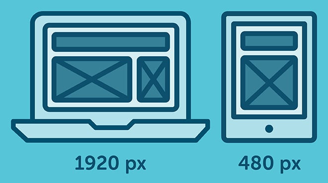
In this example, you can see how the layout adapts to the screen size. The layout at large resolution has a header and two column body layout but in small device it turns into one column layout.
How to set CSS breakpoints
The tricky part is to decide the breakpoints themselves. There aren’t any standard templates, and different frameworks use different breakpoints.
So what approach should you adopt for your breakpoints?
There are two probable approaches to follow:
- Breakpoints based on device
- Breakpoints based on content
CSS breakpoints based on device
Deciding breakpoints based on different devices sounds like a good idea, but in reality, it’s not always the best approach. We already have enough devices to worry about, and when a new one comes out with a different width, going back to your CSS and adding a new breakpoint all over again is time-consuming.
Nonetheless, it’s still a viable option, as you may find that works okay for you. Here’s an example of device-specific breakpoints:
[css]/* ----------- iPhone 6, 6S, 7 and 8 ----------- */

/* Portrait */

@media only screen

and (min-device-width: 375px)

and (max-device-width: 667px)

and (-webkit-min-device-pixel-ratio: 2)

and (orientation: portrait) {

}

/* Landscape */

@media only screen

and (min-device-width: 375px)

and (max-device-width: 667px)

and (-webkit-min-device-pixel-ratio: 2)

and (orientation: landscape) {

}

/* ----------- Google Pixel ----------- */

/* Portrait */

@media screen

and (device-width: 360px)

and (device-height: 640px)

and (-webkit-device-pixel-ratio: 3)

and (orientation: portrait) {

}

/* Landscape */

@media screen

and (device-width: 360px)

and (device-height: 640px)

and (-webkit-device-pixel-ratio: 3)

and (orientation: landscape) {

}[/css]
With this approach, you will end up having a huge list of media queries.
CSS breakpoints based on content
The ideal option for deciding breakpoints is based on the content of your site. This method allows you to simply add breakpoints where your content needs layout adjustment. This will make your media query a lot simpler and manageable.
This breakpoint means the CSS will apply when the device width is 768px and above.
[css]@media only screen (min-width: 768px){

...

}[/css]
You can also set a range with breakpoints, so the CSS will only apply within those limits.
[css]@media only screen and (min-width: 768px) and (max-width: 959px){

...

}[/css]
When to use min or max-width CSS breakpoints
You can set your breakpoints in different ways using min-width, max-width, or even by combining both. But the question is, when should you use each one?
To answer it in a simple way, if you are designing your layout with a mobile-first approach, then use min-width breakpoints and work your way up.
Set your default styles for the small device and just adjust for larger devices accordingly.
Likewise, if you are designing for larger devices first, then set your default CSS as you normally would and adjust for smaller devices with the max-width approach.
Using CSS breakpoints with SASS
If you are using a preprocessor like SASS or SCSS, you can write much smarter breakpoints. Mixin allows you to create more declarative breakpoints to remember, like this:
[css]@mixin tablet-up {

@media only screen (min-width: 768px) { @content; }

}[/css]
While working in a group, it’s much easier to remember “tablet-up” than 768px or 48em. Anyone can understand this breakpoint; it is for tablet and above screen sizes.
Which CSS breakpoints to use
We’ve seen how to use breakpoints and when to use them, but the question still remains: what specific breakpoints should you use?
Let’s break things down a little. You need to target desktop, tablet, and mobile-only sizes. You can check some popular frameworks to get an idea of what approach to follow.
Bootstrap has breakpoints at 576px, 768px, 992px, and 1200px. Foundation mainly has breakpoints at 40em and 64em. At Bulma, breakpoints are set at 768px, 769px, 1024px, 1216px, and 1408px.
Each one has different breakpoints but one thing they have in common is a mobile-first approach. You can use one of these breakpoints as a starting point or you can come up with your own, like this:
[css]@media (min-width: 640px){

...

}

@media (min-width: 768px){

...

}

@media (min-width: 1024px){

...

}

@media (min-width: 1200px){

...

}[/css]
You get the idea!
Wrapping up
To sum up, CSS breakpoints are a great way to restructure your layout to provide the best user experience across different devices.
Always try to create breakpoints based on your own content, not devices. Break them to a logical width rather than a random width and keep them to a manageable number, so modifying remains simple and clear.
What CSS breakpoints do you use for your layouts? Do let us know in the comments section below.
What’s next?
Create and test your custom Gutenberg blocks with Local for free!
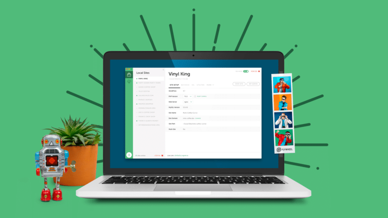
Learn more about Local here!
For more advice on building responsive sites, check out these articles!


Comments ( 0 )