Design
2021 web design trends

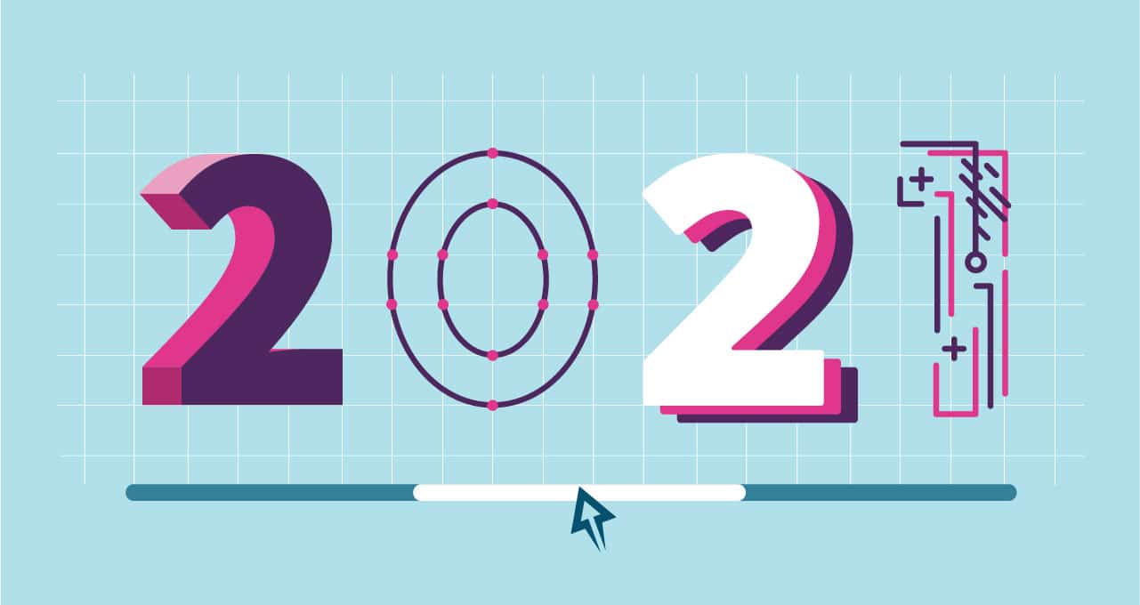
2021. (Doesn’t it feel good to add that “1?!”)
While the world adjusts to a new year, so too are designers embracing a new year of design. After a year of so many unknowns, we’re beginning to see trends that take us back to a comfortable past while emphasizing future-focused user experience.
From working online to buying online to socializing online, people are interacting with the internet more than ever before, and designers are embracing bold designs to push the boundaries of what we can experience together.
While this is by no means exhaustive, here are 11 of the top web design trends we’re seeing for 2021:
- Page layouts with a horizontal scroll
- Custom cursors
- 3d objects
- Excellent eCommerce experiences
- Visible grid lines with thick line weights
- User preference options on sites (not just apps)
- A shift from building websites to building solutions
- Playful illustrations
- Typography as design, not just words
- Geometric shapes as background elements
- WordPress as a CMS
1. Page layouts with a horizontal scroll
Long scrolling websites and parallax designs have been popular for several years now. As we head into 2021, we’re starting to see an orientation shift of designers using horizontal movement to “decrease” the length of the page.
While the physical experience isn’t different for the user (you usually still scroll the mouse up and down), the visual experience provides something unexpected and interesting. It creates a journey across the website in which the user doesn’t quite know where it’s going to take them, which is rare now that we’ve developed such normal patterns for websites.
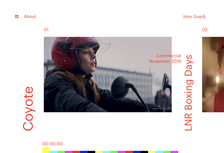
This website for Jony Guedj, a freelance film director, uses a horizontal scroll for the primary section of her site to display her work. The colorful bar at the bottom moves along with your mouse, as a helpful way to orient “where” you are on the page.

LinkSture, an agency focused on design and eCommerce solutions, uses a horizontal scroll to display their portfolio on their homepage as well. It’s further down the page, however, using a combination of both vertical and horizontal motions while you scroll.
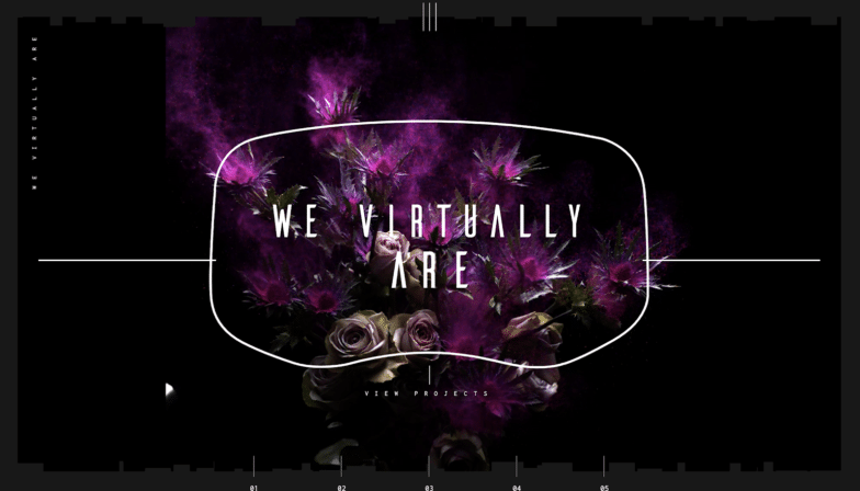
We Virtually Are, a virtual reality studio, uses horizontal movement to actually make you feel like you’re staying in the same place on their site, while all the content changes. It’s completely different than what you expect from most websites, a fitting experience for a VR company that specializes in creating new realities.
2. Custom cursors
I especially love this trend because it feels both familiar and new. A nod to custom cursors of the mid-2000s (admit it, you used one on your Myspace profile!), custom cursors are making an elegant comeback.
From minimal geometric shapes to fully interactive web page experiences, customizing the mouse cursor is becoming a small way to add some repetition to your branding. Many agencies are using it to repeat shapes or colors from their logos, or as a way to engage users with the site.
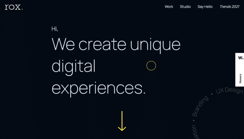
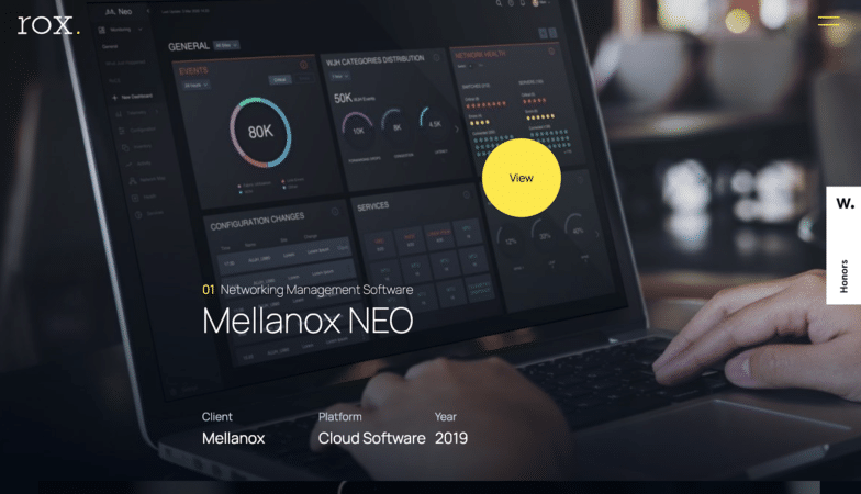
In this example from Rox Studios, a boutique design agency, the mouse is that yellow circle. It changes based on the background content you’re hovered over, turning into a CTA button itself to “View” a project.
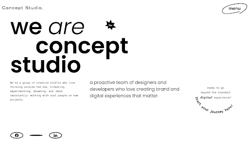
See that fun little face in the first image? That your mouse when you land on Concept Studio’s website. You’ll see some similar creatures throughout the site, and also watch the cursor change for different sections.
In the second screenshot, the mouse changes to a wand that even drops little particles as you move around. It never disrupts the content, and instead just adds an element of whimsy and interactivity as you experience their site.
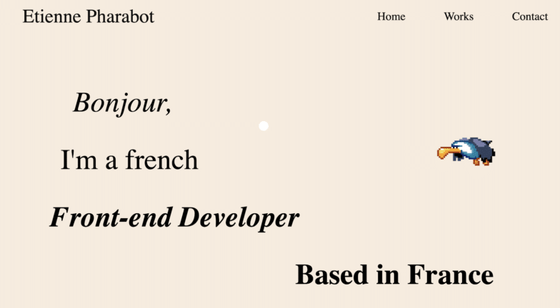
See that little white circle? That’s your mouse on Etienne Pharabot’s website, a front-end developer based in France. There’s more to it than meets the eyes, however. I highly suggest scrolling over the various sentences throughout the site. (Some emoji surprises await!)
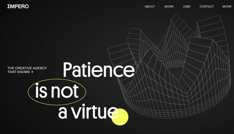
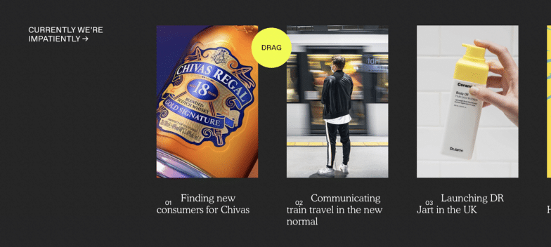
Impero, a creative agency, uses a large yellow circle as their cursor that nicely falls behind any text you hover over. They also use it as an opportunity to help users navigate the site, for example displaying “drag” over a horizontal scrolling section. (A nice way to combine a few of these trends!)
3. 3d objects
While flat design ruled for quite some time, we’re starting to see a three-dimensional shift in the elements on web designs. This may be inspired by the rise of virtual and augmented reality, bleeding into our two-dimensional browsing experiences.
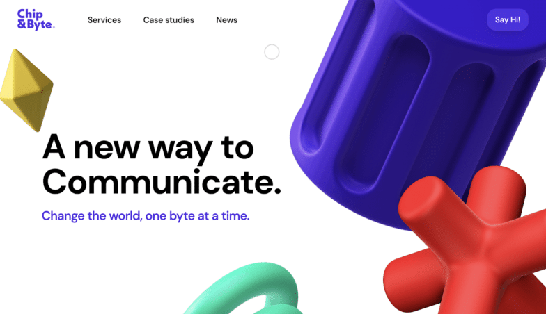
This colorful example from Chip&Byte, an agency based in Italy, adds a playful element to their site. As you move the cursor around (the little gray circle!) the shapes move as well, adding to the sense of dimension.
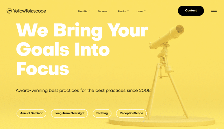
It only feels right that a company called “Yellow Telescope” has a 3d, yellow telescope displayed proudly on their homepage! When you first land on the site, you’ll watch it “build itself” as each piece falls into place, which is perhaps a synonym for how they help their clients build up reliable practices.

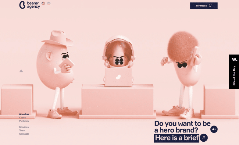
Beans Agency uses the 3d trend to bring their beans to life, displaying them in several scenes across the site. This trend is a great way to bring motion to a character, or give a “realistic” feeling over just an abstract, flat illustration.
Not entirely sold on the 3d trend? You could always take a subtle approach, like C-HM Conseil. The elegant bevel and glow on a monochromatic background leans into the material look without being overbearing.
4. Excellent eCommerce experiences
It’s no surprise that online retail has increased dramatically over the last year, which has also led to more intentional, better shopping experiences. After all, with more competitors rushing to get their websites online, it’s no longer acceptable for a store to just exist on the internet; it needs to be optimized and prioritize user experience to keep shoppers from bouncing.
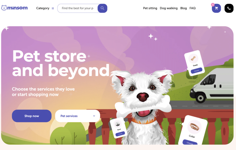
Minsom, a pet store, makes it easy to purchase both items and services right from their homepage. With large buttons and simple categories, it’s easy to navigate so you can check out quickly, instead of spending too much time searching around the site.
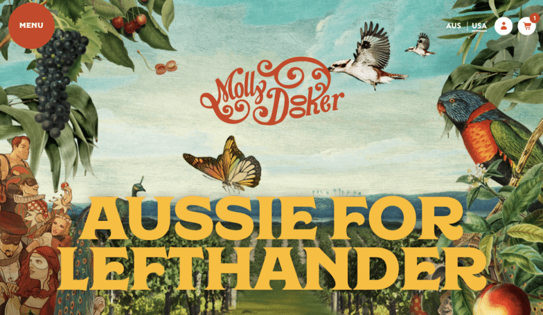
This wine shop, Molly Dooker, is not only a beautiful and artistic site experience, but a smooth shopping one as well. It’s easy to browse the wines, preview what’s in your cart, and then purchase – all while enjoying a delightful site design.
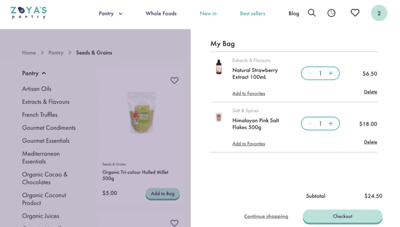
Zoya’s Pantry, a healthy and organic food store, optimizes the shopping experience for adding multiple items to your cart. When you click “Add to Bag,” your window doesn’t change, so you can just continue browsing without losing your place on the page. Then to view your cart, all you have to do is hover over the icon in the top navigation (instead of clicking out to a separate page).
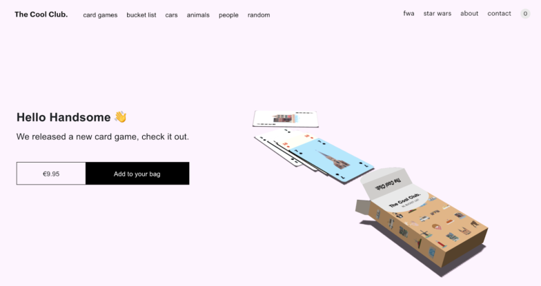
You’ll notice a few 2021 design trends on The Cool Club site. From an effortless eCommerce experience to a 3D display of one of their products (a card game!), it’s easy to see exactly what you’re buying and then put it in your cart. (Even right above the fold on the homepage!)
5. Visible grid lines with thick line weights
Grids have been useful in web design for a long time, but we’re starting to see a trend of giving them a pop of color or a thick line weight. Instead of keeping them minimal, designers are leaning into the natural shapes they build on the page and making their grid lines stand out to achieve a bold, geometric appearance.
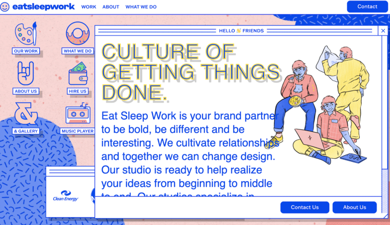
Eat Sleep Work uses colorful lines to help bring their Windows-like desktop to life. While they aren’t too thick, the bold blue does the trick to make the grid stand out and create intentional structure across the site.
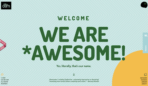
This software development studio, OSM, uses grid lines in a few interesting ways across the site. As you can see from the background, they lean into a thick line weight and geometric style with their brand, and repeat this in multiple different ways, including with grid layouts.
Not sure if bold grid lines are right for your site? You could try a “negative space” approach like Rui Ma, a designer and art director. It’s more subtle than emphasizing the grid with a contrasting color, but the wide spacing still allows that geometric-feeling to shine through.
6. User preference options on sites (not just apps)
Creating unique, personalized experiences is becoming more and more popular, and one way web designers are doing that is by building options into the site design. From preferences like light mode vs dark mode to accessibility options like what language to use, this trend is all about giving more control to the user over what their site experience is like.

Right away when you load Hoang Nguyen’s website, you’ll see an option for audio. The default is set to “off,” so even if the site loads before you make a choice, it won’t startle you (although even if it was set to “on,” it wouldn’t; it’s very calming music!). This gives you the power to customize your experience right away, and if you change your mind later, there’s an option for sound right next to his logo at the top of the site.
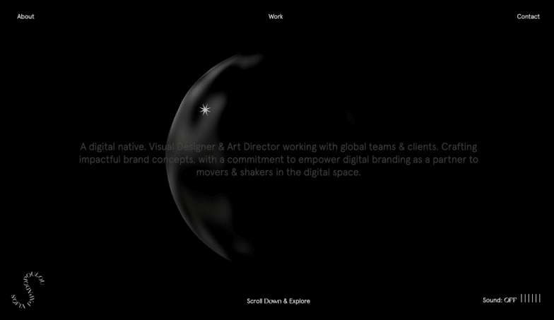
Sofia Papadopoulou’s site is similar in that it offers settings for audio, but they’re stuck to the bottom right corner (where you might traditionally find a sticky back-to-top button.) The default is again set to “off,” despite the sound containing just calming instrumentals (nothing crazy).
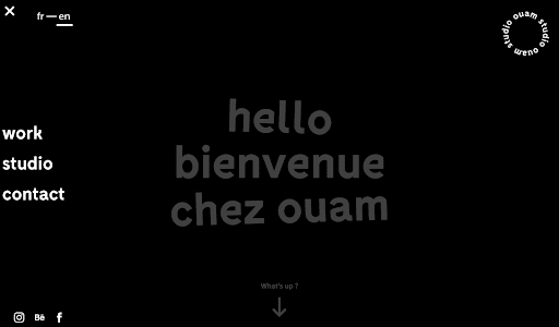
This example from Studio OUAM, a creative agency in France, makes it easy to choose which language you’d like to use while browsing their site. Listed right at the top of the menu, they give the option for French or English, tailoring their website to their two primary audiences.
7. A shift from building websites to building solutions
While web design is as important as ever (if not even more critical in the age of the coronavirus), agencies are starting to shift their focus toward full-solution selling, instead of individual deliverables. For example, instead of calling themselves a web design agency, a creative studio might refer to itself as a “brand experience partner,” or something else that refers to the full value of what they provide (not just the tangible parts).
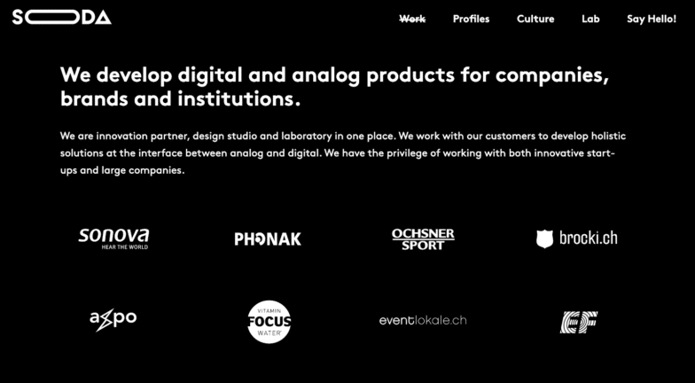
This is Soda Studios, an “innovation partner, design studio, and laboratory.” They’re not too concerned with listing off every single individual service they provide, but rather focusing on holistic solutions for their customers.
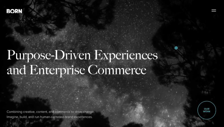
BORN Group is a “global digital agency driven by human-centered experiences.” They do have a services page to go into more details about what they offer, but even that focuses on the bigger picture with services like brand experience, service design, and innovation.
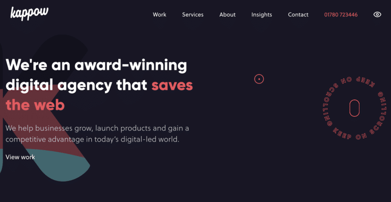
Kappow is a digital agency that focuses on web design, but you wouldn’t necessarily know it from their homepage. Instead, they share the value of what their work really provides their clients: business growth, successful product launches, and an advantage over competitors. (Who doesn’t want all that?!)
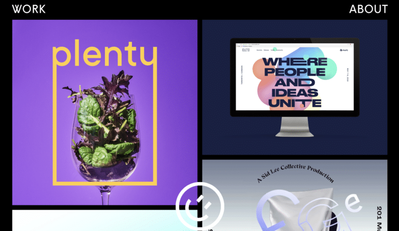
8. Playful illustrations
The rise of illustrations has been increasing for a few years now, and we don’t see it going anywhere quite yet. It’s a great way to add a “human” element to your site, especially if you don’t have access to a great photographer and want to avoid stock photos. Or if you/your agency specialize in illustration, it’s the perfect way to show off your work!

What a wonderful world to browse on RUYA’s site, a branding and digital agency. They’ve given their illustration the full-width of their homepage, making it quite the showstopper as soon as you load the page. Even better: When you hover your mouse over parts of the image, you’ll discover that it serves as a navigation element, helping you learn more about their agency, services, and work.

These quirky illustrations from UPQODE, a web design agency, are paired with animation to really bring them to life. You can watch them change colors, sizes, and interact with each other, which makes for an entertaining homepage experience.
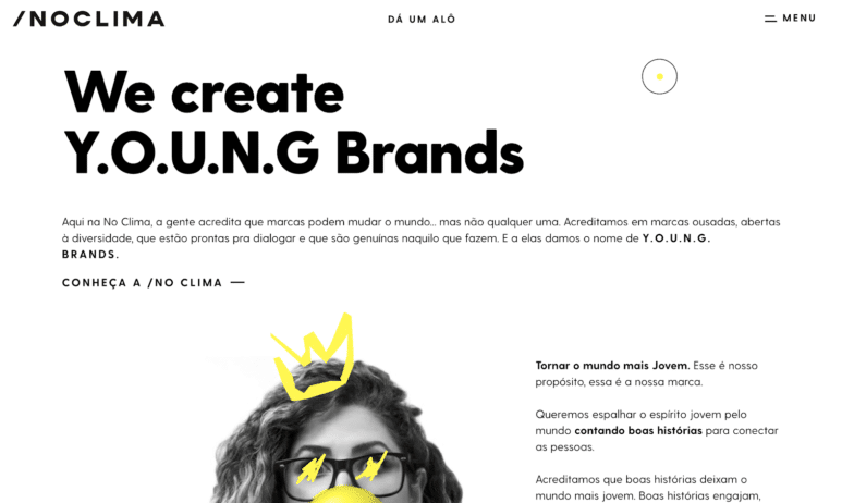
If full illustrations aren’t quite right for your brand, there’s always the option to use them as accents, like No Clima does. You’ll find “doodles” on top of photos throughout their site, lending it a hand-crafted, artistic feeling. This is also a great way to combine illustration and photography, if you’re interested in using both!
9. Typography as design, not just words
Sometimes words are meant to be practical, sometimes they’re meant to be art. And today’s web designers aren’t afraid to use them for the second purpose, as more of a design element than a paragraph or body of text.
While it’s still legible, the text on the Dystopian Creatives homepage blurs the lines between practical and visual in a compelling way. It feels more like a background pattern than a paragraph, and interacts with the other images on the page in interesting ways.

Loop, a full-service creative agency, uses type as a background element on their homepage along with an easier-to-read paragraph on top. Because the background font size is so big (and a nice shade of yellow), your eyes can read both sets of text without becoming confused. I also love the way it prompts users to scroll, to answer the question, “Design for…what?”

As you scroll down this site for Stone & Style, you’ll see each headline as a normal block of text, but also echoed in a large serif-font in the background that bleeds off the page. It’s a great way to repeat the message without sounding repetitive and adds a hint of elegant mystery to the site as you try to read what the background text says (before you discover the pattern).
10. Geometric shapes as background elements
When it comes to your site design, don’t overthink it. While geometric shapes may feel too “simple,” they’re familiar and uncomplicated (both qualities that are good for user experience!). And with such strong building blocks, there’s a lot you can do to put your agency’s brand on them, so they feel like anything but simple.

This example from fourpillars uses simple shapes (essentially just blocks and dots!) paired with movement based on the user’s scroll to create a dynamic, geometric experience. As you scroll down the page, you’ll watch the blocks build themselves up and break themselves down, ever-changing to keep telling the story. (There may be a “Pong” game easter egg in there also, if you’re looking for a little break!)

While the colorful, oval-like shapes on Oh Happy Dani may not technically be geometrical, they certainly achieve the same playful effect. Paired with her brand colors, they make for a great frame behind her hero image, and you’ll see them repeated in new ways across the site.

Blab, a communication studio, also makes use of almost-geometric shapes on their homepage. These circle/oval/egg-shaped patterns grow and shrink as you rest on the page, and then move aside as you start to scroll. They remind me of sound coming out of a speaker, which pairs perfectly with the copy on the page “Your voice louder.”

This colorful studio, illo, uses geometric shapes right behind their primary message on the homepage. As you hover over the phrases that are underlined, one of the shapes will move to reveal an image within, a clever way to show off their first focus – motion design.
11. WordPress as a CMS
Last, but certainly not least, is how these sites are built. (After all, if the back-end isn’t serving the purpose you need it to, it doesn’t matter how great the front-end looks!)
WordPress now powers more than 40% of the internet. That’s almost half of all websites (including those not built on a CMS), and it’s likely due to how flexible the CMS has truly become over the years.
Not sold on it? All of the websites in this roundup are powered by WordPress, to give you a great example of everything you can build with it! From beautiful themes that help you get started quickly to more than 55,000 free plugins that help you extend functionality, WordPress can do just about anything.
What do you think of these web design trends for 2021? Do you agree with the rise of custom cursors, or think that 3d designs are just a fad? Let us know in the comments below which trends you love, or which ones you think are missing from this list!


Comments ( 295 )
Davidtub
June 29, 2025
https://chelseafansclub.com/budvacarme
newsletters
June 18, 2025
This is the proper weblog for anybody who wants to seek out out about this topic. You realize so much its almost arduous to argue with you (not that I actually would want?HaHa). You positively put a new spin on a topic thats been written about for years. Great stuff, just great!
https://www.magileads.com/conseil-astuces-pour-creer-newsletters/
JonasChear
June 1, 2025
kroatien boot chartern https://eurosegeln.com/yachtcharter-kroatien
Georgeorife
May 31, 2025
аренда катамарана турция https://european-yachts.com/rent-yacht-turkey
Stevennom
May 31, 2025
virtual phone number for telegram>
Josephner
May 29, 2025
erectile dysfunction online prescription: Ero Pharm Fast - ed treatments online
Josephner
May 28, 2025
cheap ed meds: ed med online - Ero Pharm Fast
CurtisAdurl
May 28, 2025
Pharm Au24: Pharm Au 24 - Pharm Au24
Davidunlor
May 28, 2025
https://eropharmfast.com/# Ero Pharm Fast
Rodneysog
May 28, 2025
buy antibiotics from canada [url=https://biotpharm.com/#]antibiotic without presription[/url] cheapest antibiotics
Josephner
May 28, 2025
buy antibiotics from india: buy antibiotics online uk - best online doctor for antibiotics
Josephner
May 28, 2025
Licensed online pharmacy AU: pharmacy online australia - Online medication store Australia
CurtisAdurl
May 28, 2025
Ero Pharm Fast: Ero Pharm Fast - what is the cheapest ed medication
Josephner
May 28, 2025
online pharmacy australia: PharmAu24 - Online medication store Australia
Rodneysog
May 28, 2025
erectile dysfunction pills online [url=https://eropharmfast.com/#]ed meds cheap[/url] Ero Pharm Fast
CurtisAdurl
May 28, 2025
Over the counter antibiotics pills: buy antibiotics from canada - get antibiotics quickly
Josephner
May 27, 2025
buy antibiotics from india: Biot Pharm - buy antibiotics from india
Davidunlor
May 27, 2025
http://biotpharm.com/# best online doctor for antibiotics
CurtisAdurl
May 27, 2025
buy ed meds: discount ed meds - where to buy ed pills
Josephner
May 27, 2025
ed meds cheap: cheap boner pills - buy erectile dysfunction pills online
CurtisAdurl
May 27, 2025
best online ed medication: Ero Pharm Fast - Ero Pharm Fast
BryantFex
May 27, 2025
https://www.electronics-lab.com/community/index.php?/profile/98237-roscartr/&tab=field_core_pfield_11
CurtisAdurl
May 27, 2025
get ed meds online: Ero Pharm Fast - discount ed meds
Rodneysog
May 27, 2025
Ero Pharm Fast [url=http://eropharmfast.com/#]Ero Pharm Fast[/url] Ero Pharm Fast
Davidunlor
May 27, 2025
https://eropharmfast.com/# Ero Pharm Fast
Josephner
May 27, 2025
Discount pharmacy Australia: Licensed online pharmacy AU - Medications online Australia
Charlesmub
May 27, 2025
get antibiotics quickly: antibiotic without presription - buy antibiotics from india
Lorenhag
May 24, 2025
generic cialis available in canada: cialis generic overnite shipping - can cialis cause high blood pressure
FrankieLar
May 24, 2025
https://tadalaccess.com/# cialis 20 mg tablets and prices
Lorenhag
May 23, 2025
cialis bathtub: cialis effects - where to buy cialis online
JosephTes
May 23, 2025
buy cipla tadalafil [url=https://tadalaccess.com/#]Tadal Access[/url] cialis over the counter at walmart
FrankieLar
May 23, 2025
https://tadalaccess.com/# tadalafil versus cialis
JosephTes
May 23, 2025
buy cialis in toronto [url=https://tadalaccess.com/#]TadalAccess[/url] cialis overnight shipping
Lorenhag
May 23, 2025
cialis as generic: TadalAccess - cialis free trial voucher
Lorenhag
May 23, 2025
cialis pills: TadalAccess - tadalafil online paypal
JosephTes
May 23, 2025
most recommended online pharmacies cialis [url=https://tadalaccess.com/#]cialis generic versus brand name[/url] cialis sublingual
FrankieLar
May 23, 2025
https://tadalaccess.com/# tadalafil vidalista
JosephTes
May 23, 2025
generic cialis available in canada [url=https://tadalaccess.com/#]tadalafil eli lilly[/url] cialis 40 mg
FrankieLar
May 22, 2025
https://tadalaccess.com/# cialis sample
Lorenhag
May 22, 2025
maximum dose of tadalafil: levitra vs cialis - generic cialis 5mg
JosephTes
May 22, 2025
tadalafil soft tabs [url=https://tadalaccess.com/#]sanofi cialis otc[/url] cialis pills pictures
Lorenhag
May 22, 2025
cialis professional vs cialis super active: buy cialis in toronto - tadalafil buy online canada
FrankieLar
May 22, 2025
https://tadalaccess.com/# typical cialis prescription strength
JosephTes
May 22, 2025
cialis canada free sample [url=https://tadalaccess.com/#]tadalafil review forum[/url] generic cialis 20 mg from india
Lorenhag
May 22, 2025
what possible side effect should a patient taking tadalafil report to a physician quizlet: TadalAccess - cialis soft
Scottdroca
May 22, 2025
best research tadalafil 2017: Tadal Access - how to buy cialis
Lorenhag
May 22, 2025
cialis discount coupons: TadalAccess - tadalafil (exilar-sava healthcare) [generic version of cialis] (rx) lowest price
JosephTes
May 22, 2025
what does cialis look like [url=https://tadalaccess.com/#]Tadal Access[/url] what does cialis do
Lorenhag
May 22, 2025
cialis for sale in toront ontario: TadalAccess - buy cheap tadalafil online
Scottdroca
May 21, 2025
cialis goodrx: TadalAccess - cialis for sale in canada
Lorenhag
May 21, 2025
cialis from mexico: generic cialis - cialis online without perscription
FrankieLar
May 21, 2025
https://tadalaccess.com/# cialis com coupons
Lorenhag
May 21, 2025
cialis online overnight shipping: Tadal Access - cialis free trial
JosephTes
May 21, 2025
how long does cialis last 20 mg [url=https://tadalaccess.com/#]Tadal Access[/url] tadacip tadalafil
FrankieLar
May 21, 2025
https://tadalaccess.com/# how to buy tadalafil
Scottdroca
May 21, 2025
cialis meme: achats produit tadalafil pour femme en ligne - tadalafil and voice problems
FrankieLar
May 21, 2025
https://tadalaccess.com/# cheap cialis for sale
Scottdroca
May 21, 2025
cialis 5 mg for sale: non prescription cialis - paypal cialis no prescription
Lorenhag
May 21, 2025
cialis over the counter in spain: TadalAccess - cialis reddit
JosephTes
May 21, 2025
cialis walmart [url=https://tadalaccess.com/#]cialis over the counter[/url] buy cialis without a prescription
Lorenhag
May 20, 2025
cheap generic cialis canada: Tadal Access - buy tadalafil cheap online
JosephTes
May 20, 2025
buy tadalafil online canada [url=https://tadalaccess.com/#]TadalAccess[/url] generic cialis 5mg
FrankieLar
May 20, 2025
https://tadalaccess.com/# order cialis from canada
Scottdroca
May 20, 2025
what possible side effect should a patient taking tadalafil report to a physician quizlet: Tadal Access - how much does cialis cost with insurance
Lorenhag
May 20, 2025
when does cialis patent expire: canada cialis generic - cialis information
JosephTes
May 20, 2025
cialis price costco [url=https://tadalaccess.com/#]tadalafil citrate[/url] tadalafil tablets side effects
FrankieLar
May 20, 2025
https://tadalaccess.com/# centurion laboratories tadalafil review
Scottdroca
May 20, 2025
tadalafil citrate research chemical: best research tadalafil 2017 - cialis side effects a wife’s perspective
FrankieLar
May 20, 2025
https://tadalaccess.com/# cialis without prescription
Lorenhag
May 20, 2025
cialis difficulty ejaculating: tadalafil 20 mg directions - cialis online pharmacy
Scottdroca
May 20, 2025
is cialis covered by insurance: cialis from canada - how long before sex should you take cialis
FrankieLar
May 19, 2025
https://tadalaccess.com/# cialis professional vs cialis super active
JosephTes
May 19, 2025
cialis patent expiration [url=https://tadalaccess.com/#]TadalAccess[/url] us pharmacy cialis
Lorenhag
May 19, 2025
cialis samples for physicians: Tadal Access - when will generic cialis be available
Scottdroca
May 19, 2025
tadalafil 5mg generic from us: sildenafil vs tadalafil vs vardenafil - canadian online pharmacy cialis
JosephTes
May 19, 2025
cialis price costco [url=https://tadalaccess.com/#]Tadal Access[/url] cialis wikipedia
Lorenhag
May 19, 2025
cialis before and after photos: buying cialis online usa - how many 5mg cialis can i take at once
Lorenhag
May 19, 2025
tadalafil online paypal: TadalAccess - cialis genetic
JosephTes
May 19, 2025
ordering cialis online [url=https://tadalaccess.com/#]TadalAccess[/url] cialis 20 mg price walgreens
FrankieLar
May 19, 2025
https://tadalaccess.com/# buy cialis on line
Lorenhag
May 19, 2025
cialis manufacturer coupon lilly: TadalAccess - cialis dapoxetine overnight shipment
Scottdroca
May 19, 2025
paypal cialis no prescription: TadalAccess - special sales on cialis
FrankieLar
May 19, 2025
https://tadalaccess.com/# cialis lower blood pressure
Lorenhag
May 19, 2025
over the counter cialis 2017: cialis 5mg coupon - п»їwhat can i take to enhance cialis
JosephTes
May 18, 2025
cialis payment with paypal [url=https://tadalaccess.com/#]peptide tadalafil reddit[/url] cialis online usa
Scottdroca
May 18, 2025
cialis tadalafil & dapoxetine: Tadal Access - how many 5mg cialis can i take at once
FrankieLar
May 18, 2025
https://tadalaccess.com/# what is the difference between cialis and tadalafil
Lorenhag
May 18, 2025
buy cialis no prescription: Tadal Access - cialis black review
JosephTes
May 18, 2025
cialis free 30 day trial [url=https://tadalaccess.com/#]sunrise remedies tadalafil[/url] cialis 5mg coupon
Scottdroca
May 18, 2025
cialis daily dosage: Tadal Access - cialis professional review
FrankieLar
May 18, 2025
https://tadalaccess.com/# maxim peptide tadalafil citrate
Scottdroca
May 18, 2025
typical cialis prescription strength: TadalAccess - buy cialis online without prescription
FrankieLar
May 18, 2025
https://tadalaccess.com/# how much does cialis cost with insurance
Lorenhag
May 18, 2025
original cialis online: buying cialis internet - buying cialis online safely
JosephTes
May 18, 2025
cialis dosage 20mg [url=https://tadalaccess.com/#]TadalAccess[/url] does cialis really work
Scottdroca
May 18, 2025
cialis cost at cvs: which is better cialis or levitra - cialis free trial voucher
Lorenhag
May 18, 2025
is tadalafil and cialis the same thing?: TadalAccess - cheap cialis online overnight shipping
FrankieLar
May 18, 2025
https://tadalaccess.com/# canadian pharmacy cialis
JosephTes
May 17, 2025
cialis sample pack [url=https://tadalaccess.com/#]Tadal Access[/url] cialis 2.5 mg
FrankieLar
May 17, 2025
https://tadalaccess.com/# buy cialis 20mg
Scottdroca
May 17, 2025
best place to buy liquid tadalafil: TadalAccess - tadalafil citrate liquid
JosephTes
May 17, 2025
cialis super active real online store [url=https://tadalaccess.com/#]tadalafil cheapest price[/url] tadalafil citrate liquid
Lorenhag
May 17, 2025
cialis com coupons: TadalAccess - cialis generic purchase
FrankieLar
May 17, 2025
https://tadalaccess.com/# cialis lower blood pressure
Scottdroca
May 17, 2025
cialis canada over the counter: buy cialis on line - cheap cialis pills
Lorenhag
May 17, 2025
sildenafil vs cialis: Tadal Access - cialis brand no prescription 365
FrankieLar
May 17, 2025
https://tadalaccess.com/# cialis professional
Scottdroca
May 17, 2025
cialis no prescription: maxim peptide tadalafil citrate - mambo 36 tadalafil 20 mg reviews
JosephTes
May 17, 2025
tadalafil how long to take effect [url=https://tadalaccess.com/#]TadalAccess[/url] prescription for cialis
Scottdroca
May 17, 2025
cialis manufacturer coupon: Tadal Access - purchasing cialis online
FrankieLar
May 16, 2025
https://tadalaccess.com/# cialis super active plus
JosephTes
May 16, 2025
us pharmacy cialis [url=https://tadalaccess.com/#]TadalAccess[/url] cialis canada
Scottdroca
May 16, 2025
cialis 5 mg price: cialis for sale online - cialis images
Lorenhag
May 16, 2025
what is cialis: cheapest cialis 20 mg - buying cialis internet
FrankieLar
May 16, 2025
https://tadalaccess.com/# cialis free trial voucher
JosephTes
May 16, 2025
cialis patent expiration 2016 [url=https://tadalaccess.com/#]TadalAccess[/url] typical cialis prescription strength
Lorenhag
May 16, 2025
canadian no prescription pharmacy cialis: what is cialis tadalafil used for - cialis trial pack
FrankieLar
May 16, 2025
https://tadalaccess.com/# cheap cialis generic online
JosephTes
May 16, 2025
cialis daily dosage [url=https://tadalaccess.com/#]TadalAccess[/url] buy cialis online australia pay with paypal
Scottdroca
May 16, 2025
cialis prescription cost: recreational cialis - cialis goodrx
Lorenhag
May 16, 2025
cialis 20mg tablets: TadalAccess - cialis medicine
FrankieLar
May 16, 2025
https://tadalaccess.com/# cialis 5mg price comparison
JosephTes
May 16, 2025
buying cialis without a prescription [url=https://tadalaccess.com/#]tamsulosin vs. tadalafil[/url] tadalafil generic usa
Lorenhag
May 16, 2025
cialis daily dosage: buy tadalafil cheap online - free samples of cialis
Scottdroca
May 15, 2025
what is the generic for cialis: generic cialis available in canada - vardenafil vs tadalafil
FrankieLar
May 15, 2025
https://tadalaccess.com/# cialis tadalafil 20mg price
Lorenhag
May 15, 2025
cheap generic cialis: tadalafil walgreens - buy cialis generic online 10 mg
FrankieLar
May 15, 2025
https://tadalaccess.com/# tadalafil citrate research chemical
JosephTes
May 15, 2025
e-cialis hellocig e-liquid [url=https://tadalaccess.com/#]buy tadalafil powder[/url] canada cialis for sale
Lorenhag
May 15, 2025
cialis headache: TadalAccess - cialis dosages
Scottdroca
May 15, 2025
why does tadalafil say do not cut pile: TadalAccess - best place to buy generic cialis online
Lorenhag
May 15, 2025
purchase cialis: tadalafil 20mg (generic equivalent to cialis) - no prescription cialis
FrankieLar
May 15, 2025
https://tadalaccess.com/# cialis super active real online store
Scottdroca
May 15, 2025
cialis free trial voucher: cialis overdose - п»їwhat can i take to enhance cialis
Lorenhag
May 15, 2025
sildenafil and tadalafil: cialis online reviews - cialis black
FrankieLar
May 15, 2025
https://tadalaccess.com/# tadalafil cialis
JosephTes
May 15, 2025
cialis from india online pharmacy [url=https://tadalaccess.com/#]buy cialis no prescription overnight[/url] sildenafil and tadalafil
Scottdroca
May 14, 2025
what is cialis pill: generic cialis - tadalafil tablets side effects
Lorenhag
May 14, 2025
how many 5mg cialis can i take at once: recreational cialis - cialis professional review
JosephTes
May 14, 2025
tadalafil medication [url=https://tadalaccess.com/#]where to buy cialis soft tabs[/url] cheap cialis 20mg
Scottdroca
May 14, 2025
prices on cialis: cialis dapoxetine overnight shipment - cialis street price
Lorenhag
May 14, 2025
cialis insurance coverage blue cross: uses for cialis - cialis not working
FrankieLar
May 14, 2025
https://tadalaccess.com/# cialis for prostate
Scottdroca
May 14, 2025
cialis free: cheapest 10mg cialis - cialis purchase
JosephTes
May 14, 2025
cialis professional review [url=https://tadalaccess.com/#]TadalAccess[/url] cialis buy without
Lorenhag
May 14, 2025
canadian pharmacy cialis 40 mg: cialis free trial coupon - where to buy cialis
FrankieLar
May 14, 2025
https://tadalaccess.com/# cialis black in australia
Scottdroca
May 14, 2025
teva generic cialis: buying cialis generic - cialis 100mg from china
JosephTes
May 14, 2025
cialis free trial voucher [url=https://tadalaccess.com/#]cialis sublingual[/url] walgreens cialis prices
Lorenhag
May 14, 2025
cialis 5mg 10mg no prescription: TadalAccess - cialis website
FrankieLar
May 14, 2025
https://tadalaccess.com/# best time to take cialis 20mg
Scottdroca
May 14, 2025
when to take cialis for best results: Tadal Access - cialis online with no prescription
MatthewTom
May 13, 2025
can you get clomid tablets [url=http://clomhealth.com/#]can i order generic clomid without insurance[/url] can you buy generic clomid online
Oscargef
May 13, 2025
PredniHealth: PredniHealth - buy prednisone from india
Russellfeeve
May 13, 2025
how to buy prednisone online: buy generic prednisone online - non prescription prednisone 20mg
MatthewTom
May 13, 2025
can you get clomid without insurance [url=http://clomhealth.com/#]how to get generic clomid price[/url] cost cheap clomid now
Oscargef
May 13, 2025
where to buy generic clomid for sale: cheap clomid without a prescription - how can i get cheap clomid without a prescription
RogerCouct
May 13, 2025
https://amohealthcare.store/# Amo Health Care
Russellfeeve
May 13, 2025
prednisone purchase online: PredniHealth - PredniHealth
MatthewTom
May 13, 2025
ampicillin amoxicillin [url=https://amohealthcare.store/#]Amo Health Care[/url] Amo Health Care
Oscargef
May 13, 2025
purchase amoxicillin online: Amo Health Care - Amo Health Care
Russellfeeve
May 13, 2025
PredniHealth: prednisone 50 - PredniHealth
RogerCouct
May 13, 2025
https://prednihealth.shop/# PredniHealth
MatthewTom
May 13, 2025
over the counter amoxicillin [url=https://amohealthcare.store/#]Amo Health Care[/url] amoxicillin buy canada
Russellfeeve
May 13, 2025
buy clomid without rx: buying clomid without prescription - can you buy generic clomid pills
Oscargef
May 13, 2025
can i get generic clomid without prescription: cost of generic clomid without prescription - cost of generic clomid without insurance
RogerCouct
May 13, 2025
https://clomhealth.com/# where to buy cheap clomid
JudsonZoown
May 12, 2025
where to get clomid now: Clom Health - can i order cheap clomid without a prescription
MatthewTom
May 12, 2025
Amo Health Care [url=https://amohealthcare.store/#]amoxicillin online pharmacy[/url] Amo Health Care
Russellfeeve
May 12, 2025
medicine amoxicillin 500mg: Amo Health Care - amoxicillin order online
RogerCouct
May 12, 2025
http://prednihealth.com/# PredniHealth
Oscargef
May 12, 2025
amoxicillin 500 mg tablet: buy amoxicillin online without prescription - Amo Health Care
JudsonZoown
May 12, 2025
Amo Health Care: order amoxicillin no prescription - cost of amoxicillin 30 capsules
MatthewTom
May 12, 2025
can i purchase clomid without prescription [url=http://clomhealth.com/#]cost of cheap clomid without a prescription[/url] where to buy clomid pill
Russellfeeve
May 12, 2025
amoxicillin 500: Amo Health Care - amoxicillin 800 mg price
RogerCouct
May 12, 2025
https://clomhealth.com/# order cheap clomid without rx
Oscargef
May 12, 2025
can i purchase clomid without insurance: buy generic clomid - cost of clomid prices
JudsonZoown
May 12, 2025
prednisone best price: PredniHealth - PredniHealth
Russellfeeve
May 12, 2025
Amo Health Care: Amo Health Care - prescription for amoxicillin
Oscargef
May 12, 2025
cost of clomid without a prescription: Clom Health - can you get cheap clomid prices
RogerCouct
May 12, 2025
https://prednihealth.com/# PredniHealth
MatthewTom
May 12, 2025
order prednisone with mastercard debit [url=http://prednihealth.com/#]PredniHealth[/url] cost of prednisone
JudsonZoown
May 12, 2025
amoxicillin capsules 250mg: Amo Health Care - Amo Health Care
Jeremyfax
May 12, 2025
discreet shipping ED pills: generic tadalafil - reliable online pharmacy Cialis
Albertoseino
May 12, 2025
modafinil 2025: legal Modafinil purchase - buy modafinil online
RobertKet
May 11, 2025
same-day Viagra shipping: fast Viagra delivery - buy generic Viagra online
Albertoseino
May 11, 2025
cheap Viagra online: legit Viagra online - legit Viagra online
Albertoseino
May 11, 2025
purchase Modafinil without prescription: Modafinil for sale - modafinil legality
RonaldFOEFS
May 11, 2025
https://maxviagramd.com/# legit Viagra online
Jeremyfax
May 11, 2025
FDA approved generic Cialis: cheap Cialis online - cheap Cialis online
LorenzoBlize
May 11, 2025
cheap Cialis online [url=https://zipgenericmd.com/#]order Cialis online no prescription[/url] buy generic Cialis online
RonaldFOEFS
May 11, 2025
http://maxviagramd.com/# fast Viagra delivery
Albertoseino
May 10, 2025
cheap Viagra online: Viagra without prescription - order Viagra discreetly
RonaldFOEFS
May 10, 2025
https://maxviagramd.shop/# cheap Viagra online
Albertoseino
May 10, 2025
modafinil pharmacy: verified Modafinil vendors - modafinil pharmacy
RobertKet
May 10, 2025
modafinil 2025: buy modafinil online - buy modafinil online
Albertoseino
May 9, 2025
legal Modafinil purchase: safe modafinil purchase - Modafinil for sale
RobertKet
May 9, 2025
discreet shipping ED pills: secure checkout ED drugs - affordable ED medication
Jeremyfax
May 9, 2025
buy generic Viagra online: no doctor visit required - legit Viagra online
RonaldFOEFS
May 9, 2025
https://modafinilmd.store/# Modafinil for sale
Albertoseino
May 9, 2025
best price Cialis tablets: secure checkout ED drugs - FDA approved generic Cialis
RobertKet
May 9, 2025
Modafinil for sale: modafinil pharmacy - purchase Modafinil without prescription
Jeremyfax
May 9, 2025
same-day Viagra shipping: best price for Viagra - trusted Viagra suppliers
RobertKet
May 9, 2025
FDA approved generic Cialis: affordable ED medication - FDA approved generic Cialis
RobertKet
May 9, 2025
generic sildenafil 100mg: buy generic Viagra online - same-day Viagra shipping
Jeremyfax
May 9, 2025
cheap Cialis online: discreet shipping ED pills - FDA approved generic Cialis
RonaldFOEFS
May 9, 2025
http://zipgenericmd.com/# reliable online pharmacy Cialis
RobertKet
May 9, 2025
generic sildenafil 100mg: generic sildenafil 100mg - cheap Viagra online
Jeremyfax
May 9, 2025
secure checkout Viagra: discreet shipping - buy generic Viagra online
Linwoodcor
May 7, 2025
https://bookhalifatickets.com/burj-khalifa-restaurants/
DavidNow
May 5, 2025
https://chatterchat.com/roscargr
ElmerSip
May 3, 2025
пин ап вход: пинап казино - пин ап зеркало
ElmerSip
May 2, 2025
pin up az: pin up az - pin up
Kennethsheby
May 1, 2025
pin up az: pin up casino - pin up az
Kennethsheby
May 1, 2025
pin-up casino giris: pin up azerbaycan - pin up casino
ElmerSip
May 1, 2025
вавада зеркало: vavada - вавада зеркало
BrianCrugh
May 1, 2025
пин ап вход: пин ап казино - пин ап казино официальный сайт
ZackaryCaush
April 30, 2025
http://pinuprus.pro/# пин ап вход
ElmerSip
April 30, 2025
pin up azerbaycan: pinup az - pinup az
Richardmat
April 30, 2025
pin up [url=http://pinupaz.top/#]pinup az[/url] pin up az
ZackaryCaush
April 30, 2025
http://pinupaz.top/# pin-up casino giris
ElmerSip
April 30, 2025
vavada casino: вавада зеркало - vavada
Richardmat
April 30, 2025
vavada [url=https://vavadavhod.tech/#]вавада официальный сайт[/url] vavada casino
Kennethsheby
April 30, 2025
пин ап казино: пин ап казино - пин ап казино
ZackaryCaush
April 30, 2025
https://pinupaz.top/# pin up
ElmerSip
April 30, 2025
vavada casino: vavada вход - vavada casino
Kennethsheby
April 30, 2025
pin up вход: пинап казино - пин ап вход
ZackaryCaush
April 30, 2025
http://vavadavhod.tech/# вавада казино
ElmerSip
April 30, 2025
pin up вход: pin up вход - пинап казино
Kennethsheby
April 30, 2025
pin up az: pin up - pin up
Walterhap
April 29, 2025
http://medicinefromindia.com/# indian pharmacy
Dannysit
April 29, 2025
indian pharmacy online: indian pharmacy online - indian pharmacy
MichaelFaulp
April 29, 2025
legit canadian pharmacy: Buy medicine from Canada - pharmacy in canada
Stevendrype
April 29, 2025
indian pharmacy online: indian pharmacy - MedicineFromIndia
MichaelFaulp
April 29, 2025
canadian pharmacy 24 com: Express Rx Canada - my canadian pharmacy
Stevendrype
April 29, 2025
Medicine From India: Medicine From India - indian pharmacy online
Dannysit
April 29, 2025
certified canadian international pharmacy: ExpressRxCanada - online pharmacy canada
Stevendrype
April 29, 2025
MedicineFromIndia: Medicine From India - indian pharmacy online shopping
Walterhap
April 29, 2025
http://medicinefromindia.com/# indian pharmacy online shopping
Michaeljouch
April 29, 2025
pharmacy website india [url=https://medicinefromindia.com/#]indian pharmacy[/url] mail order pharmacy india
Stevendrype
April 29, 2025
Rx Express Mexico: mexico pharmacy order online - mexican drugstore online
Walterhap
April 29, 2025
https://medicinefromindia.com/# indian pharmacy online shopping
Dannysit
April 29, 2025
canadian pharmacy ed medications: Express Rx Canada - canadian pharmacy no rx needed
Stevendrype
April 29, 2025
canada drugs reviews: Express Rx Canada - safe canadian pharmacies
MichaelFaulp
April 28, 2025
canadian pharmacy world: ExpressRxCanada - best canadian online pharmacy
Walterhap
April 28, 2025
https://rxexpressmexico.com/# mexican online pharmacy
Dannysit
April 28, 2025
MedicineFromIndia: Medicine From India - Medicine From India
Stevendrype
April 28, 2025
Rx Express Mexico: mexican rx online - RxExpressMexico
MichaelFaulp
April 28, 2025
buy canadian drugs: Express Rx Canada - cheapest pharmacy canada
Dannysit
April 28, 2025
safe reliable canadian pharmacy: Generic drugs from Canada - canadian pharmacy antibiotics
Stevendrype
April 28, 2025
Rx Express Mexico: mexican rx online - mexican rx online
MichaelFaulp
April 28, 2025
canadian drug pharmacy: Express Rx Canada - canadian pharmacy no scripts
Walterhap
April 28, 2025
https://expressrxcanada.shop/# best canadian pharmacy to buy from
Dannysit
April 28, 2025
canadian online drugs: legal to buy prescription drugs from canada - is canadian pharmacy legit
Stevendrype
April 28, 2025
indian pharmacy: indian pharmacy online shopping - indian pharmacy online
MichaelFaulp
April 28, 2025
mexican rx online: mexico drug stores pharmacies - mexican online pharmacy
Bradleyfup
April 28, 2025
Tadalafil achat en ligne: Tadalafil achat en ligne - cialis prix tadalmed.shop
Bradleyfup
April 28, 2025
pharmacie en ligne livraison europe: Medicaments en ligne livres en 24h - trouver un mГ©dicament en pharmacie pharmafst.com
Robertmut
April 27, 2025
https://pharmafst.com/# vente de mГ©dicament en ligne
Robertmut
April 26, 2025
https://kamagraprix.com/# achat kamagra
BilliesniCt
April 26, 2025
Cialis sans ordonnance 24h: cialis sans ordonnance - Tadalafil sans ordonnance en ligne tadalmed.shop
PeterUnomb
April 26, 2025
Cialis en ligne [url=https://tadalmed.com/#]Tadalafil 20 mg prix en pharmacie[/url] Tadalafil achat en ligne tadalmed.com
Robertmut
April 26, 2025
https://pharmafst.shop/# pharmacie en ligne france livraison internationale
BilliesniCt
April 26, 2025
Pharmacie en ligne livraison Europe: Pharmacies en ligne certifiees - trouver un mГ©dicament en pharmacie pharmafst.com
Bradleyfup
April 26, 2025
Cialis en ligne: Acheter Cialis - Tadalafil 20 mg prix en pharmacie tadalmed.shop
PeterUnomb
April 26, 2025
kamagra en ligne [url=https://kamagraprix.com/#]Acheter Kamagra site fiable[/url] kamagra en ligne
BernardVeida
April 26, 2025
kamagra en ligne: achat kamagra - kamagra pas cher
BernardVeida
April 26, 2025
kamagra 100mg prix: kamagra en ligne - kamagra en ligne
Bradleyfup
April 26, 2025
Cialis en ligne: Acheter Viagra Cialis sans ordonnance - Cialis sans ordonnance pas cher tadalmed.shop
Robertmut
April 26, 2025
https://tadalmed.shop/# Pharmacie en ligne Cialis sans ordonnance
BernardVeida
April 25, 2025
kamagra livraison 24h: Kamagra pharmacie en ligne - kamagra en ligne
Bradleyfup
April 25, 2025
Cialis sans ordonnance pas cher: cialis sans ordonnance - cialis sans ordonnance tadalmed.shop
BilliesniCt
April 25, 2025
pharmacie en ligne france livraison belgique: pharmacie en ligne - п»їpharmacie en ligne france pharmafst.com
BernardVeida
April 25, 2025
Cialis sans ordonnance pas cher: Tadalafil achat en ligne - Cialis sans ordonnance pas cher tadalmed.shop
Bradleyfup
April 25, 2025
Kamagra Commander maintenant: Achetez vos kamagra medicaments - kamagra oral jelly
BernardVeida
April 25, 2025
cialis generique: Acheter Cialis - Acheter Cialis 20 mg pas cher tadalmed.shop
BilliesniCt
April 25, 2025
Pharmacie Internationale en ligne: pharmacie en ligne sans ordonnance - pharmacie en ligne pas cher pharmafst.com
Robertmut
April 25, 2025
http://pharmafst.com/# pharmacie en ligne pas cher
BernardVeida
April 25, 2025
pharmacie en ligne livraison europe: Pharmacie en ligne France - pharmacie en ligne sans ordonnance pharmafst.com
Bradleyfup
April 25, 2025
Acheter Viagra Cialis sans ordonnance: Cialis en ligne - Tadalafil sans ordonnance en ligne tadalmed.shop
BilliesniCt
April 25, 2025
Cialis generique prix: Pharmacie en ligne Cialis sans ordonnance - Cialis en ligne tadalmed.shop
Edwardtoupe
April 23, 2025
olympe casino cresus: olympe - olympe casino en ligne
RichardweP
April 6, 2025
https://www.thetaxheaven.com/blog/1xbet-mobile-platform-access-anytime-anywhere-in-india
Terrypox
April 5, 2025
https://pq.hosting/arenda-vpsvds-hostinga-v-alzhire
Jake
April 1, 2025
Привет,
Друзья.
В данный момент я бы хотел рассказать немного
про купить ссылки даркнет.
Я думаю Вы в поискее сейчас про купить ссылки
пушкина!
Поэтому эта наиболее актуальная
информация про купить ссылки тор будет для тебя сто
процентов будет полезной.
Если ты искал про купить ссылки тор или про купить ссылки по, возможно
и про купить ссылки украина?
На нашем сайте больше про купить ссылки по,
Гарантированные ссылки! Качественные обратные ссылки проверенные опытом!
НАШ SEO WEBSITE - купить ссылки тор:
https://tumblr.com/seoquantum - 2025 купить сквозные ссылки
Только, если Вы реально искали информацию про купить обратные ссылки, а также про купить ссылки украина, то вы
найдете самую свежую и актуальную информацию про купить ссылки для продвижения или возможно хотите купить ссылки.
Вы найдете много предложений для купить
ссылки на - а именно про где купить ссылки и про купить внешние ссылки.
Входите с нами в контакт на нашем сайте и вы наверняка найдете популярную и самую актуальную информацию от экспертов по поводу
следующих тем касающихся
нижеперечисленных ключевых слов, а именно:
1. купить ссылки сео;
2. купить ссылки на сайт
3. Про купить обратные ссылки;
4. купить ссылки для продвижения;
5. купить внешние ссылки
Наши Теги: купить ссылки даркнет,
купить ссылки в, купить ссылки seo, купить
ссылки для сео, купить ссылки украина.
Доброго Вам Дня!
BryanAdugh
March 30, 2025
INCREDIBLY REALISTIC SEX DOLL WITH METAL SKELETON!
Feel the difference – just like a real partner!
ULTRA-SOFT SKIN that perfectly mimics the touch of real human skin – indistinguishable!
Anatomically accurate proportions, just like a real woman – every curve in perfect harmony!
WHY IS THIS DOLL EVERY MAN'S DREAM?
- FLEXIBLE METAL FRAME – holds any position you can imagine!
- 100% SAFE – non-toxic medical-grade material, certified by CCIC – no weird smells, just pure pleasure!
- MAXIMUM VERSATILITY – enjoy vaginal, anal, oral, breast play and anything else you desire!
- EASY MAINTENANCE – simple to keep clean and fresh!
EXCLUSIVE OFFER! Get yours now at the best price – while stocks last [url=https://ify.ac/1c3Z]TOP-RATED Love Doll on AliExpress with RAVING REVIEWS![/url]!
GET YOUR LUXURIOUS COMPANION NOW!
Discreet neutral packaging – 100% privacy guaranteed!
This isn’t just a doll – it’s the fulfillment of your deepest desires! Don’t miss out – **order now and experience ultimate pleasure!
ElliottdreSk
March 29, 2025
https://dissertation-now.com/article-review/
BryanAdugh
March 22, 2025
Immerse yourself in the world of cutting-edge technology with the global version of the POCO M6 Pro, which combines advanced features, stylish design, and an affordable price. This smartphone is designed for those who value speed, quality, and reliability.
Why is the POCO M6 Pro your ideal choice?
- Powerful Processor: The octa-core Helio G99-Ultra delivers lightning-fast performance. Gaming, streaming, multitasking—everything runs smoothly and without lag.
- Stunning Display: The 6.67-inch AMOLED screen with FHD+ resolution (2400x1080) and a 120Hz refresh rate offers incredibly sharp and vibrant visuals. With a touch sampling rate of 2160 Hz, every touch is ultra-responsive.
- More Memory, More Possibilities: Choose between the 8/256 GB or 12/512 GB configurations to store all your files, photos, videos, and apps without compromise.
- Professional Camera: The 64 MP main camera with optical image stabilization (OIS), along with additional 8 MP and 2 MP modules, allows you to capture stunning photos in any conditions. The 16 MP front camera is perfect for selfies and video calls.
- Long Battery Life, Fast Charging: The 5000 mAh battery ensures all-day usage, while the powerful 67W turbo charging brings your device back to life in just a few minutes.
- Global Version: Support for multiple languages, Google Play, and all necessary network standards (4G/3G/2G) makes this smartphone universal for use anywhere in the world.
- Convenience and Security: The built-in fingerprint sensor and AI-powered face unlock provide quick and reliable access to your device.
- Additional Features: NFC, IR blaster, dual speakers, and IP54 splash resistance—everything you need for a comfortable experience.
The POCO M6 Pro is not just a smartphone; it’s your reliable companion in the world of technology.
Hurry and grab it at a special price of just 15,000 rubles! Treat yourself to a device that impresses with its power, style, and functionality.
Take a step into the future today—purchase it on [url=https://ify.ac/1Y26]AliExpress[/url]!
RichardweP
March 20, 2025
https://burj-khalifa-dubai.com/
Matthewimisk
March 14, 2025
https://1xbetvnlogin.com/
RichardMah
March 13, 2025
https://1xbetnplogin.com/
Jerald
March 10, 2025
Привет,
Дорогие Друзья.
Сегодня я бы хотел рассказать немного
про купить ссылки украина.
Я думаю Вы искали снова про купить сквозные ссылки!
Сейчас эта наиболее актуальная информация про купить ссылки
пушкина будет для сейчас наиболее будет полезной.
Мы предлагаем больше полезностей
про купить ссылки по или про купить ссылки по, возможно и про
купить ссылки пушкина?
На нашем сайте больше про купить ссылки seo,
Сто процентные ссылки! Качественные обратные ссылки проверенные опытом!
НАШ SEO WEBSITE - купить внешние ссылки: https://tumblr.com/seoquantum - 2025 где купить ссылки
Только, если Вы реально искали информацию про купить
ссылки для раскрутки сайта, а также про купить ссылки сео, то вы найдете самую свежую и актуальную информацию про
купить ссылки для сайта или возможно хотите купить ссылки.
Вы найдете много предложений для где купить ссылки - а именно про купить сквозные ссылки и про купить ссылки в.
Входите с нами в контакт на нашем сайте и
вы наверняка найдете популярную и самую актуальную информацию от экспертов по поводу следующих тем касающихся нижеперечисленных ключевых слов, а именно:
1. купить внешние ссылки;
2. где купить ссылки
3. Про купить сквозные ссылки;
4. где купить ссылки на сайт;
5. купить ссылки в
Наши Теги: купить внешние ссылки, купить внешние ссылки,
купить ссылки в, купить внешние ссылки, купить ссылки пушкина.
Доброго Вам Дня!
TimothynuaZy
February 24, 2025
https://www.adpost.com/u/winnitalycom/
Lewisblots
February 23, 2025
http://www.petsinform.com/forum/viewtopic.php?f=31&t=34024
stavkapro
February 19, 2025
Yes, really. I agree with told all above. We can communicate on this theme.