
For the past four years, Flywheel has launched a summer sale called Fly July featuring 3 months free on any new annual hosting plan. While the main goal is to drive revenue and sales, it’s also a fantastic exercise in creativity for our marketing team.
It always goes a little something like this…
- We decide to do the sale again!
- We start brainstorming themes, only to decide…
- We want to keep the summer theme from years past, but…
- We still want it to feel new and exciting!
How many marketers in the room can relate?
While it’s always a challenge to take something you’ve done before and put a new spin on it, we thrive on these types of projects! And we love working on large campaigns like this where our entire team is involved.
And it occurred to us – typically, you (as our customer/subscriber/brand new friend!) never get to see all of the creativity that goes into these campaigns. You only see the final product, and while we’re super proud of the end result, we’re also proud of all the steps it takes to get there. And if we had to guess, you (as a marketer/business-owner/creative) might also find some value in the process we’ve learned to take!
 Aaron, in his second Fly July shoot at Flywheel!
So we wanted to do something a little different for this year’s Fly July and share a little behind-the-scenes glimpse into our campaign process! I hope you enjoy learning more about our methods and peeking at some work-in-progress photos from the campaign!
The brainstorming process
Like any large project, this campaign kicked off with a big group brainstorm. We analyzed last year’s campaign, set our goals for this year, and then put our thinking hats on to dream up new ways to share a discount for the same great hosting product our customers have always loved.
Right off the bat, we had a lot of ideas. But we kept catching ourselves getting really attached to an idea without a clear reason “why” it was the right message for the campaign.
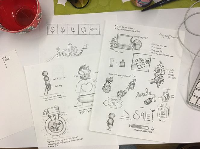 Early sketch concepts for the Fly July campaign.
So we took a step back.
And we took a moment to clearly define every single audience that we’d be targeting with this campaign. This broke down into six main segments for us:
- People who have never heard of Flywheel and people who subscribe, but don’t know much about what we do.
- People who have heard of Flywheel before and are considered leads or MQLs.
- People who have downloaded our free development app, Local, but don’t use Flywheel yet.
- Existing customers who are growing their business and may want to add more WordPress sites to our platform.
- Existing customers who are paying monthly and could take advantage of the discount by upgrading to annual pricing.
- Our referral partners who could earn a kickback for referring their friends to Flywheel during the sale.
When you list out your audiences like that, you start to realize that they’re pretty different. Some know your brand super well, but others are just starting their buyer’s journey and need to learn more before making a purchasing decision. Some identify as technical developers while others might be getting ready to launch their very first WordPress site.
Our audience for this campaign varied, so we knew our visuals and messages needed to vary, also.
Once we clearly defined those segments, their individual pain points, and what they need to know about Flywheel in this moment, things started to fall into place pretty quickly.
For people who needed to learn more about Flywheel, we knew we wanted to stick pretty close to our brand and show off the Flywheel app. Since this audience doesn’t know much about us yet, it was important that the message didn’t get too “creative” and confusing. (This is also why we tend to take both a “literal” and “conceptual” approach to our campaign images, so we always have the option of both!)
 One of the final images, with a direct message about the discount.
For our developer audience (those that use Local but not Flywheel yet), we loved the idea of using sand, to play off the old phrase “sandbox environment.” It’s subtle, so not too distracting from the core message of the discount, but provided a fun way to really target that demographic.
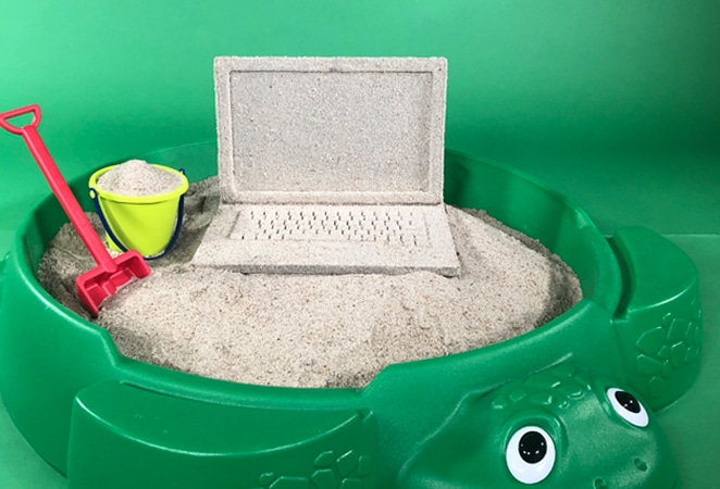 Our local “sandbox” environment.
And for our referral partners, we just adored the idea that everyone’s a winner: the end client gets a great WordPress host and the referral partner gets a cash “thank you” for sending that customer our way. And what says “You’re a winner!” like a fun carnival scene?!
 Carleen rocking this carnival theme!
I won’t go into every image, but you can start to see the pattern: The individual audience drove the creative for that segment. Whether it resulted in ads to that demographic or an email to that list, we kept these “themes” consistent for each audience to create a tailored, consistent message.
With all of this information in hand and distributed to the team, it was time to start the fun part: creating the images!
The Fly July photoshoot
I’ll let you in on a little secret: Almost every image Flywheel uses is created in-house! That’s right: everything from the people to the props to the locations are right here at our Omaha headquarters.
For the models, we simply use…us. There’s no hired talent here, other than our very talented Flywheelers who are always up to help the marketing team with a photoshoot!
For this year’s Fly July campaign, you’ll see:
- Rese, a design intern on the marketing team
- Carleen, our referral program coordinator
- Jess, an enterprise sales rep
- Aaron, a support engineer (and the star of Fly July 2015!)
- Michelle, a software engineer
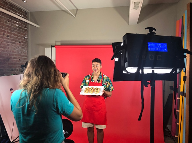 Rese, our design intern, in his first Flywheel campaign shoot!
With these five Flywheelers on board to help us out, the next step was to think about the props. Andrea Trew, Flywheel’s Art Director, has a talent for bringing ideas to life, both in the digital and physical space. From the textured laptops to the cotton candy, all of our props were actually real life objects!
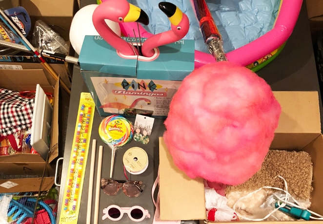 Some of the props used in this year’s Fly July campaign.
We love the look of real objects, as opposed to just Photoshopping things in. While it’s not always feasible for every team, if you’ve been thinking about setting up an in-house photo studio, we totally recommend it. (With the right equipment, you can turn any room into a photo studio; ours is technically an old conference room!)
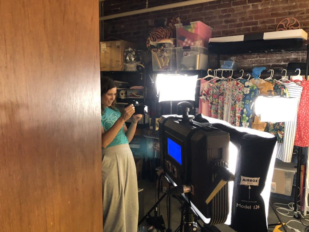 While our photo studio isn’t the biggest, we’re sure proud of all the awesome work we’ve created in it!
With props and people in place, we were able to start the photoshoots. Kimberly Bailey, our in-house photographer, scheduled each one for an hour. This gave her plenty of time to capture everything on our list of “required” images and still have a little time just to play. For any shoot, we try to list out every angle, crop, variety, etc., that way we can get all the shots in one take. This includes things like:
- Tall, full-body
- Wide, full-scene
- Wide, close up of hands
- Wide, angled to the right
- Close-up of props in motion
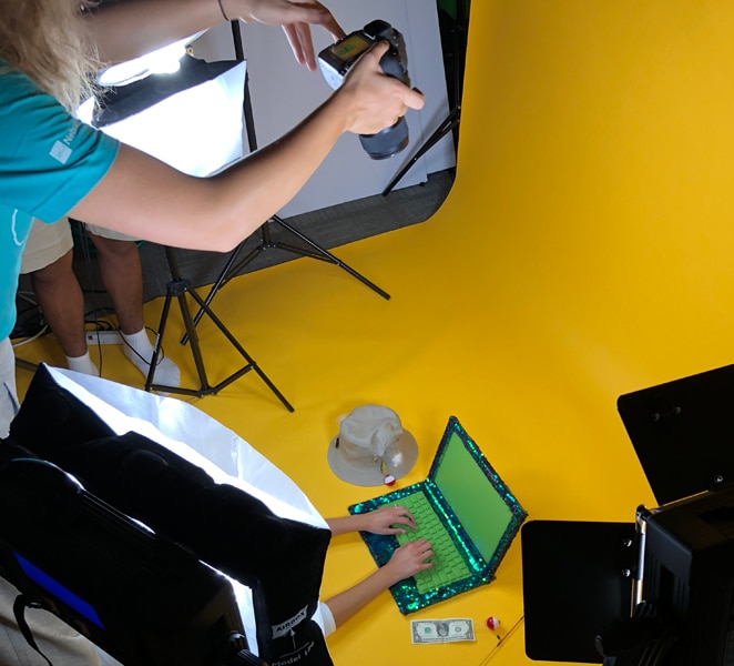 Gotta get those angles!
We then replicate this same list for every shoot within the campaign for added consistency. By taking all these shots, we’re always pretty confident at the end of a shoot that we got the final image, and can press on with the campaign work.
So, two days and over 1,000 photos later, our photoshoot was completed! Next came the refinement work.
Creating the final images
With a wide variety of images to work with, our visual team got to work to determine which ones would be used for the final campaign assets. Our ad strategy determined a lot of this. We knew we needed some images that were horizontal, some that were better suited for vertical layouts, and variations for each type. (After all, we love A/B testing around here!)
Once the final images were chosen, Kimberly did a little color correcting. Thanks to our colorful backdrops and lighting in our photo studio, we never have to do too much correction in post, but Kimberly has a great eye for detail.
 Can’t you just imagine Carleen saying, “You’ve just won three free months of hosting!”
In this phase, we also started finalizing the copy that would accompany each image. Some, like display ads, would have copy directly in the image itself, while others we decided to let the visuals stand alone (with copy living next to it, of course).
While the copywriters had tried to plan out every single line of copy prior to this step, we find small review sessions helpful, to make sure everything is going to plan. When Andrea had a few examples of the final designs to show, she did a quick review with Ashley (our ad strategist) and me (as the content manager), to make sure everything was on a path to success. This quick check-in allowed us to make a few small copy changes and tailor the messages even more, based on the final image direction.
 One of the final campaign images, usually displayed with copy like, “Don’t spend your summer fishing for support answers. Catch a deal on Flywheel instead!”
With the messages finalized and the images created, all that was left was to launch!
Launch day!
Fly July is always fun because it starts July 1st, which this year, was a Sunday. We decided to launch ads that day, since we could do some of the prep work ahead of time, but wait to send emails until Monday. We’ve found that our email list typically is more engaged during the work week, so we weren’t too concerned about missing that one day.
When Monday came, our team rallied behind the email process to help edit, code, and review them. We had a few people from our team out of the office, so everyone jumped in to a play a few different roles in order to help the campaign launch with a successful start.
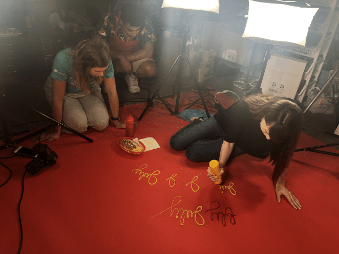 Our team is always willing to try new things, like ketchup and mustard calligraphy!
We updated the site, scheduled some social posts, and then…we had a celebration in the office for the entire Flywheel team! This campaign was a ton of work for us as a marketing team, and we wanted to rally the whole office behind our launch instead of acting in a silo.
Working with our Employee Experience team, we planned a “Fly July” themed lunch. Not only did this get the entire company excited about the campaign, but it also gave our team an opportunity to share all the work we had done and answer a few practical FAQs about the sale.
Our best tips for your next campaign
One of the reasons our team is so successful is that we’re not only dedicated to producing great work, but we’re also committed to learning how to produce better work. Throughout campaigns and definitely after completion, we try to take a moment to reflect on what went well, what challenges we overcame, and what could be even better.
To help with your next campaign, I wanted to share a few of our big takeaways from Fly July 2018!
1. Make a checklist of every asset you’ll need at the beginning of the campaign
Trust us, this will save you so much time down the road, and help keep your timeline on track! The alternative is forgetting something important until launch day, when you usually don’t have enough time to fix it.
2. Don’t make it more complicated than it needs to be
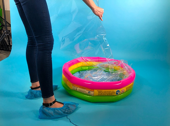
I’ll let you in on a secret. Last year for Fly July, we filled an entire kid’s pool with water in the basement of our office for an “authentic” water look. It was difficult to photograph, and even more difficult to empty all that water out. The clear plastic we used this year looked just fine in photos and was much easier to clean! Don’t overcomplicate it.
3. Encourage feedback throughout the process
Even if everyone on your team is working on a different piece of the puzzle, collaborate and listen to each other. This will help your message stay consistent and your campaign cohesive. Don’t work in a vacuum.
4. Make time to reflect on the campaign and write up a debrief
Having a written document recapping last year’s campaign saved us tons of time getting in the right mindset. It also helped remind us of a few “lessons learned,” so we didn’t have to learn them again this year!
I hope you’ve enjoyed this behind-the-scenes glimpse into our Fly July campaign! If you’re working on a campaign yourself, did we help inspire any ideas? Any tips you’d like to add to our list? Let us know in the comments!





Comments ( 304 )
best canadian online pharmacy
July 25, 2025
medication online
buy prescriptions online
July 25, 2025
discount prescriptions
foreign online pharmacy
July 25, 2025
safe online pharmacies in canada
internet pharmacy no prior prescription
July 25, 2025
canadian pharmacies that ship to us
best online pharmacy reviews
July 25, 2025
overseas online pharmacies
safe canadian online pharmacies
July 25, 2025
highest rated canadian pharmacies
best online pharmacies reviews
July 25, 2025
drug store online
mail order pharmacies
July 25, 2025
mail order prescription drugs from canada
canada drug stores
July 25, 2025
online pharmacy canada
spucfqgpd
July 22, 2025
You will look for a lot - you will not get anything. These words can describe the main winning strategy in Space XY. The essence of constant defeats and draining the balance in your own actions - lack of patience, greed, the desire to win back faster - is detrimental to the gambler. Our tips will help you get the most out of the game and profit. Winning in Space XY is not guaranteed, but risk management can increase your chances. Setting automatic cash-outs at lower multipliers, like 1.5x or 2x, may offer smaller but more frequent wins. Betting lower amounts can also allow for more extended play and opportunity to adapt strategies as you learn the game's rhythm. There’s no doubt that the BGAMING casino provider managed to refresh the iGaming World once again with this innovative Crash game. On the other hand, we’re not quite sure what to make of the same as it might be interesting for a couple of rounds only.
https://centrolamansion.com/chrome-extensions-for-thimbles-enhancement-or-exploit/
A key feature that sets Aviator apart is its genuine randomness. This characteristic has helped the game attract a diverse gambling community. The game employs a sophisticated random number generator to determine each round’s endpoint, making outcome prediction impossible. Furthermore, the integration of the Provably Fair algorithm in online Aviator gameplay ensures complete round integrity. Use the margin shorthand property with four values: - View more details and explore which plan is right for you by visiting fleek.xyz pricing. All you need to do is watch the rocket flying over the two X and Y coordinates and cash out before it crashes – making it a very simple game. Overall, we rate this title a 7 10 and recommend you sign up on one of our top Canadian online casinos to begin. You can claim welcome bonuses and free spins to play the Space XY Crash Game or other of your favourite titles and win real cash!
kkizopoap
July 18, 2025
NA OKUMA FISHING ISCA, NÓS OFERECEMOS MAIS DO QUE APENAS EQUIPAMENTOS DE PESCA. NÓS OFERECEMOS A MOTIVAÇÃO PARA ENTRAR NA ÁGUA, A ENERGIA PARA MANTER O FOCO E A EMPOLGAÇÃO QUE INJETAM CADA LANÇAMENTO COM ALTAS EXPECTATIVAS. COM 30 ANOS DE EXPERIÊNCIA EM DESENVOLVIMENTO DE Fishing Reel VARA E FORNECENDO UM SERVIÇO COMPLETO ATRAVÉS DE P&D, PRODUÇÃO E MARKETING. Copyright © 2025 2 Coelhos Auto Peças | Powered by Tema Astra para WordPress Copyright © 2025 2 Coelhos Auto Peças | Powered by Tema Astra para WordPress Para jogar o Big Bass Splash, acesse o seu casino online de preferência, e pressione o botão de ‘’Spin’’, tal qual em outros slots que você já é familiar. Um painel de 50 juízes especialistas presidiu o evento e a votação foi julgada de forma independente pela KPMG Gibraltar, a EGT é famosa por desenvolver máquinas de caça-níqueis com temáticas baseadas na História. Os jogadores podem encontrar jogos para todos gostarem, juntamente com símbolos de bônus e outros recursos.
https://wlmltd.com/index.php/2025/07/15/fortune-tiger-analise-do-horario-mais-quente-para-jogar-em-2024/
O Big Bass Splash é um dos jogos de 10 centavos que oferece Rodadas Grátis, em que o pescador coleta prêmios em dinheiro, com modificadores extras que aumentam as possibilidades de ganhos, chegando a até 5.000x a aposta. O slot atingiu o maior RTP real entre os jogos do cassino em 2024, com 103,22%, segundo foi revelado na pesquisa dos melhores jogos de para jogar na KTO. Tem cinco bobinas, três linhas e 10 linhas de pagamento. Para um RTP semelhante ao de Big Bass Splash (96,71%), um jogo divertido é o Fortune Ox, que oferece 96,75% de RTP. @ 2024 Danpris Construtora - Todos Direitos Reservados. O Extra Juicy impressiona com sua vitória máxima de 60.000x, enquanto Big Bass Bonanza encanta com coletas de prêmios extras e multiplicadores de até 10x, que podem ativados durante as Rodadas Grátis.
CurtisAdurl
May 28, 2025
Ero Pharm Fast: Ero Pharm Fast - Ero Pharm Fast
Josephner
May 28, 2025
Licensed online pharmacy AU: Pharm Au 24 - Pharm Au 24
Josephner
May 28, 2025
Over the counter antibiotics for infection: Biot Pharm - buy antibiotics online
CurtisAdurl
May 28, 2025
Ero Pharm Fast: Ero Pharm Fast - Ero Pharm Fast
Josephner
May 28, 2025
buy antibiotics over the counter: Over the counter antibiotics pills - over the counter antibiotics
CurtisAdurl
May 28, 2025
buy antibiotics over the counter: buy antibiotics online uk - get antibiotics quickly
Josephner
May 28, 2025
Licensed online pharmacy AU: Buy medicine online Australia - Pharm Au 24
Josephner
May 27, 2025
buy antibiotics: Biot Pharm - buy antibiotics over the counter
CurtisAdurl
May 27, 2025
Buy medicine online Australia: Online drugstore Australia - PharmAu24
Davidunlor
May 27, 2025
https://eropharmfast.shop/# Ero Pharm Fast
Josephner
May 27, 2025
Ero Pharm Fast: Ero Pharm Fast - ed doctor online
CurtisAdurl
May 27, 2025
Online medication store Australia: PharmAu24 - Online medication store Australia
Rodneysog
May 27, 2025
antibiotic without presription [url=https://biotpharm.shop/#]buy antibiotics online[/url] over the counter antibiotics
Davidunlor
May 27, 2025
http://pharmau24.com/# PharmAu24
Josephner
May 27, 2025
get antibiotics without seeing a doctor: BiotPharm - best online doctor for antibiotics
CurtisAdurl
May 27, 2025
Online drugstore Australia: pharmacy online australia - Licensed online pharmacy AU
Charlesmub
May 27, 2025
buy antibiotics from india: buy antibiotics for uti - get antibiotics quickly
Rodneysog
May 27, 2025
Ero Pharm Fast [url=http://eropharmfast.com/#]Ero Pharm Fast[/url] Ero Pharm Fast
FrankieLar
May 24, 2025
https://tadalaccess.com/# when is the best time to take cialis
Lorenhag
May 24, 2025
letairis and tadalafil: blue sky peptide tadalafil review - tadalafil softsules tuf 20
JosephTes
May 24, 2025
taking cialis [url=https://tadalaccess.com/#]buy cialis online overnight shipping[/url] tadalafil and ambrisentan newjm 2015
FrankieLar
May 23, 2025
https://tadalaccess.com/# cialis next day delivery
JosephTes
May 23, 2025
cialis super active [url=https://tadalaccess.com/#]TadalAccess[/url] buy cialis united states
Lorenhag
May 23, 2025
cialis free trial offer: para que sirve las tabletas cialis tadalafil de 5mg - cialis time
JosephTes
May 23, 2025
cialis cost per pill [url=https://tadalaccess.com/#]when is generic cialis available[/url] when does cialis go generic
JosephTes
May 23, 2025
tadalafil medication [url=https://tadalaccess.com/#]TadalAccess[/url] cialis doesnt work
Lorenhag
May 23, 2025
cheap cialis online tadalafil: Tadal Access - buy a kilo of tadalafil powder
JosephTes
May 23, 2025
cialis tadalafil discount [url=https://tadalaccess.com/#]Tadal Access[/url] combitic global caplet pvt ltd tadalafil
FrankieLar
May 23, 2025
https://tadalaccess.com/# cialis sales in victoria canada
Lorenhag
May 23, 2025
where can i buy cialis online in australia: cialis online paypal - buy cialis canadian
JosephTes
May 22, 2025
buy cialis 20 mg online [url=https://tadalaccess.com/#]Tadal Access[/url] generic tadalafil 40 mg
Lorenhag
May 22, 2025
best time to take cialis 20mg: Tadal Access - cialis pills for sale
JosephTes
May 22, 2025
tadalafil dose for erectile dysfunction [url=https://tadalaccess.com/#]buy generic tadalafil online cheap[/url] purchase cialis online
Lorenhag
May 22, 2025
tadalafil lowest price: cialis coupon code - buy cialis 20mg
FrankieLar
May 22, 2025
https://tadalaccess.com/# cialis reviews
JosephTes
May 22, 2025
cialis drug interactions [url=https://tadalaccess.com/#]buy cialis free shipping[/url] cialis free trial canada
Lorenhag
May 22, 2025
buy cialis no prescription: canadian cialis 5mg - what does cialis treat
Scottdroca
May 22, 2025
when does cialis go off patent: cialis walmart - us pharmacy prices for cialis
Lorenhag
May 22, 2025
cialis pills online: Tadal Access - cialis trial pack
FrankieLar
May 22, 2025
https://tadalaccess.com/# cialis mexico
Lorenhag
May 21, 2025
does cialis make you last longer in bed: Tadal Access - canadian pharmacy ezzz cialis
Scottdroca
May 21, 2025
buy cialis online usa: Tadal Access - what does cialis do
Lorenhag
May 21, 2025
cialis coupon free trial: TadalAccess - vardenafil and tadalafil
Lorenhag
May 21, 2025
cialis cost at cvs: Tadal Access - cialis genetic
Scottdroca
May 21, 2025
tadalafil generic headache nausea: Tadal Access - cialis super active vs regular cialis
JosephTes
May 21, 2025
cialis where to buy in las vegas nv [url=https://tadalaccess.com/#]cialis canada over the counter[/url] canadian pharmacy cialis brand
Lorenhag
May 21, 2025
cialis canadian purchase: cialis dosage reddit - what is the normal dose of cialis
JosephTes
May 21, 2025
cialis tadalafil cheapest online [url=https://tadalaccess.com/#]cialis overnight deleivery[/url] canada drug cialis
Lorenhag
May 21, 2025
cialis using paypal in australia: cialis 5mg cost per pill - how well does cialis work
FrankieLar
May 21, 2025
https://tadalaccess.com/# tadalafil best price 20 mg
Scottdroca
May 20, 2025
cialis online no prescription australia: pharmacy 365 cialis - over the counter drug that works like cialis
JosephTes
May 20, 2025
canadian cialis no prescription [url=https://tadalaccess.com/#]TadalAccess[/url] cialis 100mg review
Lorenhag
May 20, 2025
cialis windsor canada: TadalAccess - cialis timing
FrankieLar
May 20, 2025
https://tadalaccess.com/# cialis shelf life
Scottdroca
May 20, 2025
cialis for daily use cost: cialis over the counter in spain - cialis 20 mg from united kingdom
JosephTes
May 20, 2025
tadalafil how long to take effect [url=https://tadalaccess.com/#]Tadal Access[/url] tadalafil brand name
Lorenhag
May 20, 2025
reliable source cialis: TadalAccess - cialis canada pharmacy no prescription required
FrankieLar
May 20, 2025
https://tadalaccess.com/# san antonio cialis doctor
Scottdroca
May 20, 2025
how to buy tadalafil: cialis online usa - cialis manufacturer coupon
Lorenhag
May 20, 2025
cialis for enlarged prostate: TadalAccess - cialis 5 mg tablet
FrankieLar
May 20, 2025
https://tadalaccess.com/# tadalafil generic usa
Scottdroca
May 20, 2025
where to buy generic cialis ?: cialis superactive - how long does cialis take to work 10mg
Lorenhag
May 20, 2025
how well does cialis work: buy cialis toronto - buy cialis online overnight shipping
JosephTes
May 20, 2025
cialis timing [url=https://tadalaccess.com/#]Tadal Access[/url] what happens if a woman takes cialis
FrankieLar
May 20, 2025
https://tadalaccess.com/# cialis tadalafil 20 mg
Scottdroca
May 19, 2025
order cialis online no prescription reviews: when will teva's generic tadalafil be available in pharmacies - buy cialis online from canada
Lorenhag
May 19, 2025
does medicare cover cialis for bph: cialis from india - cialis online with no prescription
JosephTes
May 19, 2025
tadalafil without a doctor prescription [url=https://tadalaccess.com/#]TadalAccess[/url] buying cialis in canada
FrankieLar
May 19, 2025
https://tadalaccess.com/# cialis effect on blood pressure
Scottdroca
May 19, 2025
taking cialis: TadalAccess - what is the use of tadalafil tablets
Lorenhag
May 19, 2025
cialis dosages: Tadal Access - walgreen cialis price
Lorenhag
May 19, 2025
over the counter drug that works like cialis: TadalAccess - cialis dapoxetine
FrankieLar
May 19, 2025
https://tadalaccess.com/# side effects of cialis
Lorenhag
May 19, 2025
cialis professional review: TadalAccess - max dosage of cialis
Scottdroca
May 19, 2025
cialis without a doctor prescription canada: cialis as generic - buying cialis
FrankieLar
May 19, 2025
https://tadalaccess.com/# achats produit tadalafil pour femme en ligne
JosephTes
May 19, 2025
cialis coupon walgreens [url=https://tadalaccess.com/#]order generic cialis online 20 mg 20 pills[/url] buy generic cialis online
FrankieLar
May 18, 2025
https://tadalaccess.com/# cialis online usa
JosephTes
May 18, 2025
cialis 5mg cost per pill [url=https://tadalaccess.com/#]Tadal Access[/url] cialis drug interactions
Lorenhag
May 18, 2025
cialis vs flomax: how to take liquid tadalafil - how long does cialis take to work 10mg
FrankieLar
May 18, 2025
https://tadalaccess.com/# cialis difficulty ejaculating
Scottdroca
May 18, 2025
cialis 10mg price: Tadal Access - canadian cialis no prescription
Lorenhag
May 18, 2025
best time to take cialis 5mg: cialis over the counter at walmart - cialis online with no prescription
Scottdroca
May 18, 2025
buy cialis free shipping: cialis price walmart - cialis super active vs regular cialis
JosephTes
May 18, 2025
tadalafil eli lilly [url=https://tadalaccess.com/#]cialis for prostate[/url] cialis professional ingredients
FrankieLar
May 18, 2025
https://tadalaccess.com/# cialis side effects
JosephTes
May 18, 2025
cialis dose [url=https://tadalaccess.com/#]TadalAccess[/url] cialis walmart
Lorenhag
May 18, 2025
mint pharmaceuticals tadalafil: TadalAccess - cialis testimonials
FrankieLar
May 17, 2025
https://tadalaccess.com/# purchase cialis online
Scottdroca
May 17, 2025
where to buy generic cialis ?: cialis cheapest prices - cialis 5 mg for sale
Lorenhag
May 17, 2025
sunrise remedies tadalafil: TadalAccess - purchasing cialis online
JosephTes
May 17, 2025
canadian pharmacy ezzz cialis [url=https://tadalaccess.com/#]how to buy tadalafil online[/url] cialis stopped working
FrankieLar
May 17, 2025
https://tadalaccess.com/# average dose of tadalafil
Scottdroca
May 17, 2025
cialis online overnight shipping: TadalAccess - how long does it take cialis to start working
Lorenhag
May 17, 2025
us cialis online pharmacy: tadalafil citrate liquid - how much does cialis cost with insurance
FrankieLar
May 17, 2025
https://tadalaccess.com/# cialis pricing
Lorenhag
May 17, 2025
buy cialis cheap fast delivery: tadalafil generic in usa - online cialis prescription
Scottdroca
May 17, 2025
order generic cialis online: cheap cialis with dapoxetine - cialis online canada ripoff
JosephTes
May 17, 2025
where to buy cialis over the counter [url=https://tadalaccess.com/#]when does cialis go off patent[/url] cialis 20 mg tablets and prices
FrankieLar
May 17, 2025
https://tadalaccess.com/# cialis company
Lorenhag
May 17, 2025
order cialis no prescription: cialis paypal canada - cialis in las vegas
Scottdroca
May 17, 2025
tadalafil citrate research chemical: Tadal Access - cialis reddit
FrankieLar
May 16, 2025
https://tadalaccess.com/# cialis side effects heart
JosephTes
May 16, 2025
where to buy tadalafil online [url=https://tadalaccess.com/#]Tadal Access[/url] what is cialis tadalafil used for
Lorenhag
May 16, 2025
special sales on cialis: Tadal Access - order cialis no prescription
Scottdroca
May 16, 2025
cialis patent expiration 2016: cialis tablet - cialis review
FrankieLar
May 16, 2025
https://tadalaccess.com/# cialis canada price
JosephTes
May 16, 2025
cialis from india online pharmacy [url=https://tadalaccess.com/#]cialis online no prescription australia[/url] purchase cialis online
Lorenhag
May 16, 2025
cialis generic cvs: TadalAccess - cialis australia online shopping
FrankieLar
May 16, 2025
https://tadalaccess.com/# cialis shipped from usa
JosephTes
May 16, 2025
cialis online aust [url=https://tadalaccess.com/#]Tadal Access[/url] cialis dosage reddit
Lorenhag
May 16, 2025
best reviewed tadalafil site: cialis tadalafil cheapest online - cialis insurance coverage
FrankieLar
May 16, 2025
https://tadalaccess.com/# cialis generic timeline
Scottdroca
May 16, 2025
cialis buy online: cialis and high blood pressure - cialis buy online canada
Lorenhag
May 16, 2025
ordering tadalafil online: mint pharmaceuticals tadalafil reviews - where to get generic cialis without prescription
FrankieLar
May 16, 2025
https://tadalaccess.com/# cialis free trial voucher
Scottdroca
May 16, 2025
how long before sex should i take cialis: TadalAccess - when to take cialis 20mg
Lorenhag
May 15, 2025
cialis how does it work: TadalAccess - cialis reddit
JosephTes
May 15, 2025
cialis with dapoxetine 60mg [url=https://tadalaccess.com/#]most recommended online pharmacies cialis[/url] reliable source cialis
FrankieLar
May 15, 2025
https://tadalaccess.com/# cialis online paypal
Scottdroca
May 15, 2025
cialis sales in victoria canada: can you purchase tadalafil in the us - cialis trial
Lorenhag
May 15, 2025
cialis savings card: cialis online no prescription australia - cialis tablet
FrankieLar
May 15, 2025
https://tadalaccess.com/# cialis online without a prescription
Scottdroca
May 15, 2025
cialis free trial 2018: Tadal Access - tadalafil tablets 20 mg reviews
Lorenhag
May 15, 2025
cialis free trial voucher: does cialis lowers blood pressure - tadalafil tablets
JosephTes
May 15, 2025
tadalafil daily use [url=https://tadalaccess.com/#]TadalAccess[/url] pastillas cialis
FrankieLar
May 15, 2025
https://tadalaccess.com/# buy generic cialiss
Scottdroca
May 15, 2025
generic tadalafil cost: TadalAccess - sunrise pharmaceutical tadalafil
Lorenhag
May 15, 2025
cialis 100mg: cialis 10 mg - buy cialis cheap fast delivery
JosephTes
May 15, 2025
is tadalafil from india safe [url=https://tadalaccess.com/#]TadalAccess[/url] tadalafil vs sildenafil
FrankieLar
May 15, 2025
https://tadalaccess.com/# cialis 10 mg
Scottdroca
May 14, 2025
super cialis: cialis buy online canada - cialis for sale over the counter
Lorenhag
May 14, 2025
cialis what age: TadalAccess - what is cialis used for
JosephTes
May 14, 2025
how much tadalafil to take [url=https://tadalaccess.com/#]TadalAccess[/url] tadalafil online paypal
FrankieLar
May 14, 2025
https://tadalaccess.com/# where can i get cialis
Lorenhag
May 14, 2025
tadalafil long term usage: TadalAccess - buy tadalafil online paypal
Scottdroca
May 14, 2025
online cialis no prescription: cialis generic over the counter - purchase cialis
FrankieLar
May 14, 2025
https://tadalaccess.com/# buy cialis cheap fast delivery
JosephTes
May 14, 2025
cialis patient assistance [url=https://tadalaccess.com/#]TadalAccess[/url] prices of cialis
Lorenhag
May 14, 2025
pictures of cialis pills: Tadal Access - no prescription female cialis
Scottdroca
May 14, 2025
cialis payment with paypal: TadalAccess - cialis tablet
FrankieLar
May 14, 2025
https://tadalaccess.com/# tadalafil citrate
JosephTes
May 14, 2025
cialis time [url=https://tadalaccess.com/#]Tadal Access[/url] buy cialis online safely
Lorenhag
May 14, 2025
tadalafil 20 mg directions: cialis dapoxetine overnight shipment - tadalafil long term usage
Scottdroca
May 14, 2025
cialis super active real online store: does cialis make you last longer in bed - maximum dose of cialis in 24 hours
Lorenhag
May 14, 2025
cialis tadalafil online paypal: cialis company - cialis dapoxetine
JosephTes
May 14, 2025
cialis online aust [url=https://tadalaccess.com/#]buy generic cialiss[/url] cialis 20 mg how long does it take to work
Scottdroca
May 14, 2025
cialis drug: sildenafil vs tadalafil vs vardenafil - purchase cialis online
Russellfeeve
May 13, 2025
amoxicillin buy canada: cost of amoxicillin 30 capsules - amoxicillin 500mg capsule
Oscargef
May 13, 2025
can i buy clomid without prescription: Clom Health - how can i get clomid prices
RogerCouct
May 13, 2025
https://amohealthcare.store/# Amo Health Care
MatthewTom
May 13, 2025
can i buy cheap clomid tablets [url=http://clomhealth.com/#]Clom Health[/url] where to get generic clomid online
Russellfeeve
May 13, 2025
Amo Health Care: amoxicillin 500 mg online - Amo Health Care
RogerCouct
May 13, 2025
https://amohealthcare.store/# amoxicillin online purchase
Oscargef
May 13, 2025
can i order cheap clomid tablets: where to get clomid without dr prescription - can i buy clomid prices
MatthewTom
May 13, 2025
cheap clomid without rx [url=https://clomhealth.shop/#]where to buy cheap clomid tablets[/url] can i get generic clomid without insurance
Russellfeeve
May 13, 2025
buy amoxicillin online mexico: amoxicillin 500 tablet - amoxicillin 500 mg online
RogerCouct
May 13, 2025
https://prednihealth.com/# PredniHealth
Oscargef
May 13, 2025
how to buy cheap clomid tablets: Clom Health - where can i buy generic clomid without dr prescription
Russellfeeve
May 13, 2025
order cheap clomid pills: cheap clomid pill - clomid brand name
RogerCouct
May 13, 2025
http://prednihealth.com/# prednisone 4 mg daily
JudsonZoown
May 13, 2025
PredniHealth: PredniHealth - prednisone 50 mg price
Oscargef
May 13, 2025
can i order cheap clomid prices: can i buy generic clomid without a prescription - cheap clomid now
MatthewTom
May 12, 2025
PredniHealth [url=https://prednihealth.shop/#]PredniHealth[/url] how to buy prednisone
Russellfeeve
May 12, 2025
get cheap clomid for sale: clomid without rx - cost of generic clomid
JudsonZoown
May 12, 2025
PredniHealth: prednisone tablets 2.5 mg - PredniHealth
RogerCouct
May 12, 2025
https://amohealthcare.store/# amoxicillin 500 coupon
Oscargef
May 12, 2025
how to get generic clomid online: clomid cheap - where can i buy clomid for sale
MatthewTom
May 12, 2025
Amo Health Care [url=https://amohealthcare.store/#]Amo Health Care[/url] Amo Health Care
JudsonZoown
May 12, 2025
amoxicillin 500mg capsules antibiotic: generic amoxicillin 500mg - amoxicillin 500 tablet
RogerCouct
May 12, 2025
https://clomhealth.com/# can i order cheap clomid no prescription
Oscargef
May 12, 2025
buying generic clomid no prescription: buying cheap clomid no prescription - cost of generic clomid price
Russellfeeve
May 12, 2025
how can i get clomid no prescription: where can i get cheap clomid no prescription - order cheap clomid without rx
MatthewTom
May 12, 2025
where to buy prednisone in canada [url=https://prednihealth.shop/#]PredniHealth[/url] prednisone brand name
JudsonZoown
May 12, 2025
buy clomid tablets: where can i buy clomid pills - where to buy generic clomid prices
RogerCouct
May 12, 2025
https://amohealthcare.store/# amoxicillin 30 capsules price
Oscargef
May 12, 2025
buying generic clomid prices: can i purchase generic clomid pills - where buy cheap clomid pill
Russellfeeve
May 12, 2025
prednisone uk: prednisone over the counter uk - prednisone generic brand name
JudsonZoown
May 12, 2025
can i get clomid without rx: can i get clomid pill - cost of cheap clomid pill
MatthewTom
May 12, 2025
where buy generic clomid tablets [url=http://clomhealth.com/#]how can i get generic clomid without dr prescription[/url] can i get cheap clomid now
RogerCouct
May 12, 2025
https://amohealthcare.store/# cost of amoxicillin 30 capsules
Jeremyfax
May 12, 2025
Cialis without prescription: FDA approved generic Cialis - buy generic Cialis online
LorenzoBlize
May 11, 2025
order Viagra discreetly [url=https://maxviagramd.shop/#]fast Viagra delivery[/url] same-day Viagra shipping
Jeremyfax
May 11, 2025
doctor-reviewed advice: Modafinil for sale - doctor-reviewed advice
LorenzoBlize
May 11, 2025
legal Modafinil purchase [url=https://modafinilmd.store/#]doctor-reviewed advice[/url] modafinil legality
Jeremyfax
May 11, 2025
best price Cialis tablets: FDA approved generic Cialis - secure checkout ED drugs
Albertoseino
May 11, 2025
cheap Viagra online: fast Viagra delivery - buy generic Viagra online
Albertoseino
May 10, 2025
order Viagra discreetly: generic sildenafil 100mg - generic sildenafil 100mg
LorenzoBlize
May 10, 2025
reliable online pharmacy Cialis [url=http://zipgenericmd.com/#]buy generic Cialis online[/url] secure checkout ED drugs
RonaldFOEFS
May 10, 2025
http://maxviagramd.com/# secure checkout Viagra
Jeremyfax
May 10, 2025
buy modafinil online: purchase Modafinil without prescription - verified Modafinil vendors
RobertKet
May 10, 2025
buy generic Viagra online: cheap Viagra online - legit Viagra online
LorenzoBlize
May 10, 2025
modafinil legality [url=http://modafinilmd.store/#]modafinil pharmacy[/url] legal Modafinil purchase
Jeremyfax
May 10, 2025
modafinil legality: modafinil legality - legal Modafinil purchase
Albertoseino
May 10, 2025
cheap Cialis online: Cialis without prescription - generic tadalafil
LorenzoBlize
May 10, 2025
modafinil pharmacy [url=http://modafinilmd.store/#]purchase Modafinil without prescription[/url] buy modafinil online
LorenzoBlize
May 9, 2025
buy modafinil online [url=https://modafinilmd.store/#]Modafinil for sale[/url] modafinil legality
LorenzoBlize
May 9, 2025
online Cialis pharmacy [url=https://zipgenericmd.com/#]secure checkout ED drugs[/url] secure checkout ED drugs
Jeremyfax
May 9, 2025
doctor-reviewed advice: Modafinil for sale - safe modafinil purchase
Albertoseino
May 9, 2025
buy modafinil online: verified Modafinil vendors - modafinil legality
RobertKet
May 9, 2025
legal Modafinil purchase: legal Modafinil purchase - modafinil legality
Jeremyfax
May 9, 2025
buy generic Cialis online: best price Cialis tablets - FDA approved generic Cialis
Albertoseino
May 9, 2025
discreet shipping ED pills: Cialis without prescription - best price Cialis tablets
RonaldFOEFS
May 9, 2025
https://modafinilmd.store/# Modafinil for sale
LorenzoBlize
May 9, 2025
online Cialis pharmacy [url=http://zipgenericmd.com/#]secure checkout ED drugs[/url] online Cialis pharmacy
RobertKet
May 9, 2025
purchase Modafinil without prescription: safe modafinil purchase - safe modafinil purchase
Jeremyfax
May 9, 2025
modafinil pharmacy: doctor-reviewed advice - purchase Modafinil without prescription
RonaldFOEFS
May 9, 2025
https://maxviagramd.com/# order Viagra discreetly
Kennethsheby
May 2, 2025
pin-up casino giris: pin up azerbaycan - pinup az
Kennethsheby
May 2, 2025
вавада зеркало: vavada casino - vavada вход
Kennethsheby
May 2, 2025
вавада казино: вавада казино - vavada casino
Kennethsheby
May 1, 2025
пинап казино: пин ап вход - пин ап вход
ZackaryCaush
May 1, 2025
http://pinupaz.top/# pin up casino
Kennethsheby
May 1, 2025
вавада официальный сайт: vavada вход - вавада зеркало
Kennethsheby
May 1, 2025
вавада: вавада зеркало - вавада официальный сайт
Richardmat
May 1, 2025
пин ап вход [url=http://pinuprus.pro/#]pin up вход[/url] пин ап вход
ZackaryCaush
April 30, 2025
http://vavadavhod.tech/# вавада казино
Kennethsheby
April 30, 2025
vavada casino: vavada - вавада официальный сайт
ElmerSip
April 30, 2025
пин ап вход: pin up вход - пинап казино
Kennethsheby
April 30, 2025
пин ап вход: пин ап зеркало - пин ап казино официальный сайт
Richardmat
April 30, 2025
пин ап вход [url=http://pinuprus.pro/#]пин ап зеркало[/url] пинап казино
ZackaryCaush
April 30, 2025
http://pinuprus.pro/# пин ап вход
ElmerSip
April 30, 2025
vavada casino: вавада официальный сайт - вавада казино
Kennethsheby
April 30, 2025
пин ап казино: пинап казино - пинап казино
Richardmat
April 30, 2025
pin up az [url=https://pinupaz.top/#]pin up azerbaycan[/url] pin up
ZackaryCaush
April 30, 2025
https://pinuprus.pro/# пин ап казино
Stevendrype
April 30, 2025
Rx Express Mexico: mexico drug stores pharmacies - medicine in mexico pharmacies
Michaeljouch
April 29, 2025
canadian pharmacy king [url=https://expressrxcanada.shop/#]Generic drugs from Canada[/url] canadian online pharmacy
Walterhap
April 29, 2025
https://expressrxcanada.com/# reputable canadian pharmacy
Dannysit
April 29, 2025
best canadian online pharmacy: Buy medicine from Canada - my canadian pharmacy
MichaelFaulp
April 29, 2025
medicine courier from India to USA: Medicine From India - Medicine From India
Stevendrype
April 29, 2025
canadian pharmacy in canada: canadian pharmacy meds - best canadian pharmacy to buy from
Dannysit
April 29, 2025
Medicine From India: Online medicine home delivery - Medicine From India
Stevendrype
April 29, 2025
best canadian pharmacy to order from: Express Rx Canada - canadian pharmacy 24h com safe
Dannysit
April 29, 2025
mexico pharmacies prescription drugs: mexico drug stores pharmacies - RxExpressMexico
Michaeljouch
April 29, 2025
mexico pharmacies prescription drugs [url=https://rxexpressmexico.shop/#]mexico pharmacy order online[/url] mexican online pharmacy
MichaelFaulp
April 29, 2025
MedicineFromIndia: medicine courier from India to USA - medicine courier from India to USA
Stevendrype
April 29, 2025
mexican rx online: mexican rx online - RxExpressMexico
Dannysit
April 29, 2025
buy drugs from canada: Canadian pharmacy shipping to USA - reliable canadian online pharmacy
Michaeljouch
April 29, 2025
safe canadian pharmacy [url=http://expressrxcanada.com/#]Express Rx Canada[/url] ordering drugs from canada
MichaelFaulp
April 29, 2025
mexican rx online: mexico pharmacies prescription drugs - mexico pharmacies prescription drugs
Stevendrype
April 29, 2025
canadian drug: Buy medicine from Canada - canadian 24 hour pharmacy
Walterhap
April 29, 2025
https://rxexpressmexico.com/# mexican online pharmacy
Dannysit
April 29, 2025
mexican online pharmacy: Rx Express Mexico - Rx Express Mexico
Michaeljouch
April 28, 2025
canadian pharmacy price checker [url=http://expressrxcanada.com/#]Generic drugs from Canada[/url] canadian valley pharmacy
Stevendrype
April 28, 2025
mexico drug stores pharmacies: mexican rx online - Rx Express Mexico
MichaelFaulp
April 28, 2025
Medicine From India: top online pharmacy india - MedicineFromIndia
Walterhap
April 28, 2025
https://medicinefromindia.shop/# Medicine From India
Dannysit
April 28, 2025
Rx Express Mexico: mexico drug stores pharmacies - buying prescription drugs in mexico
Stevendrype
April 28, 2025
indian pharmacy: indian pharmacy online shopping - indian pharmacy online
Michaeljouch
April 28, 2025
canadian pharmacy meds [url=https://expressrxcanada.com/#]Express Rx Canada[/url] canadian pharmacy victoza
MichaelFaulp
April 28, 2025
indian pharmacy: indian pharmacy online - indian pharmacy online shopping
Dannysit
April 28, 2025
medicine courier from India to USA: online pharmacy india - Medicine From India
Stevendrype
April 28, 2025
best online pharmacies in mexico: RxExpressMexico - RxExpressMexico
MichaelFaulp
April 28, 2025
canada drugs reviews: Buy medicine from Canada - best online canadian pharmacy
Michaeljouch
April 28, 2025
reputable canadian pharmacy [url=https://expressrxcanada.com/#]Canadian pharmacy shipping to USA[/url] pharmacy in canada
Dannysit
April 28, 2025
indian pharmacy online: Medicine From India - Medicine From India
Walterhap
April 28, 2025
https://medicinefromindia.com/# Medicine From India
Stevendrype
April 28, 2025
Medicine From India: indian pharmacy online shopping - Medicine From India
BernardVeida
April 28, 2025
pharmacie en ligne fiable: pharmacie en ligne pas cher - vente de mГ©dicament en ligne pharmafst.com
BilliesniCt
April 28, 2025
pharmacie en ligne france fiable: Meilleure pharmacie en ligne - vente de mГ©dicament en ligne pharmafst.com
PeterUnomb
April 27, 2025
Cialis sans ordonnance 24h [url=http://tadalmed.com/#]Tadalafil achat en ligne[/url] Tadalafil achat en ligne tadalmed.com
BernardVeida
April 27, 2025
Kamagra Oral Jelly pas cher: Kamagra pharmacie en ligne - acheter kamagra site fiable
Robertmut
April 27, 2025
https://tadalmed.shop/# Cialis en ligne
Robertmut
April 27, 2025
https://tadalmed.shop/# Tadalafil sans ordonnance en ligne
BilliesniCt
April 27, 2025
Kamagra pharmacie en ligne: achat kamagra - kamagra gel
Bradleyfup
April 27, 2025
pharmacie en ligne livraison europe: Pharmacie en ligne France - pharmacie en ligne avec ordonnance pharmafst.com
PeterUnomb
April 26, 2025
achat kamagra [url=https://kamagraprix.shop/#]kamagra gel[/url] achat kamagra
Robertmut
April 26, 2025
https://pharmafst.com/# pharmacie en ligne fiable
PeterUnomb
April 26, 2025
pharmacie en ligne fiable [url=https://pharmafst.shop/#]pharmacie en ligne sans ordonnance[/url] pharmacie en ligne avec ordonnance pharmafst.shop
BilliesniCt
April 26, 2025
Achat Cialis en ligne fiable: Acheter Cialis 20 mg pas cher - cialis sans ordonnance tadalmed.shop
BilliesniCt
April 26, 2025
acheter kamagra site fiable: kamagra 100mg prix - kamagra pas cher
BernardVeida
April 26, 2025
Achetez vos kamagra medicaments: Achetez vos kamagra medicaments - kamagra oral jelly
Robertmut
April 25, 2025
https://pharmafst.shop/# п»їpharmacie en ligne france
PeterUnomb
April 25, 2025
pharmacie en ligne france livraison belgique [url=http://pharmafst.com/#]Meilleure pharmacie en ligne[/url] Pharmacie sans ordonnance pharmafst.shop
BernardVeida
April 25, 2025
Pharmacie sans ordonnance: Livraison rapide - trouver un mГ©dicament en pharmacie pharmafst.com
BilliesniCt
April 25, 2025
pharmacie en ligne pas cher: Meilleure pharmacie en ligne - Achat mГ©dicament en ligne fiable pharmafst.com
Bradleyfup
April 25, 2025
Achetez vos kamagra medicaments: acheter kamagra site fiable - kamagra 100mg prix
Robertmut
April 25, 2025
https://tadalmed.com/# Acheter Cialis 20 mg pas cher
BernardVeida
April 25, 2025
Pharmacie Internationale en ligne: pharmacie en ligne - pharmacie en ligne france livraison belgique pharmafst.com
BilliesniCt
April 25, 2025
Tadalafil 20 mg prix sans ordonnance: Cialis en ligne - Tadalafil achat en ligne tadalmed.shop
Bradleyfup
April 25, 2025
Kamagra pharmacie en ligne: Kamagra Oral Jelly pas cher - acheter kamagra site fiable
BernardVeida
April 25, 2025
Achat Cialis en ligne fiable: cialis prix - Acheter Viagra Cialis sans ordonnance tadalmed.shop
Robertmut
April 25, 2025
https://pharmafst.shop/# Pharmacie Internationale en ligne
PeterUnomb
April 25, 2025
pharmacie en ligne avec ordonnance [url=https://pharmafst.com/#]acheter mГ©dicament en ligne sans ordonnance[/url] trouver un mГ©dicament en pharmacie pharmafst.shop
Bradleyfup
April 25, 2025
Acheter Kamagra site fiable: Kamagra pharmacie en ligne - kamagra pas cher
BilliesniCt
April 25, 2025
Acheter Kamagra site fiable: Kamagra Oral Jelly pas cher - kamagra 100mg prix
BernardVeida
April 25, 2025
Cialis sans ordonnance pas cher: cialis prix - Acheter Viagra Cialis sans ordonnance tadalmed.shop
Robertmut
April 25, 2025
http://kamagraprix.com/# achat kamagra
BernardVeida
April 25, 2025
Acheter Cialis 20 mg pas cher: Pharmacie en ligne Cialis sans ordonnance - cialis sans ordonnance tadalmed.shop
Edwardtoupe
April 23, 2025
olympe casino: casino olympe - olympe
Jeremy Knedler
August 30, 2018
Great article. Love the process!
Brian
July 20, 2018
Thanks for providing this behind the scenes look at your ad campaign. I always appreciate getting a chance to analyze the various processes that creative teams use to communicate with their audience. Great work!