Design
15 trending colors for spring and summer 

As spring comes to a close and summer makes its entrance, your marketing efforts start to change. Retailers will soon begin pushing their summer sales, certain clients will need their websites updated, and a fresh look online will help set you and your clients apart.
Instead of branding your graphics with a shining sun or a poolside photo shoot, consider changing up or adding to your existing color palettes for a sleek, modern spring or summer look. Introducing a new color or two is an easy way to create seasonally appropriate content without breaking your brand standards or resorting to overused stock images and graphics.
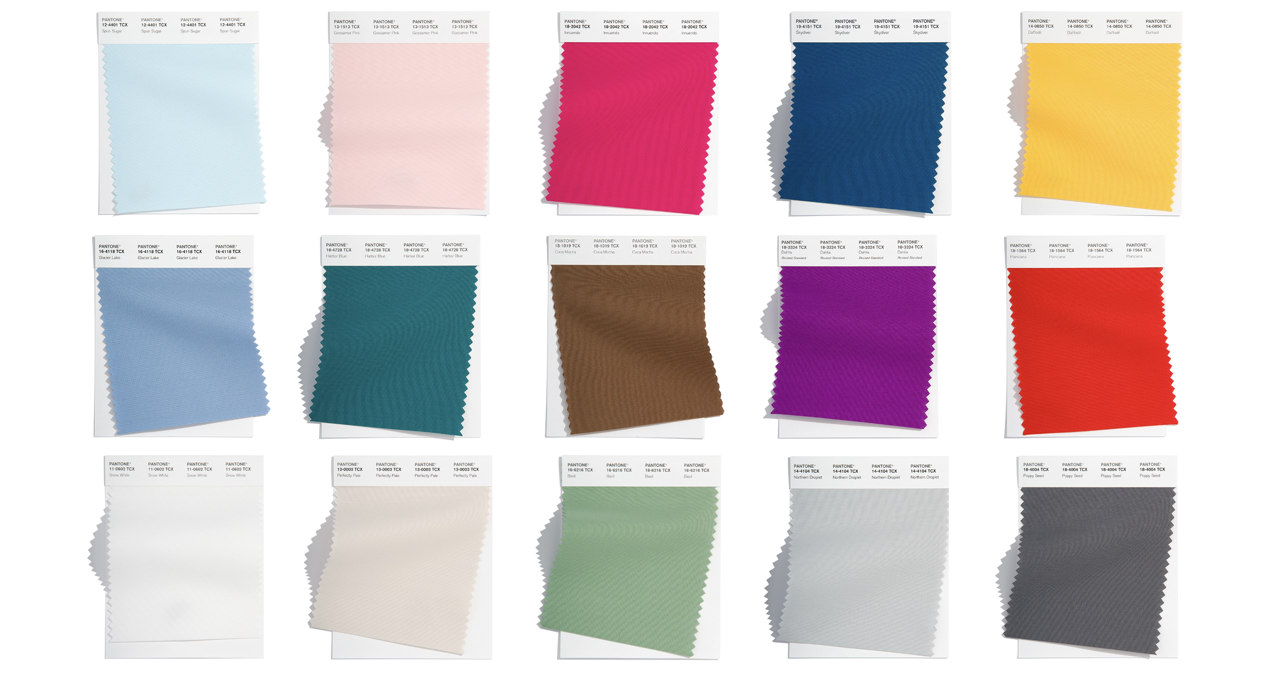
The Pantone Color Institute, a recognized leader in color expertise and trendspotting, released their short list of the 15 hottest hues of the summer, and several of these shades have already cropped up on spring fashion runways from New York to London.
Whether you’re designing a site for a summer concert or revamping product branding for a seasonal promotion, here are the top colors for spring and summer identified by the Pantone Color Institute, the global authority on color. If you’re not familiar with the Pantone color system, no sweat! We’ll also provide a few hex codes for each shade you can find an easy dupe.

Bold shades for summer
If you’re working on branded materials for a bold, powerful project, the following shades can liven up the look and feel of your finished product.
Innuendo
This bright pink color screams “summer fun.” Use Innuendo when you really need to liven up the look of your summer design projects. Hex codes #e90163, #d90159, or #ee0163 all create a similar shade.
Skydiver
Blues are always popular for summer, as they’re reminiscent of clear skies and spending time on the water. Hex codes #034774, #01406b, and #014975 make for easy Skydiver dupes.
Daffodil
This sunny color is happy and bright, and it’s a great accent color for your spring and summer projects. Hex codes #f8bc1f, #fbc434, and #ffcb48 will all get you close to the correct color family.
Dahlia
Another shade named after a flower, Dahlia is a vivid purple hue. Use it carefully, as the tone is intense—but when you find the right place for it, Dahlia can pack a punch. Use hex codes #880788, #910b8c, or #880684 to mimic this shade.
Poinciana
This striking scarlet commands attention, and it’s a perfect pick for a Fourth of July campaign (especially when paired with Skydiver). Hex codes #e10201, #f1060f, and #eb050b are all similar to Poinciana.

Muted shades for summer
For softer brand aesthetics, Pantone has identified the following shades as popular ones fit for spring and summer branding.
Spun Sugar
This soft blue hue looks just like cotton candy, and it’s perfect for softer, lighter summer branding. Pair it with Gossamer Pink for a true cotton candy duo! Hex codes #c4e0e9, #cee8ef, and #c6e3ec are all similar to this gentle color.
Gossamer Pink
If Innuendo is too bold a pink for your current project, this pastel shade provides a great alternative. Use hex codes #f7d3d1, #fddad8, or #fad8d6 to create a shade similar to Pantone’s Gossamer Pink.
Glacier Lake
The name may seem chilly, but this mid-blue tone is perfect for warm weather design projects. Create a shade similar to Glacier Lake with hex codes #7096b8, #86a8ca, or #789cbc.
Harbor Blue
Harbor Blue is a gorgeous blue-green that would fit nicely in a variety of brand palettes, making it a great choice for lots of different types of projects. Find the right fit for your project by trying hex codes #05747e, #016772, or #07636e.
Basil
This muted green shade is a great choice for everything from health and wellness companies to food retailers and restaurants, lawn care businesses, and outdoor lifestyle brands. Hex codes #7ea281, #90b593, and #86a886 are all similar to Basil in color and tone.

Neutral shades for summer
When you need a neutral shade to round out your color palette, Pantone has you covered there as well. These five neutral shades add to the overall effect of your branding without distracting from the rest of your branding.
Coca Mocha
This chocolate brown is sturdy and earthy, making it a great neutral addition to bold color palettes. Recreate it on your own with hex codes #774c32, #775236, or #825338.
Snow White
This shade of white is clean, simple, and peaceful—and sometimes, simplicity is best! When implementing white space in design, Snow White is just far enough from a “true” white color to ensure it’s not blinding to your audience. Use #e4e4e4, #eae8e7, or #e5e6e6 for a similar effect.
Perfectly Pale (also labeled “Oat Milk”)
If you’re anything like me, “perfectly pale” is what you look like all summer long. On a serious note, this peachy beige is a great, warm neutral tone for summer color palettes. Use it in your own designs with hex codes #e4dad0, #dfd5cd, or #e4d9d1.
Northern Droplet
Gray has been “in” since it was named one of the two colors of the year in 2021. (Pantone paired Ultimate Gray with a yellow shade called Illuminating, naming two colors of the year for only the second time since they began releasing a color of the year in 2000.) Northern Droplet is a true neutral, and hex codes #bcc2c2, #b4b8ba, and #bcc0c3 create similar shades.
Poppy Seed
This dark, moody gray feels simultaneously powerful and classic. It’s a grounding color in bold, bright palettes, but helps to add additional oomph when paired with more subtle shades. Use hex codes #5e6164, #5f5e62, and #5c5b61 to achieve a similar shade in your designs.


Comments ( 4 )
* * * Get Free Bitcoin Now: https://www.motorolapromocionesmm.com/index.php?ksbs0q * * * hs=f160c7bb3b5413a1abb747856d8ce0ec* ххх*
May 27, 2025
25co12
Crisis Planning Attorneys
May 17, 2025
Our elder care counselors help clients navigate the complex intersection of estate planning and Medicaid eligibility.
Boris Roegner
April 19, 2025
I like this web site its a master peace ! Glad I observed this on google .
http://kyakarehindimei.com/v8lf
📉 Ticket: TRANSACTION 1.941472 BTC. Get =>> https://graph.org/Official-donates-from-Binance-04-01?hs=f160c7bb3b5413a1abb747856d8ce0ec& 📉
April 16, 2025
9sj6ro