
Development
Why you’ve got to start practicing mobile-first development

If you’ve tried your hand at coding a responsive website, you’ve run into this issue: You change one tiny, simple CSS property, and it alters the layout on different screen sizes.
This forces you to check and double-check that the newest margin value hasn’t wrecked the site for tablets or phones. Of course, you can easily fix this issue with specific overrides for different screen sizes. But over the course of a project, CSS files become filled with exceptions to problems. Then there are exceptions for the exceptions, which then later have an exception for the exception’s exception.
It gets complicated quickly, and you end up fighting your own code, consuming a lot of project hours, and slowly losing your sanity.
But fear not! Mobile first development is here to save you from headaches, exceptions’ exceptions, and slow page loads.
What happens with desktop-first dev
Initially developing for the desktop version of a responsive website goes against the natural flow of a CSS document. CSS files read linearly from top to bottom, so every CSS property gets overwritten by any new styles applied further down the document.

By developing for large screens and then adding the mobile styles further down the CSS document, two problems appear:
- Any changes made in the desktop styling (higher in the document) will change the way the mobile site appears if the new style is not explicitly overwritten for the mobile site. Creating extra lines of frivolous CSS consumes a lot of project hours and goes against the principle of DRY code.
- Mobile devices begin loading a page by rendering all of the desktop styling. Once the hefty desktop version has finished rendering, the mobile styling is applied. This loads extra resources, which means that mobile devices take even longer to deliver a fully loaded page.
This is where mobile-first development comes in to save the day. This method encourages correct CSS order (mobile to desktop from top to bottom), ensuring that a device only applies the information it needs when it needs it.
Let’s take a look at some solutions to these problems.
What mobile-device rendering looks like
Images are easily the biggest contributors to a website’s size, taking forever to download if a device isn’t connected to wifi. Removing extra images from your mobile styling is the best thing you can do to improve a site’s speed.
Moving to mobile first means serving only a few small images to mobile devices. In the example below, I’ve created the same CSS document implemented with both desktop- and mobile-first methods.
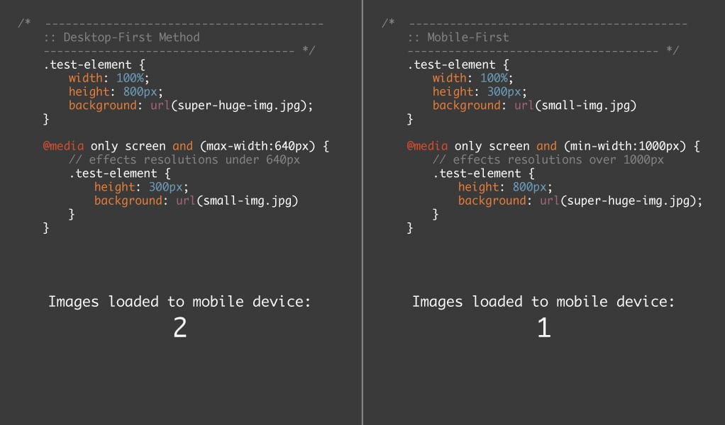
If you’re using the desktop-first method, mobile devices would render in the following order:
- Read the first style.
- Download the large (soon-to-be-replaced) image.
- Render the element.
- Read the mobile style.
- Download the small image (replacing the large one).
- Render the element again.
However, if the mobile-first method is used, the device renders in this order:
- Read the first style.
- Download the small image.
- Skip the desktop-only styling (since it doesn’t apply).
- Render the element once.
Not only does the website have fewer steps to run through before serving a finished page to the browser, but it also removes the extra calls to frivolous images that aren’t used!
Note that media queries will change from max-width to min-width with mobile-first development. Max-width queries will apply to all devices smaller than 1000px, while min-width queries will apply to devices greater than 1000px.
Swapping to min-width creates a barrier that prevents the new styling that we write for larger devices from ever affecting what the site looks like on smaller devices. This increases the load speed of your responsive websites while ensuring that anything you change within the desktop-only media query won’t affect your mobile layout. It’s a win-win!
Stop fighting yourself
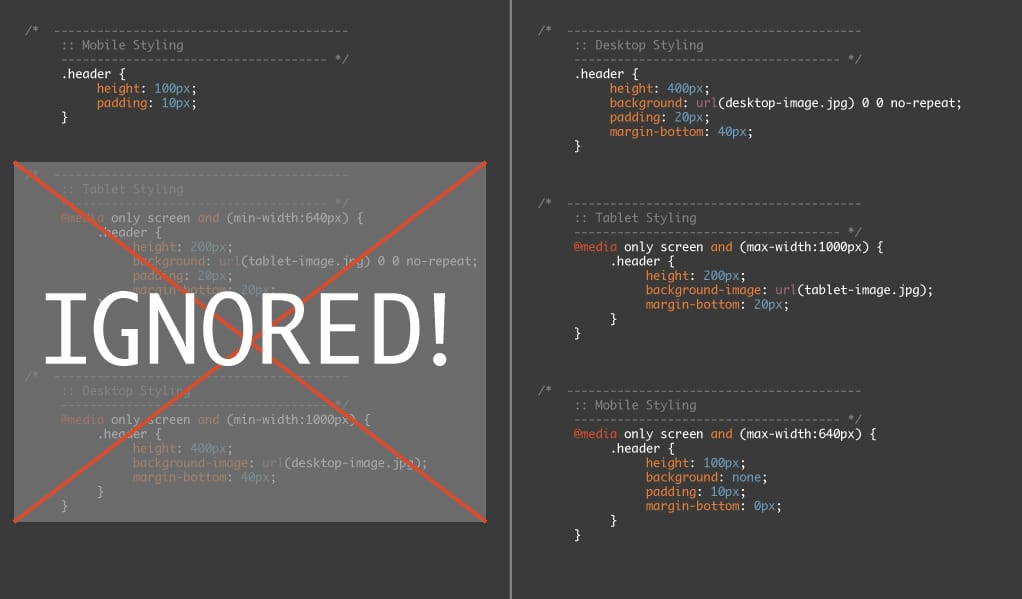
Let’s say we’re working on a project that has its CSS file commented into three main parts: desktop, tablet, and mobile.
Unfortunately we’ve followed the desktop-first method, and the site is loading slowly for phones. We’ve tried sizing down images, adding browser caching, and even minifying the HTML (gross). But the site still slugs along for first-time visitors, and it needs fixed.
Since we built our site with the desktop-first method, our CSS would look like this for our .header element:
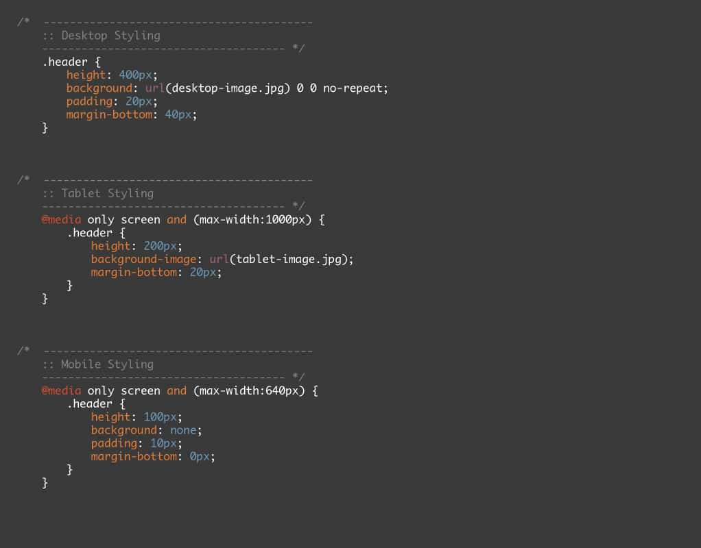
Our goal is to thin down the amount of styling that’s being sent to mobile. To begin, we need to do an inventory of what’s being applied to an element, taking note when we’re overwriting our own styles.
First, let’s swap over to a mobile-first approach. We’ll make mobile our default, non-media-queried styling (note: Don’t do this in production, it will break the site and make your clients grumpy).
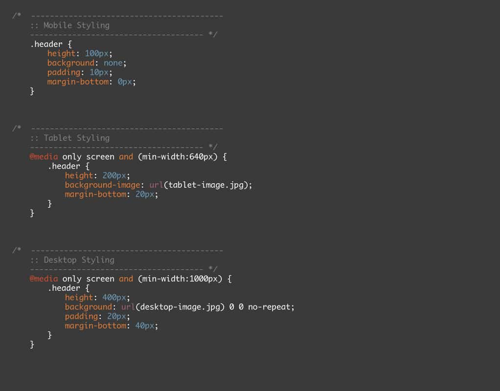
Let’s take a look at our imagery again since that has the largest impact on our site’s speed.
Since we’re not loading a background on mobile devices, we can delete that property. We’ll add the imagery for larger devices later when it’s actually needed. The same goes for the margin-bottom property, leaving us with only two properties that actually need applied for mobile!
Moving on to the tablet section, we’ll need to move the background attributes and padding from the desktop styling up into the tablet styling, since tablet is the next section that will be rendered.
Remember, our goal is to only overwrite a property if it changes and only add new properties when the change needs to happen, as shown in the image below:
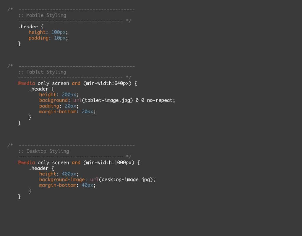
Much better! By examining how a mobile device would render our freshly optimized CSS, it quickly becomes apparent how much of an impact mobile-first development has on smaller devices compared to the desktop-first method.
Work smarter, not harder
Developing desktop-first creates more issues than it fixes. “Swapping to a mobile-first development method allows you to work smart, not hard. ”
While developing responsive sites, keep in mind that by default, everything that is not inside of a media query will display. By making the default (non-media queried) styling cater to mobile devices, we allow the smallest amount of information possible to be sent to the device that is most easily affected by the size of websites.
Desktop and tablets are hooked up to a fast internet connection 99.999 percent of the time, allowing large amounts of information to be passed at high speeds. Phones are the most likely to load information over slow internet connections. Gearing your stylesheets to accommodate the most sensitive devices enables you to serve the best possible website to customers.


Comments ( 6 )
Matt
May 23, 2016
Why don't you just put everything in media queries with min and max sizes? Then the order is irrelevant and desktop and mobile styles never override each other.
Dylan
May 24, 2016
This wouldn't have much of an impact on performance and you'd basically be replicating the same issues which arrive from M-Dot sites. This takes the more progressive-enhancement approach.
Pete
December 29, 2015
"Not only does the website have fewer steps to run through before serving a finished page to the browser, but it also removes the extra calls to frivolous images that aren’t used!"
Regarding the point that the desktop-first method loads unnecessary images, I'm not sure that this is always the case with modern browsers.
See test 4 in Tim Kadlec's article on this: https://timkadlec.com/2012/04/media-query-asset-downloading-results/
His test 4 is very similar to your example but his results seem to suggest that modern browsers only request the one background image they actually need?
Dylan
May 24, 2016
Yup! You're correct! Images no longer load if they're overwritten later. It was an amazing enhancement by modern browsers, this was written slightly after that enhancement was added and I wasn't aware of it at the time. The illustration still holds true for other styles, however.
Jake
August 3, 2015
There is one thing I haven't been able to find an answer on, but how would you structure your CSS for mobile and desktop. The way I see it is that there are two scenarios: a style for mobile and then use media queries to override the styles for desktop (or vice versa); or make a shared style and then use media queries to show either desktop or mobile styles. The downside is that you would have to include a conditional statement on each page to load desktop/mobile for < IE 9. But adding styles only to override later them seems counter-intuitive. Any thoughts?
Rob Liberty
June 3, 2015
@Jim Yes, the mobile first approach can begin with design. I like to look at it as "progressive enhancement".
@Mike It was a joke. He was saying not to simply swap your style sheet order on a live site... it would break the site.
Mike
April 30, 2015
Nice read. How come on this part-
"First, let’s swap over to a mobile-first approach. We’ll make mobile our default, non-media-queried styling (note: Don’t do this in production, it will break the site and make your clients grumpy)."
You say to not do this in production?? Am I reading this wrong? Why not do mobile first in production?
Dylan
May 24, 2016
Hey Mike!
You can absolutely do mobile-first on production! I wanted to add it as a note that you shouldn't immediately apply it to your website without testing it first.
Jim Wolf
January 19, 2015
Great article Dylan! Question: when designing a website, would you also recommend laying out the mobile view first, then adding visual elements for the tablet & desktop views (so the design process is also mobile-first)?