
Design
16 tips for improving the composition of your designs

Great artistic compositions don’t just come out of the blue. They take careful consideration, preparation, patience, and a familiarity with the nuances of visual design. The good thing is, regardless of how little or much artistic talent you have, it’s always possible to improve your designs through excellent composition.
A powerful composition is important for effective designs. It’s what’s going to appeal to the viewer’s eye, and what holds their interest when they take a closer look. An outstanding composition spells the difference between a vibrant art piece and a contemplative one. In a nutshell, it conveys the mood you want to express.
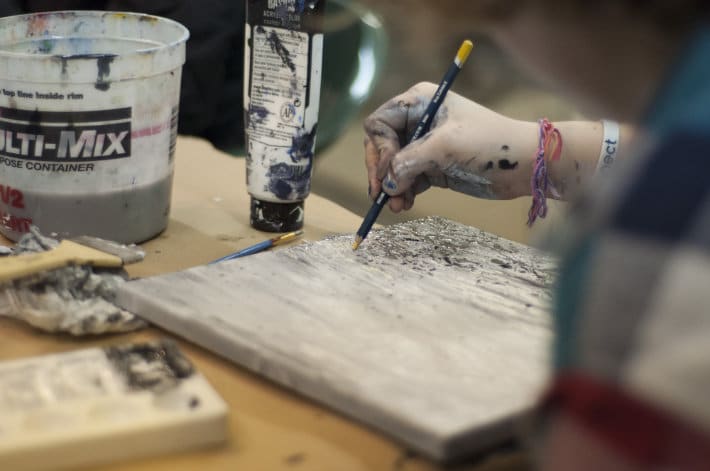
Learning how composition works is something that every designer must make time for. Without having to invest in extravagant tools and accessories, understanding the elements of a good artistic composition can improve your work. Developing an artistic eye is something that comes effortlessly to some people, but for many, it takes time, effort, energy, and patience to develop visual skills and creative abilities. Regardless of what category you fall into, here are the guidelines on how to improve your artistic composition.
The basics
Set up an inspiring work environment
This rule may seem pretty obvious, but most people take it for granted. Remember, your output is a product of your environment. “It’s hard to create excellent work if your surroundings are unpleasant, dull, or uninspiring. ”
Clean and organize your creative space at the end of each workday so you have an uncluttered space the next day. A well-ordered environment allows you to just concentrate on your art. Clean your tools and arrange your materials. This basic step goes a long way in enhancing your creativity and improving your work ethic.
Develop a concept before you begin
Each project starts with a concept – an idea shaped in the mind that helps designers express how their work will come to be. To improve your art, it’s best to have a concept in mind or in an actual sketchbook before you start. Your concept can include the possible compositions you can try to work on.
Choose a good subject
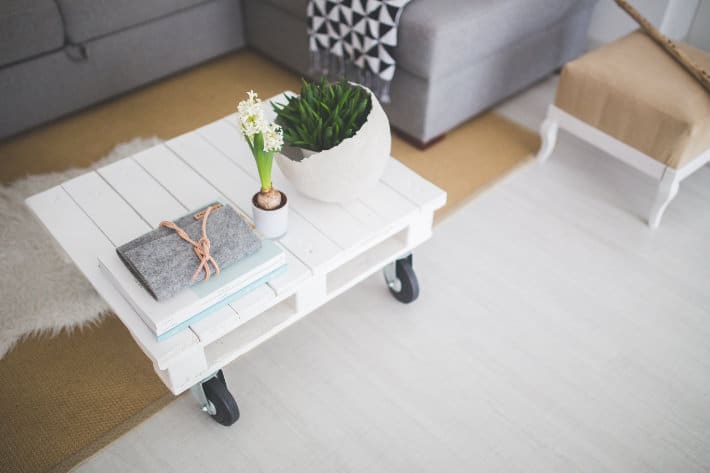
You can’t produce a great composition if you have a substandard subject. Undoubtedly, your composition will depend a great deal on what you are actually designing (a landing page, wireframes, a logo design, etc.), so choose, at least, a visually interesting subject and stellar client.
Work with good lighting
It doesn’t matter what medium you’re working with, lighting is an element that requires careful consideration. The type of light and its power, shade, and direction have an impact on your visual work. If you can’t have natural lighting, find a fixture that gives you as much natural light as possible.

Let go of perfection
It’s imperative that you understand that art is subjective. This means there’s no such thing as a “perfect” composition where you 100% hit all the marks at the same time. But, there is such a thing as “imperfectly perfect.” This is where you can adjust, edit, and tweak your work to make it stronger and more stimulating.
Tips and tricks for great composition
These guidelines are relevant to most forms of art, but of course, modify them as needed to your specific project.
Learn the art of simplicity
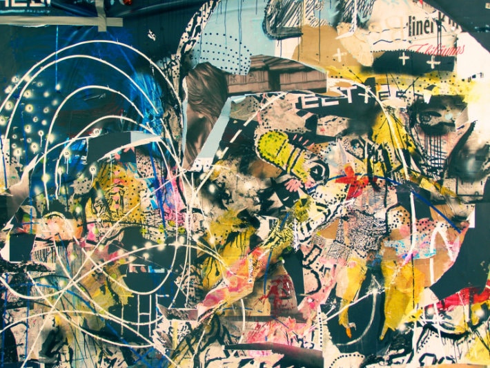
When it comes to design work, one of the primary points to consider is how each element connects with one another. This leads to considering what you can include or omit to maximize the impact. There’s normally a temptation to load up a design with as many elements as possible. However, for composition, the belief “less is more” is more relevant. Many of the most remarkable designs feature a simple yet powerful composition that embraces negative space.
Master the Rule of Thirds
One of the simplest yet most valuable composition rules is the Rule of Thirds. This principle has developed into a brilliant go-to tool for both amateur and professional designers. The technique calls for a vertical and horizontal division of the frame into thirds. Use the lines to properly bisect the work. The nodes where the lines intersect work as vital spots for a visual point of interest. This principle, although simple and easy, works remarkably well when done correctly.
The Rule of Thirds is effective because it requires that the designer chooses only one dominant element in the frame. This key part typically results in asymmetry. The “imbalance” will invariably catch the attention of your site viewers.
The truth is, the composition doesn’t have to be divided into accurate thirds. It’s possible to split the image into fourths, fifths, and so on. As long as there’s some sort of disproportion, the composition will show a flare. This principle of asymmetry is also true for several other elements of composition such as form and color.
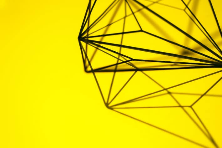
Understand the power of lines
Lines are among the best ways to display drama in art form. Vertical and horizontal lines create a dominant and impressive design for images. On the contrary, curved lines provide a more relaxed mood.
When conceptualizing your designs, think of where each line in the image begins and ends. Often, it’s effective to produce a line that catches the attention of the viewers. For example, create a ‘line’ starting from the bottom of the frame through the center and off into the opposite corner.
When you use vertical and horizontal lines in your art, always make sure that the image is straight. Thanks to various photo apps available today, it’s easy to fix tilted shots post-processing. However, it’s much better to get into the practice of making certain your images are properly aligned as you take shots and create your work.
Play with shapes
Once you have experimented with the power of lines within your composition, it will be easier to play with shapes. Instead of looking at or conceptualizing your design as a single shape on one screen, consider all the shapes of every element in the frame. You need to identify how each shape interacts with one another.
Dominant shapes like squares and triangles are quicker to frame than soft round shapes. But, if you learn to appreciate how each element works fluidly with the rest of the design, you can effectively display the shapes and their relationship with the subject.

Study how to use contrast within the subject
When conceptualizing your designs, think about its context and how it works with the site as a whole. How do basic elements like the colors, shapes, and textures of the point of interest compare to that of the surrounding area? If you find a strong connection within the elements, it’ll be easier to highlight the contrast between elements.
Use correct framing
Framing your work properly is one of the foundations of achieving powerful composition. The natural inclination of many is to position the point of interest dead center of the frame. However, this pattern usually results in art that looks unusual and way out of context. To avoid this mistake, offset the point of interest to one side or in the corner.
Also, when it comes to framing, try to experiment a lot. Use different framing structures to see what option is best for your site.
Embrace negative space
It’s important to acknowledge that the negative space within your work is part of the art’s overall design. When you work with lots of small elements, the inclination is to try and fit everything into the frame. In reality, the composition can feel more dramatic if you use negative space around everything. This will help the subject ‘breathe’ and ‘relax’ within its environment, which will attract user’s attention.
Recommendations from the pros
Use visual elements that complement each other
In a design process, you’ll often hear the term “complementary colors.” To improve composition, it’s all about complementary elements. One key factor to powerful composition is taking the time to meticulously and deliberately choose each element of the design so everything is complementary.
A typical blunder with compositions is working with visuals that don’t go together. When you use multiple images in your design, make sure that each element looks cohesive when put together. There are plenty of ways to implement this concept.
For one, use images from the same photo shoot. This is a good way to make your visuals look unified and logical, as they’re likely all under the same graphic style. Another technique is to color your visuals the same way. With all the filter options and image modifying tools today, it’s easy to color and adjust your visuals to come up with a more natural pallet and complementary combinations. Also, you may use graphics that are designed with similar techniques. And work with visuals that have related aesthetics and designs.
Repeat some elements to create consistency
To maintain a consistent and logical design, take specific components from one part of your design and use it for other parts. This could be something like a font or a motif. By repeating elements, you can smoothly and cleverly tie your design together.
Repetition is the main factor when designing multiple layouts. Duplicating elements help each page flow naturally into the next, establishing a cohesive site. By duplicating visual elements, you keep your layout solid and consistent. You can repeat specific types of structures, graphics, shapes, or lines to set up a powerful design.
When designing, keep track of the fonts, colors, and other elements you use. Try to reuse some throughout the design to wrap your elements together.
Understand how visual hierarchy and scale works
“Visual hierarchy is among the creative fundamentals that can truly make or break your design. ” It’s also one of the elements that people struggle with, so it’s important that you understand how it works to create an effective composition. In a nutshell, a hierarchy is the setup and structure of elements to visually reveal importance. Visual hierarchy is especially crucial when it comes to typefaces.
A visual scale is commonly used to help express hierarchy by drawing focus in and out of specific elements. As a result, the size difference displays the value of these elements to the design as a whole. A scale is likewise a helpful tool for rendering design proportion. With the correct scaling, you can make things small and detailed or you can make them big and grand. By using a visual scale in your composition, you can create a number of effects.
And the most important tip of all…
Practice. Practice. Practice.
You were just presented with some serious guidelines on how to improve your artistic composition. Whenever possible, practice these tips and tricks. That’s the only way for you to enhance your work and improve your skills. By practicing constantly, you also open yourself up to learn more about design that you couldn’t possibly know just by reading articles about it.
There are plenty of things to take into account when creating the composition of your designs. This is especially true if you’re new to your craft. It takes time, patience, and effort to master the rules so you can experiment on your own.
Whatever medium you’re working with, there’s always room for improvement to make your visuals more compelling and dramatic. What other tips do you have for creating a truly compelling composition?


Comments ( 0 )