Design, Flywheel
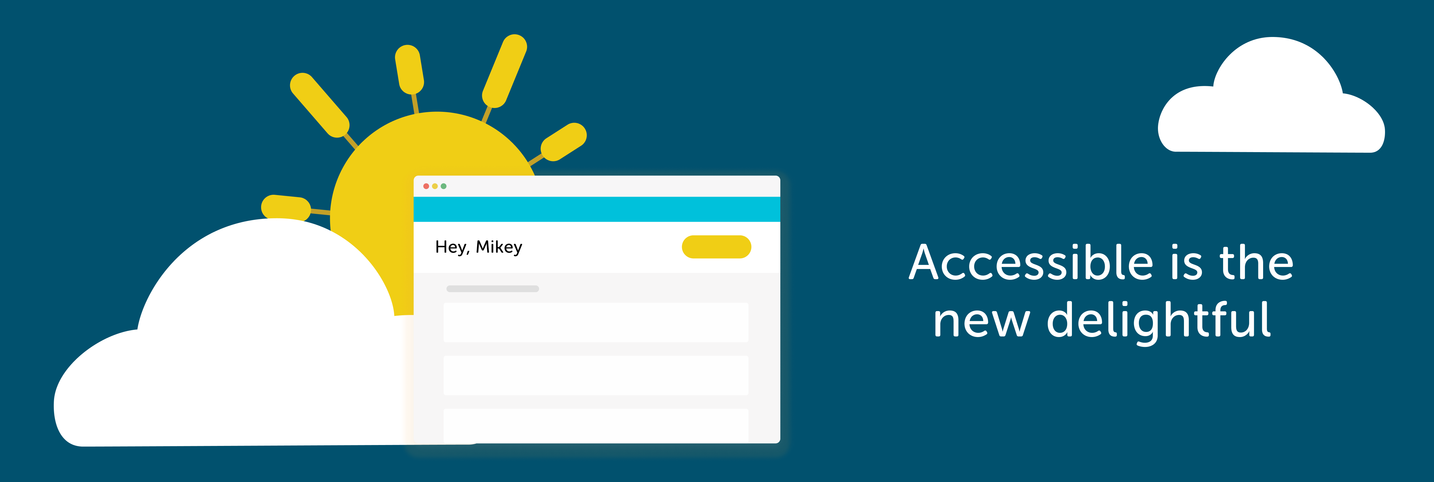
We designed a more inclusive Flywheel

Flywheel’s interface is known and recognized for its colorful palette and whimsical experience. It’s just one way we reflect our core value “Design Matters.” We believe that good design is not just aesthetically pleasing, but also utilitarian and delightful for all.
Accessibility is an area that our Product Design team is putting laser focus on this year, and I’m happy to report that we are making progress with some small but impactful changes to the Flywheel UI that will improve color and text contrast throughout the app in big ways.
TLDR; We have made a handful of color contrast changes to our text, buttons, links, and labels in the Flywheel app, as well as, a cross-department collaboration with Marketing to improve accessibility on the marketing site, getflywheel.com.
Why the change?
While working on a project, I came across a scenario where I was designing labels—I know, super exciting stuff here. Anyways, the labels were conveying a pretty critical piece of information to our customer (Agency owner) on whether or not they were paid by their clients.
The labels were red, to communicate unpaid and green, to communicate paid. My design spider sense started tingling because I felt uneasy about relying on red and green to communicate a payment status. So, I got curious and checked the color contrast on the text to make sure that even if a user had red/green color-blindness, they would at least be able to read the label. (Shoutout to Stark for creating my favorite color contrast tool inside my design tool, Figma.)
The contrast failed on both the labels—frick. This sparked a discussion on the design team: Should we create a one-off label to be accessible in this scenario, or should we address the problem at a design system level?
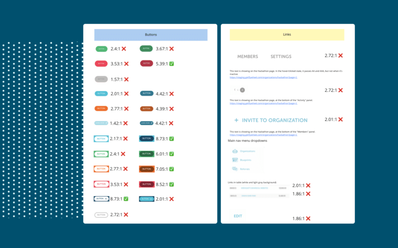
Raising awareness with a hackathon audit
Around the time of these conversations, we had a 2-day hackathon event for the entire product/development teams. My design manager, Bianca Zongrone Jefferson, rallied a group of folks and pitched an idea to do an accessibility audit of the Flywheel app IN JUST TWO DAYS! Using collaboration tools and contrast checkers, the team was able to comb through the app and document their findings on a digital whiteboard.
Collaboration is key
Following the hackathon audit project, there was more leadership buy-in to make the changes, and it brought awareness to the marketing team to improve the GetFlywheel domain This launched a six-week project where the marketing folks took a deep dive into the buyer’s journey.
Marketing and product design teams collaborated in feedback sessions. This collaboration was key because it allowed our designers to understand the changes being made to the marketing site and quickly identify what would and would not work in the app interface. Big love to Katie Gleason, Andrea Wofford, and Nicholas Tilley for being such great collaborators to work with.
Turning concepts into validated deliverables
Now that we had clear direction from the marketing team, I was able to take those concepts and ideate on them further. This was a process with a lot of feedback loops from other designers and front end developers.
A piece of feedback that I received from several designers was some concern about changing our primary buttons to yellow. They said that yellow is often used as a cautionary/warning color in app interfaces. There was also some concern around the new dark blue link color not being perceived as clickable. We were at a place where we needed user validation.
My fellow product designer, Katie Fennelly, and I collaborated with members of our User Experience Research Team (Bri Landry and Jocelyn Bellas) to quickly generate a clickable prototype and a testing script to upload to Usertesting.com.
We wanted to validate/challenge a few ideas:
1. Does the user have pause or concern with a yellow primary button?
2. Does the user understand that the dark blue links are clickable?
3. Does the new pastel label treatment read as an informative label
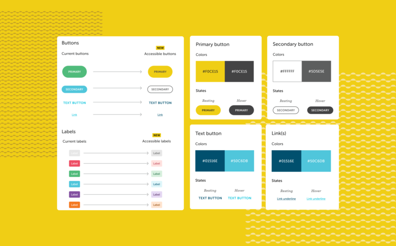
We were able to very quickly validate our concerns and felt confident moving forward after. Sidenote: I’m a bit of a color-theory nerd, and while yellow can be associated with cautionary warnings, it is regularly associated with brightness, happiness, and sunshine as well. If that’s not on-brand for Flywheel’s whimsy, I’m not sure what else is!
After we had our decisions made, we continued our collaboration with front-end developers to get the changes implemented and tested. Big shout out to Tony Prokop for leading all these efforts on the front end and for actively caring about accessibility in the UI.
This is just the beginning
While this is a big step in the right direction, we still have lots to learn and improve upon in the Flywheel app. We believe in continuous improvement and learning, so to put more changes in motion, Bianca Zongrone Jefferson is leading a “virtual book club.” online courses available to employees at WP Engine, including the Flywheel team, so we can all collectively learn more.
We will continue to audit and clean up Flywheel’s design system components for color contrast in the coming months. The next phase will be an audit on the implementation of components and making sure we are considering things like aria labels, alt image text, tab order, focus etc. Then, we’ll create a checklist/workflow for engineers to ensure we are baking accessibility into our design and engineering processes.
What other accessibility changes should we be making based on what you’ve noticed as a Flywheel user? Let us know in the comments—who knows, maybe your idea will show up in our next round of changes!


Comments ( 13 )
mqzokycwb
July 2, 2025
Sweet Bonanza Candyland offers a visually rich, candy-themed adventure, combining the thrill of real-time gaming with the convenience of online play. Our live video feed brings the game's action directly to you, allowing you to watch, learn, and check out the game before you make a deposit at one of our partner casinos. The potential payouts in Sweet Bonanza Candyland are up to 20,000 times your bet amount. To me, a chance of winning such a huge amount plays a big role in the appreciation of live dealer games. Hosted by our charismatic presenters in a purpose-built studio, Sweet Bonanza CandyLand seamlessly merges physical elements with 3D virtual effects to sweeten the gaming experience. It’s packed with Mega Multipliers, three mouth-watering bonus games, and a massive €500,000 max win for players to unwrap.
https://dados.iff.edu.br/user/chtigerlefi1983
Each bonus feature in Big Bass Bonanza comes during the free spins bonus round. While the base game of Big Bass Bonanza doesn't offer much in the way of additional features, the excitement of the free spins round is worth waiting for. Each bonus feature in Big Bass Bonanza comes during the free spins bonus round. While the base game of Big Bass Bonanza doesn't offer much in the way of additional features, the excitement of the free spins round is worth waiting for. Big Bass Bonanza Megaways In this slot, we once again get to enjoy a fishing adventure with the rodfather, where the Megaways mechanic has been applied this time. This mechanic results in up to 46656 ways to win, which gives the opportunity to land large amounts of symbols during the spins. Everything is very similar within this slot, where the design of the symbols is the same as before and during the spins, we once again get to enjoy uplifting music. By landing 3 or more scatter symbols, we can take part in the Free Spins feature. Then we are welcomed with up to 20 free spins and here we can also land the Fisherman symbol.
rfdvplyqz
June 23, 2025
Its minimalist design and straightforward software make it obtainable to newcomers whilst still offering degree and excitement for seasoned players. The functionality of the aviator casino sport is very basic and does not” “need special skills. To get started, study the rules in how to enjoy the aviator sport on the internet and watch the short video regarding this purpose. Leaning the Aviator game in India will be best accomplished by way of practising throughout the game’s demo mode. Crash видеоигра Aviator построена на доказуемо честной системе. Это связано с использованием криптографической технологии Provably Fair. Благодаря этой технологии вмешательство
https://telegra.ph/tutaj-jest-opis-06-17
W Polsce każdego miesiąca tysiące graczy odwiedzają polskie kasyno online BLIK i grają w ulubione gry. Z tego artykułu dowiecie się, które najlepsze polskie strony hazardowe oferują płatności tą metodą, jak zdeponować kasę i jakie są zalety tego systemu. aviator predictor online free Игровые Автоматы Играть Бесплатно Онлайн никаких Регистрации Слот Ревью Content Лучшие Онлайн Слоты Для Бесплатной Игры Без Регистрации И Их тип Играть В Демо Игровые Автоматы как Играть В W Polsce każdego miesiąca tysiące graczy odwiedzają polskie kasyno online BLIK i grają w ulubione gry. Z tego artykułu dowiecie się, które najlepsze polskie strony hazardowe oferują płatności tą metodą, jak zdeponować kasę i jakie są zalety tego systemu.
kpi leads
June 18, 2025
Have you ever considered creating an e-book or guest authoring on other websites? I have a blog based on the same topics you discuss and would really like to have you share some stories/information. I know my viewers would value your work. If you're even remotely interested, feel free to shoot me an e mail.
https://www.magileads.com/les-kpi-de-generation-de-leads-b2b/
qugpjxrqz
June 16, 2025
Graj odpowiedzialnie: Odpowiedzialny hazard jest priorytetem w aviator-games , który nie jest powiązany z polecanymi przez nas witrynami. Przed wzięciem udziału w grach hazardowych lub zakładach powinieneś upewnić się, że spełniasz wszystkie obowiązujące wymagania wiekowe i prawne. Nasza witryna została zaprojektowana w celu dostarczania treści informacyjnych i angażujących, aby poprawić wrażenia z hazardu. Należy pamiętać, że wszelkie linki kliknięte w naszej witrynie przekierowują do odpowiednich zasobów. Rejestracja w Aviator Game Online to prosty proces, który otwiera świat ekscytujących zakładów o tematyce lotniczej i nagród za prawdziwe pieniądze. Zanurkuj i zarejestruj się w renomowanym kasynie online, aby rozpocząć niezapomnianą przygodę z zakładami z Aviator Game!
https://www.abclinuxu.cz/lide/rockzenberi1970
Your bank account merely needs for adequate money to experience the new specific position games you’ve chosen. You can trust you to definitely casinos offering which incentive have been in existence for a time and therefore are legitimate. You could think this refers to a lot of the on the internet casinos, but one to’s untrue. There are a few what to remember while you look for an established, feature-rich internet casino. Baixar o aplicativo ( simplesbet-br) permite que você tenha a melhor experiência de cassino no seu celular. O processo de instalação é simples, e a interface foi otimizada para garantir que a navegação seja ágil e intuitiva. Com o app da ( simplesbet-br), você pode acessar rapidamente todos os jogos e promoções, além de aproveitar uma jogabilidade sem interrupções. A plataforma foi projetada para funcionar perfeitamente em qualquer dispositivo móvel, garantindo uma experiência de jogo segura e de alta qualidade em qualquer lugar.
ffjmfcvnl
June 11, 2025
Looking for new Rise of Kingdoms codes that actually work? You are at the right place! In Rise of Kingdoms, you will find an impeccably detailed map of the world and can choose from 8 civilizations and 20 heroes. No NN55 , logo de cara já me deparei com um bônus de boas-vindas para apostas esportivas bem interessante. Funciona assim: você faz um depósito mínimo de R$ 100 e, se ganhar sua primeira aposta, recebe 50% do valor como aposta grátis. Código Blaze; Bônus de boas-vindas para cassino Le jeu de pari JetX de SmartSoft Gaming est un jeu de casino innovant de type arcade. JetX at 1xBet, a captivating online game , was introduced by gaming company SmartSoft Gaming. Since its inception, JetX has gained significant traction among online gamers, particularly in Malaysia. This game, known for its unique, aviation-themed gameplay, invites players to bet on the outcome of a virtual aircraft’s flight
https://muje.org/2025/06/05/review-do-jogo-thimbles-da-evoplay-para-jogadores-brasileiros/
E é importante lembrar que a variedade também é importante para encontrar a modalidade que você deseja entre Poker, Roleta, Bacará, Blackjack e Slots, que estão entre os mais jogados. Com apenas 5 reais, já dá para fazer um depósito via Pix e começar a jogar na Betboo. Você encontra jogos de todos os estilos, desde slots e jogos de mesa até vídeo bingo e uma seção exclusiva para o Aviator. Para sacar fundos, você deve ir à sua conta pessoal e deixar um pedido de saque na guia “Caixa”. Quando a guia for aberta, você precisará especificar o valor da retirada e o sistema de pagamento. O jogo Jetx funciona como qualquer outro jogo de crash do mesmo estilo no cassino da KTO, seu objetivo é obter o maior multiplicador possível antes que o jato exploda e a rodada termine.
rxkbmuwbc
June 9, 2025
For fans of high-speed aviation betting with JetX, finding the right online casino is key to maximizing both excitement and profits. As developers of the Jet X experience, we have carefully outlined what separates an average platform from a winning one. By focusing on the right selection factors, Kenyan players can enjoy fair play, fast payouts, and an unbeatable gaming atmosphere. Below are the essential criteria every player should look for when choosing where to place their jetx bet. Yes, JetX app is completely free to download for the iOS and Android operating systems. When you register at the casino, to play the JetX, you need to make a deposit. Thus, 1xBet online casino is a great place to bet on JetX for real money. A wide game library awaits you, where you will find not only JetX but also slots, table games, live tables, lotteries, and much more. A nice addition is generous bonuses and promotions. Register, make a deposit, and enjoy the games right now.
https://spaanslerenamsterdam.com/everything-you-should-know-about-round-time-duration-in-aviator-by-spribe/
You bet 1 € and set the automatic collector to x2. If there is a crash before x2, you lose 1 €. In this case you bet 2 €, if there is another crash before x2, you double again by betting 4 €. If JetX's result is 5 times in a row less than x2 before exceeding this multiplier in the 6th game, you lose the first 5 bets and win the 6th. You will have bet a total of €31 (1 + 2 + 4 + 8 + 16) and won €32 (16x2 = 32). Betting odds are shown as decimals on our betting website. To see your winnings, multiply the odds in the decimal by your stake. The best way to view potential winnings is to use the bet slip which automatically calculates your potential winnings minus charges free of charge. JetX is a fast-paced crash game combining strategy, risk, and excitement. Players watch a jet soar higher, with potential winnings multiplying as it climbs. Designed with vibrant graphics and responsive controls, JetX keeps the gameplay engaging and dynamic. This review uncovers its unique features, gameplay strategies, and why it’s gaining traction among gaming enthusiasts.
qjhxkyxki
June 6, 2025
399BET Game is a real money game that is getting very popular in Pakistan. It is a free earning platform where you get plenty of exciting games to play, and you can make any amount you want. The best Teen Patti Leader: A Fun Indian Card Game Answer: The Spin 101 APK is an excellent application that offers users a sign-up bonus of ₹38 when they join. This game includes a fantastic bonus program, and you can learn more by reading the complete post. Additionally, Spin 101 is a popular rummy game with a minimum withdrawal amount of ₹100 and a minimum deposit of ₹100. Play Patti with people worldwide SignUp Bonus ₹39 - 3 Patti India Star Online is a free-to-play card game that brings the popular Indian poker experience to your smartphone. Players in this game rely on both luck and strategy to create the strongest three-card hand or employ bluffing techniques to secure victory.
https://adeptpools.com.au/uncategorized/where-balloon-game-is-available-globally-in-real-money-mode/
PLAY RESPONSIBLY: jetxgame is an independent site with no connection to the websites we promote. Before you go to a casino or make a bet, you must ensure that you fulfil all ages and other legal criteria. jetxgame goal is to provide informative and entertaining material. It is offered only for the purpose of informative educational education. If you click on these links, you will be leaving this website. The benefits of the application are hard to overestimate, so it’s time to make the game even brighter and make the opening view to the winnings! Casino CBet is known for excellent service and a wide variety of gambling and entertainment options, as well as regularly featuring new games and experiences on their website. One of the most famous representatives of crash slots is the Jet X Game, which was added to the CBet online casino catalog in early 2021. The game was developed by specialists from SmartSoft – a company known for using innovative technologies.
slvrwgukd
June 2, 2025
SignUp Bonus ₹30 - Purchase your tickets to visit another time or rebook existing tickets below: More Ways To Give Yes, it's called Junktion; a fully-licenced cafe bar managed by our Partners, Double Puc. You can enjoy delicious light meals, snacks and drinks throughout the day, including sandwiches, crisps, cookies, and more. As part of our ethos we are meat-free and source everything as locally as is possible, reducing our carbon footprint.You can enter Junktion at anytime before, after or during your exploration if you need some time out, however please note, Junktion is only available for ticketholders of Wake The Tiger. A casual poker game that is best for beginners Purchase your tickets to visit another time or rebook existing tickets below: Download it free at Apple's App Store or Google Play!
https://bhamjeefashion.co.za/analytics-of-payout-methods-in-aviator-for-canadian-players/
Side bets are not associated with the main game bets. You can bet on the Dragon main bet position and a Tiger Odd side bet, and vice versa, for example. Cambodians invented the Dragon Tiger game; it’s a simple easy and great game to play. It is very similar to Baccarat in that there are very few options for betting, and you can only bet on the Tiger or the Dragon. Several online casinos now offer the game, which has grown in popularity around the world. The following data may be collected and linked to your identity: Rather than running into the betting industry, take time for proper analysis. Then, execute a specific strategy on the online casino ID provider website. Observe the dealer, and if possible, record the outcome of every game. This will help make the precise betting decisions in the future. Once you know how to play Dragon Tiger for real money, your winning rate will be highest compared to playing the game without any basic knowledge.
xqcitdpvn
May 31, 2025
Potential Payout If individuals are unsure about a website, post, or advertisement, they can contact BCLC directly at 1-866-815-0222 or go on a live chat at corporate.bclc or PlayNow. They can also report suspected fraudulent activity to the Canadian Anti-Fraud Centre online or by calling 1-888-495-8501. BCLC specifically pointed to Ontario, where that province’s regulator, the Alcohol and Gaming Commission, is licensing online gambling companies. One of those companies, BetRivers, was a heavy advertiser on CBC’s Beijing 2022 Winter Olympics coverage. The Government of B.C. has given BCLC the authority to operate on or through a computer, including through the Internet any lottery scheme which it has been authorized to conduct and manage.
https://cocuklaricinelele.org.tr/aviator-game-by-spribe-analysis-of-real-bet-multipliers-over-90-days-in-pakistan
In order to be eligible for this experience though, you will have to be ranked at diamond tier or above. Those with accounts that have not leveled up to this stage of the Slotomania levels, which you can read more about in our guide to leveling up, will not be eligible to take advantage of the VIP benefits. 50 GRATIS-FREISPIELE Earn benefits and features by reaching higher Tiers in our VIP Program! Enjoy exclusive chip package offerings and special game modes. Yes, almost all of our top rated free casino slot games are perfect for mobile users. Take a look at our recommended online casinos for a list of great mobile-friendly options. Let us know if that resolves this issue for you. How do I get a vip host Many players who become Diamond players and becomes the VIP player on Slotomania face the challenge to install the Slotomania VIP app on their android devices. This is due to the unavailability of Slotomania VIP app on Google Play Store. In Play store, only regular app of Slotomania is available as the VIP app is … Read more
nuchpkpro
May 28, 2025
Denzel Dumfries ‘saw the real Inter, we played with heart’ in the exhilarating 3-3 Champions League semi-final draw with Barcelona. ‘It was a difficult injury for me, but I am... The developers describe how their game uses AI Generated Content like this: Experience unlimited access to a collection of top EA titles, trials of select new games and more. Juventus star Alisha Lehmann has hit back at criticism by a former Swiss team-mate that she spends too much time on social media. Sports Interactive regret to inform that, following extensive internal discussion and careful consideration with SEGA, we have made the difficult decision to cancel Football Manager 25. One for Scotland here, this track from the Edinburgh indie rockers’ third album, The Remote Part, was later used in the FIFA Football 2003 game.
http://onlineboxing.net/jforum/user/profile/378714.page
Há muitos métodos diferentes para depositar no Jet X Casino, assim como para sacar. Você pode usar cartões, como de costume, pode usar vários PayPal, Neteller, Skrill, assim como usar criptomoedas, e a aposta mínima aqui é de US$ 0,1, e a máxima é de US$ 600 por rodada. New users can get a 1Win JetX bonus on their first deposit to wagering larger - up to 500% up to R$210.00. It's one of the biggest casino incentive available. To claim it, don't forget to activate it in the "Bonuses and promotions" control panel. A oportunidade de jogar Jetx está disponível em vários cassinos online. No entanto, recomendamos fortemente que você utilize apenas sites oficiais que tenham sido verificados e aprovados por nós. Uma lista de cassinos virtuais confiáveis onde você pode jogar honestamente no Jetx SmartSoft Gaming está disponível no link abaixo:
SidneyVeicy
February 25, 2025
Cheers! Quite a lot of stuff.
online casino moneybookers https://combatcasino.info/states/ online casino s ceskou licenci 2023
SidneyVeicy
February 23, 2025
Nicely put. Thanks.
casino online 100 bonus https://combatcasino.info/online-casino-illinois/ best online casino ny real money
Casinosnup
February 21, 2025
Factor very well taken!.
resorts online casino no deposit bonus https://casinoslotoking.com/omaha-poker-play-online-game/ online casino license costa rica