Marketing
Behind the brand of Fly Fest: Our very own company conference

When you hear the term, “company conference,” a little part of you might shrivel up into a corporate shell. It’s a fear any creative, growing startup might have: becoming too “formal” and losing that small-company energy. Flywheel, however, took the idea of a company conference and turned it on its head!
Every quarter, we host a company retreat. And for Q3 2018, we decided to mix things up a bit by hosting our very own company conference! Don’t let that fool you, however. We intentionally used the term “conference” to express a layout or schedule, not a brand. Our team wanted to expand both the breadth of topics and speakers to compensate for a company that went from a little under 100 to nearly 200 very quickly while maintaining our trademark sense of Flywheel whimsy. And of course, we wanted to stay true to our goals of an all-company retreat: all-company alignment and exceptional shared experiences between Flywheelers!
So, how do you build a brand for a new, not-your-typical company conference?
That’s the question that laid before our art director (Andrea Trew), our graphic designer (Bryan North), and myself (Rese Wynn, the design intern). In true Flywheel fashion, we dove right in!
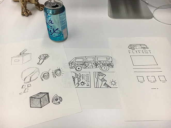
To begin, we needed an idea, a symbol to carry throughout the conference. We were given a theme to follow, “Product Driven,” but we had no defined route. To find this path, we crammed into a tiny local coffee shop and threw on our thinking caps. We recklessly launched ideas into the air, keeping track of the good, the bad, and everything in between. From a vintage R.V. to a 3D movie, our schemes and sketches were endless.
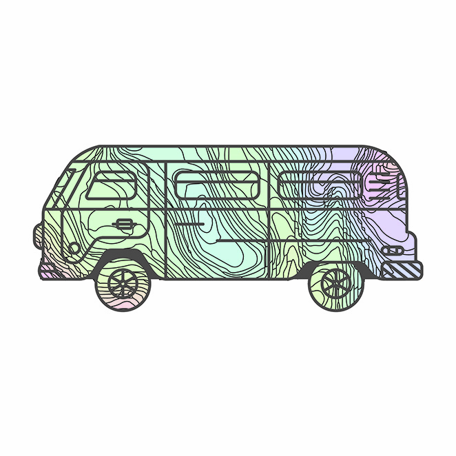
This brainstorming session culminated into a final epiphany, in which it seems we were all sent the same idea: something involving “a maze.” I know, it seems elementary.
This maze idea was all-encompassing. It spoke to the notion of being product driven, it allowed us to express the subject of connectedness (like how every department and role is connected to product), and not to mention, it looked sick.
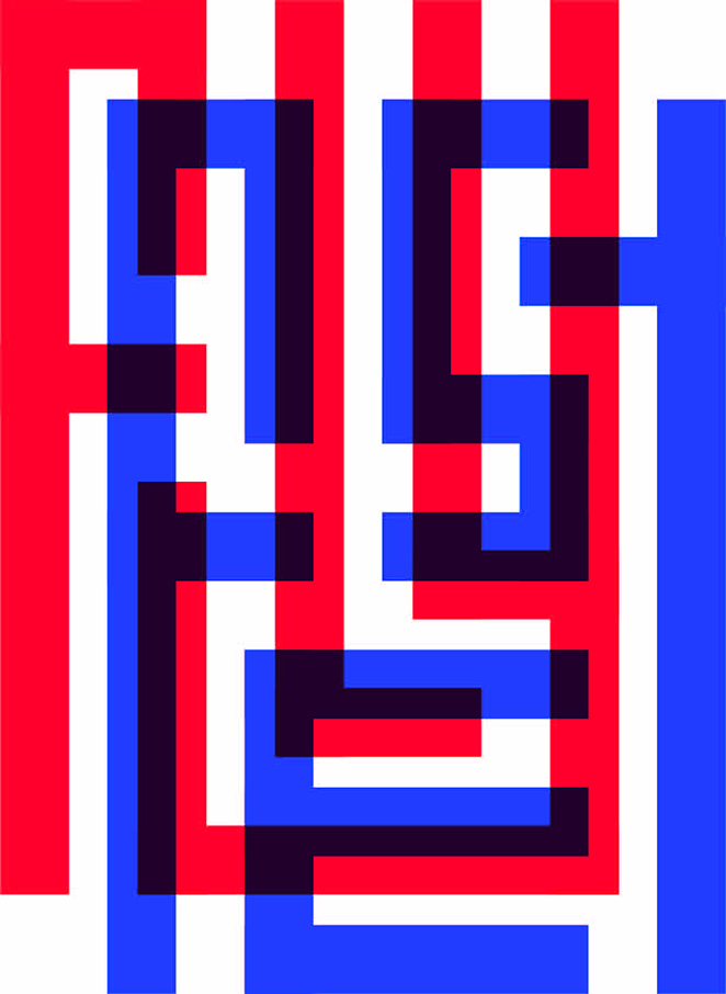
Now it was time to do our thing as designers and start building out this brand! We sat down at our desks and got to work. We wanted to work with the guiding image of a maze, but also convey a feeling of fun. (Mazes can sometimes be stressful, so we needed to counteract that emotion to focus on the connection.) We sketched a few logo ideas, scrapped a few logo ideas, and ended up with a total of four well-curated designs.
We then presented these to an internal group, conceptualizing the make-up and creation of the conference identities, as if they were external entities. We showed the group mockups, revealed design ideas for 3D art installations, gave them buzzwords, did the whole dance…and then our conference organizer chose a design! The process of narrowing down your visions to the final design is a difficult, but essential step. It’s the basis for the entire process; the entire brand.
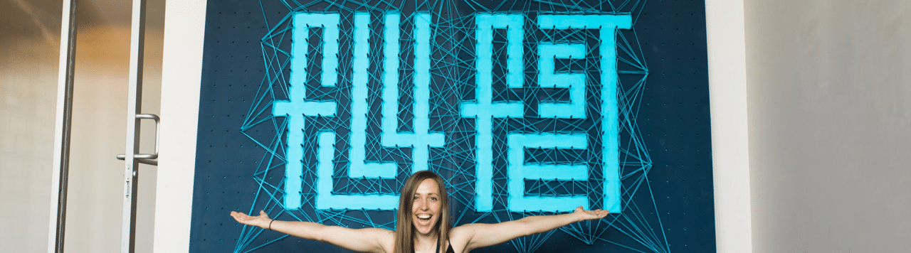
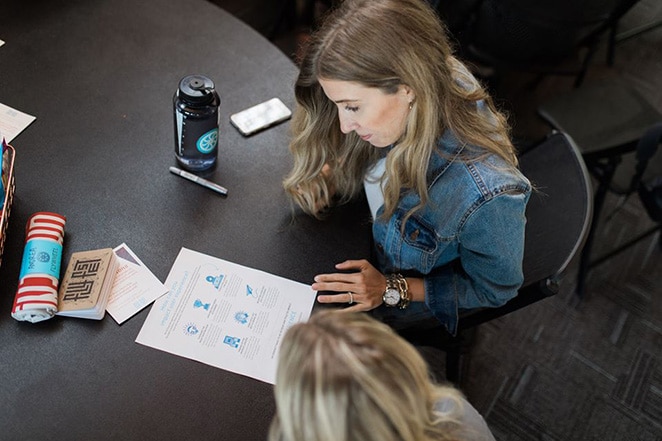
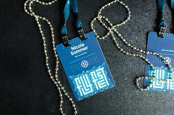
Once we had the Fly Fest identity created, we developed brochures, ID badges, and even created a fully-functioning website (just so Flywheelers didn’t have to look too far for updates)! We worked tirelessly to color the smallest of pixels, to create a t-shirt that was fly and fun, and stay true to our overall theme/vision. We even sought out a specialist to design a colossal peg board that was the centerpiece for our photo station – and then when the specialist didn’t work out, built it ourselves.
This level of effort and pursuit to achieve something not just good, but great, is what differentiates standard and extraordinary. The tale doesn’t end with the products, however, but the clients (in this case, Flywheelers!) interacting with them in the space.
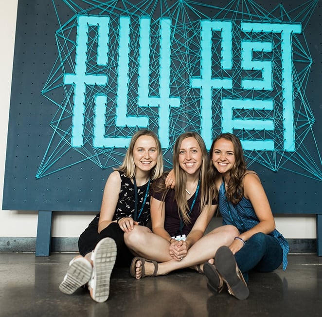
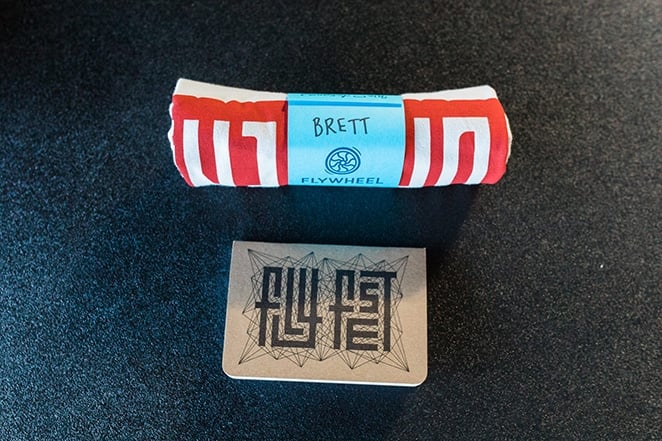
You never quite know how your work will be received until you see people react to it. On the first day of the conference, we got to observe first-hand what people thought. That’s when it happened; the first “good job,” a “sweet shirt,” and then “great logo.” We had done it! We had successfully mapped out, planned, and designed a great set of assets and art for the conference, without it ever feeling like a bland hotel ballroom.
My top 3 tips for a “fly” conference brand:
1. Brainstorm with people who won’t be dream killers.
It’s important to let creativity flow. People who are too practical can hinder this action and force the creative sector into a box of boring normality. Start with dreams, and worry about practicality later.
2. Make multiple renditions of the same thing.
Sometimes the best thing for a design is to workshop it until all its options are exhausted. This allows you to meticulously operate on a design and pick from the best, not just the first one you created.
3. Don’t design in a silo.
Design with others, asking what they like/ dislike, what they want to see or imagine. If you think a design is great but it doesn’t accurately serve the audience it is useless.
Want more behind the scenes content? Check this out:

Comments ( 0 )