
We (obviously) love WordPress, and we really love finding sites built with WordPress that are absolutely beautiful and powerful. We made a list of 20 sites–ranging from portfolio sites to blogs to agencies to photographers–that are perfect examples of how beautiful WordPress sites can be. Check them out below.
1. Sane Communications
2. Mindcastle
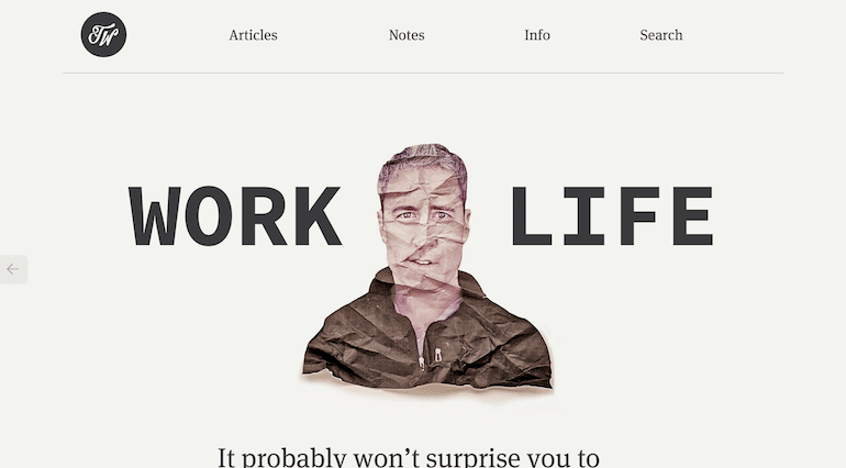
3. Trent Walton
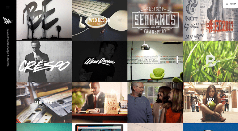
4. Angel Acevedo
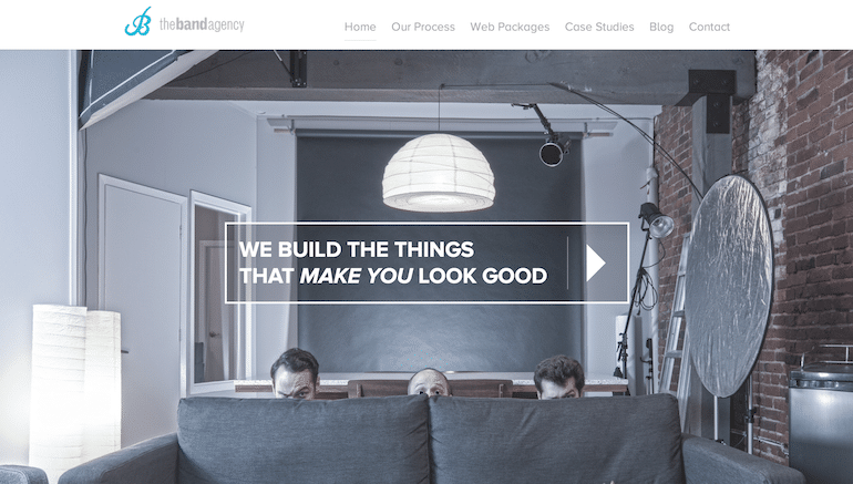
5. The Band Agency
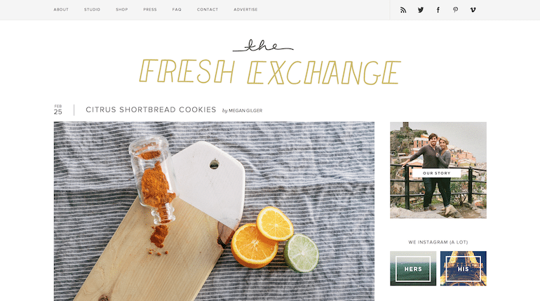
6. The Fresh Exchange
7. Design Made in Germany
8. Childagain
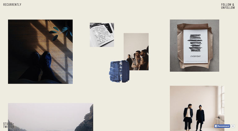
9. Recurrently
10. Seattle Cider Company
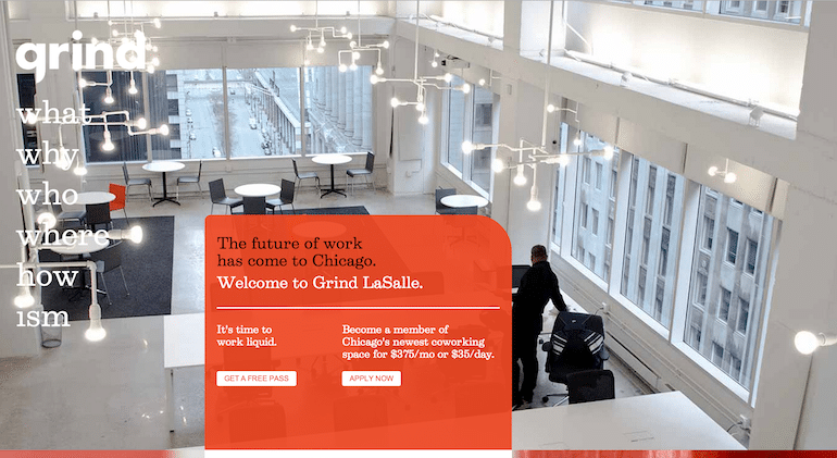
11. Grind
12. I Shot Him
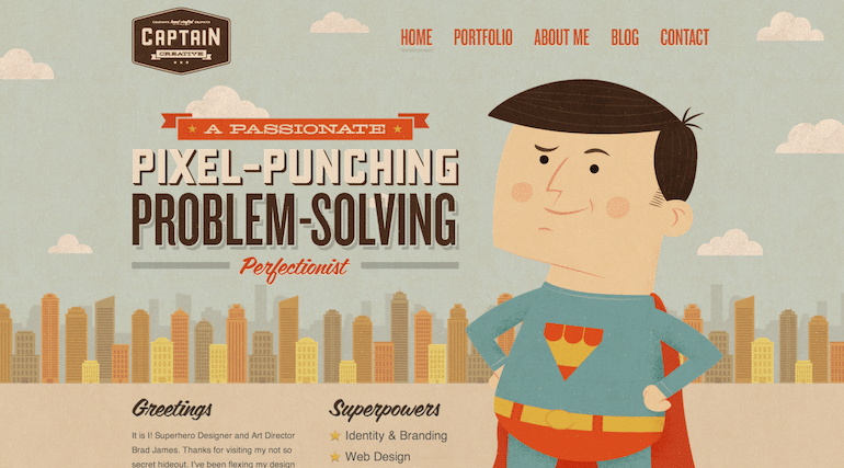
13. Captain Creative
14. Listen
15. Racket
16. Hyemi Oh
17. Trever Hoehne
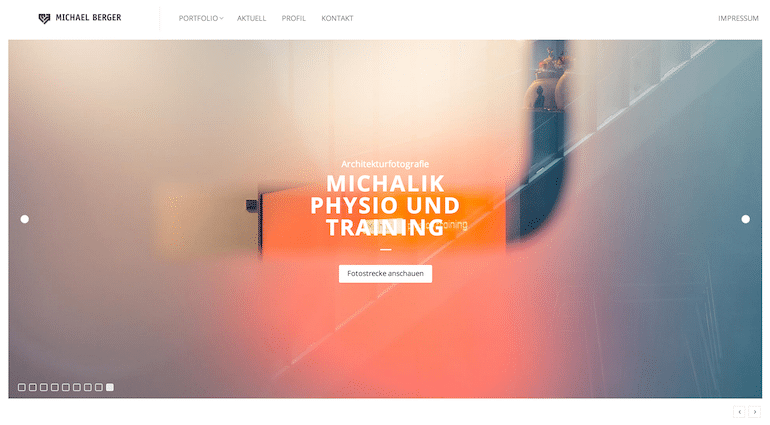
18. Michael Berger
19. Breanna Rose
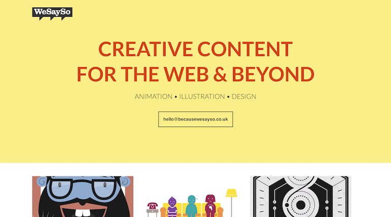
20. We Say So
Can’t get enough of these badass sites? Check out even more here!















Comments ( 22 )
DanielInemn
August 9, 2025
https://t.me/s/Official_1win_kanal/1761
DanielInemn
August 9, 2025
https://t.me/s/Official_1win_kanal/1741
Conniefauct
August 9, 2025
Proof blog you be undergoing here.. It’s severely to espy elevated calibre writing like yours these days. I justifiably appreciate individuals like you! Go through mindfulness!! https://letssearch.com/?domainname=https://doselect.com/@decab16353abf074be022fa5f
Conniefauct
August 6, 2025
This website exceedingly has all of the low-down and facts I needed there this subject and didn’t positive who to ask.
order celecoxib pill
Conniefauct
August 3, 2025
More posts like this would create the online elbow-room more useful. https://ondactone.com/simvastatin/
iw484
July 23, 2025
Greetings! Jolly serviceable suggestion within this article! It’s the crumb changes which wish espy the largest changes. Thanks a a quantity towards sharing! https://aranitidine.com/fr/modalert-en-france/
9ed6j
July 21, 2025
I couldn’t weather commenting. Warmly written! https://prohnrg.com/product/cytotec-online/
Conniefauct
July 20, 2025
This is the type of advise I unearth helpful. https://ursxdol.com/furosemide-diuretic/
Conniefauct
July 18, 2025
More posts like this would make the blogosphere more useful. https://gnolvade.com/
om1oj
July 18, 2025
More posts like this would make the online elbow-room more useful. amoxicillin brand
65616
July 16, 2025
viagra 50 mg for sale - sildenafil 50 mg for sale sildenafil 50mg tablets price
Conniefauct
July 15, 2025
buy ranitidine generic - https://aranitidine.com/# ranitidine drug
6uhr0
July 14, 2025
cialis tadalafil & dapoxetine - https://strongtadafl.com/# purchase cialis
abwba
July 12, 2025
tadalafil 20 mg directions - https://ciltadgn.com/ where to buy cialis
rrzc8
July 11, 2025
buy cenforce - on this site cenforce online buy
159rb
July 9, 2025
order diflucan 200mg generic - https://gpdifluca.com/# buy fluconazole 200mg
0u53w
July 6, 2025
cost amoxil - buy amoxil amoxil online buy
Pat
December 29, 2015
These are very cool designs. Some of them seemed a little similar to a couple of Squarespace templates but getting these designs on Wordpress is impressive. With the flexibility of Wordpess, I think more and more people are migrating from SQ.
Luke Cavanagh
July 23, 2015
You could use any of the lazy load plugin which would help image loading and also use a static caching plugin as well.
https://github.com/Automattic/lazy-load
Carole Baskin
March 21, 2014
I liked the way Trever Hoehne displayed the images on the front page. I'd love to know how that was done so that a screen loading quickly, as others below it were starting to load in the background. With our big cats, that could really be stunning.
I noticed that most of the graphics intensive sites took 8 seconds or longer to load, which isn't a trade off we can make. We have been thrilled to get our 6 seconds down to about 2 thanks to FlyWheel.
Nasendackel
March 18, 2014
Its always quite impressive, how designers use Wordpress. For years I try that May blog looks different.
John Locke
February 25, 2014
The Captain Creative site is f-f-f-f-FRESH! I love how the colors even look retro.
Most of the rest of these use imagery to tell stories, oftentimes in intriguing ways. Check out Racket, LIsten, Trent Walton's site, Design Made In Germany, and Sane.
The workspace photo as a metaphor for expertise is still effective, but I think it *has* peaked and will eventually become cliched. This applies for both the macro (here's our offices) and micro (coffee cup and Mac).
It's difficult to tell a story with photos, that just seems to be the quickest way to do it, and I see everyone do it.
That Seattle Cider site uses photography very effectively, without being blunt.
Jason Terry
February 26, 2014
John, I checked out the Captain Creative site and it does look amazing. It really surprised me that his last blog update was in August of 2012. Yikes!
John Locke
March 21, 2014
Hi Jason:
Yikes indeed! That's way too bog of a gap in between publishing. Good content works wonders if you produce it consistently.