
Design
Re-introducing Flywheel’s blog: Layout!

Layout, Flywheel’s official blog, was first launched in 2014 as a publication for designers. Since then, it’s evolved into a community of thoughtfully-written and curated content for busy creatives of all types. From articles and videos to specialized courses, you’ll find a range of resources for a variety of skills: site design, web development, marketing, business growth, client management, and so much more!
Today, I’m delighted to share that our site design has evolved to make all of this content more discoverable, easier to experience, and hopefully more enjoyable!
The short version: We have a brand new site design, and I’d love to hear what you think in the comments below!
The long version: We spent a lot of time thinking really intentionally about this redesign, and made some important decisions along the way. Keep reading for the strategy behind it all, details about our favorite features, and a look at the process from sketches to production!

Why the change?
Flywheel has evolved a lot since the company was founded in 2012. I’ll let you read the details of Flywheel’s history here, but to sum it up: Our products are more advanced, our audience is wider, and our mission is greater.
To help creatives do their best work.
Our content strategy evolved with the rest of the company, but other than a couple bug fixes, we left Layout the same. (The one exception being a purple logo that showed up in 2016, which we never really acknowledged – sorry about that!)
Essentially, we were forcing something that was originally built as a design publication to also start speaking to developers, marketers, agency owners, and more – and simply put, the user experience was not great.
We were using the age-old “reverse, chronological” layout, with zero tags and only five categories: Business, WordPress, Inspiration, How-to, and Freebies. (How-to? Inspiration? For who?)
This made it hard to highlight our most helpful resources, and put a lot of responsibility on readers to create their own content journey. Engagement was low, our bounce rate was high, and people asked us for content we already had – they just couldn’t find it.
User experience was lacking, and on top of that – the experience for our own internal team wasn’t great, either. We were still using the WordPress Classic Editor, and while that does work just fine, we’ve been excited about the Gutenberg Editor and its potential for a long time.

On the visual side of things, our team had to work with a feature image size that was 1800 px wide by 500 px tall. While they were good sports about it, it’s not easy to tell stories in photos that long and narrow.
Plus, we always create our own images for articles – but you’d never know it!
We’ve been stock photo free since 2018.
We’re super proud of that fact, but the traditional site design for blogs only highlights the author – not anyone behind the visuals.

So, to sum it all up, we felt that we weren’t helping our readers do their best work, nor were we letting our own team do our best work.
Queue: This redesign!
We’ve kept the best parts of Layout (like the actionable content and inspiring imagery!), but in a way that’ll help us all do better work. You’ll be able to find the content you care about most, and we’ll be able to further our craft to give you even better stories.
A few new features
There are so many things we’re excited about with this design, but I wanted to highlight a few of our favorites!
New categories and tags
One of the most important elements of the new design was to make it easier for you to find more of the content you’re interested in, so we have five new categories plus more than 50 tags! You’ll see these in several places, making it much easier to explore the site.
Along with all the actionable advice and technical tutorials that Layout specializes in, you’ll now also find categories for Flywheel product updates and company stories! For customers and fans of our brand, it’s a nice holistic experience of all things Flywheel-related.
Powered by the Gutenberg Editor
While this is technically under the hood, we’re excited about the storytelling possibilities Gutenberg will give our team. Featuring new image sizes, layout options, and custom Gutenberg blocks, we have lots of ideas we’ll be experimenting with to give you higher quality content.
Coming soon: Highlighting authors, designers, photographers, and more!
We’re thrilled to give credit to everyone behind an article, not just the primary author. While we decided to launch without this feature, we’ll be rolling out additional credits very soon. Here’s a sneak peek!
Coming soon: Table of contents
Skip what you know and jump straight to the information you’re looking for. We’ll be rolling out a sticky table of contents soon, so you can easily navigate each and every article!
Behind the scenes
Because our audience consists of all types of people related to websites and the creative process, we wanted to share a little behind-the-scenes look of how we accomplished an update of this scale! I’ve already talked about some of the marketing strategy behind the redesign, but wanted to showcase a few of the design and development decisions we made along the way.

The design process
For this project, we actually worked with a talented friend and freelancer, Adam Nielsen. He took a very messy Google Doc with a bunch of marketing strategy notes and turned it into the design you’re looking at now!

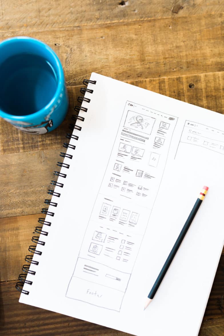

Before the design was finalized, Adam spent a lot of time talking to Kimberly Bailey (our in-house photographer) and Bryan North (one of our designers) to make sure their vision for Layout’s imagery could come to life.
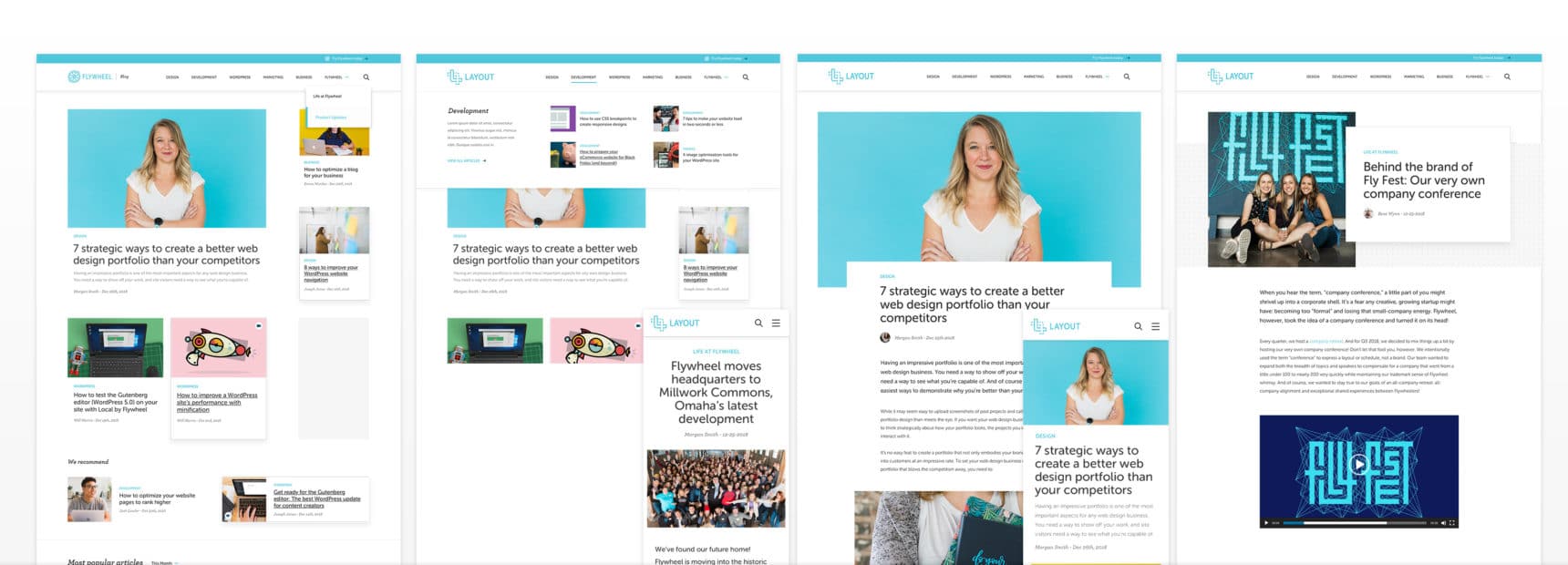
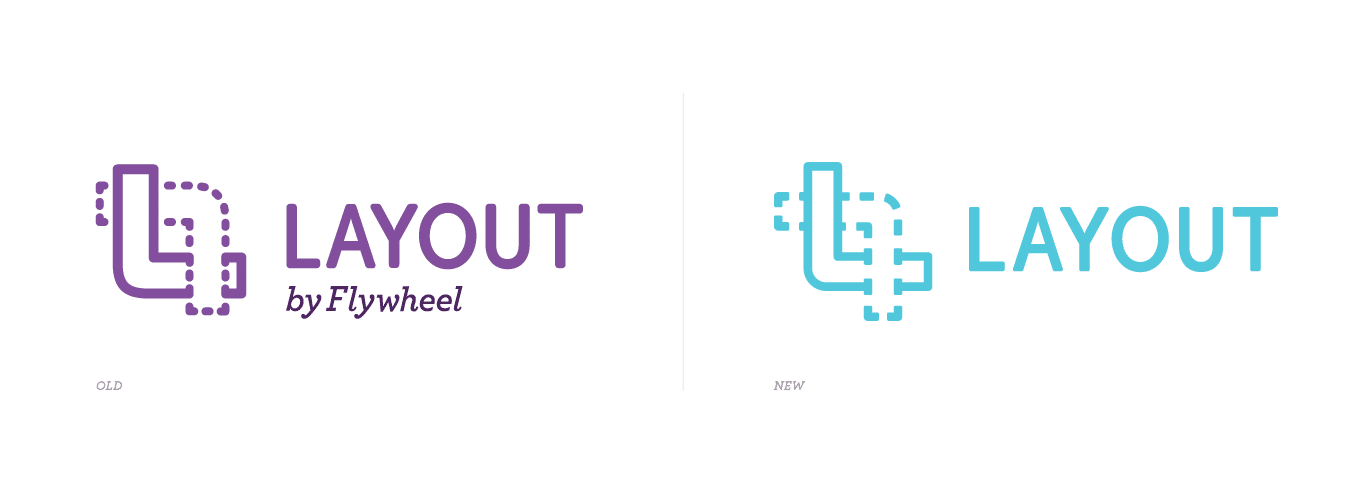
Fun fact: For a minute, we almost decided to change “Layout” to “Flywheel’s blog.” (Notice the logo in the upper left of the mockups!) We decided we wanted Layout to maintain its own identity, however, just with a closer connection to the Flywheel brand. (Hence, altering the logo slightly and switching it to Flywheel blue!) Our in-house Art Director, Nicholas Petersen, was behind this.
Development decisions
Once the design mockups were finalized, they were passed off to Josh Masen, our in-house developer, to turn it all into a functional website!
As you can probably guess, we use Flywheel’s hosting infrastructure, so the development process was super streamlined. The redesign started in Local, moved into a staging environment, and finally to production.
To create the custom theme, Josh used the Timber WordPress plugin and the Gutenberg Editor to create custom blocks.

What’s to come
The best part of all of this is that we have even more planned! Over the next few months, we’ll be rolling out more features to create a better reading experience, share unique stories, and help you do your best creative work.
This also means that we’d love your feedback! Tell me in the comments below: What should we do more of? What should we change? What can we help you learn this year?
We’re excited to build a community of creatives furthering our craft, and can’t thank you enough for joining us!


Comments ( 306 )
Islamabad Call Girls
July 1, 2025
The finest Islamabad call girls provide a luxurious and discreet experience for those seeking top-tier companionship. Their charm, beauty, and professionalism ensure a night of relaxation, excitement, and unforgettable memories.|
https://www.girlsforislamabad.com/
Josephner
May 28, 2025
Ero Pharm Fast: Ero Pharm Fast - Ero Pharm Fast
Josephner
May 28, 2025
cheapest antibiotics: buy antibiotics over the counter - buy antibiotics from india
Josephner
May 28, 2025
buy antibiotics for uti: cheapest antibiotics - best online doctor for antibiotics
CurtisAdurl
May 28, 2025
Ero Pharm Fast: п»їed pills online - online erectile dysfunction
Josephner
May 28, 2025
Over the counter antibiotics pills: BiotPharm - cheapest antibiotics
Josephner
May 27, 2025
Ero Pharm Fast: Ero Pharm Fast - cheapest ed online
Josephner
May 27, 2025
PharmAu24: Pharm Au 24 - PharmAu24
Rodneysog
May 27, 2025
Online medication store Australia [url=https://pharmau24.com/#]Licensed online pharmacy AU[/url] pharmacy online australia
Davidunlor
May 27, 2025
https://pharmau24.com/# online pharmacy australia
Josephner
May 27, 2025
best ed medication online: Ero Pharm Fast - erection pills online
CurtisAdurl
May 27, 2025
ed online treatment: Ero Pharm Fast - how to get ed meds online
Rodneysog
May 27, 2025
Ero Pharm Fast [url=https://eropharmfast.shop/#]low cost ed pills[/url] Ero Pharm Fast
Charlesmub
May 27, 2025
buy antibiotics from india: Biot Pharm - over the counter antibiotics
CurtisAdurl
May 27, 2025
Pharm Au 24: Discount pharmacy Australia - PharmAu24
Josephner
May 27, 2025
Over the counter antibiotics for infection: buy antibiotics online uk - Over the counter antibiotics pills
Davidunlor
May 27, 2025
https://biotpharm.shop/# get antibiotics without seeing a doctor
Lorenhag
May 24, 2025
buy cialis free shipping: cialis prices at walmart - online cialis
JosephTes
May 24, 2025
tadalafil 5mg once a day [url=https://tadalaccess.com/#]TadalAccess[/url] cialis and cocaine
FrankieLar
May 23, 2025
https://tadalaccess.com/# vardenafil vs tadalafil
Lorenhag
May 23, 2025
best price on generic cialis: is tadalafil peptide safe to take - buy cheapest cialis
FrankieLar
May 23, 2025
https://tadalaccess.com/# cialis mechanism of action
JosephTes
May 23, 2025
cialis 20mg for sale [url=https://tadalaccess.com/#]cheap cialis 20mg[/url] cialis indien bezahlung mit paypal
JosephTes
May 23, 2025
cialis pricing [url=https://tadalaccess.com/#]where to buy cialis online for cheap[/url] cialis for sale online in canada
FrankieLar
May 23, 2025
https://tadalaccess.com/# how many 5mg cialis can i take at once
Lorenhag
May 23, 2025
natural cialis: mint pharmaceuticals tadalafil - cialis male enhancement
FrankieLar
May 23, 2025
https://tadalaccess.com/# buy cialis 20 mg online
JosephTes
May 22, 2025
can i take two 5mg cialis at once [url=https://tadalaccess.com/#]when should i take cialis[/url] cialis w/o perscription
Lorenhag
May 22, 2025
order generic cialis online 20 mg 20 pills: Tadal Access - cialis genetic
JosephTes
May 22, 2025
cialis experience [url=https://tadalaccess.com/#]cialis and alcohol[/url] cialis logo
Lorenhag
May 22, 2025
cialis 20mg for sale: TadalAccess - cialis professional ingredients
FrankieLar
May 22, 2025
https://tadalaccess.com/# too much cialis
Lorenhag
May 22, 2025
cialis generic name: Tadal Access - cialis canada prices
Lorenhag
May 22, 2025
stockists of cialis: cialis 5mg how long does it take to work - tadalafil online paypal
JosephTes
May 22, 2025
purchasing cialis [url=https://tadalaccess.com/#]best price cialis supper active[/url] how to buy tadalafil online
FrankieLar
May 22, 2025
https://tadalaccess.com/# cialis black review
Lorenhag
May 22, 2025
cialis liquid for sale: TadalAccess - cialis patent expiration date
JosephTes
May 22, 2025
when is generic cialis available [url=https://tadalaccess.com/#]Tadal Access[/url] cialis coupon code
FrankieLar
May 21, 2025
https://tadalaccess.com/# tadalafil citrate bodybuilding
JosephTes
May 21, 2025
cialis effect on blood pressure [url=https://tadalaccess.com/#]Tadal Access[/url] do you need a prescription for cialis
FrankieLar
May 21, 2025
https://tadalaccess.com/# best place to get cialis without pesricption
Scottdroca
May 21, 2025
sildenafil vs tadalafil vs vardenafil: buy liquid tadalafil online - buy cheap tadalafil online
Lorenhag
May 21, 2025
generic cialis tadalafil 20 mg from india: TadalAccess - adcirca tadalafil
FrankieLar
May 21, 2025
https://tadalaccess.com/# cialis doesnt work for me
JosephTes
May 21, 2025
cheap cialis dapoxitine cheap online [url=https://tadalaccess.com/#]cialis professional ingredients[/url] cialis interactions
FrankieLar
May 21, 2025
https://tadalaccess.com/# overnight cialis
JosephTes
May 21, 2025
cialis professional review [url=https://tadalaccess.com/#]Tadal Access[/url] cialis generic best price that accepts mastercard
Lorenhag
May 20, 2025
cialis black in australia: TadalAccess - cialis for sale over the counter
FrankieLar
May 20, 2025
https://tadalaccess.com/# where to buy cialis over the counter
Scottdroca
May 20, 2025
tadalafil and voice problems: vidalista 20 tadalafil tablets - cialis free trial offer
FrankieLar
May 20, 2025
https://tadalaccess.com/# cialis 10mg
JosephTes
May 20, 2025
do you need a prescription for cialis [url=https://tadalaccess.com/#]cialis for daily use[/url] cialis daily vs regular cialis
Lorenhag
May 20, 2025
buy cialis 20mg: Tadal Access - cialis side effects forum
JosephTes
May 20, 2025
no prescription female cialis [url=https://tadalaccess.com/#]order cialis canada[/url] cialis 40 mg reviews
FrankieLar
May 20, 2025
https://tadalaccess.com/# buy cialis without a prescription
Lorenhag
May 20, 2025
sildenafil and tadalafil: purchase cialis - cheap cialis generic online
JosephTes
May 19, 2025
cialis effectiveness [url=https://tadalaccess.com/#]how long before sex should you take cialis[/url] cialis free trial voucher 2018
Scottdroca
May 19, 2025
natural cialis: vardenafil and tadalafil - tadalafil troche reviews
FrankieLar
May 19, 2025
https://tadalaccess.com/# canada pharmacy cialis
JosephTes
May 19, 2025
cialis side effects [url=https://tadalaccess.com/#]is tadalafil available in generic form[/url] cheap generic cialis
Scottdroca
May 19, 2025
canadian cialis no prescription: Tadal Access - tadalafil online canadian pharmacy
FrankieLar
May 19, 2025
https://tadalaccess.com/# cialis difficulty ejaculating
Lorenhag
May 19, 2025
cialis canada online: cialis wikipedia - cialis over the counter in spain
JosephTes
May 19, 2025
when should you take cialis [url=https://tadalaccess.com/#]natural cialis[/url] how long does cialis last in your system
Scottdroca
May 19, 2025
buy cialis generic online 10 mg: Tadal Access - cialis overnight deleivery
Lorenhag
May 19, 2025
tadalafil tablets 20 mg global: Tadal Access - tadalafil 20mg (generic equivalent to cialis)
FrankieLar
May 19, 2025
https://tadalaccess.com/# letairis and tadalafil
JosephTes
May 19, 2025
tadalafil vs sildenafil [url=https://tadalaccess.com/#]when is generic cialis available[/url] cialis from india
Scottdroca
May 19, 2025
cialis coupon walmart: Tadal Access - canadian cialis 5mg
FrankieLar
May 18, 2025
https://tadalaccess.com/# tadalafil price insurance
Scottdroca
May 18, 2025
buy cialis/canada: buy cialis with dapoxetine in canada - pregnancy category for tadalafil
JosephTes
May 18, 2025
cialis erection [url=https://tadalaccess.com/#]cheap t jet 60 cialis online[/url] cialis experience
Lorenhag
May 18, 2025
prices of cialis 20 mg: Tadal Access - how long before sex should i take cialis
Scottdroca
May 18, 2025
cialis 20 mg tablets and prices: order cialis from canada - how long for cialis to take effect
JosephTes
May 18, 2025
tadalafil citrate powder [url=https://tadalaccess.com/#]TadalAccess[/url] how long does it take for cialis to start working
Lorenhag
May 18, 2025
tadalafil canada is it safe: Tadal Access - price of cialis at walmart
FrankieLar
May 18, 2025
https://tadalaccess.com/# cialis difficulty ejaculating
Scottdroca
May 18, 2025
ordering tadalafil online: Tadal Access - cialis online canada ripoff
JosephTes
May 18, 2025
cialis 20 milligram [url=https://tadalaccess.com/#]Tadal Access[/url] cheaper alternative to cialis
Lorenhag
May 18, 2025
cialis generic overnite: cialis from mexico - how many mg of cialis should i take
FrankieLar
May 18, 2025
https://tadalaccess.com/# tadalafil cialis
Scottdroca
May 18, 2025
cialis paypal: tadalafil review - cialis how to use
Lorenhag
May 18, 2025
cialis free trial coupon: TadalAccess - when to take cialis 20mg
JosephTes
May 18, 2025
how to buy tadalafil online [url=https://tadalaccess.com/#]TadalAccess[/url] cialis tablets for sell
FrankieLar
May 18, 2025
https://tadalaccess.com/# cialis online reviews
Lorenhag
May 17, 2025
vardenafil vs tadalafil: cialis after prostate surgery - cialis pill canada
Scottdroca
May 17, 2025
peptide tadalafil reddit: buy cialis without prescription - cialis cost per pill
JosephTes
May 17, 2025
cialis for performance anxiety [url=https://tadalaccess.com/#]is tadalafil peptide safe to take[/url] canadian pharmacy tadalafil 20mg
FrankieLar
May 17, 2025
https://tadalaccess.com/# cialis 20mg review
Lorenhag
May 17, 2025
where can i buy cialis: TadalAccess - generic cialis tadalafil 20mg reviews
Scottdroca
May 17, 2025
cialis coupon online: Tadal Access - vidalista tadalafil reviews
JosephTes
May 17, 2025
india pharmacy cialis [url=https://tadalaccess.com/#]cialis instructions[/url] cialis prices
FrankieLar
May 17, 2025
https://tadalaccess.com/# how much does cialis cost with insurance
Lorenhag
May 17, 2025
where can i buy cialis: cialis 5 mg price - tadalafil tablets 20 mg side effects
Scottdroca
May 17, 2025
online cialis prescription: Tadal Access - side effects cialis
JosephTes
May 17, 2025
cialis side effects [url=https://tadalaccess.com/#]TadalAccess[/url] tadalafil liquid review
FrankieLar
May 17, 2025
https://tadalaccess.com/# tadalafil vs cialis
Lorenhag
May 17, 2025
cheap cialis: cialis with out a prescription - where can i buy cialis online
JosephTes
May 17, 2025
cialis pills for sale [url=https://tadalaccess.com/#]buy tadalafil no prescription[/url] tadalafil (tadalis-ajanta) reviews
Scottdroca
May 17, 2025
cialis daily: ordering tadalafil online - where can i buy cialis online in canada
FrankieLar
May 17, 2025
https://tadalaccess.com/# tadalafil 10mg side effects
Lorenhag
May 17, 2025
cialis manufacturer coupon 2018: Tadal Access - cialis wikipedia
JosephTes
May 16, 2025
cialis bodybuilding [url=https://tadalaccess.com/#]what is cialis tadalafil used for[/url] cialis manufacturer coupon
Scottdroca
May 16, 2025
cialis from india: what does cialis do - cialis without a doctor prescription canada
Lorenhag
May 16, 2025
does cialis make you harder: cialis medicine - cialis stories
FrankieLar
May 16, 2025
https://tadalaccess.com/# cialis 10mg ireland
JosephTes
May 16, 2025
cialis for enlarged prostate [url=https://tadalaccess.com/#]take cialis the correct way[/url] purchase cialis on line
Scottdroca
May 16, 2025
cialis 10mg ireland: TadalAccess - cialis over the counter in spain
Lorenhag
May 16, 2025
cialis tablets for sell: paypal cialis no prescription - cialis how long
бнанс Рестраця
May 16, 2025
Thanks for sharing. I read many of your blog posts, cool, your blog is very good. https://accounts.binance.com/hu/register-person?ref=FIHEGIZ8
FrankieLar
May 16, 2025
https://tadalaccess.com/# tadalafil no prescription forum
Scottdroca
May 16, 2025
tadalafil 40 mg with dapoxetine 60 mg: cialis soft tabs - best price on generic tadalafil
JosephTes
May 16, 2025
over the counter cialis 2017 [url=https://tadalaccess.com/#]cialis buy australia online[/url] cialis super active vs regular cialis
Lorenhag
May 16, 2025
no prescription tadalafil: Tadal Access - best time to take cialis 5mg
FrankieLar
May 16, 2025
https://tadalaccess.com/# online tadalafil
Lorenhag
May 16, 2025
when to take cialis 20mg: TadalAccess - cialis liquid for sale
Scottdroca
May 16, 2025
cialis prices in mexico: cialis free 30 day trial - cialis pill
JosephTes
May 16, 2025
cialis 5mg side effects [url=https://tadalaccess.com/#]TadalAccess[/url] buy cialis canada
FrankieLar
May 15, 2025
https://tadalaccess.com/# brand cialis australia
Lorenhag
May 15, 2025
cialis male enhancement: TadalAccess - sunrise remedies tadalafil
Scottdroca
May 15, 2025
cialis generic timeline: Tadal Access - cialis 30 mg dose
JosephTes
May 15, 2025
cialis samples for physicians [url=https://tadalaccess.com/#]how much does cialis cost at walgreens[/url] is tadalafil available at cvs
FrankieLar
May 15, 2025
https://tadalaccess.com/# how long does cialis last 20 mg
Lorenhag
May 15, 2025
buy cialis shipment to russia: cialis 5mg side effects - cialis black 800 mg pill house
Scottdroca
May 15, 2025
cialis side effects forum: is there a generic equivalent for cialis - cheap cialis dapoxitine cheap online
JosephTes
May 15, 2025
cialis generic cvs [url=https://tadalaccess.com/#]TadalAccess[/url] cialis testimonials
FrankieLar
May 15, 2025
https://tadalaccess.com/# find tadalafil
Lorenhag
May 15, 2025
cialis for sale toronto: Tadal Access - cialis tadalafil 20mg tablets
Scottdroca
May 15, 2025
cialis for sale: us pharmacy prices for cialis - cialis canadian pharmacy ezzz
JosephTes
May 15, 2025
cialis how long [url=https://tadalaccess.com/#]cheap cialis 20mg[/url] cialis daily vs regular cialis
FrankieLar
May 15, 2025
https://tadalaccess.com/# what is the active ingredient in cialis
Lorenhag
May 15, 2025
e20 pill cialis: TadalAccess - buy cialis online without prescription
Scottdroca
May 15, 2025
is cialis covered by insurance: Tadal Access - how long does cialis last in your system
JosephTes
May 14, 2025
cialis from india [url=https://tadalaccess.com/#]purchase cialis on line[/url] pharmacy 365 cialis
FrankieLar
May 14, 2025
https://tadalaccess.com/# best place to buy tadalafil online
Lorenhag
May 14, 2025
reliable source cialis: cialis pills for sale - cialis medicare
Scottdroca
May 14, 2025
cialis website: generic cialis super active tadalafil 20mg - cialis para que sirve
JosephTes
May 14, 2025
cialis dapoxetine australia [url=https://tadalaccess.com/#]cialis daily vs regular cialis[/url] cialis 20mg price
FrankieLar
May 14, 2025
https://tadalaccess.com/# cialis with dapoxetine 60mg
Lorenhag
May 14, 2025
online pharmacy cialis: Tadal Access - cheap cialis pills
Scottdroca
May 14, 2025
cialis tadalafil online paypal: TadalAccess - buy cialis from canada
FrankieLar
May 14, 2025
https://tadalaccess.com/# cialis generic online
JosephTes
May 14, 2025
cialis purchase [url=https://tadalaccess.com/#]how much does cialis cost at walmart[/url] cialis street price
Lorenhag
May 14, 2025
natural cialis: Tadal Access - cialis 20 mg
Scottdroca
May 14, 2025
cialis premature ejaculation: TadalAccess - cialis paypal
FrankieLar
May 14, 2025
https://tadalaccess.com/# cialis max dose
Lorenhag
May 14, 2025
cialis sample request form: cialis once a day - cialis onset
JosephTes
May 14, 2025
cialis online no prescription australia [url=https://tadalaccess.com/#]cialis for sale brand[/url] cialis dopoxetine
Scottdroca
May 14, 2025
cialis side effects a wife’s perspective: cipla tadalafil review - where to buy tadalafil online
FrankieLar
May 14, 2025
https://tadalaccess.com/# buy cialis online from canada
RogerCouct
May 13, 2025
https://amohealthcare.store/# Amo Health Care
MatthewTom
May 13, 2025
get generic clomid tablets [url=http://clomhealth.com/#]Clom Health[/url] generic clomid without rx
Oscargef
May 13, 2025
prednisone 20 mg tablet: can you buy prednisone in canada - PredniHealth
RogerCouct
May 13, 2025
https://amohealthcare.store/# buy amoxicillin over the counter uk
MatthewTom
May 13, 2025
Amo Health Care [url=https://amohealthcare.store/#]amoxicillin 500mg buy online uk[/url] Amo Health Care
Oscargef
May 13, 2025
amoxacillian without a percription: Amo Health Care - amoxicillin over the counter in canada
Russellfeeve
May 13, 2025
prednisone 3 tablets daily: prednisone 5 mg tablet rx - order prednisone 10mg
RogerCouct
May 13, 2025
https://clomhealth.shop/# where to buy generic clomid without a prescription
MatthewTom
May 13, 2025
prednisone pill [url=https://prednihealth.shop/#]prednisone 5mg price[/url] prednisone cream brand name
Oscargef
May 13, 2025
PredniHealth: price of prednisone 5mg - 50 mg prednisone canada pharmacy
Russellfeeve
May 13, 2025
where to buy cheap clomid prices: can you buy cheap clomid prices - can you get generic clomid pills
RogerCouct
May 13, 2025
https://prednihealth.shop/# prednisone 20mg by mail order
Oscargef
May 13, 2025
Amo Health Care: Amo Health Care - buy amoxicillin 500mg capsules uk
MatthewTom
May 13, 2025
prednisone 5 mg brand name [url=https://prednihealth.shop/#]PredniHealth[/url] prednisone buy online nz
JudsonZoown
May 13, 2025
can you get clomid without insurance: buy cheap clomid price - cost of clomid no prescription
RogerCouct
May 12, 2025
https://prednihealth.com/# PredniHealth
Russellfeeve
May 12, 2025
PredniHealth: PredniHealth - where can i order prednisone 20mg
JudsonZoown
May 12, 2025
Amo Health Care: Amo Health Care - Amo Health Care
Oscargef
May 12, 2025
Amo Health Care: amoxicillin 500 mg without prescription - amoxicillin 500 mg purchase without prescription
MatthewTom
May 12, 2025
cost of amoxicillin 30 capsules [url=https://amohealthcare.store/#]Amo Health Care[/url] amoxicillin 500 capsule
RogerCouct
May 12, 2025
https://prednihealth.shop/# PredniHealth
Russellfeeve
May 12, 2025
amoxicillin 875 mg tablet: Amo Health Care - Amo Health Care
JudsonZoown
May 12, 2025
can i purchase clomid now: Clom Health - how can i get cheap clomid without insurance
Oscargef
May 12, 2025
buy amoxicillin 500mg uk: Amo Health Care - Amo Health Care
RogerCouct
May 12, 2025
http://prednihealth.com/# PredniHealth
Russellfeeve
May 12, 2025
PredniHealth: PredniHealth - prednisone canada
JudsonZoown
May 12, 2025
amoxicillin 500mg capsules price: amoxicillin cephalexin - Amo Health Care
Oscargef
May 12, 2025
amoxicillin 500mg capsules price: Amo Health Care - Amo Health Care
MatthewTom
May 12, 2025
cost generic clomid without insurance [url=https://clomhealth.com/#]Clom Health[/url] order cheap clomid without a prescription
RogerCouct
May 12, 2025
https://prednihealth.com/# prednisone over the counter
Russellfeeve
May 12, 2025
where to buy amoxicillin over the counter: Amo Health Care - azithromycin amoxicillin
JudsonZoown
May 12, 2025
prednisone 20 mg tablets coupon: PredniHealth - prednisone 20 mg
Oscargef
May 12, 2025
Amo Health Care: Amo Health Care - Amo Health Care
RonaldFOEFS
May 11, 2025
http://maxviagramd.com/# cheap Viagra online
Albertoseino
May 11, 2025
buy generic Cialis online: Cialis without prescription - generic tadalafil
Jeremyfax
May 11, 2025
Modafinil for sale: doctor-reviewed advice - verified Modafinil vendors
RobertKet
May 11, 2025
safe online pharmacy: trusted Viagra suppliers - best price for Viagra
LorenzoBlize
May 10, 2025
modafinil legality [url=https://modafinilmd.store/#]modafinil pharmacy[/url] modafinil 2025
RobertKet
May 10, 2025
same-day Viagra shipping: order Viagra discreetly - safe online pharmacy
Jeremyfax
May 10, 2025
best price for Viagra: trusted Viagra suppliers - Viagra without prescription
Albertoseino
May 10, 2025
verified Modafinil vendors: doctor-reviewed advice - buy modafinil online
LorenzoBlize
May 10, 2025
buy generic Cialis online [url=https://zipgenericmd.shop/#]generic tadalafil[/url] cheap Cialis online
Jeremyfax
May 10, 2025
safe modafinil purchase: Modafinil for sale - safe modafinil purchase
RobertKet
May 9, 2025
purchase Modafinil without prescription: verified Modafinil vendors - purchase Modafinil without prescription
Jeremyfax
May 9, 2025
best price Cialis tablets: discreet shipping ED pills - best price Cialis tablets
Albertoseino
May 9, 2025
cheap Cialis online: buy generic Cialis online - online Cialis pharmacy
RobertKet
May 9, 2025
fast Viagra delivery: generic sildenafil 100mg - discreet shipping
Jeremyfax
May 9, 2025
purchase Modafinil without prescription: modafinil pharmacy - purchase Modafinil without prescription
Albertoseino
May 9, 2025
order Cialis online no prescription: secure checkout ED drugs - secure checkout ED drugs
RobertKet
May 9, 2025
Viagra without prescription: legit Viagra online - safe online pharmacy
LorenzoBlize
May 9, 2025
no doctor visit required [url=https://maxviagramd.shop/#]secure checkout Viagra[/url] secure checkout Viagra
RonaldFOEFS
May 9, 2025
https://modafinilmd.store/# Modafinil for sale
Albertoseino
May 9, 2025
legal Modafinil purchase: legal Modafinil purchase - legal Modafinil purchase
Jeremyfax
May 9, 2025
safe modafinil purchase: modafinil 2025 - modafinil pharmacy
RobertKet
May 9, 2025
doctor-reviewed advice: doctor-reviewed advice - doctor-reviewed advice
LorenzoBlize
May 9, 2025
buy generic Cialis online [url=http://zipgenericmd.com/#]generic tadalafil[/url] affordable ED medication
RonaldFOEFS
May 9, 2025
https://maxviagramd.shop/# discreet shipping
Jeremyfax
May 9, 2025
purchase Modafinil without prescription: Modafinil for sale - Modafinil for sale
RobertKet
May 9, 2025
Viagra without prescription: discreet shipping - legit Viagra online
ElmerSip
May 7, 2025
пинап казино: пинап казино - пин ап казино
ZackaryCaush
May 7, 2025
http://vavadavhod.tech/# вавада зеркало
Richardmat
May 5, 2025
пин ап зеркало [url=https://pinuprus.pro/#]пин ап зеркало[/url] pin up вход
ZackaryCaush
May 4, 2025
https://vavadavhod.tech/# вавада казино
ElmerSip
May 4, 2025
вавада: вавада - vavada вход
Richardmat
May 4, 2025
pin up вход [url=http://pinuprus.pro/#]пин ап казино официальный сайт[/url] пин ап казино
ZackaryCaush
May 3, 2025
http://pinupaz.top/# pin up az
ElmerSip
May 3, 2025
pinup az: pin up az - pin up azerbaycan
Kennethsheby
May 3, 2025
pin up вход: пин ап казино официальный сайт - пин ап казино официальный сайт
Kennethsheby
May 2, 2025
pin up casino: pin-up - pin up casino
Richardmat
May 2, 2025
пин ап казино официальный сайт [url=https://pinuprus.pro/#]пин ап казино официальный сайт[/url] pin up вход
BrianCrugh
May 2, 2025
vavada вход: vavada - vavada вход
ZackaryCaush
May 2, 2025
https://pinupaz.top/# pin-up
BrianCrugh
May 1, 2025
vavada вход: vavada casino - вавада казино
Kennethsheby
April 30, 2025
pin-up casino giris: pin up casino - pin-up
Kennethsheby
April 30, 2025
pin up casino: pin up casino - pin up azerbaycan
Richardmat
April 30, 2025
вавада казино [url=https://vavadavhod.tech/#]vavada casino[/url] вавада
Kennethsheby
April 30, 2025
вавада: vavada - вавада казино
Richardmat
April 30, 2025
пин ап казино официальный сайт [url=http://pinuprus.pro/#]пин ап вход[/url] pin up вход
ElmerSip
April 30, 2025
пин ап казино официальный сайт: пин ап казино официальный сайт - пин ап зеркало
ZackaryCaush
April 30, 2025
http://pinuprus.pro/# пин ап зеркало
Kennethsheby
April 30, 2025
вавада официальный сайт: вавада официальный сайт - вавада казино
ElmerSip
April 30, 2025
pin up casino: pin up azerbaycan - pin up
ZackaryCaush
April 30, 2025
http://vavadavhod.tech/# vavada вход
MichaelFaulp
April 30, 2025
mexico pharmacy order online: mexico pharmacy order online - mexican border pharmacies shipping to usa
Stevendrype
April 29, 2025
mexico pharmacy order online: Rx Express Mexico - mexico drug stores pharmacies
Dannysit
April 29, 2025
RxExpressMexico: Rx Express Mexico - purple pharmacy mexico price list
Michaeljouch
April 29, 2025
best online pharmacy india [url=https://medicinefromindia.shop/#]best online pharmacy india[/url] Medicine From India
MichaelFaulp
April 29, 2025
Medicine From India: indian pharmacy - MedicineFromIndia
Dannysit
April 29, 2025
Medicine From India: Medicine From India - п»їlegitimate online pharmacies india
Stevendrype
April 29, 2025
medicine courier from India to USA: Medicine From India - medicine courier from India to USA
Michaeljouch
April 29, 2025
recommended canadian pharmacies [url=http://expressrxcanada.com/#]Generic drugs from Canada[/url] legitimate canadian online pharmacies
MichaelFaulp
April 29, 2025
mexico pharmacy order online: mexican rx online - mexican mail order pharmacies
Dannysit
April 29, 2025
Medicine From India: indianpharmacy com - MedicineFromIndia
Walterhap
April 29, 2025
https://rxexpressmexico.com/# mexican rx online
Stevendrype
April 29, 2025
mexican rx online: mexico drug stores pharmacies - mexico pharmacy order online
Michaeljouch
April 29, 2025
medicine courier from India to USA [url=https://medicinefromindia.com/#]indian pharmacy[/url] Medicine From India
MichaelFaulp
April 29, 2025
Rx Express Mexico: RxExpressMexico - Rx Express Mexico
Dannysit
April 29, 2025
mexican online pharmacy: mexican online pharmacy - pharmacies in mexico that ship to usa
Stevendrype
April 29, 2025
online canadian pharmacy reviews: Express Rx Canada - canadian pharmacy drugs online
Michaeljouch
April 29, 2025
canada drugs reviews [url=http://expressrxcanada.com/#]pharmacy in canada[/url] canadian pharmacies compare
Dannysit
April 29, 2025
MedicineFromIndia: indian pharmacy online shopping - reputable indian pharmacies
Stevendrype
April 29, 2025
mexican rx online: Rx Express Mexico - mexico drug stores pharmacies
MichaelFaulp
April 29, 2025
Medicine From India: indian pharmacy online shopping - indian pharmacy online shopping
Stevendrype
April 28, 2025
mexican online pharmacy: mexican online pharmacy - Rx Express Mexico
Dannysit
April 28, 2025
mexico drug stores pharmacies: Rx Express Mexico - Rx Express Mexico
Walterhap
April 28, 2025
https://medicinefromindia.com/# medicine courier from India to USA
Michaeljouch
April 28, 2025
mexico pharmacies prescription drugs [url=https://rxexpressmexico.com/#]Rx Express Mexico[/url] mexican rx online
MichaelFaulp
April 28, 2025
Rx Express Mexico: mexican rx online - buying prescription drugs in mexico
Stevendrype
April 28, 2025
mexican online pharmacy: mexican online pharmacies prescription drugs - Rx Express Mexico
Dannysit
April 28, 2025
Medicine From India: indian pharmacy - Medicine From India
Walterhap
April 28, 2025
http://expressrxcanada.com/# legal canadian pharmacy online
MichaelFaulp
April 28, 2025
indian pharmacy online shopping: online pharmacy india - top 10 pharmacies in india
Michaeljouch
April 28, 2025
mexico pharmacies prescription drugs [url=https://rxexpressmexico.shop/#]mexico drug stores pharmacies[/url] mexico drug stores pharmacies
Dannysit
April 28, 2025
RxExpressMexico: mexican online pharmacy - mexico pharmacy order online
Stevendrype
April 28, 2025
mexico pharmacy order online: mexico pharmacy order online - buying prescription drugs in mexico
Walterhap
April 28, 2025
https://expressrxcanada.com/# canada drugs online
MichaelFaulp
April 28, 2025
Medicine From India: indian pharmacy online shopping - Medicine From India
Michaeljouch
April 28, 2025
buy canadian drugs [url=https://expressrxcanada.com/#]Canadian pharmacy shipping to USA[/url] best mail order pharmacy canada
Bradleyfup
April 28, 2025
kamagra gel: Kamagra Commander maintenant - Kamagra Oral Jelly pas cher
Robertmut
April 27, 2025
https://kamagraprix.shop/# kamagra oral jelly
BilliesniCt
April 27, 2025
pharmacie en ligne pas cher: Medicaments en ligne livres en 24h - pharmacie en ligne pas cher pharmafst.com
Robertmut
April 26, 2025
http://pharmafst.com/# pharmacie en ligne france fiable
Bradleyfup
April 26, 2025
kamagra livraison 24h: Kamagra Oral Jelly pas cher - Kamagra pharmacie en ligne
PeterUnomb
April 26, 2025
Cialis en ligne [url=https://tadalmed.com/#]cialis prix[/url] Acheter Cialis tadalmed.com
BilliesniCt
April 26, 2025
pharmacie en ligne: trouver un mГ©dicament en pharmacie - pharmacie en ligne france livraison belgique pharmafst.com
Bradleyfup
April 26, 2025
vente de mГ©dicament en ligne: pharmacie en ligne france livraison internationale - Achat mГ©dicament en ligne fiable pharmafst.com
PeterUnomb
April 26, 2025
Pharmacie en ligne Cialis sans ordonnance [url=https://tadalmed.shop/#]Cialis sans ordonnance 24h[/url] cialis prix tadalmed.com
BilliesniCt
April 26, 2025
kamagra gel: kamagra oral jelly - kamagra 100mg prix
BernardVeida
April 25, 2025
Achetez vos kamagra medicaments: Kamagra pharmacie en ligne - kamagra gel
Robertmut
April 25, 2025
http://kamagraprix.com/# Achetez vos kamagra medicaments
Bradleyfup
April 25, 2025
Tadalafil 20 mg prix en pharmacie: Acheter Cialis - Tadalafil 20 mg prix sans ordonnance tadalmed.shop
Robertmut
April 25, 2025
https://pharmafst.shop/# Pharmacie en ligne livraison Europe
Bradleyfup
April 25, 2025
Acheter Viagra Cialis sans ordonnance: cialis prix - cialis generique tadalmed.shop
BilliesniCt
April 25, 2025
Cialis sans ordonnance pas cher: cialis sans ordonnance - Pharmacie en ligne Cialis sans ordonnance tadalmed.shop
Robertmut
April 25, 2025
https://tadalmed.com/# cialis prix
Bradleyfup
April 25, 2025
pharmacie en ligne livraison europe: Meilleure pharmacie en ligne - pharmacie en ligne france livraison internationale pharmafst.com
BernardVeida
April 25, 2025
pharmacie en ligne sans ordonnance: Livraison rapide - vente de mГ©dicament en ligne pharmafst.com
Robertmut
April 25, 2025
https://tadalmed.com/# Cialis sans ordonnance 24h
PeterUnomb
April 25, 2025
Kamagra Oral Jelly pas cher [url=https://kamagraprix.shop/#]acheter kamagra site fiable[/url] Kamagra Oral Jelly pas cher
BilliesniCt
April 25, 2025
achat kamagra: Kamagra Commander maintenant - kamagra pas cher
Bradleyfup
April 25, 2025
Pharmacie en ligne livraison Europe: Medicaments en ligne livres en 24h - Achat mГ©dicament en ligne fiable pharmafst.com
BernardVeida
April 25, 2025
acheter kamagra site fiable: Kamagra Oral Jelly pas cher - kamagra en ligne
DavidSaisp
April 23, 2025
Acheter Kamagra site fiable: Kamagra Oral Jelly pas cher - acheter kamagra site fiable
Edwardtoupe
April 23, 2025
casino olympe: olympe casino - casino olympe
David
April 7, 2019
Amazing! You have a very nice team and office :) Congratulations!
David - https://davidylozano.com
Brin Wilson
April 6, 2019
Simply amazing - I'd normally write more, but really that actually just sums it up. Great work indeed!
Michael
April 6, 2019
The new design looks fantastic. Great job everyone. For me it was so interesting to read the story behind it and to see the pictures of the team and the work. I think more companies could take inspiration from this to bring them closer to their customers.
M Asif Rahman
April 6, 2019
I love when brands do a redesign. I personally think you need to give the blog a bit of design bump, now blog should not mean just a linear approach, it could be much more, a more robust magazine approach is more future-centric. This is a very artistic approach you have made, I am sure that's meaningful for your brand, but I would have wanted to go beyond this trivial blog type approach. Still, thanks for focusing on good content! Cheers!
Tom
April 6, 2019
This looks like a copy of the GHOST BLOGGING PLATFORM CASPER { default } theme. Why didn't you just create the blog using ghost - your page would load faster lol
Mandy Kubicek
April 5, 2019
LOVE! Great work! Thanks for the fun behind-the-scenes look. Also... Um, Morgan has a tattoo?!
Michael
April 5, 2019
Nice work!
Rick
April 5, 2019
I'm seeing 'broken' horizontal scrollbars in all three browsers.
I think it's the 100vw on .post__content .alignfull not taking into account your margins.
Alonso
April 5, 2019
Liking the new layout!
BTW the .post__content is overflowing a bit on the right because of the .wp-block-image and is adding scrollbars.
.post__content needs some overflow hidden for large devices.
Jon Moss
April 5, 2019
Congratulations! The new look is very nice and enjoyed reading about the process :)
Chelsey W
April 5, 2019
Nice work! It looks awesome!
Emanuel S.
April 3, 2019
The new design looks great! I liked the old one too, but you guys really did an awesome job.